
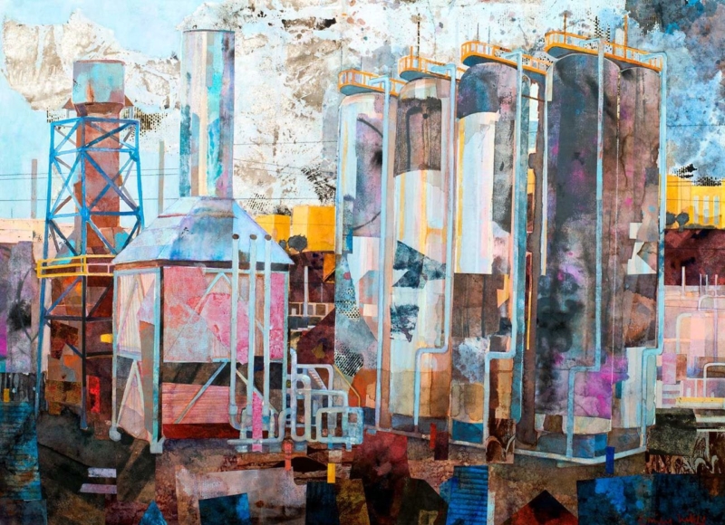
Choosing art for a converted warehouse apartment means working with architecture that already has a strong voice. Brick, steel, tall windows, deep reveals, and open spans can make a memorable home, but they can also leave smaller walls feeling unresolved. Industrial Reverie by Emily Little offers a compact, atmospheric counterpoint. Its semi-abstract character can acknowledge the setting without simply repeating industrial motifs.
Let the building remain part of the composition
A warehouse conversion rarely needs artwork to supply more visual scale. The structure has already done that. What it often needs is a point of human focus: something that rewards a closer view and makes a particular corner feel inhabited. A modest landscape-format print can create that pause without trying to dominate a double-height wall.
The title Industrial Reverie suggests a useful tension between harder surroundings and a more reflective mood. That makes the work suitable for an interior where original fabric meets domestic life. It can connect with the building’s history while preventing brick, metal, and concrete from becoming the only story in the room.
Where art for a converted warehouse apartment can work hardest
| Position | What the artwork can do | Useful check |
|---|---|---|
| Above a compact console | Give an entrance zone a clear identity | Relate the frame to the furniture width |
| Beside an exposed-brick pier | Soften a hard architectural junction | Leave visible brick around the frame |
| Near a reading chair | Create a more intimate visual scale | Check the view from the seat |
| Along an open-plan transition | Mark the change between living and dining areas | Avoid a busy route where the frame may be brushed |
Do not assume that the largest blank wall is automatically the right location. A compact piece may look stranded there. Shorter returns, structural bays, and walls near furniture often provide better proportion. Use a paper template that includes the expected frame, not only the 345 x 250 millimetre print size.
Build contrast instead of matching every material
An industrial apartment can become heavy if every choice repeats black metal, dark leather, and reclaimed timber. Artwork provides an opportunity to introduce ambiguity, movement, and a different kind of surface. Semi-abstract work is especially helpful because it can sit between the building’s geometry and the softer objects of everyday life.
Keep nearby accessories selective. One ceramic, a stack of books, or a soft pool of lamplight may be enough. Avoid arranging vintage factory signs and mechanical objects around the frame. Those additions can make the room feel staged, whereas a little clear space allows the picture and original architecture to hold a more natural conversation.
Choose a frame that defines rather than imitates
A black frame may suit steel window lines, but it is not the only answer. A fine dark moulding can provide definition on pale plaster. Natural timber can bring warmth to exposed brick or concrete. If the wall itself is highly textured, a mount and a clean outer edge can give the image visual breathing room.
First 4 Frames produces colour-managed Giclée prints and completes bespoke framing in-house at its Falkirk workshop. That careful presentation matters in a detail-rich apartment. It makes a smaller artwork feel deliberate and gives it enough finish to stand alongside strong architectural materials.
A quieter focal point within a large interior
Emily Little explores colour, memory, emotion, and the world around us through expressive semi-abstract painting. Visit Emily Little’s official website for more of her practice, or compare the wider Emily Little collection at First 4 Frames.
Successful art for a converted warehouse apartment does not have to fill the biggest wall or mirror every exposed beam. It can make one part of the home feel more personal and complete. View the framed Industrial Reverie print for an atmospheric piece that respects the architecture while bringing the interior back to a human scale.