Posted on

Horizontal Wall Art Above a Dining Bench: Let Wayfaring Extend the Line

Image of Wayfaring by Jill McIntosh

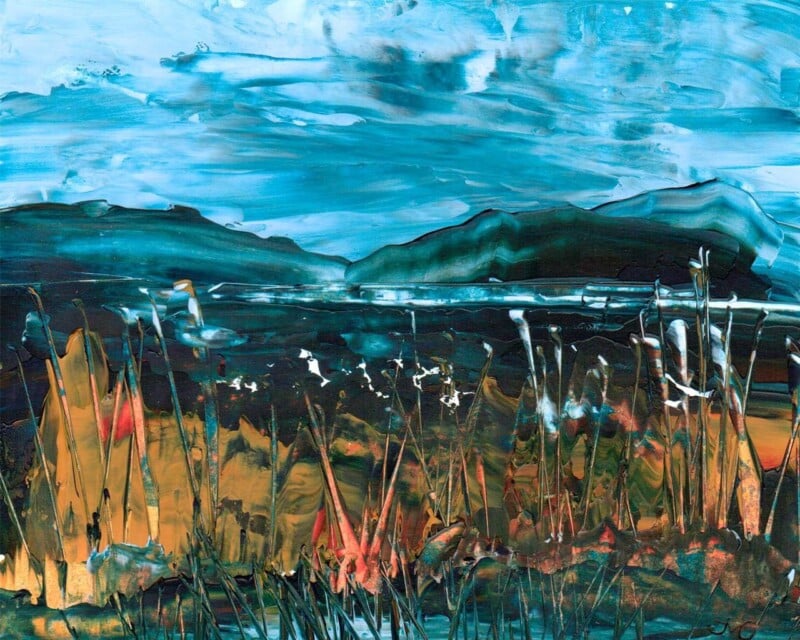
horizontal wall art above a dining bench should earn its place by answering a real question about the room or recipient. Wayfaring is a useful starting point because the wide painted sky and low landscape echo the bench’s long line, while fine foreground marks add movement without introducing a busy pattern behind diners.

horizontal wall art above a dining bench - Wayfaring

Size horizontal wall art above a dining bench from the finished frame

Measure the bench, not the whole wall. The artwork should relate to the seating zone while leaving a visible margin at both ends. Include the mount and frame in every calculation, because print dimensions understate how much wall the finished piece occupies.

MeasureWhat to check
Bench widthKeep the framed work inside the seating zone.
Backrest heightLeave room for cushions and movement.
Seated headroomAsk the tallest diner to sit before fixing.
Table lightingKeep pendants out of the main sightline.

The low land in Wayfaring provides a visual baseline. Aligning it loosely with the room’s long elements creates calm, but avoid making every shelf, frame and tabletop perfectly level. A small difference keeps the arrangement natural.

Measure artwork with people seated; a dining wall is an occupied space, not an empty elevation.

Use textiles to acknowledge one earth or sky tone. A complete blue-and-beige scheme is unnecessary. The painting contains enough weather and texture to connect the zone.

Choose a frame that completes the bench composition

A long, calm landscape exposes uneven mounting and imprecise spacing. Colour-managed Giclée production keeps the pale sky and warm land balanced, while bespoke framing completed in-house establishes a dependable outer line above fixed seating.

To explore the artist’s wider response to Scottish shoreline, weather and atmosphere, visit Jill McIntosh’s official website. You can also browse the Jill McIntosh collection or see the exact framed product.

Horizontal wall art above a dining bench can make built-in seating feel integrated. Wayfaring extends the zone through horizon and sky, while practical measurement keeps the picture comfortable for everyone at the table.

Posted on

Wall Art for a Room With Low Natural Light: Open the Horizon With Under Our Skies

Image of Under Our Skies by Jill McIntosh

wall art for a room with low natural light should earn its place by answering a real question about the room or recipient. Under Our Skies is a useful starting point because its broad blue-and-white sky and low distant land create depth, while earthy grasses keep the composition grounded in a room that depends on lamps for much of the day.

wall art for a room with low natural light - Under Our Skies

Light wall art for a room with low natural light from the side

Artwork cannot solve a dark room alone. Support it with a floor or wall light that washes the surrounding surface gently, not a spotlight that produces a bright patch on the glazing. Side light can reveal the foreground texture while preserving distance in the sky.

  • Use warm-white ambient light for comfort.
  • Add a separate task light where reading happens.
  • Keep the glass outside direct lamp reflections.
  • Test the picture when the room is used most.

Do not make every surface pale in an attempt to chase brightness. A mid-tone wall can give the clouds cleaner definition, while timber, wool and warmer landscape marks prevent the blues from feeling cold. The result should have depth, not imitate daylight.


Under Our Skies has horizontal calm, yet the moving weather keeps it alive. That balance suits a snug or internal dining area where the aim is to create a visual destination rather than deny the room’s sheltered character.

Retain subtle sky changes through colour-managed production

A pale sky can lose structure if tonal transitions are poorly reproduced. Colour-managed Giclée production protects those changes, while a measured mount and bespoke frame made in-house separate the open image from a deeper wall colour.

For more of the artist’s Scottish weatherscapes and information about her practice, visit Jill McIntosh’s official website. You can also browse the Jill McIntosh collection or see the exact framed product.

Wall art for a room with low natural light is useful when it creates depth and works with the lighting plan. Under Our Skies brings an open horizon, active weather and enough warm land to keep a sheltered room welcoming.

Posted on

Wall Art for a Room With Garden Views, Why Cuckoos Calling Works So Well

Image of Cuckoos Calling by Jill McIntosh

Rooms with lovely outlooks still need art. The key is choosing something that supports the connection to the outdoors rather than trying to outdo it. Cuckoos Calling is a strong piece of wall art for a room with garden views because it echoes that natural rhythm instead of pulling the room in a completely different direction.

Why this piece suits the space

When windows already frame greenery, trees, or changing seasonal colour, artwork works best when it feels like part of the same conversation. This piece adds movement, atmosphere, and a sense of nature, but it still lets the real view do its job.

  • It helps the interior feel connected to the garden rather than separate from it.
  • It adds a focal point on walls that do not have glazing of their own.
  • It suits breakfast rooms, garden rooms, and sitting areas that need softness rather than contrast for its own sake.

Where it works best

That balance matters because too much visual competition can make a bright room feel unsettled. Cuckoos Calling supports the mood of the space while still giving it a clearly finished look inside.

Why the framed finish matters

First 4 Frames produces the artwork in-house with bespoke framing, colour-managed Giclee quality, and hand-finished craftsmanship. In a light-filled room, that careful finish helps the piece feel deliberate and lasting rather than casually decorative.

This artwork is by Jill McIntosh, and you can view the exact framed product here.

If you are choosing wall art for a room with garden views, Cuckoos Calling offers a calm way to tie the room and the outlook together.

Posted on

Why After the Rain Works So Well as Wall Art for Sloped Ceilings

Image of After the Rain by Jill McIntosh

Choosing wall art for sloped ceilings can be harder than styling a standard straight wall. Angled lines often make a room feel charming, but they can also leave one section looking unresolved. After the Rain works especially well in that setting because it brings atmosphere and structure without making the space feel cramped.

Why this kind of wall needs a calmer focal point

Rooms with eaves, attic conversions, and top-floor bedrooms often benefit from artwork that feels settled rather than busy. A sloped ceiling already introduces visual movement, so the framed print needs to steady the wall rather than compete with it. After the Rain does that nicely. Its mood and colour give the eye somewhere to rest, which helps the room feel more intentional.

  • It softens awkward geometry without ignoring it.
  • It suits loft rooms, upper landings, and bedrooms tucked into the roofline.
  • It adds personality without asking for a large, square wall.

Where it tends to work best

This sort of piece is especially effective on the full-height section beneath the slope, beside a dormer window, or on the wall you first see when entering the room. In each case, the framed presentation helps turn an awkward area into part of the design rather than a compromise you have to work around.

Good art does not fight a difficult wall. It resolves it.

Why the framed finish matters here

In a room with unusual lines, presentation matters even more. First 4 Frames produces each piece in-house in Falkirk using colour-managed Giclée printing, bespoke framing, and hand-finished craftsmanship. That cleaner, more polished finish gives the artwork enough presence to hold its place properly on an angled wall.

This artwork is by Jill McIntosh, and you can view the exact framed product here.

If you want wall art for sloped ceilings that feels balanced, atmospheric, and properly considered, After the Rain is a very strong option.

Posted on

How Adrift Can Set the Right Tone for Hotel Lounge Wall Art

Image of Adrift by Jill McIntosh

The best hotel lounge wall art helps guests relax almost immediately. It should add atmosphere and identity, but it should not feel noisy or overly themed. Adrift is a particularly good choice because it brings calm movement and a sense of place while still feeling polished enough for a professional hospitality setting.

Why guest spaces need calm rather than clutter

A hotel lounge often has to do several jobs at once. It may welcome arriving guests, give people somewhere to wait, support quiet conversation, or simply soften the transition between public and private space. Artwork that is too busy can work against that. This piece succeeds because it feels atmospheric without becoming demanding.

  • It suits lounges, reception seating areas, and quieter corners in boutique hotels or guest houses.
  • It brings Scottish coastal character without forcing a full seaside theme.
  • It helps a commercial interior feel curated rather than off-the-shelf.

A better choice than generic hospitality filler

Many guest spaces rely on safe but forgettable décor. One well-chosen framed print can do far more. This artwork gives the room a stronger mood and a more considered identity, which can make the whole experience feel warmer and more memorable for the people using the space.

Why presentation matters in hospitality

First 4 Frames produces each piece in-house in Falkirk using colour-managed Giclée printing and hand-finished bespoke framing. In a hospitality setting, where guests notice overall finish very quickly, that craftsmanship helps the artwork support the quality of the room rather than undermine it.

The artwork is by Jill McIntosh, and you can view the exact framed product here.

If you need hotel lounge wall art that feels calm, distinctive, and easy for guests to live with, Adrift is a very effective choice.

Posted on

Why Atlantic Storm Approaching Works So Well When You Want Art for a Room With Black Accents

Image of Atlantic Storm Approaching by Jill McIntosh

Choosing art for a room with black accents is often about balance. Black details can make a room feel crisp, tailored, and modern, but they can also harden the overall look if everything around them is too static. Atlantic Storm Approaching is a very good way to introduce movement and colour without losing that sense of control.

Why this kind of contrast works

The darker accents in a room already provide definition, so the artwork does not need to compete through heaviness. This piece works because it brings energy through weather, texture, and shifting tone. That keeps the room feeling alive rather than overly formal.

  • It suits living rooms, dining spaces, and home offices with darker metalwork or painted details.
  • It adds depth without forcing the room into a full coastal theme.
  • It helps black accents feel intentional rather than severe.

A useful choice when a scheme feels too sharp

Rooms with black picture rails, lighting, furniture, or window frames often benefit from one softer but still confident focal point. The atmosphere in this artwork does that job well. It gives the eye somewhere to settle while still keeping the space visually strong.

Why the framed finish matters

First 4 Frames produces each piece in-house in Falkirk using colour-managed Giclée printing and hand-finished bespoke framing. That superior quality presentation is especially important in a more design-led room, because details are noticed more quickly when the scheme is clean and deliberate.

The artwork is by Jill McIntosh, and you can view the exact framed product here.

If you want art for a room with black accents that feels dramatic but still easy to live with, Atlantic Storm Approaching is an excellent option.

Posted on

Why Cuckoos Calling Works Beautifully as Morning Room Wall Art

Image of Cuckoos Calling by Jill McIntosh

Good morning room wall art should support the way the room is actually used. In a space where people begin the day with coffee, light, and a little quiet, the artwork needs to feel fresh rather than heavy. Cuckoos Calling does that beautifully.

A natural fit for a brighter part of the home

This piece has openness in it. The sky, grasses, and sense of movement help a room feel aired out and settled at the same time. That is especially useful in a morning room, where the best interiors feel relaxed and easy rather than overfilled.

  • It works well with pale timber, rattan, painted furniture, and soft neutral upholstery.
  • It brings colour into the room without making the space feel busy first thing in the day.
  • It suits people who want a calm Scottish landscape with a little more lift than a muted print.

Where it tends to work best

A framed piece like this can sit comfortably above a small sofa, beside a breakfast table, or on the wall you see first when the curtains are opened. If the room already has plenty of natural light, this artwork helps that light feel like part of the atmosphere rather than just a practical feature.

Why the finish matters in an everyday room

First 4 Frames produces the piece in-house in Falkirk using colour-managed Giclée printing and hand-finished bespoke framing. In a room you use every day, that superior quality matters. It gives the artwork a more lasting, considered presence and stops it from feeling like temporary décor.

The artwork is by Jill McIntosh, and you can view the exact framed product here.

If you want morning room wall art that feels airy, restful, and properly finished, Cuckoos Calling is a very appealing choice.

Posted on

Why Evening Reflections Works So Well as Wall Art for a Room With Hard Floors

Image of Evening Reflections by Jill McIntosh

Choosing wall art for a room with hard floors is often about balance. Timber, stone, and tile can look crisp and elegant, but they can also leave a room feeling slightly cool or echoing if there is not enough softness elsewhere. Evening Reflections is a very good choice when you want to bring warmth and atmosphere back in without making the room feel heavy.

Why it helps a harder-finished room feel calmer

Rooms with exposed flooring often benefit from artwork that introduces movement, depth, and gentler colour transitions. This piece does that beautifully. It softens the sharper edges of the room and helps the space feel more settled, especially when the furniture lines are clean and the flooring takes up a lot of visual space.

  • It suits living rooms, dining spaces, and bedrooms with visible wood or tiled floors.
  • It adds warmth without fighting against a clean, uncluttered scheme.
  • It works particularly well when you want a room to feel finished rather than simply practical.

A useful choice when the room feels a little echoing

Artwork cannot replace rugs, curtains, or upholstery, but it does play a real part in how a room feels. A piece like this introduces visual softness, which helps harder surfaces feel less stark. If your room already has neutral walls and simple flooring, that change can be surprisingly effective.

Why the framed finish matters

First 4 Frames completes the work in-house in Falkirk using colour-managed Giclée printing and hand-finished bespoke framing. That superior quality presentation gives the piece more presence and keeps the final result feeling polished rather than temporary.

The artwork is by Jill McIntosh, and you can view the exact framed product here.

If you want wall art for a room with hard floors that brings warmth, calm, and a more comfortable overall feel, Evening Reflections is a strong option.

Posted on

Why Freedom Works Beautifully When You Need Art for a Grey Room

Image of Freedom by Jill McIntosh

Choosing art for a grey room can be trickier than it first seems. Grey gives a room flexibility and calm, but it can also leave the space feeling slightly flat if the artwork does not bring enough life to the scheme. Freedom is a very good answer to that problem.

Why grey interiors benefit from the right contrast

A grey room often needs artwork that introduces movement and warmth without breaking the calm mood that made the palette appealing in the first place. This piece does that well, helping the room feel more layered and more intentional rather than simply neutral.

  • It adds colour without making a grey scheme feel busy.
  • It gives a plain wall a more confident focal point.
  • It keeps the room calm while stopping it from feeling cold.

A useful choice for living spaces, bedrooms, and home offices

Because the colour and atmosphere feel balanced, Freedom can work across several settings. It suits rooms where you want a little more visual interest, but still need the artwork to remain easy to live with day after day.

Why the framed finish matters

First 4 Frames completes the piece in-house in Falkirk using colour-managed Giclée printing and hand-finished bespoke framing. That superior quality finish matters because in a restrained room, every detail is noticed more clearly.

The artwork is by Jill McIntosh, and you can view the exact framed piece here.

If you are looking for art for a grey room that brings lift without losing calm, Freedom is a very persuasive piece to consider.

Posted on

What Makes Hope a Strong Treatment Room Wall Art Choice

Image of Hope by Jill McIntosh

Good treatment room wall art needs to do more than fill a blank wall. It should help the room feel calm and reassuring, while still looking considered and professional. Hope is a strong option when you want that balance.

Why this matters in a treatment setting

Whether the room is used for beauty treatments, massage, holistic therapy, or quiet one-to-one appointments, people notice the atmosphere straight away. If the walls feel too bare, the room can seem temporary. If the artwork is too busy, it can work against the sense of ease you are trying to create.

  • It brings a softer visual focus to the room without becoming distracting.
  • It helps the space feel more restorative and welcoming for clients.
  • It suits a professional setting where presentation still matters.

A calmer room often feels more premium

One well-chosen framed piece can make a treatment room feel more settled and more complete. That is especially useful in smaller rooms, where every visual decision carries more weight. Hope adds colour and atmosphere while keeping the overall mood gentle.

Why the finish matters as much as the image

First 4 Frames produces the piece in-house in Falkirk with colour-managed Giclée printing and bespoke hand-finished framing. That quality matters in client-facing rooms because a polished finish quietly supports the impression of care and professionalism.

The artwork is by Jill McIntosh, and you can view the exact framed piece here.

If you are choosing treatment room wall art that helps the room feel both restorative and properly finished, Hope is an excellent piece to consider.