Posted on

Statement Wall Art Starts More Conversations With Extreme Dining, Rockall

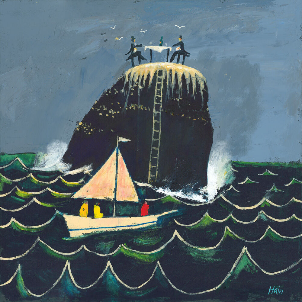
Three people sail past a rocky outcrop in choppy seas while three others enjoy Extreme Dining, Rockall atop the stone near a ladder, as white birds soar above and waves crash below.

The appeal of statement wall art is not simply that it draws the eye. It should also reward attention once people stop and look. Extreme Dining, Rockall does exactly that, giving the room a focal point with wit, place, and a sense of story.

statement wall art - Extreme Dining, Rockall

Why statement wall art should offer more than impact

A stronger focal piece works best when it gives the room personality as well as presence. Extreme Dining, Rockall has enough humour and originality to become a talking point, but it still feels composed enough for a dining space, home bar, hallway, or sitting room that wants one memorable feature.

  • It creates conversation without feeling gimmicky.
  • It suits rooms that already have simpler furniture and need one stronger accent.
  • It gives personality to spaces that might otherwise feel polished but anonymous.

Why Extreme Dining, Rockall holds attention so well

First 4 Frames completes the print and framing in-house in Falkirk using bespoke craftsmanship and colour-managed Giclee production. That careful finish matters because a more unusual piece like this needs enough control and quality to feel display-worthy rather than novelty led.

For more on the wider island setting that informs this kind of imagery, VisitScotland on the Outer Hebrides is worth a look. You can also browse more work by Rob Hain and view the exact framed product here.

If you want statement wall art that feels imaginative, distinctive, and easy to remember, Extreme Dining, Rockall is an excellent option.

Posted on

Scottish Wall Art Feels More Sociable With Tigh an Truish (The Hoose o’ Troosers)

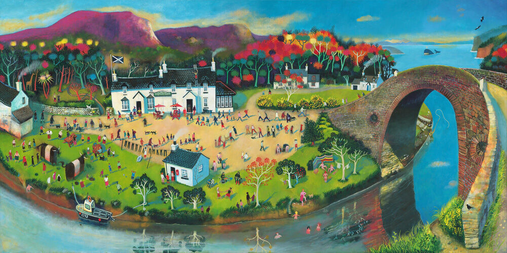
A vibrant painting of Tigh an Truish (The Hoose o’ Troosers), showing a lively riverside village with people strolling, boating, autumn trees, white houses, and the famed stone bridge arching over the water.

Strong Scottish wall art should feel rooted without becoming predictable. Tigh an Truish (The Hoose o’ Troosers) manages that beautifully. It brings a recognisable west coast spirit into the room, but it does so with warmth and humour rather than stiffness or cliche.

Scottish wall art - Tigh an Truish (The Hoose o’ Troosers)

Why Scottish wall art can work especially well in sociable rooms

Shared spaces often benefit from artwork that gives people something to notice and talk about straight away. Tigh an Truish (The Hoose o’ Troosers) has that kind of appeal. It feels lived in and welcoming, which makes it particularly useful in kitchens, dining spaces, snug corners, or holiday homes where a sense of place matters.

There is also a generosity to the scene. Rather than simply decorating the wall, it helps the room feel more relaxed and more personal, which is often exactly what a well-used family or entertaining space needs.

Why Tigh an Truish feels welcoming rather than staged

First 4 Frames produces and frames every piece in-house with bespoke craftsmanship and colour-managed Giclee quality. That finish gives the artwork the superior quality presence it needs to feel properly integrated into the room, not just pinned there for effect.

For more on the west coast area behind the subject, VisitScotland on Argyll and Bute is useful. You can also browse more work by Rob Hain and view the exact framed product here.

If you want Scottish wall art that feels rooted, easy to enjoy, and full of local warmth, Tigh an Truish (The Hoose o’ Troosers) is a very strong fit.

Posted on

London Wall Art Feels More Grown Up With London in the Pink

London in the Pink" is a vibrant illustrated map of central London featuring famous landmarks, parks, lively streets, and the River Thames in a colorful, whimsical style.

The best London wall art should bring place and personality into a room without looking like a souvenir. London in the Pink does that especially well because the pink light gives the scene energy and charm, while the overall composition still feels refined enough for everyday living.

London wall art - London in the Pink

Why London wall art works best when it feels stylish rather than obvious

London is such a familiar subject that some prints can lean too hard on recognition alone. London in the Pink avoids that. It feels fashionable without becoming cold, and lively without shouting for attention. That makes it especially useful in a guest room, dressing room, hallway, or creative workspace where colour needs to feel intentional rather than random.

  • It brings city character without turning the room into a theme.
  • It suits interiors that want warmth as well as definition.
  • It feels expressive, but still easy to live with over time.

Why London in the Pink feels polished on the wall

First 4 Frames completes the work in-house in Falkirk with bespoke framing and colour-managed Giclee production. That matters here because the lighter tonal shifts and bolder accents need a superior quality finish if they are going to look composed rather than simply bright.

For more on the city behind the subject, Visit London is worth exploring. You can also browse more work by Rob Hain and view the exact framed product here.

If you are comparing London wall art and want something warmer, more confident, and less predictable, London in the Pink is an excellent choice.

Posted on

Why Glen Brittle, Home of the Fairy Pools Works So Well as Fairy Pools Wall Art

A vibrant landscape featuring Glen Brittle, Home of the Fairy Pools: green grass, a rocky path, waterfalls flowing into clear pools, colorful rocks, distant mountains under a pink sky, and two birds soaring above.

Good Fairy Pools wall art should feel tied to the place itself, not just broadly scenic. People looking for artwork linked to Skye often want something that holds onto memory, atmosphere, and landscape character without slipping into souvenir territory. Glen Brittle, Home of the Fairy Pools does that especially well, bringing the drama of the Fairy Pools area into a framed piece that still feels refined enough for everyday living.

Fairy Pools wall art featuring Glen Brittle, Home of the Fairy Pools

Why Fairy Pools wall art needs more than a familiar location name

Artwork inspired by a well-known destination works best when it gives you a real sense of mood as well as recognition. The Fairy Pools have become one of the most memorable parts of Skye because of the movement, colour, and shifting light around them. A framed print needs to carry some of that atmosphere if it is going to feel lasting on the wall rather than simply topical.

Glen Brittle, Home of the Fairy Pools succeeds because it feels grounded in the landscape while still reading as a strong interior piece. It can work beautifully in a sitting room, hallway, holiday cottage, or guest room where the aim is to bring in a sense of Scottish place without overwhelming the rest of the scheme.

Why Glen Brittle, Home of the Fairy Pools feels worth displaying long term

  • It reflects a specific Skye setting rather than a generic scenic theme.
  • It gives the room a place-led focal point without feeling overly themed.
  • It suits both local connection and wider love of Scottish landscape art.

First 4 Frames completes every piece in-house in Falkirk with bespoke framing, colour-managed Giclee printing, and hand-finished craftsmanship. That quality-led finish matters when you want landscape artwork to feel substantial and display-worthy rather than temporary.

You can browse more by Rob Hain, visit Rob Hain’s official website, and view the exact framed print here.

If you are comparing Fairy Pools wall art and want something atmospheric, rooted, and easy to live with, Glen Brittle, Home of the Fairy Pools is a very strong choice.

Posted on

Wall Art for Terrazzo Floors Works Beautifully With Around and About Oban

A colorful, whimsical painting inspired by Around and About Oban, featuring a Scottish coastal town with red-roofed buildings, people strolling, a large boat at the dock, and an arched viaduct under a crescent moon and starry sky.

Choosing wall art for terrazzo floors is often about controlling visual rhythm. Around and About Oban works especially well because it has movement, colour, and local character, but it still reads as one confident image rather than lots of disconnected detail.

wall art for terrazzo floors - Around and About Oban

Why wall art for terrazzo floors needs clear structure

Terrazzo can be brilliant at giving a room texture, but it already asks the eye to do some work. That means the artwork should feel intentional. Around and About Oban has enough energy to keep pace with the floor, yet its composition still feels gathered together and easy to read from across the room.

That is useful in kitchens, hallways, and modern living spaces where terrazzo introduces pattern below and the wall still needs a focal point that feels deliberate rather than busy for the sake of it.

Why Around and About Oban holds its own without competing

First 4 Frames completes every piece in-house using bespoke framing and colour-managed Giclee production. That finish matters because patterned interiors need artwork with enough presence to register cleanly, while still looking polished and easy to live with.

For more on the harbour town inspiration, VisitScotland on Oban is worth exploring. You can also browse more work by Rob Hain and view the exact framed product here.

If you are comparing wall art for terrazzo floors and want patterned flooring to feel complemented rather than challenged, Around and About Oban is a very strong fit.

Posted on

Why Lilliesleaf Is Such a Strong Choice for Scottish Borders Wall Art

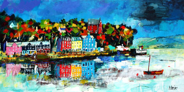
Lilliesleaf: A colorful abstract painting featuring multicolored houses, trees, and a yellow sky. Bold brushstrokes and overlapping shapes evoke the vibrant and playful atmosphere of a lively town.

Good Scottish Borders wall art should do more than mention a location. It should capture enough atmosphere and personality to make the place feel present in the room. Lilliesleaf does that especially well, offering a characterful local scene that feels connected to the Borders without slipping into the look of a generic souvenir.

Scottish Borders wall art featuring Lilliesleaf

Why Scottish Borders wall art needs a real sense of place

When people buy art connected to the Borders, they are often looking for more than a named landmark. They want something that reflects community, setting, and memory in a way that still works naturally at home. That balance is important. The piece should feel rooted, but it also needs enough colour and life to stand on its own as framed artwork.

Lilliesleaf manages that balance beautifully. It has the kind of local character that can resonate with people who know the area, while still feeling warm and decorative for a hallway, sitting room, study, or guest space. That makes it a strong option for anyone who wants Scottish Borders wall art with genuine personality.

Why Lilliesleaf feels more lasting than a location-led novelty piece

  1. It carries a clear sense of local identity without feeling over themed.
  2. It is easy to display in both traditional and more relaxed modern interiors.
  3. It gives a room connection to place while still feeling like a properly chosen piece of art.

First 4 Frames completes every piece in-house in Falkirk with bespoke framing, colour-managed Giclee printing, and hand-finished craftsmanship. That quality-led presentation matters when the goal is to own something that feels enduring rather than temporary.

You can discover more about the artist at Rob Hain, browse more work by Rob Hain, and view the exact framed print here.

If you are looking for Scottish Borders wall art that feels rooted, display-worthy, and genuinely connected to the area, Lilliesleaf is well worth considering.

Posted on

Commercial Wall Art Feels More Memorable With Bollywood at Holyrood

Bollywood at Holyrood is a vibrant, whimsical painting depicting castles, colorful buildings, rolling green hills, an ornate elephant with a rider near old stone ruins, and a lively park—capturing the spirit of Bollywood in Edinburgh.

Good commercial wall art should make a business space feel more distinctive without pushing it into novelty. Bollywood at Holyrood does that well, bringing colour, local reference, and movement into the room while still feeling professional enough for everyday use.

commercial wall art - Bollywood at Holyrood

Why commercial wall art works best when it has personality

Reception spaces, meeting rooms, studios, and client lounges often need more than safe filler. They need artwork that helps the space feel thought through. Bollywood at Holyrood brings a recognisable Edinburgh energy that can make a room feel warmer and more memorable without becoming loud or over-designed.

That makes it especially useful where a business wants to signal place, confidence, and a more considered eye for detail. It feels welcoming, but it also feels specific, which is often what commercial rooms are missing.

Why Bollywood at Holyrood holds a shared space so well

First 4 Frames completes every piece in-house with bespoke framing and colour-managed Giclee production, so the final result feels polished rather than disposable. That craftsmanship matters in commercial settings, where the artwork becomes part of the overall impression clients and visitors take away.

For more context around the setting, Historic Environment Scotland on Holyrood Park is useful. You can also browse more work by Rob Hain and view the exact framed product here.

If you want commercial wall art that feels memorable, local, and properly finished, Bollywood at Holyrood is an excellent fit.

Posted on

Beach Wall Art for a Dining Nook Feels More Sociable With Day Out, North Berwick

The painting "Day Out, North Berwick" features vibrant houses, a sandy beach curving around the bay, sailing boats, strolling people, and a green hill beneath a bright blue sky, capturing the charm of this coastal town.

Choosing beach wall art for a dining nook is often about atmosphere rather than theme. In a smaller dining nook, the right piece should make the space feel brighter, more open, and easier to linger in. Day Out, North Berwick does exactly that.

beach wall art for a dining nook - Day Out, North Berwick

Why beach wall art for a dining nook should feel relaxed, not themed

Dining nooks work best when they feel welcoming enough for coffee, conversation, and everyday meals. A coastal image can help, but only if it brings ease rather than obvious seaside styling. Day Out, North Berwick has enough lightness and movement to soften the area without making it feel overly decorative.

That makes it especially useful in kitchens, breakfast corners, and informal dining spots where you want the artwork to add warmth while still keeping the room practical and uncluttered.

Why Day Out, North Berwick gives a dining corner more lift

The scene already carries brightness and easy rhythm, while the framing gives it enough authority to hold the wall properly. First 4 Frames completes every piece in-house with bespoke framing and colour-managed Giclee production, helping the final artwork feel superior quality and ready to enjoy from the day it arrives.

For more on the setting, VisitScotland on North Berwick is useful. You can also browse more work by Rob Hain and view the exact framed product here.

If you are looking for beach wall art for a dining nook that feels bright, sociable, and properly finished, Day Out, North Berwick is an excellent fit.

Posted on

Why Pipers on Parade Makes a Memorable Gift for a Bagpipe Player

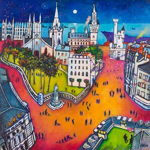
Pipers on Parade is a colorful, whimsical painting featuring a cityscape with historic buildings, vibrant trees, and people gathered along winding roads beneath a bright blue sky, grassy hill castle, and crescent moon.

A really good gift for a bagpipe player should feel more personal than the usual themed extras. For someone who plays the pipes, the best present often reflects pride in the music and the tradition, while still being refined enough to live with every day. Pipers on Parade does exactly that, giving the subject real movement and Scottish character in a piece that feels polished rather than novelty led.

gift for a bagpipe player featuring Pipers on Parade

Why a gift for a bagpipe player should feel display-worthy

Pipe players often receive presents that lean too heavily on novelty, tartan cliches, or short-lived celebration. Framed artwork offers something more lasting. It can acknowledge the music and the atmosphere around it while also becoming part of the home, studio, or practice space in a more enduring way.

Pipers on Parade stands out because it captures energy, rhythm, and the shared spirit of performance. That makes it a strong choice for birthdays, thank-you gifts, competition milestones, retirements, or simply marking someone’s lasting connection to Scottish music.

Why Pipers on Parade feels more considered than a novelty gift

  1. It reflects the subject directly without feeling gimmicky.
  2. It is easy to display in a hall, study, music room, or sitting room.
  3. It carries the sense of occasion that makes a gift feel properly chosen.

First 4 Frames completes each piece in-house in Falkirk with bespoke framing, colour-managed Giclee printing, and hand-finished craftsmanship. That superior quality helps the present feel substantial from the first glance, which is exactly what you want when the gift is meant to be remembered.

You can learn more about the artist at Rob Hain, browse more work by Rob Hain, and view the exact framed print here.

If you need gift for a bagpipe player that feels rooted, thoughtful, and genuinely lasting, Pipers on Parade is well worth considering.

Posted on

Gateway to the Mile Feels Fresh Among Contemporary Art Prints

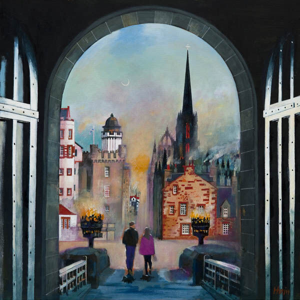
Gateway to the Mile": A painting of two people walking a dog beneath the iconic archway, with historic buildings and a church spire silhouetted against a twilight sky filled with warm lights and hints of mist.

The most convincing contemporary art prints tend to feel current without trying too hard. Gateway to the Mile does that very well. The image carries movement and city character, yet it still feels welcoming enough for a real home rather than like a design gesture that might date too quickly.

contemporary art prints - Gateway to the Mile

Why contemporary art prints work when they combine movement with place

Contemporary does not have to mean detached. Gateway to the Mile feels lively because it captures a recognisable route and a real urban rhythm. That gives the room energy, but it also gives the piece staying power because the image has more behind it than trend value alone.

This makes it a strong option for hallways, dining spaces, home offices, or sitting rooms that need a little more momentum without becoming visually hard.

Why Gateway to the Mile benefits from a careful final presentation

First 4 Frames handles the piece in-house with bespoke framing, colour-managed Giclee printing, and superior craftsmanship. That presentation helps the image feel polished and lasting, which is important when a more contemporary picture needs to look composed rather than merely busy.

You can browse more work by Rob Hain, visit Rob Hain, and view the exact framed product here.

If you are looking through contemporary art prints and want something lively, current, and easy to place, Gateway to the Mile stands out for the right reasons.