
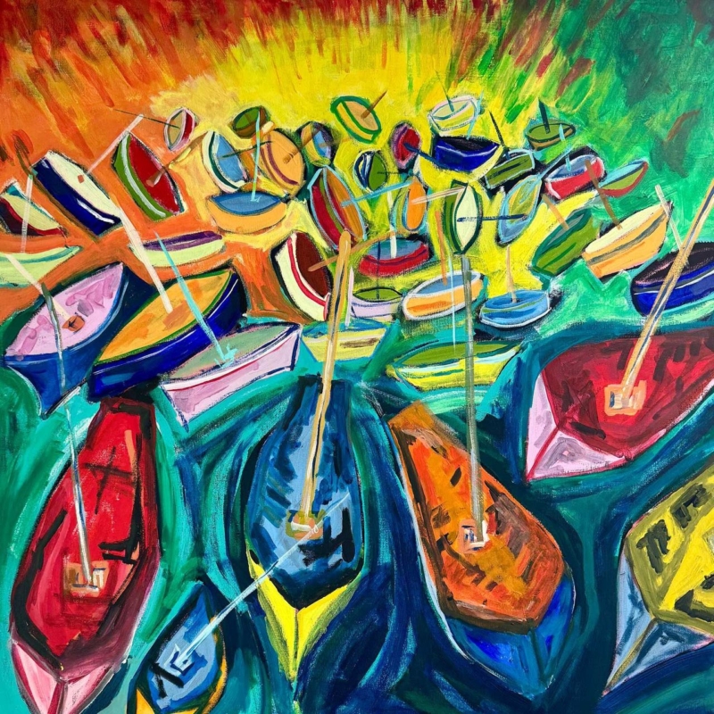
colourful boat wall art for teal furniture can connect a strong sofa, chair or cabinet to the rest of a room without copying its colour exactly. View from the Harbour by David Short places vivid boats across layered turquoise, blue and green water. Red, orange, yellow and pink hulls break up the cooler field. The result gives teal furniture company, contrast and energy rather than turning the scheme into one continuous block of blue-green.
How colourful boat wall art for teal furniture avoids a flat match
Matching artwork to furniture does not mean finding the same teal and repeating it at the same strength. That approach can make both pieces disappear into a large cool area. A better connection uses variation. View from the Harbour moves between turquoise, sea green, cobalt and deep navy. Those neighbouring tones recognise the furniture while keeping the surface lively.
The warm boats are equally important. Their red, orange and yellow shapes create stopping points across the composition. They also provide a route for introducing smaller accents elsewhere in the room. The teal remains the anchor, but it is no longer responsible for the entire colour scheme.
Build a colour hierarchy rather than repeating every shade
Choose three levels of colour. Let the furniture hold the largest block of teal. Allow the artwork to supply the broadest range. Then use one or two small objects to repeat selected warm notes. This hierarchy feels connected without becoming over-coordinated.
| Colour from the print | Good place to repeat it | What to avoid |
|---|---|---|
| Deep navy | A plain cushion or narrow rug detail | Another large blue item beside the sofa |
| Tomato red | A small ceramic or book spine | Several bright red accessories |
| Warm orange | Natural timber or a lamp base | Trying to match the paint exactly |
| Clear yellow | One compact decorative accent | A second competing focal point |
White lines and pale sections within the boats also create breathing space. A warm off-white wall can connect with those marks and keep the saturated colours crisp. Very dark teal paint may still work, but the frame needs a clear edge so the picture does not merge into the wall.
Use the square format to balance the furniture
The print is available in several square sizes. That shape is useful above a broad chair, at one end of a sideboard or on the return wall beside a sofa. It gives a firm visual stop without stretching the teal horizontally across the entire room.
- Above a chair, centre the picture on the furniture rather than the full wall.
- Beside a sofa, align the artwork with a lamp or small table to form a separate group.
- Above a sideboard, leave enough width for the furniture to frame the square composition.
- Between windows, test the finished frame size and check reflections at the brightest time of day.
Make a paper template for the complete framed dimensions. The larger option can hold a substantial wall, but clear space is still valuable. If the frame sits too close to curtains, shelving or a tall plant, the clustered boats may feel busier than intended.
Keep the room coastal without making it nautical
The subject provides enough harbour character by itself. Rope, anchors, striped cushions and model boats would make the theme unnecessarily literal. Instead, connect through materials and mood. Woven texture can suggest working rope without depicting it. Natural timber can bring warmth associated with hulls and jetties. Simple glass can echo water and light.
This approach also makes the picture suitable far from the coast. The boats become an energetic pattern of shape and colour as well as a recognisable subject. That dual reading is useful in a contemporary room, where the work can feel cheerful and graphic without depending on a seaside setting.
Give the busy composition a clean boundary
View from the Harbour contains many overlapping hulls, masts and colour changes. A simple frame helps organise that activity. A dark moulding can connect with the navy outlines, while a light neutral frame can emphasise the brighter, more informal mood. Avoid an ornate profile that adds another layer of movement around the edge.
First 4 Frames produces colour-managed Giclée prints and completes bespoke framing in-house at its Falkirk workshop. Accurate colour is especially important here. It keeps teal distinct from green and cobalt, while preserving the warm differences between red, pink, orange and yellow boats.
David Short is a Scottish artist whose bold contemporary paintings celebrate colour, pattern, memory and everyday pleasure. The harbour scene reflects that interest through familiar boats arranged with playful rhythm. Explore his wider work at David Short’s official website, or browse the David Short collection at First 4 Frames.
Thoughtful colourful boat wall art for teal furniture should make an existing colour choice feel richer, not merely repeated. View the framed View from the Harbour print for a lively harbour composition that brings teal, warm accents and a polished focal point into balance.