
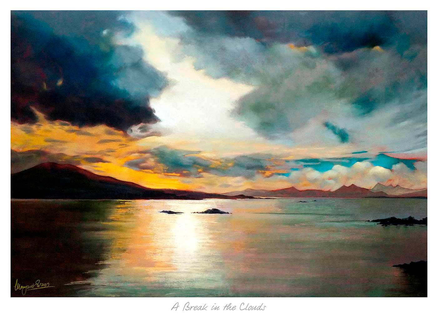
Good art for pale blue walls should stop a cool scheme from feeling too slight. Pale blue can be restful and elegant, but it often needs artwork that adds a little warmth and movement. A Break in the Clouds works especially well because it brings light and atmosphere without breaking the calm that made the wall colour appealing in the first place.
Why A Break in the Clouds suits art for pale blue walls
The strength of A Break in the Clouds is its balance. It keeps enough freshness to sit naturally with pale blue, yet it also introduces tonal variation that stops the room feeling one-note. That makes it useful in bedrooms, sitting rooms, and hallways where you want calm but still need a little visual depth.
It is particularly helpful when pale blue walls are paired with white woodwork, lighter fabrics, or painted furniture. In those rooms the artwork can become the element that makes the scheme feel considered rather than merely safe.
- It keeps a cool room soft rather than chilly.
- It adds light and depth without overwhelming the wall colour.
- It works well with gentler palettes that still need a focal point.
First 4 Frames completes the print and bespoke framing in-house, which is important for artwork built around subtle tonal shifts. That hand-finished presentation helps the final piece feel more substantial and room-ready from the moment it goes up.
For more on the kind of Scottish landscape atmosphere that makes this scene so appealing, VisitScotland’s Cairngorms guide is worth reading. You can also browse more work by Margaret Evans and see the exact framed product here.
If you are looking at art for pale blue walls, A Break in the Clouds is a strong example of how to keep a cooler room layered, welcoming, and quietly interesting.