
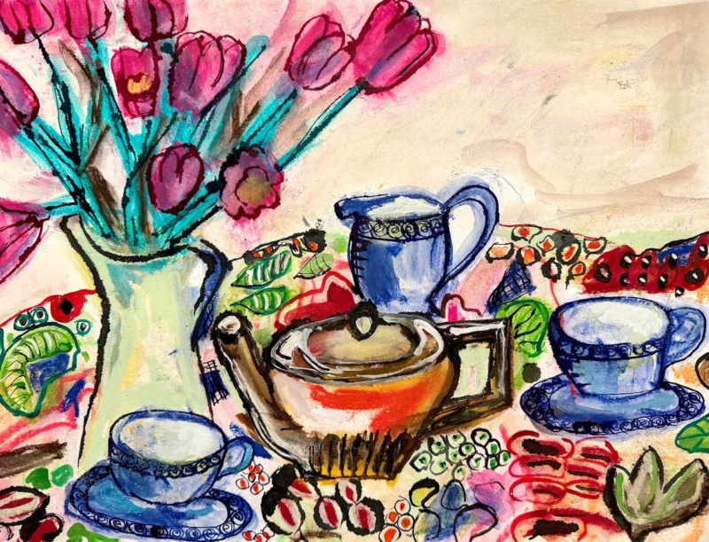
Choosing art for pale blue walls is less about a perfect match and more about depth. Blue Tea Set brings stronger blue notes and still-life structure. Against a softer wall, it can make a breakfast room feel layered rather than washed into one flat shade.
Layer art for pale blue walls instead of matching it
| Element | Role |
|---|---|
| Pale blue paint | Creates a light field around the framed piece. |
| Deeper print blue | Adds focus and prevents a faded effect. |
| Neutral table and frame | Breaks up blue and grounds the scheme. |
The tea-set subject suits an everyday dining corner. It suggests hospitality without spelling out a message and can connect with ceramics already used there. Mix in cream, timber, and warmer glazes instead of arranging only matching blue objects.
Test the blue in changing daylight
Pale paint can turn cool on an overcast morning and brighter in direct light. Natural timber adds warmth, while a slim dark frame gives the still life sharper definition. Both choices are more useful than copying the paint.
First 4 Frames completes bespoke framing and colour-managed Giclée printing in-house in Falkirk. This keeps the blues distinct and preserves contrast under changing domestic light.
For useful background, visit the V&A ceramics collection. You can also browse more work by David Short or view the exact Blue Tea Set print.
As art for pale blue walls, Blue Tea Set works through tonal layering, familiar subject matter, and enough contrast to keep a calm breakfast room alive.