
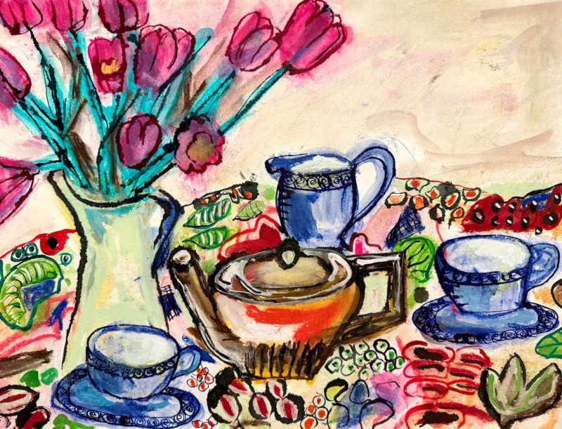
maximalist kitchen wall art can be exuberant without being chaotic. The strongest piece repeats colours and shapes already enjoyed in the room, then gathers them into one deliberate composition. Blue Tea Set by David Short does exactly that. Blue cups, a russet teapot, pink flowers, turquoise stems, and patterned fabric create plenty to discover, while the horizontal arrangement holds everything together.
Why maximalist kitchen wall art still needs visual order
A colourful kitchen may already contain glazed tiles, cookware, cookbooks, ceramics, and open storage. Adding a timid print can make the wall look incidental. Adding several unrelated pictures can make the room feel fragmented. One confident still life is often the better answer because it reflects the room’s abundance while establishing a clear centre.
In Blue Tea Set, the blue tea pieces recur across the image and give the eye a sequence to follow. The central pot provides weight. Flowers rise on the left, balancing the lower row of cups without creating a rigid mirror image. Black outlines keep individual objects legible, while repeated pink, red, green, and turquoise marks connect the patterned areas.
Let the artwork organise the kitchen palette
| Colour from the print | Useful room connection | Keep it controlled by |
|---|---|---|
| Deep and powder blue | Cabinetry, crockery, or a small appliance | Choosing one main blue rather than matching every shade |
| Pink and red | Flowers, a blind, or seat fabric | Repeating it in one or two compact accents |
| Turquoise and leaf green | Painted chair, plant pot, or glassware | Leaving larger worktops and walls quieter |
| Rust and ochre | Timber, terracotta, or warm metal | Using natural texture instead of more printed pattern |
The aim is relationship, not exact matching. Pulling one blue and one warm accent from the picture is enough. The remaining colours can stay within the artwork, where they add richness without requiring a new purchase for every shelf.
Give the horizontal composition room to spread
The landscape format can work above a low dresser, a dining bench, or a clear stretch of wall near the table. It can also bridge the visual gap between tall cabinets and a doorway. Avoid hanging it directly above a hob, kettle, or sink, where heat, steam, and splashes make the location unsuitable for framed work.
Measure the usable wall after doors and cupboards are open. A paper template helps confirm that the frame will not be crowded by shelves or pendant lights. From a distance, the flowers and tea set should read as one broad arrangement. At closer range, the patterned cloth and energetic drawn marks provide the detail that maximalist interiors thrive on.
Pair pattern with areas of calm
Maximalism works through editing as much as collecting. If the wall art sits near patterned tiles, keep the space between them uncluttered. If open shelves hold many ceramics, group them by colour or scale rather than spreading every piece evenly. A clear edge around the frame allows the composition to feel intentional instead of absorbed into the background.
The pale ground within the picture is useful here. It gives the flowers, cups, and tablecloth breathing space and can connect to a light wall without making the whole scheme quiet. A slim blue or dark frame could reinforce the drawn outlines, while a lighter moulding may give a busier wall a cleaner boundary.
Everyday objects treated with colour and humour
David Short creates contemporary work informed by colour, pattern, memory, and familiar possessions. That viewpoint makes a tea set feel less like formal still life and more like a lively record of hospitality. Visit David Short’s official website for more of the artist’s practice, or explore the David Short collection at First 4 Frames.
First 4 Frames produces colour-managed Giclée prints and completes bespoke framing in-house in Falkirk. That careful finish is especially important for maximalist kitchen wall art, where crisp colour relationships and a considered frame distinguish joyful layering from visual muddle. View the framed Blue Tea Set print and use its palette as a confident starting point.