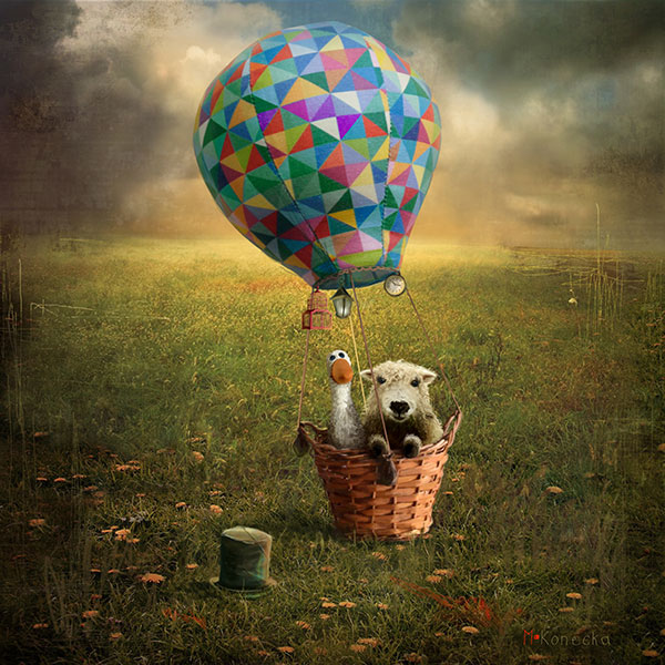
Posted on

Choosing Art for Sage Green Walls, Why Off the Beaten Path Skye Works

Image of Off the Beaten Path Skye by Arie Vardi

Finding the right art for sage green walls can be trickier than it first appears. A soft green room already has character, so the artwork needs to add depth without clashing or fading away. Off the Beaten Path Skye by Arie Vardi is a strong solution because it feels atmospheric, layered, and confident enough to hold its place.

Why sage green benefits from contrast and depth

Sage green often works because it feels restful and natural, but that same softness can leave a room looking slightly flat if the wall art is too timid. This piece introduces stronger tonal variation and a more dramatic landscape mood, which gives the room shape and movement without breaking the calm.

It is especially useful when you want the décor to feel thoughtful rather than overly matched. Instead of repeating the wall colour, the artwork complements it while adding another layer of atmosphere.

Where it works especially well

  • Above a sofa in a green-toned living room.
  • In a bedroom with sage paint, darker timber, and natural fabrics.
  • In a dining space where muted wall colour needs one stronger focal point.

Why the framed presentation matters

First 4 Frames completes the work in-house in Falkirk with bespoke framing, hand-finished craftsmanship, and colour-managed Giclée printing. In a carefully coloured room, that quality matters. A strong frame and a superior print finish help the artwork feel fully integrated into the design rather than simply added afterwards.

The artwork is by Arie Vardi, and you can view the exact framed product here.

For anyone choosing art for sage green walls and wanting a room to feel richer, calmer, and more complete, Off the Beaten Path Skye is a very smart option.

Posted on

Why The Fish That Never Swam (Glasgow) Stands Out as Quirky Wall Art

A golden fish with a nose ring leaps above dark waters in "The Fish That Never Swam (Glasgow)" while an underwater oil rig and cityscape are visible below, bubbles rising to the surface.

Good quirky wall art does more than look unusual. It gives a room a point of view. The Fish That Never Swam (Glasgow) by Matylda Konecka is a perfect example, because it feels witty and imaginative while still carrying enough visual weight to anchor a space properly.

Why wit can improve a room

Interiors often become more memorable when one piece breaks the pattern a little. This artwork brings story, humour, and curiosity, which makes it especially useful in homes that already lean eclectic or personality-led. Instead of disappearing into the background, it gives visitors something to notice and talk about.

How to use quirky art without making a room feel random

  • Let it be the focal piece on one wall rather than surrounding it with too many competing statements.
  • Pair it with simpler furniture or calmer paint so the artwork has room to breathe.
  • Use the framed finish to keep the overall look intentional rather than novelty-led.

That approach works particularly well in a sitting room, a creative workspace, a hallway with personality, or even a dining area where conversation matters. The piece feels imaginative, but a properly framed presentation keeps it grounded.

Why the First 4 Frames finish suits this kind of piece

At First 4 Frames, the artwork is produced in-house with bespoke framing and colour-managed Giclée quality. That matters with more unusual artwork because the finish helps the piece read as collected and considered rather than impulsive. It is exactly the difference between a clever image and a piece that genuinely elevates the room.

The artwork is by Matylda Konecka, and you can view the exact framed product here.

If you want quirky wall art that feels intelligent, distinctive, and beautifully finished, The Fish That Never Swam (Glasgow) is well worth a closer look.

Posted on

Why Two Highland Cows Works So Well as Farmhouse Wall Art

Image of Two Highland Cows by Hillary Barker

The best farmhouse wall art feels warm and characterful, but it should still look considered rather than themed. Two Highland Cows by Hillary Barker gets that balance right. It has genuine rural charm, yet the finished piece still feels polished enough for a carefully styled home.

What makes it feel at home in a country interior

Highland cattle have a familiar Scottish presence, and that gives this artwork an easy sense of place. At the same time, the composition is simple enough to work with timber furniture, painted cabinetry, natural textiles, and warmer neutral walls. It adds personality, but it does not demand a full rustic makeover around it.

That makes it especially useful in homes where you want a country feel with restraint. Instead of becoming novelty wall décor, the piece helps a room feel lived-in, welcoming, and a little more rooted.

Rooms where it can earn its place

  • A kitchen-diner that needs one warmer focal point.
  • A family room with oak, linen, or painted wood finishes.
  • A hallway or breakfast area where Scottish character feels especially fitting.

A stronger finish than an off-the-shelf print

Because First 4 Frames completes the work in-house, the framed result benefits from bespoke craftsmanship, colour-managed Giclée quality, and a hand-finished presentation. That extra care matters with a piece like this. The subject may feel relaxed and familiar, but the finish should still feel superior quality and ready to live with for years.

The artwork is by Hillary Barker, and the exact framed product can be viewed here.

For anyone looking for farmhouse wall art that feels warm, authentic, and well finished rather than overly rustic, Two Highland Cows is an excellent fit.

Posted on

How A Path Unseen Can Bring Focus to a Meditation Room

Image of A Path Unseen by Diana Hand

Choosing meditation room wall art is not about filling a blank wall for the sake of it. The right piece should help the room feel more settled, more focused, and easier to be in. A Path Unseen by Diana Hand does that beautifully, because it has movement without agitation and presence without heaviness.

Why this piece suits a reflective space

A Path Unseen is an equestrian artwork, but it does not feel literal or decorative in a busy way. The expressive lines and sense of motion give it life, while the overall feel remains thoughtful and inward-looking. That balance works well in a room designed for breathing, stretching, journalling, or quiet thought.

  • It introduces focus without becoming visually loud.
  • It brings warmth and emotion into a pared-back room.
  • It suits spaces where calm matters more than trend-driven styling.

Where it can work best

This piece would sit especially well on the main wall you face during seated practice, beside a reading chair, or above a low console with candles or objects that already support a slower routine. If the room includes natural textures, muted paint, timber, or soft stone tones, the artwork can help tie everything together.

Why the framed finish matters

First 4 Frames produces the work in-house in Falkirk using colour-managed Giclée printing and hand-finished bespoke framing. That matters in a meditation room because small details stand out more in quieter spaces. A properly framed piece feels deliberate, lasting, and in keeping with a room built around care and attention.

The artwork is by Diana Hand, and you can view the exact framed product here.

If you want meditation room wall art that feels calm, expressive, and professionally finished, A Path Unseen is a very strong option.

Posted on

How Kyles of Bute II Can Elevate Show Home Wall Art

Image of Kyles of Bute II by Arie Vardi

The right show home wall art should help a property feel aspirational without becoming distracting. In a staged interior, every piece has a job to do, and the artwork often helps buyers imagine how the room could feel once it is properly lived in. Kyles of Bute II is especially effective in that role.

Why artwork matters in staged interiors

Show homes and dressed properties often rely on calm furniture, clean lines, and broad appeal. That can make the rooms look neat, but sometimes slightly anonymous. One strong framed print can introduce atmosphere and identity without narrowing the appeal of the space.

  • It helps a room feel warmer and more complete in photographs and viewings.
  • It adds a focal point without competing with the layout of the space.
  • It supports a premium presentation that feels thoughtful rather than generic.

A useful choice for lounges, principal bedrooms, and entrance spaces

Because the piece feels polished and easy to place, it works across several settings within a staged property. It can help a lounge feel more resolved, a bedroom feel calmer, or an entrance area make a stronger first impression.

Why a bespoke framed finish supports the overall impression

First 4 Frames produces the work in-house in Falkirk with colour-managed Giclée printing and hand-finished bespoke framing. That craftsmanship is important in presentation-led spaces, where buyers and clients tend to notice whether the finishing details feel convincing.

The artwork is by Arie Vardi, and you can view the exact framed print here.

For anyone choosing show home wall art that adds polish and memorability without overcomplicating the room, Kyles of Bute II is a very smart option.

Posted on

Why Lourin by Moonlight Makes Such a Good Country Kitchen Wall Art Choice

Image of Lourin by Moonlight by Hillary Barker

Good country kitchen wall art should make the room feel lived in and welcoming, not forced. Kitchens that already have timber, stone, painted cabinetry, or farmhouse touches often suit artwork with character, but the piece still needs to feel easy to live with every day. Lourin by Moonlight has that balance.

Why kitchens need more than practicality

A kitchen may be one of the busiest rooms in the house, but it still benefits from a focal point that gives the space warmth and identity. The right piece can soften harder surfaces and help the room feel more personal from morning coffee through to evening meals.

What makes this piece work in a country setting

Lourin by Moonlight has presence, but it does not feel fussy. That makes it particularly useful in country kitchens where charm comes from texture, routine, and atmosphere rather than over-decoration.

  • It adds character without crowding a practical wall.
  • It suits kitchens where warmth matters as much as function.
  • It helps a country-style room feel more settled and complete.

Why framing quality matters in everyday spaces

First 4 Frames completes the work in-house in Falkirk with colour-managed Giclée printing and bespoke hand-finished framing. That superior quality presentation helps the artwork hold its own in a hard-working room where details are seen every day.

The artwork is by Hillary Barker, and you can view the exact framed piece here.

If you are looking for country kitchen wall art that feels welcoming, grounded, and properly finished, Lourin by Moonlight is a very natural fit.

Posted on

How The Storyteller Can Bring Imagination to Playroom Wall Art

The Storyteller: A wise tree with a face reads a glowing red book to small animals and colorful owl-like creatures in an enchanted, softly lit forest.

The best playroom wall art should feel lively without tipping the whole room into visual chaos. In a space already full of books, toys, and movement, one well-chosen framed piece can give the room personality while still helping it feel pulled together. The Storyteller is a lovely example.

Why playful spaces still need visual balance

Children’s spaces work better when the fun has some structure. Rather than covering every surface with colour, it often makes more sense to use one expressive artwork as a focal point and let the rest of the room breathe around it.

  • It adds imagination and story without filling the room with more clutter.
  • It helps a family space feel designed rather than accidental.
  • It suits homes that want playful character with a more polished finish.

A good choice for playrooms, reading corners, and shared family areas

This piece works well in rooms where children play, draw, read, or make things. It can also suit a family corner that needs a little more identity, especially if the rest of the room uses simple furniture and storage.

Why a hand-finished piece makes a difference

First 4 Frames produces the artwork in-house in Falkirk with colour-managed Giclée printing and bespoke framing. That craftsmanship gives the finished piece a much more lasting feel than a generic off-the-shelf poster, which matters in a room that sees a lot of daily life.

The artwork is by Matylda Konecka, and you can view the exact framed print here.

If you want playroom wall art that brings imagination while still keeping the room grounded, The Storyteller is a very appealing piece to consider.

Posted on

Why Sound of Jura Works So Well When You Need Art for a Beige Room

Image of Sound of Jura by Arie Vardi

Choosing art for a beige room is often about adding depth without losing calm. Beige interiors can feel warm and versatile, but they still need a focal point that stops the scheme from looking too safe or washed out. Sound of Jura does that beautifully.

Why beige rooms benefit from artwork with movement

When walls, flooring, and upholstery sit in softer neutral tones, the artwork has to bring shape, contrast, and atmosphere rather than simply more beige. This piece introduces that extra layer, helping the room feel more complete while still staying restful.

  • It gives a neutral room more visual depth without becoming heavy.
  • It adds interest while still working comfortably with natural textures and timber.
  • It helps a calm palette feel finished instead of under-decorated.

A useful fit for sitting rooms, bedrooms, and quieter corners

Because the colour feels balanced rather than sharp, Sound of Jura can sit comfortably in spaces where you want the room to stay relaxed. It works especially well where linen, stone, oak, or painted neutrals already shape the scheme.

Why the framed presentation matters

First 4 Frames completes the piece in-house in Falkirk using colour-managed Giclée printing and bespoke hand-finished framing. That superior quality finish matters in a neutral room, where careful craftsmanship tends to show more clearly.

The artwork is by Arie Vardi, and you can view the exact framed piece here.

If you are looking for art for a beige room that brings warmth, movement, and a more resolved feel, Sound of Jura is a very strong option.

Posted on

What Makes Kingfisher Such a Good Alcove Wall Art Choice

Image of Kingfisher by Stuart Roy

Finding the right alcove wall art is often about restraint. Small recesses, narrow walls, and in-between spaces do not usually need a large display. They need one piece that gives the area focus. Kingfisher does that beautifully.

Why alcoves respond well to a single clear focal point

Alcoves can easily end up looking unfinished, especially if they sit between bigger furniture pieces or connect one part of a room to another. A compact framed print can resolve the space quickly, giving the eye somewhere definite to land.

Colour and detail matter more in a smaller space

Because the wall area is limited, the artwork needs enough character to hold attention on its own. Kingfisher brings colour and clarity without overwhelming the recess, which makes it useful in hall-adjacent spaces, small corners, or narrow linking walls.

  • It suits smaller walls that need a proper focal point.
  • It adds polish without making the space feel crowded.
  • It works well where a larger landscape or gallery arrangement would be too much.

Why a hand-finished framed piece works so well here

First 4 Frames completes the piece in-house in Falkirk with colour-managed Giclée printing and bespoke framing. On a smaller wall, that clean hand-finished presentation is especially important because the artwork is being asked to do a precise job.

The artwork is by Stuart Roy, and you can view the exact framed print here.

If you need alcove wall art that makes a small awkward space feel properly resolved, Kingfisher is a very effective choice.

Posted on

Why Saving the Ideas Is a Natural Fit for Creative Studio Wall Art

The product “Saving the Ideas” features a large blue umbrella floating in the rain with whimsical items like a ghost, mask, green monster, gnome, horn, picture frames, anchor, and candy cane hanging from it.

The best creative studio wall art should support the mood of the room without adding noise for the sake of it. In spaces used for making, drawing, planning, or writing, the right artwork can help the room feel energising and personal. Saving the Ideas is a particularly good example.

Why creative spaces need more than blank walls

Studios and maker spaces often collect tools, materials, and works in progress very quickly. That can make the room functional, but not necessarily inspiring. One well-chosen framed piece can give the space a stronger centre and help it feel more intentional.

  • It adds imagination and movement without making the room feel messy.
  • It helps a studio feel curated rather than accidental.
  • It gives the space a focal point that still leaves room for your own ideas.

A good fit for home studios, writing rooms, and design corners

This piece works especially well where creative work already fills the room. Because it has personality and story, it can energise the space, but it still leaves enough visual breathing room for concentration.

Why craftsmanship matters in a room built around making

First 4 Frames produces the piece in-house in Falkirk with colour-managed Giclée printing and bespoke hand-finished framing. In a room where materials and process matter, that level of craftsmanship feels especially appropriate.

The artwork is by Matylda Konecka, and you can view the exact framed piece here.

For anyone choosing creative studio wall art that brings energy without clutter, Saving the Ideas is a very strong option.