Posted on

Blue Thunder, The River Dee and the Appeal of Salmon Fishing Lodge Wall Art

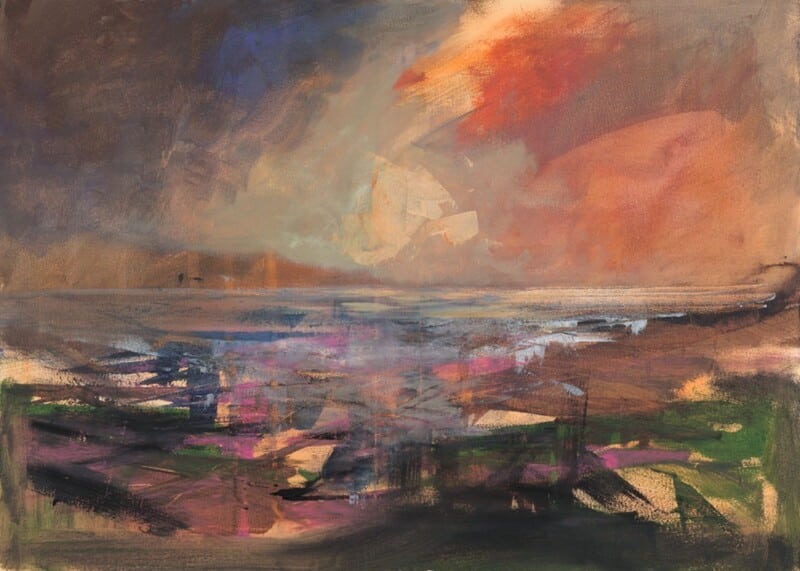
Image of Blue Thunder, The River Dee by Colin Robertson

Choosing salmon fishing lodge wall art is usually about restraint as much as relevance. A fishing lodge or river-facing room benefits from artwork that reflects its setting, but the piece still needs enough refinement to avoid feeling predictable. Blue Thunder, The River Dee stands out because it carries energy and place without becoming obvious sporting décor.

Why lodge interiors need more than the expected motifs

Rooms shaped by fishing, country pursuits, or river settings can quickly feel over-themed if every visual choice leans too literally on the subject. The strongest artwork acknowledges the setting while still feeling like part of a well-finished interior.

  • It suits fishing lodges, country guest spaces, and river-view sitting rooms.
  • It adds movement and atmosphere without becoming heavy handed.
  • It gives the room a clearer sense of place.

Why Blue Thunder, The River Dee feels so well judged

The artwork captures energy and flow in a way that feels alive rather than decorative. That makes it especially useful in a room where the subject matters, but where the overall standard of presentation matters just as much.

Why craftsmanship makes the difference

First 4 Frames produces each piece in-house in Falkirk using bespoke framing, colour-managed Giclée printing, and hand-finished craftsmanship. That superior finish helps the artwork sit comfortably in a quality-led setting where detail is already part of the appeal.

This artwork is by Colin Robertson, and you can view the exact framed product here.

If you are looking for salmon fishing lodge wall art that feels rooted, polished, and genuinely atmospheric, Blue Thunder, The River Dee is an excellent fit.

Posted on

Wake up Call as Wall Art for a Kitchen Dresser Wall

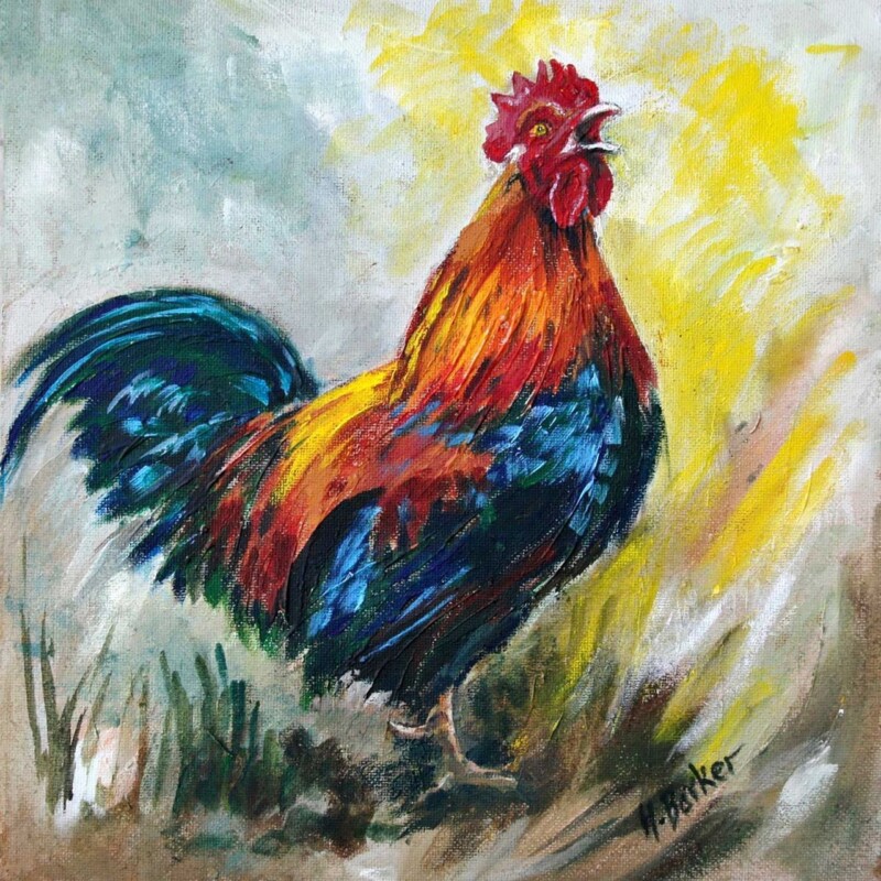
Image of Wake up Call by Hillary Barker

Good wall art for a kitchen dresser wall should support the room rather than crowd it. A dresser wall often carries plates, bowls, jars, or everyday pieces, so the artwork nearby needs enough character to be noticed while still sitting comfortably with practical kitchen life. Wake up Call does that beautifully.

Why kitchen dresser walls can be harder to finish than they look

A dresser usually introduces a lot of useful detail into the room. That is part of its charm, but it can also leave the surrounding wall feeling slightly unresolved if the artwork is too formal or too slight. The best piece adds warmth and cohesion without creating clutter.

  • It suits family kitchens, breakfast spaces, and country-leaning interiors.
  • It adds a more relaxed focal point beside useful storage and display.
  • It helps practical kitchen details feel intentional and inviting.

Why Wake up Call fits so comfortably

The subject feels friendly and lively, which is exactly what many kitchens need, but it still remains polished enough to look at home in a carefully finished space. That balance is what makes it so effective near a dresser.

Why First 4 Frames adds the right finish

First 4 Frames completes every piece in-house in Falkirk using bespoke framing, colour-managed Giclée printing, and hand-finished craftsmanship. That superior finish helps the artwork feel substantial enough for a room that sees daily use and close attention.

This artwork is by Hillary Barker, and you can view the exact framed product here.

If you are choosing wall art for a kitchen dresser wall and want something warm, characterful, and easy to live with, Wake up Call is a very strong choice.

Posted on

What Makes Phonebox Cottage Such a Charming Piece of Quirky Cottage Wall Art

The Phonebox Cottage features a red British phone booth in a foggy field, topped with moss and a black bowler hat. A crow holds a "Welcome" sign above, while inside the booth, a person can be faintly seen.

The best quirky cottage wall art should feel full of character without becoming throwaway. A cottage setting often benefits from a little humour and individuality, but the artwork still needs enough polish to feel properly chosen for the home. Phonebox Cottage is especially good at striking that balance.

Why cottage interiors suit artwork with a bit of story

Cottages often have more personality built into them already, whether through older features, compact rooms, or a more collected mix of furniture. Artwork with a sense of narrative can strengthen that warmth, provided it still feels refined enough to live with every day.

  • It suits cottages, guest rooms, and lived-in homes with a personal feel.
  • It adds wit without making the room look themed.
  • It helps the interior feel individual rather than overly polished.

Why Phonebox Cottage works so well

The piece has playful character, but it still carries enough design confidence to avoid feeling gimmicky. That makes it much easier to place in a real room where charm matters, but quality matters too.

Why framing quality keeps it feeling considered

First 4 Frames produces each piece in-house in Falkirk using bespoke framing, colour-managed Giclée printing, and hand-finished craftsmanship. That superior finish gives the artwork the presence it needs to feel part of a thoughtful interior rather than a novelty purchase.

This artwork is by Matylda Konecka, and you can view the exact framed product here.

If you want quirky cottage wall art that feels witty, warm, and genuinely stylish, Phonebox Cottage is a lovely option.

Posted on

The Sound of Mull and the Quiet Strength of Wall Art for Recessed Shelving

Image of The Sound of Mull by Arie Vardi

Choosing wall art for recessed shelving is often about balance. Built-in shelves and recessed storage can make a room feel tidy and architectural, but they also risk making the wall seem more functional than welcoming. The Sound of Mull works beautifully here because it brings atmosphere and calm without competing with the structure around it.

Why recessed shelving can make a wall feel visually firm

When shelves, alcoves, or joinery already divide the wall, the artwork needs to introduce a little ease. The right framed print helps stop the room from feeling too planned or slightly rigid, especially if the shelving is also styled with books, ceramics, or collected objects.

  • It suits living rooms, studies, and open-plan spaces with fitted joinery.
  • It adds softness without losing a tidy, considered feel.
  • It gives the eye a calmer focal point beside more practical storage.

Why The Sound of Mull is such a natural fit

The scene has enough depth to hold its own near shelving, but it still feels quiet rather than demanding. That makes it especially useful in rooms where the architecture and storage are already doing part of the visual work.

Why the finish matters

First 4 Frames completes every piece in-house in Falkirk using bespoke framing, colour-managed Giclée printing, and hand-finished craftsmanship. That superior quality helps the artwork feel fully integrated with the room rather than simply added to a spare patch of wall.

This artwork is by Arie Vardi, and you can view the exact framed product here.

If you are looking for wall art for recessed shelving that feels calm, grounded, and easy to place around fitted joinery, The Sound of Mull is an excellent choice.

Posted on

Heading North and the Appeal of Wall Art for Dormer Windows

In "Heading North," a whimsical furry creature with large ears and a pink nose stands on grass, lantern in hand and glowing eyes shining, framed by dark mountains beneath a cloudy sky for a mysterious atmosphere.

The right wall art for dormer windows can make an awkward room feel much more resolved. Dormer windows often create lovely pockets of light, but they can also leave the wall layout feeling slightly uncertain. Heading North works especially well because it adds character and focus without making the room feel more crowded.

Why dormer rooms need more deliberate focal points

Dormer spaces often have angled ceilings, shorter wall runs, and light arriving from a very specific direction. That can be charming, but it also means the artwork has to work harder to make the room feel properly composed.

  • It suits attic bedrooms, top-floor studies, and guest rooms with shaped architecture.
  • It adds focus without overfilling a smaller wall.
  • It helps the room feel intentional rather than leftover.

Why Heading North fits so naturally

The piece has enough narrative character to animate the room, yet it still feels light enough for a space where architecture is already doing some of the work. That balance makes it especially helpful in more awkward top-floor layouts.

Why in-house craftsmanship matters here

First 4 Frames produces each piece in-house in Falkirk using bespoke framing, colour-managed Giclée printing, and hand-finished craftsmanship. That superior finish helps the artwork feel purposeful and polished in a room where every choice needs to earn its place.

This artwork is by Matylda Konecka, and you can view the exact framed product here.

If you are looking for wall art for dormer windows that feels thoughtful, characterful, and easy to place, Heading North is a very good fit.

Posted on

Why The Roman Bridge, Glen Lyon Works So Well as Wall Art for an Entrance Hall With Stone Flooring

Image of The Roman Bridge, Glen Lyon by Colin Robertson

Choosing wall art for an entrance hall with stone flooring is usually about warmth. Stone underfoot can look beautiful and durable, but it can also make the entrance feel slightly hard if the walls are too quiet. The Roman Bridge, Glen Lyon is a strong fit because it softens that first impression while still feeling grounded enough for the space.

Why entrances need more than practicality

An entrance hall has a working job to do, but it also sets the tone for the house. When flooring is stone or stone-effect, the wall art becomes especially important because it can bring some welcome flow and personality into an otherwise harder scheme.

  • It suits entrance halls, vestibules, and garden-facing back halls with harder flooring.
  • It adds welcome softness without feeling out of place.
  • It helps the home’s first impression feel more considered.

Why The Roman Bridge, Glen Lyon works in that role

The landscape has enough calm movement to loosen the harder materials in the space. That makes it especially effective where flooring, doors, and practical finishes might otherwise make the entrance feel more functional than inviting.

Why a superior framed finish improves the result

First 4 Frames completes every piece in-house in Falkirk using bespoke framing, colour-managed Giclée printing, and hand-finished craftsmanship. That superior finish helps the artwork look purposeful from the moment someone steps through the door.

This artwork is by Colin Robertson, and you can view the exact framed product here.

If you need wall art for an entrance hall with stone flooring that feels welcoming, balanced, and easy to place, The Roman Bridge, Glen Lyon is an excellent option.

Posted on

Porty Dogwalkers and the Appeal of Dog Friendly Holiday Let Wall Art

Image of Porty Dogwalkers by Nikki Monaghan

Thoughtful dog friendly holiday let wall art should reinforce the kind of stay you want guests to remember. In a property that welcomes dogs, the artwork can help set that tone, but it still needs enough polish to avoid feeling gimmicky. Porty Dogwalkers does that very well, bringing local personality and warmth without becoming novelty décor.

Why dog-friendly spaces still need considered styling

Being practical and welcoming does not mean the room should lose its sense of design. Guests tend to respond well to spaces that feel generous and relaxed, but also properly put together. The right framed print helps strike that balance.

  • It suits holiday lets, coastal apartments, and guest spaces that welcome dogs.
  • It adds friendliness without making the room feel childish.
  • It gives the property a clearer local identity.

Why Porty Dogwalkers feels so appropriate

The scene has humour and character, but it also feels rooted in a real place. That makes it much easier to live with than generic pet-themed artwork and far more useful in a guest setting.

Why framing quality still matters in hospitality spaces

First 4 Frames produces each piece in-house in Falkirk using bespoke framing, colour-managed Giclée printing, and hand-finished craftsmanship. That superior finish helps the space feel cared for, durable, and ready for repeat guests.

This artwork is by Nikki Monaghan, and you can view the exact framed product here.

If you are choosing dog friendly holiday let wall art and want something warm, memorable, and properly local, Porty Dogwalkers is a very strong choice.

Posted on

Rain Storm over Edinburgh as Wall Art for a City Guest Bedroom

Image of Rain Storm over Edinburgh by Esther Cohen

The best wall art for a city guest bedroom should make the room feel thought through rather than merely furnished. A guest room in a city home often needs a little more identity, especially if the rest of the space is fairly simple. Rain Storm over Edinburgh is a strong choice because it gives the room atmosphere and local character without making it feel overly busy.

Why guest bedrooms benefit from a stronger sense of place

Guests notice when a room feels considered. Local artwork does more than decorate the wall. It gives the room personality and helps the stay feel more personal, especially in a city where place and memory matter.

  • It suits spare rooms, guest bedrooms, and short-stay city spaces.
  • It adds identity without crowding a restful room.
  • It helps the room feel welcoming rather than generic.

Why Rain Storm over Edinburgh works particularly well

The subject feels unmistakably connected to Edinburgh, yet the mood remains elegant enough for everyday living. That balance makes it especially useful in a guest room, where character matters but calm still comes first.

Why a hand-finished frame lifts the room

First 4 Frames completes every piece in-house in Falkirk using bespoke framing, colour-managed Giclée printing, and hand-finished craftsmanship. That superior presentation helps the room feel more settled and properly finished for the people staying in it.

This artwork is by Esther Cohen, and you can view the exact framed product here.

If you need wall art for a city guest bedroom that feels distinctive, welcoming, and rooted in the city itself, Rain Storm over Edinburgh is an excellent option.

Posted on

Momentum of the Fall and the Appeal of Art for Green Marble Accents

Image of Momentum of the Fall by Colin Robertson

Finding the right art for green marble accents is often about relief. Green marble brings beautiful depth and natural pattern, but it can make a room feel slightly more formal if the surrounding artwork does not introduce enough movement. Momentum of the Fall works especially well because it softens that effect while still feeling substantial enough to belong.

Why marble details need visual balance

Whether the marble appears on a fireplace, side table, lamp base, or decorative surface, it tends to carry a room toward richness quite quickly. Artwork nearby helps decide whether that richness feels elegant and layered or simply heavy.

  • It suits sitting rooms, studies, and bedrooms with deeper material finishes.
  • It adds movement without undermining the room’s polish.
  • It helps richer green tones feel more relaxed and livable.

Why Momentum of the Fall is such a good partner

The composition brings flow and atmosphere into the scheme, which is exactly what a marble-led room often needs. Instead of amplifying the weight of the materials, it gives them a more natural counterpoint.

Why presentation quality matters in a richer scheme

First 4 Frames produces each piece in-house in Falkirk using bespoke framing, colour-managed Giclée printing, and hand-finished craftsmanship. That superior quality helps the finished piece look entirely at home in a room where detail already matters.

This artwork is by Colin Robertson, and you can view the exact framed product here.

If you are looking for art for green marble accents that feels balanced, atmospheric, and genuinely easy to place, Momentum of the Fall is an excellent fit.

Posted on

Choosing Wall Art for Butcher Block Worktops, Why Cooling off Feels So Natural

Image of Cooling off by Hillary Barker

Good wall art for butcher block worktops should complement the warmth already built into the room. Timber worktops bring texture and honesty, but they can make a kitchen feel visually dense if the artwork does not lighten the mood in the right way. Cooling off does that beautifully, adding charm and presence without making the room feel over-styled.

Why timber-led kitchens benefit from the right artwork

Butcher block surfaces already contribute warmth and practicality. The wall art nearby needs to echo that welcoming quality while still giving the scheme some lift, especially if the room also includes open shelving or natural finishes elsewhere.

  • It suits family kitchens, breakfast spaces, and country-leaning interiors.
  • It adds personality without turning the room into a theme.
  • It helps natural timber feel balanced rather than heavy.

Why Cooling off works so comfortably here

The artwork has enough friendliness to belong in a kitchen, but it still feels polished enough for a room that is used every day. That mix of ease and quality is what makes it such a natural fit.

Why the framing finish matters

First 4 Frames completes every piece in-house in Falkirk using bespoke framing, colour-managed Giclée printing, and hand-finished craftsmanship. That superior finish helps the artwork sit confidently alongside the room’s honest materials and daily wear.

This artwork is by Hillary Barker, and you can view the exact framed product here.

If you are choosing wall art for butcher block worktops and want something warm, welcoming, and easy to live with, Cooling off is a very strong choice.