Posted on

Choosing Art for a Room With Striped Fabrics, Why Sea View And Washing Lines, Pittenweem Works

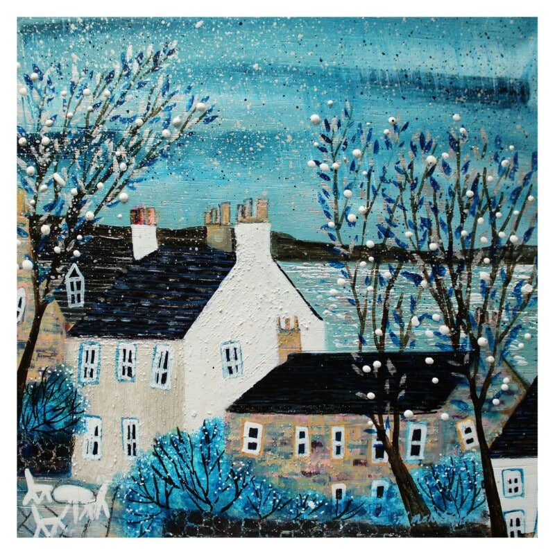
Image of Sea View And Washing Lines, Pittenweem by Nikki Monaghan

Finding the right art for a room with striped fabrics is often about stopping the scheme from pulling in too many directions. Stripes can add rhythm and freshness, but they can also make a room feel busier if the wall art is not well judged. Sea View And Washing Lines, Pittenweem works beautifully because it has movement and character while still feeling composed.

Why striped rooms need the right kind of focal point

When a room already has ticking stripes, deckchair tones, or bolder woven lines, the artwork needs to bring the look together rather than compete with it. This piece does that by echoing a sense of rhythm without becoming rigid. The result feels layered instead of overworked.

  • It suits rooms with coastal stripes, mattress ticking, or relaxed woven textiles.
  • It adds colour without introducing a jarring new pattern language.
  • It helps a room feel curated rather than accidental.

Where this approach is most useful

This kind of framed print can work well in a sitting room, guest bedroom, or sunlit corner where striped cushions, blinds, or upholstery already shape the mood. Because the piece feels airy and expressive, it gives the scheme one clear anchor without flattening its personality.

That makes it especially helpful when pattern is already present, but the room still needs something to hold it together.

Why a hand-finished frame helps the room settle

First 4 Frames completes each artwork in-house with bespoke framing, colour-managed Giclée printing, and hand-finished craftsmanship. That superior finish adds structure around a more patterned scheme, helping the final result feel deliberate and refined.

This artwork is by Nikki Monaghan, and you can view the exact framed product here.

If you want art for a room with striped fabrics that feels lively, balanced, and beautifully finished, Sea View And Washing Lines, Pittenweem is a very strong option.

Posted on

How Borders Bothy Can Bring Character to Garden Office Wall Art

Image of Borders Bothy by Esther Cohen

The best garden office wall art helps a separate workspace feel purposeful without becoming severe. A garden office often needs a different mood from an indoor study. It should still support focus, but it can also feel more personal and restorative. Borders Bothy is a very good fit for that balance.

Why a detached workspace needs warmth

Garden offices can sometimes feel a little spare, especially when the layout is practical and compact. This piece gives the room a clearer emotional tone. It adds character and atmosphere while still keeping the space calm enough for work, planning, and quieter concentration.

  • It makes a workspace feel less temporary.
  • It adds personality without creating distraction.
  • It suits offices designed for focus, calls, writing, or creative work.

Where it can make the most difference

Borders Bothy would work well behind a desk, on the wall opposite the main chair, or near shelving where the room needs one more visual anchor. The subject feels especially appropriate in a garden building, because it brings a sense of retreat without becoming rustic in a forced way.

That gives the office more identity, which can make long working days feel a little more considered.

Why bespoke framing helps in a small workspace

At First 4 Frames, every piece is completed in-house in Falkirk with bespoke framing, colour-managed Giclée printing, and hand-finished craftsmanship. In a smaller workspace, those details stand out quickly, and a superior quality finish helps the room feel more polished overall.

This artwork is by Esther Cohen, and you can view the exact framed product here.

If you are choosing garden office wall art that feels warm, useful, and professionally finished, Borders Bothy is a very appealing choice.

Posted on

Why Ceol Mor (Plockton) Works So Well as B&B Bedroom Wall Art

Ceol Mor (Plockton) depicts a whimsical, brightly colored fishing boat on a lake shore near green hills and mountains, with a white cottage by the water, all shown in a dreamy, painted style.

Good B&B bedroom wall art should make a guest room feel considered from the moment someone walks in. The aim is not to overcrowd the room, but to give it warmth, identity, and a sense of place. Ceol Mor (Plockton) does that beautifully, especially in guest spaces that want a more memorable Scottish character.

Why guest bedrooms benefit from local character

A well-run B&B often feels strongest when the room reflects something of its location or atmosphere. This piece adds personality without becoming themed or fussy. It gives the room a talking point, but it still feels restful enough for somewhere people come to unwind.

  • It helps a guest room feel less generic.
  • It adds warmth without asking for a bold or crowded scheme.
  • It suits spaces where comfort and a sense of place matter equally.

Why it works for hospitality spaces

Ceol Mor (Plockton) can work above a bed, beside a dressing table, or on the main wall guests see first. Because the image carries story and mood, it helps the room feel more individual without making the layout harder to style.

That balance is valuable in B&B rooms, where the space needs to feel both welcoming and easy to maintain.

Why the quality of finish matters to guests

First 4 Frames produces each piece in-house in Falkirk with bespoke framing, colour-managed Giclée printing, and hand-finished craftsmanship. That polished presentation helps a guest room feel more cared for, which is exactly the impression good hospitality spaces should leave.

This artwork is by Matylda Konecka, and you can view the exact framed product here.

If you need B&B bedroom wall art that feels warm, distinctive, and properly finished, Ceol Mor (Plockton) is an excellent option.

Posted on

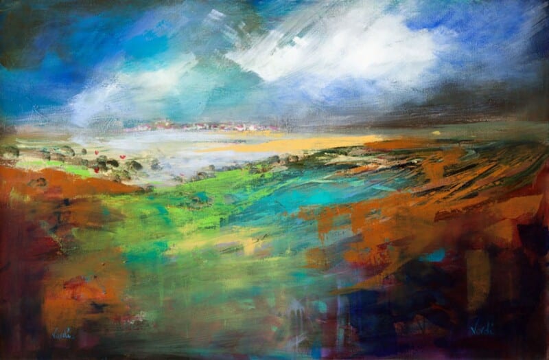
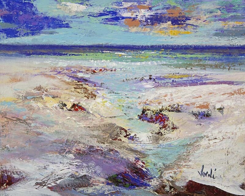
Why Northern Light Works Beautifully as Wall Art for a West Facing Room

Image of Northern Light by Arie Vardi

Choosing wall art for a west facing room is often about understanding what late-day light actually does to a space. Afternoon sun can make some prints feel washed out, while evening light can turn others too heavy. Northern Light sits in a very helpful middle ground, bringing atmosphere and clarity without fighting the changing light.

Why west facing rooms need balance

Rooms with this aspect often feel different hour by hour. That means the artwork needs enough presence to hold up in brighter light, but enough softness to stay comfortable later in the day. This piece manages that balance beautifully, which is one reason it is so easy to live with.

  • It helps warm evening light feel intentional rather than overpowering.
  • It adds a focal point without making the room feel darker.
  • It works well in living spaces, bedrooms, and dining rooms that catch the setting sun.

Where it tends to work best

Northern Light would sit well above a sofa, opposite a window, or on the wall that catches the richest late-day glow. Because the composition feels expansive rather than busy, it helps the room feel calmer as the light shifts across the evening.

That makes it especially useful when you want a brighter room to feel grounded instead of visually unsettled.

Why the framed finish matters

At First 4 Frames, each piece is completed in-house in Falkirk with bespoke framing, colour-managed Giclée printing, and hand-finished craftsmanship. In a room where light changes so much, that superior quality really helps the artwork keep its presence throughout the day.

This artwork is by Arie Vardi, and you can view the exact framed product here.

If you want wall art for a west facing room that feels calm, balanced, and beautifully finished, Northern Light is a very strong choice.

Posted on

Kelvingrove, Glasgow and the Appeal of a Graduation Gift With Real Sense of Place

Image of Kelvingrove, Glasgow by Colin Robertson

A thoughtful Glasgow graduation gift should feel like more than a token. It should mark a real milestone and, ideally, connect to the city that shaped that chapter of life. Kelvingrove, Glasgow does that beautifully, offering a stronger sense of place than a generic present ever could.

Why location matters with graduation gifts

Graduation is often tied to memory, independence, and a particular city or campus rhythm. A piece linked to Glasgow feels more lasting because it reflects that lived experience. It is not just something nice for the wall. It becomes part of the story of that time.

  • It feels more personal than a standard celebratory gift.
  • It is easy to display in a first flat, study, or future home.
  • It offers a grown-up keepsake rather than a short-lived gesture.

Why this piece works after the occasion too

The strongest graduation gifts still feel right years later. This artwork has enough character and calm to live easily in different rooms and different stages of life. That makes it especially suitable for someone moving on, starting work, or setting up a new home.

It carries the memory of Glasgow without needing to shout about it.

Why First 4 Frames makes it more gift-worthy

First 4 Frames produces each piece in-house with bespoke framing, colour-managed Giclée printing, and hand-finished craftsmanship. That superior quality matters when the artwork is meant to mark an achievement and last well beyond the day itself.

This artwork is by Colin Robertson, and you can view the exact framed product here.

If you want a Glasgow graduation gift that feels lasting, personal, and beautifully presented, Kelvingrove, Glasgow is a superb option.

Posted on

Why Winter Blues Works So Well as Wall Art for Brushed Steel Accents

Image of Winter Blues by Stuart Roy

The right wall art for brushed steel accents can completely change the mood of a cooler interior. Steel, chrome, and similar finishes bring crispness and polish, but they can also leave a room feeling slightly sharp if nothing softens the overall impression. Winter Blues is a strong answer because it introduces atmosphere without losing that cleaner, contemporary edge.

Why cooler finishes still need warmth of mood

A room with brushed steel often looks best when there is some contrast in texture or feeling. This piece adds that through tone and depth rather than through loud colour. The result is calmer and more refined, which helps the scheme feel complete rather than simply modern.

  • It softens cooler materials without fighting them.
  • It suits contemporary rooms that need atmosphere more than extra colour.
  • It adds focus while keeping the overall look composed.

Where it can make the biggest difference

This sort of artwork works well in dining areas, open-plan living spaces, and bedrooms where steel accents appear in lighting, handles, table legs, or furniture details. It helps the room feel more settled and less clinical, which is often exactly what a cooler palette needs.

That balance between clarity and softness is what makes the piece so easy to live with.

Why the framed presentation is important

At First 4 Frames, each piece is completed in-house in Falkirk with bespoke framing, colour-managed Giclée printing, and hand-finished craftsmanship. That superior quality gives the artwork enough presence to sit confidently in a cleaner, more design-led room.

This artwork is by Stuart Roy, and you can view the exact framed product here.

If you need wall art for brushed steel accents that feels calm, atmospheric, and beautifully finished, Winter Blues is a very strong choice.

Posted on

The Apostles, Catacol and the Appeal of Wall Art for Woven Textures

Image of The Apostles, Catacol by Nikki Monaghan

Choosing wall art for woven textures is often about helping a room feel curated rather than simply natural. Rattan, seagrass, cane, and linen can create a lovely relaxed atmosphere, but they still need a focal point with enough clarity and colour to stop the room drifting into sameness. The Apostles, Catacol does that very well.

Why texture-led rooms still benefit from structure

When an interior relies heavily on natural materials, texture becomes part of the palette. That can feel warm and relaxed, but it can also leave the room needing one piece that sharpens the look a little. This artwork brings shape, atmosphere, and a clear visual pause without losing the calmer mood.

  • It works beautifully with rattan, rush, linen, and pale timber.
  • It adds colour without making the room feel busier.
  • It helps a relaxed interior look more deliberate and complete.

Why this subject suits the scheme

The sense of place and open air in this piece sits naturally with interiors shaped by tactile materials and softer finishes. It can work above a sofa, beside a woven chair, or on the wall that needs a little more weight to hold the room together.

That makes it a useful choice for homes that want to feel easy and natural, but not underdesigned.

Why bespoke framing matters here

First 4 Frames completes the work in-house with bespoke framing, colour-managed Giclée printing, and hand-finished craftsmanship. In a texture-led room, that superior finish helps the artwork feel properly integrated and avoids the more casual look that ready-made prints can bring.

This artwork is by Nikki Monaghan, and you can view the exact framed product here.

If you want wall art for woven textures that feels calm, collected, and professionally finished, The Apostles, Catacol is an excellent option.

Posted on

Choosing Art for Coral Accents, Why Pink Bass Feels So Well Judged

Image of Pink Bass by Esther Cohen

Finding the right art for coral accents is often about control. Coral can be uplifting and full of warmth, but if a room does not have enough visual balance, the scheme can start to feel sugary or disconnected. Pink Bass helps solve that by carrying warmth and colour in a way that still feels composed.

Why warmer accent colours need a steadier focal point

Rooms with coral in cushions, ceramics, upholstery, or smaller décor pieces often benefit from artwork that gathers those notes together. This piece does not merely echo the colour. It gives the eye a stronger anchor, helping the room feel more intentional overall.

  • It ties warmer accents together without overmatching them.
  • It brings enough contrast to stop the palette feeling too sweet.
  • It works well where the room needs both character and calm.

Why this kind of piece is easy to place

Pink Bass can sit comfortably in a sitting room, dining room, or bedroom where warmer tones are already present in smaller ways. It gives the scheme more confidence without forcing the room into a theme, which is often the difference between a palette that feels curated and one that feels accidental.

That flexibility makes it especially useful when you want colour, but still care about restraint.

Why the First 4 Frames finish helps

At First 4 Frames, each print is produced in-house in Falkirk with bespoke framing, colour-managed Giclée printing, and hand-finished craftsmanship. That superior quality helps brighter tones feel polished and intentional, especially in interiors where the details matter.

This artwork is by Esther Cohen, and you can view the exact framed product here.

If you are looking for art for coral accents that feels balanced, lively, and beautifully finished, Pink Bass is a very smart choice.

Posted on

Why The Little Highland Bull Calf at 3 Days Old Works Brilliantly as Family Kitchen Wall Art

Image of The Little Highland Bull Calf at 3 days old by Hillary Barker

Good family kitchen wall art should make the room feel welcoming from the first glance. Kitchens are busy, practical spaces, but they also carry a lot of everyday life. The Little Highland Bull Calf at 3 days old brings exactly the right kind of warmth and personality without making the space feel fussy.

Why this subject works so well in a kitchen

A family kitchen benefits from artwork that feels alive, approachable, and easy to smile at. This piece has charm and humour, but it still looks considered. That balance is important when you want a room to feel relaxed rather than childish.

  • It adds character to a room used every day.
  • It suits spaces where warmth matters more than formality.
  • It gives a practical area a stronger sense of personality.

Where it can sit comfortably

This kind of piece works well above a breakfast table, beside a dresser, or on the wall that catches people’s eye as they come into the kitchen. It can also soften a more modern scheme by adding a touch of heart without forcing a rustic look.

That makes it especially useful for kitchens that want to feel lived in, but still properly put together.

Why a framed finish elevates the room

First 4 Frames completes every piece in-house with bespoke framing, colour-managed Giclée printing, and hand-finished craftsmanship. In a room used this often, that superior quality helps the artwork feel more substantial and more clearly part of the home.

This artwork is by Hillary Barker, and you can view the exact framed product here.

If you are choosing family kitchen wall art that feels cheerful, characterful, and well finished, The Little Highland Bull Calf at 3 days old is a very appealing option.

Posted on

What Makes Silver Beauty Such an Elegant Wedding Gift for a Horse Lover

Image of Silver Beauty by Diana Hand

A meaningful wedding gift for a horse lover should feel personal without becoming gimmicky. That can be difficult to get right. Many equestrian gifts lean too novelty-driven for a couple’s home, especially when the aim is to give something lasting and display-worthy. Silver Beauty offers a far more refined answer.

Why this kind of gift stands out

The best wedding presents are the ones people genuinely want to keep. This artwork connects with a real passion while still feeling elegant enough for shared living spaces. It respects the subject, but it also feels like a serious piece for the home rather than a themed extra.

  • It feels more personal than a generic home gift.
  • It is easy to place in a bedroom, study, or sitting room.
  • It offers long-term value because it is ready to hang and easy to live with.

Why elegance matters with equestrian gifts

Horse lovers often appreciate the grace and quiet strength of the subject, not just the theme itself. That is where this piece shines. It feels composed, warm, and grown-up, which makes it particularly well suited to a wedding gift where taste and presentation matter just as much as the idea behind it.

It is the sort of gift that can feel thoughtful on the day and still look right on the wall years later.

Why First 4 Frames adds to the occasion

At First 4 Frames, each print is completed in-house in Falkirk with bespoke framing, colour-managed Giclée printing, and hand-finished craftsmanship. That superior quality helps a gift feel substantial and properly chosen, which matters when the occasion is important.

This artwork is by Diana Hand, and you can view the exact framed product here.

If you want a wedding gift for a horse lover that feels elegant, personal, and beautifully presented, Silver Beauty is a lovely choice.