Posted on

Choosing Art for Peach Walls, Why When the Boat Comes Home Feels So Balanced

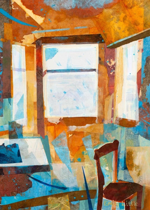
Image of When the Boat Comes Home by Esther Cohen

Choosing art for peach walls is often about restraint. Peach can make a room feel warm, welcoming, and flattering, but it can also drift into feeling a little soft if the artwork does not bring enough balance. When the Boat Comes Home works beautifully because it supports that warmth while still giving the room a clearer focal point.

Why warmer wall colours need steadier artwork

Rooms with peach tones usually benefit from artwork that gathers the palette together without overmatching it. This piece has enough colour to feel connected, but it also brings the structure and contrast that help the room stay composed.

  • It keeps a warm room from feeling too sugary.
  • It adds presence without breaking the softer mood.
  • It suits bedrooms, sitting rooms, and guest spaces especially well.

Why this subject makes the palette feel more natural

The sense of place in this artwork stops the colour story from becoming purely decorative. It gives the room something more grounded to gather around, which is often exactly what softer wall colours need.

That makes it a useful choice above a chest of drawers, over a sofa, or on the wall that needs one stronger element to complete the scheme.

Why the finish matters in a softer scheme

First 4 Frames completes every piece in-house with bespoke framing, colour-managed Giclée printing, and hand-finished craftsmanship. That superior quality helps a warm palette look considered and polished rather than overly casual.

This artwork is by Esther Cohen, and you can view the exact framed product here.

If you are searching for art for peach walls that feels balanced, welcoming, and professionally finished, When the Boat Comes Home is a lovely option.

Posted on

Momentum and the Case for Better Equestrian Office Wall Art

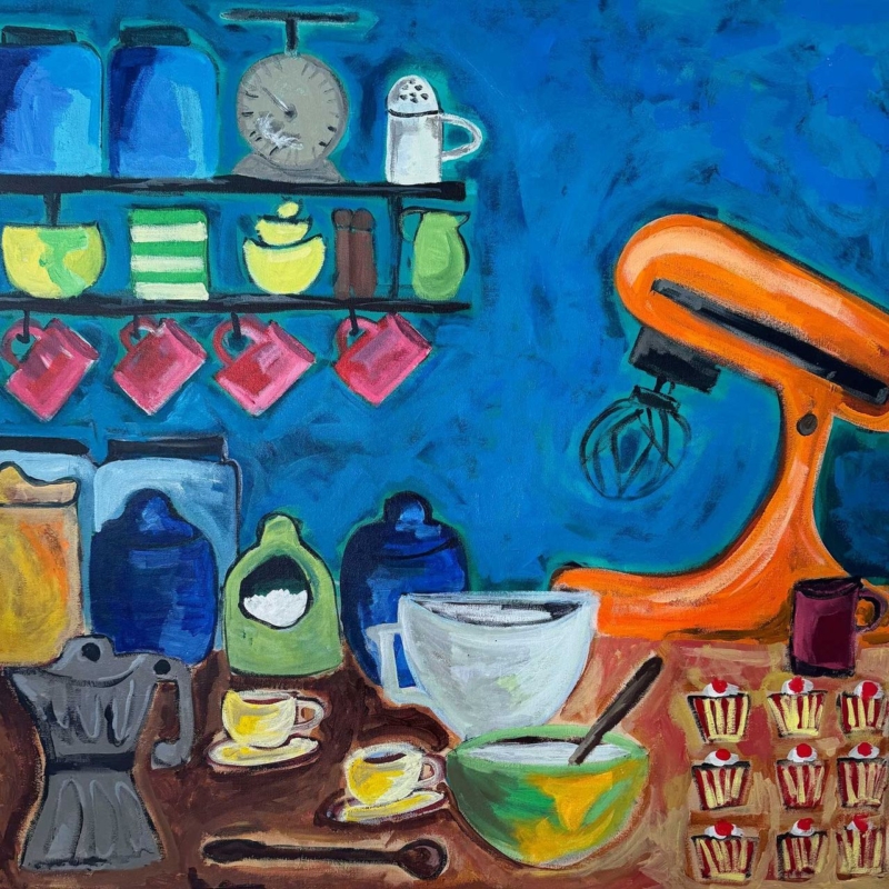
Image of Momentum by Diana Hand

Good equestrian office wall art should bring personality to a workspace without making it feel like a hobby room. That balance matters, especially when the office needs to stay professional while still reflecting the interests of the person using it. Momentum does that especially well.

Why this subject works in a working space

A well-designed office usually benefits from artwork that suggests purpose, movement, and concentration. This piece carries that energy, but it does so with enough restraint to feel polished rather than busy. It gives the room character without pulling attention away from the work.

  • It feels personal while still being suitable for meetings or calls.
  • It adds movement and focus to a cleaner office scheme.
  • It works in home offices, studios, and client-facing workspaces alike.

Why refined equestrian art is easier to live with

The strongest equestrian pieces usually capture presence and grace rather than leaning too hard on theme. Momentum has that quality, which makes it suitable for a room that needs to feel capable and grown-up as well as personal.

Placed above a desk, beside shelving, or on the wall visible behind a chair, it can help the whole workspace feel more considered.

Why a bespoke framed finish matters

At First 4 Frames, each piece is produced in-house in Falkirk with bespoke framing, colour-managed Giclée printing, and hand-finished craftsmanship. That superior quality helps artwork feel properly at home in a workspace where presentation matters.

This artwork is by Diana Hand, and you can view the exact framed product here.

If you need equestrian office wall art that feels elegant, focused, and professionally finished, Momentum is a very good choice.

Posted on

Why Capercaillie (Holding Court) Feels Right as Scottish Wildlife Wall Art for a Lodge

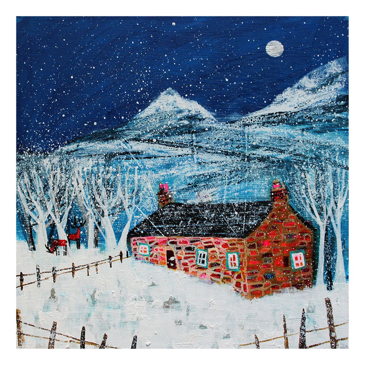
The Capercaillie (Holding Court) stands proudly on mossy rocks in a sunlit forest clearing, displaying its dark, iridescent blue and green plumage and impressive fanned tail.

The best Scottish wildlife wall art for a lodge should feel connected to place without tipping into cliché. A lodge or country retreat usually needs warmth, character, and a little sense of story, but it still benefits from restraint. Capercaillie (Holding Court) strikes that balance very well.

Why wildlife subjects work best when they feel grounded

In a lodge setting, artwork should echo the surrounding landscape and atmosphere rather than simply announce a theme. This piece has presence and personality, but it still feels considered enough for a polished interior.

  • It brings Scottish character without looking novelty-led.
  • It suits timber, wool, leather, and stone beautifully.
  • It helps a retreat space feel memorable and rooted in place.

Where it can make the strongest impression

This sort of framed print can work especially well in a sitting room, entrance hall, or upstairs landing where guests first register the mood of the property. It gives the room identity, but it still leaves space for the rest of the interior to breathe.

That is often the difference between a lodge that feels thoughtfully put together and one that leans too hard on obvious motifs.

Why the First 4 Frames finish matters

First 4 Frames completes each piece in-house with bespoke framing, colour-managed Giclée printing, and hand-finished craftsmanship. That superior finish helps the artwork feel worthy of a more characterful room and avoids the flatter look of mass-produced décor.

This artwork is by Chris Sharp, and you can view the exact framed product here.

If you are searching for Scottish wildlife wall art for a lodge that feels authentic, characterful, and well finished, Capercaillie (Holding Court) is an excellent option.

Posted on

Scorched Earth as Wall Art for Concrete Floors, Why It Works

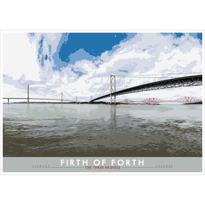
Image of Scorched Earth by Stuart Roy

Finding the right wall art for concrete floors is often about adding warmth without softening the room too much. Concrete can look crisp, contemporary, and beautifully understated, but it can also make a space feel a little severe if nothing counterbalances it. Scorched Earth works especially well because it brings atmosphere and texture while still feeling right at home in a modern interior.

Why cooler surfaces need more depth on the wall

Concrete tends to flatten the mood of a room unless other elements bring movement and visual warmth. This piece does that without relying on overly sweet colour or decorative fuss. It feels strong, but not harsh.

  • It softens a cooler scheme without making it look traditional.
  • It adds texture that complements polished or matte concrete alike.
  • It works well in loft spaces, dining areas, and contemporary hallways.

Why this kind of artwork sits well in design-led rooms

Some modern interiors need art that can hold its own against stronger materials. Scorched Earth has enough presence to do that, but it still leaves room for the architecture. That balance makes it easier to live with over time.

It can be especially effective where the floor already carries a lot of visual weight and the walls need something equally considered.

Why superior framing helps the result

At First 4 Frames, every piece is completed in-house in Falkirk with bespoke framing, colour-managed Giclée printing, and hand-finished craftsmanship. That superior quality matters in a pared-back room where cheaper finishes tend to show very quickly.

This artwork is by Stuart Roy, and you can view the exact framed product here.

If you want wall art for concrete floors that feels atmospheric, grounded, and professionally finished, Scorched Earth is a very smart choice.

Posted on

How The Island (Plockton) Can Balance Wall Art for Bifold Doors

A dark, mysterious scene features "The Island(Plockton)": a small tree-covered island floating on water, while beneath, a large rocky creature with big eyes blends into the island's base.

Good wall art for bifold doors has an unusual job. In rooms that open wide onto a garden or terrace, the view naturally pulls attention outward. That is lovely, but it can also leave the interior side of the room feeling slightly unfinished. The Island (Plockton) helps solve that by giving the room a sense of place and balance indoors as well.

Why open-plan rooms still need visual weight indoors

When glazing takes up a large section of one wall, the remaining surfaces need to work harder. One well-chosen framed print can stop the room feeling all view and no centre. This piece brings colour and story while still keeping an easy, relaxed mood.

  • It helps balance a wall layout dominated by doors and glass.
  • It adds warmth without making the room feel busy.
  • It suits kitchen-living spaces and garden-facing sitting rooms particularly well.

Why a coastal subject works so naturally

There is a nice connection between an artwork that suggests openness and a room built around light and views. The Island (Plockton) feels airy enough for that kind of setting, yet it still provides the definition the room needs once the doors are closed and evening falls.

It can work especially well beside a dining area, above a sideboard, or on the wall opposite the doors where the interior needs a stronger identity.

Why the framing finish matters

First 4 Frames completes every piece in-house with bespoke framing, colour-managed Giclée printing, and hand-finished craftsmanship. That superior presentation helps artwork feel intentional in a cleaner, more architectural room where details are easy to notice.

This artwork is by Matylda Konecka, and you can view the exact framed product here.

If you need wall art for bifold doors that helps a bright room feel more complete, The Island (Plockton) is an excellent fit.

Posted on

Welcome to Harris and the Challenge of Art for a Room With Skylights

Image of Welcome to Harris by Arie Vardi

Choosing art for a room with skylights can be surprisingly difficult. Overhead daylight gives a room wonderful openness, but it can also leave walls feeling visually thin if the artwork does not carry enough shape and colour. Welcome to Harris works beautifully in that setting because it brings clarity and calm without feeling heavy.

Why skylit rooms still need a clear focal point

Rooms with roof windows often change character across the day. Morning light can feel crisp, while afternoon light can flatten softer tones. This piece holds its presence through those shifts and helps the room stay visually grounded.

  • It gives a brighter room structure without darkening it.
  • It keeps a light scheme feeling calm rather than empty.
  • It suits bedrooms, loft rooms, and upper-floor living spaces especially well.

Why the colour balance matters

In a room where light arrives from above, balanced colour usually works better than anything too faint or too sharp. Welcome to Harris brings enough movement to be noticed, but it still feels easy to live with in a restful space.

That makes it useful above a bed, opposite a window wall, or in the section of the room that needs one stronger visual anchor.

Why a hand-finished framed print helps

At First 4 Frames, each piece is completed in-house in Falkirk with bespoke framing, colour-managed Giclée printing, and hand-finished craftsmanship. In a skylit room, that superior finish helps the artwork hold its own against stronger natural light.

This artwork is by Arie Vardi, and you can view the exact framed product here.

If you are looking for art for a room with skylights that feels settled, luminous, and professionally finished, Welcome to Harris is a very strong option.

Posted on

Why Nightswimming Is Such a Strong Choice for Art in a Room With Curved Furniture

Image of Nightswimming by Stuart Roy

Choosing art for a room with curved furniture is often about echo rather than contrast. Softer silhouettes in sofas, armchairs, and tables give a room a gentler feel, so the artwork needs to support that movement without turning the whole space vague. Nightswimming gets that balance right.

Why shape matters as much as colour

When a room uses more rounded forms, harsh or overly rigid artwork can feel slightly disconnected. The better choice is usually a piece that carries flow and atmosphere while still giving the room a proper point of focus. That is what makes this artwork so useful.

  • It supports softer furniture lines without becoming too blurred.
  • It suits calmer interiors that rely on shape and mood.
  • It helps a room feel cohesive rather than stage-managed.

Why Nightswimming works particularly well

The atmosphere feels settled and fluid, which makes it a natural partner for rounded silhouettes and more tactile upholstery. It can work especially well in a sitting room, bedroom, or snug where the aim is comfort with a cleaner, more deliberate edge.

Why a superior framed finish completes the look

First 4 Frames produces each piece in-house with bespoke framing, colour-managed Giclée printing, and hand-finished craftsmanship. In a room where the furniture has been chosen carefully for shape and feel, the framed finish matters. A superior quality presentation helps the artwork feel like part of the scheme rather than an afterthought.

This artwork is by Stuart Roy, and you can view the exact framed product here.

If you need art for a room with curved furniture that feels calm, cohesive, and beautifully presented, Nightswimming is a very strong option.

Posted on

How Rock Pools Can Make Window Seat Wall Art Feel More Considered

Image of Rock Pools by Arie Vardi

The best wall art for a window seat should support the feeling that draws people to that spot in the first place. A window seat is usually about pause, light, and a little retreat within the room. Rock Pools works beautifully there because it feels reflective and textured without becoming sleepy or flat.

Why these smaller corners matter

A window seat can easily become an almost-finished part of a room. The cushions are there, the light is lovely, but the wall can still feel underused. One framed piece nearby often does more than people expect. It turns the seat into a destination rather than just a practical ledge or tucked-away perch.

  • It helps the corner feel properly styled.
  • It supports a calmer, slower mood without looking empty.
  • It works well in reading nooks, bedrooms, and garden-facing sitting rooms.

Why Rock Pools is a strong fit

The sense of texture and reflection feels very natural beside changing daylight. That makes it especially suitable for spaces where the view and the light already do part of the work. It brings enough interest to hold the wall, but it still leaves the corner feeling restful.

Why the framed finish matters

At First 4 Frames, every artwork is completed in-house with bespoke framing, colour-managed Giclée printing, and hand-finished craftsmanship. In a smaller corner, quality becomes even more noticeable. A superior framed finish helps the whole seating area feel more intentional and more refined.

This artwork is by Arie Vardi, and you can view the exact framed product here.

If you are searching for wall art for a window seat that feels calm, textural, and properly finished, Rock Pools is well worth considering.

Posted on

Why Whispered Shore Works Beautifully as Art for Boucle Furniture

Image of Whispered Shore by Colin Robertson

Choosing art for boucle furniture is often about texture as much as colour. Boucle brings softness and comfort into a room, but without the right artwork nearby the whole scheme can start to feel a little too muted. Whispered Shore is a strong answer because it adds movement and clarity while keeping that softer overall mood intact.

Why texture-led rooms need visual contrast

Rooms built around tactile fabrics benefit from artwork that brings definition without becoming harsh. The better pieces usually echo the softness of the room in spirit, but still introduce enough shape, colour, and direction to stop everything blending together. That is exactly where this artwork works well.

  • It suits softer interiors without feeling overly pale.
  • It gives a textured room more visual depth.
  • It helps neutral upholstery feel finished rather than unfinished.

Why Whispered Shore fits the setting

The coastal atmosphere brings ease and light, while the composition gives the room something more definite to gather around. It can work beautifully in sitting rooms, bedrooms, or relaxed guest spaces where boucle chairs, benches, or cushions need a companion piece that keeps the scheme elevated.

Why the First 4 Frames finish helps

First 4 Frames produces every piece in-house with bespoke framing, colour-managed Giclée printing, and hand-finished craftsmanship. In a texture-led interior, those finishing details stand out. A superior quality frame helps the artwork feel considered and keeps the softer room scheme looking polished rather than vague.

This artwork is by Colin Robertson, and you can view the exact framed product here.

If you need art for boucle furniture that feels soft, balanced, and beautifully finished, Whispered Shore is a very appealing choice.

Posted on

Saviours of the Spinning Wheel and the Appeal of Wall Art for Open Shelving

Saviours of the Spinning Wheel" features a gnome in a sailboat, a puffin with a rope, and a bird in a top hat on a spinning wheel adrift at sea, against rocky islands and soaring birds.

Good wall art for open shelving should do something shelves often cannot. It should bring focus. Books, ceramics, baskets, and collected objects can make a room feel layered and personal, but they can also leave the wall behind them feeling a little fragmented. Saviours of the Spinning Wheel is a brilliant answer when you want a more memorable focal point.

Why shelves need a stronger visual anchor

Open shelving already introduces plenty of smaller shapes and details. A single framed artwork nearby can help gather all of that into one more coherent composition. The trick is choosing a piece with enough personality to stand up to the shelves without making the room feel chaotic.

  • It helps a shelf-filled wall feel more intentional.
  • It brings story and colour without needing multiple extra pieces.
  • It suits rooms that feel collected rather than minimal.

Why this piece works so well

Saviours of the Spinning Wheel has imagination, movement, and plenty to notice, which makes it a strong companion for rooms that already contain books, objects, and conversation pieces. It works especially well in a study, family sitting room, creative corner, or library-style space where a little narrative on the wall feels welcome.

Why quality framing matters in a layered room

At First 4 Frames, every print is finished in-house with bespoke framing, colour-managed Giclée printing, and hand-finished craftsmanship. In a room full of smaller details, a superior quality frame helps the artwork hold its place and stops it from being visually lost among the shelving.

This artwork is by Matylda Konecka, and you can view the exact framed product here.

If you are looking for wall art for open shelving that feels lively, distinctive, and properly framed, Saviours of the Spinning Wheel is a very good option.