Posted on

Why Badger Works So Well as Wildlife Wall Art for a Study

This Badger framed Giclée print shows a black and white badger among lush green foliage with vibrant blue and green brushstrokes, capturing the animal peeking through greenery.

The best wildlife wall art for a study should add character without interrupting concentration. Badger is a particularly good fit because it feels observant, grounded, and quietly distinctive rather than loud or decorative for its own sake.

wildlife wall art for a study featuring Badger

Why wildlife wall art for a study works best when it feels observant

A study, library, or home working room often benefits from artwork that rewards attention without demanding it. Wildlife subjects can do that especially well because they bring life and personality while still feeling calm. The key is choosing a piece with enough presence to enrich the room, but not so much visual insistence that it breaks focus.

Badger gets that balance right. The subject has quiet strength, and the overall feel is thoughtful rather than overly sweet or overly rustic. That makes it a strong choice for studies that need warmth and individuality, but still need to support concentration.

What gives Badger its strength as wildlife wall art for a study

  1. It adds natural character without pulling the room off task.
  2. It helps a study feel more personal and considered rather than purely functional.
  3. It suits both traditional and contemporary workspaces where quieter subject matter tends to last well.

First 4 Frames completes every piece in-house in Falkirk with bespoke framing, colour-managed Giclee printing, and hand-finished craftsmanship. That level of finish suits a study particularly well because these are rooms where customers often notice paper quality, colour control, and careful presentation at close range.

You can browse more work by Charlotte Strawbridge, visit the Charlotte Strawbridge website, and view the exact framed print here.

If you are looking for wildlife wall art for a study with quiet presence and lasting display value, Badger is well worth considering.

Posted on

Why Blue Washing Works Beautifully as Powder Room Wall Art

Blue Washing captures a rural coastal landscape with white cottages, red roofs among green hills beside a blue sea and swirling sky, evoking the serene effect of blue washing across the scene.

Good powder room wall art should give a smaller space presence without making it feel cluttered. Blue Washing works especially well for that balance because it brings colour, movement, and a clear focal point while still feeling easy to live with every day.

powder room wall art featuring Blue Washing

Why powder room wall art needs confidence without clutter

A powder room often has less wall space than a bathroom, hallway, or dressing area, so every visual choice carries more weight. Artwork can make that compact space feel considered and complete, but only if the piece has enough character to hold attention without turning the room into a collection of competing details.

Blue Washing suits that job beautifully. Its expressive composition gives the wall energy, yet the colour still feels composed rather than noisy. That matters in a smaller room where pattern, paint, fittings, and mirrors are already working hard.

Why Blue Washing suits powder room wall art so naturally

  • It adds personality without making a compact room feel crowded.
  • It brings colour movement that helps a smaller space feel more intentional.
  • It feels distinctive enough to be memorable, yet calm enough for everyday use.

First 4 Frames completes each piece in-house in Falkirk using bespoke framing, colour-managed Giclee printing, and hand-finished craftsmanship. That superior finish is especially valuable in smaller rooms because details are seen up close and presentation matters more, not less.

You can browse more work by Fiona Matheson, visit the Fiona Matheson website, and view the exact framed print here.

If you are comparing powder room wall art and want something polished, distinctive, and easy to place, Blue Washing is a very strong option.

Posted on

What Makes Anstruther Early Morning Such a Strong Choice for Anstruther Wall Art

Anstruther Early Morning is an impressionist painting featuring colorful boats on tranquil water and charming pastel waterfront houses, brought to life with vibrant, textured brushstrokes that capture the harbor’s serene beauty.

Good Anstruther wall art should feel more connected to the real place than a generic seaside picture. Anstruther Early Morning stands out because it captures harbour atmosphere, working character, and colour in a way that feels display-worthy at home rather than purely nostalgic or tourist led.

Anstruther wall art featuring Anstruther Early Morning

Why Anstruther wall art needs place as well as polish

When people look for artwork linked to a coastal town they know, they usually want more than a reminder of a day out. They want something that carries the pace, light, and harbour character of the place while still working properly as framed art in a hallway, kitchen, study, or sitting room. That balance is what stops local artwork from feeling like a souvenir.

Anstruther Early Morning gets that balance right. It feels rooted in Anstruther, yet it also has the clarity and colour needed to brighten a room in everyday life. That makes it a strong choice for anyone with a connection to the East Neuk, the Fife coast, or Scottish harbour scenes more broadly.

What gives Anstruther Early Morning its strength as Anstruther wall art

  1. It carries recognisable harbour character without slipping into novelty.
  2. It adds colour and atmosphere that can lift a room all year round.
  3. It feels local and personal while still looking polished enough for everyday display.

First 4 Frames completes every piece in-house in Falkirk with bespoke framing, colour-managed Giclee printing, and hand-finished craftsmanship. That superior finish matters because artwork linked to a real place should still look refined enough to earn its space on the wall long after the first emotional connection.

You can browse more work by Peter Foyle, read this Anstruther harbour overview, and view the exact framed print here.

If you are looking for Anstruther wall art with local identity, colour, and lasting display value, Anstruther Early Morning is well worth considering.

Posted on

Why Buttercups Works Beautifully as Wall Art for Painted Cabinetry

Buttercups: Watercolor painting of wildflowers in a vase on a windowsill, with views of a blue lake, grassy fields, and a cloudy sky in the colorful landscape outside.

The best wall art for painted cabinetry should give a room some definition without fighting the softer character that painted furniture already creates. Buttercups works especially well here because it brings freshness, colour, and a clear focal point while still keeping the overall look welcoming rather than overly formal.

wall art for painted cabinetry featuring Buttercups

Why wall art for painted cabinetry needs balance as well as colour

Painted cabinetry often gives a room warmth and personality straight away, whether it appears in a kitchen, pantry, dining space, or country-style sitting room. The challenge is making sure the scheme still feels shaped and complete. Artwork helps most when it adds lift and contrast without making the room feel too busy or too carefully matched.

Buttercups suits that job beautifully. The floral subject feels light and easy to live with, while the composition still has enough presence to hold the wall confidently. That makes it a strong fit for interiors where cabinetry, shelving, or painted woodwork already carry much of the room’s character.

Why Buttercups suits wall art for painted cabinetry so naturally

  • It introduces freshness without making a softer scheme feel overly sweet.
  • It helps painted cupboards and joinery feel connected to the rest of the room.
  • It adds a brighter focal point that still feels calm and easy to live with.

First 4 Frames completes each piece in-house in Falkirk with bespoke framing, colour-managed Giclee printing, and hand-finished craftsmanship. That superior finish matters in rooms with painted cabinetry because these interiors depend on detail, balance, and presentation rather than sheer scale.

You can discover more about the artist at Clare Arbuthnott, browse more work by Clare Arbuthnott, and view the exact framed print here.

If you are comparing wall art for painted cabinetry and want something fresh, balanced, and quietly uplifting, Buttercups is a very strong option.

Posted on

Why Phonebox Cottage Makes Quirky Guest Room Wall Art Feel Thoughtful

The Phonebox Cottage features a red British phone booth in a foggy field, topped with moss and a black bowler hat. A crow holds a "Welcome" sign above, while inside the booth, a person can be faintly seen.

Well-chosen quirky guest room wall art can make a spare room feel far more personal. Phonebox Cottage works especially well because it gives guests something imaginative to notice straight away, yet still feels warm, composed, and easy to live with rather than loud for the sake of it.

quirky guest room wall art featuring Phonebox Cottage

Why quirky guest room wall art should feel welcoming first

A guest room does not need to be overly plain to feel restful. In fact, the best spare rooms often include one detail that gives them identity. The key is choosing artwork with story and charm while avoiding pieces that feel too busy or too gimmicky for an overnight space.

Phonebox Cottage strikes that balance beautifully. Its phone box subject, misty setting, and quietly surreal tone give the room personality without making it feel crowded. It suits guest bedrooms, box rooms, and cottage stays where you want visitors to feel that some real thought has gone into the space.

Why Phonebox Cottage gives quirky guest room wall art more staying power

  1. It creates an immediate talking point without overwhelming a smaller room.
  2. It blends whimsy and atmosphere in a way that still feels calm enough for guests.
  3. It rewards closer attention, which helps a spare room feel considered rather than simply furnished.

First 4 Frames completes every piece in-house in Falkirk with bespoke framing, colour-managed Giclee printing, and hand-finished craftsmanship. That makes a difference when you want guest room artwork to feel properly finished and lasting, not like an afterthought added to fill a blank wall.

You can browse more by Matylda Konecka, visit the Matylda Konecka official website, and view the exact framed print here.

If you are looking for quirky guest room wall art with story, charm, and real display value, Phonebox Cottage is an excellent option.

Posted on

Why The Sound of Mull Works So Well as Wall Art for Oak Flooring

Image of The Sound of Mull by Arie Vardi

The best wall art for oak flooring should work with the warmth already in the room rather than fighting it. The Sound of Mull is a strong example because it introduces cooler coastal blues, gentle movement, and enough tonal variation to stop oak-heavy spaces feeling too uniform.

wall art for oak flooring featuring The Sound of Mull

Why wall art for oak flooring needs contrast as well as warmth

Oak flooring often brings natural richness, visible grain, and a steady golden undertone. That is a real strength, but it can also make a room feel visually same-note if the artwork leans too brown, too muted, or too close in tone. A better choice introduces freshness and depth while still sitting comfortably with the timber beneath it.

The Sound of Mull does that beautifully. The coastal subject has softness and space in it, which helps an oak-led interior feel lighter and more open. It can work especially well in living rooms, bedrooms, hallways, or open-plan spaces where the floor already contributes a strong sense of material character.

How The Sound of Mull helps wall art for oak flooring feel more balanced

  • It introduces cooler blues and natural contrast without clashing with timber tones.
  • It keeps a warm room feeling layered rather than overly golden.
  • It suits homes where calm presentation and craftsmanship matter more than quick trend changes.

First 4 Frames completes each piece in-house in Falkirk with bespoke framing, colour-managed Giclee printing, and hand-finished craftsmanship. That superior quality matters when a room already includes strong natural materials, because the artwork needs enough presence and finish to hold its place beside them.

You can browse more by Arie Vardi, visit the Arie Vardi official website, and view the exact framed print here.

If you are comparing wall art for oak flooring and want something that brings contrast, calm, and lasting display value, The Sound of Mull is well worth a closer look.

Posted on

How Where Ghosts Wander Softens a Room with Exposed Ceiling Beams

Image of Where Ghosts Wander by Noel Fenech Photography

The best wall art for exposed ceiling beams should balance a room rather than compete with it. In spaces with visible timber overhead, the architecture already carries strong lines and texture. Where Ghosts Wander works especially well because it brings depth and atmosphere while softening the harder structure around it.

wall art for exposed ceiling beams featuring Where Ghosts Wander

Why wall art for exposed ceiling beams needs softness and depth

Exposed beams can give a room wonderful age, rhythm, and presence, but they also make the upper part of the space feel visually firm. That often means the artwork below needs to introduce some ease. The strongest choice brings atmosphere, movement, or tonal variation so the room feels layered instead of slightly top heavy.

Where Ghosts Wander does that beautifully. Its woodland subject feels immersive and calm, and the tree forms echo natural structure without repeating the straight geometry of the beams themselves. That makes it a strong fit for living rooms, garden rooms, studies, and bedrooms where you want a period or cottage interior to feel settled rather than busy.

How Where Ghosts Wander helps wall art for exposed ceiling beams feel more resolved

  1. It softens stronger joinery with organic shapes and tonal depth.
  2. It adds atmosphere without making a characterful room feel darker or heavier.
  3. It suits homes where texture and craftsmanship matter more than trend-led styling.

First 4 Frames completes every piece in-house in Falkirk with bespoke framing, colour-managed Giclee printing, and hand-finished craftsmanship. That superior finish matters in older or more characterful rooms because the artwork needs enough quality to sit confidently beside natural timber, stone, or traditional joinery.

You can browse more by Noel Fenech Photography, read the Woodland Trust guide to ancient woodland, and view the exact framed print here.

If you are looking for wall art for exposed ceiling beams with mood, softness, and lasting presence, Where Ghosts Wander is a very strong option.

Posted on

Why Findochty Makes a Strong Seaside Cafe Wall Art Choice

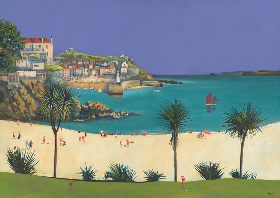
Findochty is a colorful, whimsical painting of a coastal village featuring boats in the harbor, red roads, white houses with blue roofs, green hills, and a vivid blue sea under a bright sky. The scene is lively and vibrant.

Well-chosen seaside cafe wall art should help a cafe feel welcoming before anyone even sits down. Findochty works especially well because it brings harbour character, friendly colour, and a recognisable sense of place without tipping into overly themed seaside styling.

seaside cafe wall art featuring Findochty

Why seaside cafe wall art needs personality as well as calm

A good cafe interior should feel easy to settle into. Artwork can help with that, but only when it adds warmth and local character rather than feeling like a stock coastal theme. The strongest piece gives people something to notice while still supporting the room’s atmosphere, conversation, and comfort.

Findochty suits that kind of setting because the harbour subject feels grounded and human. It can work beautifully in a coffee shop, breakfast room, bakery cafe, or coastal tearoom where you want the walls to feel lively and welcoming rather than purely decorative.

Why Findochty works so naturally as seaside cafe wall art

  • It adds a clear coastal identity without leaning on obvious nautical cliches.
  • It brings colour and story that help a seating area feel more relaxed and memorable.
  • It suits customer-facing interiors where atmosphere matters as much as neat presentation.

First 4 Frames completes each piece in-house in Falkirk with bespoke framing, colour-managed Giclee printing, and hand-finished craftsmanship. That superior quality matters in hospitality spaces because customers notice the details, especially when artwork is positioned near tables, counters, or waiting areas.

You can browse more work by Rob Hain, visit the Rob Hain official website, and view the exact framed print here.

If you are comparing seaside cafe wall art and want something with place, warmth, and everyday display value, Findochty is well worth considering.

Posted on

Why Tigh an Truish (The Hoose o’ Troosers) Works So Well as Scottish Lodge Wall Art

A vibrant painting of Tigh an Truish (The Hoose o’ Troosers), showing a lively riverside village with people strolling, boating, autumn trees, white houses, and the famed stone bridge arching over the water.

The best Scottish lodge wall art should give a room genuine local character without making it feel stage set. Tigh an Truish (The Hoose o’ Troosers) works especially well because it brings Scottish identity, humour, and atmosphere in a way that still feels polished enough for a lodge, snug, home bar, or sitting room.

Scottish lodge wall art featuring Tigh an Truish (The Hoose o’ Troosers)

Why Scottish lodge wall art needs personality without cliche

Lodge-inspired rooms often want warmth, texture, and a clear sense of place. The challenge is stopping that look from becoming too predictable. If every detail leans too literally on tartan, antlers, or rustic cliche, the room can lose its individuality. The strongest artwork adds Scottish personality while still feeling like a considered art choice.

Tigh an Truish (The Hoose o’ Troosers) has that balance. It feels rooted in a real place and cultural story, but the presentation stays lively and display worthy rather than novelty led. That makes it a particularly strong fit for rooms with timber, leather, wool, or darker painted finishes that need artwork with warmth and wit.

Why Tigh an Truish works so well as Scottish lodge wall art

  1. It gives a room Scottish identity without relying on obvious decor tropes.
  2. It has enough warmth and humour to suit relaxed, characterful spaces.
  3. It feels rooted in place while still working as a refined framed piece.

First 4 Frames completes each piece in-house in Falkirk with bespoke framing, colour-managed Giclee printing, and hand-finished craftsmanship. In lodge-inspired interiors, that superior quality matters because richer materials and stronger colours quickly reveal whether the artwork feels thoughtfully finished or merely themed.

You can browse more by Rob Hain, visit the Rob Hain official website, explore the VisitScotland route featuring Tigh-An-truish, and view the exact framed print here.

If you are comparing Scottish lodge wall art and want something rooted, witty, and full of lasting character, Tigh an Truish (The Hoose o’ Troosers) is a very strong option.

Posted on

Why Cobbled Streets And Flowers, Culross Works Beautifully as Cottagecore Hallway Art

Cobbled Streets And Flowers, Culross is a colorful, whimsical painting featuring a person with an umbrella and black dog walking past vibrant houses, bright flowers, and slanted buildings beneath a sky streaked with white clouds.

The best cottagecore hallway art should make an entrance feel personal from the first step inside. Cobbled Streets And Flowers, Culross works especially well because it brings cobbled-street charm, flowers, and gentle Scottish character while still feeling polished enough for everyday display in a hallway, porch, or stair landing.

cottagecore hallway art featuring Cobbled Streets And Flowers, Culross

Why cottagecore hallway art needs charm without visual fuss

Hallways often work hard without getting much decorative attention. Cottage-inspired styling can warm them up beautifully, but it works best when the artwork feels characterful rather than fussy. The strongest piece brings colour, story, and a softer welcome while still leaving the space feeling tidy and well judged.

Cobbled Streets And Flowers, Culross gets that balance right. The cobbled lane, floral details, and village atmosphere give the print real warmth, yet the overall composition still feels composed enough for a lived-in home. It adds welcoming detail without making the wall feel crowded.

Why Cobbled Streets And Flowers, Culross works so well as cottagecore hallway art

  • It brings warmth and village character without tipping into novelty.
  • It suits narrower transition spaces where colour and welcome matter.
  • It feels romantic and story-led, but still tidy enough for everyday interiors.

First 4 Frames completes every piece in-house in Falkirk with bespoke framing, colour-managed Giclee printing, and hand-finished craftsmanship. That superior finish matters in entrance spaces because the artwork is often seen up close, in passing light, and alongside practical details like hooks, tables, and painted woodwork.

You can browse more by Nikki Monaghan, read the VisitScotland guide to Culross, and view the exact framed print here.

If you are comparing cottagecore hallway art and want an entrance to feel softer, more personal, and more inviting, Cobbled Streets And Flowers, Culross is well worth considering.