Posted on

How Brys Blossom Supports framed art prints

Image of Brys Blossom by The Wee Deaf Artist

Searches for framed art prints usually come from buyers who care not just about the image, but about the finished result on the wall. Brys Blossom is a useful example of that more complete approach.

A framed piece should feel resolved before it arrives in the room. That means the artwork, the frame, the scale, and the presentation all need to work together rather than being treated as separate decisions.

  • It suits buyers who want more confidence before they commit.
  • It supports a more bespoke, less generic art-buying process.
  • It links visual choice with framing quality in a way many galleries underplay.

When you can picture how a framed piece will sit in a real interior, it becomes much easier to choose something with confidence. That is exactly where a stronger framing-led buying process helps.

Why the framed finish matters

At First 4 Frames, the final presentation comes from in-house bespoke framing, colour-managed Giclée production, and hand-finished craftsmanship. That framed finish is part of the value, not an afterthought.

This artwork is by Bryony Hamilton, and you can see the framed product here.

For anyone exploring framed art prints, Brys Blossom shows why the framed presentation matters as much as the image itself.

Posted on

How Scottish Meadow Can Add Warmth to a Home Office

Image of Scottish Meadow by The Wee Deaf Artist

The right home office wall art can change how a workspace feels day to day. Scottish Meadow is a strong choice when you want the room to feel more personal, focused, and visually balanced.

Why this piece suits the space

A home office can easily become too functional, especially if the furniture and storage are practical rather than expressive. Scottish Meadow helps offset that by adding atmosphere and interest, giving the space a focal point that feels intentional.

  • It can make a workspace feel less temporary and more properly designed.
  • It adds personality without distracting from the work itself.
  • It works well in offices that need warmth rather than more visual noise.

This kind of artwork suits a desk wall, a shelving backdrop, or the first wall you see when entering the room. In each case, it helps the office feel less sterile and more connected to the rest of the home.

Why the framed finish matters

At First 4 Frames, each piece is produced in-house with colour-managed Giclée quality and hand-finished bespoke framing. That quality-led presentation is especially useful in a space where you spend long hours and notice the details every day.

The piece is by Bryony Hamilton, and you can see the framed product here.

If you want home office wall art that adds warmth, presence, and a more finished feel to the room, Scottish Meadow is well worth considering.

Posted on

Why Isn’t She Happy Is a Strong Choice for Dining Room Wall Art

Image of Isn't She Happy by The Wee Deaf Artist

When people look for dining room wall art, they usually want something that brings the room together without making it feel too formal. Isn’t She Happy does that well, adding presence and personality to a space where people gather, eat, and talk.

Why this piece suits the space

Dining areas benefit from artwork that can hold attention and create atmosphere, especially when the furniture is relatively simple. Isn’t She Happy helps the room feel more finished, giving it a focal point that contributes to the experience of the space rather than just filling a wall.

  • It suits rooms where you want colour and character, but not visual clutter.
  • It can help a dining area feel more intimate and considered.
  • It works well in both dedicated dining rooms and open-plan spaces with a dining zone.

Where it works best

This kind of artwork often works best above a sideboard, on the main wall visible from the table, or in a spot that benefits from a more deliberate focal point. The framed finish helps the piece feel substantial and properly part of the room.

Why the framed finish matters

Because First 4 Frames produces the work in-house in Falkirk, the final result carries the craftsmanship, bespoke framing, and superior quality expected from a mid-to-premium presentation.

This artwork is by Bryony Hamilton, and you can view the exact framed version here.

For anyone choosing dining room wall art that adds atmosphere and a stronger sense of occasion, Isn’t She Happy is a very appealing option.

Posted on

Sunday Morning, Edinburgh and the Ease of Ready to Hang Artwork

Sunday Morning, Edinburgh is a colorful giclée art print by Joseph Maxwell Stuart, featuring a misty park with trees, a distant statue, and a lone figure walking along the path near a hazy castle.

One reason people search for ready to hang artwork is simple: they want the room finished, not half-finished. There is real appeal in receiving a piece that is ready for the wall from the outset, especially when the image itself is strong enough to shape the space. Sunday Morning, Edinburgh is a very good example because it combines atmosphere with a presentation that is already resolved.

Why convenience matters more when the room already feels nearly there

Many rooms only need one final decision to feel complete. That is why ready-to-hang pieces can be so useful. They remove the delay between choosing the artwork and actually living with it. Sunday Morning, Edinburgh suits that kind of decision particularly well because it adds place, warmth, and visual structure straight away.

  • It helps a room feel finished faster without sacrificing quality.
  • It suits buyers who want confidence in both image and presentation.
  • It gives a wall immediate character once it arrives.

This can be especially appealing in hallways, sitting rooms, and guest spaces where the wall already has its paint, lighting, and furniture in place, but still lacks a final focal point.

Why ready to hang should still feel bespoke

First 4 Frames completes every piece in-house in Falkirk with bespoke framing, colour-managed Giclee printing, and hand-finished craftsmanship. That means the convenience of ready-to-hang presentation does not come at the expense of finish, durability, or visual authority.

You can browse more from Joseph Maxwell Stuart and view the exact framed product here.

If you want ready to hang artwork that feels convenient but still genuinely well made, Sunday Morning, Edinburgh is a very smart choice.

Posted on

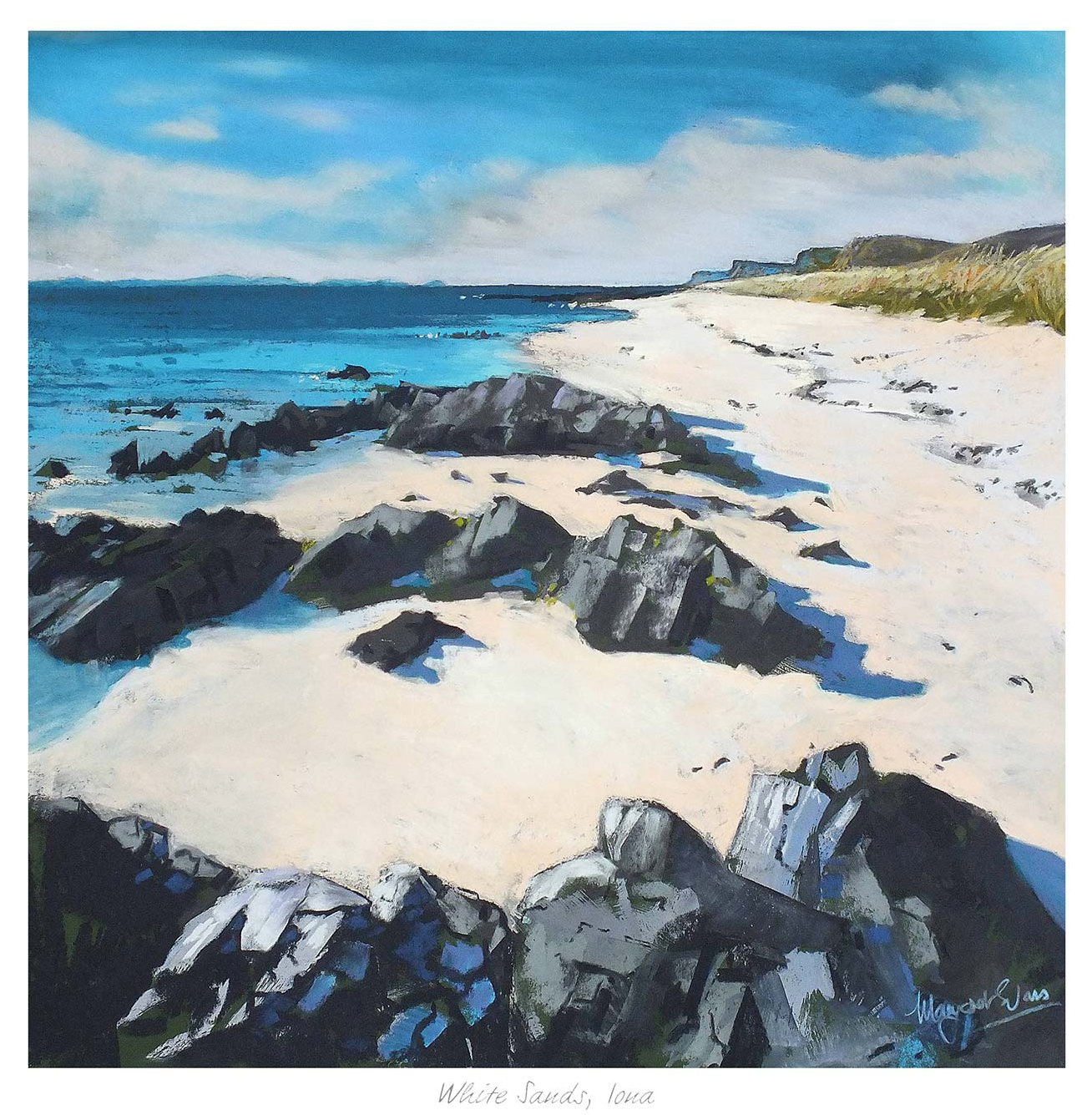
Why The Queens View Shows What Good Fine Art Prints Can Do

The Queens View is a vibrant landscape painting depicting a snow-capped mountain, winding river, lush green fields, and a partly cloudy sky casting soft shadows over the hills.

People often compare fine art prints on image alone, but the best results come from looking at the full presentation. The print, the colour handling, and the framed finish all affect how the piece will live in the room. The Queens View is a strong example because the atmosphere of the image is matched by a presentation that lets it feel complete rather than temporary.

Why quality is visible long before the artwork is framed on the wall

Good fine art printing has a steadier, more convincing presence. The tones feel better judged, the detail feels clearer, and the piece settles into the room more naturally. The Queens View benefits from that kind of finish because its mood depends on subtlety rather than loud colour alone.

  • It shows how atmosphere survives when the print process is properly handled.
  • It gives the room a more enduring focal point than a thinner decorative print.
  • It rewards careful framing because the image already has depth and composure.

This is exactly where First 4 Frames makes the difference. Everything is completed in-house in Falkirk with bespoke framing, colour-managed Giclee printing, and hand-finished craftsmanship, so the final piece feels deliberate from the start.

The best fine art prints do not just show a scene well. They hold their quality once they become part of the room.

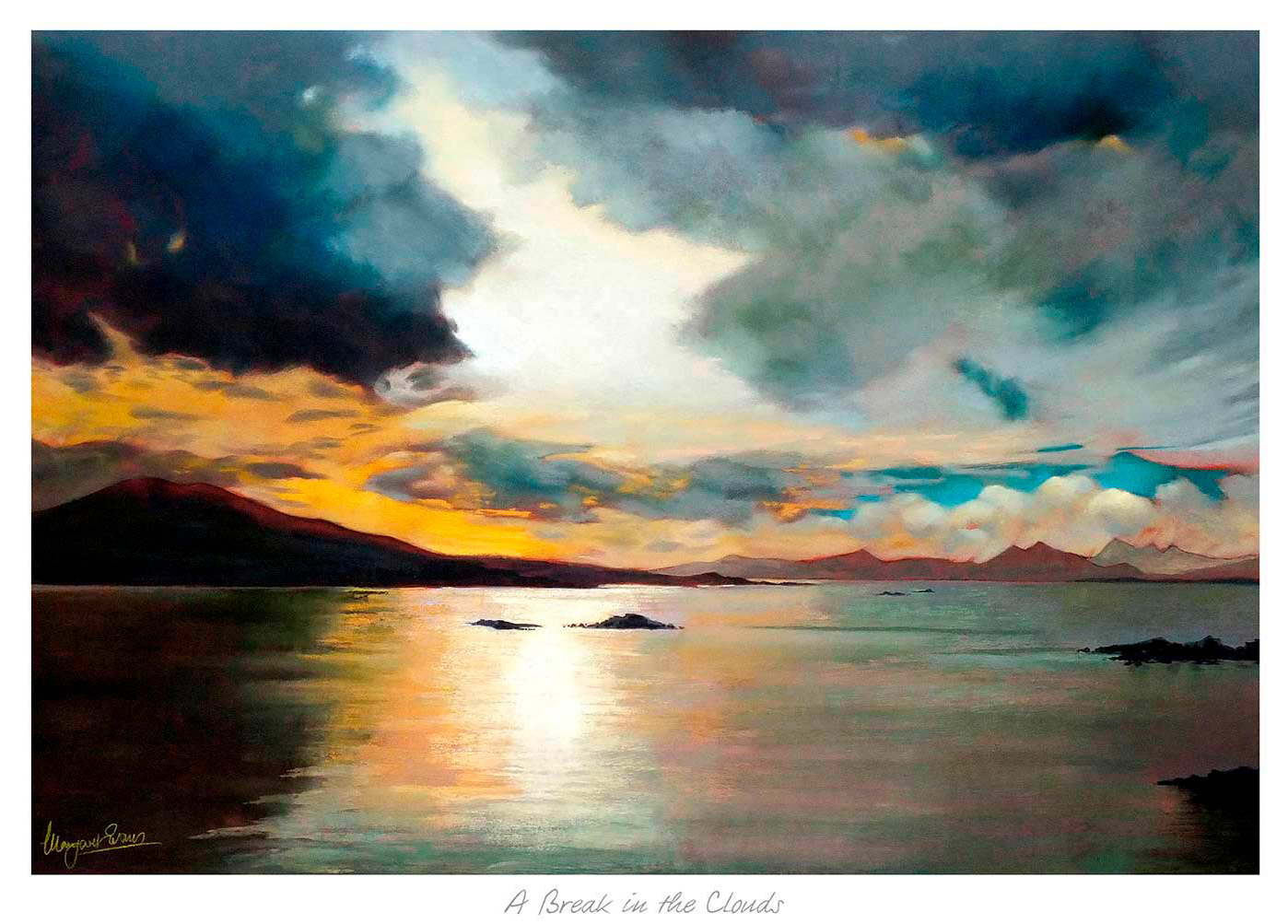
You can explore more from Margaret Evans and view the exact framed print here.

If you are comparing fine art prints and want something with atmosphere, print quality, and a more lasting finish, The Queens View is well worth a closer look.

Posted on

Why Wallace Monument Feels Like Art Inspired by Scotland at Its Best

An impressionist painting of the Wallace Monument—a tall stone tower on a hill—under swirling clouds and greenery. “Murray” is signed in the corner of this Framed Fine Art Giclée Print, titled Wallace Monument, by Raymond Murray.

People searching for art inspired by Scotland are often trying to find something that feels connected to place without becoming predictable. The strongest pieces carry memory, atmosphere, and a sense of character that can live naturally in the home. Wallace Monument does that especially well, giving the wall Scottish identity without tipping into something that feels merely commemorative.

Why place matters more than novelty

Artwork linked to Scotland often works best when it has mood as well as recognition. The point is not just to name a landmark. It is to make the room feel more rooted and more personal. Wallace Monument brings that sense of place while still feeling easy to live with day after day.

  • It suits homes that want Scottish character without a souvenir feel.
  • It adds atmosphere and local identity in equal measure.
  • It works well in living spaces, studies, and welcoming entrance areas.

This kind of subject can be particularly effective when a room already leans on natural textures, deeper neutrals, or traditional details. The image gives those surroundings a clearer focal point while still feeling relaxed rather than staged.

First 4 Frames produces each piece in-house in Falkirk with bespoke framing, colour-managed Giclee printing, and hand-finished craftsmanship. That superior finish helps the artwork feel lasting and properly resolved, which matters when the subject carries as much meaning as the look.

You can browse more from Raymond Murray and view the exact framed product here.

If you want art inspired by Scotland with more atmosphere, identity, and long-term appeal, Wallace Monument is an excellent example.

Posted on

Cobalt Water and the Calm Appeal of Blue Wall Art

Cobalt Water" features an abstract landscape with vibrant cobalt water, green reeds in the foreground, and distant mountains beneath a turquoise sky. Energetic brushstrokes evoke movement and life throughout the scene.

Well-chosen blue wall art can cool a room gently without making it feel distant. That balance matters because blue is often used to create calm, yet the wrong piece can leave the wall looking flatter than before. Cobalt Water works beautifully because it brings freshness and depth while still keeping the overall mood relaxed.

Why calmer colour still needs contrast

Rooms built around softer palettes often rely on subtle changes in tone. Artwork has to support that rather than break it. Cobalt Water does this especially well, giving the wall more shape and movement while keeping the palette airy and easy to live with.

  • It suits bedrooms, sitting rooms, and calmer corners that need a little more visual depth.
  • It adds blue in a way that feels refined rather than overly decorative.
  • It helps neutral walls feel more composed and less empty.

This is particularly useful where the room already includes pale paint, washed wood, or lighter upholstery. The artwork introduces clearer colour, but it still leaves the space feeling open and restful.

Why better presentation keeps the effect polished

First 4 Frames completes each piece in-house in Falkirk with bespoke framing, colour-managed Giclee printing, and hand-finished craftsmanship. That superior quality helps the colour stay purposeful on the wall, rather than feeling thin or easily lost within a quieter scheme.

You can explore more from Fiona Matheson and see the exact framed print here.

If you are comparing blue wall art and want something calm, fresh, and easy to place, Cobalt Water is a very appealing choice.

Posted on

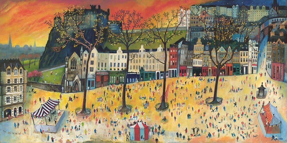
Why Pipers on Parade Gives Music Wall Art More Presence and Movement

Pipers on Parade is a colorful, whimsical painting featuring a cityscape with historic buildings, vibrant trees, and people gathered along winding roads beneath a bright blue sky, grassy hill castle, and crescent moon.

The best music wall art should capture energy without feeling gimmicky. Many music-themed pieces lean too heavily on notes, instruments, or obvious motifs. Pipers on Parade is different because it carries movement, atmosphere, and cultural character in a way that feels far more grounded and display worthy.

Why rhythm on the wall matters in a music-led space

Rooms shaped by music often benefit from artwork that feels lively, but still controlled. The aim is not visual noise. It is a sense of pace and personality. Pipers on Parade does that especially well, making the wall feel animated without taking over the room.

  • It works beautifully in music rooms, practice spaces, or hallways near a piano or listening area.
  • It adds cultural identity rather than generic decorative references.
  • It helps the room feel more spirited and memorable.

This kind of piece is often most useful where the room already has timber, darker upholstery, or shelves filled with records and books. The image contributes movement, but it still feels coherent alongside those lived-in details.

Good music wall art should carry rhythm and personality, not just a musical subject.

First 4 Frames produces each piece in-house in Falkirk with bespoke framing, colour-managed Giclee printing, and hand-finished craftsmanship. That superior presentation helps the artwork feel intentional enough for a room built around creativity and enjoyment.

You can browse more from Rob Hain and view the exact framed product here.

If you want music wall art with more movement, place, and personality, Pipers on Parade is well worth considering.

Posted on

Why Out of Reach Works So Well as Large Wall Art in a Brighter Room

Image of Out of Reach by Noel Fenech Photography

Good large wall art should feel confident on the wall without making the whole room heavier. That matters especially in brighter spaces, where blank areas can feel more obvious and smaller pieces can disappear. Out of Reach works particularly well because it brings vertical energy, rich natural colour, and enough presence to hold a broader surface properly.

Why larger walls need movement as well as scale

A bigger wall is not solved by size alone. The artwork still needs rhythm, shape, and enough interest to stop the room feeling static. Out of Reach has that sense of lift, which helps a taller room feel more alive while still staying calm and easy to live with.

  • It suits rooms with higher ceilings or broader uninterrupted wall space.
  • It adds scale without relying on a dark or overpowering image.
  • It helps a lighter room feel finished rather than simply open.

This can be especially useful where daylight already plays a big part in the room. Artwork that is too slight can get lost there, while something too dense may feel out of proportion. Out of Reach keeps the balance far better.

Why the framed finish matters at a larger scale

First 4 Frames completes each piece in-house in Falkirk with bespoke framing, colour-managed Giclee printing, and hand-finished craftsmanship. That superior finish gives the image the authority larger walls need, rather than leaving it feeling temporary or underpowered.

You can explore more from Noel Fenech Photography and view the exact framed print here.

If you are weighing up large wall art for a room that needs scale, lift, and atmosphere, Out of Reach is a very strong option.

Posted on

Why Top of the Hill Works So Well as Wall Art for Offices

In "Top of the Hill," a fuzzy red creature with big eyes carries a bag, aided by two colorful birds. Behind them, a round wooden building glows in dreamy, magical mist, creating a surreal atmosphere.

Choosing wall art for offices is often harder than it sounds. Many workplaces want to avoid blank walls, but they do not want artwork that distracts, shouts, or feels decorative in a superficial way. Top of the Hill is a strong answer because it brings calm focus and a sense of progression without losing character.

Why office artwork should steady the room

In a workspace, the best art usually supports the atmosphere rather than dominating it. Top of the Hill has that steadier quality. The sense of height, distance, and open ground helps the room feel more spacious and thoughtful, which can be especially useful in private offices, meeting rooms, or reception-adjacent areas.

Office artwork works best when it sharpens the mood of the room without demanding constant attention.

  1. It gives the wall purpose without visual fuss.
  2. It helps a professional space feel more human and considered.
  3. It keeps the mood calm enough for concentration.

Why quality framing matters in a working environment

First 4 Frames completes each piece in-house in Falkirk with bespoke framing, colour-managed Giclee printing, and hand-finished craftsmanship. In an office, that superior finish matters because the artwork contributes directly to how polished and dependable the space feels to staff, visitors, and clients alike.

You can explore more from Matylda Konecka and see the exact framed piece here.

If you are reviewing wall art for offices, Top of the Hill is a very useful example of artwork that feels calm, professional, and genuinely helpful within a working room.