Posted on

Meaningful Gift Wall Art: Choose Red Roses Without Relying on a Date

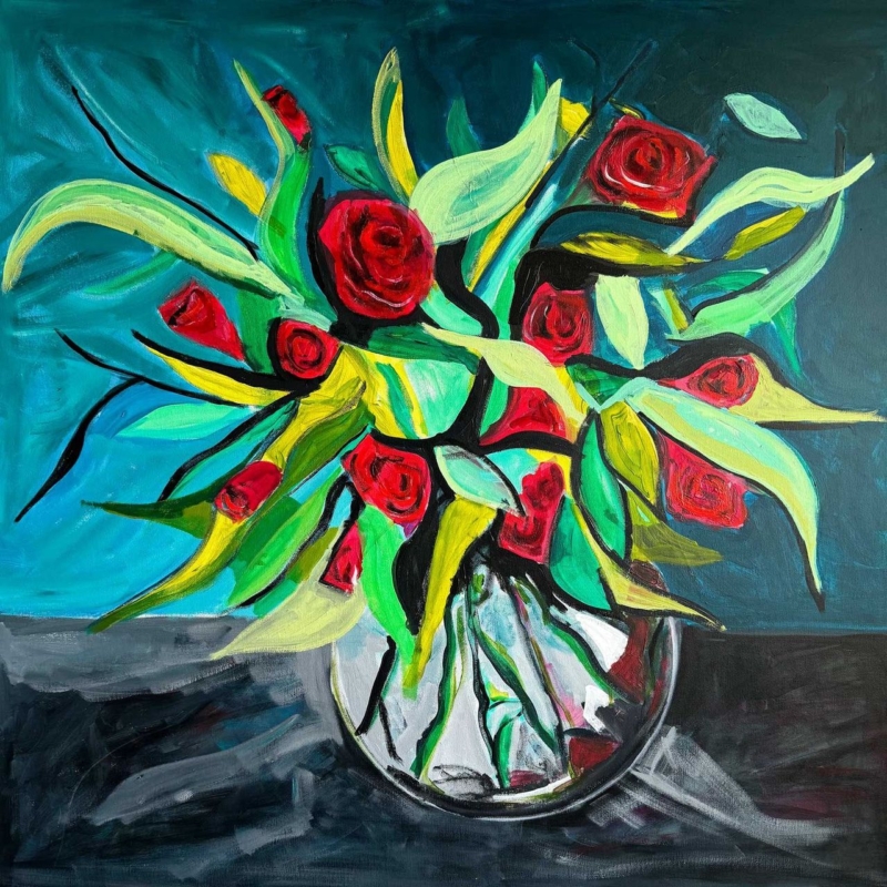
Image of Red Roses by David Short

meaningful gift wall art feels personal when the subject connects with the recipient’s life rather than carrying a generic inscription for one day. Red Roses gives that decision a real subject, proportion and finish to assess.

meaningful gift wall art - Red Roses

Choose meaningful gift wall art through a real connection

Red Roses can suit a keen gardener, someone with a favourite variety, or a person whose home already uses the flower’s richer colour. Ask what the subject means to them. A genuine association gives the picture more staying power than a conventional message.

  • Choose the artwork for the recipient, not only the occasion.
  • Check whether 189 × 275, 350 × 500 or 560 × 780 mm suits their wall.
  • Include the likely frame size when discussing placement discreetly.
  • Keep the product details with the presentation.

The portrait format can work beside a dressing table or above a narrow cabinet. The largest print needs a clearer wall and more viewing distance. Do not assume the most generous gift must be the largest option.

A personal art gift does not need the recipient’s name printed on it; the thought can live in the choice.

Give meaningful gift wall art a lasting finish

Petal colour and quieter surrounding spaces deserve accurate reproduction. Colour-managed Giclée printing keeps the red nuanced rather than flat. Hand-finished framing completed in-house turns the print into a substantial gift ready for a considered place.

If the recipient’s interest is horticultural as well as visual, explore Royal Horticultural Society guidance on roses. Browse the David Short collection, then view the exact product and framing choices.

Meaningful gift wall art should remain relevant after cards and wrapping have gone. Red Roses offers a specific subject, while the right scale and bespoke finish make the thought durable.

Posted on

Wall Art for a Narrow Wall Between Windows: Use L’altra Sponda’s Vertical Rhythm

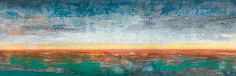
Image of L'altra Sponda by Emily Little

wall art for a narrow wall between windows must fit the complete gap, including curtains, handles and the finished frame rather than paper dimensions alone. L’altra Sponda gives that decision a real subject, proportion and finish to assess.

wall art for a narrow wall between windows - L'altra Sponda

Measure wall art for a narrow wall between windows precisely

  1. Measure the clear plaster between both window trims.
  2. Open curtains or blinds to their normal position.
  3. Mark the full frame around the 120 × 280 and 240 × 560 mm options.
  4. Stand at the entrance and seated viewpoint.
  5. Check window reflections after dark.

L’altra Sponda’s vertical proportion can turn the wall pier into a purposeful pause. The smaller size suits a compact room. The larger option gives more authority, but its outer frame must leave visible wall on both sides.

Protect the edges

Allow curtains to move without rubbing the frame. Check projecting handles and the route used when cleaning the glass.

Control the symmetry

Centre the finished object on the usable pier. Do not move it off the architectural line to compensate for uneven curtains.

Avoid adding a stack of smaller frames. That can make the gap look narrower and create more reflected edges. One well-proportioned piece lets the windows remain the larger feature.

Frame wall art for a narrow wall between windows as one object

A slim composition exposes alignment errors and weak edge definition. Colour-managed Giclée production keeps the image articulate. In-house bespoke framing gives the unusual proportion stability without consuming unnecessary wall width.

For a useful overview of how visual elements are organised, see Tate’s guide to composition. Browse the Emily Little collection, then view the exact product and framing choices.

Wall art for a narrow wall between windows should look chosen for the architecture, not squeezed into a leftover gap. L’altra Sponda offers the right rhythm; measuring makes it convincing.

Posted on

Contemporary Art Prints for a Conversation Corner: Enter the Court of Clowns

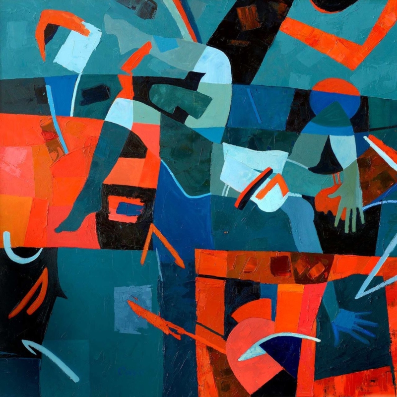
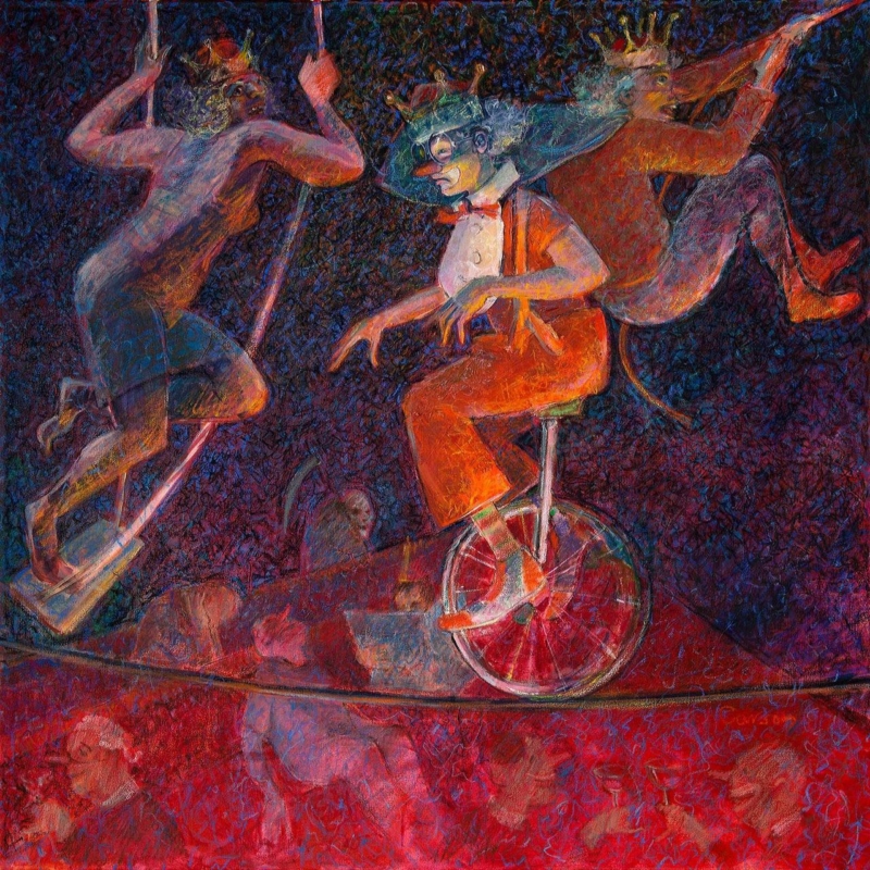
Image of In the Court of Clowns by Fred Carson

contemporary art prints work well in a sociable corner when they invite different readings instead of supplying one decorative answer. In the Court of Clowns gives that decision a real subject, proportion and finish to assess.

contemporary art prints - In the Court of Clowns

Let contemporary art prints invite interpretation

In the Court of Clowns suggests characters, performance and hierarchy without requiring a circus palette. Place it where two chairs or a small sofa encourage people to pause. The picture can begin a conversation while the furniture does its practical job.

Keep the supporting scene quiet

A patterned rug, bright cushions and theatrical ornaments may compete with the work. Choose one subtle colour connection and leave the remaining surfaces calm.

DecisionUseful test
265 mm squareTry it in a close corner with one chair and a focused lamp.
500 mm squareMark the full frame above a wider pair of seats.
Viewing heightSit down before setting the centre.
LightingCheck evening glare from every lamp.
Must the frame look overtly modern?

No. A very thin frame can feel underweight, while an elaborate moulding can turn ambiguity into theatre. Compare finishes against the complete room.

Finish contemporary art prints without explaining them away

An open-ended image depends on tonal and colour detail that remains available for close looking. Colour-managed Giclée printing supports that detail. Hand-finished bespoke framing gives the square work presence without prescribing its meaning.

For a concise account of why contemporary art is broader than one style, read Tate’s introduction to contemporary art. Browse the Fred Carson collection, then view the exact product and framing choices.

Contemporary art prints can make a small conversation area memorable. In the Court of Clowns supplies the question; restrained surroundings leave room for different answers.

Posted on

Isle of Skye Prints With Botanical Character: Style Wild Thistles Carefully

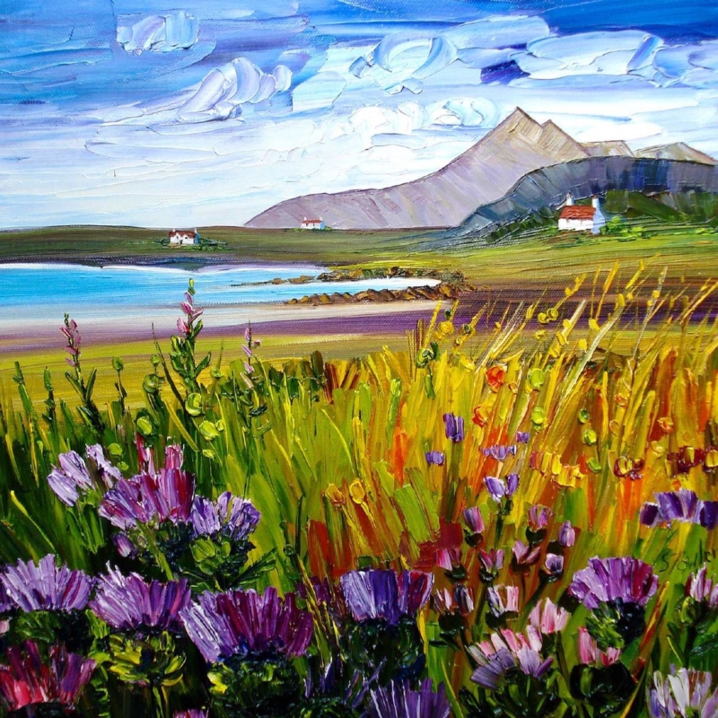
Image of Wild Thistles, Skye by Sheila Fowler

Isle of Skye prints can express the island through plants as convincingly as through a mountain or shoreline view. Wild Thistles, Skye gives that decision a real subject, proportion and finish to assess.

Isle of Skye prints - Wild Thistles, Skye

Choose Isle of Skye prints beyond the expected panorama

Wild Thistles, Skye shifts attention towards resilient Scottish plants. It suits a room where a sweeping scenic view would feel predictable. The botanical subject still carries place, yet it can sit naturally beside contemporary furniture and plain textiles.

Use the 265 mm square

The smaller print can make an intimate focal point above a compact cabinet or beside a reading chair. Mark the finished frame, not only the paper size.

Use the 500 mm square

The larger option can hold a wider wall. Give its square outline space instead of surrounding it with several small flower pictures.

  • Repeat one purple or green note, not the full palette.
  • Keep dried flowers and tartan accessories away from the display.
  • Check daylight so reflections do not hide finer marks.
  • Let the named place provide the Scottish connection.

A botanical island picture can feel rooted in Scotland without turning the room into a Highland theme.

Frame Isle of Skye prints to preserve botanical detail

Thistle heads, stems and surrounding colour need clear separation at either square size. Colour-managed Giclée production retains those relationships. Bespoke framing completed in-house gives the composition a firm boundary without making it formal.

For wider context on Scotland’s varied plant life, explore NatureScot’s introduction to flowering plants. Browse the Sheila Fowler collection, then view the exact product and framing choices.

Isle of Skye prints can describe more than a famous horizon. Wild Thistles brings island character through close observation, while edited colour and careful framing keep it fresh.

Posted on

Black and White Framed Prints for a Colourful Hallway: Start With The Grassmarket

Black and white watercolor print titled "The Grassmarket," depicting old European-style buildings with gabled roofs fading into a cloudy sky, capturing the area’s historic charm.

black and white framed prints can provide visual structure where painted walls, doors and passing views already bring plenty of colour. The Grassmarket provides a specific subject, scale and mood to test in the room.

black and white framed prints - The Grassmarket

Let black and white framed prints steady strong colour

Ismael Pinteño Visuara’s view of The Grassmarket uses architectural line and tonal contrast to describe a recognisable Edinburgh place. Against deep blue, green, ochre or warm red paint, that restraint can create a pause without introducing another competing palette.

  1. Stand at the front door and identify the first uninterrupted wall.
  2. Mark the full framed outline clear of switches and door swings.
  3. Walk the route carrying a bag or coat to check shoulder clearance.
  4. Test the glazing under ceiling lights and daylight.
  5. Remove nearby monochrome signs or small frames before judging balance.

Choose contrast deliberately

A black frame can sharpen the drawing, but it may look severe on a very dark wall. A lighter mount or timber edge can create separation. The best choice relates to the actual print and paint rather than a rule that monochrome work must have a black frame.

A hallway rewards close looking, so keep the image at a comfortable passing height. Avoid centring it on the total wall if a console, radiator or doorway shifts the usable visual field. Align the complete arrangement people actually see.

One detailed city view can calm a colourful route more effectively than a grid of unrelated monochrome images.

Frame black and white framed prints for close viewing

Fine architectural lines and tonal washes reveal weak reproduction quickly. Colour-managed Giclée printing protects subtle greys as well as deep darks, while bespoke framing completed in-house creates a precise boundary suitable for repeated close viewing.

For the history and urban context of the place depicted, explore Edinburgh World Heritage on the Grassmarket. Browse the Ismael Pinteño Visuara collection, then see the exact product and framing choices.

Black and white framed prints do not require a neutral room. The Grassmarket can organise a colourful hallway through line and place, while practical spacing keeps the route clear and contemporary.

Posted on

Floral Wall Art for a South-Facing Dining Room: Keep Red Flowers Fresh

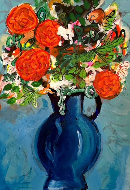
Image of Red Flowers in a Glass Bowl by David Short

floral wall art for a south-facing dining room can use the room’s brightness, but the picture still needs protection from direct sun and relief from too many competing patterns. Red Flowers in a Glass Bowl provides a specific subject, scale and mood to test in the room.

floral wall art for a south-facing dining room - Red Flowers in a Glass Bowl

Place floral wall art for a south-facing dining room carefully

Daylight issuePractical response
Direct sun on the wallChoose a protected return wall or use blinds during the strongest hours.
Window reflected in glazingTest the marked position from every dining chair.
Colour feels too intenseUse plain table linen and quieter surrounding paint.
Picture disappears at nightAdd controlled lighting that does not create a bright hotspot.

Red Flowers in a Glass Bowl comes in 265, 500 and 800 mm square print sizes. The smallest can suit an intimate breakfast table. The middle size can anchor a standard sideboard, while the largest needs a broad clear wall and a careful check of the final frame.


Let the painted flowers carry the main red note. Repeating it in curtains, chair fabric, tableware and a rug can make a sunny room feel visually hot. One small echo in a bowl or napkin is often enough to connect the picture with the table.

Can a bright room take a dark frame?

Possibly, especially if it gives the still life a clean boundary. Compare it with the wall, table and image in both daylight and evening light instead of assuming a pale frame is always safer.

Protect floral wall art for a south-facing dining room

Strong red, quieter vessel tones and small floral marks require dependable colour separation. Colour-managed Giclée production keeps the still life articulate, while hand-finished framing gives it a stable edge in a bright, frequently used room.

For context on the long tradition of making flowers and everyday vessels the focus of art, read the Tate introduction to still life. Browse the David Short collection, then see the exact product and framing choices.

Floral wall art for a south-facing dining room should feel lively, not overheated. Red Flowers supplies the focal colour, while protected placement and edited textiles keep the dining space fresh.

Posted on

How Large Should Artwork Be Above a Sofa? Use Evening Horizon to Test Width

Image of Evening Horizon by Emily Little

how large should artwork be above a sofa is best answered with the actual furniture and finished frame, not a universal percentage copied from a diagram. Evening Horizon provides a specific subject, scale and mood to test in the room.

how large should artwork be above a sofa - Evening Horizon

How large should artwork be above a sofa in your room?

Evening Horizon is available at 560 × 180 mm and 900 × 310 mm before framing. Both are notably horizontal. That proportion can echo a sofa without demanding a very tall display zone, which is helpful in rooms with a low ceiling, picture rail or wall lights.

Test the 560 mm print

It may suit a compact two-seat sofa or an arrangement where lamps already occupy both sides. Centre it on the furniture grouping, not automatically on the wall.

Test the 900 mm print

It can carry a longer sofa more confidently. Add the planned frame width to every edge before deciding that the larger print will fit.

  • Mark the complete frame with low-tack tape or paper.
  • Sit down to check comfortable headroom and viewing height.
  • Include the visual width of side tables and floor lamps.
  • Open curtains and switch on lamps to reveal reflections.
  • Check the arrangement from the doorway and adjacent seats.

The right width belongs to the complete furniture group; it is not a calculation based on the sofa alone.

Use the frame to answer how large artwork should be above a sofa

A slim horizon relies on fine tonal changes across a long composition. Colour-managed Giclée production preserves that continuity, while bespoke framing gives the image enough structure to hold the furniture line without adding unnecessary height.

For broader context on how landscape can be interpreted rather than simply documented, see the Tate guide to landscape art. Browse the Emily Little collection, then see the exact product and framing choices.

The answer to how large should artwork be above a sofa changes with the room. Evening Horizon offers two useful widths, and a full-size frame outline turns a vague rule into a decision you can see.

Posted on

Extra Large Framed Wall Art for a Double-Height Space: Test Fallen Angel I

Image of Fallen Angel I by Fred Carson

extra large framed wall art must connect the architecture with the people using it; sheer size alone will not resolve a tall wall. Fallen Angel I provides a specific subject, scale and mood to test in the room.

extra large framed wall art - Fallen Angel I

Scale extra large framed wall art from real viewpoints

  1. Mark the outer frame around the 265, 500 and 800 mm square print choices.
  2. View each outline from the main sofa and the room entrance.
  3. Check it again from any upper landing or mezzanine.
  4. Add the furniture, lamps and plants that normally occupy the wall.
  5. Photograph the options at eye level before selecting a scale.

Fallen Angel I has an ambiguous title and square format that reward a slower look. The 800 × 800 mm print may suit a broad wall, but its finished frame will be larger. A 500 × 500 mm version can feel more deliberate if the wall includes a console, stair line or architectural opening.

Do not hang only for the upper void

A picture centred in the full wall height can feel disconnected from the seating below. Relate its lower edge to the occupied part of the room, then confirm that the composition still reads from upstairs.

Leave enough negative space for the square outline to register. Several small objects beneath an already expressive piece can weaken its impact. One low furniture line or a clear wall often provides the stronger relationship.

Specify extra large framed wall art as one object

At larger scale, tonal transitions and edge detail become more visible. Colour-managed Giclée production keeps the image coherent, while in-house bespoke framing allows the moulding, mount and final weight to be considered as part of the artwork rather than an afterthought.

For a useful starting point when looking at non-literal imagery and form, read the Tate introduction to abstract art. Browse the Fred Carson collection, then see the exact product and framing choices.

Extra large framed wall art succeeds when it feels connected to the room at human height. Fallen Angel I offers scale choices; measured outlines and several viewpoints reveal which one truly belongs.

Posted on

Art for Maple Furniture: Balance Cottages at Blaven With Pale Timber

Image of Cottages at Blaven, Skye by Sheila Fowler

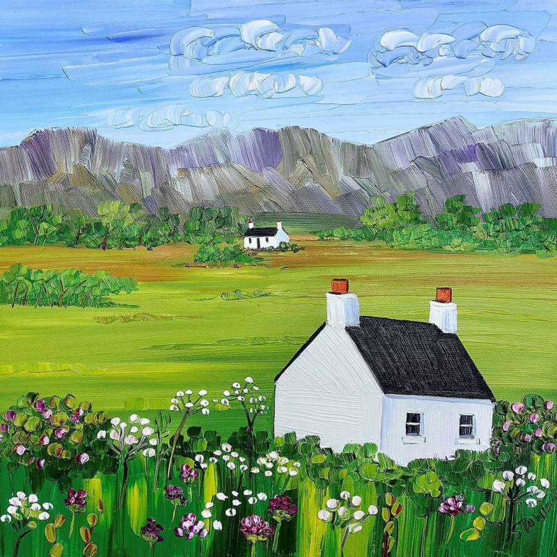
art for maple furniture needs enough tonal definition to stop a pale room feeling faded, yet it should still respect the timber’s quiet grain and warmth. Cottages at Blaven, Skye provides a specific subject, scale and mood to test in the room.

art for maple furniture - Cottages at Blaven, Skye

Use art for maple furniture to create depth

Cottages at Blaven, Skye introduces a recognisable island landscape within a square composition. The view can extend the room beyond a pale sideboard or dining table. Let the artwork provide the scenic detail rather than adding several rustic ornaments around it.

Room elementUseful response
Pale maple cabinetTest the full frame above it, leaving a visible band of wall.
Warm white paintChoose an edge that separates the print without looking harsh.
Strong daylightMove the picture out of direct sun and check glazing reflections.
Natural fabricsKeep pattern quiet so the landscape remains the destination.

The 265 × 265 mm print can make an intimate focal point over a narrow cabinet or in a reading corner. The 500 × 500 mm option has more authority above wider furniture. In both cases, compare the outer framed dimensions rather than judging from print size alone.

Should the frame match the maple exactly?

Not automatically. A close but imperfect timber match can look accidental. Compare a deliberately contrasting edge, a painted moulding and a sympathetic natural finish against the actual furniture and wall.

Finish art for maple furniture with a clear boundary

A landscape beside pale timber depends on subtle separation between sky, cottages, mountain and foreground. Colour-managed Giclée printing retains those relationships, while bespoke framing can provide definition without making a light room feel heavy.

For geographical context behind the mountain in the title, visit the Isle of Skye guide to Blà Bheinn. Browse the Sheila Fowler collection, then see the exact product and framing choices.

Art for maple furniture should add depth rather than cover every quiet surface with colour. Cottages at Blaven brings a strong destination, while careful scale and framing let the pale timber remain part of the scheme.

Posted on

A Scottish Housewarming Gift With Wit: Choose One Phrase That Fits

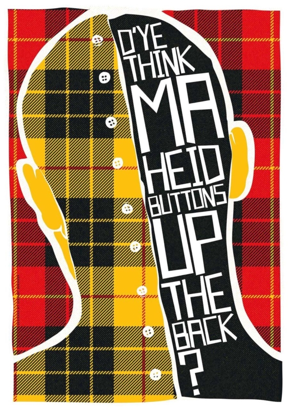
Image of D'Ye Think Ma Heid Buttons Up the Back? by Stewart Bremner

Scottish housewarming gift works best when it reflects the new homeowner’s own humour instead of relying on a generic address, date or tartan motif. D’Ye Think Ma Heid Buttons Up the Back? provides a specific subject, scale and mood to test in the room.

Scottish housewarming gift - D'Ye Think Ma Heid Buttons Up the Back?

Make a Scottish housewarming gift personal, not generic

The question in this Stewart Bremner print is playful, recognisable and gently incredulous. Before buying it, imagine the recipient actually saying it. A phrase with a real connection will remain funny after moving boxes disappear; a random slogan may not.

Choose 420 × 594 mm

The smaller portrait print can suit a kitchen dining corner, compact hall or wall beside a bookcase. Mark the outer frame before choosing the position.

Choose 594 × 840 mm

The larger option needs a clear focal wall. It can greet people in a sociable kitchen or living space without being surrounded by more lettering.

  • Check that the wording suits the recipient, not only the giver.
  • Measure the complete framed outline in the new home.
  • Keep other signs and quotations away from the display wall.
  • Place it clear of kitchen steam, splashes and chair impact.

A lasting gift can be humorous without turning the whole room into a collection of slogans.

Frame a Scottish housewarming gift for the new home

Crisp lettering needs clean reproduction and a frame with enough presence for the selected size. Colour-managed Giclée production keeps the graphic detail clear, while hand-finished framing completed in-house makes the gift ready for a permanent place rather than temporary display.

To explore the meaning and history of Scots words beyond novelty translations, use Dictionaries of the Scots Language. Browse the Stewart Bremner collection, then see the exact product and framing choices.

A Scottish housewarming gift should say something recognisable about the person receiving it. This phrase supplies the wit; an appropriate size, clear wall and bespoke finish give it staying power.