Posted on

Why Bay of A Thousand Names Works Beautifully as Wall Art for Whitewashed Interiors

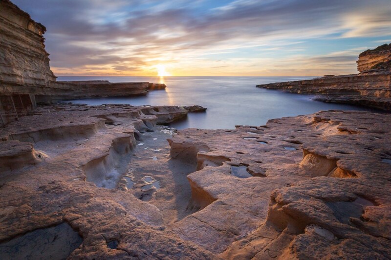
Image of Bay of A Thousand Names by Noel Fenech Photography

Choosing wall art for whitewashed interiors is often less straightforward than it seems. Whitewashed rooms can feel calm and spacious, but they can also end up looking slightly unfinished if the artwork does not bring enough depth, atmosphere, and visual weight. Bay of A Thousand Names is especially effective because it adds presence while keeping the room airy and easy to live with.

Why lighter interiors need warmth as well as simplicity

Whitewashed walls usually work best when the rest of the room relies on texture, daylight, and a few carefully judged focal points. That means the artwork has an important role. It should add character and help anchor the space, but it should not disrupt the quieter palette that makes the room feel restful in the first place.

Bay of A Thousand Names does that beautifully. The coastal subject matter keeps the mood open and relaxed, while the tones and movement stop the wall from feeling too flat or too stark. It is the kind of piece that helps a pared-back room feel designed rather than merely minimal.

  • It adds atmosphere without making the room feel visually heavy.
  • It suits spaces built around natural light, pale woods, and simple finishes.
  • It helps a cleaner interior scheme feel warmer and more complete.

Why a hand-finished framed piece makes the difference

In a restrained room, presentation matters even more. First 4 Frames completes each piece in-house in Falkirk using bespoke framing, colour-managed Giclee printing, and hand-finished craftsmanship. That level of finish gives the artwork the polish it needs to hold its place in a room where every detail is more noticeable.

You can explore more work by Noel Fenech Photography and view the exact framed print here.

If you are looking for wall art for whitewashed interiors that feels calm, warm, and properly considered, Bay of A Thousand Names is a very strong choice.

Posted on

Why Peter’s Pool Is Such a Calm Coastal Wall Art Choice

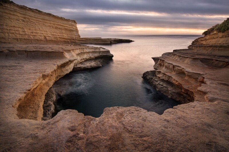
Image of Peter's Pool by Noel Fenech Photography

A lot of coastal wall art leans too hard on obvious nautical signals. Buyers often want something calmer and more refined than that. Peter’s Pool stands out because it uses stone, water, and evening light to create openness without relying on a decorative seaside formula.

The result feels expansive and clean, which makes it easier to place in a home that wants coastal influence without becoming themed.

What Makes This Piece Feel Different

The sculpted limestone gives the image shape and texture, while the still water keeps the whole composition settled. That balance is useful in interiors that need a little more air and movement, but not a louder focal point.

  • It brings coastal character through mood and material rather than novelty.
  • It helps lighter rooms feel more spacious and resolved.
  • It keeps the wall fresh without becoming overstyled.

Best Rooms For This Sort Of Coastal Piece

Peter’s Pool would sit naturally in a bathroom, bedroom, landing, or relaxed sitting room where pale finishes and daylight already do much of the visual work. It is also useful in rooms with stone, linen, or sand-toned textiles because the artwork echoes those materials without blending away.

When the room needs calm rather than more activity, one framed image like this often works better than several smaller coastal accents.

Why Bespoke Framing Keeps It Polished

Subtle coastal photography can look underpowered if the finish is generic. First 4 Frames completes the framing and colour-managed Giclee production in-house, which helps quieter work like this retain presence once it is on the wall.

You can see the exact framed product here, and explore more from Noel Fenech Photography if you enjoy coastal photography with the same calm, sculptural feel.

If you want coastal wall art that feels airy, grown up, and easy to live with, Peter’s Pool is a very convincing choice.