Posted on

Why Summer Lingers On Works Beautifully as Art for Olive Green Walls

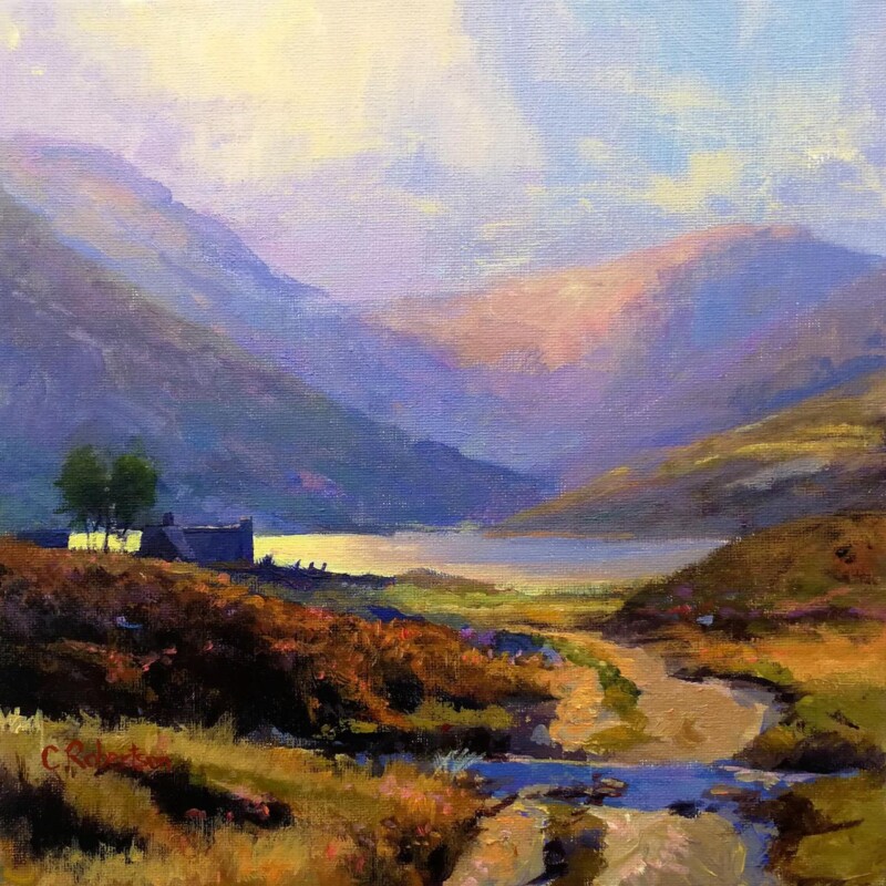
Image of Summer Lingers On by Colin Robertson

Finding the right art for olive green walls is often about balance. Olive green has depth and sophistication, but it can also pull a room towards feeling too earthy if the artwork nearby does not bring enough light or movement. Summer Lingers On is a particularly good answer because it adds freshness while still sitting comfortably within a richer palette.

What olive green needs from the artwork around it

Green walls usually look best when the artwork helps the colour feel intentional rather than dominant. The aim is not to fight the paint choice, but to stop the room becoming too uniform or heavy. One well-chosen framed print can do that very effectively.

  • It suits bedrooms, sitting rooms, and dining spaces with richer painted walls.
  • It adds lift without losing the room’s calm mood.
  • It helps a stronger colour choice feel polished rather than overcommitted.

Why Summer Lingers On is such a useful match

The image carries warmth and atmosphere, yet it still feels airy enough to keep the wall colour from closing in. That is exactly what helps olive green feel elegant rather than slightly over-saturated.

First 4 Frames completes each piece in-house in Falkirk using bespoke framing, colour-managed Giclee printing, and hand-finished craftsmanship. That superior presentation helps the artwork hold its own against a confident wall colour and quality furnishings.

You can explore more from Colin Robertson and view the exact framed product here.

If you need art for olive green walls that feels balanced, fresh, and fully at ease in a deeper scheme, Summer Lingers On is an excellent fit.

Posted on

Why Golden Cascade Falls of Dochart Works Beautifully as Art for Dark Wood Furniture

Image of Golden Cascade, Falls of Dochart by Colin Robertson

Well chosen art for dark wood furniture should complement the depth of the timber without leaving the room feeling heavy. Darker wood pieces bring wonderful substance to a space, but they can also make the palette feel weightier unless the artwork introduces some movement and lift. Golden Cascade Falls of Dochart handles that balance especially well.

Why richer timber needs artwork with enough light in it

Walnut, mahogany, stained oak, and other darker woods often give a room confidence and maturity. The wall art should respect that, yet still stop the scheme from feeling too closed in. A framed print with atmosphere, contrast, and flow can do exactly that.

Golden Cascade Falls of Dochart brings energy and tonal variation in a way that helps darker joinery and furniture feel more alive. It supports the richness of the room without adding extra visual weight.

  • It suits sitting rooms, studies, and dining spaces with substantial timber furniture.
  • It adds lift without undermining the room’s sense of depth.
  • It helps a darker scheme feel layered rather than slightly dense.

Why the finished presentation matters

First 4 Frames produces every piece in-house in Falkirk with bespoke framing, colour-managed Giclee printing, and hand-finished craftsmanship. That superior quality matters in rooms with darker woods, where poor framing quickly looks flat beside stronger materials.

This artwork is by Colin Robertson, and you can view the exact framed product here.

If you want art for dark wood furniture that feels bright enough to balance a richer interior while still looking entirely at home in it, Golden Cascade Falls of Dochart is a very strong fit.

Posted on

Bidean Nam Bian, Glencoe and the Challenge of Art for Slate Floors

Image of Bidean Nam Bian, Glencoe by Colin Robertson

Finding the right art for slate floors is often about protecting depth without letting the room become too heavy. Slate brings beautiful natural texture and a sense of permanence, but it can also make a scheme feel cooler if the artwork above it does not add enough warmth and atmosphere. Bidean Nam Bian, Glencoe handles that beautifully.

Why darker natural materials need balance

Rooms with slate underfoot often look grounded and well made, yet they benefit from artwork that introduces softness and visual lift. The aim is not to fight the flooring, but to stop the overall scheme from feeling too still or dense.

  • It suits kitchens, garden rooms, and sitting rooms with natural stone flooring.
  • It adds atmosphere without undermining the room’s stronger materials.
  • It helps a grounded scheme feel richer and more complete.

Why Bidean Nam Bian, Glencoe answers the brief

The image carries enough movement and openness to offset the weight of stone, while still feeling calm and properly resolved. That makes it a practical choice for rooms that want character without a hard edge.

First 4 Frames completes each piece in-house in Falkirk using bespoke framing, colour-managed Giclee printing, and hand-finished craftsmanship. That superior quality suits interiors where tactile materials and careful finishing already matter.

You can explore more work by Colin Robertson and view the exact framed product here.

If you are searching for art for slate floors that feels warm, balanced, and naturally suited to a more grounded room, Bidean Nam Bian, Glencoe is an excellent fit.

Posted on

First Light and the Quiet Value of Wall Art Above a Dining Room Sideboard

Image of First Light by Colin Robertson

A sideboard wall often ends up as one of the most important blank areas in the dining room. The right wall art above a dining room sideboard should give that wall enough presence to support the furniture below, while still keeping the room relaxed and sociable. First Light does that with real ease.

Why this part of the dining room matters

Sideboards naturally collect lamps, serving pieces, flowers, and practical essentials, so the art above them needs to bring order rather than more fuss. One well-chosen framed work can turn the whole arrangement into a focal point and make the room feel much better resolved.

Why First Light feels right for the job

The image has enough mood to anchor the furniture, but it also keeps a dining room feeling open and welcoming. That balance is especially useful in rooms used both for ordinary family meals and for having people over.

  • It suits dining rooms, kitchen dining spaces, and open-plan eating areas.
  • It adds presence without making the room feel formal or overworked.
  • It helps a sideboard arrangement look intentional and complete.

First 4 Frames produces every piece in-house in Falkirk using bespoke framing, colour-managed Giclee printing, and hand-finished craftsmanship. That superior finish helps the artwork hold its own beside furniture and table settings chosen with care.

This artwork is by Colin Robertson, and you can view the exact framed product here.

If you want wall art above a dining room sideboard that feels welcoming, balanced, and properly finished, First Light is an excellent choice.

Posted on

Why Towards Easdale Works So Well as Wall Art for Sisal Carpet

Image of Towards Easdale by Colin Robertson

Rooms with sisal underfoot often feel calm, natural, and well judged, but they can also lean a little dry if the wall art does not add enough atmosphere. The best wall art for sisal carpet should support that natural texture while bringing some depth back into the room. Towards Easdale is particularly good at this.

Where natural flooring can leave a gap

Sisal is admired because it feels honest and textural, yet that same restraint means the room often benefits from one framed piece that introduces mood and visual softness. The aim is not to fight the flooring, but to help the overall scheme feel richer and more composed.

  • It suits bedrooms, sitting rooms, and hallways with natural flooring.
  • It adds depth without losing the room’s understated quality.
  • It helps textured materials feel more intentional and complete.

Why Towards Easdale earns its place

The image carries enough atmosphere to balance the dryness that sisal can sometimes introduce, but it still feels measured and easy to live with. That makes it a very practical choice for interiors that want natural character without a sparse finish.

First 4 Frames completes each piece in-house in Falkirk using bespoke framing, colour-managed Giclee printing, and hand-finished craftsmanship. That superior presentation works especially well in rooms where tactile materials and careful finishing are part of the appeal.

You can explore more work by Colin Robertson and view the exact framed product here.

If you are searching for wall art for sisal carpet that feels balanced, natural, and properly resolved, Towards Easdale is a very good fit.

Posted on

Bidean from the River Coe and the Appeal of Wall Art for Russet Accents

Image of Bidean from the River Coe by Colin Robertson

Choosing wall art for russet accents is often about balance. Russet tones can make a space feel rich, welcoming, and cocooning, but they also need artwork that keeps the room from tipping into something too dark or too season-bound. Bidean from the River Coe brings exactly that kind of balance.

Why richer colour schemes need a steadier focal point

Warm accent colours are at their best when they feel layered rather than loud. One well-chosen framed piece can connect deeper upholstery, cushions, or textiles while still giving the eye somewhere calm to settle.

  • It suits sitting rooms, studies, and bedrooms with warmer textile accents.
  • It adds atmosphere without making the palette feel too dense.
  • It helps richer colours feel considered and lived with rather than theme led.

Why Bidean from the River Coe feels so effective

The landscape has presence and tonal depth, but it still feels composed rather than dramatic for its own sake. That makes it easier to place in a room where warmth already exists and the artwork needs to refine it rather than compete with it.

Craftsmanship that supports the room

First 4 Frames produces each piece in-house in Falkirk using bespoke framing, colour-managed Giclee printing, and hand-finished craftsmanship. That superior presentation helps the finished artwork hold its own beside stronger fabrics, timber tones, and layered soft furnishings.

This artwork is by Colin Robertson, and you can view the exact framed product here.

If you need wall art for russet accents that feels warm, grounded, and easy to live with, Bidean from the River Coe is a strong choice.

Posted on

Why Resting Boats Works Beautifully as Wall Art for Painted Panelling

Image of Resting Boats by Colin Robertson

Good wall art for painted panelling should work with the architecture rather than fight it. Painted panelling gives a room shape and structure, but it can also make the walls feel more formal unless the artwork introduces some ease. Resting Boats is especially effective because it brings calm and openness without losing definition.

Why panelled rooms need a little softness

Joinery brings welcome detail, yet it also creates lines, edges, and repetition. Artwork can balance that by introducing atmosphere and a more relaxed focal point. The aim is not to erase the character of the room, but to stop it feeling overly mannered.

  • It suits dining rooms, stair halls, and sitting rooms with painted panelling.
  • It softens stronger architectural lines.
  • It helps a traditional room feel lighter and more lived in.

Why Resting Boats feels so successful

The composition has enough clarity to stand up to a detailed wall treatment, but the overall mood remains calm. That makes it ideal where the room already has structure and simply needs a more relaxed centre of attention.

Why the First 4 Frames finish matters

First 4 Frames completes every piece in-house in Falkirk using bespoke framing, colour-managed Giclée printing, and hand-finished craftsmanship. That superior presentation helps the finished piece feel worthy of a room with thoughtful joinery and traditional detail.

This artwork is by Colin Robertson, and you can view the exact framed product here.

If you are looking for wall art for painted panelling that feels composed, gentle, and timeless, Resting Boats is a lovely option.

Posted on

Where Silence Speaks and the Appeal of Quiet Sitting Room Wall Art

Image of Where Silence Speaks by Colin Robertson

The right quiet sitting room wall art should help the room breathe. A quieter sitting room usually asks for less visual noise, but that does not mean the walls should feel bare or undecided. Where Silence Speaks is a strong choice because it adds depth and atmosphere while still keeping the room calm.

Why quieter rooms need confidence rather than clutter

When a room is meant for slower evenings, reading, or conversation, too many decorative decisions can work against the mood. One carefully chosen framed print often does more for the space than several smaller gestures.

  • It suits sitting rooms, upstairs lounges, and restful evening spaces.
  • It brings atmosphere without overcomplicating the wall.
  • It helps a quieter room feel finished rather than sparse.

Why Where Silence Speaks is so well suited

The composition carries calm movement and enough tonal richness to hold the eye gently. That is especially useful in a room where comfort matters more than drama, but where quality still matters a great deal.

Why craftsmanship improves the mood

First 4 Frames produces each piece in-house in Falkirk using bespoke framing, colour-managed Giclée printing, and hand-finished craftsmanship. That superior finish gives the work the quiet presence a more restful sitting room needs.

This artwork is by Colin Robertson, and you can view the exact framed product here.

If you are looking for quiet sitting room wall art that feels calm, substantial, and easy to live with, Where Silence Speaks is an excellent fit.

Posted on

Blue Thunder, The River Dee and the Appeal of Salmon Fishing Lodge Wall Art

Image of Blue Thunder, The River Dee by Colin Robertson

Choosing salmon fishing lodge wall art is usually about restraint as much as relevance. A fishing lodge or river-facing room benefits from artwork that reflects its setting, but the piece still needs enough refinement to avoid feeling predictable. Blue Thunder, The River Dee stands out because it carries energy and place without becoming obvious sporting décor.

Why lodge interiors need more than the expected motifs

Rooms shaped by fishing, country pursuits, or river settings can quickly feel over-themed if every visual choice leans too literally on the subject. The strongest artwork acknowledges the setting while still feeling like part of a well-finished interior.

  • It suits fishing lodges, country guest spaces, and river-view sitting rooms.
  • It adds movement and atmosphere without becoming heavy handed.
  • It gives the room a clearer sense of place.

Why Blue Thunder, The River Dee feels so well judged

The artwork captures energy and flow in a way that feels alive rather than decorative. That makes it especially useful in a room where the subject matters, but where the overall standard of presentation matters just as much.

Why craftsmanship makes the difference

First 4 Frames produces each piece in-house in Falkirk using bespoke framing, colour-managed Giclée printing, and hand-finished craftsmanship. That superior finish helps the artwork sit comfortably in a quality-led setting where detail is already part of the appeal.

This artwork is by Colin Robertson, and you can view the exact framed product here.

If you are looking for salmon fishing lodge wall art that feels rooted, polished, and genuinely atmospheric, Blue Thunder, The River Dee is an excellent fit.

Posted on

Why The Roman Bridge, Glen Lyon Works So Well as Wall Art for an Entrance Hall With Stone Flooring

Image of The Roman Bridge, Glen Lyon by Colin Robertson

Choosing wall art for an entrance hall with stone flooring is usually about warmth. Stone underfoot can look beautiful and durable, but it can also make the entrance feel slightly hard if the walls are too quiet. The Roman Bridge, Glen Lyon is a strong fit because it softens that first impression while still feeling grounded enough for the space.

Why entrances need more than practicality

An entrance hall has a working job to do, but it also sets the tone for the house. When flooring is stone or stone-effect, the wall art becomes especially important because it can bring some welcome flow and personality into an otherwise harder scheme.

  • It suits entrance halls, vestibules, and garden-facing back halls with harder flooring.
  • It adds welcome softness without feeling out of place.
  • It helps the home’s first impression feel more considered.

Why The Roman Bridge, Glen Lyon works in that role

The landscape has enough calm movement to loosen the harder materials in the space. That makes it especially effective where flooring, doors, and practical finishes might otherwise make the entrance feel more functional than inviting.

Why a superior framed finish improves the result

First 4 Frames completes every piece in-house in Falkirk using bespoke framing, colour-managed Giclée printing, and hand-finished craftsmanship. That superior finish helps the artwork look purposeful from the moment someone steps through the door.

This artwork is by Colin Robertson, and you can view the exact framed product here.

If you need wall art for an entrance hall with stone flooring that feels welcoming, balanced, and easy to place, The Roman Bridge, Glen Lyon is an excellent option.