Posted on

Bedroom Wall Art for a Teen Skiing Fan: Downhill Racers

“Downhill Racers” depicts a whimsical winter scene with skiers racing snowy slopes, friends by a cottage with smoke from the chimney, snow-covered peaks and bare trees in the background beneath a blue sky and crescent moon.

bedroom wall art works best when the picture answers a practical question about the room. Downhill Racers is useful because Rob Hain’s crowded snowy slope turns skiing into a lively community scene rather than a posed athlete or generic slogan.

bedroom wall art - Downhill Racers

Place bedroom wall art beside the active zone

A fast, detailed image does not need to face the bed. Try it near the desk, equipment storage or entry wall. That position connects the energy with daytime activity and leaves the sleeping sightline calmer. Keep the frame clear of cupboard doors, jackets and bags.

Make the room personal, not themed

  • Repeat one snow, sky or clothing colour in a plain textile.
  • Store goggles and helmets instead of displaying every item.
  • Leave wall around the picture so the figures read clearly.
  • Ask the young person which viewpoint fits their experience.

The work can mature with the room because its subject is an activity and social story, not an age-specific cartoon. Avoid piste signs, slogan cushions and multiple skiing posters around it.

Choose bedroom wall art with durable presentation

Small racers, tracks and winter colours need clarity rather than exaggerated contrast. Colour-managed Giclée printing preserves the detail, while bespoke framing gives a busy image a controlled edge.

For useful context, visit Snowsport Scotland’s participation resources. Browse the Rob Hain collection, or inspect the exact product and framing choices.

Bedroom wall art for a teenage skiing fan should acknowledge the interest and still support a usable room. Downhill Racers supplies movement; thoughtful zoning keeps sleep and study settled.

Posted on

Bedroom Wall Art With a Softer Wildlife Mood: Live With Hares

Hares features two expressive hares amid grass in a dreamy, watercolor-style forest scene, with soft pastel pink, blue, and green hues blending into the background.

bedroom wall art works best when the subject solves a real decorating or buying question. Hares offers a useful example because two expressive hares sit among grass in a dreamlike forest of soft pink, blue and green rather than a hard-edged sporting scene.

bedroom wall art - Hares

Place bedroom wall art where the day slows down

The wall opposite the bed is often more valuable than the space above the headboard. It can be seen while settling at night and again on waking. Place the pair at a comfortable resting eye line, then check whether a tall chest, television or open door interrupts the scene.

Work with the paired subject

Two hares create quiet companionship. Give them one generous position instead of splitting the mood across several small wildlife pictures.

Use colour sparingly

Lift one faded pink, blue or green into bedding. Neutral layers can carry the rest of the room without copying the whole forest palette.

Test the proposed wall under the bedside lamps, not only at midday. A low, warm light should reveal the animals without producing a bright reflected patch. Keep the area beneath free from piles of clothing or high decorative objects that would disturb the quieter lower edge.

  • Avoid a full woodland theme of branches, mushrooms and animal motifs.
  • Keep direct morning sun away from the finished artwork.
  • Include the mount and moulding when making a paper template.
  • Judge the picture from both sides of the bed.

Let bedroom wall art retain its gentle colour

Soft washes and expressive animal detail need careful reproduction. Colour-managed Giclée printing supports the pastel transitions, while accurate mounting and bespoke in-house framing keep the dreamlike image composed rather than faint.

For natural-history context about the animal, read the Scottish Wildlife Trust’s brown hare profile. Browse the Lee Scammacca collection, or view the exact framed product and its options.

Bedroom wall art should reward a slower look. Hares brings companionship and wildlife character to the room, while gentle light and edited styling preserve the restful mood.

Posted on

Bedroom Wall Art That Keeps the Morning Calm: The Sound of Mull

Image of The Sound of Mull by Arie Vardi

bedroom wall art is easiest to choose when the room, wall and mood are considered together. The Sound of Mull offers a practical example: its quiet water and spacious composition can support rest while still giving the room a meaningful focal point

bedroom wall art - The Sound of Mull

Choose bedroom wall art by its after-dark character

Artwork that looks attractive in bright daylight may feel too forceful beside bedside lighting. Look for a composition with open area to remain restful at night, then test the wall colour and frame beside the actual lamp.

CheckWhat to look for
PlacementAvoid glare across the pillow sightline.
ScaleRelate the finished width to the bed.
ColourChoose one quiet echo rather than matching every tone.

Make the finish part of the restful mood

Subtle water and sky require careful tonal control. Colour-managed Giclée production preserves that restraint, and in-house bespoke framing provides a polished edge without unnecessary visual weight.

Discover more about Mull through Visit Mull and Iona. For more work by Arie Vardi, browse the artist collection or view the exact product.

The best bedroom wall art gives the room a gentle final view at night and a positive first view in the morning. The Sound of Mull achieves that through space, light and quiet character.

Posted on

Bedroom Wall Art Can Feel Dark Without Feeling Heavy: Northern Lights

The Northern Lights illuminate the night sky above a tranquil, rocky shore with distant snow-capped mountains beneath a clear expanse of stars.

Bedroom wall art does not have to be pale to feel restful. Northern Lights sets luminous aurora and stars above a dark rocky shore, open water, and distant snow-capped mountains. The broad sky creates depth, so the darker palette never feels enclosed.

bedroom wall art - Northern Lights

Balance dark bedroom wall art with points of light

DecisionUseful approach
Wall colourSoft grey, muted blue, or warm off-white lifts the illuminated sky.
Frame toneA slim dark edge adds definition; natural timber prevents too much coolness.
LightingUse low side light instead of a spotlight reflected in the glazing.

Position the work where it can be enjoyed from the bed, but avoid an uncovered window opposite. Reflections can erase the stars by day. A side wall or carefully angled lamp protects the quieter detail.


One inky cushion or subtle green-grey throw is sufficient. The room will feel calmer when the photograph remains the main source of drama.

First 4 Frames offers colour-managed printing and bespoke framing from its Falkirk workshop. Tonal control keeps the black shoreline, blue night, green light, and fine stars separate instead of merging into one dark field.

For useful background, visit Royal Museums Greenwich’s guide to the aurora. You can also browse the Photography collection or view the exact Northern Lights print.

Among bedroom wall art choices, Northern Lights shows that darkness can feel spacious, luminous, and settled when contrast is handled well.

Posted on

Bedroom Wall Art Feels Calmer With A Moment by the Sea

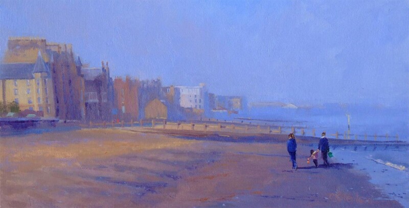
Image of A Moment by the Sea by Colin Robertson

The best bedroom wall art should slow a room down without draining it of character. A Moment by the Sea manages that beautifully. It has enough light and movement to keep the wall interesting, but the overall mood stays settled and restorative.

bedroom wall art - A Moment by the Sea

Why bedroom wall art needs calm as well as presence

A bedroom often feels unfinished when the wall above a chest, beside the bed, or opposite the window has nothing to anchor it. A Moment by the Sea can solve that without creating visual tension. The composition brings a gentle horizon line and enough atmosphere to make the room feel more complete, which is especially useful in quieter schemes built around linen, painted timber, or softer natural colour.

  • It adds depth without making the room feel busier.
  • It suits both coastal-leaning and more neutral bedrooms.
  • It helps a restful room feel considered rather than under-furnished.

Why A Moment by the Sea works so naturally in a bedroom

First 4 Frames completes the print and framing in-house in Falkirk with bespoke craftsmanship and colour-managed Giclee production. That superior quality finish keeps the quieter tonal changes clear and helps the final piece feel hand-finished rather than generic.

For wider coastal inspiration, Visit East Lothian is useful. You can also browse more work by Colin Robertson and view the exact framed product here.

If you want bedroom wall art that feels restful, balanced, and easy to wake up to every day, A Moment by the Sea is a very appealing choice.

Posted on

Why Islay in the Light Works So Well as Bedroom Wall Art

Image of Islay in the Light by Arie Vardi

Choosing bedroom wall art is often about finding something calm enough for the room, but not so quiet that it fades into the background. Islay in the Light gets that balance right by bringing soft coastal light, gentle movement, and enough structure to give the wall real purpose.

bedroom wall art - Islay in the Light

That matters in a bedroom, where the artwork should help the whole space feel settled rather than overstimulated.

Why Bedroom Wall Art Benefits From Calm Direction

A restful room still needs a focal point. This piece offers one without relying on louder contrast or restless detail, which helps the room feel more cohesive and easier to switch off in.

  • It keeps the mood calm without becoming flat.
  • It gives the wall presence in a softer, more bedroom-friendly way.
  • It works well when the room needs atmosphere more than drama.

Where It Sits Best In The Room

Islay in the Light would work beautifully above a bed, chest of drawers, or dressing table wall where one framed coastal piece can shape the tone of the room. It pairs naturally with pale neutrals, brushed brass, light timber, and textured bedding because the artwork already carries the same quiet balance.

Why The Framed Finish Matters Here

Subtle coastal work benefits from careful print handling and a frame that helps the image feel complete rather than vague. First 4 Frames handles bespoke framing and colour-managed Giclee production in-house, helping the final piece feel polished from the outset. You can view the exact framed product here, and browse more from Arie Vardi if you enjoy coastal work with the same calm authority.

For anyone comparing bedroom wall art and wanting the room to feel calmer, softer, and more finished, Islay in the Light is a very strong choice.

Posted on

Choosing Art for a Pale Oak Bedroom, Why Spring Blue Feels So Balanced

Image of Spring Blue by Colin Robertson

Finding the right art for a pale oak bedroom is often about giving the room enough contrast without losing its natural calm. Pale oak furniture keeps a bedroom feeling light and easy, but it can also leave the scheme needing more depth if everything stays too close in tone. Spring Blue handles that balance beautifully.

Why lighter timber rooms still need a focal point

Pale oak has a softness that many people love, especially in bedrooms. The risk is that the space can become slightly washed out if the artwork does not bring enough movement or gentle definition. Spring Blue adds that missing layer, helping the room feel more settled without making it heavier.

  • It sits comfortably with pale timber and softer wall colours.
  • It brings enough variation to stop the room feeling too one-note.
  • It supports a calmer bedroom mood rather than disrupting it.

This approach works especially well where oak is paired with linen, off-white paint, or softer blues and greys. The artwork adds atmosphere while staying in tune with the room’s quieter character.

Better framing keeps a gentle scheme looking polished

First 4 Frames produces each piece in-house in Falkirk with bespoke framing, colour-managed Giclee printing, and hand-finished craftsmanship. That superior quality helps the final result feel intentional and complete, which is especially important in a bedroom designed around quieter materials.

You can explore more from Colin Robertson and view the exact framed print here.

If you are weighing up art for a pale oak bedroom, Spring Blue is a very good example of how to keep the room airy while still giving it more warmth and depth.

Posted on

Why Tulips Standing Tall Works Beautifully as Bedroom Wall Art

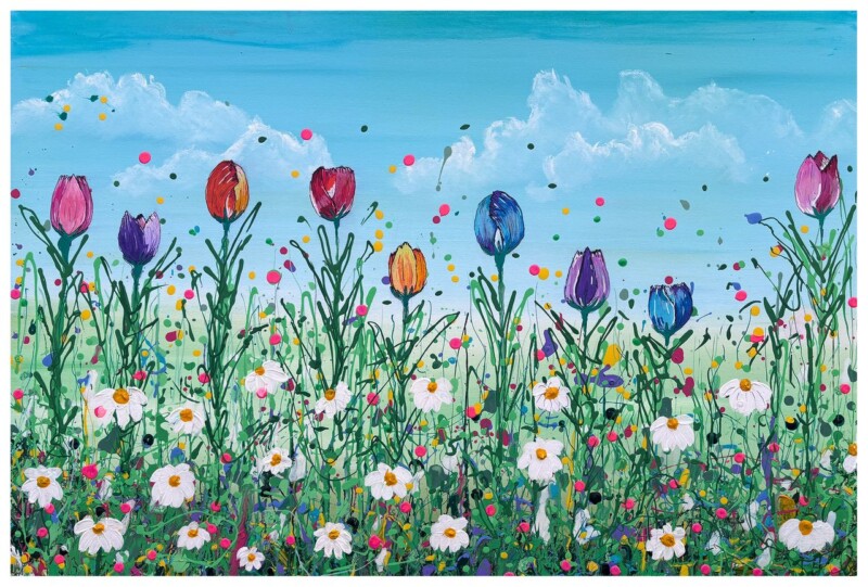
Image of Tulips Standing Tall by The Wee Deaf Artist

Good bedroom wall art should help the room feel settled rather than overstimulating. Tulips Standing Tall does that beautifully, bringing character and colour into the space while keeping the overall mood calm and comfortable.

Why this piece suits the space

Bedrooms often benefit from artwork that feels restorative rather than demanding. Tulips Standing Tall has enough presence to shape the room, but it does not feel harsh or restless. That makes it well suited to spaces where you want visual interest without losing the sense of retreat.

  • It works well with soft neutral bedding, painted furniture, and layered textures.
  • It can give a simpler bedroom scheme more personality without upsetting the calm.
  • It suits both main bedrooms and well-styled guest rooms.

Where it works best

This piece would sit comfortably above a chest of drawers, on the main wall opposite the bed, or anywhere the room needs a focal point with a gentler tone. The framed presentation helps the artwork feel properly integrated into the room rather than added at the last minute.

Why the framed finish matters

Because First 4 Frames completes the work in-house in Falkirk, the result has the superior quality and craftsmanship you would expect from a bespoke framed Giclée piece. That extra care is especially noticeable in quieter rooms, where details tend to stand out more.

This artwork is by Bryony Hamilton, and the framed product can be viewed here.

For anyone choosing bedroom wall art that feels calm, personal, and well finished, Tulips Standing Tall is a strong option.

Posted on

Why Isn’t She Happy Works Beautifully as Bedroom Wall Art

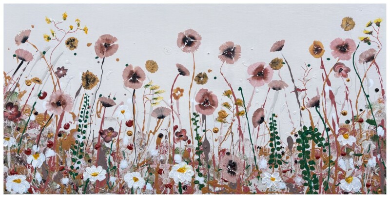
Image of Isn't She Happy by The Wee Deaf Artist

Good bedroom wall art should help the room feel settled rather than overstimulating. Isn’t She Happy does that beautifully, bringing character and colour into the space while keeping the overall mood calm and comfortable.

Why this piece suits the space

Bedrooms often benefit from artwork that feels restorative rather than demanding. Isn’t She Happy has enough presence to shape the room, but it does not feel harsh or restless. That makes it well suited to spaces where you want visual interest without losing the sense of retreat.

  • It works well with soft neutral bedding, painted furniture, and layered textures.
  • It can give a simpler bedroom scheme more personality without upsetting the calm.
  • It suits both main bedrooms and well-styled guest rooms.

Where it works best

This piece would sit comfortably above a chest of drawers, on the main wall opposite the bed, or anywhere the room needs a focal point with a gentler tone. The framed presentation helps the artwork feel properly integrated into the room rather than added at the last minute.

Why the framed finish matters

Because First 4 Frames completes the work in-house in Falkirk, the result has the superior quality and craftsmanship you would expect from a bespoke framed Giclée piece. That extra care is especially noticeable in quieter rooms, where details tend to stand out more.

This artwork is by Bryony Hamilton, and the framed product can be viewed here.

For anyone choosing bedroom wall art that feels calm, personal, and well finished, Isn’t She Happy is a strong option.

Posted on

Why Sunart Blue Works Beautifully as Bedroom Wall Art

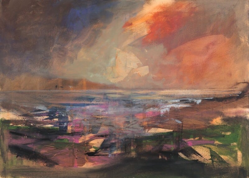
Image of Sunart Blue by Jill McIntosh

Choosing bedroom wall art is rarely about making the biggest statement in the house. More often, it is about creating a room that feels settled, restful, and personal. Sunart Blue is a particularly good fit for that kind of space, thanks to its calm coastal palette and atmospheric sense of distance.

A better choice for a room meant for rest

Bedrooms tend to suit artwork that gives the eye somewhere gentle to land. This piece has enough depth to hold attention, but it does not feel busy or demanding. Blue tones can help a room feel cooler, quieter, and more composed, which is exactly why they work so well in spaces designed for winding down.

  • It complements soft neutrals, pale timber, and layered bedding.
  • It adds atmosphere without making the room feel heavy.
  • It suits both modern and more traditional bedroom schemes.

Where Sunart Blue can sit best

This artwork works especially well above a chest of drawers, opposite the bed, or on a wall that needs quiet character rather than loud colour. If your bedroom already includes creams, stone shades, faded blues, or natural textures, the print can settle into the room with ease while still giving it a more considered finish.

It is also a good option for guest bedrooms where you want the space to feel welcoming and complete without becoming overly decorative.

Why framed Giclée quality matters here

In a bedroom, subtle presentation often makes the difference. A hand-finished framed Giclée print brings clarity, depth, and a more refined presence than a loose print or standard poster. First 4 Frames completes the work in-house in Falkirk, using colour-managed printing and careful craftsmanship so the finished piece feels bespoke from the start.

This artwork is by Jill McIntosh, whose Scottish scenes are known for mood and atmosphere. You can view the exact framed product here.

If you are looking for bedroom wall art with a calm, coastal feel and a superior quality framed finish, Sunart Blue is well worth considering.