Posted on

Why Bidean Nam Bian, Glencoe Works Beautifully as Wall Art for Picture Windows

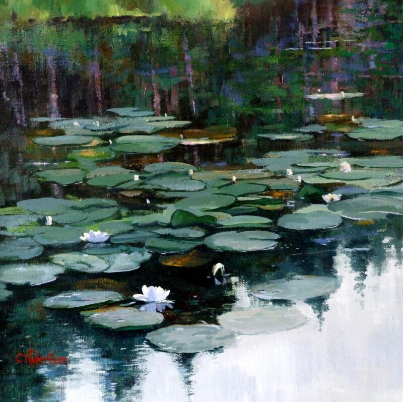
Image of Bidean Nam Bian, Glencoe by Colin Robertson

The best wall art for picture windows needs enough presence to hold its own in a brighter room. Picture windows can flood a space with light and open the room to a wider view, but they can also make nearby walls feel slightly underpowered if the artwork is too timid. Bidean Nam Bian, Glencoe works especially well because it brings depth, movement, and atmosphere without fighting against the openness of the space.

wall art for picture windows featuring Bidean Nam Bian, Glencoe

Why wall art for picture windows needs grounding as well as light

Large glazing often makes a room feel expansive and calm, which is a real advantage. At the same time, that much daylight can flatten weaker artwork or leave a room feeling visually unfinished once the view becomes the only focal point. The strongest print gives the eye somewhere to settle indoors as well as out.

Bidean Nam Bian, Glencoe does that particularly well. The Glencoe scene has scale and mood, yet it still feels easy to live with in a sitting room, open-plan family space, garden room, or reading corner with broad glass and longer sightlines. It helps the room feel anchored without making it heavier.

Why Bidean Nam Bian, Glencoe is a strong fit for wall art for picture windows

  1. It has enough atmosphere to balance a brighter wall.
  2. It works with wide views without trying to compete with them.
  3. It brings a grounded Scottish landscape presence that still feels calm and refined.

First 4 Frames completes every piece in-house in Falkirk with bespoke framing, colour-managed Giclee printing, and hand-finished craftsmanship. In brighter rooms, that superior quality matters because colour control, paper quality, and finish all help the artwork keep its presence through changing light.

You can browse more by Colin Robertson, explore the VisitScotland guide to Glencoe, and view the exact framed print here.

If you are looking for wall art for picture windows with atmosphere, depth, and a more grounded feel, Bidean Nam Bian, Glencoe is a very strong option.

Posted on

Interior Design Wall Art Needs Atmosphere, Why Autumn’s Embrace, Edinburgh Works

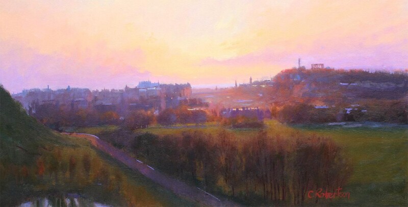
Image of Autumn's Embrace, Edinburgh by Colin Robertson

The best interior design wall art does not just match a colour scheme. It helps connect the room’s mood, architecture, and pacing. Autumn’s Embrace, Edinburgh works beautifully on that level, bringing warmth and city atmosphere together in a way that feels thoughtfully composed.

interior design wall art - Autumn's Embrace, Edinburgh

Why interior design wall art needs more than a fashionable palette

Rooms usually feel stronger when the artwork brings a little story and texture, not simply a block of on-trend colour. Autumn’s Embrace, Edinburgh does that nicely. The Edinburgh setting adds identity, while the autumn tones make the piece useful in spaces with timber, brass, deeper paint, or softer upholstery.

  • It adds atmosphere without making the scheme feel dark.
  • It suits rooms that need one thoughtful layer rather than a louder focal point.
  • It gives a polished interior more individuality and local character.

Why Autumn’s Embrace, Edinburgh feels so considered in the room

First 4 Frames produces and frames the work in-house in Falkirk with bespoke craftsmanship and colour-managed Giclee production. That careful finish gives the detail and tonal variation the superior quality presentation they need, so the artwork feels hand-finished and fully resolved on the wall.

For a wider sense of the city behind the scene, Forever Edinburgh is worth visiting. You can also browse more work by Colin Robertson and view the exact framed product here.

If you are comparing interior design wall art and want something warmer, more atmospheric, and more memorable than filler decor, Autumn’s Embrace, Edinburgh is a very strong choice.

Posted on

Why Spring Yellows Makes Floral Wall Art Feel Fresh Rather Than Fussy

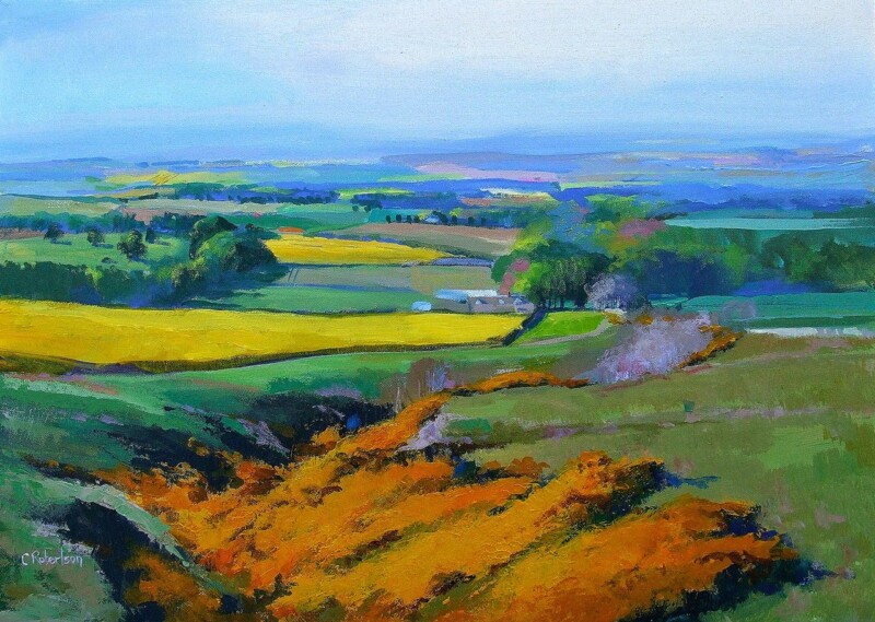
Image of Spring Yellows by Colin Robertson

Good floral wall art should lift a room without making it feel sugary or overdone. Spring Yellows does exactly that. The colour brings warmth and optimism, but the overall effect stays calm enough for everyday living.

floral wall art - Spring Yellows

Why floral wall art works best when it still feels grown up

One reason floral-led artwork lasts is that it can make a room feel fresher without demanding an entire decorative theme around it. Spring Yellows is especially effective in a breakfast room, kitchen corner, or spare bedroom where you want colour and light, but still need the room to feel composed and practical.

It also suits spaces that already use natural textures, painted furniture, or softer wall tones, because the piece adds energy without turning the scheme busy.

Why Spring Yellows feels bright but still balanced

First 4 Frames produces and frames the artwork in-house with bespoke craftsmanship and colour-managed Giclee quality. That careful presentation helps the yellows stay luminous rather than harsh and gives the final piece the superior quality presence needed for a lived-in home.

If you enjoy the broader world of flowers and planting, The Royal Horticultural Society is a useful place to browse. You can also see more work by Colin Robertson and view the exact framed product here.

If you are comparing floral wall art and want something lighter, more welcoming, and easy to place, Spring Yellows is an excellent choice.

Posted on

Bedroom Wall Art Feels Calmer With A Moment by the Sea

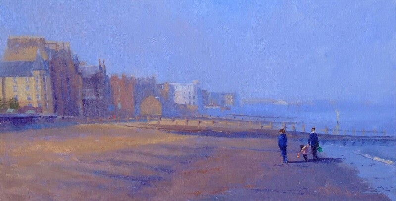
Image of A Moment by the Sea by Colin Robertson

The best bedroom wall art should slow a room down without draining it of character. A Moment by the Sea manages that beautifully. It has enough light and movement to keep the wall interesting, but the overall mood stays settled and restorative.

bedroom wall art - A Moment by the Sea

Why bedroom wall art needs calm as well as presence

A bedroom often feels unfinished when the wall above a chest, beside the bed, or opposite the window has nothing to anchor it. A Moment by the Sea can solve that without creating visual tension. The composition brings a gentle horizon line and enough atmosphere to make the room feel more complete, which is especially useful in quieter schemes built around linen, painted timber, or softer natural colour.

  • It adds depth without making the room feel busier.
  • It suits both coastal-leaning and more neutral bedrooms.
  • It helps a restful room feel considered rather than under-furnished.

Why A Moment by the Sea works so naturally in a bedroom

First 4 Frames completes the print and framing in-house in Falkirk with bespoke craftsmanship and colour-managed Giclee production. That superior quality finish keeps the quieter tonal changes clear and helps the final piece feel hand-finished rather than generic.

For wider coastal inspiration, Visit East Lothian is useful. You can also browse more work by Colin Robertson and view the exact framed product here.

If you want bedroom wall art that feels restful, balanced, and easy to wake up to every day, A Moment by the Sea is a very appealing choice.

Posted on

Art for Terrazzo Floors, Why Towards Easdale Feels So Balanced

Image of Towards Easdale by Colin Robertson

Choosing art for terrazzo floors is often about balance. Terrazzo already brings pattern, fleck, and visual energy underfoot, so the wall usually benefits from artwork that adds atmosphere and colour without making the room feel restless. Towards Easdale does that especially well.

art for terrazzo floors - Towards Easdale

Its calm coastal movement helps the room feel softer and more joined up, which is often exactly what a terrazzo-based scheme needs.

Why Art for Terrazzo Floors Needs Calm Direction

When the floor carries texture and small-scale variation, the wall can work harder by offering a broader rhythm. This piece gives you horizon, water, and weather instead of another busy pattern, helping the eye settle while still keeping the room interesting.

  • It softens harder finishes without becoming vague.
  • It picks up cooler and warmer notes in terrazzo naturally.
  • It helps a room feel more layered rather than more crowded.

Where Towards Easdale Works Best

Towards Easdale would work beautifully in a kitchen-dining room, hallway, bathroom-adjacent space, or contemporary sitting room where terrazzo plays a visible role. It pairs naturally with pale woods, off-whites, chalky blues, brushed metal, and stone-toned accents because the image already carries that same balanced restraint.

Why The Framed Finish Matters Here

With a detailed floor beneath it, the artwork needs enough clarity and definition to hold its own. First 4 Frames handles bespoke framing and colour-managed Giclee production in-house, helping the final piece feel properly finished and confidently placed. You can view the exact framed product here, and browse more from Colin Robertson if you enjoy Scottish scenes with the same quiet coastal balance.

If you are looking for art for terrazzo floors that adds warmth and flow rather than extra visual noise, Towards Easdale is a very well-judged option.

Posted on

Choosing Art for Forest Green Walls, Why The Distant Hamlet Feels So Well Judged

Image of The Distant Hamlet by Colin Robertson

Choosing art for forest green walls is often about making sure a richer painted room still feels easy to live with. Forest green can look beautifully grounded and cocooning, but it also asks more from the artwork around it. The picture needs to bring enough light, movement, and tonal variation to stop the space feeling too closed in. The Distant Hamlet does that especially well, adding atmosphere without breaking the deeper mood that makes this colour so appealing in the first place.

art for forest green walls featuring The Distant Hamlet

Why art for forest green walls needs light as well as depth

Green rooms work best when they feel layered rather than uniformly dark. If every surface carries the same visual weight, the scheme can start to feel heavy. The right framed print gives the eye somewhere to travel, bringing contrast and softness while still respecting the room’s stronger colour.

The Distant Hamlet is especially effective here because Colin Robertson’s landscape handling carries distance, shifting light, and a real sense of air. That helps a room with green walls feel more open and more settled at the same time. It is a useful balance in living rooms, studies, and bedrooms where you want colour and character, but still need calm.

  • It lifts a deeper paint colour without fighting it.
  • It adds atmosphere and movement instead of another block of visual weight.
  • It suits rooms that want a hand-finished focal point with real softness and place.

A landscape choice with craftsmanship and real atmosphere

If this kind of painterly Scottish landscape appeals, you can explore more of Colin Robertson‘s work as well. First 4 Frames completes each piece in-house in Falkirk using bespoke framing, colour-managed Giclee printing, and hand-finished craftsmanship. In a darker colour scheme, that superior quality matters. The artwork needs to feel properly made and confidently placed, not simply bright enough to interrupt the wall colour.

You can view the exact framed print here. If you are looking for art for forest green walls that keeps a richer room atmospheric while giving it enough light and balance, The Distant Hamlet is well worth considering.

Posted on

How to Style Coastal Wall Art, Starting With A Moment by the Sea

Image of A Moment by the Sea by Colin Robertson

Anyone asking how to style coastal wall art is usually trying to avoid one common mistake: making the room feel too literal. A Moment by the Sea is a strong example because it brings shoreline calm and open space without pushing the room into obvious seaside cliches.

how to style coastal wall art - A Moment by the Sea

That balance is what makes coastal artwork easier to live with over time. The room feels lighter and fresher, but still properly designed.

Why Coastal Wall Art Works Best When It Stays Subtle

The most effective coastal styling usually comes from restraint. A piece like this gives the room openness, texture, and atmosphere while leaving space for the rest of the interior to breathe.

  • It adds a coastal mood without turning the room into a theme.
  • It works with both modern and more traditional interiors.
  • It helps calmer materials and colours feel more connected.

Where A Piece Like This Fits Naturally

A Moment by the Sea would work beautifully in a living room, bedroom, hallway, or guest room where one framed coastal piece can soften the space. It pairs especially well with pale woods, sandy tones, linen textures, muted blues, and off-whites because the artwork already carries that same layered calm.

Why First 4 Frames Strengthens The Result

Delicate coastal colour needs careful handling if the final piece is going to feel refined rather than washed out. First 4 Frames handles bespoke framing and colour-managed Giclee production in-house, helping the finished artwork keep its softness and clarity. You can view the exact framed product here, and browse more from Colin Robertson if you enjoy coastal scenes with the same easy atmosphere.

For homeowners thinking about how to style coastal wall art in a more polished way, A Moment by the Sea is a very smart place to start.

Posted on

Why The River Roars, Linn of Quoich Works Beautifully as Wall Art for a Room With Natural Stone

Image of The River Roars, Linn of Quoich by Colin Robertson

Choosing wall art for a room with natural stone is often about making sure the room feels warmer and more human, not just beautifully finished. Stone, lime-based surfaces, and rougher natural textures can give an interior tremendous character, but they still need artwork that brings atmosphere and movement. The River Roars, Linn of Quoich does that especially well, adding depth without fighting the quieter strength of the materials around it.

wall art for a room with natural stone featuring The River Roars, Linn of Quoich

Why wall art for a room with natural stone needs movement as well as calm

Natural stone can make a room feel grounded, enduring, and architecturally rich. What it sometimes lacks is softness. If the artwork nearby is too static or too decorative, the room can start to feel slightly hard. The best pieces introduce flow, tonal variation, and enough atmosphere to stop the scheme feeling over-composed.

The River Roars, Linn of Quoich works beautifully on those terms. Colin Robertson handles weather, distance, and light with a painterly restraint that gives the image motion without noise. That makes it especially effective in spaces where stone appears in flooring, fireplaces, wall details, or tactile accessories and you want the whole room to feel connected rather than material-led.

  • It softens stone-rich interiors without diluting their character.
  • It adds movement and atmosphere rather than just another block of colour.
  • It suits living rooms, hallways, and quieter open-plan spaces that need a calmer focal point.

A Scottish landscape with real place and hand-finished quality

The scene draws on the drama of Linn of Quoich, which helps explain why the picture feels so full of flow and terrain rather than generic landscape styling. You can also explore more of Colin Robertson‘s atmospheric work if this kind of mood and landscape handling appeals to you.

First 4 Frames completes each piece in-house in Falkirk using bespoke framing, colour-managed Giclee printing, and hand-finished craftsmanship. In a room with natural materials, that superior quality matters. The artwork needs to feel properly made, not simply added at the end.

You can view the exact framed print here. If you are looking for wall art for a room with natural stone that brings atmosphere, movement, and a more settled finish to the room, The River Roars, Linn of Quoich is well worth considering.

Posted on

Silent Watcher and the Appeal of Wall Art for a Room With Muted Colours

Image of Silent Watcher by Colin Robertson

Choosing wall art for a room with muted colours is often less about contrast for its own sake and more about preserving mood while giving the space enough presence. Silent Watcher does that especially well, bringing atmospheric depth to a restrained scheme without breaking the quieter character that muted interiors often get right.

wall art for a room with muted colours featuring Silent Watcher

What wall art for a room with muted colours needs to do well

Muted colours can make a room feel elegant, grounded, and easy to live with, but they also leave less room for artwork that feels thin or overly decorative. The strongest pieces in that kind of scheme tend to deepen the atmosphere rather than simply interrupt it. They bring tonal variation, a clearer focal point, and a little more emotional weight to the room.

Silent Watcher works on exactly those terms. Its soft handling and restrained structure help it sit naturally within a quieter palette, while the sense of place and changing light give the wall more substance. That makes it a particularly good fit for living rooms, hallways, or studies where the room already leans calm and you want the artwork to add depth rather than noise.

  • It strengthens a softer palette without making the room feel darker or heavier.
  • It adds atmosphere that suits calm, understated interiors.
  • It gives a muted scheme a more confident focal point without upsetting the balance.

Why hand-finished craftsmanship matters in a quieter scheme

When a room relies on subtle colour and a measured mood, finish matters. First 4 Frames completes each piece in-house in Falkirk using bespoke framing, colour-managed Giclee printing, and hand-finished craftsmanship. That superior quality helps the artwork feel fully part of the interior rather than an item added at the last minute.

You can explore more work by Colin Robertson and view the exact framed print here.

If you are looking for wall art for a room with muted colours that brings depth, atmosphere, and a more resolved finish to the room, Silent Watcher is an excellent option.

Posted on

Why Spring Yellows Works Beautifully as Wall Art for a Sage Green Kitchen

Image of Spring Yellows by Colin Robertson

Choosing wall art for a sage green kitchen is often about balance rather than contrast for its own sake. Sage green can make a kitchen feel calm, welcoming, and quietly refined, but it also benefits from artwork that adds a little lift and movement. Spring Yellows works especially well because it brings warmth and freshness without fighting the softer painted character of the room.

wall art for a sage green kitchen featuring Spring Yellows

Why a sage green kitchen benefits from artwork with warmth and light

Sage green kitchens are popular because they feel settled and easy to live with. They can soften cabinetry, work beautifully with natural timber, and help the room feel connected to the rest of the home. The challenge is making sure the overall scheme does not become too muted. Artwork can solve that by introducing more variation in tone while keeping the room calm.

Spring Yellows suits that role beautifully. The colour and sense of landscape give the wall more life, but the piece still feels composed enough for a hardworking room. That makes it a strong option for kitchens where you want a gentler painted scheme to feel finished rather than a little too careful.

  • It lifts a softer green scheme without making the room feel louder.
  • It adds warmth that works well with timber, stone, and painted cabinetry.
  • It helps the kitchen feel layered rather than too tone-on-tone.

Why hand-finished framing suits a well-considered kitchen space

When a kitchen has been carefully styled, the finishing details matter. First 4 Frames completes each piece in-house in Falkirk using bespoke framing, colour-managed Giclee printing, and hand-finished craftsmanship. That superior quality helps the artwork feel properly chosen for the space rather than like an afterthought added once the decorating was done.

You can explore more work by Colin Robertson and view the exact framed print here.

If you are looking for wall art for a sage green kitchen that keeps the room calm while adding warmth and brightness, Spring Yellows is well worth considering.