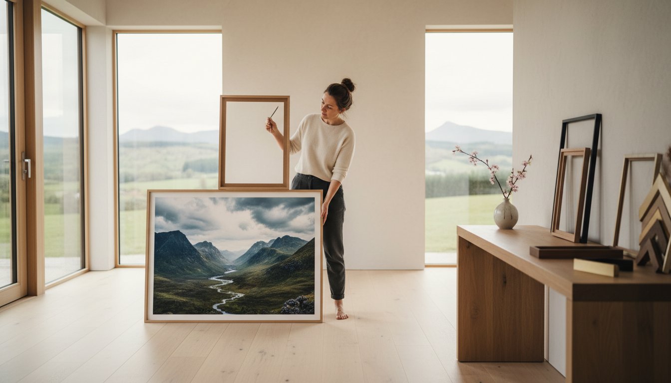
A spectacular piece of art can lose all its power with the wrong frame. It’s a high-stakes design choice that can make or break an entire room, turning a potential masterpiece into a missed opportunity.
We get it. You’ve found a beautiful print from the First4Frames Gallery, but now you’re hesitating. The fear of picking a style that will look dated by 2028 is real, and the question of whether to match the floor, the sofa, or the art itself is a common dilemma. This guide promises to eliminate that uncertainty. We’ll give you the confidence and the professional secrets for choosing a frame to match your decor perfectly, every single time.
You’ll learn how to transform your space by using the frame as a beautiful bridge between your art and your home’s unique style, selecting premium, bespoke materials that create a cohesive and timeless look you’ll love for years to come.
Key Takeaways
Learn how the right frame acts as a crucial design bridge, seamlessly connecting your favourite artwork to your room’s unique style.
Discover how to use frame materials and finishes-from warm natural woods to elegant metallics-to complement your existing furniture and fixtures.
Master the art of choosing a frame to match your decor, with expert tips for pairing frames with popular styles like Scandi, Japandi, and Traditional.
Get a room-by-room guide to selecting frames that create a stunning focal point in your living room or a professional atmosphere in your home office.
Explore a simple process for selecting a bespoke frame for beautiful Giclée prints from our gallery of top Scottish artists.
The Art of the Bridge: Why Choosing a Frame to Match Your Decor Matters
A frame is much more than a simple border; it’s the architectural bridge that connects the two-dimensional world of art with the three-dimensional reality of your room. It’s the handshake between the artist’s vision and your personal space. Get this crucial element wrong, and even a spectacular John Lowrie Morrison (Jolomo) original, bursting with Hebridean colour, can feel disconnected and jarring on your wall. The process of choosing a frame to match your decor is an art in itself, and it’s one we’ve perfected over 20 years of bespoke craftsmanship.
To see how to avoid common pitfalls and make the right choice, this video offers some fantastic advice:
A thoughtfully chosen frame does the real heavy lifting in your interior design scheme. It doesn’t just contain the art; it actively enhances both the piece and the room, acting as a silent partner that ties everything together. Imagine a minimalist black frame around a vibrant abstract piece; it grounds the energy and provides a crisp, modern finish. Now picture a rustic oak frame around a tranquil landscape by Ron Lawson; it echoes the natural subject matter, adding warmth and texture that resonates with your decor. For those interested in the technical aspects, the history and construction of picture frames provides fascinating context on their evolution and purpose.
The Psychology of a Well-Framed Room
The right frame does more than just look good; it fundamentally changes how you experience a space. It’s an investment in your home’s long-term atmosphere, creating a sense of permanence and considered style. A professionally framed piece can:
Create Visual ‘Anchors’: A well-placed frame gives the eye a place to rest, bringing order and focus to a room’s design.
Influence Room Perception: The scale and style can manipulate perception. A large, simply framed piece can make a compact room in a new-build home feel more expansive, while an ornate frame can add a sense of history to a period property.
Elevate the Artwork: Professional framing protects your art from environmental damage and presents it in the best possible light, honouring the artist’s work.
First4Frames Gallery: Where Creativity Meets Craftsmanship
Our deep-seated passion for fine art is the beating heart of our Falkirk-based workshop. We believe beautiful, professionally framed art should be accessible to everyone. This commitment to quality and service is reflected in our consistently high customer ratings for excellence and trustworthiness across trusted review platforms. We offer a unique ‘one-stop-shop’ advantage that simplifies the entire process. You can discover a stunning Giclée print from acclaimed artists like Alexander Millar in our gallery, and our expert team will guide you through our bespoke framing service, transforming it into a ready-to-hang masterpiece, perfectly suited to your home and your style.
Decoding Frame Styles: Materials, Finishes, and Profiles
A frame does more than just protect your art; it’s the crucial bridge between the artwork and your interior design. Think of it as the final, perfecting touch that pulls everything together. The secret to choosing a frame to match your decor lies in understanding three key elements: the material it’s made from, its surface finish, and its profile or shape. Getting these right ensures your chosen piece, whether it’s a fine art print or a family photograph, feels perfectly at home on your wall.
From the tactile warmth of natural wood to the sharp precision of modern metal, each material carries its own personality. Let’s explore how to select the perfect one for your space.
Wooden Frames: Timeless and Versatile
Wooden frames offer a classic, organic warmth that is unmatched. To create a seamless look, try matching the wood grain of the frame to existing elements in your room. A light oak frame, for instance, beautifully complements the pale woods and clean lines of a Scandinavian-inspired living room with oak flooring—if you’re planning a similar design, you can check out Frankly Flooring for a wide selection of wood styles. A deeper, richer walnut frame can echo the finish of mid-century modern cabinetry, creating a cohesive and sophisticated feel. The finish also plays a vital role:
Stained Wood: Enhances the natural grain while adding a specific colour tone.
Painted Wood: Offers a block of solid colour, perfect for a contemporary or minimalist aesthetic.
Raw Wood: Provides a rustic, unfinished look that works well in bohemian or farmhouse-style interiors.
At First4Frames, our commitment to quality extends to our materials. For our bespoke picture framing service, we prioritise using premium, sustainably sourced wood, ensuring your frame is not only beautiful but also responsibly made.
Contemporary Metal and Synthetic Options
For a sharper, more modern edge, metal and synthetic frames are excellent choices. A slim, black or silver aluminium frame is the perfect partner for an industrial-style space, adding a clean, graphic line that complements exposed brickwork or concrete. Consider how a sleek aluminium frame could elevate a powerful black-and-white photograph from an artist like Andy Gotts, making the portrait the undeniable focal point.
High-quality synthetic frames offer incredible versatility and durability. Their resistance to moisture makes them the ideal choice for hanging art in humid environments like kitchens or bathrooms, where a wooden frame might warp over time. They also open up a world of colour. Don’t be afraid to use a frame to introduce a ‘pop of colour’ that ties into other accents in the room, like a vibrant yellow frame that matches your scatter cushions or a key colour in a nearby rug.
Beyond material, the frame’s physical presence matters. An ornate, wide-profile frame adds historical weight and grandeur, ideal for traditional art. A slim, minimalist profile, however, allows the artwork itself to dominate. The final piece of the puzzle is the mount, or mat. This cardboard border creates essential breathing space, preventing the art from touching the glass. This separation is key to visual balance, a principle supported by the expert advice from Christie’s on achieving harmony. A crisp white mount can make colours appear more vibrant, while an off-white or cream mount can lend a softer, warmer tone to the piece.
Matching Frames to Your Interior Design Style
A great frame acts as a bridge, connecting the beautiful artwork on your wall to the room’s overall feel. It’s a vital part of the story. With over 20 years of bespoke framing experience, we’ve learned how the perfect choice can elevate both the art and the interior. The process of choosing a frame to match your decor should be an exciting final step, not a daunting one.
Your home’s aesthetic provides the perfect starting point. Here’s how to select a frame that complements some of the most popular interior design styles:
Scandi & Japandi: For the clean lines and natural textures of Scandinavian or Japandi design, less is truly more. Think thin, minimalist profiles in light woods like oak or ash. These frames don’t shout for attention; they whisper of quality craftsmanship and let the artwork breathe, enhancing the calm, ‘hygge’ atmosphere central to these styles.
Traditional & Victorian: If your home celebrates classic elegance, a more ornate frame is a spectacular choice. Gilded frames with intricate detailing or deep, rich woods evoke the timeless feel of a traditional Scottish gallery. Paired with a deep mount, these frames give a piece of art significant presence and a sense of history, turning it into a true centrepiece.
Industrial & Loft: The raw, utilitarian aesthetic of industrial and loft spaces calls for frames with confidence. Simple, bold profiles in matte black metal or wood work beautifully against exposed brick, concrete, or steel. They provide a strong graphic element that complements the architectural features without adding unnecessary fuss.
Modern Maximalism: Maximalism is all about personality, colour, and curated collections. Here, the rules are meant to be broken. A gallery wall can be an eclectic masterpiece, mixing ornate gold frames with sleek modern ones. The key is creating a cohesive look through a common theme. For more expert tips, this guide on matching frames to your decor style offers brilliant, practical advice.
Framing Scottish Landscapes: The Jolomo Example
John Lowrie Morrison’s work is a celebration of colour, capturing the vibrant spirit of the Scottish coast. When framing a Jolomo, the goal is to complement, not compete. A simple, premium-quality frame in a neutral finish, like soft white or a deep charcoal, allows the artwork’s spectacular palette to take centre stage. A generous mount also provides visual space, drawing your eye into the heart of the landscape. Explore our collection of Jolomo Prints: Bring Scotland’s Colour Home to find your perfect piece.
The Cinematic Vibe: Framing Jack Vettriano
Jack Vettriano’s art is filled with mood, narrative, and a distinct 1940s-style glamour. The frame should enhance this cinematic quality. We recommend elegant, dark profiles in deep woods or a classic black finish. A subtle scoop or a touch of silver leaf on the inner edge can add a hint of sophistication that echoes the timeless allure of his subjects. This thoughtful choice transforms the print into a window to another world. Discover the drama in our collection of Jack Vettriano Prints: Iconic Scottish Art.
Ultimately, choosing a frame to match your decor is a personal journey. It’s about creating harmony between your art, your frame, and your home. As our 5-star customer reviews consistently show, we are passionate about helping you find that perfect balance with our professional, bespoke framing services.
Room-by-Room Guide: Selecting the Right Frame for Every Space
The perfect frame does more than just protect a piece of art; it acts as a bridge, connecting the artwork to the room’s unique atmosphere and function. The process of choosing a frame to match your decor isn’t a one-size-fits-all task. A frame that shines in the living room might feel out of place in a tranquil bedroom. Let’s explore how to select the perfect frame for the key spaces in your home and beyond.
The Living Room: The Heart of the Home
Your living room is where you entertain guests and relax with family, making it the ideal place for a statement piece. To create a captivating focal point above a sofa or fireplace, think big. A spectacular large-format print, like a dramatic Scottish landscape from our gallery, demands a frame that enhances its scale. For a traditional home, a classic ornate gold or a deep mahogany frame adds a sense of grandeur. In a minimalist or Scandi-inspired space, a simple, thin black or white wood frame allows the art to command all the attention.
The Home Office: Professional and Productive
In a space designed for focus, your framing choices should be clean and uncluttered. Simple, straight-lined frames in neutral finishes like oak, black, or brushed aluminium minimise distractions while adding a touch of sophistication. A professionally framed abstract piece creates a polished and inspiring backdrop for video calls, signalling creativity and attention to detail. It’s a simple way to elevate your professional presence from home.
The Bedroom: A Serene Sanctuary
The bedroom should be a place of rest and calm. Soften the look by opting for frames with natural textures. Light woods like our solid oak or ash frames introduce a warm, organic element that promotes relaxation. Pair these with a soft, off-white mount to create gentle separation between the art and the frame, which is perfect for calming seascapes or delicate botanical prints from the First4Frames gallery. This thoughtful combination helps build your personal sanctuary.
Staging and Commercial Art Curation
We partner with property developers, interior designers, and hoteliers across Scotland to ‘finish’ their spaces with stunning, professionally framed art. Understanding that commercial areas experience high traffic, we provide durable, premium framing solutions built to last. Our curated art packages for Scottish estate agents have been proven to help sell homes faster by creating a memorable, high-end feel for potential buyers. It’s about creating an unforgettable first impression.
Practical Logistics: Size and Placement
A common mistake is choosing art that’s too small for the wall. As a rule of thumb, artwork hung above furniture should be about two-thirds the width of the piece below it. While a single A4 print can get lost on a large wall, a collection of them can form a beautiful gallery. For art placed in bright rooms or near windows, we strongly recommend our UV-protective glass to prevent your fine art prints from fading over their 80+ year lifespan. Need help getting started? Read our guide on How to Measure Your Art for a Custom Frame.
This room-by-room guide makes choosing a frame to match your decor a simple and rewarding part of creating a home you love. Ready to find the perfect centrepiece for your living room or a calming print for your bedroom? Explore our curated gallery of fine art prints and begin your journey today.
Bespoke Excellence: The First4Frames 3-Step Process
You’ve learned the principles of colour, style, and scale. Now, let’s put it all into practice with a process designed for perfection. Our ‘print-and-frame’ service is the simplest way to bring spectacular, professionally finished art into your home. It’s our passion, refined over 20 years, and trusted by thousands, as our 5-star customer ratings show. We’ve made the journey from a blank wall to a stunning focal point a simple, three-step experience.
Think of us as your one-stop-shop for fine art. Here’s how it works:
Step 1: Discover Your Perfect Piece. Your journey begins in our extensive gallery, a curated collection of breathtaking Giclée prints from Scotland’s most talented artists. From the vibrant landscapes of Ron Lawson to the evocative cityscapes of John Lowrie Morrison, you can browse hundreds of works to find the one that speaks to you and your home.
Step 2: Create a Bespoke Frame. Once you’ve selected your artwork, our intuitive online tool makes choosing a frame to match your decor an inspiring and creative process. Experiment with hundreds of moulding and mount combinations to build the perfect complement to your art. For a hands-on experience, you can also visit our Falkirk gallery to see the materials firsthand.
Step 3: Receive Ready-to-Hang Art. Your chosen print and bespoke frame are hand-assembled by our expert team. We combine precision craftsmanship with premium materials to create a finished piece that is built to last. It arrives at your door, securely packaged and ready to hang, transforming your space the moment it’s unwrapped.
The Giclée Difference: Quality That Lasts
Our Giclée prints are created using archival-quality pigment inks on fine art paper, resulting in a flawless reproduction with a lightfast rating of over 100 years. This exceptional longevity means your decor will likely change long before the art ever fades. Such a premium print deserves protection, and our professional framing techniques preserve its beauty and value for generations to come.
Ready to Transform Your Walls?
A frame is more than a border; it’s the bridge that connects your artwork to your room. It creates harmony and makes a piece truly feel like it belongs. Now that you understand the art of choosing a frame to match your decor, you’re ready to build that bridge. Explore our gallery’s ‘New In’ and ‘Best Sellers’ collections for inspiration and see what’s currently capturing the hearts of UK art lovers.
Your Journey to a Perfectly Framed Home Starts Here
You now know a frame is more than a border; it’s the essential bridge connecting your art to your living space. By considering material, style, and the unique character of each room, you transform a house into a home. This philosophy of using expert craftsmanship to perfect a personal style extends beyond decor; for those in London, you can visit ARQ Hair for a similar approach to luxury hairstyling. The process of choosing a frame to match your decor should be an exciting one, and our team is here to make it seamless. With over 20 years of expert framing experience, our passion for craftsmanship is validated by our excellent customer ratings on Google and Trustpilot.
Ready to put your new knowledge into action? As specialists in Scottish fine art and premium Giclée prints, our gallery is the perfect place to begin. Browse our curated gallery and choose your bespoke frame today, and let’s create something spectacular for your walls.
Frequently Asked Questions
Should my picture frames all match in one room?
No, your picture frames don’t all have to match. A curated collection of different styles can add wonderful character and visual depth to your space. The secret to a cohesive look is finding a common thread. This could be a consistent colour, such as black or gold, a shared material like natural oak, or a similar style era. This approach allows for a more personal and dynamic display that tells a unique story.
How do I choose a frame color for a grey wall?
A grey wall offers fantastic versatility, acting as a perfect neutral backdrop for almost any frame colour. For a chic, understated look, opt for classic black, crisp white, or cool metallic frames in silver or pewter. To create a striking focal point and add warmth, consider a bold, contrasting colour or a natural wood frame. A beautiful oak frame, for example, can prevent a cool-toned grey room from feeling stark.
Is it better to match the frame to the art or the room decor?
A truly great frame serves as a bridge, connecting both the artwork and the room’s decor. While the art should always be the primary inspiration, the process of choosing a frame to match your decor ensures the final piece feels at home. A professional framer can help you select a frame that enhances the art while echoing elements of your interior, like pulling a subtle colour from the print that also appears in your furnishings.
Can I use different frame styles for a gallery wall?
Absolutely. Using different frame styles is a brilliant way to create a lively and engaging gallery wall. An eclectic mix avoids a rigid, uniform look and injects personality into your display. To keep the collection looking unified, choose a consistent colour palette for the frames (e.g., a mix of black and wood tones) or use the same colour mount for every piece. This technique elegantly ties the diverse artworks together.
What is the best frame for a modern, minimalist home?
The best frame for a modern, minimalist home is typically one with a thin, simple profile and a clean, uncluttered finish. Slim black, white, or light natural wood frames are ideal as they align with minimalist principles of form and function. These styles, often called “box” frames, ensure the focus remains on the artwork itself. A bold print from an artist like Kirin in our gallery looks spectacular in a simple, high-quality black frame.
How much does professional bespoke framing cost in the UK?
The cost of professional bespoke framing in the UK typically starts around £50 and can exceed £300 for very large or complex projects. The final price depends on the artwork’s size, the choice of frame moulding, the type of glazing selected (e.g., anti-UV), and the mount design. For a standard A4-sized piece with premium materials, you can expect a cost between £70 and £120. Our bespoke service always provides a clear, transparent quote.
What kind of frame makes a small room look bigger?
To make a small room feel bigger, choose frames that are light, slender, or reflective. A thin white or pale wood frame can blend seamlessly with light-coloured walls, creating an open and airy effect. Alternatively, metallic or mirrored frames in silver, gold, or chrome are excellent choices as they bounce light around the room, creating an illusion of greater space and depth. Pairing this with a generous mount also enhances the effect.
Does the frame size include the mount (matting)?
No, the frame size you see listed refers to the internal dimensions, which is the size of the artwork, glass, and backing board it can hold. The mount, also known as a mat, fits inside this dimension. For example, an A3 frame will hold an A3 print. If you add a mount, the mount’s external size will be A3, but the window opening (aperture) will be slightly smaller to overlap and hold your artwork neatly in place.
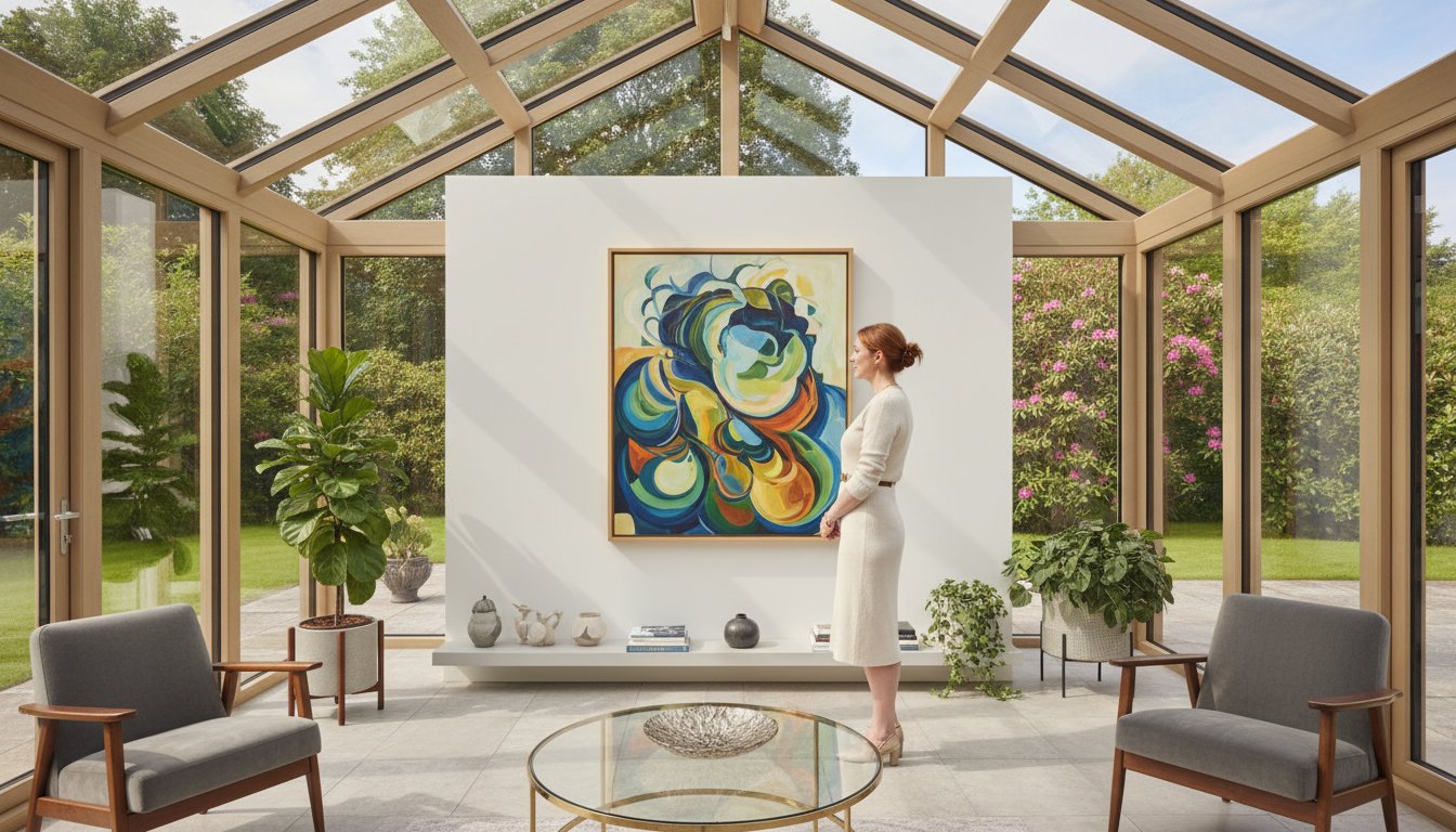
A conservatory is a room of light, a beautiful bridge between your home and garden. But this glorious abundance of sun can make choosing art feel like a risk. Will your cherished print fade to a pale ghost of its former self? Is it even possible to hang art when most of your walls are glass? It’s a common dilemma, but transforming this bright space with spectacular artwork is easier than you think. Finding the perfect art for a conservatory or sunroom simply requires a little expert knowledge and the right craftsmanship.
This is where we can help. In this complete guide, we’ll show you exactly how to select beautiful pieces that are protected for years to come. We’ll delve into the best materials, explore premium framing techniques designed to combat sun damage, and offer creative ideas for placement. You’ll discover how to choose styles that create a seamless flow with the outdoors, giving you the confidence to turn your sun-filled room into a stunning, art-filled sanctuary.
The Unique Challenge: Why Art in a Conservatory Needs Special Care
A conservatory is a wonderful bridge between your home and garden, a space filled with light and life. But this beautiful environment, with its glass walls and ceiling, poses a unique and significant challenge for displaying artwork. The very qualities that make a sunroom so inviting-abundant natural light and a close connection to the outdoors-create a harsh climate for fine art. The main enemies are intense UV light, fluctuating humidity, and dramatic temperature swings. Understanding these factors is the first step to choosing beautiful art for a conservatory or sunroom that will last for years to come.
To get inspired by how to decorate these unique spaces, take a look at these helpful tips:
In the following sections, we’ll show you how to select and protect your investment, ensuring your chosen pieces remain as spectacular as the day you bought them.
The Sun Factor: Combating Fading from UV Exposure
The single greatest threat to your art is sunlight. Ultraviolet (UV) radiation is a high-energy component of light that relentlessly breaks down the chemical bonds in pigments, causing colours to fade and lose their vibrancy. This process, known as photodegradation, is irreversible. It’s a common misconception that only direct sunlight is harmful; even the ambient, indirect light in a bright room can cause significant fading over time. As detailed in the principles of The Unique Challenge: Why Art in a Conservatory Needs Special Care, light exposure is a primary cause of deterioration. Furthermore, the heat from direct sun can make paper brittle and cause the varnish on a painting to crack.
Humidity and Temperature: Protecting Against Warping and Moisture
Unlike other rooms in your home, a conservatory experiences much greater swings in temperature and humidity throughout the day and across the seasons. This constant fluctuation puts immense stress on artwork. High humidity can encourage the growth of mould or lead to ‘foxing’-those unsightly brown spots on paper. Moisture in the air can cause paper to buckle or ripple, while extreme temperature changes can make wood frames expand and contract, potentially warping them and damaging the artwork within.
The ‘Glass Box’ Effect: Working with Light and Limited Wall Space
Beyond the environmental challenges, there’s the practical layout of a conservatory. With walls made mostly of glass, finding a solid, suitable spot to hang a piece can be difficult. The abundance of light also creates issues with glare and reflections, which can obscure the art and diminish your viewing pleasure. But don’t be discouraged! This simply calls for creative thinking. Consider displaying art on a sturdy easel or hanging smaller pieces on structural pillars or the slivers of solid wall space available.
The Best Art Mediums and Styles for Sunlit Spaces
A conservatory is a beautiful bridge between your home and garden, but its abundant sunlight poses a unique challenge for displaying art. Not all mediums are created equal when faced with constant light exposure. Choosing the right type of print and a complementary theme is your first line of defence against fading and discolouration. Let’s explore the most resilient options and inspiring styles to ensure your art remains as vibrant as your garden view.
Why Giclée Prints Are the Superior Choice
When selecting prints for a bright space, Giclée is the gold standard for longevity and quality. Unlike standard prints that use common dye-based inks, our Giclée process uses premium, archival pigment-based inks. These professional-grade inks are inherently more resistant to light, with many rated to last over 100 years without fading. Paired with high-quality archival paper that resists yellowing, a Giclée print is a beautiful and lasting investment. Explore our collection of vibrant Giclée prints, perfect for any room in your home.
Art Styles and Themes that Thrive in a Conservatory
The right theme can transform your conservatory, creating a seamless connection with the outdoors. The perfect art for a conservatory or sunroom often echoes its natural surroundings. Consider these inspiring styles:
Botanical and Floral Prints: Create a beautiful, organic link between your indoor space and the garden just beyond the glass.
Landscapes and Seascapes: Enhance the feeling of open, airy space, drawing the eye towards the horizon and extending your view.
Abstract Pieces: Bold, vibrant colours and dynamic shapes can hold their own against the bright, natural light, adding a powerful splash of energy.
Local Scottish Artists: Reflect the beauty of your surrounding landscape by choosing pieces from talented local artists, adding a personal and authentic touch.
Mediums to Use with Caution
While some art is built to last, other mediums are particularly vulnerable in a sunlit room. The constant exposure to UV light causes cumulative and irreversible damage to delicate materials. Be especially cautious with:
Original Watercolours: The delicate pigments in watercolours are extremely susceptible to fading and should be avoided in direct sunlight.
Standard Posters & Photographic Prints: These are typically printed with dye-based inks on non-archival paper and will fade noticeably within a few years, or even months.
Oil and Acrylic Paintings: While far more durable than watercolours, even these robust mediums can suffer from cracking or fading over decades without proper UV protection.
Your Secret Weapon: The Power of Professional Framing
When selecting art for a conservatory or sunroom, it’s easy to focus solely on the image. However, the frame is far more than a decorative border; it is a vital protective shield for your investment. Off-the-shelf frames simply aren’t designed to cope with the extreme conditions of a glass-walled room. Bespoke framing, on the other hand, empowers you to choose the exact components needed for long-term preservation, creating a beautiful piece that is built to last.
Investing in professional, conservation-grade framing is the single most important step you can take to protect your art from the unique environmental threats of a sun-drenched space. The right glass, mount, and backing work together to create a micro-environment that safeguards your artwork for decades to come.
Choosing the Right Glazing: UV Protection is Non-Negotiable
The intense, prolonged light in a conservatory is an artwork’s greatest enemy. Standard glass offers minimal protection, allowing harmful ultraviolet (UV) rays to penetrate and cause fading, yellowing, and brittleness. This exposure results in cumulative and irreversible damage to the paper and pigments. To combat this, you should always opt for specialist glazing:
UV-Filtering Glass or Acrylic: These premium options are essential, blocking up to 99% of damaging UV rays without altering the colours of your artwork.
Anti-Reflective Glazing: A fantastic choice for a bright room, this specialised glass minimises glare and reflections, ensuring your art can be enjoyed from any angle, at any time of day.
Frame and Mount Materials that Withstand the Elements
Fluctuating temperature and humidity can cause inferior frame materials to warp, crack, or expand. For a conservatory, choose stable, high-quality materials like solid wood or premium aluminium that can withstand these changes. Just as crucial are the internal components. We always use conservation-grade, acid-free mounts and backing boards. This prevents “mat burn”-the unsightly yellow or brown staining that occurs when acidic materials leach into the artwork over time.
The Importance of a Sealed Finish
A final, critical step in professional framing is sealing the back of the frame. Our expert framers apply a special tape to the back, creating a robust barrier that protects against humidity, dust, and even insects. In a room prone to condensation and moisture, this seal is crucial for preventing the growth of mould and mildew inside the frame, which can permanently ruin your art. It’s this attention to detail that ensures your piece remains pristine. Let our experts create the perfect protective frame for your beautiful new art.
Design and Placement: Styling Art in Your Sunroom
Now for the truly rewarding part: bringing your conservatory to life with beautiful art. The goal is to choose pieces that complement the abundant light and garden views, rather than compete with them. Think of your conservatory as a seamless bridge between your home and the outdoors; the right artwork will harmonise these two worlds. By carefully considering scale, colour, and placement, you can create a spectacular and inviting atmosphere.
Creating a Focal Point on a Solid Wall
If your conservatory has a solid structural wall, it presents a perfect canvas. Use this space to hang a single, large statement piece that commands attention and anchors the room’s design. Alternatively, a curated gallery wall can tell a personal story and add deep character. Whichever you choose, ensure the art is positioned away from the path of intense, all-day sunlight to protect its vibrancy and craftsmanship for years to come.
Matching Art to Your Conservatory’s Style
The perfect art for a conservatory or sunroom should feel like a natural extension of your home’s aesthetic. Consider these styles:
For modern spaces: Think clean lines. Abstract prints or minimalist photography in simple, sleek frames work beautifully to maintain a contemporary feel.
For traditional or cottage styles: Embrace nature’s elegance. Botanical illustrations, classic landscapes, or floral watercolours in more ornate, bespoke frames will enhance the room’s charm.
A wonderful professional tip is to draw inspiration directly from your garden, letting the colours of your flowers and foliage inform the palette of your chosen artwork.
Thinking Beyond the Walls
Is wall space at a premium? It’s time to think creatively. A sturdy wooden easel offers a sophisticated and flexible way to display a favourite piece. This not only adds an artistic touch but also allows you to easily move the artwork to avoid harsh light throughout the day. Don’t overlook smaller surfaces, either. A small, professionally framed print placed on a side table or a bookshelf can add a final, polished layer to your design, completing the room with effortless style.
Feeling inspired to find the perfect piece? Our passion at First4Frames Gallery is helping you on your artistic journey. Explore our gallery to discover a curated collection of fine art prints, all available with premium, bespoke framing to suit your unique space.
Bring Your Conservatory to Life with Lasting Art
Decorating your sun-drenched space is a wonderful opportunity to turn light into life. As we’ve explored, the key is choosing the right art mediums and, most importantly, investing in professional protection. The right frame does more than just complement the artwork; it acts as a guardian against the very sunlight that makes your room so special, ensuring your investment is enjoyed for years to come.
Finding beautiful and durable art for a conservatory or sunroom is our passion. With over 20 years of bespoke framing expertise, we protect our spectacular, museum-quality Giclée prints with specialist UV-protective and anti-reflective glazing options. This guarantees their vibrant, archival inks will not fade over time, allowing you to display your chosen piece with complete confidence.
Can I hang an original oil painting in my conservatory?
We strongly advise against this. The intense, direct sunlight and fluctuating temperatures in a conservatory can be incredibly damaging to an original oil painting. This environment can cause the paint to crack, fade, and flake, and the canvas to warp over time. To enjoy the image without risking the original, we recommend commissioning a high-quality Giclée print. This allows you to display the art you love while keeping the valuable original safe in a more stable environment.
How can I stop my art prints from fading in a sunny room?
Protecting your prints from UV light is essential. The first line of defence is the print quality itself; always choose archival Giclée prints that use lightfast, pigment-based inks designed for longevity. The second, crucial step is professional framing that incorporates UV-protective glazing. This specialist glass can block up to 99% of harmful UV rays, preserving the vibrant colours of your print and preventing the paper from yellowing. This combination offers the ultimate protection for your art.
What is the best type of glass to use for framing conservatory art?
For a room with so much natural light, specialist glazing is a must. We highly recommend using a UV-protective glass, such as Conservation Clear or Museum Glass. Standard picture glass offers very little protection from the sun’s damaging rays. Investing in glazing that blocks 99% of UV light is the most effective way to prevent fading and ensure your artwork remains beautiful for years to come. It’s a vital component for any art displayed in such a bright space.
Is canvas art a good choice for a sunroom?
Canvas can be a spectacular choice, provided you take the right precautions. The main challenges are fading from sunlight and warping from humidity changes. To combat this, choose a high-quality Giclée canvas print that has been treated with a UV-protective varnish. This will safeguard the colours. Also, ensure your sunroom is well-ventilated to maintain a relatively stable level of humidity, which protects the wooden stretcher bars from expanding or contracting. This makes it a perfect piece of art for a conservatory or sunroom.
How do I deal with glare and reflections on my artwork?
Glare is a common problem in bright, sunny rooms, but it has a simple solution: anti-reflective glass. Often referred to as Museum Glass, this premium material has a special coating that diffuses light, making the glass seem almost invisible. This provides a crystal-clear view of your artwork from any angle, without distracting reflections. While it is a premium option, the difference is truly remarkable and allows you to fully appreciate the detail and colour of your art.
What frame materials are best for a room with high humidity?
In environments with fluctuating humidity like a conservatory, certain frame materials perform much better than others. We recommend avoiding natural wood, which can swell, warp, or even encourage mould. Instead, opt for metal frames, like sleek and modern aluminium, or composite materials such as Polcore. Polcore is a recycled polystyrene material that is completely stable in humid conditions, ensuring your frame’s joints remain tight and its shape true, protecting your artwork perfectly.
You’ve found the perfect piece of art, a spectacular print that speaks to you. Now for the final, crucial step: the frame. Stood before a wall of options, it’s easy to feel overwhelmed. Do you match the frame to the artwork or the wall? What if you choose a colour that clashes, undermining the very piece you love? Learning how to choose a picture frame colour can feel like a high-stakes decision, but it doesn’t have to be a source of stress.
Think of the frame as the perfect supporting actor, designed to make your artwork the star of the show. It’s the beautiful bridge connecting your art to your home décor, and choosing its colour is an art in itself. In this professional guide, we’ll demystify the process, sharing the simple principles we use every day. You’ll gain the confidence to select the perfect bespoke frame, ensuring your final piece looks harmonious, professionally finished, and absolutely beautiful in your space.
The First Rule: Complement the Art, Don’t Overpower It
When embarking on the journey of choosing a frame, the first and most crucial rule is to honour the artwork. A premium, bespoke frame should never compete for attention; its purpose is to enhance and protect the piece it holds. Think of the frame as the perfect bridge between your beautiful art and your room’s décor, creating a seamless transition that draws the eye inward, right to the heart of the image.
This principle is central to understanding how to choose a picture frame colour that truly works. To better understand this concept, watch this helpful video from the experts:
A common mistake is to match the frame colour exactly to a dominant colour in the artwork. This can flatten the image and make the composition feel repetitive. A more professional approach is to select a frame that picks up on a subtle, secondary hue within the piece. This creates a sophisticated, cohesive look that allows the art’s primary colours to shine. The frame’s finish also plays a vital role; a matte finish offers a contemporary, understated look, while a gloss or metallic finish can add a touch of glamour and reflect light.
Identifying the Artwork’s Undertone
Every piece of art has an overall temperature or undertone. Is it warm or cool? Matching the frame’s undertone to the art’s creates a naturally harmonious feel that is pleasing to the eye.
Warm Tones: Think reds, yellows, oranges, and creamy off-whites. Natural wood, gold, and bronze frames work beautifully.
Cool Tones: Look for blues, greens, purples, and crisp, pure whites. Silver, pewter, black, and white frames are excellent choices.
Considering the Art’s Style and Era
The style of the artwork provides strong clues. A sleek, black or white frame complements the clean lines of modern, minimalist art perfectly. Conversely, a traditional landscape or a classic portrait often calls for the timeless elegance of a natural wood or an ornate gold picture frame, honouring its historical context. Bold, abstract pieces can often handle a stronger, more colourful frame that echoes their vibrant energy.
Light vs. Dark Artwork
The interplay between light and dark is a powerful tool in framing. For light, airy pieces, a dark frame (like a deep charcoal or espresso wood) can create a dramatic, grounding contrast that makes the artwork pop. For dark, moody pieces, a lighter frame-such as a pale wood or off-white-can provide visual relief and prevent the composition from feeling overly heavy. When in doubt, a mid-tone wood frame is a versatile and timeless choice that suits most pieces.
The Second Rule: Coordinate with Your Room’s Decor
Once you’ve considered the artwork, the next step is to look at the room where it will hang. A professionally chosen picture frame acts as the perfect bridge between your art and your décor, tying everything together into a cohesive and beautiful whole. The secret to how to choose a picture frame colour that works is to aim for coordination, not a perfect match. The frame should feel like a deliberate addition that truly belongs in the space, whether your style is modern, traditional, or rustic.
Matching Wood Tones and Finishes
Take cues from the existing wood in your room-your flooring, a beautiful oak dining table, or even wooden window sills. While you don’t need an exact match, consider the undertones. A warm cherry frame will complement other warm woods, while a cooler, ash-toned frame works well with similar finishes. Pay attention to the grain and finish, too; a rustic, heavily-grained frame brings a different energy than a smooth, polished one. For a truly seamless look, explore our bespoke wood framing options to find the perfect character for your space.
Working with Metal Accents
Metal frames offer a sleek and sophisticated touch. Look around your room for existing metal finishes on light fixtures, cabinet hardware, or furniture legs. This is a simple but effective way to create a connected look.
Silver, pewter, or chrome frames complement cool-toned, modern interiors.
Gold, brass, or bronze add a touch of warmth and timeless elegance, perfect for traditional spaces.
Matte black metal is a contemporary chameleon, working beautifully in almost any setting, from industrial to minimalist.
Considering Your Wall Colour
The relationship between your frame and your wall colour is crucial. Generally, you want enough contrast for the artwork to stand out, but there are stylish exceptions. A crisp white frame on a white wall can create a chic, minimalist gallery effect that lets the art do all the talking. Conversely, a dark frame on a deep-coloured wall-like charcoal on navy-can produce a moody and dramatic atmosphere. If your chosen frame is very similar to your wall, using a wide, light-coloured mount is an expert trick to create essential visual separation.
A Practical Guide to Popular Frame Colours
Now that we’ve explored the theory, let’s get practical. Think of this section as your cheat sheet for the most popular and versatile frame colours. Understanding when and where to use these classic options is the secret to mastering how to choose a picture frame colour that feels intentional and beautiful. Each choice offers a unique personality, acting as the perfect bridge between your art and your room.
The Classic Black Frame
A black frame offers a crisp, graphic finish that commands attention. It creates a powerful contrast that makes the colours within your artwork truly pop, lending a formal, gallery-like quality. This makes it a spectacular choice for black and white photography, official certificates, and bold, contemporary art. A premium black frame provides a perfect, sharp anchor in modern or industrial interiors.
The Versatile White Frame
For a clean, fresh, and airy feel, a white frame is an unbeatable choice. It gives artwork breathing room, preventing it from feeling ‘boxed in’ and creating a light, modern aesthetic. It’s beautifully suited for casual family photos, vibrant illustrations, and simple prints where you want the art to feel open and accessible. This versatile option is a staple in minimalist, coastal, and Scandinavian-inspired spaces.
The Natural Warmth of Wood Frames
Nothing adds an organic, timeless element quite like a wood frame. The natural grain brings its own unique texture and interest to the piece, enhancing the overall craftsmanship. Consider these options:
Light Woods (Oak, Maple): Perfect for creating a relaxed, earthy feel for nature prints and casual art.
Dark Woods (Walnut, Mahogany): Add a touch of sophistication and depth, ideal for complementing traditional paintings and richer colour palettes.
The Elegance of Metallic Frames
Metallic frames introduce a touch of luxury and light. A classic gold frame adds warmth and a sense of tradition, making it ideal for oil paintings and formal portraits. In contrast, sleek silver or pewter frames offer a cool, contemporary edge that works beautifully with abstract art and stylised photography. Use a metallic finish to elevate your piece and add a final, polished sparkle.
Understanding these foundational choices gives you a fantastic starting point. For inspiration on how to choose a picture frame colour in a real-world setting, why not explore our gallery to see how different artworks are brought to life with bespoke framing?
The Secret Weapon: Choosing the Right Mount Colour
The frame might get all the attention, but the mount-the elegant border between your art and the frame-is the unsung hero of professional presentation. Its purpose is twofold: to create visual space that prevents the artwork from feeling cramped, and to guide the viewer’s eye inward, directly to the image itself. When learning how to choose a picture frame colour, understanding the role of the mount is a game-changer. It acts as a neutral buffer, enhancing the colours within the art and bridging the gap between the piece and its new frame.
Why Off-White is the Professional’s Choice
While it might seem logical to reach for brilliant white, it can often be too stark, visually draining the colours from your artwork and making them appear dull. Professionals favour the subtlety of off-white, cream, or ivory. These softer tones provide a gentle transition that complements the art and the frame without competing for attention. For a truly seamless look, a key tip is to match the mount’s undertone-its subtle warm or cool tint-to the paper of the artwork itself.
Using Coloured Mounts Effectively
Coloured mounts offer a fantastic opportunity to add a bespoke touch, but they should be used with a discerning eye. A dark mount in charcoal or navy can create a wonderfully dramatic, moody effect, especially for monochrome photography. For a more subtle approach, consider these professional tips:
Pick a secondary colour: Choose a subtle, less dominant colour from within the artwork for the mount.
Try a double mount: This technique uses two mounts, allowing a thin reveal of an accent colour beneath the main mount-a truly refined touch.
Use bold colours sparingly: A bright, bold mount can easily overpower the art. It’s a high-impact choice best reserved for specific decorative goals.
The Role of Mount Size
The width of the mount has a significant impact on the final presentation. A wider mount gives the artwork more “breathing room,” creating a sense of importance and drawing the eye more effectively to the centre. This is particularly useful for making a smaller piece of art appear more substantial and impactful on your wall. While a standard width is often between 2-3 inches, this can be adjusted for bespoke effect. Deciding on the perfect proportions can be tricky. If you need advice, our framing experts are here to help.
Your Masterpiece Awaits: Choosing the Perfect Frame Colour
Choosing a frame colour is the final, beautiful step in bringing art into your home. Remember to let your frame complement the artwork, not compete with it, and to use it as a bridge to your room’s existing decor. This thoughtful approach is the key to a professional, harmonious display that elevates your entire property, a principle that applies just as much to exterior upkeep, like professional roof restoration brisbane, as it does to interior details.
Mastering how to choose a picture frame colour transforms a simple picture into a stunning focal point. With over 20 years of bespoke framing experience, our passionate team of art lovers uses only premium, gallery-quality materials to ensure every piece looks its absolute best. We pour our expert advice and craftsmanship into every selection, so you can be confident in your choice.
Ready to discover a piece that is already perfectly presented? Embark on a journey of artistic discovery and find the perfect ready-to-hang art in our gallery. Let us help you find a masterpiece for your walls.
Frequently Asked Questions
Should a picture frame be lighter or darker than the artwork?
There is no strict rule; the goal is to enhance the art. A darker frame can create a rich contrast that draws the eye inward, making the artwork’s colours appear more vibrant. Conversely, a lighter frame can lend an open, airy feel, which is perfect for delicate watercolours or minimalist prints. We recommend considering the artwork’s dominant tones and the overall mood you wish to create in the room.
Is it okay to mix different frame colours in the same room?
Absolutely! Mixing frame colours is a wonderful way to add personality and visual interest to your space, creating a curated, designer look. To ensure the result feels cohesive rather than chaotic, try to maintain a common element. This could be the material (e.g., various wood finishes), the style (e.g., all modern or all ornate), or a consistent mount colour to tie the collection together beautifully.
What is the best frame colour for black and white photos?
For a timeless and sophisticated display, a classic black or white frame is a perfect choice. A simple black frame provides a sharp, graphic contrast that makes the photographic details pop. A crisp white frame offers a clean, contemporary feel that integrates seamlessly with the image. For a slightly softer but equally elegant alternative, consider a sleek silver or a muted grey frame to complement the photo’s beautiful tonal range.
How much does my wall colour matter when choosing a frame?
Your wall colour matters significantly, as the frame acts as the perfect bridge between your artwork and your room’s decor. For a bold statement, choose a frame that contrasts with the wall, such as a black frame on a pale wall. For a more subtle, harmonious effect, select a frame that shares similar undertones with your wall colour, like a natural oak frame on a warm, neutral wall, creating a seamless and tranquil look.
What is the most timeless and versatile frame colour?
Simple black, clean white, and natural wood finishes are undoubtedly the most versatile and timeless options. A classic black frame works with nearly any art style, from traditional portraits to modern abstracts. Natural wood, such as oak, adds warmth and texture that complements a wide variety of interiors. These classic choices are a safe yet stylish investment, ensuring your professionally framed art looks spectacular for years to come.
Can I put a gold frame in a room with silver fixtures?
Yes, you certainly can. Mixing metals like gold and silver is a chic and modern interior design trend that adds depth and sophistication. The key is to make the choice look intentional. Create balance by repeating the gold accent elsewhere in the room-perhaps with a lamp, a decorative vase, or a detail in a cushion. This ensures the warm and cool tones feel harmoniously integrated within your space.
Should all the frames on a gallery wall be the same colour?
Not at all! While using a single colour creates a formal, uniform look, mixing colours can result in a more dynamic and personal display. When exploring how to choose a picture frame colour for a gallery wall, consider a limited palette of two or three complementary finishes, like black, white, and a natural wood. This approach creates a collection that feels thoughtfully curated, personal, and effortlessly stylish.