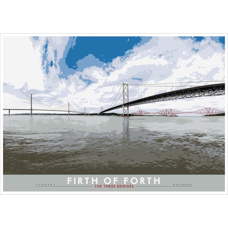
office wall art works best when the picture answers a practical question about the room. Forth Bridges is useful because Lee Scammacca’s design-led image combines an iconic structure with sunset colour, linking technical achievement to a warmer sense of place.
Use office wall art where discussion happens
A meeting room gives the subject more purpose than a forgotten corridor. Position it behind participants or opposite the main seats, then test video-call framing and projector sightlines. The bridge should be recognisable without sitting directly behind a bright screen.
Signal place
The landmark communicates a Scottish base without a large printed location statement.
Signal practice
Line and span suit technical teams, while sunset keeps the room from feeling clinical.
Keep safety notices and branding on a separate operational wall. One repeated sunset tone and a defined frame allow the work to carry identity with confidence.
Specify office wall art as part of the interior
Architectural lines and graduated sunset colour need accurate reproduction. Colour-managed Giclée output maintains both, while bespoke framing coordinates with workplace finishes without copying branding.
Office wall art works harder when it carries a connection to place and profession. Forth Bridges gives a Scottish engineering practice an assured reference without a slogan.
office wall art works best when it responds to the room rather than filling a convenient gap. Firth of Forth: the Three Bridges gives this decision a specific starting point because the three Forth crossings show different structural eras in one landscape-format Scottish view.
Choose office wall art that rewards technical curiosity
An engineering workplace does not need motivational typography to express what its people value. The rail bridge, road bridge and Queensferry Crossing let viewers compare cantilevers, suspension and cable-stayed forms. That gives the image relevance without turning the reception or meeting room into a corporate display.
Placement
Useful test
Meeting room
Keep the bridges visible from occupied seats, not only from the doorway.
Reception
Allow enough clear wall for the long structural lines to read at first glance.
594 x 420 mm print
Try it over a compact console or within a smaller project room.
840 x 594 mm print
Template the full framed outline on a broad wall before ordering.
Coordinate the frame with one existing finish, such as dark metal, pale timber or a restrained painted edge. Avoid adding models, technical diagrams and several bridge photographs around it. One composed view leaves room for the real projects and people in the space.
Frame office wall art for changing workplace light
Glazing and overhead light can create reflections across a detailed landscape. Check the sightline from desks and meeting chairs. Colour-managed Giclée output keeps Stewart Bremner’s printed detail clear, while in-house mounting and a hand-finished frame give the two substantial sizes a stable professional edge.
Office wall art feels credible when it relates to the work without explaining it too loudly. The Three Bridges offers structure, Scottish identity and a useful conversation across generations of design.
A beautifully framed print can still be difficult to enjoy when bright reflections compete with the image. Choosing non-reflective frames for office lighting involves more than the frame itself: glazing, light direction and artwork placement all play a part. Glazing terms can also be confusing when you’re comparing options for a professional-looking display.
First4Frames Gallery individually crafts each frame using high-quality materials. Its framing service uses 2mm float glass, which it describes as clearer than perspex. That should not be mistaken for non-reflective glazing. If reflections are a concern, check directly with your framer which specialist glazing choices are available before ordering.
This guide explains what causes reflections and how glazing, lighting and placement can work together to make office artwork easier to see. Learn how anti-glare and anti-reflective glazing differ, what to consider when choosing framed wall art, and which questions to ask before commissioning custom picture framing.
Key Takeaways
Check how windows, overhead lights and viewing angles affect the display, then assess the lighting around the wall you’re considering.
Compare glazing choices when considering non-reflective frames for office lighting. Clear 2mm float glass is not necessarily glazing designed to reduce reflections.
Use a practical order of checks: inspect the lighting, identify viewing angles, choose artwork, confirm framing options, then settle on placement.
Explore bespoke framing and commercial artwork curation for an office display. First4Frames individually crafts each frame using high-quality materials.
Why office lighting creates reflections on framed artwork
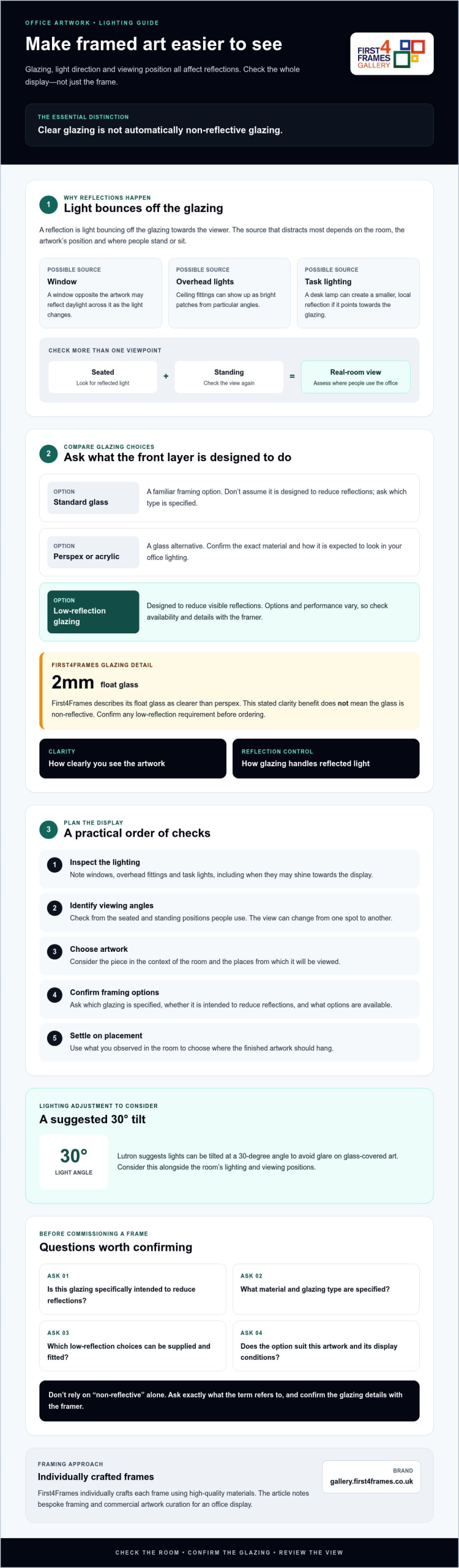
A reflection is light bouncing off the glazing towards the viewer, not a feature of the frame itself. A window opposite the artwork may reflect across it as daylight changes. Ceiling lights can appear as bright patches, while a desk lamp may cause a smaller, local reflection. The most distracting source depends on the room and the artwork’s position.
Viewing angle matters too. A framed print may look clear from one spot and mirror a light source from another. Check it from the seated and standing positions people typically use in the office. For an overview of picture framing glass or acrylic, see the different glazing materials used in framing.
This short video demonstrates acrylic described as non-glare:
Which office lights and positions create the most glare?
Assess the artwork in the lighting conditions it will actually face. A window opposite the frame may reflect daylight directly, while overhead fittings can show up from particular angles. Task lighting can cause glare if it points towards the glazing. No single light source always dominates, so check from the usual seated and standing positions before deciding where the piece should hang.
Does a non-reflective frame mean non-reflective glass?
The frame surrounds and supports the artwork; glazing is the transparent front layer. The phrase “non-reflective frame” may refer loosely to the glazing or the finished display, so ask the seller exactly what it means and which glazing is specified. The frame shapes the presentation; the glazing determines how its surface handles light. First4Frames specifies 2mm float glass and describes it as clearer than perspex, but does not describe it as non-reflective. Confirm any low-reflection requirement before ordering.
Compare glazing choices for clearer framed art in an office
Glazing affects how clearly artwork can be seen and how reflections appear, but these are separate considerations. When choosing non-reflective frames for office lighting, compare the glazing itself rather than assuming the frame material controls glare.
Glazing choice
What to consider
Standard glass
A familiar framing option, but don’t assume it’s designed to reduce reflections. Ask what type is specified.
Perspex or acrylic
A glass alternative. Confirm the exact material and how it is expected to look in your office lighting.
Low-reflection glazing
Designed to reduce visible reflections, but options and performance vary. Check availability and details with the framer.
First4Frames specifies 2mm float glass and describes its clarity as superior to perspex. That stated clarity benefit doesn’t mean the glass is non-reflective. Clarity describes how clearly you see the artwork; reflection control describes how glazing handles reflected light. Availability depends on the framer.
What should you ask about anti-reflective glazing?
Ask whether the quoted glazing is specifically intended to reduce reflections, how the provider describes its performance, and whether it suits your artwork and display conditions. Confirm which options can be supplied and fitted, and ask for any relevant care guidance. Don’t rely on “non-reflective” alone; find out exactly what the term refers to.
How do clarity and reflection control differ?
Glazing can offer a clear view without being designed to minimise reflections. Consider both needs, then ask the framer to explain the available choices. Lighting placement may also help: Lutron suggests lights can be tilted at a 30-degree angle to avoid glare on glass-covered art.
To find artwork for your office, browse the framed artwork gallery, then confirm your glazing requirements directly before ordering.
How to choose and position framed artwork under office lighting
A practical plan helps you choose artwork that suits the office and stays visible from the places people use most. Before ordering non-reflective frames for office lighting, work through these steps:
Inspect the lighting. Note windows, overhead fittings and task lights, including when they’re likely to shine towards the display.
Identify viewing angles. Check sightlines from desks, meeting areas and circulation routes, from both seated and standing positions.
Choose the artwork. Consider the room’s purpose, existing colours and the atmosphere you want the art to create.
Confirm framing options. Ask the framer about suitable frame and glazing choices before placing your order.
How should you assess artwork placement before ordering?
Use a temporary paper outline or hold a sample print against the wall in a few possible positions. This helps you visualise the scale and placement before you buy. A wall art visualiser may also help if you have access to one, but don’t assume it’s provided by the seller. Check sightlines from desks and meeting areas. If reflections distract from the image, try moving the planned position or adjusting nearby lighting.
Which artwork styles suit a professional office?
Choose imagery that supports the space without overwhelming it. Coastal wall art can suggest an open, restful mood; landscape wall art offers a broad range of natural scenes, while Scottish landscape art brings a more specific sense of place. Fine art, photography prints and contemporary art prints offer further options. If considering work by best-selling artists or famous artists, compare the image, scale and palette with the room before choosing a frame.
For broader frame-selection advice, consult Picture Frames: The Ultimate Guide. To explore artwork options for your office, browse the framed art gallery.
Choose bespoke framed wall art for a polished office finish
A well-chosen frame brings artwork into the room’s design, while suitable glazing and placement help keep it comfortable to view. First4Frames individually crafts each frame to order using high-quality materials. Bespoke framing lets you discuss how the frame should present the artwork and fit the space. Businesses planning a coordinated display can also consider commercial artwork curation.
First4Frames offers a selection of frames and artwork online. Choose a frame, then plan the finished piece around the print, office palette and intended position. If reflections are a concern, ask which glazing options are available rather than assuming a bespoke frame includes non-reflective glass.
What can an office ask a bespoke framer to tailor?
Discuss the artwork’s size and presentation, frame selection and any glazing requirements. First4Frames specifies 2mm float glass and describes its clarity as superior to perspex; this doesn’t mean it has anti-reflective performance. Confirm any low-reflection requirement directly with the framing service. These choices can help shape custom framed art prints through an art print framing service, creating bespoke framed wall art suited to the workplace.
How can businesses source office artwork and framed photographs?
Commercial artwork curation can help businesses furnish office spaces. First4Frames offers bespoke framing for prints, fine art, paintings and photographs. Businesses can discuss the artwork and framing requirements for their space, including the glazing and presentation they have in mind.
Choosing non-reflective frames for office lighting means looking beyond the frame: glazing, light direction and viewing position all influence how easily artwork can be seen. Check the display from everyday desk and meeting-room sightlines, and confirm exactly what a framer means by “non-reflective” before ordering.
First4Frames individually crafts each frame to order using high-quality materials. Its framing uses 2mm float glass, described as clearer than perspex, but that clarity should not be mistaken for verified anti-reflective performance. Ask about glazing requirements directly. Businesses can also consider commercial artwork curation for a cohesive office display.
Thoughtful artwork choices and bespoke framing can help create a polished space that feels welcoming and reflects your workplace. Explore framed wall art for your office and find pieces to help bring your vision to life.
Frequently Asked Questions
Are non-reflective frames the same as anti-reflective glass?
No. “Non-reflective frame” doesn’t necessarily mean the frame includes anti-reflective glass. The frame is the structure surrounding the artwork, while glazing is the transparent front layer. Sellers may use the phrase informally, so ask what glazing is included and whether it’s specifically intended to reduce reflections. Don’t assume ordinary glass or a particular frame finish will control glare.
Does 2mm float glass stop reflections from office lights?
No. First4Frames specifies 2mm float glass and describes its clarity as superior to perspex, but clarity and reflection reduction are different qualities. Float glass can still show reflections from office lights, depending partly on light direction and viewing angle. Ask the framer whether lower-reflection glazing is available for your chosen artwork and frame before ordering.
How can I reduce glare on framed pictures in an office?
Start by checking the artwork from the places people usually sit or stand. Reflections can change with the sightline, so view the piece from desks and meeting areas, then try adjusting its position or nearby lighting. Before ordering non-reflective frames for office lighting, ask the framer about glazing options. The best approach depends on your room, windows, light sources and viewing angles.
Is perspex clearer than glass for picture framing?
Not necessarily. Performance depends on the specific glazing and your priorities. First4Frames describes its 2mm float glass as clearer than perspex, but this doesn’t establish that every type of glass is clearer than every acrylic. Ask the framer to explain the materials available and compare how they suit your artwork, office lighting and handling needs.
Can I order custom framed art prints for an office?
Yes. First4Frames offers bespoke picture framing, fine art prints and commercial artwork curation, so businesses can discuss artwork and framing requirements for their space. Frames are individually crafted for each order using high-quality materials. Confirm glazing choices directly, especially if reducing reflections under office lighting is important to your project.
Office wall art can make a workspace feel established without filling it with slogans or generic city photography. Glasgow Waterfront by Esther Cohen combines an identifiable skyline with atmospheric Scottish light. It gives the eye distance and the room a clear connection to place.
Use office wall art to balance structure and visual distance
Workspace need
How to respond
Focus
Place the frame beyond the main screen rather than directly behind it.
Video calls
Keep it visible but offset, with no bright reflection across the skyline.
Local identity
Let the Glasgow subject speak without adding maps or signs nearby.
Visual space
Preserve clear wall around the horizon and waterfront.
In a home office, the print can soften practical storage and a functional desk. In a client-facing room, it can introduce conversation while remaining professional. Charcoal, muted blue, warm timber, or one metal detail can connect with the city setting without copying every colour.
A useful office focal point should support concentration, not demand attention every minute.
Give architectural detail a precise framed finish
City subjects depend on readable edges as well as variations in sky and water. Colour-managed Giclée production protects that balance. A hand-finished bespoke frame gives the waterfront enough authority for a professional setting while keeping the overall presentation approachable.
Office wall art can communicate energy without spelling out a motivational message. Salmon Leaping upstream in river catches the fish in mid-leap against the force of the river. Water droplets, current, and a taut body create purpose through action rather than words.
Let office wall art imply momentum naturally
Why the image suits focused work
Diagonal movement stops a blank wall feeling static.
The natural subject feels less corporate than arrows, skylines, or slogans.
The moment of effort suggests persistence without prescribing one message.
Place the work where it can be seen when looking away from a screen. A side wall, meeting corner, or clear space above low storage works better than a busy noticeboard.
Purposeful artwork can encourage focus quietly; it does not need to instruct the person looking at it.
A dark frame emphasises force and precision. Warmer timber makes the wildlife subject more approachable in a home office. Both are stronger than a literal river theme.
First 4 Frames can produce this image in a range of sizes and completes framing in-house in Falkirk. Colour-managed printing holds the water detail and the fish’s shape, while the frame gives the energetic moment a disciplined boundary.
The right office wall art should give a workspace more authority without making it feel colder. St George’s Tron, Church of Scotland in Glasgow is a strong example because the architectural subject adds structure, place, and a sense of confidence that suits a room used for thinking, meeting, or focused daily work.
Why St George’s Tron works so well as office wall art
St George’s Tron, Church of Scotland in Glasgow carries exactly the kind of definition that helps an office feel resolved. The lines are strong enough to hold the wall, yet the subject still has warmth and local personality. That balance is useful in a home office, studio, or client-facing room where generic artwork can feel forgettable very quickly.
It gives a workspace stronger visual structure.
It adds place and identity without becoming distracting.
It suits rooms that need authority but still want warmth.
Because First 4 Frames handles the framing and Giclée production in-house, the finished presentation feels polished enough for a serious workspace. That hand-finished result is often what separates artwork that merely fills a wall from artwork that helps define the room.
If you would like more background on the building itself, St George’s Tron Church is worth a look. You can also browse more work from the Photography collection and view the exact framed print here.
For anyone choosing office wall art that feels grounded, capable, and well judged, St George’s Tron, Church of Scotland in Glasgow is a very convincing option.
The most effective office wall art usually adds confidence without distraction. Dornie does that beautifully, bringing place, atmosphere, and breathing space into a room that needs to feel professional but still human.
Why Dornie works so well as office wall art
Dornie helps an office feel judged rather than merely filled. The scene has enough structure to give a wall presence, but it also carries calm, which matters in workspaces where clarity and steadiness are more valuable than louder statement pieces. That makes it a useful option for private offices, meeting rooms, or a well-prepared home office.
It adds authority without corporate blandness.
It helps a workspace feel more considered and welcoming.
It balances local character with a professional finish.
First 4 Frames completes every piece in-house with bespoke framing and colour-managed Giclée print quality, so the final presentation feels hand-finished and dependable. In an office, that level of craftsmanship makes a real difference because clean presentation often shapes the whole tone of the room.
Good office wall art should help a room feel more composed, not simply more decorated. Schiehallion works especially well in that setting because it brings mountain scale, calm colour, and enough structure to give the wall real presence without distracting from work.
That matters in both home offices and more client-facing spaces. The artwork should strengthen the room rather than compete with it.
Why Office Wall Art Benefits From Quiet Authority
A workspace often needs steadier visual energy than a busier living room. This piece gives the eye somewhere confident to land, while still keeping the atmosphere settled and thoughtful.
It gives a desk wall more depth without adding clutter.
It helps the room feel professional without feeling bland.
It supports concentration better than something louder or more decorative.
Where Schiehallion Works Best
Schiehallion would suit a home office, consulting room, studio, or study where one framed landscape can give the space more credibility and calm. It pairs especially well with timber desks, slate tones, muted paint colours, and cleaner shelving because the image already carries a strong sense of order.
Why First 4 Frames Makes The Difference
Landscape pieces with subtle tonal transitions benefit from careful print handling and a properly judged frame. First 4 Frames completes bespoke framing and colour-managed Giclee production in-house, helping the final result feel polished from the outset. You can see the exact framed product here, and explore more from Julie Arbuckle if you value mountain-led work with the same calm authority.
If you are choosing office wall art and want the room to feel steadier, more focused, and properly finished, Schiehallion is a strong option.
Good office wall art should do more than brighten a blank wall. In a working room, the right piece can shape the whole tone of the space, helping it feel more focused, grounded, and worth spending time in. A Cold Old Man of Storr is especially effective when you want that sense of presence without making the room feel formal or overdesigned.
Why an office benefits from artwork with quiet authority
Workspaces often need a steadier visual rhythm than busier living areas. Artwork that is too decorative can distract, while something too bland quickly disappears into the background. A Cold Old Man of Storr sits in the middle very well, bringing landscape depth and a more composed mood to the room.
It gives a desk wall a stronger focal point without feeling loud.
It helps a practical room feel more personal and less purely task led.
It suits both home offices and client-facing workspaces where presentation matters.
This is especially useful if the room already includes timber furniture, darker shelving, or a more restrained colour palette. The image adds atmosphere, but it still leaves the space calm enough for concentration.
Why the framed finish matters in a workspace
First 4 Frames completes each piece in-house in Falkirk with bespoke framing, colour-managed Giclee printing, and hand-finished craftsmanship. That superior finish helps the artwork feel deliberate and professional, which is exactly what many offices need.
You can explore more from Scott McGregor and view the exact framed print here.
If you want office wall art that brings focus, depth, and a more resolved feel to the room, A Cold Old Man of Storr is a very strong option.
Not every room benefits from loud artwork. In a workspace, studio or reception area, the right piece often does something quieter. It settles the room, gives the eye somewhere to rest and helps the space feel considered. That is exactly where Under Our Skies comes into its own.
With its coastal mood, layered sky and cool, reflective palette, this Jill McIntosh print is a strong choice for anyone looking for calm wall art for an office or reception area. It has presence, but it does not demand attention in a way that would overwhelm the room.
Why calming artwork matters in working spaces
People often think about furniture, lighting and storage first when shaping a work environment, but the walls do a great deal of emotional work too. In client-facing spaces, artwork helps set the tone before a conversation even begins. In personal workspaces, it can make the room feel more balanced and less purely functional.
Under Our Skies suits that job well because the composition feels open and breathable. The sea-and-sky atmosphere creates a sense of distance and stillness that works naturally in places where you want people to feel at ease.
Where this print works best
This piece is especially effective in:
home offices that need a calmer visual rhythm
reception spaces where first impressions matter
meeting rooms that benefit from a softer backdrop
studios, treatment rooms or consulting spaces where a restful feel is important
Because the colours are cool and understated, it can sit comfortably alongside neutral décor, natural wood, black frames or contemporary interiors with clean lines.
The value of bespoke framing for a professional finish
Presentation matters even more in work settings. A bespoke frame gives the artwork a finished, intentional look and helps it sit confidently within the wider design of the room. At First 4 Frames, every piece is framed in-house, which means the final result can be tailored to suit a modern office, a softer reception space or a more design-led studio interior.
A simple contemporary frame can keep the look crisp and architectural. A slightly warmer finish can make the piece feel more welcoming in client-facing spaces. Either way, careful framing helps the print feel substantial rather than incidental.
A useful choice when you want art without visual noise
Some artwork is chosen to dominate a room. Under Our Skies is different. Its strength is in how it supports the atmosphere of a space. The coastal palette brings freshness, while the expansive sky introduces a sense of openness that can be especially helpful in smaller offices or enclosed rooms.
That makes it a practical option for businesses and homeowners alike, particularly when they want art that feels polished, calming and easy to live with over time.
View the product
You can see Under Our Skies at First 4 Frames here. If you need advice on a suitable frame for a workspace, reception area or home office, First 4 Frames can help you choose a presentation that matches the setting.
For rooms that need composure rather than clutter, Under Our Skies is a very strong fit. Professionally framed, it offers a calm focal point with the craftsmanship and finish to suit a quality-led interior.