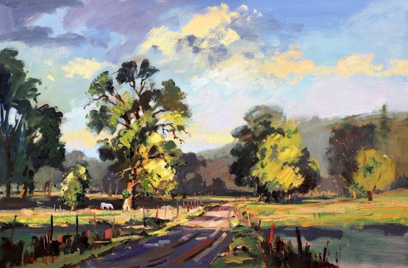
Giclee art prints becomes more useful when the artwork answers a real feature of the room. Late Afternoon offers a clear example because the scene’s atmosphere depends on the transitions that occur as stronger daylight softens towards evening.
What to notice in Giclee art prints with subtle light
A print built around time of day needs more than a bright overall result. Look for separation between the lightest areas, middle tones and deeper passages. If those zones collapse together, the atmosphere becomes flat. A colour-managed workflow is valuable because it aims to reproduce those relationships consistently.
Viewing check
What to look for
Morning daylight
Quiet tones should remain distinct rather than appearing washed out.
Late afternoon
Warm room light should support the scene without turning every neutral orange.
After dark
A nearby lamp should reveal detail without reflecting directly in the glazing.
Late Afternoon is offered in 350 × 230 mm and 550 × 365 mm print sizes. Compare the finished framed outline with the viewing distance, since the larger option can reveal gradual tonal changes more readily from across a room.
Frame atmosphere without introducing visual noise
First 4 Frames produces colour-managed Giclée work in-house in Falkirk. A restrained bespoke frame can then protect the quieter mood, while careful positioning prevents glare from hiding the tonal work the print process preserves.
The appeal of Giclee art prints lies partly in controlled detail and tone. Late Afternoon rewards checking those qualities under the real light in which the finished work will be seen.
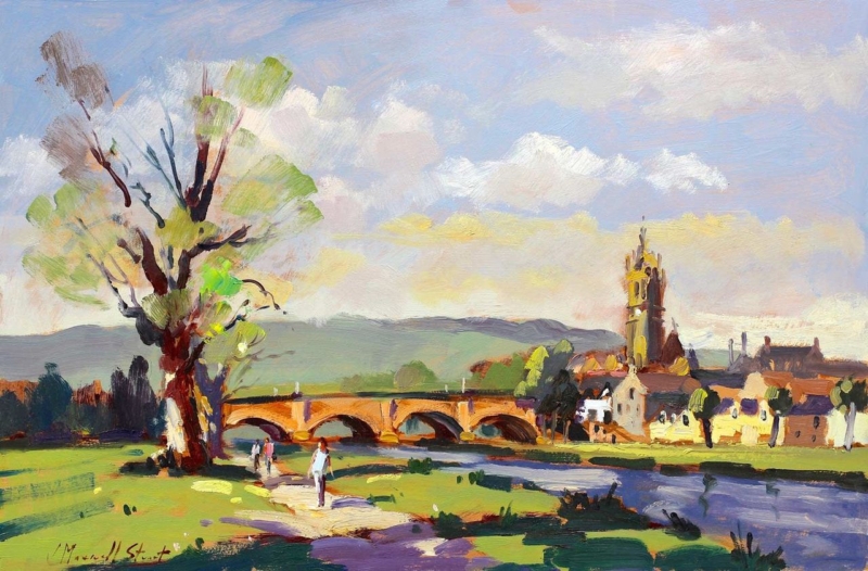
Wall art for a room with picture windows should hold its own beside a real outlook. It does not need to imitate the exact trees, weather or season outside. By the River Tweed, Peebles by Joseph Maxwell Stuart offers a distinct journey through a Peebles riverscape. Its landscape format can extend the room’s sense of distance while remaining clearly framed as an artist’s view.
Position wall art for a room with picture windows off-axis
Choose the side wall
A side wall lets the eye move between the real outlook and the painted river. Directly opposite the glass, reflections may replace the quieter detail with a bright rectangle.
Keep the horizon at a comfortable level
Relate the composition to seated viewing height rather than aligning it mechanically with the window frame. The picture should remain comfortable when curtains or blinds are closed.
The available 550 × 365 mm and 350 × 230 mm print sizes support different roles. The larger size can balance a generous glazed area, while the smaller option suits a return wall or reading corner. Always mark the complete framed dimensions before ordering.
Should the frame match the window frames?
It can relate to them, but an exact match is unnecessary. A frame should first support the artwork. A natural timber or quiet dark moulding may connect with the architecture while still giving the River Tweed scene its own identity.
Protect the quieter view from changing daylight
River, foliage and atmospheric distance depend on subtle tonal steps. Colour-managed Giclée production helps retain those layers. Bespoke framing completed in-house can then account for the wall colour and the room’s unusually strong daylight, with a finish that gives the painted landscape definition beside the brighter live view.
Thoughtful wall art for a room with picture windows creates a second kind of looking. By the River Tweed, Peebles brings a composed place, a chosen season and an artist’s emphasis, giving the interior something rewarding even after the daylight fades.
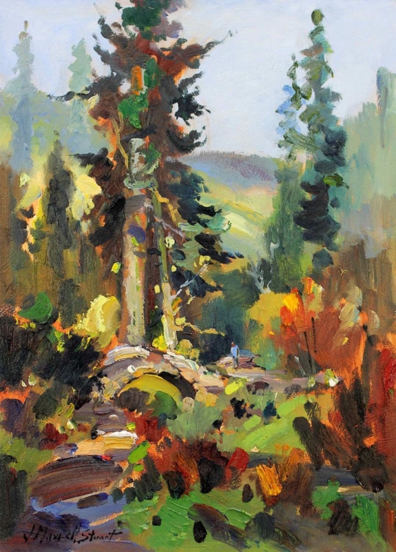
Art for living room walls can do more than supply colour. The Woodland of Royal Botanic Garden, Dawyck offers a route into a real Borders woodland, using its portrait format to draw the eye through trees and layered space. That visual depth is especially useful where a living room feels enclosed or where a narrow wall needs a convincing destination.
Place art for living room depth on a useful sightline
Seen from the doorway
Use the portrait image to create a point of arrival. Keep the floor area below it clear so the woodland route is not blocked by a tall plant or lamp.
Seen from the sofa
Hang it at seated viewing height and check reflections at the time of day the room is used most. Softer side lighting will reveal depth more reliably than a spotlight aimed at the glass.
Should woodland art sit beside lots of houseplants?
Not necessarily. One plant can connect the room to the subject, but several overlapping leaves may flatten the framed view. Let the picture provide the main woodland structure.
The 230 × 320 mm print size suits a reading-side wall or compact room. The 400 × 550 mm option has more presence beside a standard sofa or console. In either case, relate the complete framed dimensions to the furniture rather than judging the print size alone.
Frame the woodland as a view, not a pattern
Subtle changes through trunks, foliage and distance create the sense of walking into the scene. Colour-managed Giclée output protects those quieter tonal steps. Bespoke in-house framing can provide breathing space around the portrait image so it reads as a considered view rather than another layer of surface pattern.
When choosing art for living room walls, The Woodland of Royal Botanic Garden, Dawyck is a useful reminder that perceived space can matter as much as colour. A clear woodland route gives the eye somewhere calm to travel.
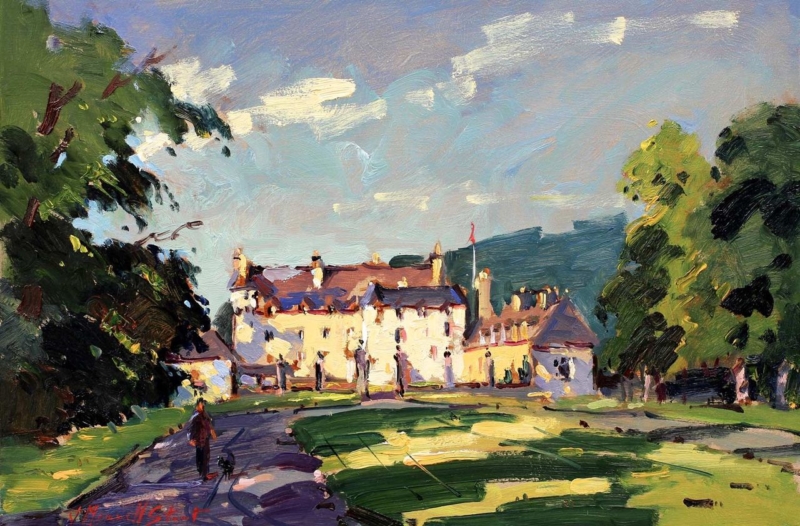
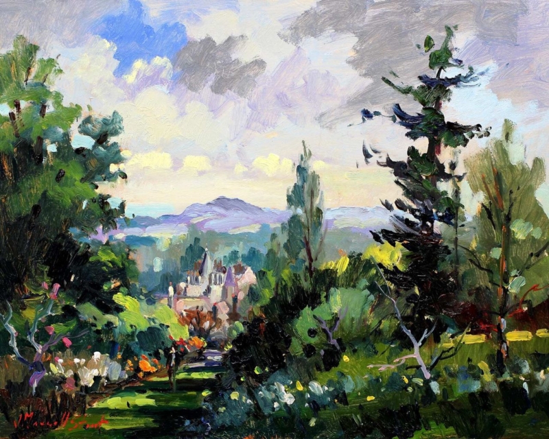
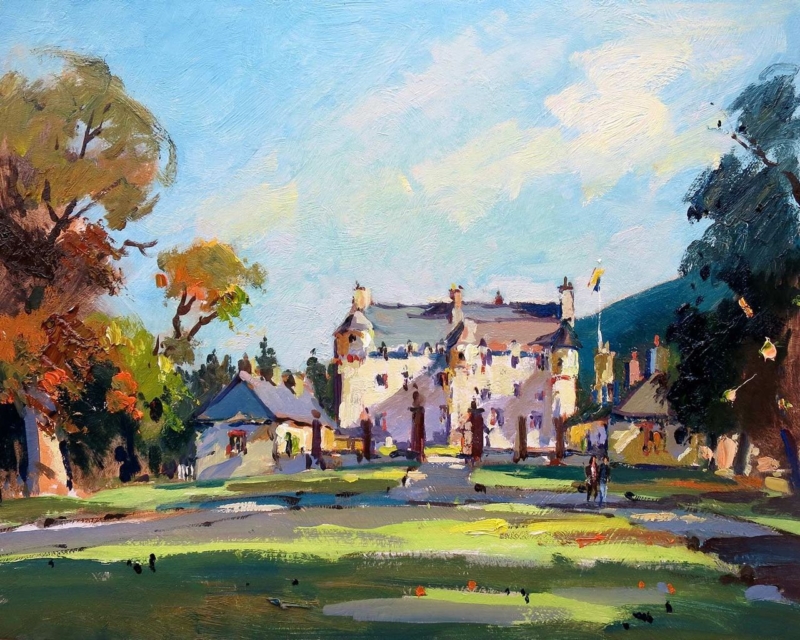
Art for a hallway works especially well when the composition seems to extend the route through the home. In Traquair House, a curving approach leads between deep trees toward a sunlit historic house. That progression can give a narrow or windowless passage a welcome sense of destination.
Position art for a hallway along the natural sightline
Look from the doorway
Choose the wall that remains visible as someone enters and moves through the hall. The bright building should read before the smaller figures and garden detail.
Relate the frame to the route
Align the work with a console, radiator cover or strong door frame. This makes the landscape feel connected to the architecture rather than floating between several openings.
Check evening glare
Hall lighting often sits close to the wall. View the proposed position after dark and move the frame away from a direct reflection if the facade becomes difficult to see.
The warm house and lawn can relieve a cool passage, while the large areas of sky and shadow provide breathing room. Keep nearby objects low so the painted path remains visually open.
Preserve the light that draws the eye forward
The appeal lies in the contrast between shaded trees, loose brushwork and the luminous facade. Colour-managed Giclée reproduction keeps those values separate. A bespoke frame adds an orderly edge that suits the hallway without making the painting feel formal or remote.
When choosing art for a hallway, Traquair House offers more than decoration: its path, light and welcoming architecture can make movement through the space feel purposeful.
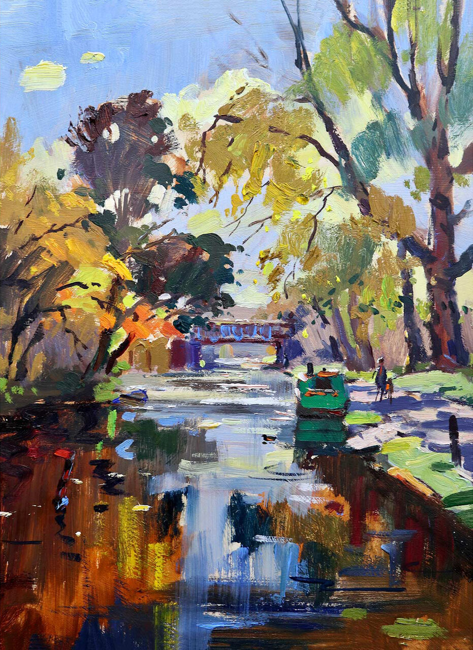
wall art for a narrow hallway has to earn its place. The route may be busy, the viewing distance short, and the available wall broken up by doors. Autumn Reflections Union Canal by Joseph Maxwell Stuart answers those constraints with a path-like stretch of water, trees, figures, and a distant bridge. That recession draws the eye forward, while the autumn colour gives a practical circulation space genuine warmth.
Why wall art for a narrow hallway benefits from depth
A narrow hall can feel like a passage rather than a room. Artwork with a clear foreground, middle distance, and horizon helps counter that effect. In Autumn Reflections Union Canal, the canal carries the view beyond the surface of the wall. The bridge and walkers provide small points of interest without turning the image into a crowded scene.
This visual depth is particularly useful on the end wall of a straight hallway. The picture becomes a destination as someone enters. On a side wall, it can also slow the eye between doorways. Choose the position that offers the longest comfortable view, then check it again from the rooms that open onto the hall.
Map the sightlines before making holes
Stand at the entrance. Mark the section of wall that remains visible when internal doors are open.
Walk the route. Make sure the frame will not sit where shoulders, bags, or coats regularly pass.
Check the end view. Centre the picture on the useful sightline, which may differ from the mathematical centre of the wall.
Test eye level. Use the viewpoint of a person walking through the space, rather than aligning automatically with a nearby door frame.
A paper template cut to the finished frame size is valuable here. Leave it in place for a day and approach it from both directions. This simple check reveals whether the piece feels confident or cramped, and whether switches, radiators, or opening doors interrupt the composition.
Use autumn colour without darkening the passage
Warm orange, russet, and gold can make a hallway feel welcoming, especially as October light becomes cooler. The water and open distance in this image prevent those richer notes from becoming heavy. Rather than painting the whole hall a matching deep shade, repeat one restrained colour in a runner, small ceramic, or timber detail.
Hallway condition
Helpful response
Limited daylight
Keep the surrounding wall and mount relatively light
Several timber doors
Relate the frame to one established wood tone
Patterned runner
Allow plain wall space between floor pattern and artwork
Strong ceiling light
Check the glazing for reflections from walking height
Choose a frame with safe, useful presence
A hallway frame needs enough definition to look deliberate, but excessive projection can become awkward in a tight route. A neat profile, carefully chosen mount, and secure hanging method keep the presentation refined. If the wall is plasterboard or receives regular vibration from doors, suitable fixings are as important as the visual choice.
First 4 Frames produces colour-managed Giclée prints and completes bespoke framing by hand at its Falkirk workshop. That in-house approach makes it easier to consider the image, finished dimensions, moulding depth, and exact wall together rather than treating the frame as an afterthought.
Effective wall art for a narrow hallway can make the journey through a home feel considered, not merely decorated. View the framed Autumn Reflections Union Canal print for a scene that adds perspective, Scottish character, and autumn warmth while keeping a compact passage visually open.
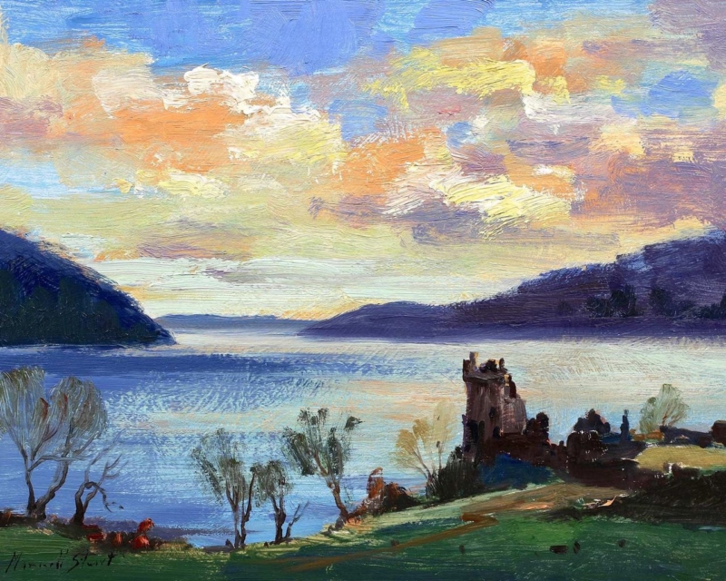
Scottish landscape art can give a morning room a sense of distance before the day becomes busy. Sunrise, Urquhart Castle by Joseph Maxwell Stuart combines early light with the structure of a historic site. The result feels rooted and contemplative without asking the room to become formal.
Let Scottish landscape art support the morning light
Start by studying where the first usable daylight reaches the room. Hang the work where soft light can reveal the landscape, but avoid a direct line to the window. Reflections will hide the quieter transitions that make a sunrise scene convincing.
Measure above the breakfast table, low sideboard, or reading bench.
Compare the 350 × 280 mm and 560 × 440 mm print options against that furniture.
Keep the artwork visually connected to the surface below, rather than centring it on the entire wall.
Check the view from the doorway and the seat used most often in the morning.
Keep heritage references selective
The castle already supplies history and place. Pair it with simple ceramics, linen, or timber rather than tartan patterns and miniature landmarks. This allows the image to feel relevant in both traditional and contemporary homes.
A quieter wall colour can help the sunrise remain the source of warmth. Soft grey, chalky blue, or muted stone will give the landscape definition while keeping the room restful.
Frame detail without hardening the atmosphere
The ruins need enough definition to remain recognisable, while the sky and distance need softer tonal handling. Colour-managed Giclée reproduction protects both qualities. In-house bespoke framing gives the horizontal view a precise finish without making its morning mood severe.
As Scottish landscape art for a morning room, Sunrise, Urquhart Castle offers light, history, and visual distance in a format that can make the start of the day feel more settled.
botanical wall art for an orangery should do more than repeat the planting visible through the glass. It needs to give the room a steady focal point when daylight changes and the garden moves through the seasons. Amongst the Azaleas by Joseph Maxwell Stuart offers that balance. Its layered garden subject brings colour and depth indoors, while the composition feels considered enough to stand apart from the view outside.
Why botanical wall art for an orangery needs visual structure
An orangery often contains several competing features: broad windows, strong sunlight, pots, patterned leaves, and routes into the garden. Artwork can disappear among those details if it is too pale or slight. At the other extreme, a very graphic piece may feel disconnected from the room’s softer purpose.
Amongst the Azaleas provides a useful middle ground. The azaleas relate naturally to a planted setting, yet the framed image creates its own boundary and sense of order. This makes it suitable for the solid wall above a console, between glazed doors, or near a dining table where the picture can be enjoyed at close range.
Choose the wall by watching the light
Before fixing the position, observe the room in the morning, at midday, and near dusk. Direct glare can hide colour and detail. A wall at right angles to the main glazing often gives a clearer view than one directly opposite it. If reflections remain a concern, discuss glazing and placement during the framing consultation.
Season matters too. A wall that seems quiet in summer may become much more prominent when leaves fall and daylight shortens. Place the artwork where it can hold the room during winter as well as complement abundant colour in spring. That year-round role is more valuable than matching one brief flowering period.
Build a restrained orangery palette
Room element
Useful connection
Common mistake
Painted walls
Soft mineral or warm neutral colour
Matching the brightest flower exactly
Furniture
Natural timber, cane, or one painted piece
Adding several competing garden motifs
Textiles
Plain linen or a small-scale texture
Using a large floral pattern beside the print
Accessories
One ceramic drawn from a quieter picture tone
Repeating every colour around the room
The artwork does not need exact colour partners. One or two quiet echoes will make it feel connected. Leaving some plain surfaces around the frame also helps separate the painted garden from real foliage. That breathing space is especially useful in a room where plants already provide texture.
Use scale to support the architecture
Measure the solid section of wall rather than the entire glazed elevation. A frame should relate to the furniture below it and retain a clear margin at each side. If the wall is narrow, the smaller available print size can create a deliberate pause. On a broader wall, the larger version can hold its own against tall windows and substantial seating.
A mount can give the detailed subject a calm transition into the frame. A warm timber may connect with natural furniture, while a refined painted or darker moulding can define the image more firmly. First 4 Frames produces colour-managed Giclée prints and completes bespoke framing in-house at its Falkirk workshop, allowing the presentation to respond to both the image and the room.
A garden subject that is not limited to one season
Well-chosen botanical wall art for an orangery should connect inside and outside while still giving the interior its own identity. View the framed Amongst the Azaleas print for a garden-led focal point that can remain rewarding through bright summer days and quieter winter light.
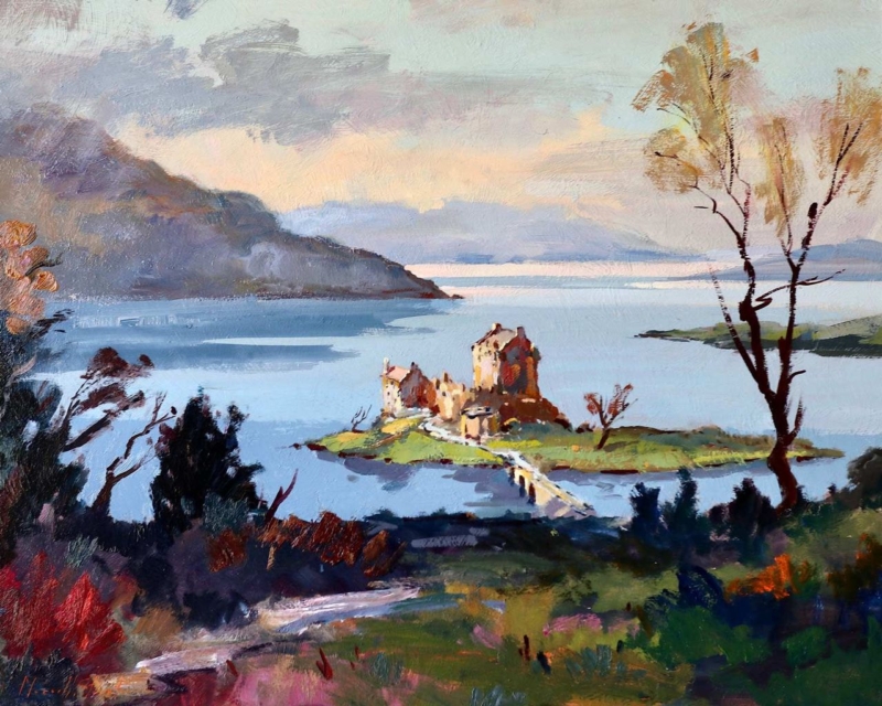
Scottish castle wall art can work beautifully in a room with limestone flooring when it offers more than another hard stone surface. View to Eilean Donan Castle by Joseph Maxwell Stuart sets historic architecture within water, landscape, and open distance. Those softer layers can balance a cool, durable floor.
Balance Scottish castle wall art with the room’s hard surfaces
Room element
Useful response
Pale limestone
Choose a restrained frame that separates the image from the wall.
Cool grey stone
Introduce wool, timber, or linen near the artwork for warmth.
Broad glazing
Hang away from direct reflections so water and distance stay readable.
Traditional furniture
Keep castle references to the artwork rather than adding heritage props.
The horizontal print options suit a console, bench, or modest sideboard. Avoid placing the lower edge too close to a stone surface, where the frame can feel compressed. Breathing space lets the castle sit within its wider setting and prevents architecture from dominating the room.
Let the landscape soften the stone; do not ask the room to imitate the castle.
Preserve detail across architecture, water, and distance
A castle landscape needs crisp structure, but its atmosphere depends on quieter changes in land, sky, and water. Colour-managed Giclée production retains both. Bespoke framing made in the Falkirk workshop gives the view a precise boundary against a tactile limestone interior.
As Scottish castle wall art, View to Eilean Donan Castle introduces heritage and a strong sense of place while helping a limestone-floored room feel more open and liveable.
Scottish heritage wall art for a traditional study works best when the subject brings real history but the room remains comfortable for present-day use. Traquair House, Early Autumn by Joseph Maxwell Stuart offers architecture, landscape, and early autumn atmosphere together. It can sit naturally with books and timber without requiring tartan accessories or staged antiques.
Balance Scottish heritage wall art for a traditional study with the room
If the study is dark
Use a lighter mount and leave clear wall around the frame. Place the work near the reading zone, but angle lamps so reflected bulbs do not obscure the house or landscape.
If the study is pale
A deeper frame can connect the picture with a desk or bookcase. Repeat one autumn colour in leather, wool, or a single object rather than throughout the room.
The artwork can work above a low cabinet, beside a reading chair, or on the wall opposite the desk. Do not force it into a narrow shelf gap. The architecture needs enough breathing space to feel like a destination rather than another item catalogued among the books.
Keep the heritage reference current
Pair the framed print with useful contemporary lighting and clear work surfaces. The historical subject then adds depth while the room remains practical, personal, and easy to use.
Keep architectural and autumn detail distinct
Stone, foliage, and soft seasonal light require tonal control. Colour-managed Giclée production preserves those relationships, and bespoke hand finishing gives the print a substantial presentation suited to a book-lined room. All of that work is completed in-house in Falkirk.
As Scottish heritage wall art for a traditional study, Traquair House, Early Autumn adds history and atmosphere while leaving the room grounded in everyday life.
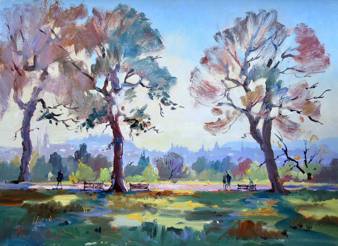
Autumn park wall art for a dining room can keep the space warm and welcoming even when the table is not laid. Autumn Afternoon, Inverleith by Joseph Maxwell Stuart combines three substantial trees, vivid foliage, open parkland, and distant figures. The scene feels social without depicting a formal meal, which allows it to support everyday breakfasts as easily as evening gatherings.
Use autumn park wall art for a dining room beyond one season
Room element
How to respond to the artwork
Table timber
Let warm wood echo the foliage without trying to match every orange tone.
Upholstery
Repeat one quieter green, rust, or blue in chair fabric or a bench cushion.
Lighting
Use warm lamps after dusk, but keep pendant glare away from the glass.
Table setting
Choose plain ceramics so the picture remains the main source of seasonal colour.
The artwork does not need to disappear after autumn. Its bright sky and park depth prevent the palette from feeling closed or wintry. In spring, pair it with fresh green stems. In summer, keep textiles pale. The same framed piece can remain settled while smaller dining details change.
Judge the height from a seated position
Dining art is viewed while sitting as well as standing. Test the centre slightly lower than you might in a hallway, and leave safe clearance above a sideboard. The distant figures and tree trunks should remain easy to read across the table.
Vivid foliage can become muddy when reproduction is poorly controlled. Colour-managed Giclée printing preserves the relationship between warm leaves, cool sky, and park shadows, while in-house framing gives the scene a lasting finish.
As autumn park wall art for a dining room, Autumn Afternoon, Inverleith adds colour and convivial warmth while remaining adaptable throughout the year.