Posted on

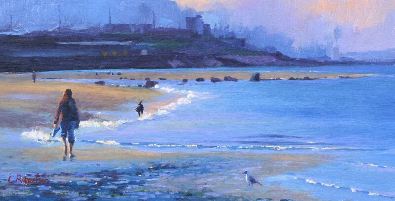
Walk on the Waves and the Appeal of Spa Treatment Room Wall Art

Image of Walk on the Waves by Colin Robertson

The right spa treatment room wall art should do more than simply fill a blank wall. In a treatment room, the artwork helps shape how calm, private, and well cared for the space feels from the moment someone walks in. Walk on the Waves is especially effective because it brings movement and atmosphere while still keeping the room settled and easy to relax in.

Why treatment spaces benefit from artwork with a quieter presence

A good spa or therapy room should feel polished without seeming staged. The atmosphere needs to support rest, trust, and a sense of being properly looked after. Artwork plays a part in that. Walk on the Waves works beautifully because it introduces coastal calm and a sense of flow without turning the room into predictable wellness decor.

That matters in smaller treatment rooms especially, where every detail is more noticeable. A hand-finished framed print can help the room feel more considered, more complete, and more in keeping with a premium client experience.

  • It helps a treatment room feel calm without becoming bland.
  • It adds atmosphere and movement without asking too much of the eye.
  • It supports a more polished, quality-led impression for clients.

Why hand-finished quality matters in a client-facing room

First 4 Frames completes each piece in-house in Falkirk using bespoke framing, colour-managed Giclee printing, and hand-finished craftsmanship. That level of presentation suits spaces where customers expect care and quality in every detail, not only in the service itself but in the setting around them.

You can explore more work by Colin Robertson and view the exact framed print here.

If you are looking for spa treatment room wall art that feels calm, professional, and genuinely well judged, Walk on the Waves is well worth considering.

Posted on

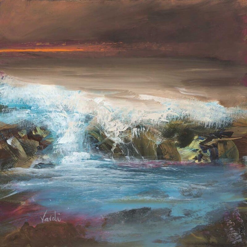
Art for a Room With Picture Windows, Why First Light 2 Feels So Natural

Image of First Light by Arie Vardi

Choosing art for a room with picture windows can be harder than it first appears. The view already does a lot of visual work, and strong daylight can make some artwork feel over-insistent. First Light 2 works beautifully in that setting because it keeps the wall feeling intentional without pulling attention away from the window itself.

The open horizon and quieter colour transitions help the artwork sit alongside natural light rather than wrestle with it. That matters in rooms where glass, sky, and changing weather are already part of the atmosphere every day.

Why It Suits Wide, Bright Rooms

Rooms with larger panes usually benefit from artwork that echoes space and calm instead of adding another dense focal point. First Light 2 has enough presence to hold the wall, but it still leaves breathing room around the scheme.

  • It supports a bright room without making it feel visually crowded.
  • It keeps sightlines open, which is useful near glazing and long exterior views.
  • It adds atmosphere without turning the wall into a second competing landscape.

Where It Works Best

This kind of piece is especially effective in a sitting room with garden or coastal outlooks, in a dining space with wide rear glazing, or in a landing where daylight pours in and the wall needs a calmer answer than a busier print would provide.

It also suits rooms where timber, linen, stone, and soft neutrals already do much of the decorating work. In those spaces, the role of the artwork is to complete the mood rather than change it completely.

The Framed Finish Matters Here

Bright rooms are unforgiving of weak presentation. If the framing looks generic or the print handling feels flat, the whole piece can disappear against the light. First 4 Frames completes work like this in-house with bespoke framing and colour-managed Giclee production, giving the finished piece more authority on the wall.

You can see the exact framed product here, and explore more from Arie Vardi if you want the same spacious coastal character elsewhere in the home.

If you are looking for art for a room with picture windows that feels calm, light-aware, and easy to live with, First Light 2 is a very strong fit.

Posted on

Wall Art for a Room With Blue Walls, Why Carista Bay Lewis Feels So Balanced

Image of Carista Bay Lewis by Arie Vardi

Choosing wall art for a room with blue walls is usually about balance. Blue can feel calm, elegant, and full of light, but it can also leave a room looking slightly cold if the artwork repeats the same note without adding warmth or movement. Carista Bay Lewis is such a good answer because it keeps the freshness of a blue scheme while softening it with shoreline colour and a more open sense of space.

This kind of piece works especially well when you want a room to feel airy and settled rather than strongly contrasted. The coastal atmosphere gives the eye somewhere gentle to rest, which helps blue walls feel layered rather than flat.

Why It Works With Blue Schemes

Blue rooms often benefit from artwork that introduces a second note without fighting the calm. Carista Bay Lewis does that neatly through soft sand, light, and horizon. The room keeps its cool composure, but it gains more warmth and rhythm.

  • It prevents a blue room from feeling too tonally narrow.
  • It adds movement without making the space feel busy.
  • It suits coastal, modern, and quietly traditional interiors alike.

Best Places To Use It

This piece would work well in a bedroom with painted blue walls, a sitting room with softer navy or denim tones, or a hallway where cooler colour needs something more welcoming to balance it. It also suits rooms with pale timber, natural fibres, and brushed metal details because the palette does not compete with them.

If the wall colour already gives the room enough atmosphere, the artwork does not need to shout. It simply needs to complete the scheme. That is exactly where Carista Bay Lewis feels strongest.

Why The Finish Helps

A blue room usually shows up weak framing very quickly. The piece needs a clean, hand-finished presentation so the colours feel intentional and the wall looks properly dressed. First 4 Frames completes this work in-house with bespoke framing and colour-managed Giclée quality, giving the finished piece much more authority than a standard print.

You can view the framed product here, and explore more from Arie Vardi if you want to build a similarly calm, coastal thread across the home.

For anyone looking for wall art for a room with blue walls that feels warm, airy, and quietly polished, Carista Bay Lewis is a very strong fit.

Posted on

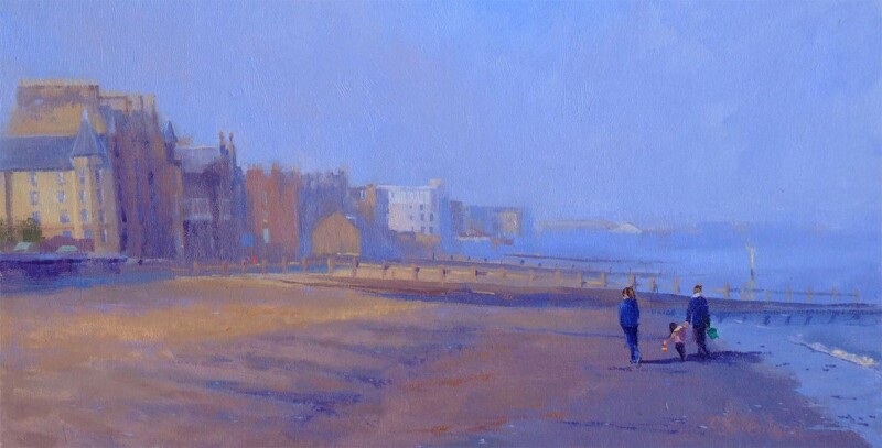
Why A Moment by the Sea Works So Well as Dental Waiting Room Wall Art

Image of A Moment by the Sea by Colin Robertson

The right dental waiting room wall art can change how a client space feels before a word is spoken. A Moment by the Sea is especially effective because it brings movement, openness, and a gentler atmosphere without making the room feel themed or overly decorative.

Why calmer imagery matters in a dental waiting room

Dental waiting areas need to feel reassuring. Patients often arrive carrying some level of tension, even for routine appointments. Artwork that feels too sharp, too busy, or too corporate can make the room seem colder than it needs to be. A Moment by the Sea offers a different balance. It introduces light, space, and a familiar human scene that helps the room feel more approachable.

That is useful in smaller practices as well as larger clinics. The piece has enough presence to lift a plain wall, but it still feels composed and easy to live with in a professional environment.

  • It helps a waiting area feel calmer without slipping into generic spa styling.
  • It brings a friendlier first impression to a client-facing room.
  • It suits reception or seating areas that need polish as much as warmth.

Why a hand-finished framed print gives a better impression

In a professional setting, finish matters. First 4 Frames completes each piece in-house in Falkirk using bespoke framing, colour-managed Giclee printing, and hand-finished craftsmanship. That gives the final presentation the substance and quality a client-facing interior deserves.

You can explore more work by Colin Robertson and view the exact framed print here.

If you are choosing dental waiting room wall art that should feel calm, professional, and genuinely welcoming, A Moment by the Sea is well worth considering.

Posted on

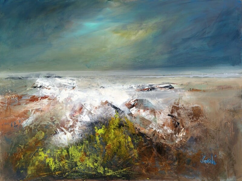
Art for a South Facing Room, Why The Finality of a Day Feels So Well Judged

Image of The Finality of a Day by Arie Vardi

A room with strong daylight can be a gift, but it also changes how artwork behaves across the day. The Finality of a Day is a strong answer for art for a south facing room because it has enough atmosphere to hold bright light without turning harsh or washed out.

Why this piece suits the space

South-facing spaces often need artwork that can cope with morning brightness, midday glare, and the warmer tone that arrives later on. This piece keeps its composure through those shifts, which makes it easier to live with in a main sitting room, sunroom, or brighter dining area.

  • The softer colour movement stops a bright wall from feeling overexposed.
  • The framed finish gives the image enough weight to hold a sunlit wall properly.
  • It works particularly well in rooms that already use pale neutrals, stone, or natural timber.

Because the light in these rooms is generous, the wrong artwork can disappear or feel too busy. The Finality of a Day sits in the middle ground. It has enough presence to anchor the wall, but it still supports a calm scheme rather than competing with it.

Why the framed finish matters

First 4 Frames completes the piece in-house in Falkirk with bespoke framing, colour-managed Giclee printing, and hand-finished craftsmanship. That matters in a bright room, where detail, tone, and presentation are always easier to notice.

This artwork is by Arie Vardi, and you can view the exact framed product here.

If you are choosing art for a south facing room and want the result to feel calm, polished, and lasting, The Finality of a Day is a very good fit.

Posted on

Why Sea Meets Skye, Easdale Works So Well as Large Coastal Wall Art

Image of Sea Meets Sky, Easdale by Colin Robertson

Good large coastal wall art needs to do more than cover square footage. On a broader wall, the artwork has to carry enough atmosphere and scale to feel intentional, while still leaving the room calm enough to live with every day. Sea Meets Skye, Easdale is especially effective because it brings width, distance, and a strong sense of place without becoming overbearing.

Why a wider wall needs more than just a bigger frame

Large rooms can make weaker artwork feel undersized surprisingly quickly. The answer is not simply choosing something bigger, but choosing a piece with enough visual breadth to belong there. Sea Meets Skye, Easdale has that quality. The composition feels open and immersive, which helps the wall feel properly resolved rather than merely occupied.

  • It gives a long wall a stronger focal point.
  • It keeps the room feeling airy rather than crowded.
  • It suits coastal, neutral, and softly layered interiors particularly well.

This is particularly helpful in sitting rooms, open-plan spaces, and larger bedrooms where the wall needs a steadier rhythm. A wide coastal scene can soften the room while still holding enough authority to stop the scheme drifting into the background.

Why the finish matters with larger artwork

First 4 Frames completes each piece in-house in Falkirk with bespoke framing, colour-managed Giclee printing, and hand-finished craftsmanship. When artwork is scaled for a bigger wall, that quality matters. A better finished piece feels settled and dependable in a way weaker presentation often does not.

You can browse more from Colin Robertson and view the exact framed print here.

If you are comparing large coastal wall art, Sea Meets Skye, Easdale is a very persuasive example of how a larger piece can feel expansive, polished, and calm all at once.

Posted on

Walk on the Waves and the Difference Custom Framing for Art Prints Can Make

Image of Walk on the Waves by Colin Robertson

People usually look into custom framing for art prints when they want the artwork to feel properly finished rather than simply bought and hung. That difference matters most with atmospheric pieces, where the image needs the frame to give it structure as well as protection. Walk on the Waves shows that especially clearly.

Why custom framing changes the feel of the print

A coastal image built on tone, weather, and movement can lose impact if the presentation feels generic. The right frame helps define the picture, supports the palette, and gives the artwork enough authority to sit confidently within the room.

  1. It creates a stronger visual boundary around the image.
  2. It helps the print suit the specific room rather than an imagined average interior.
  3. It improves the sense of permanence and care once the piece is on the wall.

Why the service matters as much as the materials

First 4 Frames completes every piece in-house in Falkirk with bespoke framing, colour-managed Giclee printing, and hand-finished craftsmanship. That combination matters because custom framing is not only about choosing a moulding. It is about making the whole presentation feel right for the artwork and for the customer's space.

You can explore more from Colin Robertson and see the exact framed print here.

If you are weighing up custom framing for art prints, Walk on the Waves is a very clear example of how better framing improves both atmosphere and everyday livability.

Posted on

Sea Meets Skye, Easdale and the Quiet Strength of Wall Art for Brushed Brass Interiors

Image of Sea Meets Sky, Easdale by Colin Robertson

Choosing wall art for brushed brass interiors is often about balance. Brass details add warmth and quiet luxury, but they can also make a room feel a little too crisp if the surrounding artwork is overly sharp or formal. Sea Meets Skye, Easdale works beautifully here because it softens the scheme with atmosphere, colour variation, and a more natural sense of movement.

Why brass finishes benefit from softer artwork

Brushed brass appears in lighting, handles, shelving details, and occasional furniture. It brings warmth, but it also introduces a gentle sheen that can dominate if everything around it feels equally hard-edged. Artwork with layered tone and a calm horizon line helps the room feel more settled and less purely styled around the fittings.

  • It tempers metallic details without fighting them.
  • It adds depth to cream, sand, stone, or muted blue palettes often paired with brass.
  • It helps a room feel collected and composed rather than designed around one finish.

Why Sea Meets Skye, Easdale is such a good match

The print has enough mood to hold its own, yet it still feels restful. That makes it a strong choice above a console, in a bedroom, or in a calmer sitting room where brass accents need a visual counterweight. The landscape quality keeps the overall effect grounded, while the hand-finished presentation from First 4 Frames gives the piece the kind of refinement that suits a well-considered interior.

First 4 Frames completes each framed print in-house in Falkirk using bespoke framing, colour-managed Giclee printing, and superior craftsmanship. That quality-led finish matters when you are pairing artwork with stronger material choices and want every detail to feel intentional.

You can discover more by Colin Robertson and see the exact framed product here.

If you are looking for wall art for brushed brass interiors that feels calm, nuanced, and easy to live with, Sea Meets Skye, Easdale is a very strong option.

Posted on

Why Castlebay Barra Is Such a Strong Large Framed Wall Art Choice

Castlebay Barra is a colorful, whimsical painting of the village featuring a church, bright houses, the ferry CLANSMAN, sailboats, and a castle on an island in a blue bay with lush green hills.

Choosing large framed wall art is rarely only about going bigger. The real aim is to give a wider wall enough presence so the room feels anchored rather than slightly adrift. Castlebay Barra is a very good example of that balance, bringing scale and atmosphere without making the space feel overfilled.

Why larger walls need artwork with shape as well as size

When a main wall is left too bare, the room can feel unfinished no matter how carefully the furniture has been chosen. A larger framed piece helps connect the architecture and the furnishings, but it still needs enough visual calm to sit comfortably in the room. Castlebay Barra carries that especially well, giving a wider wall proper weight without becoming oppressive.

Large framed wall art should steady the room, not dominate it.

This makes it particularly effective above a sofa, sideboard, or bed where the scale of the furniture already asks for something more substantial on the wall. The framed presentation gives the artwork the authority it needs, while the image keeps the mood open and breathable.

First 4 Frames produces every piece in-house in Falkirk with bespoke framing, colour-managed Giclee printing, and hand-finished craftsmanship. That superior finish matters even more at a larger scale, because the quality of the presentation is what keeps the final result feeling composed.

You can explore more from Rob Hain and view the exact framed work here.

If you need large framed wall art that feels spacious, confident, and properly finished, Castlebay Barra is a very persuasive choice.

Posted on

Why A Passing Sail Loch Linnhe Makes Wall Art for Home Office Spaces Feel Calmer

Image of A Passing Sail, Loch Linnhe by Colin Robertson

The best wall art for home office does more than fill an empty wall. It helps the room feel steadier, less makeshift, and more supportive of the hours spent there. A Passing Sail Loch Linnhe works especially well in that role because it adds calm depth without dragging attention away from the practical purpose of the space.

Home offices work better when the wall feels settled

A workspace can easily become either too stark or too cluttered. Artwork helps create a middle ground, giving the eye somewhere gentle to rest while keeping the room personal. A Passing Sail Loch Linnhe suits that balance well, especially where the aim is to introduce atmosphere without creating visual noise.

  • It gives a desk wall more depth without distracting from work.
  • Its calmer subject matter supports focus rather than restless energy.
  • It helps a practical room feel more finished and less temporary.

Why quality presentation matters in a room you use every day

Because a home office is used so often, the finish of the piece matters. First 4 Frames produces each work in-house in Falkirk with bespoke framing, colour-managed Giclee printing, and hand-finished craftsmanship. That quality helps the artwork hold its presence over time instead of fading into the background as a purely decorative gesture.

You can explore more from Colin Robertson and view the exact framed print here.

If you need wall art for home office that keeps the room calmer and more composed, A Passing Sail Loch Linnhe is a very strong option.