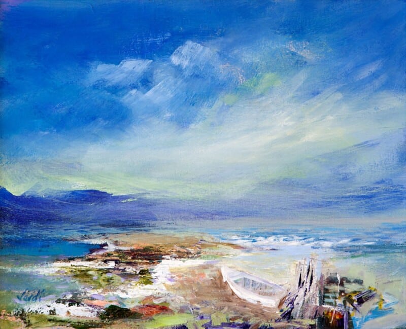
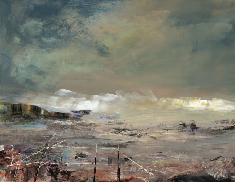
Posted on

Why Tranquility, Plockton Works So Well as Wall Art for Jute Rugs

Image of Tranquility, Plockton by Colin Robertson

Finding the right wall art for jute rugs is often less straightforward than it sounds. Jute brings welcome texture and softness underfoot, but it can also leave a room feeling a little unfinished unless the walls carry enough visual interest. Tranquility, Plockton works especially well because it keeps that natural ease while giving the room a stronger focal point.

Why natural flooring needs balance above it

Jute often appears in rooms that aim for a relaxed, pared-back look. That can be beautiful, but the scheme still needs a little colour and shape on the walls if it is going to feel fully considered. This piece brings exactly that without disturbing the calm.

  • It adds atmosphere without making the room feel busier.
  • It works well with timber, linen, and woven textures.
  • It suits sitting rooms, bedrooms, and casual dining spaces particularly well.

Why this pairing feels easy to live with

The room still keeps its natural softness, but the artwork stops it from drifting into looking incomplete. Tranquility, Plockton has enough colour and distance to help the whole space breathe while still feeling anchored.

It can work beautifully above a sofa, near a favourite chair, or on the wall that frames the seating area in a more relaxed scheme.

Why the First 4 Frames finish matters

First 4 Frames completes every piece in-house with bespoke framing, colour-managed Giclée printing, and hand-finished craftsmanship. That superior finish helps the artwork feel properly at home in a room built around better materials and a quieter style of decorating.

This artwork is by Colin Robertson, and you can view the exact framed product here.

If you need wall art for jute rugs that feels calm, layered, and professionally finished, Tranquility, Plockton is an excellent choice.

Posted on

Why Sound Of Taransay Works Beautifully as Wall Art for Rattan Furniture

Image of Sound Of Taransay by Arie Vardi

Choosing wall art for rattan furniture is often about getting the balance right. Natural textures already bring warmth and character into a room, but they can start to feel a little expected if the artwork leans too heavily into a beach-house cliché. Sound Of Taransay works beautifully because it keeps the room light and relaxed while still giving it a more considered focal point.

Why it suits natural textures so well

Rattan, cane, and woven finishes tend to look best with artwork that has movement and atmosphere rather than something too rigid or overworked. This piece has that easy sense of flow, which helps a room feel collected rather than themed.

  • It adds colour without fighting the room’s lighter materials.
  • It keeps a natural scheme feeling airy rather than rustic.
  • It suits sitting rooms, sunrooms, and relaxed bedrooms especially well.

Where it can make the biggest difference

This kind of framed print works especially well above a woven bench, near occasional chairs, or on the main wall of a room where timber and natural fibres already do much of the talking. It gives the eye somewhere to settle while still keeping the overall mood easy to live with.

Why the framed finish matters

At First 4 Frames, each piece is completed in-house in Falkirk with bespoke framing, colour-managed Giclée printing, and hand-finished craftsmanship. That superior quality helps the artwork feel polished enough for a room built around quieter materials and better textures.

This artwork is by Arie Vardi, and you can view the exact framed product here.

If you are looking for wall art for rattan furniture that feels refined, restful, and professionally finished, Sound Of Taransay is an excellent option.

Posted on

Why Whispered Shore Works Beautifully as Art for Boucle Furniture

Image of Whispered Shore by Colin Robertson

Choosing art for boucle furniture is often about texture as much as colour. Boucle brings softness and comfort into a room, but without the right artwork nearby the whole scheme can start to feel a little too muted. Whispered Shore is a strong answer because it adds movement and clarity while keeping that softer overall mood intact.

Why texture-led rooms need visual contrast

Rooms built around tactile fabrics benefit from artwork that brings definition without becoming harsh. The better pieces usually echo the softness of the room in spirit, but still introduce enough shape, colour, and direction to stop everything blending together. That is exactly where this artwork works well.

  • It suits softer interiors without feeling overly pale.
  • It gives a textured room more visual depth.
  • It helps neutral upholstery feel finished rather than unfinished.

Why Whispered Shore fits the setting

The coastal atmosphere brings ease and light, while the composition gives the room something more definite to gather around. It can work beautifully in sitting rooms, bedrooms, or relaxed guest spaces where boucle chairs, benches, or cushions need a companion piece that keeps the scheme elevated.

Why the First 4 Frames finish helps

First 4 Frames produces every piece in-house with bespoke framing, colour-managed Giclée printing, and hand-finished craftsmanship. In a texture-led interior, those finishing details stand out. A superior quality frame helps the artwork feel considered and keeps the softer room scheme looking polished rather than vague.

This artwork is by Colin Robertson, and you can view the exact framed product here.

If you need art for boucle furniture that feels soft, balanced, and beautifully finished, Whispered Shore is a very appealing choice.

Posted on

Choosing Wall Art for Walnut Furniture, Why Low Cloud at Melvich beach Sutherland Works

Image of Low Cloud at Melvich beach Sutherland by Arie Vardi

Finding the right wall art for walnut furniture is often about preventing a room from feeling too visually heavy. Low Cloud at Melvich beach Sutherland works beautifully because it brings air, movement, and coastal light into a scheme shaped by richer timber tones.

Walnut furniture has depth and warmth, but it can dominate if everything around it is equally dark or dense. This piece helps counter that. The landscape feel introduces breathing space, while the framed presentation still has enough presence to sit comfortably alongside more substantial furniture.

  • It softens deeper wood tones without making the room feel washed out.
  • It works well with walnut sideboards, dining furniture, shelving, and occasional tables.
  • It helps a scheme feel layered and intentional rather than simply brown-on-brown.

Where it works best

This kind of piece suits a dining room, living room, or study where walnut furniture already gives the space structure. It is especially effective when the room also uses neutral upholstery, stone, or soft blue-grey accents that benefit from one connecting focal point.

Why the print quality matters

At First 4 Frames, the artwork is completed in-house with colour-managed Giclée printing and bespoke hand-finished framing. That superior quality matters when the piece is sitting near better furniture, because the presentation needs to hold its own.

The artwork is by Arie Vardi, and you can view the exact framed product here.

If you are choosing wall art for walnut furniture and want the room to feel lighter, richer, and more resolved, Low Cloud at Melvich beach Sutherland is a very good option.

Posted on

What Makes Earth Wind and Tide Such a Good Choice for a Room With Large Windows

Image of Earth Wind and Tide by Arie Vardi

Choosing art for a room with large windows can be harder than it sounds. Natural light is a gift, but it can also make artwork feel visually thin if the piece does not have enough presence. Earth Wind and Tide works especially well because it brings movement, colour, and structure without making the room feel weighed down.

Why bright rooms need a little visual weight

In a room with generous glazing, the eye is constantly drawn outward. That often means the artwork needs enough depth to hold its own. Earth Wind and Tide has exactly that quality. It feels open and atmospheric, but it still gives the wall a clear focal point.

  • It works well in spaces with full-height windows or wide patio doors.
  • It adds energy without fighting the natural calm of the light.
  • It helps a brighter room feel finished rather than slightly underdressed.

Where this kind of piece earns its place

This sort of artwork suits a main sitting room, a garden-facing family room, or a dining area with strong daylight. Because the subject has both horizon and movement, it helps connect the inside of the room with the sense of openness beyond the glass.

That balance matters. In brighter rooms, the best artwork usually does not shout. It simply has enough confidence to stay present throughout the day as the light changes.

Why the framed finish matters here

At First 4 Frames, each piece is completed in-house in Falkirk with bespoke framing, colour-managed Giclée printing, and hand-finished craftsmanship. In a bright room, those cleaner details really show. A superior quality finish helps the artwork feel deliberate and well judged rather than temporary.

This artwork is by Arie Vardi, and you can view the exact framed product here.

If you are looking for art for a room with large windows that feels expansive, balanced, and properly finished, Earth Wind and Tide is a very strong option.

Posted on

Choosing Art for Patterned Wallpaper, Why Sea Meets Sky, Easdale Feels So Calm

Image of Sea Meets Sky, Easdale by Colin Robertson

Finding the right art for patterned wallpaper is often about restraint. When a room already has visual detail on the walls, the artwork needs to bring balance rather than more noise. Sea Meets Sky, Easdale does that beautifully, introducing calm horizon lines and a softer coastal mood that helps the whole scheme feel more settled.

Why calmer artwork works better here

Patterned wallpaper already carries rhythm, movement, and texture. That often means the best framed piece is one that gives the eye a place to rest. Sea Meets Sky, Easdale has enough presence to hold its own, but it does not compete with the wall behind it. Instead, it helps the room feel composed.

  • It suits wallpaper with florals, subtle geometrics, or country-inspired pattern.
  • It helps stop a more decorative room from feeling too visually busy.
  • It adds colour without introducing another competing motif.

Where a piece like this works best

This kind of artwork works particularly well above a sideboard, between windows, or on a chimney breast where wallpaper already plays a leading role. Because the image has a calmer structure, it can anchor the space without flattening its character.

That balance is often what makes the difference between a room that feels layered and one that feels crowded. Good art does not need to match the wallpaper exactly. It simply needs to steady the scheme.

Why the framed finish matters

At First 4 Frames, every piece is produced in-house with bespoke framing, colour-managed Giclée printing, and hand-finished craftsmanship. In a room with patterned walls, that cleaner presentation matters. It gives the artwork enough definition to look deliberate rather than lost.

This artwork is by Colin Robertson, and you can view the exact framed product here.

If you are looking for art for patterned wallpaper that feels calm, balanced, and properly finished, Sea Meets Sky, Easdale is a very strong option.

Posted on

Choosing Art for Terracotta Walls, Why Low Tide Morar Feels So Balanced

Image of Low Tide Morar by Arie Vardi

Finding the right art for terracotta walls is often about balance. Warm wall colours can feel rich and inviting, but they need artwork that keeps the room from becoming too visually dense. Low Tide Morar does that beautifully, bringing in coastal light and softer tonal contrast while still sitting comfortably with a warm scheme.

Why this pairing works

Terracotta has a natural grounded warmth, so it often benefits from artwork that introduces air, horizon, and a little visual breathing room. Low Tide Morar has that quality. It complements warmth rather than repeating it too heavily, which helps the room feel layered instead of overloaded.

  • It suits earthy interiors with clay, rust, or burnt orange accents.
  • It can stop a warm room from feeling visually closed in.
  • It works well with timber, linen, and natural textures.

How to use it in the room

This kind of piece works especially well above a sofa, over a sideboard, or on the main wall of a dining space where the décor already carries warmth. Because the image brings a softer coastal mood, it helps create contrast without making the scheme feel disconnected.

It is also a useful reminder that warm interiors do not always need more red or orange in the artwork. Sometimes the best result comes from choosing a piece that steadies the palette and lets the wall colour do its work.

Why the finish matters

First 4 Frames produces every piece in-house with bespoke framing, colour-managed Giclée printing, and hand-finished craftsmanship. That superior quality helps the artwork hold its own against stronger wall colour and makes the finished room feel far more considered.

This artwork is by Arie Vardi, and you can view the exact framed product here.

For anyone choosing art for terracotta walls that feels calm, polished, and easy to place, Low Tide Morar is an excellent fit.

Posted on

Why After the Rain Works So Well as Wall Art for Sloped Ceilings

Image of After the Rain by Jill McIntosh

Choosing wall art for sloped ceilings can be harder than styling a standard straight wall. Angled lines often make a room feel charming, but they can also leave one section looking unresolved. After the Rain works especially well in that setting because it brings atmosphere and structure without making the space feel cramped.

Why this kind of wall needs a calmer focal point

Rooms with eaves, attic conversions, and top-floor bedrooms often benefit from artwork that feels settled rather than busy. A sloped ceiling already introduces visual movement, so the framed print needs to steady the wall rather than compete with it. After the Rain does that nicely. Its mood and colour give the eye somewhere to rest, which helps the room feel more intentional.

  • It softens awkward geometry without ignoring it.
  • It suits loft rooms, upper landings, and bedrooms tucked into the roofline.
  • It adds personality without asking for a large, square wall.

Where it tends to work best

This sort of piece is especially effective on the full-height section beneath the slope, beside a dormer window, or on the wall you first see when entering the room. In each case, the framed presentation helps turn an awkward area into part of the design rather than a compromise you have to work around.

Good art does not fight a difficult wall. It resolves it.

Why the framed finish matters here

In a room with unusual lines, presentation matters even more. First 4 Frames produces each piece in-house in Falkirk using colour-managed Giclée printing, bespoke framing, and hand-finished craftsmanship. That cleaner, more polished finish gives the artwork enough presence to hold its place properly on an angled wall.

This artwork is by Jill McIntosh, and you can view the exact framed product here.

If you want wall art for sloped ceilings that feels balanced, atmospheric, and properly considered, After the Rain is a very strong option.

Posted on

How Adrift Can Set the Right Tone for Hotel Lounge Wall Art

Image of Adrift by Jill McIntosh

The best hotel lounge wall art helps guests relax almost immediately. It should add atmosphere and identity, but it should not feel noisy or overly themed. Adrift is a particularly good choice because it brings calm movement and a sense of place while still feeling polished enough for a professional hospitality setting.

Why guest spaces need calm rather than clutter

A hotel lounge often has to do several jobs at once. It may welcome arriving guests, give people somewhere to wait, support quiet conversation, or simply soften the transition between public and private space. Artwork that is too busy can work against that. This piece succeeds because it feels atmospheric without becoming demanding.

  • It suits lounges, reception seating areas, and quieter corners in boutique hotels or guest houses.
  • It brings Scottish coastal character without forcing a full seaside theme.
  • It helps a commercial interior feel curated rather than off-the-shelf.

A better choice than generic hospitality filler

Many guest spaces rely on safe but forgettable décor. One well-chosen framed print can do far more. This artwork gives the room a stronger mood and a more considered identity, which can make the whole experience feel warmer and more memorable for the people using the space.

Why presentation matters in hospitality

First 4 Frames produces each piece in-house in Falkirk using colour-managed Giclée printing and hand-finished bespoke framing. In a hospitality setting, where guests notice overall finish very quickly, that craftsmanship helps the artwork support the quality of the room rather than undermine it.

The artwork is by Jill McIntosh, and you can view the exact framed product here.

If you need hotel lounge wall art that feels calm, distinctive, and easy for guests to live with, Adrift is a very effective choice.

Posted on

Why Atlantic Storm Approaching Works So Well When You Want Art for a Room With Black Accents

Image of Atlantic Storm Approaching by Jill McIntosh

Choosing art for a room with black accents is often about balance. Black details can make a room feel crisp, tailored, and modern, but they can also harden the overall look if everything around them is too static. Atlantic Storm Approaching is a very good way to introduce movement and colour without losing that sense of control.

Why this kind of contrast works

The darker accents in a room already provide definition, so the artwork does not need to compete through heaviness. This piece works because it brings energy through weather, texture, and shifting tone. That keeps the room feeling alive rather than overly formal.

  • It suits living rooms, dining spaces, and home offices with darker metalwork or painted details.
  • It adds depth without forcing the room into a full coastal theme.
  • It helps black accents feel intentional rather than severe.

A useful choice when a scheme feels too sharp

Rooms with black picture rails, lighting, furniture, or window frames often benefit from one softer but still confident focal point. The atmosphere in this artwork does that job well. It gives the eye somewhere to settle while still keeping the space visually strong.

Why the framed finish matters

First 4 Frames produces each piece in-house in Falkirk using colour-managed Giclée printing and hand-finished bespoke framing. That superior quality presentation is especially important in a more design-led room, because details are noticed more quickly when the scheme is clean and deliberate.

The artwork is by Jill McIntosh, and you can view the exact framed product here.

If you want art for a room with black accents that feels dramatic but still easy to live with, Atlantic Storm Approaching is an excellent option.