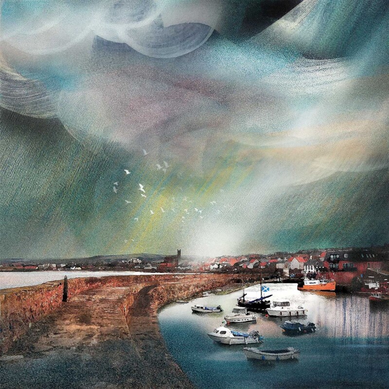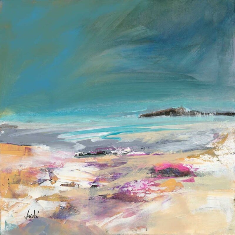
The best wall art for Crittall doors needs to balance structure with warmth. Metal-framed glazing gives a room definition and plenty of light, but it can also make the scheme feel slightly hard if nothing softens it. Approaching Elgol works beautifully because it introduces atmosphere and distance without fighting the architectural lines.
Why glazed rooms still need a grounded focal point
When a room has Crittall doors, the eye naturally notices frames, panes, and sight lines. That crispness is part of the appeal, but it leaves the wall art with an important job. The right piece should stop the space from feeling all edges and geometry. Approaching Elgol brings enough movement and depth to do exactly that.
- It suits open-plan rooms divided by internal glazing.
- It softens stronger architectural detailing without looking vague.
- It helps a modern scheme feel more welcoming and less severe.
Why this subject works in a more architectural interior
Coastal artwork often brings breathing space to rooms with stronger lines. Here, the sense of approach and distance gives the eye somewhere calmer to rest. That makes the whole room feel more layered, particularly if the doors open between a kitchen, dining area, or sitting space.
It can work especially well on the wall beyond the glazing, near a dining table, or in the seating area that needs a little more softness against black, bronze, or painted metal frames.
Why the First 4 Frames finish matters
First 4 Frames completes every piece in-house with bespoke framing, colour-managed Giclée printing, and hand-finished craftsmanship. In a room where metalwork, glazing, and joinery are already carefully chosen, that higher standard helps the artwork feel like part of the design rather than an afterthought.
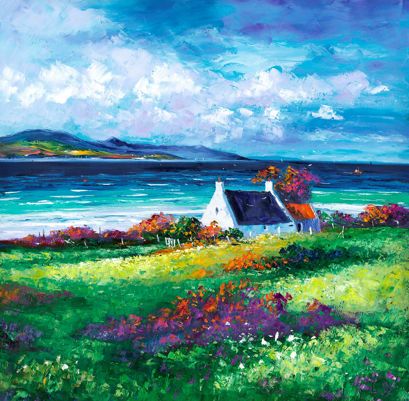
This artwork is by Jean Feeney, and you can view the exact framed product here.
If you need wall art for Crittall doors that feels warm, composed, and professionally finished, Approaching Elgol is an excellent fit.