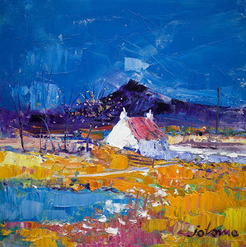
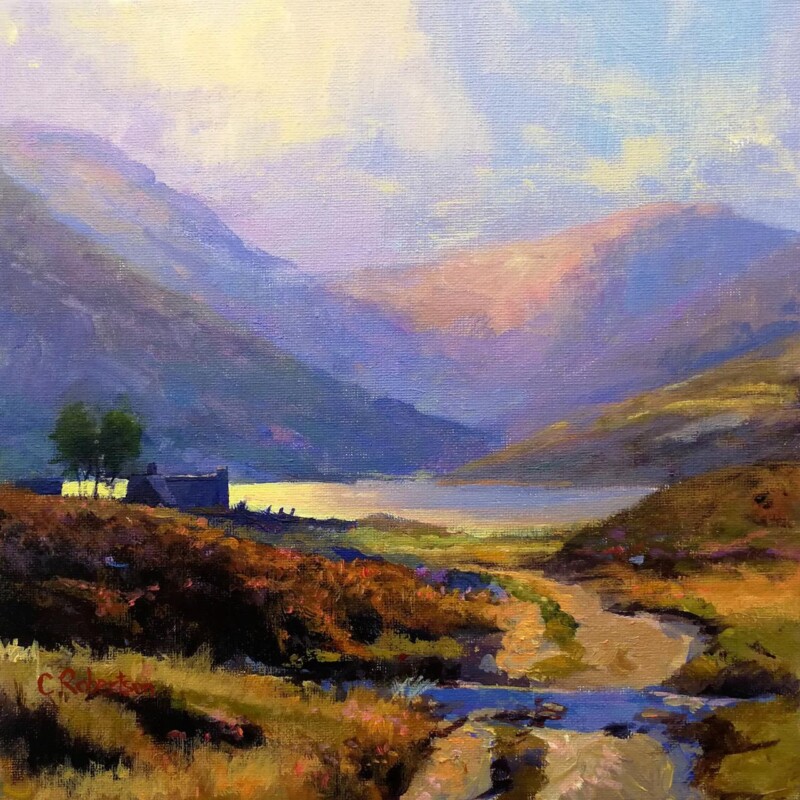
The area around a stove often becomes the emotional centre of the room, especially in cooler months. That is why Autumn Light, Pennyghael, Isle of Mull works so well as wall art by a wood burning stove. It has warmth, depth, and colour, but it still feels composed rather than overly heavy.
Why this piece suits the space
A stove creates a natural focal point on its own, so nearby artwork needs to support that atmosphere. This piece does it by adding a richer sense of place and seasonal glow without making the wall feel overcrowded or too dark.
It suits chimney-breast styling as well as side walls near the stove.
The stronger colour feels at home with flame light and natural timber.
It helps the room feel settled and lived in rather than staged.
Where it works best
That is particularly useful in cottages, family living rooms, and snug spaces where comfort matters as much as appearance. The artwork adds presence, but it still leaves the stove as part of the wider composition rather than trying to steal the whole scene.
Why the framed finish matters
First 4 Frames completes the piece in-house in Falkirk with bespoke framing, colour-managed Giclee printing, and hand-finished craftsmanship. That more substantial finish matters in a feature area where customers tend to notice the details straight away.
For anyone choosing wall art by a wood burning stove, Autumn Light, Pennyghael, Isle of Mull brings the kind of warmth and character that feels naturally right.
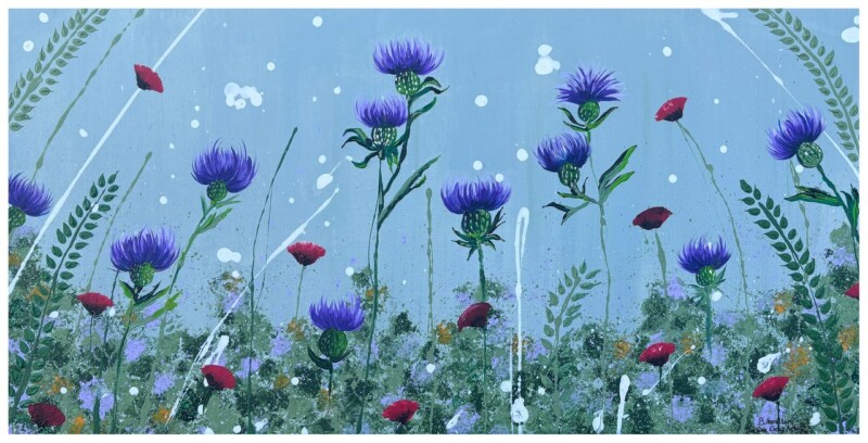
The best yoga studio wall art should support the mood of the room rather than compete with it. In a practice space, that usually means choosing something with enough presence to shape the atmosphere while still leaving mental and visual breathing room. Where Silence Speaks works especially well because it brings depth, softness, and a strong sense of calm without feeling bland.
Why quieter landscape art suits a yoga space
A yoga studio often relies on balance. The room needs character, but it should not feel busy. It needs warmth, but not visual heaviness. Where Silence Speaks has a still, atmospheric quality that helps settle the room from the moment someone walks in. That can be valuable in a dedicated home studio, a small teaching room, or a broader wellbeing space where the goal is focus rather than distraction.
It gives the wall a calm focal point without becoming loud or over-styled.
It works naturally with timber, soft neutrals, and simpler studio finishes.
It helps the space feel more intentional and less like a spare room with mats in it.
A more grounded alternative to generic wellness decor
Many practice spaces end up with artwork that feels interchangeable. A hand-finished landscape print offers something stronger. It can create atmosphere while still feeling grown-up, polished, and lasting. Where Silence Speaks is particularly good for this because the mood is reflective rather than theatrical, so the artwork supports the room quietly over time.
At First 4 Frames, each piece is completed in-house in Falkirk using bespoke framing, colour-managed Giclee printing, and superior craftsmanship. That makes a difference in a studio setting where presentation and material quality are easy to notice.
You can explore more work by Colin Robertson and view the exact framed print here.
If you are looking for yoga studio wall art that feels calm, substantial, and professionally resolved, Where Silence Speaks is a very strong option.
The right home office wall art can change how a workspace feels day to day. Scottish Meadow is a strong choice when you want the room to feel more personal, focused, and visually balanced.
Why this piece suits the space
A home office can easily become too functional, especially if the furniture and storage are practical rather than expressive. Scottish Meadow helps offset that by adding atmosphere and interest, giving the space a focal point that feels intentional.
It can make a workspace feel less temporary and more properly designed.
It adds personality without distracting from the work itself.
It works well in offices that need warmth rather than more visual noise.
This kind of artwork suits a desk wall, a shelving backdrop, or the first wall you see when entering the room. In each case, it helps the office feel less sterile and more connected to the rest of the home.
Why the framed finish matters
At First 4 Frames, each piece is produced in-house with colour-managed Giclée quality and hand-finished bespoke framing. That quality-led presentation is especially useful in a space where you spend long hours and notice the details every day.
Choosing art for a room with wool throws is often about balance. Wool throws, textured cushions, and heavier natural fabrics give a room warmth straight away, but they can also make the scheme feel visually dense if the artwork is not chosen with care. Highland Calm works especially well because it brings atmosphere and openness without losing that cosy, settled character.
Why this print suits a tactile interior
Rooms with wool textures usually feel best when the artwork introduces calm rather than extra busyness. Highland Calm has that quieter quality. The landscape carries depth, weather, and a strong sense of place, which helps softer furnishings feel more intentional instead of simply piled in for comfort.
It complements natural fibres, softer neutrals, and layered upholstery.
It adds Scottish character without becoming overly rustic.
It gives a comfortable room a focal point that still feels spacious.
Framing that keeps warmth looking refined
When a room already has tactile richness, the finish matters. A hand-finished framed print gives the wall enough structure to hold those softer materials together. It can sit beautifully above a sofa, on a wall near an armchair, or anywhere the room needs a calmer visual anchor.
First 4 Frames completes each piece in-house in Falkirk using bespoke framing, colour-managed Giclee printing, and superior craftsmanship. That quality-led finish helps a relaxed room feel carefully resolved rather than casual by default.
You can explore more work by Colin Robertson and view the exact framed print here.
If you want art for a room with wool throws that feels warm, balanced, and genuinely well made, Highland Calm is a very persuasive choice.
Well chosen guest room wall art can change how a spare bedroom is experienced. Guests notice when a room feels settled and intentional, and artwork is often what creates that impression. Sheltered in the Glen works especially well when you want the room to feel restful and welcoming without overstyling it.
Why a guest room benefits from a calmer focal point
Guest rooms often carry a practical brief. They need to be comfortable, easy to live with, and not too busy. The best artwork supports that balance by adding atmosphere and identity without making the space feel crowded. Sheltered in the Glen brings exactly that kind of quiet presence.
It helps a spare bedroom feel more welcoming from the moment someone arrives.
It adds character without making the room feel overly personal or visually heavy.
It suits softer paint colours, timber furniture, and layered bedding particularly well.
This matters even more in rooms that are not used every day. A stronger framed piece can stop the space feeling like an afterthought and make it feel properly part of the home.
Why the hand-finished presentation makes a difference
First 4 Frames completes each piece in-house in Falkirk with bespoke framing, colour-managed Giclee printing, and hand-finished craftsmanship. That superior finish is useful in a guest room because quieter spaces often depend on detail and quality rather than quantity.
You can explore more from Colin Robertson and view the exact framed print here.
If you want guest room wall art that feels thoughtful, calm, and easy to live with, Sheltered in the Glen is a very strong option.
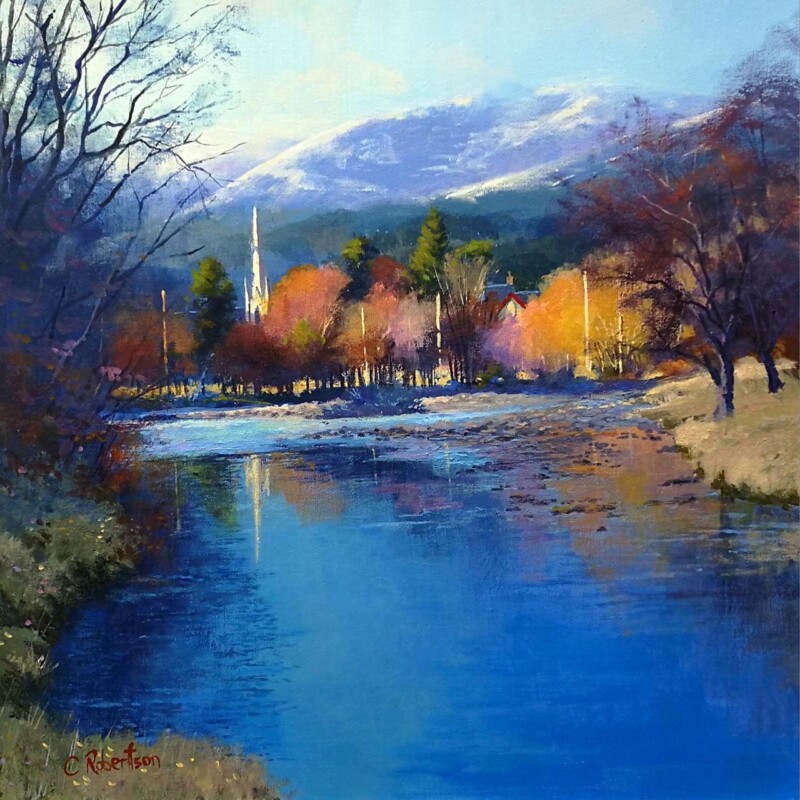
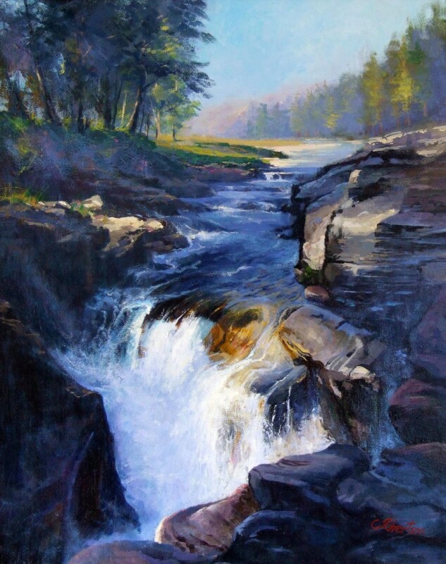
Choosing wall art for a room with a stone fireplace is rarely just about filling the space above or beside the hearth. Stone already carries weight, texture, and a strong visual presence. The artwork has to work with that rather than fight it. The River Roars, Linn of Quoich is a strong option because it introduces movement and atmosphere while still feeling natural in a more grounded room.
Why stone fireplaces need artwork that softens without weakening the room
Natural stone can make a room feel rooted and beautiful, but it can also push the scheme towards something a little stern if the surrounding details stay too heavy. The River Roars, Linn of Quoich brings a more fluid rhythm, helping the room feel warmer and more lived in while still respecting the texture already in the space.
The right artwork beside stone should add life and warmth, not try to out-muscle the architecture.
This makes it especially useful in sitting rooms, snugs, and country-style interiors where the fireplace is already the visual anchor. The framed print adds another layer of interest without turning the wall into a contest of strong elements.
Craftsmanship matters when the room already has strong natural materials
First 4 Frames completes every piece in-house in Falkirk with bespoke framing, colour-managed Giclee printing, and hand-finished craftsmanship. That superior finish helps the artwork feel assured enough to sit comfortably with stone, timber, and other substantial materials.
You can browse more from Colin Robertson and see the exact framed work here.
If you need wall art for a room with a stone fireplace that adds warmth, flow, and a more personal note to the room, The River Roars, Linn of Quoich is a very strong choice.
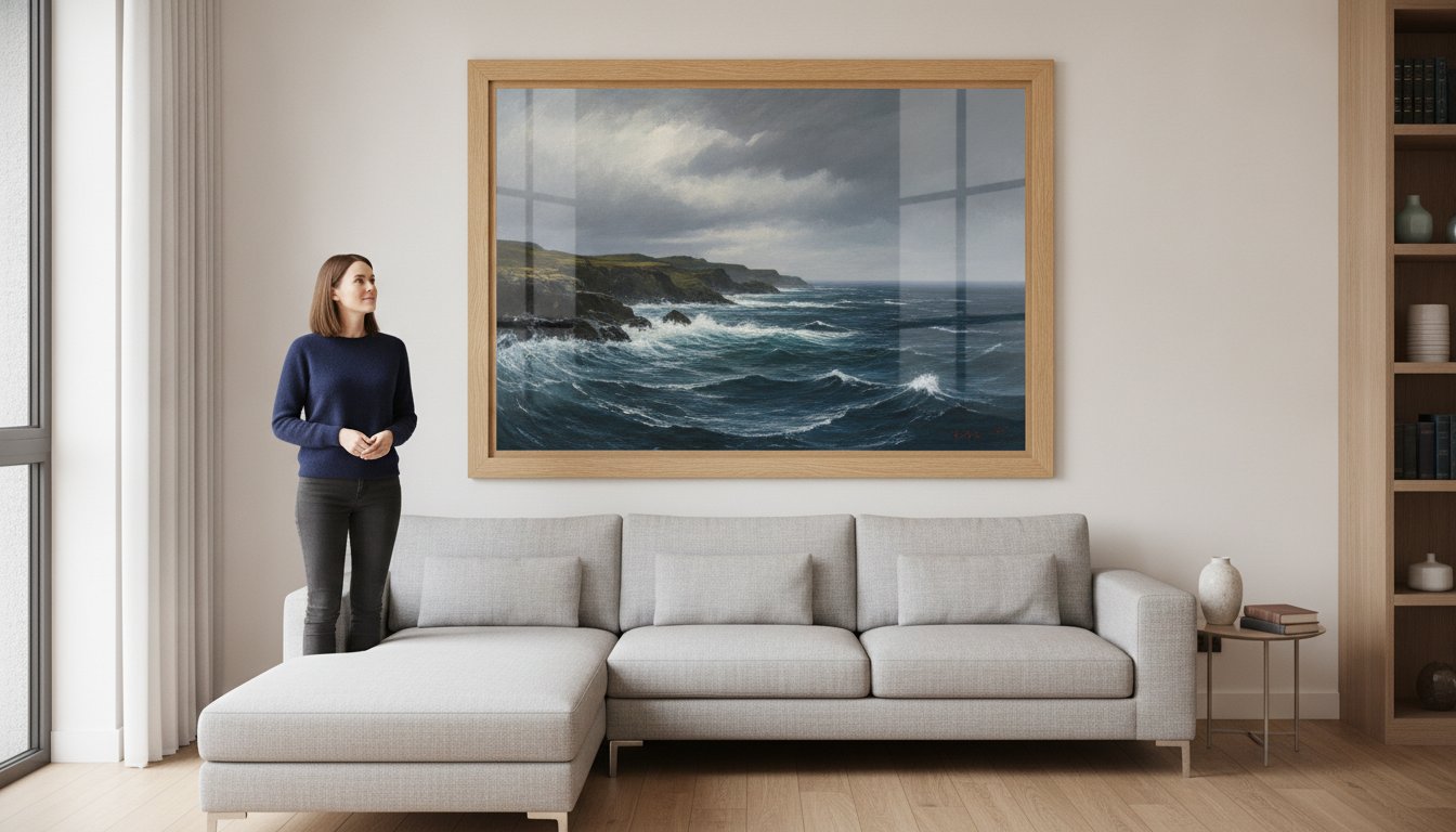
You’ve finally found a piece of Scottish landscape art that speaks to you, but as you look at your empty living room wall, a familiar doubt sets in. Will the frame look too small, or will the style clash with your existing decor? It’s a common frustration that often leads to “analysis paralysis,” leaving beautiful walls bare because you’re worried about receiving a flimsy, mass-produced frame that doesn’t do the artwork justice. We believe choosing art should be as inspiring as the piece itself, not a source of stress.
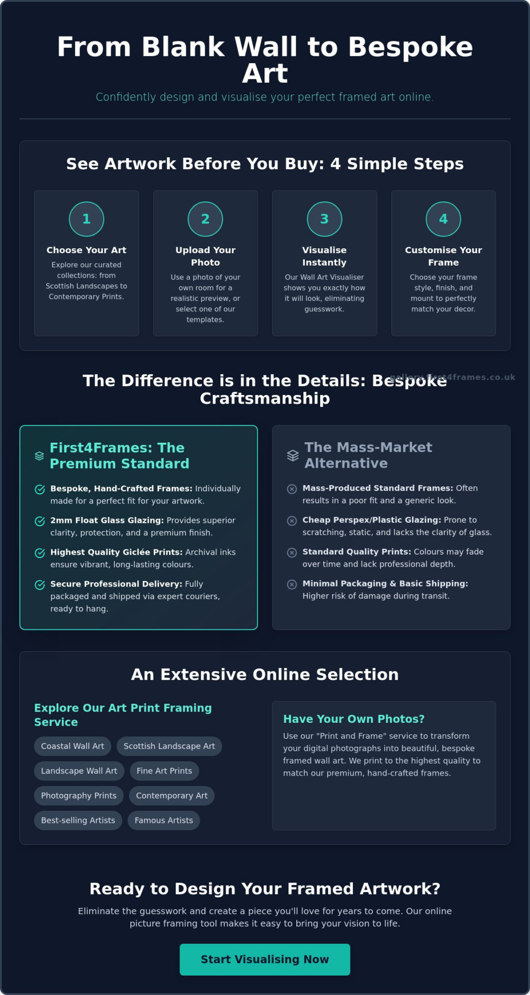
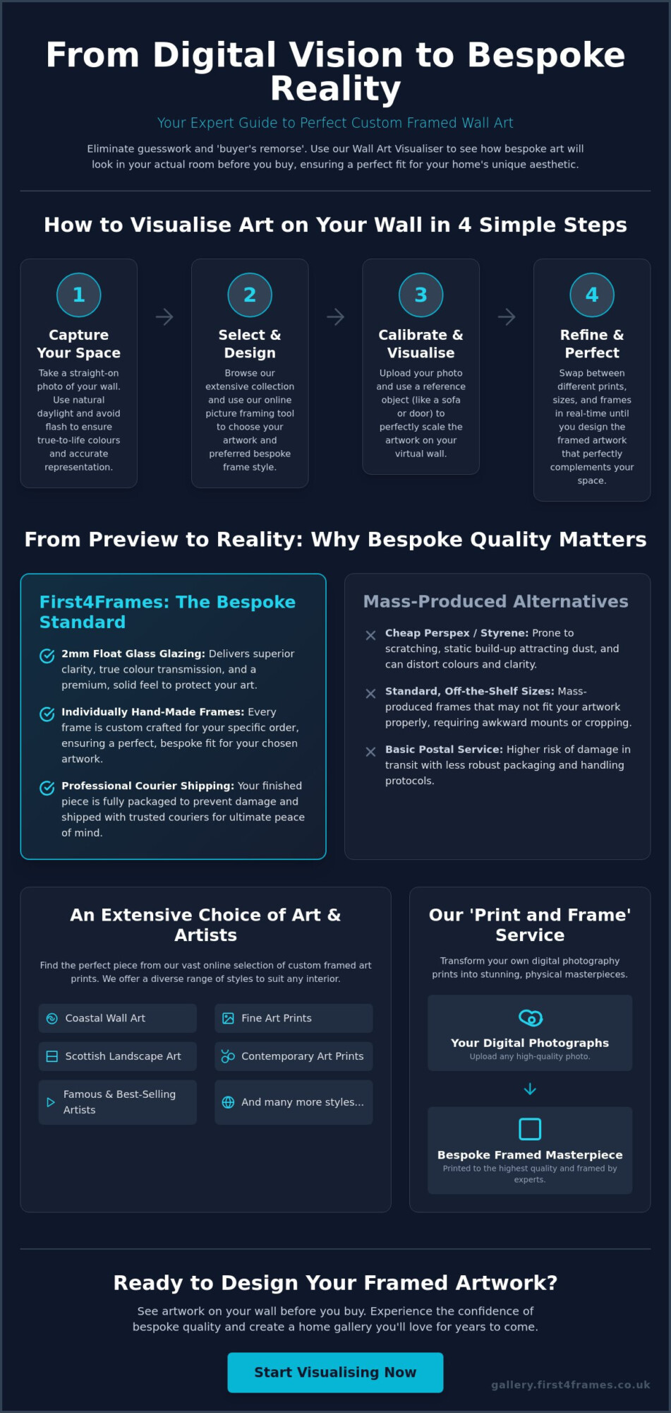
The good news is that you can now • Visualise art on your wall using our visual online creator to see exactly how your chosen piece looks in your room before you commit. We’ll show you how to use this tool to design bespoke framed wall art that features professional 2mm float glass for superior clarity, rather than the cheap perspex used by many retailers. You’ll discover how to confidently select from our range of coastal wall art and fine art prints, knowing that your hand-crafted, premium product will be delivered safely to your door by professional couriers, ready to hang and enjoy immediately.
Key Takeaways
Learn how to visualise art on your wall using our visual online creator to eliminate guesswork regarding scale and style before you make a purchase.
Follow our step-by-step guide to uploading your own room photos for a realistic preview of how bespoke framed wall art transforms your space.
Discover why hand-crafted frames and 2mm float glass provide a premium finish and superior clarity that mass-market alternatives cannot match.
Explore styling tips for diverse collections, including coastal wall art and Scottish landscape prints, to find the perfect match for your decor.
Gain peace of mind with our professional logistical process, ensuring your ready-to-hang art is securely packaged and delivered by expert couriers.
What is a Wall Art Visualiser and Why Should You Use One?
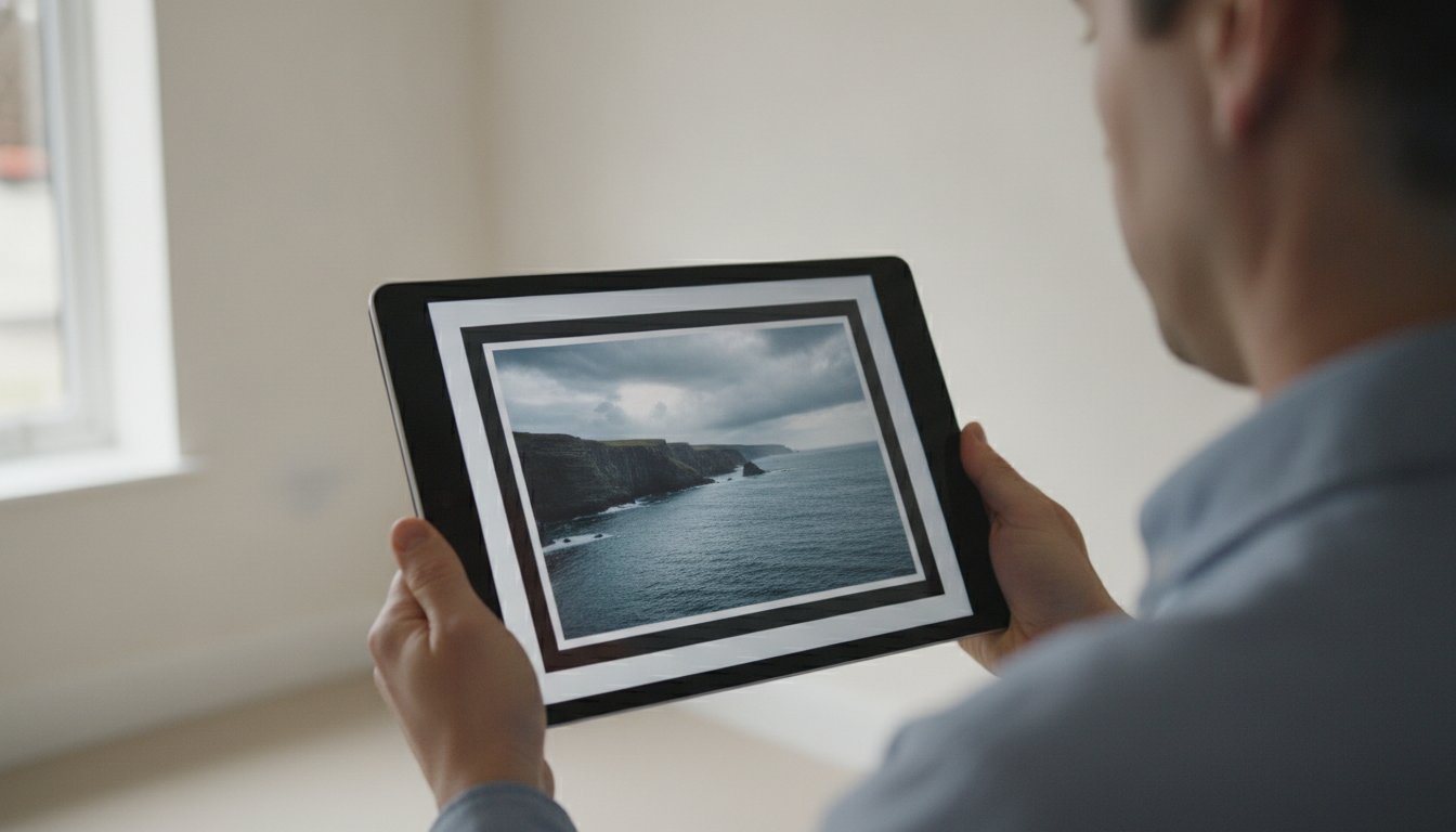
A wall art visualiser is a practical digital bridge between a blank space and a beautifully curated home. It allows you to place digital prints into real-room settings via Augmented Reality (AR), ensuring you never have to wonder if a piece will look out of place. When you choose to • Visualise art on your wall using our visual online creator, you’re essentially taking a digital test drive of your interior design, allowing for a level of precision that traditional shopping simply can’t match.
To better understand this concept, watch this helpful video:
This technology eliminates the creative guesswork that often stalls home improvement projects. Instead of holding up a tape measure and trying to imagine a frame’s presence, you can see the actual visual weight of the art in situ. It helps you decide if the colour palette complements your upholstery or if the piece provides the right focal point for your room’s specific architecture. It turns a hopeful purchase into a confident investment.
See Artwork Before You Buy: Reducing Purchase Anxiety
Buying art online often feels like a gamble, especially when you’re worried about scale. Using a wall art visualiser removes this anxiety by showing you the exact proportions in relation to your existing furniture. When you • Visualise art on your wall using our visual online creator, you can ensure that a large landscape doesn’t overwhelm a small study or that a delicate coastal print doesn’t look isolated on a wide statement wall. You’re designing with certainty, not hope.
From Digital Preview to Bespoke Reality
While the preview is digital, the final result is deeply rooted in traditional craftsmanship. Our tool isn’t just a generic filter; it represents the real materials and bespoke options we provide at the First4Frames Gallery. We transition your digital selection into a hand-crafted piece of art. Unlike mass-market retailers who rely on flimsy frames and plastic glazing, we use premium components like 2mm float glass. This ensures the physical product you receive at your door matches the clarity and beauty of your digital mockup at our Falkirk gallery.
How to Visualise Art on Your Wall Using Our Online Creator
The interface at First4Frames Gallery is designed to be as intuitive as our hand-crafted framing process. Once you have explored lessons in art buying for the beginner to settle on a style, the next step is to see it in your space. To • Visualise art on your wall using our visual online creator, you simply select your preferred artwork and enter the virtual room view. You can upload a high-resolution photo of your own wall or choose one of our curated room templates to see how a Giclée print interacts with your specific furniture and lighting.
The tool allows you to manipulate dimensions and see exactly how the piece fills your wall. You aren’t just looking at a flat image; the visualiser renders the depth of the frame and the texture of the mount. This level of detail helps you decide if a large Scottish landscape print needs a wider border or if a photography print should sit flush against the frame edge. It provides a technical blueprint for your final design, ensuring every proportion is balanced before we begin work in our workshop.
Customise Every Detail of Your Frame Online
The “Choose Your Frame Online” feature offers a real-time comparison of minimalist, ornate, and contemporary styles. You can experiment with different frame widths and finishes, such as natural wood, gold, or black, to see what best enhances the vibrant tones of your selected art. Adjusting the mount colour digitally first ensures that the final bespoke framed wall art perfectly mirrors your vision, creating a harmonious link between the artwork and your interior decor.
The Print and Frame Service for Your Own Photos
Beyond our gallery collection, you can use this tool to transform your own digital memories. By selecting our print and frame service, you can upload personal photography and • Visualise art on your wall using our visual online creator just as you would with a professional fine art print. We ensure these personal files are printed to the same high standards as our gallery works, resulting in a custom framed art print that is both high-quality and deeply personal. Start exploring the possibilities in our online art gallery.
Why Bespoke Craftsmanship Matters for Your Visualised Art
Digital tools are only the first step in transforming your home. While you can visualise art on your wall using our visual online creator to check for scale and colour, the true value lies in the physical production. Unlike mass-market retailers that ship standard, pre-made frames that often don’t fit the artwork perfectly, every piece we produce is individually crafted in our UK workshop. This bespoke approach ensures that your custom framed art prints are structurally sound and aesthetically perfect.
Choosing an online picture framing service should never mean compromising on quality. Many competitors use flimsy, lightweight materials to save on shipping costs. We take the opposite approach. By focusing on traditional craftsmanship, we ensure that your bespoke framed wall art remains a centerpiece of your decor for decades. Our artisans handle every Giclée print with care, ensuring the mounting and framing process preserves the integrity of the image.
The Importance of Premium 2mm Float Glass
One of the most significant differences between our service and budget alternatives is the glazing. Most online retailers use cheap perspex, which is prone to scratching, attracts dust through static, and often has a slight “milky” tint that dulls the image. We exclusively use premium 2mm float glass. This professional standard offers superior clarity, allowing the longevity and fidelity of your photography prints to shine through. It’s an essential component for anyone who wants their art to look as vibrant on the wall as it did on the screen.
Safe and Secure UK Delivery
We understand that ordering glass and frames online can feel risky. That’s why our logistical process is as refined as our framing. Every order is fully packaged in custom-designed protective materials to prevent damage during transit. We ship exclusively via professional couriers, ensuring your ready-to-hang art arrives in perfect condition. If you’re comparing providers, check our guide on choosing the best art frame shops to see how we measure up against industry quality benchmarks.
Experience the difference that artisan quality makes by browsing our curated art gallery today.
Choosing the Right Style: Coastal, Landscape, and Contemporary Art
Selecting the perfect piece of art is a deeply personal journey that reflects your unique taste and the atmosphere you want to create. Whether you’re drawn to the serene hues of coastal wall art or the rugged beauty of Scottish landscape art, our collection offers an extensive choice from famous artists and best-selling contemporary creators. You can visualise art on your wall using our visual online creator to see how these different styles interact with your room’s lighting and furniture.
For a bright and airy living space, try pairing coastal prints with slim, light-coloured frames. If you’re framing the Highlands, a more substantial wood frame often complements the rich textures of the Scottish moors. Our wall art visualiser is particularly useful for designing a cohesive gallery wall. You can mix and match different art categories, such as photography prints and contemporary art prints, to ensure the sizes and frame styles work together before you place your order. It’s never been easier to visualise art on your wall using our visual online creator, giving you the freedom to experiment with various layouts without any physical heavy lifting.
Featured Categories: From Fine Art to Photography
Scottish scenes often feature vibrant purples, deep greens, and dramatic greys. To make these pop, we recommend selecting a mount that picks out a subtle tone from the image itself. When you choose your frame online for contemporary art prints, consider whether a minimalist black frame or a bold, ornate finish best suits your decor. Visit our full art gallery to start visualising your next piece and see how bespoke framing elevates the final look.
Commercial Art Solutions and Bulk Framing
Our expertise extends beyond the home. Property developers and office managers frequently use our visual creator to stage commercial interiors, ensuring the artwork matches the brand’s professional image. We offer dedicated curation services for businesses that require an all-in-one art and framing solution. From a single statement piece in a boardroom to bulk framing for a hotel, we provide the same hand-crafted quality and 2mm float glass that our individual customers expect. This professional approach ensures your commercial space feels curated rather than generic.
Bring Your Design Vision to Life
Designing your home should be a joyful experience, not one filled with uncertainty. By using our wall art visualiser, you’ve seen how easy it is to eliminate the guesswork. You can now visualise art on your wall using our visual online creator, ensuring every piece of coastal or landscape art fits your space perfectly. But the journey doesn’t end with a digital preview. Our commitment to quality means every order is hand-crafted in our UK workshop, utilizing superior 2mm float glass for unmatched clarity.
We take pride in our collaborations with best-selling Scottish artists, bringing authentic, premium art directly to your door. Your ready-to-hang artwork is fully packaged and shipped via professional couriers, so it arrives in pristine condition. Don’t let your walls stay empty any longer. Start visualising your perfect artwork in our online gallery today and discover the difference that bespoke craftsmanship makes to your home. We look forward to helping you create a space that truly inspires you.
Frequently Asked Questions
How accurate is the wall art visualiser for measuring size?
The tool provides a highly realistic approximation of scale by allowing you to place digital prints in real-room settings. When you upload your own room photo, you can use existing furniture as a reference point to ensure the dimensions are perfect. This helps you avoid the common mistake of buying art that is too small for a statement wall or too large for a specific nook.
Can I use the visual online creator for my own digital photographs?
You can absolutely visualise art on your wall using our visual online creator by uploading your own digital photographs. This feature is a core part of our print and frame service, allowing you to see your personal memories in a bespoke frame before they are printed. We use high-quality Giclée printing to ensure your photography prints match the artisan quality of our individually crafted frames.
What is the difference between float glass and perspex in picture frames?
The main difference lies in visual clarity and durability; we exclusively use 2mm float glass because it is the professional standard for fine art. Many online retailers use cheap perspex, which often has a milky tint and attracts dust through static. Real glass provides superior fidelity and doesn’t scratch as easily, ensuring your bespoke framed wall art remains a pristine centerpiece in your home for years.
How do I know if a frame style will suit my room decor?
Our tool allows you to toggle between minimalist, ornate, and contemporary styles in real-time to see which best matches your room’s aesthetic. You can visualise art on your wall using our visual online creator to compare how different frame widths and finishes, like natural wood or gold, complement your decor. This digital trial run gives you the confidence to design your framed artwork with professional precision.
How long does it take to receive my bespoke framed wall art in the UK?
Because every frame is individually crafted for your specific order in our UK workshop, the process takes slightly longer than buying mass-produced, standard frames. We focus on bespoke quality and careful assembly to ensure your artwork is properly protected. Once finished, your order is fully packaged to prevent damage and shipped via professional couriers to ensure it arrives at your door in perfect condition.
Customers usually search for premium framed art prints when they want something more lasting than a quick decorative fix. The image matters, of course, but the real difference often comes from how the piece is produced and presented. Highland Calm is a very good example of that higher standard, giving a room calm presence as well as visual appeal.
What makes a framed print feel premium in the first place
Premium does not need to mean flashy. In wall art, it usually means better balance, more considered materials, and a finish that still feels right after the novelty wears off. Highland Calm carries that especially well because the image has depth and restraint, while the framed presentation adds confidence and structure.
It gives quieter rooms a more settled focal point.
It feels substantial rather than temporary.
It suits homes where craftsmanship matters as much as colour or subject.
Premium framed art prints should feel like part of the room, not like an afterthought added at the end.
First 4 Frames produces each piece in-house in Falkirk with bespoke framing, colour-managed Giclee printing, and hand-finished craftsmanship. That superior quality is what helps a print keep its presence over time, especially in rooms where the rest of the interior has been chosen with care.
You can browse more from Colin Robertson and view the exact framed work here.
If you are comparing premium framed art prints, Highland Calm is a very good example of why better production and framing make such a visible difference.
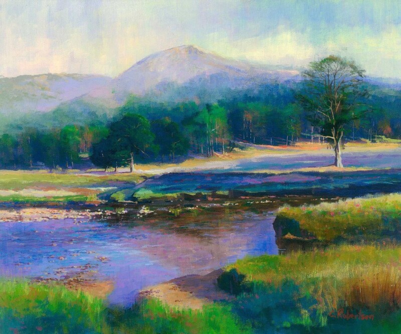
Finding the right art for pebble grey walls is usually about stopping a neutral room from feeling too flat. Pebble grey is versatile and easy to live with, but it needs artwork with enough depth to build atmosphere without dragging the whole scheme darker. The Lairig Ghru, Cairngorms gets that balance right very naturally.
Why grey rooms need contrast with restraint
Grey can create a calm and elegant backdrop, but it often works best when the artwork introduces shape, distance, and tonal variation. The aim is not to shock the scheme into life. It is to give it more range and visual substance. The Lairig Ghru, Cairngorms brings that sense of depth while still keeping the room composed.
It adds atmosphere without making the room feel heavy.
It helps quieter paint colours feel more layered and intentional.
It works well in bedrooms, sitting rooms, and calmer shared spaces.
This is especially valuable if the room already includes soft neutrals, stone tones, or brushed finishes. The piece adds a clearer focal point while still respecting the gentler palette around it.
First 4 Frames produces each piece in-house in Falkirk with bespoke framing, colour-managed Giclee printing, and hand-finished craftsmanship. That superior presentation helps the artwork hold its own against a cooler, cleaner wall colour.
You can browse more from Colin Robertson and view the exact framed product here.
If you are weighing up art for pebble grey walls, The Lairig Ghru, Cairngorms is a very good example of how to add mood and depth without losing calm.
What if you could see exactly how a piece of Scottish landscape art looks on your living room wall before you ever spend a penny? Most homeowners fear the dreaded “incorrect size” or clashing frame styles when ordering art online. With the First4Frames Gallery wall art visualiser, that uncertainty disappears, allowing you to bridge the gap between digital inspiration and physical reality. It’s about more than just a preview; it’s about making an informed decision for your home’s unique aesthetic.
In this guide, you’ll discover how to use this tool to perfectly scale and design your bespoke framed artwork before making a purchase. We’ll walk you through selecting the superior clarity of 2mm float glass and explain why our hand-made, individually crafted frames outshine mass-produced alternatives. You’ll learn how to preview coastal wall art or contemporary art prints in your own space and discover why our professional courier shipping provides the ultimate peace of mind. By the end, you’ll have all the knowledge needed to transform your digital photography prints or fine art selections into stunning, physical masterpieces.
Key Takeaways
Learn how a wall art visualiser removes the guesswork by letting you see artwork before you buy, ensuring perfect scale and colour harmony in your home.
Follow our simple guide to capture room photos and use our tools to visualise art on your wall, allowing you to design your framed artwork with ease.
Understand why bespoke quality matters, specifically the superior clarity of 2mm float glass compared to the cheap Perspex used by competitors.
Discover how our art print framing service transforms digital photography prints into custom framed art prints using our professional “print and frame” workflow.
Learn how to choose your frame online for a selection of Scottish landscape art, coastal wall art, and contemporary art prints to create bespoke framed wall art.
What is a Wall Art Visualiser and Why Should You Use One?
A wall art visualiser is much more than a simple digital overlay; it’s a bridge between your creative vision and your actual living space. By utilising Augmented Reality (AR) technology, these tools allow you to virtually hang a piece of art on your wall before any physical crafting begins. This means you can test how different pieces interact with your furniture, lighting, and existing decor without committing to a purchase. It’s the essential first step in creating a professional home gallery that feels intentional rather than accidental.
To better understand how this technology transforms your shopping experience, watch this helpful video:
Choosing bespoke framed wall art is an investment in your home’s character. Many people suffer from “buyer’s remorse” because they misjudge the scale of a print or find that the frame style doesn’t quite sit right against their wall colour. Using a visualiser helps you eliminate these risks. You can accurately check height and proportions, making it indispensable for planning a complex gallery wall or deciding if a piece works better in landscape or portrait orientation. Unlike competitors who offer standard, one-size-fits-all solutions, our online picture framing service ensures that once you design your framed artwork digitally, the physical product matches that precision. We use only premium components, such as 2mm float glass, which provides superior clarity that cheap Perspex simply cannot replicate. Every frame is hand-made to order and fully packaged for safe transit via professional couriers.
The Benefits of Seeing Artwork Before You Buy
When you visualise art on your wall, you gain the confidence to make bold design choices. Perhaps you’re eyeing a large-scale piece of Scottish landscape art but worry it might overwhelm your mantelpiece. Or maybe you’re torn between a dark wood or a sleek metallic finish for your contemporary art prints. The visualiser lets you compare these finishes against your specific wallpaper or paint. It’s about ensuring that the 2026 interior trends you love actually complement your unique space. You can choose your frame online and see how the light hits the print, giving you a realistic preview of the final custom framed art prints. Whether you’re selecting coastal wall art or custom photography prints, seeing the work in situ is the best way to ensure your home reflects your personality. This art print framing service is designed to make sophisticated design accessible and stress-free.
How to Visualise Art on Your Wall: A Step-by-Step Guide
Creating a professional gallery at home doesn’t require a designer’s eye, just the right method. At First4Frames Gallery, we’ve developed a process that ensures your digital preview matches the final hand-crafted result. To begin, capture a clear, straight-on photo of your wall. We recommend doing this during the day to take advantage of natural light. This ensures the colours of your chosen Scottish landscape art or coastal pieces look true to life. Avoid using a flash, as it creates harsh glares that can distort how you see the final composition.
Follow these four simple steps to get the most out of our digital tools:
Capture: Take a straight-on photo of your wall in natural daylight to ensure colour fidelity.
Select: Use the online picture framing tool to pick your artwork and frame style.
Calibrate: Upload your photo and use a reference object, like a sofa, to set the correct scale.
Refine: Swap between different contemporary art prints to find the perfect match.
Once you have your photo, use the wall art visualiser to see how your selection sits in the room. Calibration is the most vital part of the process for bespoke framed wall art. By using a known object like a sofa or a mantelpiece as a reference, you prevent the frustration of ordering a piece that looks disproportionate once it arrives. It’s about moving from a vague idea to a concrete design that fits your space perfectly.
Now comes the creative part. You can design your framed artwork by swapping between various traditional styles and contemporary art prints. Experiment with different finishes to see how they interact with your room’s textures. Unlike competitors who use standard frames that often leave gaps or lack durability, our frames are individually crafted for each order. This artisan approach ensures your art is protected by 2mm float glass, providing a clarity that Perspex simply cannot match.
Tips for Accurate Scaling and Designing
For the most precise results, always include a known measurement in your room photo, like the width of a window or a table. This helps the visualiser reference the true size of the space. You can also experiment with bespoke photo frames to see how different mount widths change the overall presence of the piece. A wider mount can often give a smaller print more authority on a large wall.
As you choose your frame online, look closely at the wood grain and finish. You want a style that feels like a natural extension of your home. Whether you’re interested in dramatic landscape wall art or subtle fine art, the goal is a seamless aesthetic. If you’re ready to start experimenting with your own space, you can explore our curated art gallery to find the perfect starting point for your next project.
From Preview to Reality: Why Bespoke Quality Matters
A digital preview is an essential starting point, but it’s only as good as the physical materials that bring it to life. While a wall art visualiser gives you a sense of scale and colour, the true value of bespoke framed wall art lies in the craftsmanship. Every frame we produce is individually hand-made to order. This is a significant departure from competitors who rely on cheap, mass-produced frames that often lack the structural integrity to support your artwork properly over time. A bespoke approach ensures that the frame isn’t just a container, but a tailored partner to the art itself.
One of the most critical components of a high-quality finish is the glazing. We exclusively use 2mm float glass for our frames. This provides superior clarity and longevity compared to the flimsy Perspex often used by budget-friendly providers. Perspex is prone to scratching and can dull the vibrancy of your print. In contrast, real glass ensures that the fidelity of our Giclée fine art prints remains as striking on your wall as it appeared in your digital preview. Once crafted, your frame is fully packaged and shipped via professional couriers to ensure it arrives in pristine condition.
Styling Popular Art Categories
When you design your framed artwork, consider the specific mood of the piece. For coastal wall art, use the visualiser to find the right balance of oceanic blues and neutral frame tones, such as light oaks or washed whites. This creates a cohesive, breezy aesthetic that feels like a natural extension of the coast. For Scottish landscape art, vibrant Highland scenes often benefit from deeper, richer frame colours that ground the intensity of the purples and greens. These professional standards ensure the artwork’s emotional impact is preserved.
If you’re looking for more inspiration on sourcing rare prints or understanding the nuances of different styles, refer to our art in the frame resource. Our art print framing service is here to help you move from a virtual concept to a physical masterpiece. Whether you’re choosing works by famous artists or best-selling contemporary creators, we ensure the result is a perfect fit for your home. Ready to transform your space? Visit our gallery to see artwork before you buy and start your bespoke journey today.
Designing Your Custom Framed Art Prints Online
First4Frames Gallery provides a comprehensive art print framing service that manages every stage of the journey, from your digital file to a finished physical product. While we offer an extensive collection of curated art, our “print and frame” service is specifically designed for your own photography prints. By uploading your personal images into the wall art visualiser, you can transform your digital memories into custom framed art, ensuring they are scaled and styled perfectly for your specific room before the hand-made crafting process begins.
This service is built on the same professional standards we apply to works by famous artists. Once you have used the digital tools to finalise your design, our team ensures the logistical transition is just as precise. Every order is individually hand-crafted and then fully packaged to prevent any damage during transit. We ship exclusively via professional couriers to provide total peace of mind, ensuring your bespoke artwork arrives in pristine condition and ready to hang.
Starting Your Project with First4Frames Gallery
To begin, we invite you to explore our online gallery, which features a vast selection of fine art and contemporary prints ready for immediate visualisation. If you have a unique vision or require custom framing options not found in the standard tools, our expert artisans are available to undertake any specific framing requirements you may have. We are committed to being a helpful partner in your design process.
Before you upload your personal images, we recommend checking our guide to standard photo picture sizes. This ensures your digital files are prepared for the highest quality Giclée printing, matching the premium nature of our bespoke frames. Whether you are choosing works by best-selling artists or framing your own photography, we provide the tools and expertise to ensure a flawless result.
Transforming Your Vision into a Hand-Crafted Masterpiece
Your journey from digital inspiration to a stunning home gallery should be as seamless as possible. We’ve explored how a wall art visualiser empowers you to see artwork before you buy, ensuring that every piece of bespoke framed wall art fits your room’s unique dimensions and lighting. By choosing to design your framed artwork online, you remove the guesswork and gain the confidence to invest in pieces that truly resonate with your personal style.
The quality of the final product is what truly matters. Every frame we produce is hand-crafted in the UK using premium materials like 2mm float glass. This choice ensures superior clarity and protection for your prints, far exceeding the clarity of the standard Perspex used by many competitors. Whether you’re framing a cherished photograph or a landscape masterpiece, we ensure it arrives safely via professional couriers, fully packaged to prevent any damage during transit.
Start designing your bespoke framed wall art today and experience the difference that genuine craftsmanship brings to your environment. We’re ready to help you bring your creative vision to life with precision and care.
Frequently Asked Questions
Can I use a wall art visualiser for my own photos?
Yes, you can certainly use our tool for your own photography prints. Our “print and frame” service is designed to let you upload personal digital files so you can design your framed artwork with the same precision as a professional gallery piece. This ensures your bespoke framed wall art is tailored specifically to your memories, using high-quality Giclée printing and individually crafted frames that fit your image perfectly.
How accurate are the colours in an online art visualiser?
While digital screens vary, a professional wall art visualiser provides a very high level of colour fidelity. We use Giclée fine art printing to match the vibrancy you see during the preview process. To get the most accurate result, we recommend viewing the visualiser on a device with neutral brightness settings and checking the preview in the same natural light where you intend to hang the finished piece.
Do I need a special app to visualise art on my wall?
You don’t need to download a separate app to use our online picture framing tools. Our visualiser works directly within your web browser on both desktop and mobile devices. This makes it straightforward to see artwork before you buy without the hassle of storage-heavy software. It’s a simple, all-in-one solution that allows you to choose your frame online and preview it against your room photo instantly.
What is the best way to scale artwork correctly in a room preview?
The most effective way to ensure perfect scaling is to include a reference object in your wall photo, such as a sofa or a doorway. By knowing the width of that object, you can calibrate the visualiser to match the real-world dimensions of your space. This prevents the common mistake of ordering a Scottish landscape art piece that looks grand on screen but appears lost on a large chimney breast.
Is there a difference between a frame visualiser and a wall visualiser?
Yes, a frame visualiser focuses on the relationship between the art and the moulding, while a wall art visualiser shows the piece in your actual living environment. Using both allows you to ensure the frame style complements your contemporary art prints and that the overall size works for your specific wall. Unlike competitors who only offer basic previews, our service emphasizes the bespoke, hand-made quality of the final physical product.