Posted on

Why Tulips Standing Tall Works Beautifully as Bedroom Wall Art

Image of Tulips Standing Tall by The Wee Deaf Artist

Good bedroom wall art should help the room feel settled rather than overstimulating. Tulips Standing Tall does that beautifully, bringing character and colour into the space while keeping the overall mood calm and comfortable.

Why this piece suits the space

Bedrooms often benefit from artwork that feels restorative rather than demanding. Tulips Standing Tall has enough presence to shape the room, but it does not feel harsh or restless. That makes it well suited to spaces where you want visual interest without losing the sense of retreat.

  • It works well with soft neutral bedding, painted furniture, and layered textures.
  • It can give a simpler bedroom scheme more personality without upsetting the calm.
  • It suits both main bedrooms and well-styled guest rooms.

Where it works best

This piece would sit comfortably above a chest of drawers, on the main wall opposite the bed, or anywhere the room needs a focal point with a gentler tone. The framed presentation helps the artwork feel properly integrated into the room rather than added at the last minute.

Why the framed finish matters

Because First 4 Frames completes the work in-house in Falkirk, the result has the superior quality and craftsmanship you would expect from a bespoke framed Giclée piece. That extra care is especially noticeable in quieter rooms, where details tend to stand out more.

This artwork is by Bryony Hamilton, and the framed product can be viewed here.

For anyone choosing bedroom wall art that feels calm, personal, and well finished, Tulips Standing Tall is a strong option.

Posted on

How Isn’t She lovely Can Brighten a Hallway Without Overcrowding It

Image of Isn't She lovely by The Wee Deaf Artist

Choosing hallway wall art is often about setting the tone for the rest of the home. Isn’t She lovely is a lovely option when you want that first impression to feel bright, welcoming, and considered rather than purely functional.

Why this piece suits the space

In a hallway, artwork has to work quite hard. It may be seen in passing, under changing natural light, and against a relatively simple background. Isn’t She lovely has enough colour and character to make an impact, but it still feels refined and easy to live with.

  • It helps a narrower space feel more intentional and less forgotten.
  • It adds colour without relying on clutter or extra furniture.
  • It suits homes where the entrance should feel warm and personal from the start.

Where it works best

This kind of piece works especially well above a console table, near a staircase turn, or on the main wall that greets people as they arrive. If the hallway already has soft neutrals, natural timber, or painted woodwork, the artwork can lift the scheme beautifully.

Why the framed finish matters

At First 4 Frames, the piece is produced in-house with bespoke framing, colour-managed Giclée quality, and hand-finished craftsmanship. That framed finish matters in an entrance space, where a polished presentation makes the whole home feel more cared for.

The artwork is by Bryony Hamilton, and you can view the exact framed product here.

If you want hallway wall art that feels welcoming, individual, and professionally finished, Isn’t She lovely is a very good fit.

Posted on

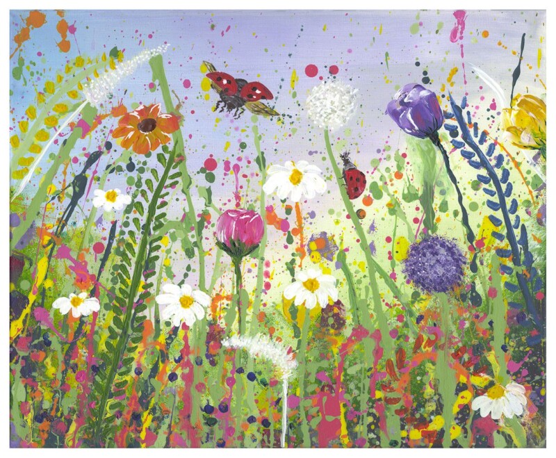
Why A Ladybug Paradice Is a Strong Choice for Dining Room Wall Art

Image of A Ladybug Paradice by The Wee Deaf Artist

When people look for dining room wall art, they usually want something that brings the room together without making it feel too formal. A Ladybug Paradice does that well, adding presence and personality to a space where people gather, eat, and talk.

Why this piece suits the space

Dining areas benefit from artwork that can hold attention and create atmosphere, especially when the furniture is relatively simple. A Ladybug Paradice helps the room feel more finished, giving it a focal point that contributes to the experience of the space rather than just filling a wall.

  • It suits rooms where you want colour and character, but not visual clutter.
  • It can help a dining area feel more intimate and considered.
  • It works well in both dedicated dining rooms and open-plan spaces with a dining zone.

Where it works best

This kind of artwork often works best above a sideboard, on the main wall visible from the table, or in a spot that benefits from a more deliberate focal point. The framed finish helps the piece feel substantial and properly part of the room.

Why the framed finish matters

Because First 4 Frames produces the work in-house in Falkirk, the final result carries the craftsmanship, bespoke framing, and superior quality expected from a mid-to-premium presentation.

This artwork is by Bryony Hamilton, and you can view the exact framed version here.

For anyone choosing dining room wall art that adds atmosphere and a stronger sense of occasion, A Ladybug Paradice is a very appealing option.

Posted on

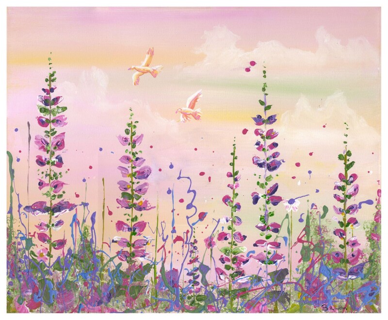
Why Isn’t She Happy Works Beautifully as Bedroom Wall Art

Image of Isn't She Happy by The Wee Deaf Artist

Good bedroom wall art should help the room feel settled rather than overstimulating. Isn’t She Happy does that beautifully, bringing character and colour into the space while keeping the overall mood calm and comfortable.

Why this piece suits the space

Bedrooms often benefit from artwork that feels restorative rather than demanding. Isn’t She Happy has enough presence to shape the room, but it does not feel harsh or restless. That makes it well suited to spaces where you want visual interest without losing the sense of retreat.

  • It works well with soft neutral bedding, painted furniture, and layered textures.
  • It can give a simpler bedroom scheme more personality without upsetting the calm.
  • It suits both main bedrooms and well-styled guest rooms.

Where it works best

This piece would sit comfortably above a chest of drawers, on the main wall opposite the bed, or anywhere the room needs a focal point with a gentler tone. The framed presentation helps the artwork feel properly integrated into the room rather than added at the last minute.

Why the framed finish matters

Because First 4 Frames completes the work in-house in Falkirk, the result has the superior quality and craftsmanship you would expect from a bespoke framed Giclée piece. That extra care is especially noticeable in quieter rooms, where details tend to stand out more.

This artwork is by Bryony Hamilton, and the framed product can be viewed here.

For anyone choosing bedroom wall art that feels calm, personal, and well finished, Isn’t She Happy is a strong option.

Posted on

How Isn’t She lovely Can Brighten a Hallway Without Overcrowding It

Image of Isn't She lovely by The Wee Deaf Artist

Choosing hallway wall art is often about setting the tone for the rest of the home. Isn’t She lovely is a lovely option when you want that first impression to feel bright, welcoming, and considered rather than purely functional.

Why this piece suits the space

In a hallway, artwork has to work quite hard. It may be seen in passing, under changing natural light, and against a relatively simple background. Isn’t She lovely has enough colour and character to make an impact, but it still feels refined and easy to live with.

  • It helps a narrower space feel more intentional and less forgotten.
  • It adds colour without relying on clutter or extra furniture.
  • It suits homes where the entrance should feel warm and personal from the start.

Where it works best

This kind of piece works especially well above a console table, near a staircase turn, or on the main wall that greets people as they arrive. If the hallway already has soft neutrals, natural timber, or painted woodwork, the artwork can lift the scheme beautifully.

Why the framed finish matters

At First 4 Frames, the piece is produced in-house with bespoke framing, colour-managed Giclée quality, and hand-finished craftsmanship. That framed finish matters in an entrance space, where a polished presentation makes the whole home feel more cared for.

The artwork is by Bryony Hamilton, and you can view the exact framed product here.

If you want hallway wall art that feels welcoming, individual, and professionally finished, Isn’t She lovely is a very good fit.

Posted on

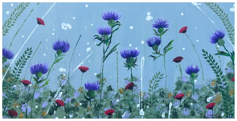
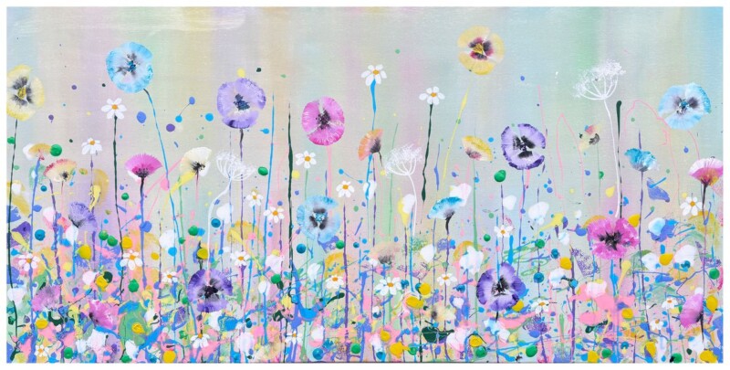
Choosing Purple Wall Art for a Calm Contemporary Room, Why Purple Moments Works

Image of Purple Moments by The Wee Deaf Artist

Choosing purple wall art can be surprisingly tricky. Purple is expressive, but in the wrong setting it can feel too heavy or too sweet. Purple Moments gets the balance right. Its layered violets, soft sky tones, and meadow-like movement bring colour into a room while still keeping the overall mood calm and easy to live with.

Why purple can work so well in a contemporary room

In a modern interior, colour often works best when it feels integrated rather than isolated. Purple Moments has enough variation in tone to do that naturally. The softer lilac and lavender notes can pick up pale paintwork, while the deeper violet areas add definition and character. That makes the piece useful in rooms where you want colour, but still want the overall scheme to feel settled and considered.

  • It works well with soft grey, off-white, taupe, and muted green schemes.
  • The floral meadow feel keeps the colour from feeling formal or severe.
  • It adds personality without overwhelming a quieter room.

A good choice for layered, restful styling

This is the kind of artwork that suits a room built around texture and gentle contrast. Think upholstered seating, natural wood, soft curtains, and a few carefully chosen accents rather than lots of visual noise. Because the composition feels expressive but not chaotic, it can help a room feel finished without taking over the whole scheme.

It is especially effective when you want the wall art to echo existing tones in cushions, throws, or fresh flowers, while still introducing a stronger focal colour. That gives the room a joined-up feel and makes the artwork seem chosen for the space rather than added as an afterthought.

Why the framed finish matters

At First 4 Frames, each piece is produced in-house in Falkirk with the craftsmanship and care you would expect from a bespoke framing workshop. A hand-finished framed print gives the artwork more presence, cleaner presentation, and a more resolved look than a loose print or mass-produced wall piece. That matters in a calm contemporary room, where every detail tends to show.

The artwork is by Bryony Hamilton from The Wee Deaf Artist. You can view the framed product itself here.

If you want purple wall art that feels uplifting, thoughtful, and easy to place within a softer interior palette, Purple Moments is a very appealing option.

Posted on

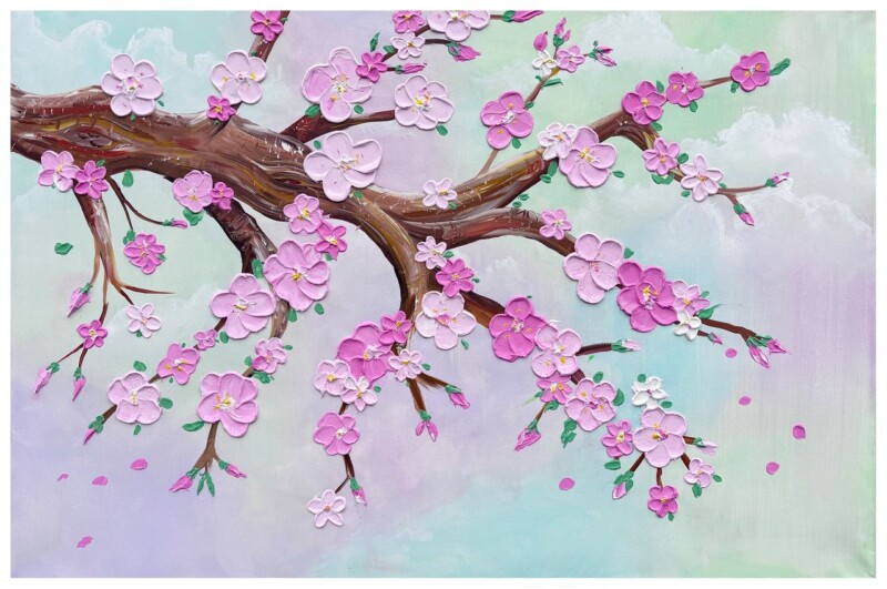
Why Brys Blossom Works Beautifully in a Sunroom or Garden Room

Image of Brys Blossom by The Wee Deaf Artist

Bright spaces often need artwork that feels alive in changing daylight. If you are looking for sunroom wall art that adds warmth without feeling heavy, Brys Blossom is an easy piece to live with. Its floral character and expressive colour make it especially well suited to a garden room, conservatory, or any corner of the home that is used for relaxing.

Why floral artwork suits these lighter spaces

Sunrooms and garden rooms often sit between indoors and outdoors. Because of that, artwork with a natural subject usually feels more connected and more convincing than something overly formal. Brys Blossom has that sense of ease. It echoes the mood of the space instead of fighting against it.

  • It brings colour into a room that may already be full of soft neutrals and natural textures.
  • It feels uplifting in morning and afternoon light.
  • It helps a sitting area feel finished without making it look crowded.

Where it can work best

This framed print would sit well above a cane chair, a slim console table, or a painted bench in a garden room. It can also work in a conservatory that needs one visual anchor to stop the glazing and pale walls from feeling a little bare. If the room already includes plants, linen, or light timber, the artwork can tie those elements together beautifully.

A softer finish with proper craftsmanship

At First 4 Frames, each framed print is finished in-house in Falkirk. That matters in a bright room where poor presentation quickly shows. A hand-finished Giclée print gives you cleaner colour, a more refined surface, and a superior quality result that feels considered from the start.

This artwork is by Bryony Hamilton, The Wee Deaf Artist, whose work often carries warmth, symbolism, and a strong connection to nature. You can view the framed piece itself here.

For anyone choosing artwork for a sunroom or garden room, Brys Blossom offers colour, character, and a relaxed floral presence that feels right at home.

Posted on

Why A Poppy Melody Is a Strong Choice for Dining Room Wall Art

Image of A Poppy Melody by The Wee Deaf Artist

Good dining room wall art should do more than fill a blank wall. It should help the room feel more welcoming, more finished, and a little more memorable when people gather around the table. A Poppy Melody is a strong example of that, using bold floral colour to bring energy and warmth without losing its sense of craftsmanship.

Why floral artwork suits a dining space

Dining rooms often benefit from artwork that feels sociable and expressive. Poppies have a natural liveliness to them, and that makes them a good match for rooms used for conversation, family meals, and entertaining. This piece feels confident rather than formal, which helps the room stay approachable.

If your dining area includes painted walls, timber furniture, or soft neutral finishes, a floral piece like this can introduce colour in a way that still feels balanced and grown-up.

How to use it in the room

A Poppy Melody would work well above a sideboard, on the main wall beside the table, or in an open-plan dining area that needs a visual anchor. Because the subject is expressive, it can help a newer or simpler room feel more personal without the need for lots of extra decorative pieces.

The best dining room art gives people something to enjoy before the first course arrives.

A framed finish that feels considered

At First 4 Frames, each piece is produced with a superior quality framed finish in mind. A hand-finished Giclée print has more depth, better colour stability, and a more polished look than a mass-produced print, which matters in a room where presentation carries so much weight. The in-house Falkirk workshop approach keeps the result bespoke and carefully made.

This artwork is by Bryony Hamilton, The Wee Deaf Artist. If you would like to see the exact framed piece, you can view A Poppy Melody here.

For anyone looking for dining room wall art with colour, character, and a genuine sense of craftsmanship, this piece makes a memorable choice.

Posted on

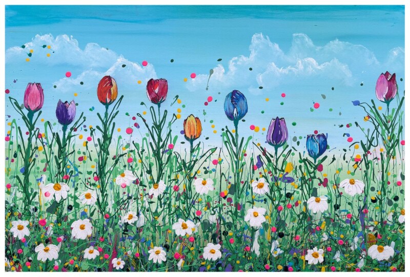
Why Tulips Standing Tall Is Such a Good Fit for Kitchen Wall Art

Image of Tulips Standing Tall by The Wee Deaf Artist

Choosing the right kitchen wall art is often about more than filling a blank space. In a room used every day, the artwork needs to feel fresh, welcoming, and easy to live with. Tulips Standing Tall does exactly that, bringing lively floral colour into the heart of the home without feeling fussy.

Why this artwork works so well in a kitchen

Tulip imagery naturally suits bright, sociable spaces, and this piece has enough presence to lift a breakfast nook, dining corner, or family kitchen wall. The colour brings warmth, while the floral subject keeps the overall feel relaxed and approachable. That matters in a room where you want personality, but not something that feels too formal.

  • It adds colour without making the room feel crowded.
  • It suits spaces where natural light changes throughout the day.
  • It gives a softer, more personal finish than purely graphic kitchen prints.

Best places to hang it

This kind of floral artwork works especially well above a sideboard, on a wall near a breakfast table, or in a dining space that connects to the kitchen. If your cabinets and surfaces are quite clean-lined, a framed print like this can stop the room from feeling too hard or purely functional.

If your kitchen already includes natural wood, painted cabinetry, or soft neutral tones, Tulips Standing Tall can help tie the room together in a way that feels considered rather than over-styled.

A floral piece with proper framed finish

At First 4 Frames, presentation matters just as much as the image itself. A framed Giclée print offers a more polished and lasting finish than a loose poster, especially in a room that gets daily use. The in-house approach, colour-managed print quality, and hand-finished framing all help the artwork feel like part of the home rather than a last-minute extra.

This piece is by Bryony Hamilton, The Wee Deaf Artist, whose work is known for expressive colour and warmth. If you would like to see the exact framed piece, you can view Tulips Standing Tall here.

For anyone looking for kitchen wall art that feels uplifting, personal, and professionally finished, this is a strong choice.

Posted on

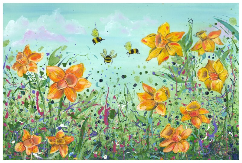
Why Dreaming Of Daffodils Makes a Thoughtful Spring Gift for the Home

Image of Dreaming Of Daffodils by The Wee Deaf Artist

When you are searching for spring gift ideas for the home, it often helps to choose something that feels uplifting, personal, and easy to live with. A framed art print can do exactly that, especially when it brings colour and meaning into everyday spaces. That is why Dreaming Of Daffodils is such a thoughtful choice.

Created by The Wee Deaf Artist, this piece carries a bright, optimistic feel that suits the season beautifully. Daffodils naturally suggest renewal, warmth, and the start of lighter days, so the artwork feels especially fitting as a gift for someone refreshing their home or celebrating a new chapter.

A gift that feels more personal than the usual options

Many seasonal gifts are enjoyable in the moment but quickly forgotten. A framed print has more staying power. It becomes part of a room and part of daily life, which makes it feel more considered. Dreaming Of Daffodils has the kind of cheerful colour and gentle energy that can brighten a kitchen, dining area, hallway, or guest room without feeling overpowering.

That makes it a strong option if you want to give something with genuine character rather than something purely practical. It feels generous, thoughtful, and lasting, especially when professionally presented.

Why daffodil artwork works so well in spring

Spring interiors often benefit from small changes that lift the mood. Daffodil imagery brings in that fresh seasonal feeling without demanding a complete redecorating project. In Dreaming Of Daffodils, the floral subject brings brightness and warmth, while the framed presentation gives the piece enough polish to feel special.

It is also versatile. Whether the recipient prefers a more traditional home, a softer country look, or a clean modern interior with a few colourful accents, this artwork can sit comfortably in the space and still feel distinctive.

A quality-led choice from First 4 Frames

At First 4 Frames, presentation matters just as much as the artwork itself. A framed Giclée print offers a superior quality finish that feels far more special than a standard poster or off-the-shelf decorative print. With in-house craftsmanship and a personal, quality-led approach, the finished piece is designed to feel ready for gifting from the moment it arrives.

If you are gathering spring gift ideas for the home and want something uplifting, well made, and genuinely memorable, Dreaming Of Daffodils is a lovely option. It brings colour, optimism, and a sense of care into the home, which is exactly what a good spring gift should do.