Posted on

Brough of Birsay, Orkney: A Meaningful Orkney Leaving Gift

Image of Brough of Birsay, Orkney by Sheila Fowler

An Orkney leaving gift can carry a familiar place into the next chapter of someone’s life. The best choice feels specific enough to stir real memories, but polished enough to work in a new room. Brough of Birsay, Orkney by Sheila Fowler offers that balance. Its island subject is unmistakably rooted in Orkney, while the square composition makes it practical to display in many kinds of home.

Orkney leaving gift: Brough of Birsay, Orkney by Sheila Fowler

What makes an Orkney leaving gift meaningful

A move away may be exciting, necessary, or bittersweet. A place-led artwork acknowledges that complexity better than a generic farewell present. It does not ask the recipient to pack another practical household item, and it will not disappear after a celebration. Instead, it gives them a familiar view to live with over time.

The Brough of Birsay is a particularly resonant subject. It speaks of coastline, weather, history, and the distinctive scale of the islands. Those associations can matter to someone who grew up nearby, worked in Orkney, studied there, or built an important period of life around the place.

Match the picture to the person’s connection

RecipientWhy the subject worksMessage to add
Someone relocating for workKeeps an island landmark present in a new cityWish them confidence in the move
A family moving to the mainlandCreates one shared reminder of homeRecall a walk, visit, or favourite season
A retiring colleagueMarks years connected to OrkneyThank them for their contribution
A student leaving to studyFits more easily than a large keepsakeOffer encouragement for what comes next

A short handwritten note can make the artwork more personal. Mention why this place was chosen rather than trying to write a long formal dedication. The picture should hold the memory; the note only needs to provide the connection.

A square format that adapts to a new home

The print is available at 265 x 265 and 500 x 500 millimetres before framing. The smaller size is useful when the recipient does not yet know how much wall space they will have. It can fit above a compact console, beside a bookcase, or on a short wall between doors. The larger option has enough presence for a living room, dining area, or generous hallway.

Square art is flexible because it does not need the broad wall demanded by a panorama. It can also join a future collection without losing its identity. If other pictures are added later, leave a consistent gap around each frame and use the Birsay image as the visual anchor rather than crowding every edge.

Choose framing that lets Orkney remain the focus

The landscape already brings colour, texture, and movement. A restrained frame will give it definition without turning the present into souvenir-style decor. Light timber can suit a relaxed coastal interior. A narrow darker moulding can add contrast in a modern flat. The best choice should also work with the recipient’s likely furniture, not only the colours within the print.

First 4 Frames produces colour-managed Giclée prints and completes bespoke framing in-house in Falkirk. That careful finish turns the gift into something ready to hang after the move. It also supports the subtler coastal colour and expressive marks that give the scene its atmosphere.

A lasting view for the next place

Sheila Fowler is known for vibrant Scottish landscapes, coastlines, and wildflowers. Read more about her work on Sheila Fowler’s official website, or explore the wider Sheila Fowler collection at First 4 Frames if another location carries a stronger personal connection.

A successful Orkney leaving gift should feel rooted without becoming a novelty. It should be personal, display-worthy, and able to settle naturally into a different home. View the framed Brough of Birsay, Orkney print for a farewell present that keeps a distinctive island place close.

Posted on

Blue Jug with Flowers: A Thoughtful Gift for a Ceramicist

Image of Blue Jug with Flowers by David Short

A thoughtful gift for a ceramicist should recognise how closely they look at shape, surface, and colour. Buying pottery can be difficult when the recipient already has strong preferences about clay bodies, glazes, and firing methods. Blue Jug with Flowers by David Short offers another route. It celebrates a familiar vessel and a generous arrangement of flowers, yet leaves the maker free to enjoy it as art rather than judge it as a tool or material.

gift for a ceramicist: Blue Jug with Flowers by David Short

Why this gift for a ceramicist feels relevant

Ceramicists spend time considering the relationship between a vessel’s outline, its opening, its handle, and the space around it. A still life built around a blue jug speaks naturally to that visual awareness. The subject is connected to their craft, but it does not rely on a slogan, a novelty mug, or specialist equipment that may not suit the way they work.

The flowers add another layer. Their softer, irregular shapes contrast with the solid jug, while the colour gives the whole arrangement energy. That conversation between a made object and natural forms is part of what makes the image rewarding. It can appeal to someone who throws functional ware, builds sculptural pieces, or simply loves good studio pottery.

Choose art instead of guessing at studio supplies

Clay, tools, brushes, and glazes are personal choices. Even an experienced buyer can choose the wrong specification. Artwork avoids that practical uncertainty while still showing that the recipient’s creative life has shaped the gift. It is also something they can enjoy away from the bench, wheel, and kiln.

  • For a new studio: mark the move with a finished piece that makes the workspace feel established.
  • For an exhibition milestone: celebrate the work involved without trying to select more materials.
  • For a birthday or retirement: choose something lasting that reflects a lifelong interest in objects and making.
  • For a tutor or mentor: acknowledge their creative influence with a subject that feels considered.

Find the right scale and place

The available print sizes are 189 x 275, 350 x 500, and 560 x 780 millimetres before framing. The smallest can suit a quiet wall beside a desk or a compact creative corner. The middle size has enough presence for a kitchen or dining room. The largest can become a confident focal point in a studio reception, living room, or open-plan space.

In a working studio, keep framed art away from clay dust, splash zones, and direct heat from a kiln. A clean office wall, customer consultation area, or home display space will make care easier. In a domestic setting, relate the finished dimensions to the furniture below it and leave enough clear wall for the jug’s outline to read properly.

Let the colour complement handmade objects

A blue vessel can sit comfortably with many ceramic collections. It can sharpen pale stoneware, cool down warm terracotta, or connect with blue-and-white tableware. Avoid arranging every blue object directly beneath the picture. A smaller echo in a bowl, cushion, or book cover is enough to make the relationship feel intentional.

A simple frame is usually the most respectful partner for a colourful still life. Light timber can connect to studio shelving and natural materials. A slim dark moulding can add definition in a brighter room. First 4 Frames can guide that decision and completes bespoke framing in-house at its Falkirk workshop.

A celebration of craft, finished with care

David Short’s work is shaped by colour, pattern, memory, and the familiar possessions that become part of home life. You can explore more of that approach on David Short’s official website and browse the wider David Short collection at First 4 Frames.

The print is produced with colour-managed Giclée methods and presented with hand-finished framing. That combination gives the vivid subject a polished, lasting form. If you need a gift for a ceramicist that feels observant, creative, and easy to display, view the framed Blue Jug with Flowers print.

Posted on

The Three Bridges: Wall Art for a Civil Engineering Office

Image of Firth of Forth: the Three Bridges by Stewart Bremner

wall art for a civil engineering office can reflect the discipline’s combination of analysis, scale, and public purpose without turning the workplace into a display of technical diagrams. Firth of Forth: the Three Bridges by Stewart Bremner offers a clear alternative. It brings three generations of bridge design into one broad view. This gives a Scottish practice or project team a strong sense of place and an immediate architectural subject.

wall art for a civil engineering office: Firth of Forth: the Three Bridges by Stewart Bremner

Why wall art for a civil engineering office should feel relevant

Generic office art may fill a blank wall, but it rarely says much about the people working there. A recognisable feat of infrastructure creates a more meaningful connection. The bridges can prompt conversation with visitors, graduates, and project partners. Meanwhile, calm water and open sky stop the subject from feeling like another working document.

This image is especially useful because the three structures are visible together. Their different profiles show how engineering answers evolve with materials, transport needs, and construction methods. The artwork does not need explanatory text to communicate that progression. Its strong silhouettes make the idea clear from across the room.

Choose the wall according to how the office is used

Office locationWhat the artwork contributesPlacement check
Client meeting roomA confident local talking pointKeep it visible from the main seats
Open project areaA visual horizon beyond screens and plansAvoid monitor glare on the glazing
ReceptionAn immediate link to Scottish infrastructureRelate the frame to the desk width
Partner’s officeA composed subject with professional relevanceLeave clear space around the finished frame

Avoid placing the picture in a crowded print zone beside pinboards, safety notices, or project programmes. Those materials change regularly and ask for close reading. Give the artwork its own wall section, where it can offer distance and visual rest. That pause is particularly valuable in a workspace filled with detailed information.

Use the landscape format to create a clear horizon

The print is available at 594 x 420 and 840 x 594 millimetres before framing. Both sizes have a generous horizontal emphasis. The smaller option may suit a private office or compact meeting room. The larger can hold a substantial wall in reception or a shared studio, provided there is enough surrounding space.

Judge the finished dimensions against nearby furniture rather than the empty wall alone. Above a credenza or meeting-room console, the frame should relate comfortably to the width below it. On a freestanding wall, use a paper template to check the view from the entrance and the seats used most often.

Connect the palette to architectural materials

Slate grey water, pale cloud, blue sky, and restrained red make the image easy to use with common office finishes. Grey carpet tiles and white walls gain a clearer focal point. Black metal furniture can connect to the dark road bridge. One small red detail can echo the rail bridge without turning the room into a branded colour exercise.

A slim black frame can reinforce the graphic outlines and suit a contemporary fit-out. A natural timber moulding can introduce warmth where glass, metal, and technical furniture dominate. Whichever direction you choose, avoid an unnecessarily heavy frame. The broad sky and water are part of the composition’s calm, and the presentation should preserve that openness.

From strong graphic design to careful in-house framing

Stewart Bremner’s hand-drawn landscapes take influence from twentieth-century travel posters. That heritage explains the bold shapes and controlled detail. You can read more on Stewart Bremner’s official artist profile and explore the wider Stewart Bremner collection at First 4 Frames.

First 4 Frames uses colour-managed Giclée production and completes bespoke framing in-house in Falkirk. That quality-led approach keeps the fine bridge lines clear and gives the finished piece enough presence for a professional setting. For wall art for a civil engineering office with structural interest and a genuine Scottish connection, view the framed Firth of Forth: the Three Bridges print.

Posted on

Doggie: Colourful Wall Art for a Dog Grooming Salon

Image of Doggie by Rikki O'Neill

colourful wall art for a dog grooming salon can help a practical reception area feel friendly before a customer reaches the desk. The right piece should celebrate dogs without relying on slogans or making the room look like a collection of pet accessories. Doggie by Rikki O’Neill offers a useful balance. Its crowned dog, patterned coat, small birds, and rich patchwork colour give the business personality while remaining a complete, self-contained composition.

colourful wall art for a dog grooming salon: Doggie by Rikki O'Neill

Why colourful wall art for a dog grooming salon matters

Owners may arrive with a wet, nervous, or excitable dog. They need the space to feel organised, but not clinical. Artwork gives the eye a positive place to settle while staff confirm an appointment or discuss a coat. A cheerful image can also make the reception feel more individual than a room furnished only with wipe-clean surfaces and product displays.

Doggie is clearly connected to the business, yet it avoids a literal grooming scene. The pale dog has a wonderfully alert expression, while the tiny crown and surrounding birds introduce gentle humour. Layered leaves, circles, stripes, and blocks of pink, red, blue, and gold keep the square image interesting without requiring several separate decorations.

Choose a position that remains practical

A salon wall has to work hard. Leads, coats, retail shelves, appointment boards, and cleaning stations all need clear positions. Place framed art where customers can see it, but away from a dog’s first shake after coming in from the rain. The wall behind a reception desk, above a low bench, or beside the collection point can work well.

  1. Check the queueing route. Keep the frame away from corners where leads and bags may brush against it.
  2. Avoid the busiest work zone. Steam, spray, loose hair, and repeated cleaning make the grooming area less suitable than reception.
  3. Use secure fixings. A commercial space needs a stable installation appropriate to the wall construction.
  4. Test the customer view. Sit on the waiting bench and stand at the desk before settling the final height.

Let one square image organise the colour

The available print size is 265 x 265 millimetres before framing. That compact square format suits a smaller reception, a narrow wall beside the desk, or a defined section above a bench. It can provide a clear focal point without using wall area needed for notices and practical information.

There is no need to copy every colour in the artwork. Choose one or two quieter notes for the room. A blue chair, a coral planter, or a warm timber counter can make a connection. Keep retail packaging and notice holders visually ordered, so the layered image feels lively rather than adding to general busyness.

Match the frame to the salon, not to the novelty

Salon finishUseful framing directionResult
White walls and pale flooringWarm timber or a restrained coloured edgeAdds warmth without losing freshness
Dark reception deskSlim dark mouldingConnects the art to the fitted furniture
Bright brand coloursSimple neutral framePrevents the scheme from competing
Natural, calming interiorLight timberSoftens the vivid patchwork palette

Avoid choosing a highly decorative frame simply because the subject is playful. The illustration already supplies pattern and humour. A well-proportioned moulding gives it a clear boundary and helps the result feel like professional artwork rather than a temporary shop sign.

A friendly detail with a professional finish

First 4 Frames produces colour-managed Giclée prints and completes bespoke framing in-house at its Falkirk workshop. That hand-finished presentation is useful in a customer-facing business. It supports the many fine patterns and bright colour shifts while giving the piece a clean, ready-to-display finish.

Learn more about the illustrator’s colourful approach in this profile of Rikki O’Neill, and browse the wider Rikki O’Neill collection at First 4 Frames. If your salon needs colourful wall art for a dog grooming salon that feels warm, distinctive, and relevant, view the framed Doggie print.

Posted on

The Attic Room: How to Choose Wall Art for a Loft Study

Image of The Attic Room by Emily Little

wall art for a loft study has to work with a room that may offer excellent character but very little straightforward hanging space. Sloping ceilings, dormer windows, desks, and built-in storage quickly divide the walls. The Attic Room by Emily Little provides a thoughtful answer. Its upright proportions fit a narrower vertical section, while the painted windows and warm interior colours create an extra sense of light and depth.

wall art for a loft study: The Attic Room by Emily Little

Map the usable walls before furnishing the loft

Begin with the full height sections. A gable wall, chimney return, or strip beside a dormer may be more valuable for art than the long walls beneath the eaves. Reserve low areas for cupboards, files, and surfaces. This prevents the picture from being squeezed into a space where the roof line cuts across it or where furniture hides the lower half.

Next, sit at the desk and note the walls in your natural sightline. Artwork directly behind a monitor is often obscured. A piece on the return wall, opposite the desk, or beside the approach to the workspace can be easier to enjoy. It can also improve the view during breaks without becoming a distraction during focused work.

Why upright wall art for a loft study is so useful

The Attic Room is available in 230 x 322 and 360 x 500 millimetre print sizes before framing. Its vertical format uses height rather than width, which is helpful when a broad wall is interrupted by windows or storage. Mark the intended finished frame with low-tack tape and check that the top has comfortable clearance from the changing roof angle.

The composition reinforces that vertical movement. Bright window shapes draw the eye upward, while the chair and fragments of table keep the image connected to a working interior. The subject therefore relates to the room without literally repeating a desk, keyboard, or office slogan.

Balance daylight and screen light

  1. Watch the room for a full working day. Rooflights and dormers can send strong light across different walls as the sun moves.
  2. Avoid direct glare. Choose a position where bright reflections will not make the image difficult to see.
  3. Keep it out of the screen’s background when needed. If video calls matter, decide whether a calm artwork backdrop helps or whether another wall gives better daily enjoyment.
  4. Add controlled task lighting. A desk lamp should support work without throwing a hard hotspot across the glazing.

The painted windows in the artwork bring a suggestion of brightness even on overcast days. Orange and rust tones add warmth, while turquoise and pale blue details keep the image from feeling enclosed. This colour balance can help a loft study feel welcoming in winter as well as airy in summer.

Let the artwork soften practical office furniture

Loft studies often rely on efficient furniture because every section of floor and wall has a job. White cupboards, metal desk legs, and filing boxes can make the result feel temporary. The layered, semi-abstract surface of The Attic Room introduces marks, irregular edges, and human warmth without requiring extra objects on the desk.

A simple natural-timber frame can connect the orange tones to exposed beams or a wooden worktop. A narrow dark frame gives the fragmented forms a crisp boundary and may relate better to contemporary lighting or black furniture. Avoid an excessively wide moulding if the hanging section is already narrow.

Make a converted room feel permanent

A loft office can sometimes feel like spare space claimed in a hurry. One properly scaled and hand-finished piece signals that the room has a settled purpose. First 4 Frames completes colour-managed Giclée production and bespoke framing in-house in Falkirk, helping the subtler paper textures, painted colour, and pale window forms remain clear.

See how the artist uses colour, memory, and semi-abstract interiors on Emily Little’s official website, then browse the wider Emily Little collection. If you need wall art for a loft study that uses a narrow wall well and gives the room greater depth, view the framed The Attic Room print.

Posted on

Cup of Ambition, 9 to 5: Wall Art for a Home Baking Corner

Image of Cup of Ambition, 9 to 5 by David Short

wall art for a home baking corner should make the space feel more enjoyable without adding to the visual clutter of mixers, scales, jars, and everyday mugs. Cup of Ambition, 9 to 5 by David Short is especially well suited to that job. Its shelves, baking tools, bright cups, and row of finished cakes celebrate the activity itself, while the square composition gathers many small details into one clear focal point.

wall art for a home baking corner: Cup of Ambition, 9 to 5 by David Short

Why wall art for a home baking corner needs a little structure

A baking area naturally contains many shapes and materials. There may be glass storage jars, metal utensils, paper cases, recipe books, and a stand mixer on show. Adding several small signs or decorative objects can make the corner feel busier. One confident artwork gives the eye a place to settle and helps the practical collection read as part of an intentional room.

Cup of Ambition, 9 to 5 reflects the same objects without trying to imitate a perfectly styled kitchen. The energetic paintwork and uneven forms make the scene feel used and sociable. That quality suits a real baking space, where flour appears on the worktop and favourite tools earn their place through regular use.

Choose the safest useful wall

Keep framed art away from direct heat, steam, and repeated splashes. The wall beside a pantry, above a freestanding sideboard, or near a kitchen table will usually be more suitable than the area immediately over a hob, kettle, or sink. A nearby position can still define the baking zone without exposing the frame and glazing to unnecessary kitchen residue.

Check how cupboard doors and appliances open before marking the hanging point. The image should remain visible when the mixer is in use, but it should not sit where a raised appliance head or open cabinet could meet the frame. A comfortable gap above the work surface also makes wiping and moving equipment easier.

Use the square shape to anchor a compact baking station

The available print sizes are 265 x 265, 500 x 500, and 800 x 800 millimetres before framing. The smallest can suit a narrow pantry wall or a modest coffee-and-baking corner. The middle size can hold its own above a sideboard. The largest needs generous clear wall and is better suited to an open-plan kitchen where it will be viewed from across the room.

What is already in the cornerUseful artwork responseWhat to avoid
Bright stand mixerRepeat one of its colours lightly in the print or frameMatching every accessory to the appliance
Open shelves and jarsLeave clear wall around one square focal pieceA cluster of many small kitchen signs
Plain fitted cabinetryUse the painting’s strong colour to add personalityChoosing art so pale that it disappears
Patterned tilesFrame the image simply and keep nearby extras restrainedAdding another competing decorative pattern

Borrow colour without turning the kitchen into a theme

The deep blue ground gives the image enough weight to work with navy cabinetry, dark shelves, or black hardware. Orange, pink, green, and yellow details prevent that blue from feeling cool. Pick up just one accent in a tea towel, bowl, or storage tin. The artwork should lead the palette rather than become an instruction to buy a complete matching set.

A slim dark moulding can sharpen the shelves and utensils in the composition. Natural timber can make the result feel warmer and connect it to chopping boards, a table, or open shelving. The right choice depends on the finishes already in the room, so consider the complete framed dimensions rather than the print alone.

A hand-finished focal point for an everyday ritual

First 4 Frames produces colour-managed Giclée prints and completes bespoke framing in-house at its Falkirk workshop. That careful presentation gives a lively subject a properly resolved finish. It also makes the piece suitable for a kitchen that is used hard but still deserves the same design attention as a sitting room.

Explore more of the artist’s colourful paintings of familiar objects and everyday pleasures on David Short’s official website, or browse the David Short collection at First 4 Frames. For wall art for a home baking corner that feels energetic, useful, and personal, view the framed Cup of Ambition, 9 to 5 print.

Posted on

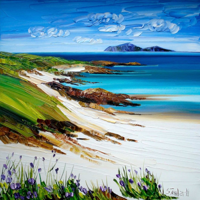
Wildflowers, Loch Lomond: How to Choose Art for a Downsized Home

Image of Wildflowers, Loch Lomond by Sheila Fowler

Choosing art for a downsized home is not simply a matter of buying smaller pictures. A move to a compact house or flat often means deciding which images still carry colour, memory, and a real sense of self. Wildflowers, Loch Lomond by Sheila Fowler is a useful example. Its square format is easy to place, yet the vivid flowers and open Loch Lomond setting give it enough presence to keep a reduced room personal.

art for a downsized home: Wildflowers, Loch Lomond by Sheila Fowler

Begin art for a downsized home with meaning, not measurements

Measurements matter, but they should not make every decision. Start by identifying what you want the new home to retain. It may be a connection to the west coast, the energy of a garden, a favourite colour, or the feeling of open landscape. A smaller collection becomes stronger when each piece carries more than decorative value.

Wildflowers, Loch Lomond combines several layers in one image. The wildflowers bring close colour and texture, while the water and distant land provide depth. That helps a compact room feel lively without filling it with many separate subjects or accessories.

Use the square format where wall space is interrupted

Smaller homes often have useful but broken-up walls. Doors, windows, radiators, cupboards, and open-plan routes can leave few long uninterrupted areas. A square composition can fit comfortably above a compact console, beside a doorway, between shelving, or over a small dining table.

The print is available at 265 x 265 and 500 x 500 millimetres before framing. Mark the complete proposed frame on the wall with low-tack tape. Then check it from the main seat, the doorway, and the route through the room. The artwork should be legible from a distance without making the furniture below feel undersized.

Edit the room around one confident colour story

  1. Choose one lead artwork. Let it establish the strongest colour and mood in the room.
  2. Repeat colour lightly. Pick up one flower tone in a cushion, ceramic, or book spine rather than matching the whole palette.
  3. Protect clear wall. Empty space around the frame makes the room feel calmer and the picture more important.
  4. Remove competing fillers. Several generic signs or small prints can create more visual clutter than one properly scaled piece.
  5. Keep useful objects useful. Do not sacrifice storage or circulation just to preserve an old furniture-and-art arrangement.

The aim is not minimalism for its own sake. It is to give the best objects enough room to work. The bright foreground of Wildflowers, Loch Lomond can provide energy, while its distant view creates visual breathing space. Quiet upholstery and natural timber allow both qualities to remain clear.

Decide what comes from the previous home

A move may involve existing furniture, frames, and sentimental objects. Lay out those items before choosing new art. If the old collection contains several small pictures with similar value, rotate them seasonally rather than hanging every piece at once. One new focal print can then give the room direction while familiar objects keep the space recognisably yours.

Place matters too. Someone with memories of Loch Lomond or Scotland’s west may see more in this image than flowers and water. That personal association can make it a better choice than a neutral print selected only because its colours fit.

Frame for proportion and long-term flexibility

A simple frame gives the expressive paintwork a clear edge. Pale timber can keep the result light, while a slim darker moulding can sharpen the colour and connect with black hardware or furniture legs. Avoid making the finished piece unnecessarily heavy in visual or physical terms, especially on a narrow wall.

First 4 Frames produces colour-managed Giclée prints and completes bespoke framing in-house in Falkirk. One-to-one advice can help balance the print size, mount, frame profile, and intended wall. That is particularly valuable when every centimetre must work harder.

See more of the painter’s colourful Scottish landscapes on Sheila Fowler’s official website, then compare the Sheila Fowler collection at First 4 Frames. For art for a downsized home that keeps personality without overwhelming a compact room, view the framed Wildflowers, Loch Lomond print.

Posted on

Dunfermline Abbey: A Thoughtful Gift for a Family History Researcher

Image of Dunfermline Abbey by Stewart Bremner

A gift for a family history researcher should recognise the curiosity and patience behind the research. Another notebook or online subscription may be useful, but it can feel impersonal. Dunfermline Abbey by Stewart Bremner offers a more lasting connection. It turns a significant Scottish place into something the recipient can live with, discuss, and relate to the stories they have uncovered.

gift for a family history researcher: Dunfermline Abbey by Stewart Bremner

Why a gift for a family history researcher needs a real connection

Family history is rarely just a list of names and dates. Researchers follow addresses, occupations, journeys, churches, and civic records until a place begins to feel part of the family story. Art tied to a genuine location respects that process. It gives the recipient a visible point of reference without trying to reduce their research to a novelty slogan.

Dunfermline Abbey has particular depth as a subject. The abbey and its surroundings carry centuries of Scottish history, while the strong graphic treatment keeps the image fresh enough for a present-day home. That combination suits someone who values the past but does not necessarily want an antique-style interior.

Check the place before choosing the present

The best heritage gift starts with evidence. Look for Dunfermline in certificates, census returns, parish records, old addresses, or family stories. The link does not need to be a direct connection to the abbey itself. A nearby birthplace, marriage, workplace, or long family residence can give the artwork genuine personal meaning.

Clue in the researchWhy the print may feel relevantDetail to add in the card
A Dunfermline birth or marriageIt anchors an important family event to placeThe name and year you found
Work in the town or nearbyIt acknowledges everyday life, not only major datesThe occupation or address
A family visit to FifeIt connects research with a shared memoryWhat you discovered or visited together
An interest in Scottish historyIt provides a strong subject beyond one family lineWhy this location stood out

If the connection is uncertain, do not invent one. Present the print as an invitation to explore the place further. A short, accurate note is far more meaningful than a grand claim that the records cannot support.

Make the research part of the gift

Include a copy of one relevant document, a small family-tree extract, or a written explanation of the connection. Keep original certificates and fragile papers safely stored. The framed artwork should stand on its own, while the accompanying note supplies the personal context that makes this particular image theirs.

This approach also works well for a research milestone. Perhaps the recipient has identified a difficult ancestor, completed one branch of the tree, or organised years of notes for the wider family. The print can mark that achievement without suggesting the project is ever truly finished.

Choose a display place where the story can be shared

A study, hall, sitting room, or landing can all suit Dunfermline Abbey. In a workspace it can sit near maps and organised records. In a shared room it becomes easier for relatives and visitors to ask about the connection. The landscape format is available in 594 x 420 and 840 x 594 millimetre print sizes, so there is scope for either a measured personal corner or a stronger focal wall.

Measure the finished framed size rather than the print alone. A simple dark moulding can reinforce the crisp travel-poster character, while a lighter timber can work with shelves, desks, and relaxed contemporary furniture. The frame should give the image definition without pushing it towards a staged historical theme.

Lasting presentation for a carefully researched story

First 4 Frames completes colour-managed Giclée production and bespoke framing in-house at its Falkirk workshop. The hand-finished presentation gives the gift permanence and polish, which feels appropriate for research built slowly from original records and patient comparison.

Explore more of the artist’s bold Scottish landscapes and heritage subjects on Stewart Bremner’s official website, or browse the Stewart Bremner collection at First 4 Frames. If Dunfermline is part of the recipient’s story, view the framed Dunfermline Abbey print as a gift for a family history researcher with a genuine sense of place.

Posted on

Alberi II: Panoramic Wall Art Above a Bed

Image of Alberi II by Emily Little

panoramic wall art above a bed can solve a familiar proportion problem. A bed creates a broad visual base, yet a standard upright picture may seem detached above it. Alberi II by Emily Little takes the opposite approach. Its very wide, shallow format follows the line of the headboard, while the repeated trunks and intense woodland floor create rhythm without requiring a group of separate frames.

panoramic wall art above a bed: Alberi II by Emily Little

Why panoramic wall art above a bed feels settled

The strongest bedroom arrangements connect the furniture and wall instead of treating them as separate layers. A horizontal image extends across the headboard area and gives the eye a clear line to follow. Because Alberi II is only 310 millimetres high at its largest print size, it adds presence without pushing too close to the ceiling.

The woodland subject supports that geometry. Slim vertical trunks rise through the composition, but their repeated spacing reads as one continuous band. That balance of horizontal format and vertical detail prevents the piece from looking like a decorative stripe. It remains an artwork with depth and movement.

Set the width in relation to the headboard

Begin with the bed, not the full wall. The framed picture should be clearly narrower than the headboard so the arrangement keeps a stable visual base. At the same time, it needs enough width to avoid floating as a small object over the pillows. Use masking tape to mark the proposed outer frame, then view it from the doorway and from the foot of the bed.

  1. Measure the headboard. Record its full visible width after bedside furniture is in place.
  2. Mark the frame outline. Include the moulding and any mount, not only the 900 x 310 or 560 x 180 millimetre print.
  3. Check the gap below. Leave comfortable breathing space above the headboard rather than allowing the frame to appear perched on it.
  4. Test the doorway view. Make sure the artwork centres on the bed, even if the bed is not centred on the whole wall.

The narrower print option can suit a single or double bed, depending on the finished frame. The larger version has the reach for a broader headboard. Exact proportions will vary with the mount and moulding, so a paper template gives a more dependable answer than a general percentage rule.

Use the red woodland without making the room restless

The red and orange ground gives the print real energy, but the pale trunks and disciplined repetition keep it controlled. Let that band of colour be the room’s main expressive feature. Bedding can stay quieter in stone, soft white, charcoal, or muted green. One rust or berry-coloured cushion is enough to connect the palette.

This restraint is particularly useful in a bedroom. Repeating every colour across curtains, lamps, throws, and rugs would make the scheme feel busy. A concentrated area of warm colour above the bed can create focus while the rest of the room remains restful.

Choose the frame and fixings as part of the plan

A dark, slim moulding can sharpen the tree trunks and suit black bedside lights or metal details. Pale timber may connect the woodland subject to oak furniture and soften the stronger red. Avoid an unnecessarily deep or ornate profile; the elongated format already provides a distinctive architectural line.

Anything positioned over a bed must be securely fixed for the wall type and finished frame weight. Use appropriate hardware and avoid relying on a loose picture ledge. First 4 Frames can advise on presentation and practical hanging considerations when the frame is specified.

A confident focal point with an in-house finish

First 4 Frames produces colour-managed Giclée prints and completes bespoke framing in-house at its Falkirk workshop. Careful production helps preserve the fine pale trunks, dark lines, and variation across the red woodland floor. The finished frame turns the unusual shape into a deliberate part of the bedroom architecture.

See how the artist explores colour, memory, and semi-abstract landscape on Emily Little’s official website, then compare more work in the Emily Little collection. If you need panoramic wall art above a bed with a strong sense of proportion and an original colour story, view the framed Alberi II print.

Posted on

Antique Bouquet: A Lasting Gift for a Flower Arranger

Image of Antique Bouquet by David Short

A gift for a flower arranger should recognise the recipient’s creative eye rather than simply repeat the materials they use. Flowers are beautiful, but a fresh bunch can feel predictable for someone who works with them every day. Antique Bouquet by David Short offers a more lasting connection. Its energetic stems, seed heads, berries, and graphic vase celebrate the choices that make an arrangement distinctive: colour, balance, line, and a willingness to combine unexpected forms.

gift for a flower arranger: Antique Bouquet by David Short

Why art can be a better gift for a flower arranger

Experienced flower arrangers often have strong preferences about tools, vessels, and plant material. Buying specialist equipment without knowing their working methods can miss the mark. A framed print avoids that problem. It honours the same visual interests while giving them something to enjoy when no active arrangement is on the table.

This piece is especially apt because it does not present a formal, perfectly symmetrical bouquet. Marks cross, colours overlap, and individual shapes retain their character. That liveliness will appeal to someone who understands that the most memorable arrangements are rarely built by matching every stem. They come from rhythm, contrast, and confident editing.

Match the gift for a flower arranger to the occasion

OccasionWhat the gift can acknowledgeWhat to add in the card
New studio or shopA creative space of their ownA wish for the work and people it will welcome
RetirementYears of skill, patience, and visual judgementA specific arrangement or event people remember
Course completionGrowing confidence and a developing personal styleThe progress you have noticed
BirthdayThe pleasure their creativity brings to everyday lifeWhy the image made you think of them

The written message supplies the personal context. Avoid broad praise if you can name something real: their unusual colour combinations, calm work under pressure, or talent for making seasonal material feel fresh. The artwork then becomes a lasting reminder of a quality you genuinely value.

Choose a display place away from the working mess

A studio wall, shop consultation area, dining room, or creative home office can all suit Antique Bouquet. In a professional setting, place it where clients can enjoy it without crowding the workbench. At home, a wall near a table or sideboard allows the floral subject to connect naturally with real vessels and seasonal stems.

The portrait format is useful on a narrower wall. It can fit between a window and cabinet, beside shelving, or above a compact piece of furniture where a wide landscape would feel squeezed. Measure the finished framed size, not only the printed image, and leave enough clear wall for the irregular marks to remain legible.

Let the artwork lead the colour rather than matching it

The mint ground, dark vase, warm orange, purple, and fresh green create several possible links to a room. Only one or two are needed. A green wall may draw out the background, while timber furniture can support the warmer marks. Against a neutral wall, the picture can carry the colour on its own.

A simple dark moulding can connect with the vase and ink-like outlines. Natural timber offers a softer choice if the room already contains baskets, wood, or handmade ceramics. The frame should give the lively composition a clear boundary without trying to compete through ornate detail.

Presentation that respects a trained eye

First 4 Frames uses colour-managed Giclée production and completes bespoke framing in-house at its Falkirk workshop. That care matters for an image built from small shifts in texture and overlapping colour. The hand-finished result also gives the present the sense of permanence appropriate to a milestone or professional achievement.

Explore more of the painter’s work with colour, memory, and familiar objects on David Short’s official website, or browse the David Short collection at First 4 Frames. For a gift for a flower arranger that feels informed, personal, and useful long after fresh stems have faded, view the framed Antique Bouquet print.