Posted on

How Adrift Can Set the Right Tone for Hotel Lounge Wall Art

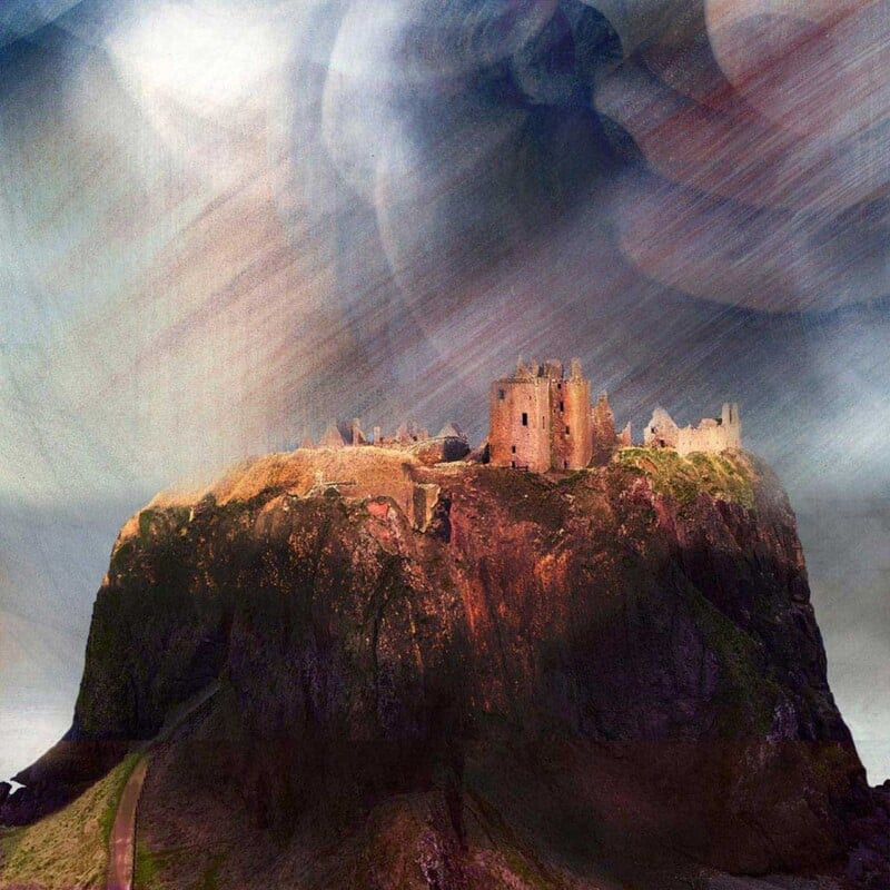
Image of Adrift by Jill McIntosh

The best hotel lounge wall art helps guests relax almost immediately. It should add atmosphere and identity, but it should not feel noisy or overly themed. Adrift is a particularly good choice because it brings calm movement and a sense of place while still feeling polished enough for a professional hospitality setting.

Why guest spaces need calm rather than clutter

A hotel lounge often has to do several jobs at once. It may welcome arriving guests, give people somewhere to wait, support quiet conversation, or simply soften the transition between public and private space. Artwork that is too busy can work against that. This piece succeeds because it feels atmospheric without becoming demanding.

  • It suits lounges, reception seating areas, and quieter corners in boutique hotels or guest houses.
  • It brings Scottish coastal character without forcing a full seaside theme.
  • It helps a commercial interior feel curated rather than off-the-shelf.

A better choice than generic hospitality filler

Many guest spaces rely on safe but forgettable décor. One well-chosen framed print can do far more. This artwork gives the room a stronger mood and a more considered identity, which can make the whole experience feel warmer and more memorable for the people using the space.

Why presentation matters in hospitality

First 4 Frames produces each piece in-house in Falkirk using colour-managed Giclée printing and hand-finished bespoke framing. In a hospitality setting, where guests notice overall finish very quickly, that craftsmanship helps the artwork support the quality of the room rather than undermine it.

The artwork is by Jill McIntosh, and you can view the exact framed product here.

If you need hotel lounge wall art that feels calm, distinctive, and easy for guests to live with, Adrift is a very effective choice.

Posted on

Choosing Art for a Room With Brass Accents, Why Golden Cascade Feels So Well Judged

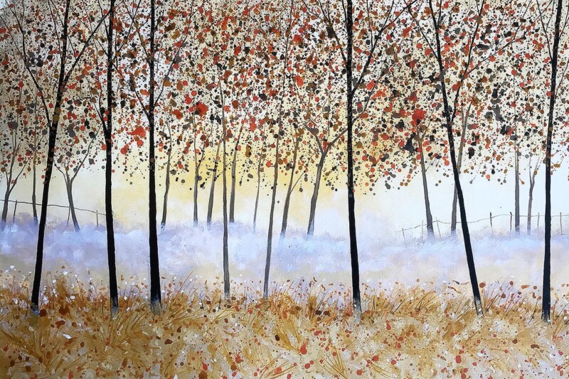
Image of Golden Cascade, Falls of Dochart by Colin Robertson

Choosing art for a room with brass accents is often about control. Brass can add welcome warmth and richness, but too many golden or amber notes in different places can make a scheme feel slightly disconnected. Golden Cascade, Falls of Dochart works beautifully because it gathers those warmer notes into one confident focal point.

Why this colour relationship feels natural

The artwork carries warmth through autumn colour and reflected light, yet it still has enough green, white, and cooler contrast to stop the room becoming heavy. That balance is exactly what helps brass accents feel intentional. Instead of isolated touches on handles, lamps, or mirror frames, the room starts to feel more coherent.

  • It suits sitting rooms, dining rooms, and hallways with brass hardware or lighting.
  • It adds warmth without pushing the interior into an overly autumnal look.
  • It helps richer metallic details feel connected to the rest of the palette.

A useful answer when a scheme feels slightly unfinished

Rooms often have one or two strong finishing details but still lack a visual centre. That is where a well-chosen framed print helps. This piece gives the warmth in the room somewhere to gather, which can make the whole space feel more deliberate and better resolved.

Why quality framing matters here

First 4 Frames completes the work in-house in Falkirk with colour-managed Giclée printing and hand-finished bespoke framing. In a room where metallic details already suggest quality, that superior presentation matters. The artwork needs to hold its own rather than look secondary to the rest of the finishes.

The artwork is by Colin Robertson, and you can view the exact framed product here.

If you want art for a room with brass accents that feels warm, balanced, and confidently put together, Golden Cascade, Falls of Dochart is an excellent fit.

Posted on

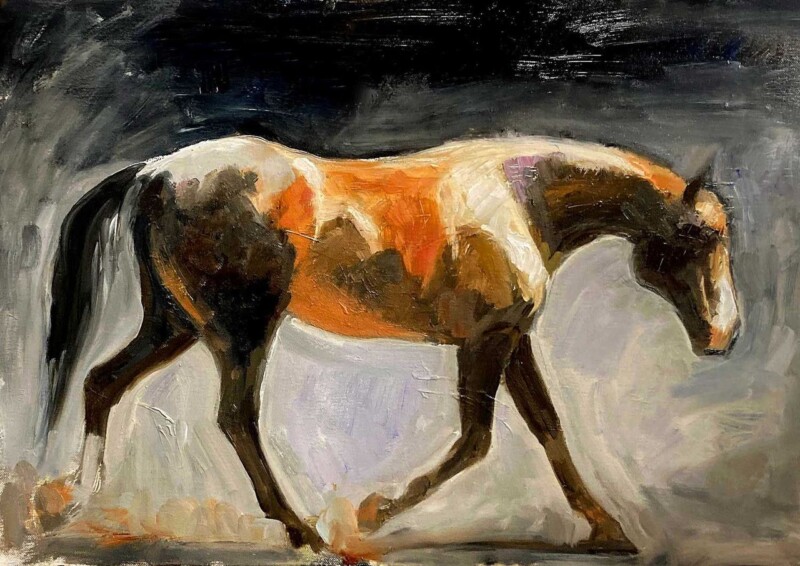
What Makes Whisper Of A Graze Such a Thoughtful Horse Lover Art Gift

Image of Whisper of a Graze by Diana Hand

A really good horse lover art gift should feel personal without becoming overly obvious. Whisper Of A Graze stands out because it captures the quiet grace of the subject in a way that feels elegant, restrained, and easy to place in the home.

Why a quieter equestrian piece often makes the better gift

When you are buying for someone who genuinely loves horses, the safest choice is not always the loudest or most dramatic image. Often the stronger gift is something they can live with every day. This artwork has that quality. It feels thoughtful and expressive, but it still leaves room for the rest of the interior to breathe.

  • It suits bedrooms, studies, dressing rooms, and calm sitting spaces.
  • It feels personal enough for a meaningful birthday or thank-you gift.
  • It has equestrian character without turning the whole room into a themed space.

A more lasting choice than a novelty present

The appeal here is longevity. A framed art print can stay in someone’s home for years, becoming part of the way they live rather than a gift that is enjoyed briefly and then packed away. That is especially valuable when you want the present to feel considered and substantial.

Why the framed finish adds to the gift

First 4 Frames produces each piece in-house in Falkirk with colour-managed Giclée printing and hand-finished bespoke framing. That craftsmanship gives the gift a superior quality finish from the outset, which matters when the intention is to give something with lasting presence.

The artwork is by Diana Hand, and you can view the exact framed product here.

If you are looking for a horse lover art gift that feels graceful, personal, and genuinely easy to enjoy every day, Whisper Of A Graze is a beautiful option.

Posted on

Why Moving House Works Brilliantly as Estate Agent Office Wall Art

Moving House" features a whimsical illustration of a crooked house on a red sleigh adorned with string lights and a lamp post, set in a snowy landscape with gentle falling snow.

Good estate agent office wall art should make the space feel more human without distracting from the work being done there. Moving House is a particularly fitting choice because it connects naturally with the experience of buying, selling, and relocating, while still feeling distinctive rather than gimmicky.

Why a property office benefits from artwork with character

Many estate agent offices lean heavily on screens, brochures, window cards, and practical furniture. That is understandable, but it can leave the space feeling functional rather than welcoming. This piece helps soften that impression. It gives clients something memorable to notice while they wait, and it reinforces the idea that property is personal, not purely transactional.

  • It suits reception areas, meeting rooms, and client-facing desks.
  • It adds personality without making the office feel informal.
  • It gives a property business a visual link to the idea of home and movement.

A useful talking point without becoming a novelty

The best commercial artwork often gives people an easy point of connection. This print does that well. Its imaginative tone makes the office feel less stiff, but the framed presentation keeps the overall effect polished. That balance matters in a business where trust and approachability need to work together.

Why presentation matters in a client-facing workspace

First 4 Frames completes each piece in-house in Falkirk using colour-managed Giclée printing and hand-finished bespoke framing. In an office where details influence first impressions, that superior quality finish helps the artwork feel chosen with care rather than added as an afterthought.

The artwork is by Matylda Konecka, and you can view the exact framed product here.

If you want estate agent office wall art that feels relevant, welcoming, and a little more memorable than the expected options, Moving House is a very strong choice.

Posted on

Choosing Art for Exposed Brick Walls, Why Lost in Time Feels So Balanced

Image of Lost in Time by Arie Vardi

Choosing art for exposed brick walls is often a question of balance. Brick already brings texture, pattern, and a certain amount of visual weight, so the artwork needs to soften the effect rather than add more noise. Lost in Time does this particularly well, offering atmosphere and colour in a calm, measured way.

Why calmer artwork often works better on brick

A heavily textured wall can make busy art feel crowded. This piece succeeds because it introduces mood and depth without fighting for attention. The room still keeps its character, but it feels less hard-edged and more complete.

It would suit dining spaces, garden rooms, studios, or open-plan corners where exposed brick is part of the architecture. Instead of trying to dominate the wall, the artwork works with it, which is usually the more lasting choice.

A useful way to bring polish to a more rugged backdrop

There is a real difference between preserving character and letting a room feel unfinished. One well-framed print can bridge that gap. This artwork adds a sense of intention, helping the wall feel styled while still allowing the brick to do its job.

  • It softens texture without making the scheme bland.
  • It suits interiors that mix older materials with cleaner furniture.
  • It brings calm colour to a wall that already has a lot going on.

Why the frame makes a difference

First 4 Frames completes the work in-house in Falkirk with colour-managed Giclée printing and hand-finished bespoke framing. That superior quality finish matters on exposed brick because the presentation needs enough clarity and structure to stand confidently against a textured backdrop.

The artwork is by Arie Vardi, and you can view the exact framed product here.

If you want art for exposed brick walls that feels calm, polished, and naturally well judged, Lost in Time is a strong choice.

Posted on

How Down the Stairs Can Lift the Wall Above a Console Table

Down the Stairs" is a surreal painting of a narrow, dim staircase where a cat-faced puppet slumps on the steps and a shadowy figure hides behind a corner. Warm light contrasts with dark, textured walls, creating an eerie atmosphere.

Finding the right wall art above a console table can be surprisingly difficult. The space usually needs personality, but not so much visual weight that the area feels crowded. Down the Stairs works especially well because it brings shape, interest, and movement to a narrow wall without overpowering it.

Why this area needs more than a generic filler print

Console tables often sit in halls, landings, or transition spaces where every detail is more noticeable. A weak artwork can make the whole arrangement feel temporary. This piece has enough character to anchor the wall properly, so even a simple table, lamp, or bowl beneath it feels more intentional.

  • It suits hallways, upstairs landings, and apartment entrances.
  • It adds personality without needing a full gallery wall around it.
  • It works well when the furniture below is slim and understated.

A useful way to make a pass-through space feel finished

Not every part of a home needs lots of objects to feel considered. Sometimes one expressive framed print is enough. This artwork helps a circulation space feel designed rather than simply passed through, which is exactly what makes it so useful above a console table.

Why the presentation matters in a small area

First 4 Frames produces the piece in-house in Falkirk with colour-managed Giclée printing and hand-finished bespoke framing. In a smaller wall area, that cleaner finish matters because the eye takes in the whole arrangement at once. A superior quality frame helps the artwork look settled and complete.

The artwork is by Matylda Konecka, and you can view the exact framed product here.

If you want wall art above a console table that feels lively, polished, and easy to place, Down the Stairs is a very good option.

Posted on

Beached Clinker at Croig and the Appeal of Scottish Wall Art for a Second Home

Beached Clinker at Croig: A vibrant painting featuring a white house by a river, a docked rowboat in the foreground, colorful blues, purples, and oranges, bare trees, and a yellow moon illuminating the scene.

Good Scottish wall art for a second home should do more than fill an empty wall. It should help the property feel settled, personal, and meaningfully connected to its setting. Beached Clinker at Croig is a strong example because it brings colour, local character, and a clear sense of atmosphere.

Why place matters more in a retreat setting

A second home often benefits from artwork that makes the space feel distinct from everyday life. This piece does that beautifully. The coastal subject and island character give the room a stronger identity, which helps even a simple interior feel more established and welcoming.

It works especially well in sitting rooms, guest bedrooms, and entrance areas where you want visitors to feel a connection to Scotland straight away. Rather than relying on generic nautical décor, it gives the home a more grounded and collected feel.

A better fit than purely decorative filler

Second homes can easily end up with practical but forgettable décor choices. One well-chosen framed print is often more effective. This artwork brings warmth and personality while still feeling polished enough for a quality-led interior.

  • It adds colour without making the room feel busy.
  • It suits coastal properties and inland homes alike when you want a stronger Scottish connection.
  • It makes a temporary-feeling room seem more established.

Why quality presentation helps

First 4 Frames completes the work in-house in Falkirk with colour-managed Giclée printing and hand-finished bespoke framing. That craftsmanship matters in a second home because the room benefits from pieces that feel chosen to last, not simply bought to fill space quickly.

The artwork is by John Lowrie Morrison OBE, and you can view the exact framed product here.

If you are looking for Scottish wall art for a second home that feels warm, rooted, and memorable, Beached Clinker at Croig is a very strong choice.

Posted on

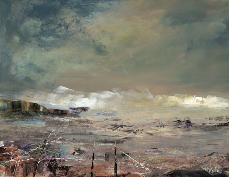
Why Atlantic Storm Approaching Works So Well When You Want Art for a Room With Black Accents

Image of Atlantic Storm Approaching by Jill McIntosh

Choosing art for a room with black accents is often about balance. Black details can make a room feel crisp, tailored, and modern, but they can also harden the overall look if everything around them is too static. Atlantic Storm Approaching is a very good way to introduce movement and colour without losing that sense of control.

Why this kind of contrast works

The darker accents in a room already provide definition, so the artwork does not need to compete through heaviness. This piece works because it brings energy through weather, texture, and shifting tone. That keeps the room feeling alive rather than overly formal.

  • It suits living rooms, dining spaces, and home offices with darker metalwork or painted details.
  • It adds depth without forcing the room into a full coastal theme.
  • It helps black accents feel intentional rather than severe.

A useful choice when a scheme feels too sharp

Rooms with black picture rails, lighting, furniture, or window frames often benefit from one softer but still confident focal point. The atmosphere in this artwork does that job well. It gives the eye somewhere to settle while still keeping the space visually strong.

Why the framed finish matters

First 4 Frames produces each piece in-house in Falkirk using colour-managed Giclée printing and hand-finished bespoke framing. That superior quality presentation is especially important in a more design-led room, because details are noticed more quickly when the scheme is clean and deliberate.

The artwork is by Jill McIntosh, and you can view the exact framed product here.

If you want art for a room with black accents that feels dramatic but still easy to live with, Atlantic Storm Approaching is an excellent option.

Posted on

Why Fun in the Snow Works as Winter Wall Art You Can Enjoy All Year

Image of Fun in the Snow by Hillary Barker

The best winter wall art should not feel like something you only want to see for a few weeks in December. Fun in the Snow works because it captures seasonal charm in a way that still feels warm, friendly, and easy to live with all year round.

Why some winter artwork lasts beyond the season

Strong winter pieces usually succeed when they carry more than a festive reference. They need personality, movement, and enough visual warmth to keep the room inviting. This artwork has that quality, so it can continue to feel at home long after the darker months have passed.

It would suit a kitchen, family room, boot room, or casual sitting area where you want something cheerful and grounded. The seasonal setting adds freshness, but the overall character still feels generous and approachable rather than tied to one short moment in the calendar.

A more usable kind of seasonal artwork

There is real value in artwork that hints at winter without becoming novelty décor. This piece keeps enough of its own character to stay enjoyable in spring and autumn too, especially in homes that like a touch of Scottish countryside warmth.

  • It brings a lighter, more playful note to practical family spaces.
  • It suits interiors with timber, painted furniture, and natural textures.
  • It offers seasonal character without feeling temporary.

Why the framed finish helps it feel lasting

First 4 Frames produces the work in-house in Falkirk using colour-managed Giclée printing and hand-finished bespoke framing. That superior quality finish helps the artwork feel permanent and properly chosen, rather than like a seasonal decoration brought out for a short spell.

The artwork is by Hillary Barker, and you can view the exact framed product here.

If you want winter wall art that feels cheerful, well made, and genuinely usable throughout the year, Fun in the Snow is a lovely option.

Posted on

What Makes Soulful Silence a Refined Equestrian Wall Art Choice

Image of Soulful Silence by Diana Hand

A lot of people are drawn to equestrian wall art, but the right piece for the home is not always the loudest or most dramatic one. Soulful Silence stands out because it feels composed, thoughtful, and emotionally intelligent. It brings the subject into the room without making the room revolve around it.

Why restraint gives this piece its strength

Horse artwork can sometimes feel overly busy or too obviously sport-led for a quiet interior. This piece goes in a different direction. The mood is gentler, which makes it easier to place in a home where calm, texture, and atmosphere matter just as much as the subject itself.

  • It suits bedrooms, dressing areas, studies, and quieter sitting spaces.
  • It works well for horse lovers who want something more elegant than overtly thematic décor.
  • It adds presence through expression and tone rather than sheer visual noise.

A good fit for interiors that value calm

This is the kind of artwork that rewards a slower look. In rooms with soft neutrals, natural materials, or a more layered, reflective feel, it can add depth without unsettling the overall mood. That makes it especially useful for people who want equestrian art that feels grown-up and lasting.

Why quality presentation matters here

First 4 Frames completes the work in-house at the Falkirk workshop with colour-managed Giclée printing and hand-finished bespoke framing. That craftsmanship is part of what helps the finished piece feel so settled. A refined subject benefits from a refined presentation.

The artwork is by Diana Hand, and you can view the exact framed product here.

If you want equestrian wall art that feels poised, personal, and beautifully presented, Soulful Silence is a very compelling choice.