Posted on

Troon Beach and the Ease of Coastal Wall Art for Blue and White Décor

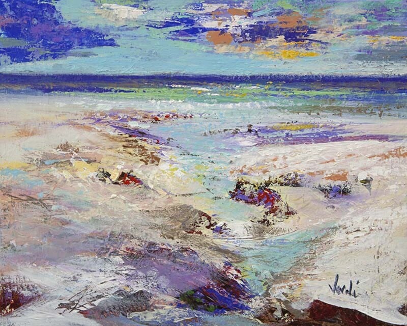
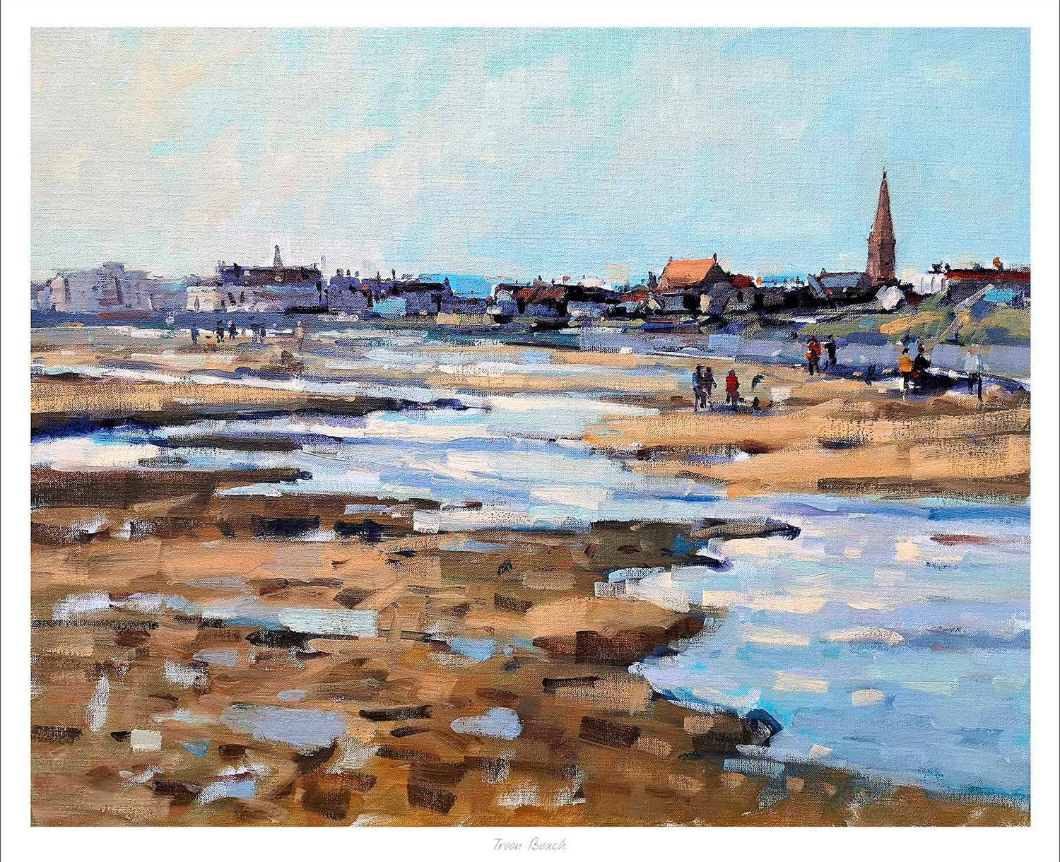
Troon Beach is depicted with a sandy, rocky shoreline, water pools, distant walkers, and a town featuring buildings and a church spire beneath a clear blue sky.

coastal wall art for blue and white décor should add more than another blue accent. The strongest piece brings depth, variation, and a believable sense of place. Troon Beach by Peter Foyle does that through an open Ayrshire shoreline, reflective pools, distant figures, and the town beyond. It supports a blue-and-white scheme without reducing the room to a nautical theme.

coastal wall art for blue and white décor: Troon Beach by Peter Foyle

Look beyond a simple blue match

Blue and white can feel fresh, but too many exact matches make it look flat. A coastal landscape introduces several related tones instead. Sky, water, wet sand, stone, and distant buildings each shift the palette slightly. Those variations make navy, chalk white, denim, pale blue, and natural timber feel connected without appearing overly coordinated.

Troon Beach also adds warmth through the shoreline. That matters in a room with white walls or pale upholstery, where a cooler seascape might feel detached. Sand and rock provide a quiet counterweight. They let the blue stay bright while giving the whole arrangement more substance.

Place coastal wall art for blue and white décor with purpose

First decide what the artwork needs to do. Above a pale sofa, it can anchor a larger seating area. In a dining space, it can open the view and keep the room sociable. On a landing, the distant shoreline can create a welcome pause without demanding a wide collection of smaller coastal objects.

A simple three-step palette

  1. Use white or a light neutral as the largest background area.
  2. Repeat one deeper blue in a limited number of textiles or ceramics.
  3. Add timber, woven texture, or warm stone to echo the beach and soften the scheme.

This approach leaves the print in charge of the detailed colour. It also avoids predictable anchors, shells, and signs. The room can feel coastal because of light and landscape, not because every accessory announces the idea.

Keep the finish crisp but not cold

A clean frame suits a blue-and-white interior, although stark white is not the only option. A slim dark moulding can define the image against a pale wall. A natural timber finish can bring out the warmer shoreline colours. At First 4 Frames, bespoke framing and colour-managed Giclée printing are completed in-house in Falkirk, so the final combination can be judged as one piece.

Explore more of the painter’s coastal work on Peter Foyle’s official website, then compare the Peter Foyle collection at First 4 Frames. If your room needs coastal character with a genuine Scottish connection, see the framed Troon Beach print.
Posted on

Traquair House, Early Autumn: Wall Art for Mixing Antique and Modern Furniture

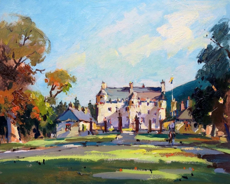
Image of Traquair House, Early Autumn by Josepth Maxwell Stuart

wall art for mixing antique and modern furniture can do more than fill an empty space. It can give two different periods a shared visual language. Traquair House, Early Autumn by Joseph Maxwell Stuart is especially useful here. Its historic subject speaks naturally to older pieces, while the clear composition and autumn colour can sit comfortably beside simpler contemporary furniture.

wall art for mixing antique and modern furniture: Traquair House, Early Autumn by Joseph Maxwell Stuart

Why wall art for mixing antique and modern furniture matters

A room with furniture from several eras often feels more personal than a matched scheme. However, it still needs a point of connection. Artwork can provide that link through subject, colour, and finish. A view of a historic Scottish house acknowledges the character of an antique chest or dining table. The open landscape around it also gives cleaner modern shapes room to breathe.

The early-autumn palette helps too. Warm foliage can pick up the depth of older timber without making the entire room feel brown. Cooler sky and landscape notes can then relate to pale upholstery, painted joinery, glass, or metal. This balance is more convincing than trying to match every item directly.

Start with one visual bridge

Choose a wall that can be seen alongside both furniture styles. Above a sideboard, opposite a mixed dining set, or at the end of a sitting room can work well. Avoid surrounding the print with too many small period objects. Some clear wall gives the composition enough presence to connect the room rather than becoming another layer of detail.

  • Repeat one warm tone from the print in a cushion, lamp, or ceramic.
  • Let a modern piece keep its clean outline instead of crowding it with accessories.
  • Use the artwork’s historic subject as context, not as a reason to theme the room.

Frame for the room you have now

An ornate frame is not automatically the best partner for antique furniture. It may make the older side of the room too dominant. A restrained dark moulding can echo traditional timber while keeping the finished piece crisp. A lighter frame can be effective when the modern furniture is pale and the room needs a softer transition.

First 4 Frames can help compare those options in person. The framed print is prepared with colour-managed Giclée production and hand-finished presentation at the Falkirk workshop. That in-house approach makes it easier to choose a finish that respects the artwork and the room around it.

You can learn more about the real setting on Traquair House’s official website, or browse the wider Joseph Maxwell Stuart collection for another view with the right balance. When old and new furniture need a thoughtful link, view Traquair House, Early Autumn at First 4 Frames.

Posted on

Ailsa Craig and Poppies: Scottish Coastal Floral Wall Art With Real Balance

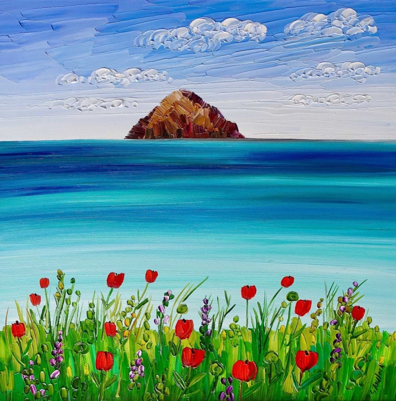
Image of Ailsa Craig and Poppies by Sheila Fowler

Scottish coastal floral wall art offers something a pure seascape or flower study cannot always provide on its own. It can open up the room with distance, then bring the eye back through colour and texture. Ailsa Craig and Poppies by Sheila Fowler is a useful example. Ailsa Craig gives the composition a strong sense of place, while the poppies make the foreground feel immediate and alive.

Scottish coastal floral wall art: Ailsa Craig and Poppies by Sheila Fowler

What Scottish coastal floral wall art adds to a room

Coastal art often leans heavily on blue, grey, and empty sky. Floral work can move in the opposite direction, filling the frame with close detail and saturated colour. Combining both subjects creates a more flexible focal point. The distant view keeps the image spacious, while the flowers stop it from feeling cool or remote.

That balance makes Ailsa Craig and Poppies suitable for rooms that need colour but not visual noise. It can lift a calm living room, brighten a dining space, or connect a garden-facing room to the wider Scottish landscape. It also gives a neutral scheme one clear colour story without demanding several matching accessories.

Use the poppies as an accent, not a decorating instruction

There is no need to repeat red throughout the room. One or two quieter echoes are enough. A rust-coloured cushion, a warm ceramic, or a small detail in a rug can connect the artwork to the space. Keeping the rest restrained preserves the depth of the coastal view.

The square format is useful too. It can sit above a sideboard, between windows, or on a shorter section of wall where a wide panorama would feel cramped. Measure the available space with the furniture in place. A generous margin around the finished frame will help the sea, sky, and foreground breathe.

Presentation that protects both colour and detail

Strong colour makes print quality especially visible. First 4 Frames uses colour-managed Giclée production and hand-finished framing in-house in Falkirk. This careful presentation supports the subtler shifts in the sky and water as well as the brighter flower colour.

For more context on the artist’s use of Scottish landscapes, coastlines, and flowers, visit Sheila Fowler’s official website. You can also browse the wider Sheila Fowler collection before deciding whether this mix of landmark and wildflower colour is right for your room.

When you want Scottish coastal floral wall art with both openness and warmth, see Ailsa Craig and Poppies at First 4 Frames. It brings a recognisable west-coast subject into the home without becoming generic seaside decor.

Posted on

How Ah Dinnae Ken Brings Scots Language Wall Art Into a Modern Home

Image of Ah Dinnae Ken by Stewart Bremner

Scots language wall art can give a room identity without relying on a landscape or a familiar landmark. The key is choosing typography with enough design strength to work as art. Ah Dinnae Ken by Stewart Bremner does this with confidence. Its Scots phrase brings wit and cultural recognition, while the bold composition gives it a clear place in a modern interior.

Scots language wall art: Ah Dinnae Ken by Stewart Bremner

Why Scots language wall art can feel contemporary

Words on a wall can sometimes feel temporary or overly playful. Good typographic art avoids that problem through proportion, spacing, colour, and a strong visual hierarchy. The phrase matters, but the design must still hold the room when it is viewed from across the space.

Ah Dinnae Ken has that balance. The familiar expression gives Scots speakers an immediate point of connection. At the same time, its poster-like treatment makes the piece easy to place beside clean furniture, painted walls, and simple architectural details.

Choose the wall before choosing the frame

This kind of artwork works best where people can stop and read it. A kitchen-dining space, hall, home office, or relaxed sitting room can all suit it. Give the print enough clear wall around it. That breathing room lets the letters become the focal point instead of competing with shelves, signs, or several smaller pictures.

A restrained frame is often the strongest choice. Black can sharpen the graphic quality, while a lighter timber can soften the overall effect. The right decision depends on nearby finishes. First 4 Frames can advise on a bespoke presentation at its Falkirk workshop, where the printing and framing are completed in-house.

Three reasons Ah Dinnae Ken avoids the souvenir look

  • The phrase feels genuine and conversational rather than manufactured for visitors.
  • The graphic treatment has enough presence to work with contemporary furniture.
  • Hand-finished framing turns the idea into a lasting piece for everyday display.

Artist context also helps. You can explore the designer’s wider Scottish work on Stewart Bremner’s official website and browse the Stewart Bremner collection at First 4 Frames. Together, those links make it easier to see how the print fits within a consistent visual style.

If you want Scots language wall art that feels personal but still polished, view the framed Ah Dinnae Ken print. It offers humour, place, and a strong graphic finish without asking the whole room to follow a theme.

Posted on

What Makes Kildonan Lighthouse Arran Such a Strong Choice for Scottish Lighthouse Wall Art

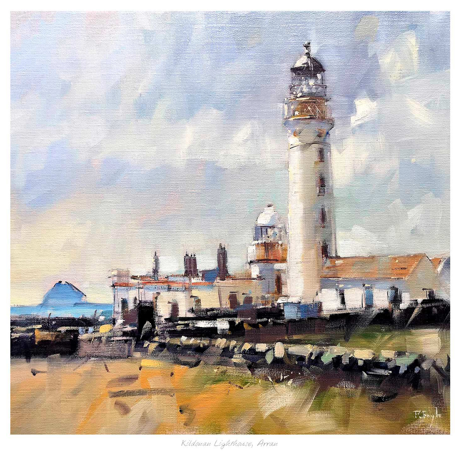
Kildonan Lighthouse Arran painting shows the lighthouse with its buildings under a cloudy sky, grassy and rocky foreground, and the sea with a distant island to the left.

The best Scottish lighthouse wall art should bring more than a simple seaside reference. In a well-finished room, lighthouse imagery works best when it adds structure, atmosphere, and a clear sense of place without drifting into decorative cliche. Kildonan Lighthouse Arran is a strong example because it feels grounded, painterly, and easy to live with.

Scottish lighthouse wall art featuring Kildonan Lighthouse Arran

Why Scottish lighthouse wall art appeals beyond coastal themed rooms

Lighthouse artwork can bring clarity and rhythm to a space, especially when the subject is handled with restraint. Rather than pushing a room into an obvious nautical theme, a well-judged piece can add atmosphere, horizon, and architectural focus. That makes it useful in living rooms, bedrooms, guest spaces, and hallways where you want a coastal note without overworking the scheme.

Kildonan Lighthouse Arran does this particularly well. The lighthouse itself provides a clear focal point, while the surrounding sky, land, and sea keep the image calm and expansive. The result is a framed print that feels rooted in Arran and Scottish coastal landscape, yet still refined enough for everyday interiors.

Why Kildonan Lighthouse Arran works so naturally as Scottish lighthouse wall art

  1. It carries a strong sense of place without feeling like a souvenir piece.
  2. It adds coastal atmosphere while keeping the room composed and balanced.
  3. It suits both classic and more contemporary interiors that need a calm focal point.

First 4 Frames completes every piece in-house in Falkirk with bespoke framing, colour-managed Giclee printing, and hand-finished craftsmanship. That attention to finish helps the artwork sit with confidence in a room where quality and presentation matter.

You can browse more by Peter Foyle, visit Peter Foyle for more about the artist, and view the exact framed print here.

If you are comparing Scottish lighthouse wall art and want something atmospheric, rooted, and properly finished, Kildonan Lighthouse Arran is an excellent option.

Posted on

Why We’re Aw Jock Tamson’s Bairns Makes a Thoughtful Gift for a Scottish Language Lover

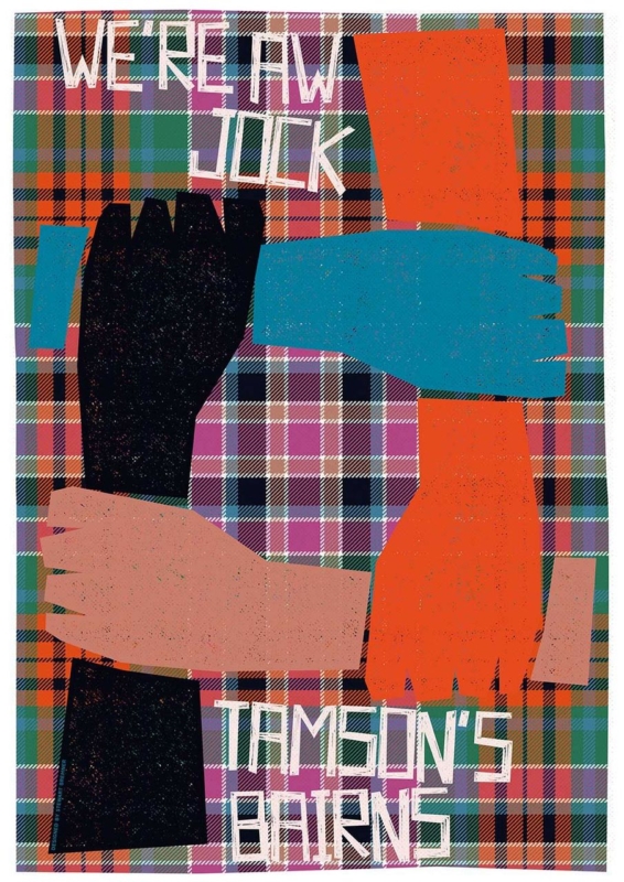
Image of We're Aw Jock Tamson's Bairns by Stewart Bremner

A good gift for a Scottish language lover should feel personal without tipping into novelty. For someone who genuinely enjoys Scots language, the best piece is often one that carries humour, recognition, and proper display value at the same time. We’re Aw Jock Tamson’s Bairns does exactly that, bringing a familiar phrase into the home in a way that still feels polished and easy to live with.

gift for a Scottish language lover featuring We're Aw Jock Tamson's Bairns

Why a gift for a Scottish language lover should feel genuine rather than novelty led

Many language-themed gifts are amusing for a moment, but they do not always earn a lasting place in the home. A framed print can do more because it offers humour, design, and cultural recognition in one piece. That makes it especially suitable for birthdays, housewarmings, or thank-you gifts when you want the present to feel considered rather than quickly bought.

We’re Aw Jock Tamson’s Bairns stands out because the phrase is immediately recognisable, warm in spirit, and rich in everyday Scottish character. It works in hallways, kitchens, studies, and shared living spaces where a piece of framed art can raise a smile while still looking intentional.

What makes We’re Aw Jock Tamson’s Bairns such a strong gift for a Scottish language lover

  • It celebrates Scots language in a way that feels familiar rather than forced.
  • It gives the recipient something display-worthy instead of a short-lived novelty gift.
  • It suits a wide range of rooms, from welcoming hallways to more personal studies.

First 4 Frames completes each piece in-house in Falkirk with bespoke framing, colour-managed Giclee printing, and hand-finished craftsmanship. That superior quality matters when the gift is meant to stay in view and become part of the home rather than disappear into a drawer.

You can explore more from the artist at Stewart Bremner, learn more through Stewart Bremner Prints, and view the exact framed print here.

If you are trying to choose a gift for a Scottish language lover with humour, warmth, and lasting display value, We’re Aw Jock Tamson’s Bairns is well worth considering.

Posted on

Why Sinking Kingdom Works Beautifully as Wall Art for Dark Timber Furniture

In Sinking Kingdom, odd long-nosed creatures in hats and colorful clothes stand on ancient railway tracks, while an owl soars overhead and a distant castle rests on an island beneath a cloudy sky.

Choosing wall art for dark timber furniture is often about balance rather than contrast alone. Dark timber gives a room weight, warmth, and lasting character, but the wrong picture can make the space feel heavier or too period led. Sinking Kingdom works beautifully because it brings mood and story while still giving the scheme enough movement and lift.

wall art for dark timber furniture featuring Sinking Kingdom

Why wall art for dark timber furniture needs atmosphere as well as relief

Darker woods can make a room feel grounded and elegant, whether they appear in dining tables, vintage cabinets, shelving, or a desk. They also create a stronger visual base, so the artwork above or beside them has to feel deliberate. A piece that is too slight can disappear, while one that is too dense can make the room feel closed in.

Sinking Kingdom handles that challenge well. It has enough depth to sit comfortably with darker furniture, but it also introduces shape, contrast, and imagination. That combination helps a living room, hallway, dining space, or reading corner feel layered rather than weighed down.

What makes Sinking Kingdom so effective with dark timber furniture

  1. It has enough presence to stand beside darker furniture without being overwhelmed.
  2. It introduces atmosphere and movement, which helps richer materials feel more balanced.
  3. It feels distinctive rather than generic, giving the room a stronger sense of personality.

At First 4 Frames, each print is produced in-house with colour-managed Giclee printing and hand-finished framing. That level of finish matters in rooms with timber and other tactile materials, because weaker presentation can look out of place beside furniture that already carries texture and substance.

You can learn more about the artist through the Matylda Konecka official website, browse more work by Matylda Konecka, and view the exact framed print here.

If you are weighing up wall art for dark timber furniture and want something atmospheric, characterful, and hand-finished to a superior standard, Sinking Kingdom is an excellent option.

Posted on

Why Temple Works Beautifully as Designer Home Office Wall Art

Image of Temple by Arie Vardi

Good designer home office wall art should help a workspace feel intentional from the start. When a home office is used every day, the artwork often does more than fill the wall. It helps set the tone for concentration, calm, and professional pride. Temple works especially well because it brings atmosphere and structure without making the room feel hard or overly formal.

designer home office wall art featuring Temple

Why designer home office wall art matters more than many people expect

A home office can quickly become too practical. Screens, paperwork, shelving, and task lighting all earn their place, but they can leave the room feeling slightly mechanical if nothing softens the mood. The right framed print gives the space personality while still supporting focus.

Temple suits that balance well. Its composition feels thoughtful and architectural, which helps the room look considered, while the overall mood remains calm enough for everyday work. That makes it useful in studies, spare-room offices, and smaller work corners where every visible detail has to work harder.

Why Temple works so well as designer home office wall art

  • It gives a workspace a stronger visual centre without distracting from the work being done.
  • It adds atmosphere and polish, helping a home office feel more designed and less temporary.
  • It benefits from bespoke framing, which gives the finished piece enough presence for a quality-led interior.

First 4 Frames completes each piece in-house in Falkirk using colour-managed Giclee printing and hand-finished framing. That craftsmanship matters in a working room, where clean presentation and superior quality are noticed every day rather than occasionally.

If you are shaping a compact workspace, these Architectural Digest home office ideas show why a home office benefits from details that feel integrated rather than purely functional. You can also browse more work by Arie Vardi and view the exact framed print here.

If you are comparing designer home office wall art and want something calm, distinctive, and professionally finished, Temple is well worth considering.

Posted on

Why Gaelic Gold Works Beautifully as Wall Art for Warm Neutral Walls

Image of Gaelic Gold by Noel Fenech Photography

Choosing wall art for warm neutral walls is often about finding enough contrast without losing the calm that makes the room appealing in the first place. Soft beiges, oat tones, sand shades, and warmer off-whites can look excellent, but they need artwork with atmosphere and quiet strength. Gaelic Gold works beautifully because it adds light, depth, and focus while staying in tune with a gentler palette.

wall art for warm neutral walls featuring Gaelic Gold

What wall art for warm neutral walls needs to do well

Warm neutrals are popular because they make a room feel restful and flexible, but they can also leave the scheme slightly underpowered if everything sits at the same visual volume. The artwork has to introduce tonal variation and a clearer focal point, otherwise the room risks feeling pleasant but unfinished.

Gaelic Gold answers that problem well. The image brings a gentle glow and a more layered mood, helping neutral walls feel richer rather than repetitive. It is especially effective in bedrooms, sitting rooms, hallways, or home offices where the decorating scheme already leans calm and understated.

Why Gaelic Gold suits wall art for warm neutral walls so well

  1. It adds luminosity without introducing harsh contrast.
  2. It gives a soft palette more depth and direction.
  3. It benefits from framed presentation, which helps the room feel properly resolved.

At First 4 Frames, each piece is produced in-house in Falkirk with bespoke framing and colour-managed print presentation. That superior quality matters in restrained interiors, where the finish and detail of the artwork are often easier to notice.

You can explore more from Noel Fenech Photography, visit Noel Fenech Photography, and see the exact framed print here.

If you are weighing up wall art for warm neutral walls and want a piece that feels luminous, calm, and carefully finished, Gaelic Gold is an excellent option.

Posted on

Why The Stars Twinkle Over Culross Is Such a Strong Choice for Culross Wall Art

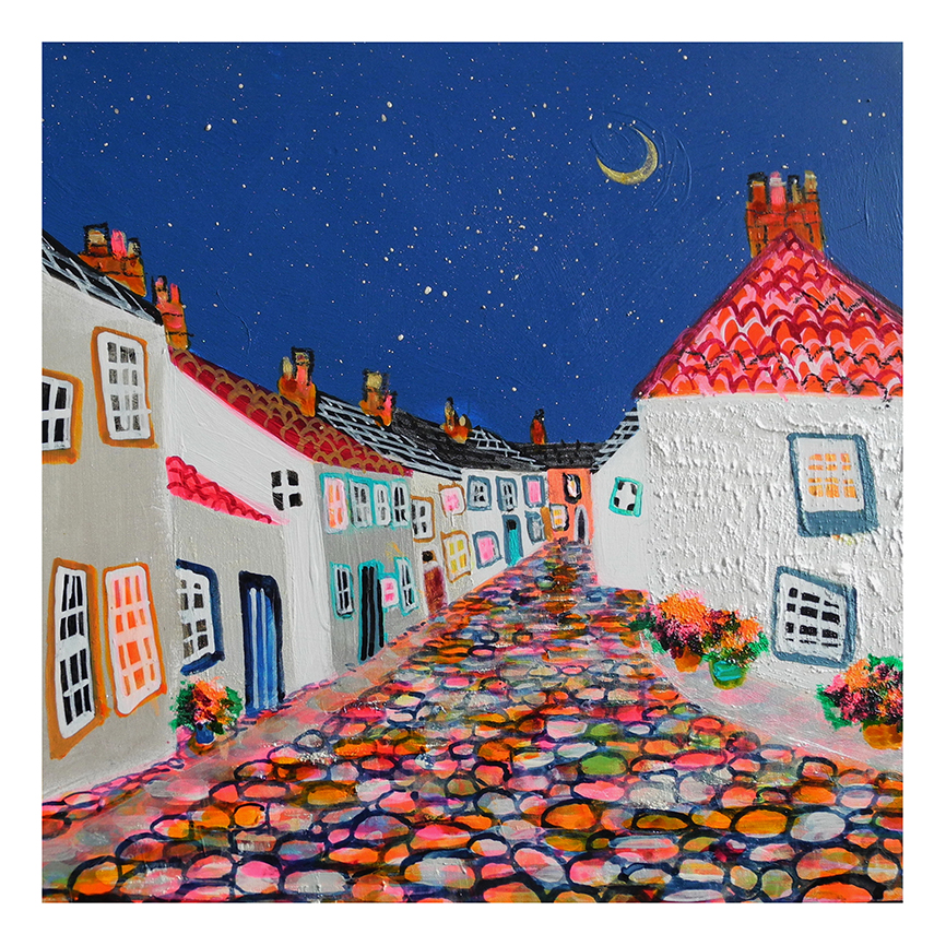
Culross: A vibrant, whimsical painting of a cobblestone street lined with white cottages, orange-red roofs, and flower pots under a crescent moon and starry night sky.

Good Culross wall art should give a room more than a scenic reference point. It should add place, atmosphere, and enough visual warmth to feel rewarding every day. The Stars Twinkle Over Culross stands out because it captures Culross with evening character and charm while still feeling refined enough for a well-finished home.

Culross wall art featuring The Stars Twinkle Over Culross

Why Culross wall art works best when it feels atmospheric rather than overly themed

Historic village scenes can easily tip too far in one of two directions. They either become so neutral that they lose their sense of place, or they lean too hard on nostalgia and start to feel more like a keepsake than a piece of art to live with. The strongest choice sits in the middle, offering local character with enough depth and mood to hold its own in an interior.

The Stars Twinkle Over Culross does exactly that. The evening light, clustered buildings, and sense of quiet activity make the scene memorable without making it busy. It can work beautifully in a hallway, sitting room, guest bedroom, or study where you want Scottish village character that feels rooted and display-worthy rather than decorative for its own sake.

What makes The Stars Twinkle Over Culross such effective Culross wall art

  • It gives the room a clear sense of place without feeling souvenir led.
  • Its evening atmosphere adds warmth and depth to the wall.
  • It suits bespoke framing, which helps the finished piece feel considered and lasting.

First 4 Frames presents each piece in-house in Falkirk using colour-managed Giclee printing and hand-finished framing. That craftsmanship matters when the artwork is meant to carry both local identity and a superior quality finish.

You can learn more about the artist at Nikki Monaghan, browse more work by Nikki Monaghan, and view the exact framed print here.

If you are comparing Culross wall art and want something atmospheric, rooted, and easy to live with, The Stars Twinkle Over Culross is well worth considering.