Posted on

Large Framed Prints Feel More Useful When They Create Space, Why A’Chleit Beach, Kintyre to the Paps of Jura Works

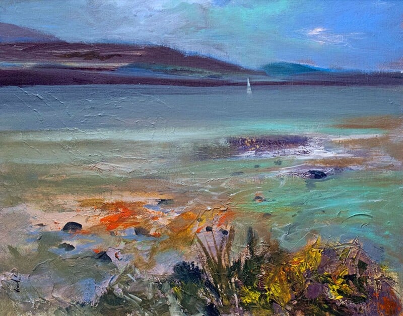
A'Chleit Beach, Kintyre to the Paps of Jura: a vibrant impressionist painting of a beach at sunset with colorful clouds, distant mountains, calm waves, and wildflowers and grasses in the foreground.

The strongest large framed prints do more than fill a broad wall. A’Chleit Beach, Kintyre to the Paps of Jura works especially well because its width and distance help the room feel more open, rather than simply more occupied.

large framed prints - A'Chleit Beach, Kintyre to the Paps of Jura

That is often the key difference with larger artwork. Scale only becomes valuable when it changes the experience of the room in a positive way.

Why Large Framed Prints Need Distance As Well As Scale

A wide coastal view like this gives the eye somewhere to travel. That is what makes a bigger framed piece feel calming and architectural rather than overpowering.

  • It helps a larger wall feel purposeful rather than sparse.
  • It creates openness instead of visual weight.
  • It suits rooms that need one broad focal piece instead of several smaller ones.

Where This Piece Can Work Best

A’Chleit Beach, Kintyre to the Paps of Jura would sit beautifully above a sofa, sideboard, bed, or long dining wall where a wider print can really stretch out. It pairs naturally with sandy neutrals, pale greys, driftwood tones, and uncluttered furniture because the image already carries a spacious coastal calm.

Why First 4 Frames Helps A Bigger Piece Land Properly

Large-scale artwork needs clean print handling, colour control, and a framed finish that feels assured. First 4 Frames completes bespoke framing and colour-managed Giclee production in-house, helping the final piece feel substantial and room-ready. You can view the exact framed product here, and browse more from John Lowrie Morrison OBE if you enjoy Scottish coastal work with the same breadth and atmosphere.

For buyers looking at large framed prints that make a room feel bigger, calmer, and more complete, this is a superb option.

Posted on

Why All Aboard Feels Fresh Among Contemporary Framed Art Prints

All Aboard features a whimsical snowy village at dusk, where small hooded figures gather. One climbs a rope ladder held by a giant bird as others cheer "All aboard!" amid colorful buildings with glowing windows.

The best contemporary framed art prints feel alive to current interiors without becoming so clever that they date quickly. All Aboard works beautifully because it combines imagination, line, and colour in a way that feels fresh but still room-friendly.

contemporary framed art prints - All Aboard

That matters for buyers who want personality on the wall without ending up with something that feels like a short-term novelty. The piece should still feel worth living with every day.

Why Contemporary Framed Art Prints Need More Than Novelty

A more imaginative print only works long term when it still has balance. This one feels playful, but it also has enough order and framing presence to sit confidently in a real room.

  • It feels current without chasing a fad.
  • It brings a more distinctive point of view to the wall.
  • It works well where a room needs personality, not clutter.

Where A Piece Like This Can Shine

All Aboard would suit a hallway, study, snug, or creative workspace where one story-led piece can change the tone of the space. It works particularly well with books, collected objects, painted furniture, and simple neutral walls that leave room for the artwork to speak.

Why The Framed Presentation Matters

A more characterful image depends on presentation that helps it feel finished rather than whimsical. First 4 Frames combines bespoke framing with colour-managed Giclee production in-house, helping the artwork feel polished and display-worthy. You can view the exact framed product here, and browse more from Matylda Konecka if you enjoy imaginative work with the same contemporary warmth.

If you are comparing contemporary framed art prints and want something fresh, clever, and still easy to live with, All Aboard is a standout option.

Posted on

Wall Art for Grey Walls Needs Lift, Why Crinan Light Works So Well

Impressionist painting of Crinan Light, a white and red lighthouse, featuring a sailboat, white house, and reflections on calm blue water with warm-toned hills in the background.

Choosing wall art for grey walls is often harder than it first appears. Grey can give a room calm structure, but it also needs artwork that brings enough warmth and light to stop the whole scheme feeling flat. Crinan Light does that beautifully.

wall art for grey walls - Crinan Light

The strength of this piece is that it lifts the wall without fighting the rest of the room. It keeps the space composed, but not sleepy.

Why Wall Art for Grey Walls Benefits From Light and Warmth

A cooler wall colour often needs artwork with some glow in it. This harbour scene has enough brightness and movement to wake the room up while still feeling easy to live with.

  • It adds warmth without turning the palette muddy.
  • It gives grey walls a cleaner focal point.
  • It helps a neutral room feel more finished and less cautious.

Where Crinan Light Can Work Especially Well

Crinan Light would suit a living room, hallway, dining room, or home office where grey walls need one stronger framed piece to feel complete. It pairs naturally with slate paint, pale woods, soft creams, and black accents because the image already balances cool and warm tones.

Why First 4 Frames Helps It Hold The Wall

A brighter piece on grey walls needs clean colour and a confident presentation. First 4 Frames handles bespoke framing and colour-managed Giclee production in-house, so the final piece feels polished from the moment it goes up. You can view the exact framed product here, and see more from Peter Foyle if you enjoy harbour work with the same clear, welcoming light.

For anyone looking at wall art for grey walls and wanting the room to feel brighter rather than flatter, Crinan Light is a very strong choice.

Posted on

Choosing Art for a South Facing Room, Why Bla Bheinn from Loch an Athain Works

Bla Bheinn from Loch an Athain depicts a snow-capped peak beneath a blue sky, with golden-brown lower slopes in shadow contrasting the white and gray summit.

The challenge with art for a south facing room is that bright light can flatten weaker colours or make warmer pieces feel overexposed by afternoon. Bla Bheinn from Loch an Athain works so well because it brings cooler tones, distance, and enough structure to steady the room rather than overstimulate it.

art for a south facing room - Bla Bheinn from Loch an Athain

That makes a real difference in spaces that already get plenty of sun. The artwork needs to hold its own in changing light while still helping the room feel restful.

Why Art for a South Facing Room Often Needs Cooler Balance

A room with strong daylight benefits from artwork that gives the eye somewhere calmer to land. This mountain scene keeps its freshness while also grounding the wall.

  • It helps bright natural light feel cleaner rather than glaring.
  • It cools a warmer scheme without making it feel severe.
  • It adds depth that stays believable from morning through evening.

Where This Kind Of Piece Works Best

Bla Bheinn from Loch an Athain would suit a sunlit living room, bedroom, garden-facing dining room, or open-plan space where daylight is one of the room’s strongest features. It pairs especially well with pale oak, limestone tones, soft blue fabrics, and off-white walls.

Why The Final Finish Needs Care

Subtle tonal shifts matter even more in strong daylight, which is why careful print handling and framing are important. First 4 Frames completes bespoke framing and colour-managed Giclee production in-house, helping the image keep its balance and clarity. You can view the exact framed product here, and browse more from Julie Arbuckle if you enjoy Scottish landscape work with the same fresh, airy calm.

If you are choosing art for a south facing room and want the space to feel bright but settled, this piece is a very thoughtful option.

Posted on

Modern Framed Wall Art Feels More Human With A Glasgow Tenement off Wilson Street

A Glasgow Tenement off Wilson Street: a tall yellow brick building with windows partly hidden by leafless trees and vibrant autumn foliage in red, orange, and green, set against a deep blue sky.

Many people searching for modern framed wall art want something clean and current, but still alive with personality. A Glasgow Tenement off Wilson Street answers that beautifully by bringing city colour, recognisable place, and a livelier rhythm to the wall.

modern framed wall art - A Glasgow Tenement off Wilson Street

That combination matters because modern interiors can become a little too controlled if every element is quiet and restrained. A piece with this kind of energy keeps the room feeling human.

Why Modern Framed Wall Art Needs Character As Well As Style

This print has enough boldness to change the room, but it never feels harsh. The architecture gives structure, while the colour keeps the atmosphere open and generous.

  • It brings modern colour without becoming trendy for its own sake.
  • It gives an urban interior more warmth and recognition.
  • It suits buyers who want design confidence without visual coldness.

A Strong Fit For Lived-In Contemporary Rooms

A Glasgow Tenement off Wilson Street would work especially well in a living room, hallway, dining room, or home office where one stronger piece can carry the wall. It pairs well with charcoal, pale plaster tones, timber finishes, and black details because the artwork already balances colour with structure.

Why First 4 Frames Strengthens The Result

Colour-led city artwork depends on good print definition and a framed finish that feels complete rather than rushed. First 4 Frames handles bespoke framing and colour-managed Giclee production in-house, helping the final piece keep its energy and polish. You can view the exact framed product here, and browse more from John Lowrie Morrison OBE if you enjoy expressive Scottish work with the same strong sense of place.

For buyers comparing modern framed wall art that feels spirited, local, and easy to live with, this piece is a superb choice.

Posted on

Why Byzantine Bouquet Feels So Well Judged as Botanical Wall Art

Byzantine Bouquet: A vibrant painting featuring a glass vase brimming with red, pink, and orange flowers with green stems set against a bright teal background, with petals and leaves scattered below.

Good botanical wall art should bring more than a simple nod to flowers. Byzantine Bouquet works beautifully because it adds shape, colour, and a sense of finish without making the room feel overly sweet or theme led.

botanical wall art - Byzantine Bouquet

That matters in spaces where floral artwork needs to feel considered rather than casual. A stronger composition gives the wall presence while still keeping the room calm and welcoming.

Why Botanical Wall Art Benefits From Structure

The appeal here is not only the subject. It is the way the piece gives the wall rhythm and detail without becoming busy. That makes it especially useful in interiors that already rely on texture, paint, and furniture to do a lot of the talking.

  • It adds softness without making the room feel fussy.
  • It gives a floral subject enough authority to hold a proper focal point.
  • It feels decorative in the best sense, but never flimsy.

Where This Piece Can Sit Especially Well

Byzantine Bouquet would suit a dining room, hallway, dressing room, or bedroom where one framed piece can lift the wall without taking over. It pairs naturally with muted greens, warm neutrals, painted furniture, and brushed metallic accents because the artwork already carries that same balanced richness.

Why The Framed Finish Matters So Much

First 4 Frames completes bespoke framing and colour-managed Giclee production in-house, which helps colour, line, and finer tonal shifts stay clean in the final piece. You can view the exact framed product here, and browse more from Keli Clark if you enjoy floral work with the same poised, decorative strength.

If you are comparing botanical wall art and want something elegant, characterful, and properly finished, Byzantine Bouquet is an excellent option.

Posted on

Why Arran from Troon Works So Well for Art Prints UK Buyers

Arran from Troon is a vibrant blue landscape painting depicting the Arran mountains from Troon under scattered clouds, their reflections shimmering on calm water. Textured brushstrokes create an impressionistic effect.

Many people searching for art prints UK want something that feels lasting rather than fashionable for a month or two. Arran from Troon works beautifully because it brings distance, light, and a quieter kind of presence that holds up well over time.

art prints UK - Arran from Troon

That is especially helpful in rooms where the artwork is expected to calm the space rather than compete with it. A broader coastal view often does that better than something louder or more obviously trend led.

Why Art Prints UK Buyers Often Choose Atmosphere Over Noise

This print has enough shape and place to stay memorable, but the overall feeling remains open and restful. That combination makes it very easy to live with in an everyday interior.

  • It gives the wall a sense of depth without heaviness.
  • It feels recognisable and rooted without being overdone.
  • It suits buyers who want calm from their artwork, not clutter.

Where It Can Work Especially Well

Arran from Troon would sit naturally in a living room, bedroom, hallway, or holiday property where one wider piece can make the room feel more open. It pairs particularly well with pale stone, off-white walls, soft blue textiles, and weathered timber.

Why The Framed Finish Matters Here

A quieter coastal scene depends on clean tonal handling and a hand-finished presentation that feels complete. First 4 Frames takes care of bespoke framing and colour-managed Giclee production in-house, helping the final result feel polished without losing its ease. You can view the exact framed product here, and browse more from Peter Foyle if you enjoy west coast work with the same spacious calm.

If you are weighing up art prints UK buyers actually enjoy living with, Arran from Troon is a calm and dependable choice.

Posted on

Commercial Framing Services Need More Than Neatness, Why Blue Gable and Roof Light Works

Blue Gable and Roof Light features a small white house with a red roof and blue gable, standing alone in a misty black-and-gray landscape. Bold brushstrokes and subtle roof light create an isolated, dynamic atmosphere.

The best commercial framing services do more than produce a tidy finish. Blue Gable and Roof Light is a useful example of why, because it shows how one well-framed piece can bring structure and personality to a project at the same time.

commercial framing services - Blue Gable and Roof Light

That matters in professional spaces where artwork needs to feel deliberate and polished, but should not drift into generic filler. A room can still feel human while remaining presentation led.

Why Commercial Framing Services Need Artwork With Character

A strong framing service only reaches its full value when the artwork itself gives something back to the room. This piece has enough line, shape, and colour to feel designed into the space rather than added late in the process.

  • It feels polished without becoming bland.
  • It adds structure to a reception, meeting area, or client-facing wall.
  • It helps a commercial interior feel chosen rather than simply equipped.

Where A Piece Like This Can Be Especially Useful

Blue Gable and Roof Light would work particularly well in a reception area, studio, hospitality corridor, or meeting space where one piece needs to add professionalism and warmth together. It suits interiors with clean walls, timber finishes, stone surfaces, and dark metal details.

Why First 4 Frames Is Well Suited To This Work

First 4 Frames supports both home and commercial clients with bespoke framing, colour-managed Giclee printing, and in-house finishing from the Falkirk workshop. You can view the exact framed product here, and browse more from Fiona Matheson if you enjoy expressive architectural work with the same balance of polish and personality.

For anyone assessing commercial framing services and the kind of artwork that makes those services worthwhile, Blue Gable and Roof Light is a strong reference point.

Posted on

Why Boatyard Tighnabruaich Is Such an Easy Art Prints Choice to Live With

Boatyard Tighnabruaich depicts colorful impressionist sailboats propped on land, their masts rising into a blue sky with trees, shadows, and reflections on the sandy ground.

Good art prints should do more than fill a blank area. Boatyard Tighnabruaich works especially well because it gives the room shape and atmosphere without making the wall feel overworked.

art prints - Boatyard Tighnabruaich

That is often what people really want from a framed print. They are not only buying colour. They are buying a calmer, more resolved feel for the room itself.

Why Art Prints Need More Than Visual Interest

This scene has enough detail to stay interesting, but the overall mood remains steady. That makes it easy to place in rooms that need warmth rather than drama.

  • It helps an everyday room feel more settled.
  • It brings harbour character without becoming too theme-led.
  • It suits buyers who want atmosphere that still feels practical to live with.

Where It Could Sit Most Naturally

Boatyard Tighnabruaich would work beautifully in a kitchen corner, breakfast space, hallway, or smaller sitting room where one thoughtful piece can finish the wall. It pairs naturally with painted timber, cream walls, slate tones, and simple woven textures.

Why First 4 Frames Helps It Land Properly

First 4 Frames handles bespoke framing and colour-managed Giclee production in-house in Falkirk, which helps a quieter print like this feel complete rather than incidental. You can view the exact framed product here, and see more from Peter Foyle if you enjoy harbour scenes with the same grounded warmth.

If you are comparing art prints and want something calm, useful, and easy to place well, Boatyard Tighnabruaich is a smart option.

Posted on

Why Blue Romance Stands Out Among Limited Edition Prints

Blue Romance is an impressionistic painting of a couple dancing closely—a woman in a flowing blue dress and a man in a black suit—surrounded by swirling brushstrokes that create a dreamy, romantic atmosphere.

People drawn to limited edition prints are often looking for more than colour on a wall. Blue Romance is a very good example of why, because it brings individuality and presence without losing its sense of grace.

limited edition prints - Blue Romance

That matters in a calmer interior where one artwork may need to carry more of the room’s personality. A more distinctive piece can make the whole space feel less generic.

Why Limited Edition Prints Often Feel More Intentional

A work like this has enough poise to stand alone. It does not need a lot of surrounding decoration to justify itself, which is often what makes a room feel more settled and more grown up.

  • It gives the wall a stronger sense of identity.
  • It feels collected rather than simply chosen to fill space.
  • It works especially well where quieter rooms need one poised focal piece.

Where Blue Romance Can Work Best

Blue Romance would suit a sitting room, dressing room, bedroom, or stair landing where a piece with a little more poise can change the feel of the whole wall. It works especially well with pale neutrals, dusky blues, charcoal details, and softer metallic accents.

Why The Presentation Matters Here

A print with this kind of elegance depends on a finish that feels deliberate. First 4 Frames completes bespoke framing and colour-managed Giclee production in-house, helping the final piece feel worthy of the space around it. You can view the exact framed product here, and browse more from Janet McCrorie if you enjoy figurative work with the same poised, expressive quality.

For buyers exploring limited edition prints that feel personal and display-worthy, Blue Romance is a very strong choice.