Posted on

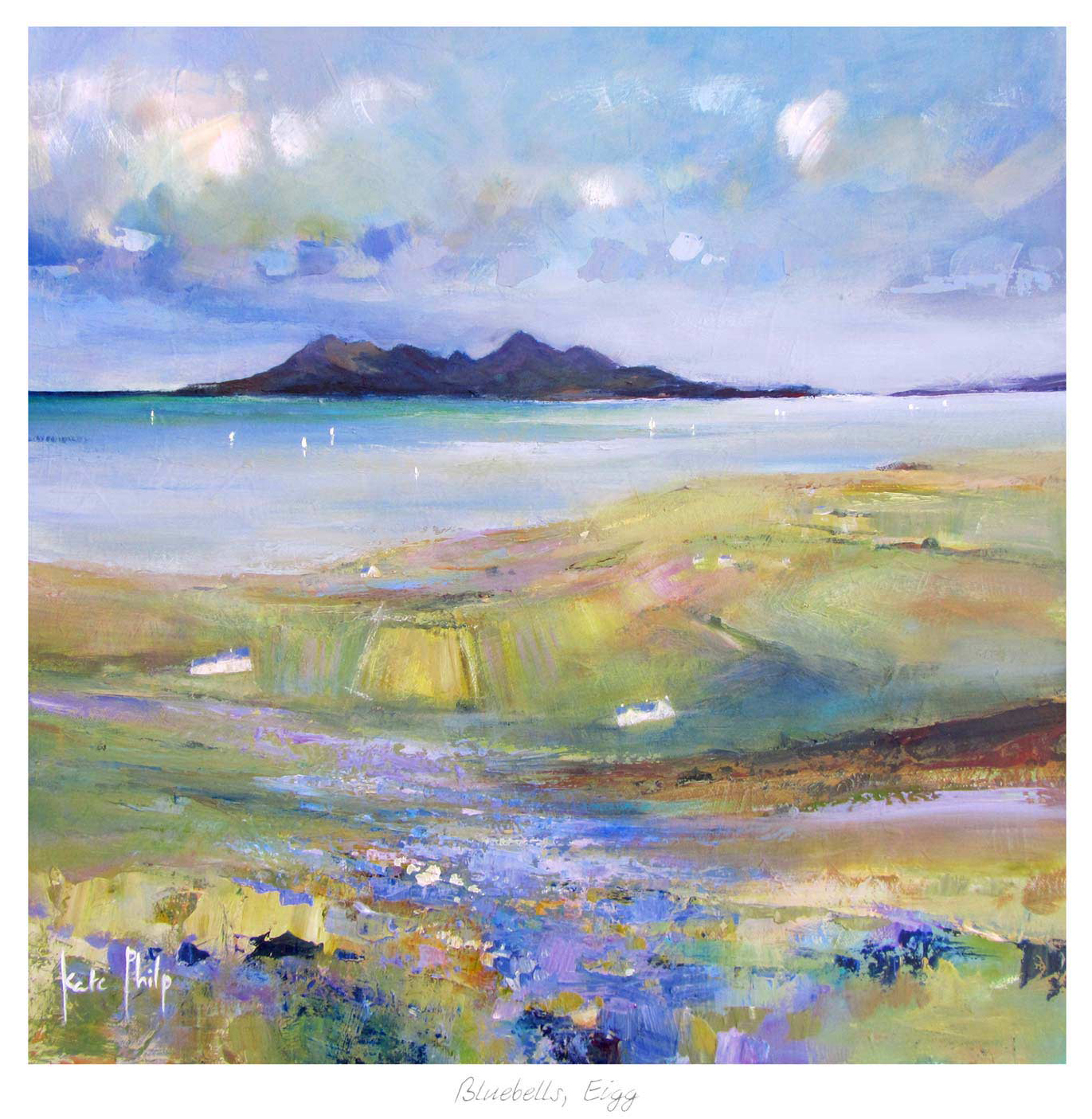
Why Bluebells Is Useful When You Want to Preview Artwork Before Buying

Bluebells: An impressionist artwork featuring a small stone cottage with a red roof, surrounded by a colorful forest and blooming bluebells in lush blue and green foliage, illuminated by streaming light.

Being able to preview artwork before buying is often what stops a good choice becoming an uncertain one. Customers may like the image itself, but still wonder whether the colour, scale, or framed weight will actually suit the room. Bluebells is a useful example because softer floral landscape work can look very different depending on the wall, the light, and the framing around it.

Why previewing matters with gentler colour palettes

Artwork with softer blues, greens, and woodland tones often succeeds through balance rather than sheer impact. That means the customer usually needs to judge more carefully how the piece will sit with daylight, paint colour, and nearby furnishings. Bluebells makes that easy to understand because it can either feel beautifully calming or slightly too quiet depending on where it goes.

  • Previewing helps you judge whether the colours will lift the room enough.
  • It shows whether the framed piece has the right visual weight for the wall.
  • It reduces the risk of choosing something lovely that still feels undersized or too gentle once hung.

This is particularly valuable in bedrooms, garden rooms, and lighter living spaces where daylight changes the artwork throughout the day. Seeing the likely effect in advance helps the final choice feel more assured.

Why framing is part of the preview, not an afterthought

First 4 Frames completes each piece in-house in Falkirk with bespoke framing, colour-managed Giclee printing, and hand-finished craftsmanship. That matters because previewing the artwork properly is not only about the image. The frame changes the visual weight and often decides whether the piece feels just decorative or properly finished.

You can explore more from Chris Sharp and view the exact framed print here.

If you want to preview artwork before buying with more confidence, Bluebells is a strong example of why colour, scale, and framing should all be judged together.

Posted on

Zebra Glass and the Lasting Appeal of Black and White Wall Art

Image of Zebra Glass by Noel Fenech Photography

Strong black and white wall art can do something colour-led pieces sometimes cannot. It can make a room feel sharper, calmer, and more deliberate all at once. Zebra Glass is a good example because its monochrome character brings clarity and contrast without asking the rest of the room to compete.

Why monochrome artwork can feel more architectural

In interiors with cleaner lines, quieter palettes, or stronger materials, colour is not always what the wall needs. Sometimes the better choice is definition. Zebra Glass works well because the black and white treatment encourages the eye to focus on form, light, and pattern rather than distraction.

  • It adds contrast without complicating the palette.
  • It suits rooms that already rely on texture, line, or material detail.
  • It can make a simpler scheme feel more intentional very quickly.

This is often useful in bedrooms, offices, or living rooms where the furniture is restrained and the room needs a focal point that feels crisp rather than decorative for its own sake.

Black and white artwork often succeeds because it edits a room rather than adding to its noise.

First 4 Frames completes each piece in-house in Falkirk with bespoke framing, colour-managed Giclee printing, and hand-finished craftsmanship. With monochrome work especially, that controlled finish helps keep the result clean and confident on the wall.

You can browse more from Noel Fenech Photography and view the exact framed product here.

If you are looking for black and white wall art that feels graphic, balanced, and easy to place in a modern room, Zebra Glass is a smart choice.

Posted on

Framed Art Prints UK Can Still Have Character, Why A Wee Dram Proves It

A Wee Dram tumbler, filled with amber whiskey and ice cubes, rests on a smooth, reflective surface against a dark background.

People searching for framed art prints UK often want more than a pleasant image. They usually want a finished piece that feels rooted, dependable, and worth living with over time. A Wee Dram is a strong example because it brings Scottish character and personality while still feeling polished enough to hold a wall properly.

Why local character makes a framed piece more memorable

A framed piece often succeeds because it gives a room a clearer point of identity. A Wee Dram does this very naturally. It feels warm, recognisable, and easy to place, which is exactly what many buyers hope for when they are choosing artwork that should feel personal rather than generic.

  • It adds personality to a snug, kitchen, or entertaining space.
  • It feels more rooted than anonymous decorative wall art.
  • It works especially well when the customer wants a finished framed result from the outset.

This kind of piece is particularly useful where timber finishes, darker paint, or sociable seating already shape the room. The artwork supports that atmosphere rather than feeling imported from a completely different style of interior.

First 4 Frames completes each piece in-house in Falkirk with bespoke framing, colour-managed Giclee printing, and hand-finished craftsmanship. That in-house work is a large part of why a product like this feels more dependable than a flatter mass-produced alternative.

You can explore more from Scott McGregor and see the exact framed print here.

If you are comparing framed art prints UK and want something with local spirit and a strong finished presentation, A Wee Dram is well worth a closer look.

Posted on

View Art on Your Wall? Calton Hill View Is a Useful Place to Start

Experience the vibrant Calton Hill View, a framed fine art giclée print by Joseph Maxwell Stuart, depicting a colorful cityscape from a green hilltop with two people, trees, a sundial, and distant sunlit towers.

Being able to view art on your wall can make the difference between a guess and a confident choice. Cityscape prints often look appealing on their own, but customers still need to know whether the finished piece will have enough width, presence, and atmosphere once it is actually in the room. Calton Hill View is a very good example because its skyline subject needs the right wall and the right scale to do its job properly.

Why scale is easier to judge when the wall is part of the decision

A city-led print can seem larger or smaller than expected depending on the furniture below it, the amount of surrounding wall space, and how much visual competition is already in the room. Calton Hill View works best when it has enough breathing room to create atmosphere rather than looking squeezed into place. Viewing it against the wall first helps that become much easier to judge.

  • You can judge whether the framed piece has enough presence for the space.
  • You can see if the skyline shape suits the width of the wall.
  • You can avoid choosing something lovely that still feels slightly undersized once hung.

This is especially useful in hallways, studies, and living spaces where the artwork has to hold its own from the moment you walk in. A piece like this needs to feel anchored, not tentative.

Why framing still shapes the final effect

First 4 Frames completes each piece in-house in Falkirk with bespoke framing, colour-managed Giclee printing, and hand-finished craftsmanship. That matters because when you view art on the wall properly, the frame is part of what you are judging. It affects the scale, the weight, and the finished mood just as much as the image itself.

You can browse more from Joseph Maxwell Stuart and view the exact framed product here.

If you want to view art on your wall with more confidence, Calton Hill View is a very useful example of how scale, setting, and presentation should be considered together.

Posted on

Why Bonny Red Dress Works So Well as Contemporary Wall Art

An abstract painting titled "Bonny Red Dress" depicts a dancing couple—she twirls in a vivid red dress, he in dark attire. Blurred figures and swirling brushstrokes evoke dynamic movement and vibrant energy.

Good contemporary wall art should feel current without becoming cold or throwaway. Many people want something with energy and personality, but they still need the room to remain comfortable and well balanced. Bonny Red Dress answers that especially well because it brings movement, colour, and presence while still feeling refined enough for everyday living.

Why a more expressive piece can steady a quieter room

In a neutral or lightly layered interior, one stronger artwork often does more than several smaller decorative touches. Bonny Red Dress works because its livelier character gives the eye something definite to land on. That helps the room feel more resolved rather than simply safe.

  • It introduces movement without making the space feel unsettled.
  • It gives softer furnishings a clearer point of contrast.
  • It feels bold, but not so dominant that the room becomes hard to live with.

This is particularly useful in sitting rooms, hallways, or bedrooms where the furniture is simple and the palette is more restrained. A stronger artwork can supply the confidence the rest of the scheme is quietly asking for.

Contemporary artwork works best when it adds direction to the room, not just decoration to the wall.

First 4 Frames completes each piece in-house in Falkirk with bespoke framing, colour-managed Giclee printing, and hand-finished craftsmanship. That superior finish matters here because a more expressive image needs a presentation that still feels controlled and polished.

You can explore more from Janet McCrorie and view the exact framed print here.

If you want contemporary wall art that feels confident, characterful, and easy to place in a real home, Bonny Red Dress is a very strong option.

Posted on

How to Create a Gallery Wall, Starting With Village Life, Winter

“Village Life, Winter” is a colorful, whimsical painting portraying snowy houses, trees, playful villagers, winding roads, and vibrant skies that create a lively and dreamlike winter landscape.

Anyone researching how to create a gallery wall usually wants the wall to feel collected and natural rather than random. One of the easiest ways to achieve that is to begin with a piece that already has enough character to lead the arrangement. Village Life, Winter works beautifully in that role because it carries colour, narrative, and a clear horizontal presence.

Why an anchor piece makes gallery walls easier to build

Gallery walls often go wrong when every item is treated as equal. The eye needs one stronger piece to organise everything around it. Village Life, Winter makes that easier because it brings enough detail and personality to set the tone for smaller supporting works without overpowering them.

  • Its width helps establish the overall line of the arrangement.
  • Its winter village detail gives neighbouring pieces a clearer context.
  • It helps the wall feel curated instead of pieced together in a rush.

This is especially useful in landings, dining spaces, or family rooms where several frames need to feel connected. Starting with one stronger print gives the whole display more confidence and makes spacing decisions easier.

Why the finish matters in a multi-frame arrangement

First 4 Frames completes each piece in-house in Falkirk with bespoke framing, colour-managed Giclee printing, and hand-finished craftsmanship. That consistent finish matters even more in a gallery wall, because the anchor piece sets the standard for everything around it.

You can browse more from Rob Hain and view the exact framed product here.

If you are planning how to create a gallery wall, Village Life, Winter is a smart place to begin because it gives the whole arrangement a stronger starting point.

Posted on

Marching the Mile and the Lasting Appeal of Edinburgh Wall Art

Marching the Mile" is a colorful, whimsical painting depicting a vibrant cityscape with tall, varied buildings, bustling streets full of tiny figures, and a distant castle on a hill beneath a vivid blue and pink sky.

The best Edinburgh wall art should feel rooted in place without looking predictable. Many people want something recognisably local, but they also want artwork that still feels stylish and easy to live with. Marching the Mile gets that balance right by bringing movement, colour, and unmistakable Edinburgh character to the wall.

Why place-specific artwork can make a room feel more personal

Artwork linked to a city often works best when it does more than record a landmark. It should carry atmosphere as well. Marching the Mile feels strong because it captures the energy of Edinburgh in a way that gives the room a clearer sense of identity, rather than simply acting as a souvenir.

  • It gives hallways, studies, and living spaces a stronger sense of local character.
  • It feels recognisable without becoming stiff or formal.
  • It offers colour and movement that can lift a quieter interior.

This kind of piece can be especially appealing in homes where customers want a Scottish connection that still feels lively and contemporary. It also makes sense where a room needs a focal point with more personality than a generic cityscape can offer.

Good city artwork should carry the spirit of a place, not just its outline.

First 4 Frames completes each piece in-house in Falkirk with bespoke framing, colour-managed Giclee printing, and hand-finished craftsmanship. That superior finish helps a lively image like this keep its clarity and polish once it is on the wall.

You can explore more from Rob Hain and view the exact framed print here.

If you are considering Edinburgh wall art and want something full of place, colour, and energy, Marching the Mile is a very appealing option.

Posted on

Why Flat Iron Building, New York Stands Out Among Limited Edition Prints

A city street at night glows with bright lights and neon signs, while the Flat Iron Building, New York stands in the background, surrounded by blurred light trails that create a dreamy urban atmosphere.

People often look at limited edition prints because they want something that feels more intentional than a generic decorative print. The image still needs to suit the room, but the decision is usually also about character, scarcity, and lasting appeal. Flat Iron Building, New York answers that well with a city subject that feels alive, polished, and worth returning to.

What makes a limited edition piece feel worth choosing

A limited edition print should feel as though it brings more than surface decoration. It should carry stronger identity and a clearer sense of why that image belongs in the room. Flat Iron Building, New York does this especially well because its evening city mood adds movement and atmosphere without looking generic.

  • It gives a room more personality than a flatter, off-the-shelf city image.
  • It feels suitable for spaces that want energy but still need refinement.
  • It offers a more deliberate choice for buyers who care about presentation.

This can work particularly well in apartments, contemporary sitting rooms, and offices where a city-led print needs to feel sharp enough for the setting without becoming brash. The limited edition aspect strengthens that sense of care and selection.

First 4 Frames completes each piece in-house in Falkirk with bespoke framing, colour-managed Giclee printing, and hand-finished craftsmanship. That superior finish supports the idea of a limited edition work by giving the presentation the same sense of intention as the image itself.

You can browse more from Lesley Anne Derks and view the exact framed product here.

If you are comparing limited edition prints and want something with more mood, movement, and individuality, Flat Iron Building, New York is well worth a closer look.

Posted on

Why Oyster Is Such a Calm, Confident Choice for Abstract Wall Art

Image of Oyster by Noel Fenech Photography

Not all abstract wall art needs to shout for attention. Some of the most effective pieces are the ones that bring structure, contrast, and atmosphere while still leaving the room feeling settled. Oyster does exactly that with a quieter black and white composition that feels modern without becoming cold.

Why abstract work can steady a cleaner interior

In a pared-back room, representational art is not always the best answer. Sometimes the space needs something more about rhythm, line, and contrast. Oyster works especially well because it gives the eye something precise to rest on while keeping the overall atmosphere uncluttered.

  • It suits modern rooms where too much colour would feel disruptive.
  • It adds definition without making the space feel busy.
  • It gives a cleaner scheme a more considered focal point.

This kind of piece can be especially effective with black accents, lighter neutrals, glass, or simpler furniture where the room benefits from one sharper visual note. The abstract quality keeps it versatile, while the contrast gives it presence.

Why presentation matters with quieter artwork

First 4 Frames completes each piece in-house in Falkirk with bespoke framing, colour-managed Giclee printing, and hand-finished craftsmanship. That superior finish is important here because quieter artwork depends on precision. The framing needs to feel deliberate for the image to keep its confidence.

You can explore more from Noel Fenech Photography and see the exact framed print here.

If you want abstract wall art that feels measured, elegant, and easy to live with, Oyster is a very strong option.

Posted on

Best Frame Colours for Black and White Photography, Starting With The Final Beacon

Image of The Final Beacon by Noel Fenech Photography

Choosing best frame colours for black and white photography is often less obvious than it sounds. A monochrome image can feel sharper, softer, more dramatic, or more architectural depending on the frame that surrounds it. The Final Beacon is a particularly useful example because its lighthouse subject and strong tonal contrast respond clearly to different framing choices.

How frame colour changes the feel of monochrome work

Black and white photography already relies on contrast, shape, and atmosphere rather than colour. That means the frame has even more influence than people often expect. With The Final Beacon, a darker frame can heighten drama and definition, while a lighter or softer finish can make the image feel calmer and more understated.

  • Darker frame tones can make the lighthouse feel bolder and more contemporary.
  • Softer finishes can keep the photograph elegant and less severe.
  • The right choice depends on the room as much as the print itself.

A good frame should guide the mood of black and white photography without stealing attention from the image.

This matters most in rooms with cleaner palettes, metal accents, or quieter furnishings where monochrome art is expected to carry more visual weight. The wrong frame can make the piece feel either too stark or slightly lost.

First 4 Frames completes each piece in-house in Falkirk with bespoke framing, colour-managed Giclee printing, and hand-finished craftsmanship. That personal framing approach is exactly what helps a photograph like this feel fully resolved on the wall.

You can browse more from Noel Fenech Photography and view the exact framed product here.

If you are comparing the best frame colours for black and white photography, The Final Beacon shows clearly why the finish around the image matters almost as much as the photograph itself.