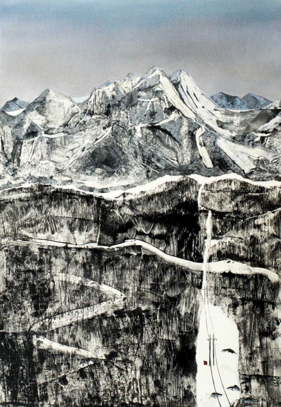
Best frame colours for art prints are chosen by studying the image as well as the room. The Clearing is nearly monochrome, with snow-lined mountains, dark rock bands, a pale winding road and one tiny red accent. That restraint makes the effect of the surrounding frame unusually easy to see.
Compare the best frame colours for art prints before deciding
Frame direction
Likely effect on The Clearing
Room relationship
Fine black
Connects to the darkest rock marks and sharpens the edge.
Useful against pale walls and simple furniture.
Soft white
Extends the snow and sky, making the image feel more open.
Works where the wall has enough contrast to retain a boundary.
Pale natural timber
Adds quiet warmth without introducing a strong new colour.
Relates well to oak, ash and textured neutral interiors.
Do not choose from a small online swatch alone. Consider the finished width, any mount, and the wall colour together. A broad black profile could overpower the delicate road, while a very bright white frame may look stark on a warm cream wall.
The frame should clarify the image’s hierarchy: mountains first, rock texture second, and the tiny red detail last.
Keep monochrome depth from becoming flat
Near-monochrome artwork depends on tonal range more than obvious colour. Colour-managed Giclée production retains the subtle steps between sky, snow, stone and ink-dark marks. Bespoke in-house framing then allows the profile and mount to be judged against the actual print.
The Clearing proves that the best frame colours for art prints are not automatically neutral choices; they are tools for protecting contrast, atmosphere and the order in which details are seen.
Modern framed wall art can carry intense colour when its composition has a clear internal structure. Breton Circus, Quatorze Juilliet layers geometric horses, human profiles and rhythmic lines over deep black, red and blue. The image feels active, yet repeated curves and verticals stop it becoming random.
Give modern framed wall art one calm surrounding zone
In a pale room
Allow the black ground and saturated colour to act as the main visual weight. Plain upholstery and one dark lamp are enough support.
In a darker room
Use a mount or frame edge that separates the black passages from the wall. This preserves the silhouettes instead of letting them disappear.
Hang the picture where there is time to scan its details, such as above a low sideboard or opposite a seating area. Avoid surrounding it with several small, equally colourful works. The circus rhythm is strongest when it has a clear field around it.
Should every accent colour be repeated?
No. Select one red, blue or burnt orange note for a textile or object. Repeating all of them would flatten the artwork into a decorating palette rather than letting it remain the focal point.
Use the frame to contain energy, not suppress it
Sharp shapes, dark grounds and adjacent saturated colours require accurate reproduction. Colour-managed Giclée production keeps their boundaries and tonal differences clear. A hand-finished frame supplies a final visual pause, helping the energetic image sit confidently in a domestic room.
For buyers considering modern framed wall art, Breton Circus, Quatorze Juilliet shows how bold subject matter can remain liveable when colour, placement and framing are handled with discipline.
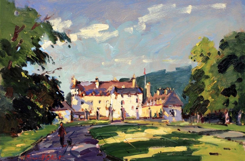
Art for a hallway works especially well when the composition seems to extend the route through the home. In Traquair House, a curving approach leads between deep trees toward a sunlit historic house. That progression can give a narrow or windowless passage a welcome sense of destination.
Position art for a hallway along the natural sightline
Look from the doorway
Choose the wall that remains visible as someone enters and moves through the hall. The bright building should read before the smaller figures and garden detail.
Relate the frame to the route
Align the work with a console, radiator cover or strong door frame. This makes the landscape feel connected to the architecture rather than floating between several openings.
Check evening glare
Hall lighting often sits close to the wall. View the proposed position after dark and move the frame away from a direct reflection if the facade becomes difficult to see.
The warm house and lawn can relieve a cool passage, while the large areas of sky and shadow provide breathing room. Keep nearby objects low so the painted path remains visually open.
Preserve the light that draws the eye forward
The appeal lies in the contrast between shaded trees, loose brushwork and the luminous facade. Colour-managed Giclée reproduction keeps those values separate. A bespoke frame adds an orderly edge that suits the hallway without making the painting feel formal or remote.
When choosing art for a hallway, Traquair House offers more than decoration: its path, light and welcoming architecture can make movement through the space feel purposeful.
Breakfast room wall art can be more playful than art chosen for a formal dining room. Speckles gathers a patterned cow, three perched birds, flowers and layered blue-green shapes into one compact square. It brings morning energy to the room without relying on coffee slogans or kitchen typography.
Use breakfast room wall art to set an informal rhythm
Choose the wall seen when entering or sitting down, rather than the busiest preparation area.
Leave enough space around the square frame for the layered pattern to remain readable.
Repeat one colour only, such as teal, coral or leaf green, in a small table accessory.
Keep other animal motifs out of the scheme so the artwork retains its wit.
A cheerful room feels collected when colour is echoed with restraint, not copied everywhere.
The print can soften painted cabinetry and hard breakfast-table surfaces. Its rounded animal form and loose flowers provide a friendly contrast to straight chair backs, tiles and cupboard lines. Because the composition is concentrated, it can make a useful focal point even where wall space is limited.
Let the small details reward a closer morning view
Layered pattern needs clean colour separation, especially where translucent blues, greens and floral marks overlap. Colour-managed Giclée printing maintains that detail. In-house framing gives the square image enough definition to hold its own in a practical, frequently used room.
Art for sandy beige walls needs enough clarity to lift the neutral colour without discarding its warmth. Shoreline Croft, Lewis brings a white shoreline croft, turquoise water, green ground and distant blue hills into that setting. The palette feels fresh, while the island landscape keeps the relationship with sand and natural texture believable.
Balance art for sandy beige walls through cool contrast
Detail in the print
Role in the room
Turquoise bay
Adds a clean, cool counterpoint to warm beige.
White croft
Creates a crisp focal point without harsh black contrast.
Green and ochre ground
Connects the image to timber, linen and woven texture.
Keep supporting colour selective. One blue-green cushion or a piece of glazed pottery can echo the bay. Several nautical ornaments would make the room feel themed and would compete with the more interesting texture in the paintwork.
The square format is useful above a compact chest, reading chair or between two wider pieces of furniture. Mark the finished dimensions before ordering. A clear border of wall around the frame lets the pale shore remain expansive.
Frame coastal texture so pale tones stay distinct
The image depends on separation between white sand, the croft, blue sky and textured water. Colour-managed Giclée production protects those quiet differences. A hand-finished frame can then bridge the warm wall and cooler landscape without making either look dull.
For a neutral interior, Shoreline Croft, Lewis demonstrates how art for sandy beige walls can add light, colour and Scottish character while the room remains calm and natural.
calming wall art for a meditation room should support attention rather than demand it. A quiet space does not need a literal lotus, slogan, or prescribed spiritual symbol. Between Earth and Sky by Emily Little offers a subtler alternative. Its atmospheric composition suggests landscape and distance while leaving enough ambiguity for the viewer to settle into their own response.
What calming wall art for a meditation room should do
The artwork is not there to fill every blank surface. Its role is to provide one stable point for the eye before practice begins or when attention wanders. Soft transitions, an open composition, and a title that connects ground with air can help establish that sense of steadiness without dictating how anyone should feel.
Between Earth and Sky works because it sits between recognisable landscape and abstraction. There is enough structure to hold the gaze, yet not so much detail that the mind starts cataloguing objects. This balance can suit a dedicated meditation room, a yoga corner, or a quiet section of a bedroom used for reflection.
Begin with the practice position
Arrange the room from the seated position outward. Sit on the cushion, chair, or bench you actually use and notice where the eyes rest naturally. The artwork should be visible without lifting the chin or twisting the body. If practice usually happens with closed eyes, the picture can still shape the transition into and out of the session.
Avoid placing the print directly above the practitioner’s head. That position removes it from view and may make the wall feel top-heavy. A wall opposite or slightly to one side often creates a more useful anchor. Keep enough clear space around the frame for the composition to feel open.
Build the room in three quiet layers
The visual layer: one considered artwork and uncluttered wall space.
The tactile layer: a supportive mat, cushion, natural textile, or simple chair chosen for comfort.
The practical layer: soft controllable light, ventilation, and storage that removes everyday clutter from view.
Keeping these roles clear prevents the room from becoming a collection of wellness accessories. The picture supplies atmosphere. The furniture supports the body. Storage and lighting make the routine easy to repeat. Nothing needs to perform several jobs or compete for attention.
Let colour remain atmospheric
Instead of matching every tone, choose a wall colour and textile that allow the artwork’s quieter shifts to register. Warm off-white, mineral grey, muted clay, or a restrained natural green can all work, depending on the print in person and the room’s daylight. Test samples at the hours when the space is normally used.
Lighting should be gentle but sufficient to see the image clearly. A shaded lamp or dimmable wall light is often more comfortable than a bright ceiling fitting. Position the light so it does not throw a distracting reflection across the glazing from the usual seated viewpoint.
Frame for calm rather than disappearance
A frame does not have to vanish to feel calm. A restrained dark moulding can give an atmospheric work definition, while a pale timber may connect it to natural textures in the room. A measured mount creates a pause between image and frame. The best combination depends on the actual print, wall, light, and nearby materials.
First 4 Frames uses colour-managed Giclée production and completes bespoke framing in-house in Falkirk. The hand-finished presentation supports the artwork’s tonal detail and gives the piece a settled, lasting presence beyond a short-term room trend.
The most useful calming wall art for a meditation room leaves room for a personal practice. View the framed Between Earth and Sky print for an artwork that can steady the room through atmosphere, proportion, and thoughtful craftsmanship rather than obvious symbolism.
wall art for a narrow hallway has to earn its place. The route may be busy, the viewing distance short, and the available wall broken up by doors. Autumn Reflections Union Canal by Joseph Maxwell Stuart answers those constraints with a path-like stretch of water, trees, figures, and a distant bridge. That recession draws the eye forward, while the autumn colour gives a practical circulation space genuine warmth.
Why wall art for a narrow hallway benefits from depth
A narrow hall can feel like a passage rather than a room. Artwork with a clear foreground, middle distance, and horizon helps counter that effect. In Autumn Reflections Union Canal, the canal carries the view beyond the surface of the wall. The bridge and walkers provide small points of interest without turning the image into a crowded scene.
This visual depth is particularly useful on the end wall of a straight hallway. The picture becomes a destination as someone enters. On a side wall, it can also slow the eye between doorways. Choose the position that offers the longest comfortable view, then check it again from the rooms that open onto the hall.
Map the sightlines before making holes
Stand at the entrance. Mark the section of wall that remains visible when internal doors are open.
Walk the route. Make sure the frame will not sit where shoulders, bags, or coats regularly pass.
Check the end view. Centre the picture on the useful sightline, which may differ from the mathematical centre of the wall.
Test eye level. Use the viewpoint of a person walking through the space, rather than aligning automatically with a nearby door frame.
A paper template cut to the finished frame size is valuable here. Leave it in place for a day and approach it from both directions. This simple check reveals whether the piece feels confident or cramped, and whether switches, radiators, or opening doors interrupt the composition.
Use autumn colour without darkening the passage
Warm orange, russet, and gold can make a hallway feel welcoming, especially as October light becomes cooler. The water and open distance in this image prevent those richer notes from becoming heavy. Rather than painting the whole hall a matching deep shade, repeat one restrained colour in a runner, small ceramic, or timber detail.
Hallway condition
Helpful response
Limited daylight
Keep the surrounding wall and mount relatively light
Several timber doors
Relate the frame to one established wood tone
Patterned runner
Allow plain wall space between floor pattern and artwork
Strong ceiling light
Check the glazing for reflections from walking height
Choose a frame with safe, useful presence
A hallway frame needs enough definition to look deliberate, but excessive projection can become awkward in a tight route. A neat profile, carefully chosen mount, and secure hanging method keep the presentation refined. If the wall is plasterboard or receives regular vibration from doors, suitable fixings are as important as the visual choice.
First 4 Frames produces colour-managed Giclée prints and completes bespoke framing by hand at its Falkirk workshop. That in-house approach makes it easier to consider the image, finished dimensions, moulding depth, and exact wall together rather than treating the frame as an afterthought.
Effective wall art for a narrow hallway can make the journey through a home feel considered, not merely decorated. View the framed Autumn Reflections Union Canal print for a scene that adds perspective, Scottish character, and autumn warmth while keeping a compact passage visually open.
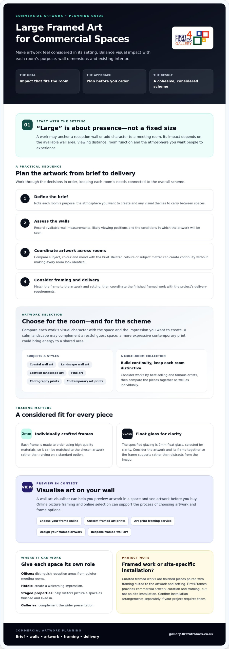
The most impressive artwork for a commercial space is not always the largest piece available. Choosing large framed art for commercial spaces means balancing visual impact with the room’s purpose, wall dimensions and existing interior. The right choice should feel considered in its setting, not oversized for the sake of it.
When you are planning artwork for several rooms, it can be difficult to make the selection feel cohesive while still giving each space its own character. You may also need to decide whether a standard frame will suit each piece. This guide covers practical ways to assess artwork, framing and project requirements before you order.
Explore how commercial artwork curation can bring a scheme together, from fine art and photography prints to coastal wall art, Scottish landscape art and contemporary art prints. You’ll also learn how to use a wall art visualiser to preview art on your wall before you buy. First4Frames Gallery’s frames are individually crafted using high-quality materials, with 2mm float glass for clarity. We’ll look at how online selection, bespoke framing and professional courier delivery can support the process from choosing artwork to receiving finished framed wall art.
Key Takeaways
Learn how large framed art for commercial spaces can support a room’s atmosphere and identity, without relying on a fixed definition of “large”.
Compare artwork subject, colour and mood with framing options to find a considered fit for each piece and setting.
Use a practical planning sequence: start with the project brief and wall measurements, then coordinate artwork, framing and delivery.
Discover how commercial artwork curation, online selection and custom framing can help property developers, hoteliers and estate agents create a cohesive scheme.
Why Large Framed Art Can Work in Commercial Spaces
“Large” has no single size threshold in a business interior. It means artwork with enough presence to relate to its surroundings, whether it anchors a reception wall or adds character to a meeting room. To judge whether a piece will work, consider the available wall area, how far away people will view it, the room’s function and the atmosphere you want visitors or staff to experience.
Well-chosen framed art can create a focal point, contribute to a business’s identity and help an interior feel complete. Artwork displayed in a shared setting also relates to the broader idea of public art, although a framed work selected for a commercial interior is not necessarily a site-specific commission.
For a visual example of oversized wall art, watch this short video:
Which commercial spaces might benefit from framed artwork?
In an office, artwork can help distinguish a reception area from a quieter meeting room. Hotels can use considered choices to create a welcoming impression, while art in a staged property can help visitors picture the space as finished and lived in. Galleries may select framed works to complement their wider presentation. Start by defining what each room needs to do and the experience you want people to have. Then consider which subjects and moods support that brief.
When is framed art different from an art installation?
Curated framed works are finished pieces, paired with framing suited to the artwork and setting. A site-specific installation, by contrast, may involve a design developed for a particular building or location. Large framed art for commercial spaces can make a strong visual statement without becoming a construction project. First4Frames provides commercial artwork curation and framing, but not on-site installation. Confirm installation arrangements separately if your project requires them.
How to Compare Large Framed Art and Framing Options
Start with the artwork, then consider the frame. Compare each option with the project brief: its subject, palette and mood should suit the room’s purpose and the impression you want to create. A calm landscape might complement a restful guest space, while a more expressive contemporary print could bring energy to a shared area. The best fit depends on the setting, not on a presumed trend.
What should a commercial buyer compare before choosing artwork?
Consider coastal wall art, landscape wall art and Scottish landscape art alongside fine art, photography prints and contemporary art prints. Check how each work’s colours and visual character relate to the interior, and whether it supports the brief. A selection may include pieces by best-selling and famous artists. For a multi-room project, compare the works as a group too. Related colours or subject matter can create continuity without making every room look identical.
Why does bespoke framing matter for large framed art?
A standard frame may not suit the dimensions or presentation of a particular work. First4Frames individually crafts each frame to order using high-quality materials, so the frame can be matched to the chosen piece rather than relying on a standard option. The specified glazing is 2mm float glass, selected for clarity. For more guidance on choosing a frame to complement a work, see Mastering Custom Picture Framing: The Expert Guide to Bespoke Art Display.
Consider the artwork and framing together before deciding. For large framed art for commercial spaces, this helps the finished piece feel intentional, with the frame supporting rather than distracting from the image. You can browse the framed art gallery to explore options for your brief.
How to Plan Large Framed Art for Your Commercial Project
A clear plan makes it easier to coordinate artwork across a commercial space. Work through the decisions in order and keep a record of the details a provider will need to give project-specific guidance.
Define the brief. Note each room’s purpose, the atmosphere you want to create and any visual themes to carry between spaces.
Assess the walls. Record the available wall measurements and where people are likely to view the artwork from. Note the viewing conditions, including natural and artificial light.
Shortlist artwork. Group rooms by function, then choose works that feel related without requiring every space to look the same.
Choose the framing. Confirm the artwork and frame combination, including the finished dimensions and any custom framing requirements.
Coordinate delivery. Confirm project quantities, delivery arrangements and how finished frames will be packaged and shipped.
How can you shortlist art for several rooms?
Begin with the experience each area should offer. A reception space and a quiet meeting room may call for different subjects or moods. A shared colour palette can help the wider scheme feel coherent. Use a wall art visualiser to Visualise art on your wall and See artwork before you buy, so you can consider a work in context. The “Art in the Frame” resource can also help you think about sourcing and framing as connected choices.
What should you confirm before ordering framed works?
Before placing an order, check the artwork dimensions, frame choice and quantities with the provider. Ask how finished frames are protected for transit and how delivery is coordinated. First4Frames packages finished frames to help prevent damage and ships them via professional couriers. Confirm project-specific dimensions, framing suitability and delivery arrangements before ordering.
How First4Frames Helps Source Large Framed Art for Business
Choosing large framed art for commercial spaces involves more than finding a striking image. First4Frames Gallery supports property developers, hoteliers and estate agents with commercial artwork curation, connecting artwork selection with bespoke framing. Its online gallery includes Giclée prints and works by artists primarily from Scotland, alongside a selection of frames. Explore landscape, coastal, fine art, photography and contemporary styles to find options that suit your project.
What can buyers explore through the online art and framing service?
Browse Custom framed art prints and Bespoke framed wall art, or consider the Art print framing service for a digital photograph you’d like printed and framed. First4Frames prints supplied photographs to complement the bespoke frame. This is a print-and-frame option, not a photography service. Frames are individually crafted for each order using high-quality materials, with 2mm float glass for clarity.
The Online picture framing journey is straightforward: choose artwork, Choose your frame online, then Design your framed artwork by reviewing the combination. Online visualisation can help you picture a work in its intended setting before deciding. For more framing guidance, explore the article Picture Frames: The Ultimate Guide to Choosing, Hanging, and Displaying Art.
How can a commercial buyer take the next step?
Browse the gallery and shortlist pieces that suit the rooms, visual brief and framing needs of your project. Then contact First4Frames Gallery to discuss commercial curation or bespoke framing requirements. Before ordering, confirm project-specific dimensions, framing suitability, quantities and delivery arrangements. Finished frames are fully packaged to help prevent damage and shipped via professional couriers.
Choosing large framed art for commercial spaces starts with the setting. Consider each room’s purpose, the artwork’s subject and mood, and how the frame completes the presentation. For a project spanning several rooms, a clear brief and recorded wall measurements help you build a cohesive selection and check the practical details before ordering.
First4Frames Gallery supports property developers, hoteliers and estate agents with commercial artwork curation, Giclée prints and works by artists primarily from Scotland. Each frame is individually crafted for its order using high-quality materials, so it can be matched to the chosen artwork rather than relying on a standard frame that may not fit. This offers a considered route from selecting artwork to choosing finished framed art.
Can large framed art work in an office or other commercial space?
Yes. Framed artwork can suit offices, hotels, staged properties and galleries when it supports the room’s purpose and visitor experience. Consider the wall around it, how people will view the work and the atmosphere you want to create. For large framed art for commercial spaces, the subject, colour and framing should suit the interior rather than being selected by size alone.
How do I choose the right size framed art for a commercial wall?
Measure the available wall area first, then consider viewing distance, furniture and the room’s layout. A work that feels prominent in a reception area may have a different impact in a corridor or meeting room. There is no universal size rule for every commercial setting. Share your measurements and viewing context with the provider, and confirm the finished artwork and frame dimensions before ordering.
Is bespoke framing better than a standard frame for commercial artwork?
Bespoke framing can be a better fit when the frame needs to suit a particular artwork. A standard frame may not fit the piece properly or complement its presentation. First4Frames individually crafts each frame to order using high-quality materials, rather than relying on a one-size-fits-all option. Its specified glazing is 2mm float glass, selected for clarity.
Can I preview framed artwork on my wall before ordering?
A wall art visualiser can help you preview a work in context and consider how its subject, colour and scale may sit within your interior. It is a useful selection aid, but it does not replace checking the actual artwork and frame details. Before ordering, confirm how the preview represents the finished piece, including the chosen frame, dimensions and appearance, with the provider.
How is large framed art packaged and delivered?
First4Frames fully packages finished framed orders to help prevent damage and ships them via professional couriers. Before placing a commercial order, confirm the artwork dimensions, framing suitability, quantities and delivery arrangements with the provider. Ask how the finished pieces will be packaged for transit, particularly if your project includes several works. No delivery time is specified, so check the arrangements for your order directly.
Scottish wall art can give a modern entrance a strong sense of place without filling it with heritage motifs. Edinburgh castle on Castle Rock concentrates that identity in one unmistakable silhouette. The fortress and its volcanic foundation bring visual weight to a clean hallway while leaving furniture and practical storage understated.
Let Scottish wall art provide one clear entrance landmark
1. Find the arrival view
Use the wall visible after the door closes, not necessarily the first narrow surface beside it. More viewing distance makes the castle form easier to read.
2. Relate it to one fixed feature
Centre the frame over a console or align it with a doorway edge. Avoid centring it on the whole hall if that leaves the work disconnected from everything below.
3. Edit supporting objects
A plain lamp, bowl for keys, and one natural texture are enough. Tartan, miniature castles, and Edinburgh signs would weaken the photograph’s authority.
Modern entrances often contain hard flooring, white walls, and closed storage. Rock and masonry add texture to that clean setting, while the sky preserves breathing room. Test the height from standing eye level and from the adjoining room.
If the hall is narrow, control reflections from the front door and ceiling lights. A position just beyond the brightest sightline can reveal more detail and make the framed piece feel calmer on arrival.
Frame a historic silhouette for a clean interior
The castle needs architectural definition, while Castle Rock and the sky need tonal range. Colour-managed Giclée reproduction keeps those elements separate. Bespoke framing adds a precise contemporary boundary for the historic subject.
For a modern entrance, Edinburgh castle on Castle Rock demonstrates how Scottish wall art can feel confident and rooted through one strong landmark, thoughtful spacing, and restrained hand-finished presentation.
Wall art for a room with grey walls should often supply what the paint cannot: warmth, depth, and a clear point of interest. Fallow Deer buck in beautiful autumn forest brings amber foliage, filtered sunlight, and the poised shape of the animal into a cool scheme. The contrast can feel natural without forcing the whole room toward orange or brown.
Balance wall art for a room with grey walls through temperature
First identify the grey undertone. Blue-grey paint will make the autumn foliage appear warmer and more vivid. A softer greige creates a gentler transition. In either case, use the frame to create a deliberate edge between woodland shadows and the wall.
Repeat one amber note in a cushion or wool throw.
Use oak or walnut nearby to extend the warmth naturally.
Keep additional animal motifs out of the room.
Let the deer remain the single narrative focus.
A cool room does not need many warm accessories when one image carries colour, light, and subject together.
The photograph can work above a reading chair, a low cabinet, or on the wall seen from a doorway. Give the antlers and trees clear space. Crowding the frame with tall lamps or plants would blur the silhouette.
Will autumn colour feel seasonal?
Not if the rest of the scheme stays restrained. Natural timber, wool, and quiet grey allow amber to read as warmth throughout the year rather than temporary autumn decoration.
Keep fur, foliage, and filtered light distinct
Wildlife photography needs fine detail in the animal and tonal depth in the woodland. Colour-managed Giclée production maintains that separation. A carefully chosen frame connects the warmth of the print to the room without fighting the grey paint.
As wall art for a room with grey walls, Fallow Deer buck in beautiful autumn forest adds measured warmth and natural focus while allowing the neutral scheme to remain calm and flexible.