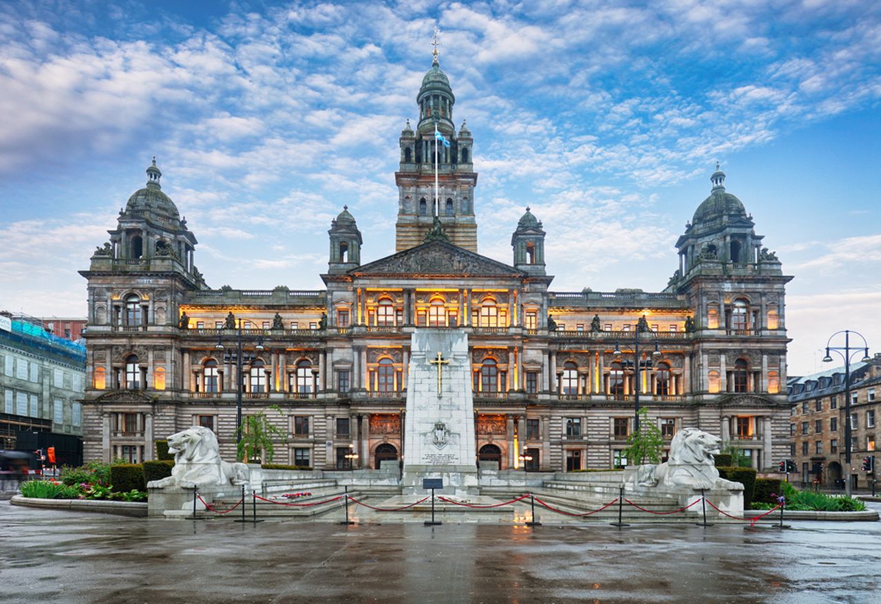
Art for offices or reception spaces should help visitors understand where they are and how the organisation sees itself. Glasgow City Chambers and George Square in Glasgow offers recognisable civic architecture and the openness of George Square. It can communicate confidence and local connection without repeating a logo across the wall.
Choose art for offices or reception spaces from the visitor route
Begin at the entrance
Stand where a new visitor first pauses. The image should be legible there and should not be hidden by a reception monitor, tall plant, or queue barrier.
Architecture brings natural order to a working interior. Align the frame with the desk, seating group, or a strong doorway line. This makes the picture feel integrated instead of treated as an isolated decorative purchase.
For clients
The landmark provides an immediate point of recognition and conversation.
For staff
A credible local scene gives a shared workplace identity without motivational slogans.
Check sightlines under daylight and the overhead lighting used during business hours. Glare across the architecture weakens the first impression, so the final position may need to sit slightly away from the central axis.
Give public-facing artwork a dependable finish
Detailed stonework and the depth of the square need controlled sharpness rather than harsh contrast. Colour-managed Giclée printing maintains that balance. In-house bespoke framing creates the precise presentation expected in a client-facing interior.
When selecting art for offices or reception spaces, Glasgow City Chambers and George Square in Glasgow offers a confident Glasgow welcome that feels specific, professional, and more lasting than anonymous corporate decoration.
Large coastal wall art can change the apparent proportions of a room when the image offers genuine horizontal distance. Isle of Harris landscape – beautiful endless sandy beach and turquoise ocean moves from pale sand and turquoise water toward green hills and mountains. In a low living room, that layered view can widen the wall without asking the artwork to sit uncomfortably high.
Size large coastal wall art from the sofa outward
Measure the sofa or sideboard rather than the whole wall.
Mark the finished frame with low-tack tape.
Keep the artwork connected to the furniture below it.
Sit in the main chair and check that the horizon feels natural.
A generous image still needs breathing room. Leave clear wall at both sides so the beach feels expansive rather than squeezed. If the ceiling is low, resist raising the frame merely to fill empty space. A lower, furniture-led position makes the horizontal composition work harder.
Does a coastal photograph require a blue room?
No. Sandy beige, soft stone, warm white, pale timber, and textured neutral fabrics can support the scene. One controlled turquoise accent is enough; shells, anchors, and striped accessories would turn a fresh landscape into a theme.
Place the picture away from direct window glare. The bright beach and sky already carry plenty of light, so a quieter side wall will often reveal more depth than the obvious position opposite the glazing.
Preserve distance from foreground sand to far hills
A coastal photograph relies on subtle separation between pale sand, clear water, distant green, and blue sky. Colour-managed Giclée production protects those transitions. Bespoke framing gives the broad scene enough presence to anchor the room cleanly.
For a low room, Isle of Harris landscape – beautiful endless sandy beach and turquoise ocean shows why large coastal wall art works best through measured width and convincing distance, not through seaside accessories or an unnecessarily high position.
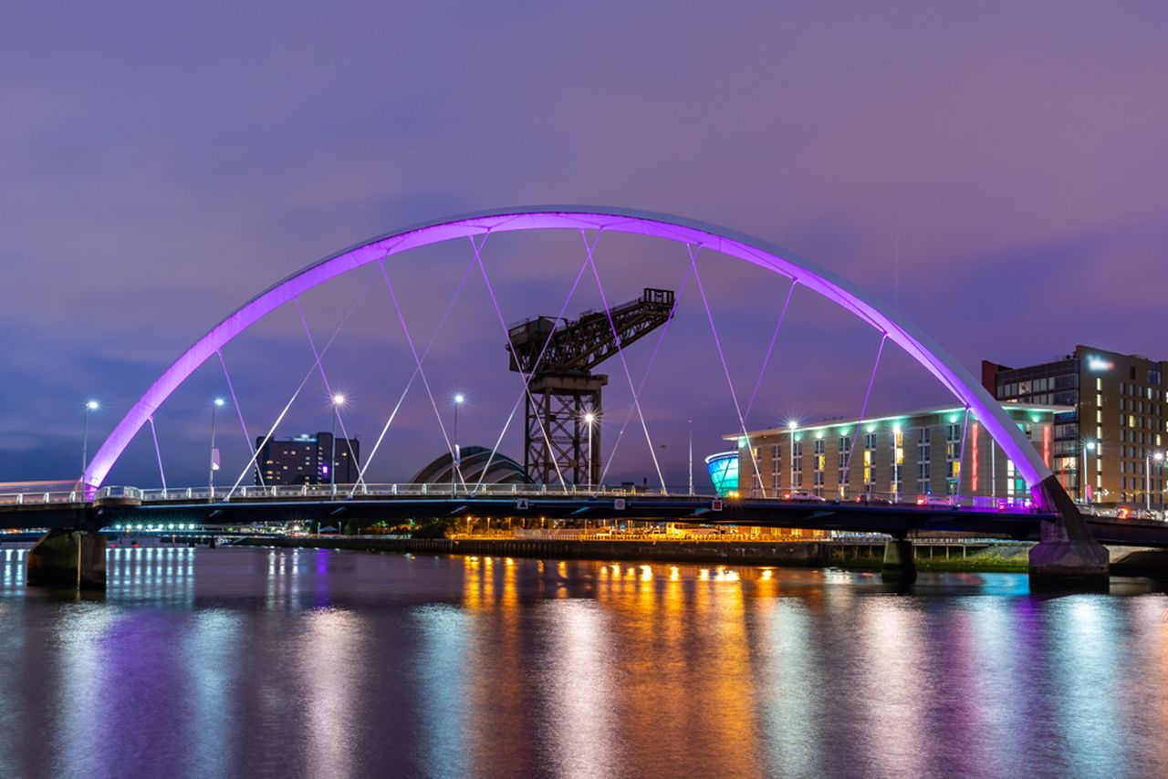
Contemporary wall art does not need to be abstract to feel current. Night lights and the Clyde Arc Bridge at Glasgow City in Scotland over river. uses the illuminated Clyde Arc, city buildings, an industrial crane, and river reflections to create a modern Glasgow view. Its long structural line can organise an open-plan room without relying on a physical divider.
Use contemporary wall art to define an evening zone
Position
What the image contributes
Above a low sideboard
The bridge continues the furniture’s horizontal proportion.
Beside a dining table
Warm reflections support evening light and conversation.
Behind a reading chair
The city view gives the smaller zone a clear identity.
Repeat only one element from the photograph. A brass lamp can pick up the reflected lights, while a charcoal textile can relate to the night sky. Copying every colour would make the room feel staged.
Urban art feels most liveable when its structure supports the room as strongly as its subject tells a story.
Check reflections from pendants and kitchen lighting before fixing the height. A slight move left or right can retain the river detail after dark and keep the glazing from becoming the brightest surface.
Keep the bridge crisp and reflections atmospheric
The engineering needs precise edges, while the water depends on softer bands of reflected colour. Colour-managed Giclée reproduction holds both qualities. A hand-finished frame adds order without making the industrial subject severe.
As contemporary wall art, Night lights and the Clyde Arc Bridge at Glasgow City in Scotland over river. brings architecture, atmosphere, and Glasgow identity into one disciplined image that can give an open-plan zone purpose after daylight fades.
Framed photography prints succeed when bright colour and deep shadow remain believable together. Northern Lights above the forest places green, yellow, and purple auroras above a dark forest and open ground. That combination offers drama, yet it also demands careful reproduction so clouds, horizon, and night sky do not merge into one flat band.
Judge framed photography prints in daylight and lamplight
A night photograph changes as the room light changes. View the proposed wall in daylight, then return after dark. Side lighting is kinder than a lamp reflected directly in the glazing because it lets the aurora remain visible without erasing the forest below.
Keep the horizon readable
Choose a frame tone that separates the dark lower edge from the wall. On charcoal or navy paint, a lighter mount can stop the image disappearing.
Protect the colour balance
Avoid strong green or purple accessories nearby. Let the aurora provide the colour while bedding, upholstery, or shelving stays quieter.
The broad sky gives useful visual distance. It can settle a bedroom, reading room, or low-lit study, especially where the wall needs atmosphere but not a busy collection of small objects.
Frame night colour without losing shadow detail
Colour-managed Giclée production helps preserve separation between the warm horizon, dark land, clouds, and luminous sky. In-house bespoke framing gives the photograph a clean boundary, allowing its night palette to feel deep rather than simply dark.
Among framed photography prints, Northern Lights above the forest offers a useful test of quality: the colour should feel vivid, but the quieter landscape beneath it should still reward a closer look.
A graduation gift for a St Andrews graduate should recognise both the achievement and the place attached to it. Flowers fade, bottles are opened, and practical presents can disappear into a move. St Andrews Harbour by Sheila Fowler offers a more lasting connection. The harbour is recognisably part of St Andrews, while the framed artwork can belong naturally in the graduate’s next home.
Why place makes a graduation gift more personal
Graduation celebrates years of work, but much of its meaning sits in ordinary memories: familiar walks, weather, shared meals, and views seen repeatedly between deadlines. A picture of a real place can hold those quieter associations without trying to list them. It leaves room for the graduate’s own experience of the town.
The harbour is a thoughtful subject because it is specific without being limited to university buildings. It may recall coastal walks and time away from study as readily as the ceremony itself. This wider connection helps the print remain relevant long after certificates and formal photographs have been put away.
Is this graduation gift for a St Andrews graduate the right fit?
Consider the person before the milestone. This artwork is especially suitable when the graduate:
formed a strong attachment to St Andrews and its coastline;
prefers meaningful objects to branded university merchandise;
is moving into a flat, first home, or professional workspace;
enjoys expressive Scottish landscapes and coastal colour;
would value a finished piece that can be hung straight away.
If several people are contributing, framed art can also make a satisfying group present. It feels substantial enough to mark the occasion, while one carefully chosen piece is easier to live with than a collection of smaller commemorative items.
Choose a size for the graduate’s next space
St Andrews Harbour is available in 265 and 500 millimetre print sizes. The smaller option can suit a first flat, compact study, or a wall shared with other personal pieces. The larger size gives the harbour more presence above a desk, console, or modest sofa. If the recipient moves later, a square format remains flexible and can transfer between rooms more easily than a very wide panorama.
When the future wall is unknown, avoid guessing at a highly specific interior trend. A balanced frame and mount can support the coastal subject while working with different paint colours and furniture. First 4 Frames offers one-to-one framing advice and completes both colour-managed Giclée production and hand-finished framing in-house in Falkirk.
Present it with a short, specific note
A personal message can explain why this view was chosen. Mention a harbour walk, a visit, or the graduate’s affection for the town. Keep the note brief enough that the picture retains space for their own memories. If you do not share the same St Andrews history, simply connect the scene to the new chapter ahead.
Sheila Fowler is a Scottish artist known for colourful, atmospheric landscapes, coastlines, and wildflowers. Her expressive oils use rich colour and texture to give familiar places fresh energy. See more of her practice on Sheila Fowler’s official website, or explore the Sheila Fowler collection at First 4 Frames.
A framed reminder that travels beyond graduation
The best graduation gift for a St Andrews graduate does not need to look like formal memorabilia. It can carry a familiar view into a new job, city, or home and gather new meaning there. View the framed St Andrews Harbour print for a thoughtful way to celebrate academic work, a memorable Scottish place, and what comes next.
wall art for a vinyl listening room needs to contribute something different from the records, sleeves, and equipment already in the space. Take Five by David Short offers a lively visual rhythm without turning the room into a display of familiar music logos. Its colourful square composition can hold attention between listening sessions and give the practical elements of a record setup a more considered setting.
What wall art for a vinyl listening room should add
A listening room often has a strong visual centre before any artwork arrives. The turntable, speakers, amplifier, and rows of records create repeated rectangles, dark surfaces, and small details. A successful picture should soften that technical arrangement while still feeling connected to the reason the room exists.
Take Five brings colour, movement, and a musical title into that setting. The connection is clear, yet the work remains an artwork in its own right. That distinction matters. It means the picture can suit a dedicated music room, a living-room listening corner, or a study where records share space with books and furniture.
Plan the wall around listening, not just looking
Start with the speakers. Keep the area directly around them visually calm so the setup still feels balanced.
Check the seated view. Position the artwork where it can be enjoyed from the main chair without asking the listener to turn or look upwards.
Leave access to records. A frame above storage should not interfere with lids, doors, or the comfortable removal of an LP.
Watch direct light. Avoid strong glare from a nearby window or lamp, especially on a wall viewed during evening listening.
The square format is particularly useful above a compact record cabinet or on a section of wall beside the equipment. Available print sizes include 265, 500, and 800 millimetres square. Measure the finished wall area and the furniture below it rather than choosing by print dimensions alone. The frame and the clear margin around it are part of the final proportion.
Balance colour with record storage and equipment
Existing feature
Useful response
What to avoid
Black equipment
A restrained dark frame with a lighter mount
Making every surface black
Timber record unit
A frame tone that relates to, rather than copies, the wood
Mixing several unrelated timber finishes
Colourful record sleeves
Clear wall space around the artwork
Displaying too many sleeves beside the print
Low evening light
A nearby lamp aimed away from the glazing
Direct reflections across the image
There is no need to pick out every colour in the picture. One echo in a chair, cushion, or small object is enough. The artwork should organise the room, not issue a list of colours that must be repeated. This restraint also allows favourite album covers to change without upsetting the wider scheme.
Frame a musical image for the long term
A listening room rewards details that feel good over time. First 4 Frames produces colour-managed Giclée prints and completes bespoke framing in-house at its Falkirk workshop. Careful print production supports the work’s colour and pattern, while a hand-finished frame gives it enough presence beside substantial speakers and record furniture.
Good wall art for a vinyl listening room should enrich the atmosphere without competing with the act of listening. View the framed Take Five print for a colourful musical focal point that can make a record space feel finished, personal, and ready for the next side.
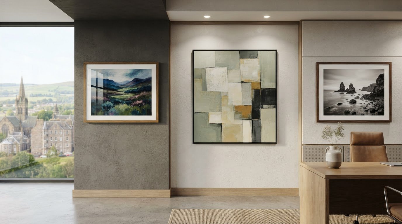
A beautifully framed print can still be difficult to enjoy when bright reflections compete with the image. Choosing non-reflective frames for office lighting involves more than the frame itself: glazing, light direction and artwork placement all play a part. Glazing terms can also be confusing when you’re comparing options for a professional-looking display.
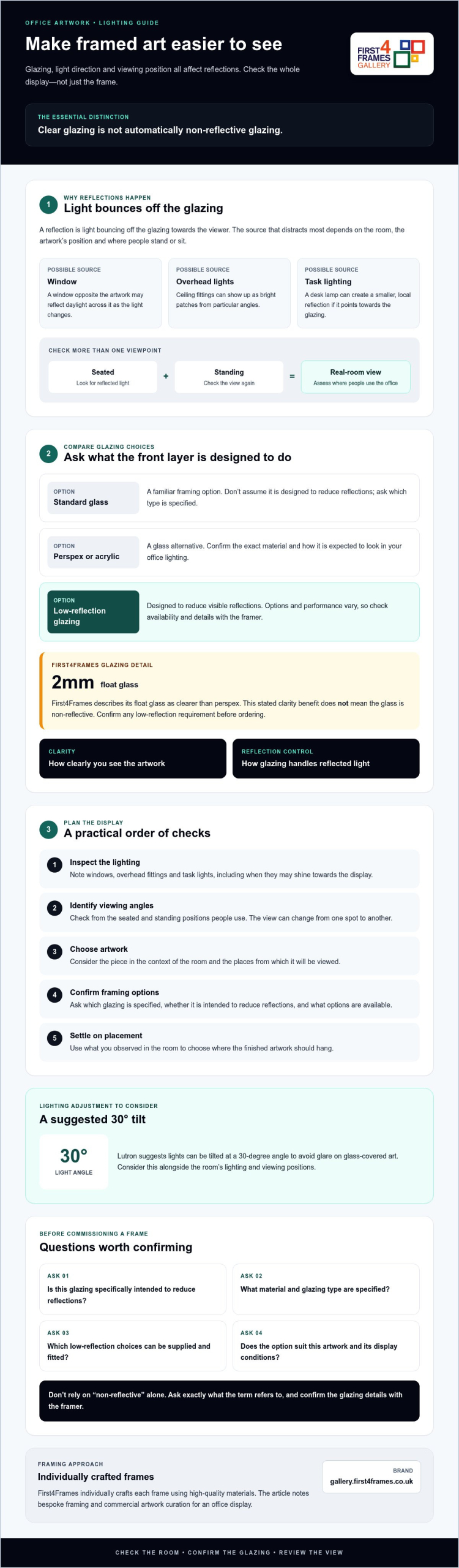
First4Frames Gallery individually crafts each frame using high-quality materials. Its framing service uses 2mm float glass, which it describes as clearer than perspex. That should not be mistaken for non-reflective glazing. If reflections are a concern, check directly with your framer which specialist glazing choices are available before ordering.
This guide explains what causes reflections and how glazing, lighting and placement can work together to make office artwork easier to see. Learn how anti-glare and anti-reflective glazing differ, what to consider when choosing framed wall art, and which questions to ask before commissioning custom picture framing.
Key Takeaways
Check how windows, overhead lights and viewing angles affect the display, then assess the lighting around the wall you’re considering.
Compare glazing choices when considering non-reflective frames for office lighting. Clear 2mm float glass is not necessarily glazing designed to reduce reflections.
Use a practical order of checks: inspect the lighting, identify viewing angles, choose artwork, confirm framing options, then settle on placement.
Explore bespoke framing and commercial artwork curation for an office display. First4Frames individually crafts each frame using high-quality materials.
Why office lighting creates reflections on framed artwork
A reflection is light bouncing off the glazing towards the viewer, not a feature of the frame itself. A window opposite the artwork may reflect across it as daylight changes. Ceiling lights can appear as bright patches, while a desk lamp may cause a smaller, local reflection. The most distracting source depends on the room and the artwork’s position.
Viewing angle matters too. A framed print may look clear from one spot and mirror a light source from another. Check it from the seated and standing positions people typically use in the office. For an overview of picture framing glass or acrylic, see the different glazing materials used in framing.
This short video demonstrates acrylic described as non-glare:
Which office lights and positions create the most glare?
Assess the artwork in the lighting conditions it will actually face. A window opposite the frame may reflect daylight directly, while overhead fittings can show up from particular angles. Task lighting can cause glare if it points towards the glazing. No single light source always dominates, so check from the usual seated and standing positions before deciding where the piece should hang.
Does a non-reflective frame mean non-reflective glass?
The frame surrounds and supports the artwork; glazing is the transparent front layer. The phrase “non-reflective frame” may refer loosely to the glazing or the finished display, so ask the seller exactly what it means and which glazing is specified. The frame shapes the presentation; the glazing determines how its surface handles light. First4Frames specifies 2mm float glass and describes it as clearer than perspex, but does not describe it as non-reflective. Confirm any low-reflection requirement before ordering.
Compare glazing choices for clearer framed art in an office
Glazing affects how clearly artwork can be seen and how reflections appear, but these are separate considerations. When choosing non-reflective frames for office lighting, compare the glazing itself rather than assuming the frame material controls glare.
Glazing choice
What to consider
Standard glass
A familiar framing option, but don’t assume it’s designed to reduce reflections. Ask what type is specified.
Perspex or acrylic
A glass alternative. Confirm the exact material and how it is expected to look in your office lighting.
Low-reflection glazing
Designed to reduce visible reflections, but options and performance vary. Check availability and details with the framer.
First4Frames specifies 2mm float glass and describes its clarity as superior to perspex. That stated clarity benefit doesn’t mean the glass is non-reflective. Clarity describes how clearly you see the artwork; reflection control describes how glazing handles reflected light. Availability depends on the framer.
What should you ask about anti-reflective glazing?
Ask whether the quoted glazing is specifically intended to reduce reflections, how the provider describes its performance, and whether it suits your artwork and display conditions. Confirm which options can be supplied and fitted, and ask for any relevant care guidance. Don’t rely on “non-reflective” alone; find out exactly what the term refers to.
How do clarity and reflection control differ?
Glazing can offer a clear view without being designed to minimise reflections. Consider both needs, then ask the framer to explain the available choices. Lighting placement may also help: Lutron suggests lights can be tilted at a 30-degree angle to avoid glare on glass-covered art.
To find artwork for your office, browse the framed artwork gallery, then confirm your glazing requirements directly before ordering.
How to choose and position framed artwork under office lighting
A practical plan helps you choose artwork that suits the office and stays visible from the places people use most. Before ordering non-reflective frames for office lighting, work through these steps:
Inspect the lighting. Note windows, overhead fittings and task lights, including when they’re likely to shine towards the display.
Identify viewing angles. Check sightlines from desks, meeting areas and circulation routes, from both seated and standing positions.
Choose the artwork. Consider the room’s purpose, existing colours and the atmosphere you want the art to create.
Confirm framing options. Ask the framer about suitable frame and glazing choices before placing your order.
How should you assess artwork placement before ordering?
Use a temporary paper outline or hold a sample print against the wall in a few possible positions. This helps you visualise the scale and placement before you buy. A wall art visualiser may also help if you have access to one, but don’t assume it’s provided by the seller. Check sightlines from desks and meeting areas. If reflections distract from the image, try moving the planned position or adjusting nearby lighting.
Which artwork styles suit a professional office?
Choose imagery that supports the space without overwhelming it. Coastal wall art can suggest an open, restful mood; landscape wall art offers a broad range of natural scenes, while Scottish landscape art brings a more specific sense of place. Fine art, photography prints and contemporary art prints offer further options. If considering work by best-selling artists or famous artists, compare the image, scale and palette with the room before choosing a frame.
For broader frame-selection advice, consult Picture Frames: The Ultimate Guide. To explore artwork options for your office, browse the framed art gallery.
Choose bespoke framed wall art for a polished office finish
A well-chosen frame brings artwork into the room’s design, while suitable glazing and placement help keep it comfortable to view. First4Frames individually crafts each frame to order using high-quality materials. Bespoke framing lets you discuss how the frame should present the artwork and fit the space. Businesses planning a coordinated display can also consider commercial artwork curation.
First4Frames offers a selection of frames and artwork online. Choose a frame, then plan the finished piece around the print, office palette and intended position. If reflections are a concern, ask which glazing options are available rather than assuming a bespoke frame includes non-reflective glass.
What can an office ask a bespoke framer to tailor?
Discuss the artwork’s size and presentation, frame selection and any glazing requirements. First4Frames specifies 2mm float glass and describes its clarity as superior to perspex; this doesn’t mean it has anti-reflective performance. Confirm any low-reflection requirement directly with the framing service. These choices can help shape custom framed art prints through an art print framing service, creating bespoke framed wall art suited to the workplace.
How can businesses source office artwork and framed photographs?
Commercial artwork curation can help businesses furnish office spaces. First4Frames offers bespoke framing for prints, fine art, paintings and photographs. Businesses can discuss the artwork and framing requirements for their space, including the glazing and presentation they have in mind.
Choosing non-reflective frames for office lighting means looking beyond the frame: glazing, light direction and viewing position all influence how easily artwork can be seen. Check the display from everyday desk and meeting-room sightlines, and confirm exactly what a framer means by “non-reflective” before ordering.
First4Frames individually crafts each frame to order using high-quality materials. Its framing uses 2mm float glass, described as clearer than perspex, but that clarity should not be mistaken for verified anti-reflective performance. Ask about glazing requirements directly. Businesses can also consider commercial artwork curation for a cohesive office display.
Thoughtful artwork choices and bespoke framing can help create a polished space that feels welcoming and reflects your workplace. Explore framed wall art for your office and find pieces to help bring your vision to life.
Frequently Asked Questions
Are non-reflective frames the same as anti-reflective glass?
No. “Non-reflective frame” doesn’t necessarily mean the frame includes anti-reflective glass. The frame is the structure surrounding the artwork, while glazing is the transparent front layer. Sellers may use the phrase informally, so ask what glazing is included and whether it’s specifically intended to reduce reflections. Don’t assume ordinary glass or a particular frame finish will control glare.
Does 2mm float glass stop reflections from office lights?
No. First4Frames specifies 2mm float glass and describes its clarity as superior to perspex, but clarity and reflection reduction are different qualities. Float glass can still show reflections from office lights, depending partly on light direction and viewing angle. Ask the framer whether lower-reflection glazing is available for your chosen artwork and frame before ordering.
How can I reduce glare on framed pictures in an office?
Start by checking the artwork from the places people usually sit or stand. Reflections can change with the sightline, so view the piece from desks and meeting areas, then try adjusting its position or nearby lighting. Before ordering non-reflective frames for office lighting, ask the framer about glazing options. The best approach depends on your room, windows, light sources and viewing angles.
Is perspex clearer than glass for picture framing?
Not necessarily. Performance depends on the specific glazing and your priorities. First4Frames describes its 2mm float glass as clearer than perspex, but this doesn’t establish that every type of glass is clearer than every acrylic. Ask the framer to explain the materials available and compare how they suit your artwork, office lighting and handling needs.
Can I order custom framed art prints for an office?
Yes. First4Frames offers bespoke picture framing, fine art prints and commercial artwork curation, so businesses can discuss artwork and framing requirements for their space. Frames are individually crafted for each order using high-quality materials. Confirm glazing choices directly, especially if reducing reflections under office lighting is important to your project.
Art for plum walls does not have to avoid purple. The key is to create separation so related colours feel layered rather than lost. Purple Cottage by Rikki O’Neill offers a compact square focal point whose cottage subject can bring imagination and structure to a deep painted wall.
Give art for plum walls enough tonal separation
Hold the print against the wall in daylight and lamplight before settling on a frame.
Use a pale mount or a lighter inner edge if the image boundary disappears into the paint.
Keep nearby purple accessories to a minimum so the artwork remains the deliberate focal point.
Add one natural material, such as oak, linen, or wool, to soften the depth of the scheme.
The 265 mm square print suits a bedside wall, compact landing, alcove, or the space above a narrow table. Centre it to the furniture or architectural feature below. On a large empty wall, the piece may need a lamp, small chair, or console to give its compact scale a clear visual anchor.
By day
Check whether cool daylight makes the plum paint appear bluer. A warm frame note can prevent the arrangement from becoming too cold.
After dark
Use a soft lamp from the side. Direct glare can flatten both the wall colour and the detail within a small image.
Let a compact image remain clear on a deep wall
Rikki O’Neill’s imaginative digital illustration needs clean colour boundaries and fine detail at a modest scale. Colour-managed Giclée production protects that clarity. Precise in-house framing then creates the contrast required for a small square image to hold its own against saturated paint.
When choosing art for plum walls, Purple Cottage shows that colour harmony can be effective when pale space, frame contrast, and disciplined placement stop the composition blending into its background.
Dining room wall art should give the space energy even when the table is not in use. Pink Jazz by David Short brings rhythm, pattern, and an optimistic colour note. It can make the room feel ready for conversation without resorting to menu boards, wine slogans, or restaurant styling.
Use dining room wall art to set a sociable tempo
Dining setting
Useful approach
Compact table for two
Use the 189 × 275 mm print as a focused portrait accent.
Four- to six-seat table
Test the 350 × 500 mm size against the table width.
Broad sideboard wall
Let the 560 × 780 mm option stand alone with clear space around it.
Open-plan room
Repeat one pink or dark note in the dining zone to define it gently.
Hang the centre where seated and standing views can both enjoy it. Artwork placed too high may relate to the ceiling rather than the table. If a pendant light is present, check that the frame does not sit directly behind the brightest bulb or catch distracting reflections at dinner.
Rhythm can come from colour and spacing; the room does not need musical props to explain the title.
Keep tableware flexible by echoing only one colour from the print. Neutral crockery, timber, or plain linen will let the artwork carry the livelier pattern. That balance keeps the dining room useful for quiet breakfasts as well as larger gatherings.
Preserve lively colour with a composed frame
David Short’s playful approach relies on confident colour and pattern. Colour-managed Giclée production keeps those relationships energetic rather than harsh. A hand-finished frame gives the portrait composition enough order to work beside furniture, lighting, and a frequently changing table.
As dining room wall art, Pink Jazz can make the space feel sociable and complete between meals, with enough scale choice to suit anything from a small table to a broad sideboard wall.
Learning how to create a gallery wall is easier when one work sets the tone. The Collector’s Room by Emily Little is a natural anchor because its portrait proportions, interior subject, and semi-abstract character already suggest a collected world. Begin with it, then make every additional piece justify its place.
How to create a gallery wall from one clear anchor
1. Choose the anchor position
Place the main work slightly off centre if the arrangement will grow to one side. The 360 × 500 mm option can lead a broader composition, while the 230 × 322 mm version suits a tighter group above a desk or console.
2. Build with paper first
Cut paper templates to the finished frame sizes and tape them to the wall. Keep a consistent gap, usually somewhere around 50 to 80 mm, and check the outer silhouette from across the room.
3. Control the relationship
Connect the pieces through one element only: frame tone, a repeated colour, subject, or drawing style. Repeating everything creates a showroom grid; repeating nothing creates visual noise.
How many pieces are enough?
Stop when the arrangement holds the furniture below it and the negative space feels deliberate. An odd number can help, but balance matters more than a fixed total. Leave room to add a genuinely meaningful work later.
Photograph the paper layout before making holes. The camera often reveals a heavy corner or an awkward gap that is less obvious when standing close to the wall.
Use framing to make variety feel intentional
Emily Little’s use of colour, memory, and suggested space rewards nuanced reproduction. Colour-managed Giclée production keeps the transitions alive. Bespoke framing can then coordinate the anchor with neighbouring works without forcing every frame to be identical.
The practical answer to how to create a gallery wall is to begin with conviction, measure carefully, and edit firmly. The Collector’s Room offers a characterful centre from which a personal collection can grow.