Art gifts are most successful when the recipient’s interests and the maker’s craft matter equally. Barn Owl with Acorns is a solid foundry bronze wildlife sculpture created through lost-wax casting. Its barn owl, branch and acorn detail offer meaning beyond novelty, while the limited-edition format gives the object clear provenance.
Assess art gifts by material, scale and provenance
Check the material. This is solid foundry bronze rather than a resin object with a metallic coating.
Confirm the process. Lost-wax casting and hand-applied patination create variation and depth in the surface.
Measure the display point. At approximately 13.5cm high, 11.5cm wide and 6cm deep, the sculpture needs a stable shelf with breathing room.
Keep the paperwork. The signed certificate and matching limited-edition number are part of the work’s provenance.
Where should a small bronze owl be displayed?
Choose a steady shelf, glazed cabinet or side table away from a vulnerable edge. A plain background helps the spread wings, branch and acorns read clearly. Avoid packing it among many small ornaments.
The subject can suit a birdwatcher, countryside enthusiast, milestone birthday or retirement. Those occasions are stronger reasons to choose it than a generic owl motif. The recipient gains an object connected to a genuine interest, with material weight and a documented edition.
Let bronze craftsmanship carry the sentiment
Patination uses acids and heat to create the rich brown surface, after which protective wax enhances the colour and helps preserve the bronze. The engraved sculptor’s signature and edition number match the enclosed certificate. Those details make the gift feel considered before any card or presentation is added.
Among art gifts, Barn Owl with Acorns stands out through the combination of wildlife meaning, compact display scale and traditional bronze craftsmanship rather than through disposable sentiment or novelty wording.
Minimalist wall art does not have to be blank or purely geometric. Birch Trees I brings the natural repetition of birch trunks into a pared-back interior. The subject offers rhythm and texture, while the woodland structure keeps the composition ordered enough for a room with few objects.
Let minimalist wall art organise a quiet wall
Placement
Useful relationship
Above a console
Align the artwork with the furniture centre, then keep objects low and sparse.
Beside a reading chair
Leave a generous margin so the tree rhythm does not collide with the lamp.
In a calm bedroom
Position it where it can be seen on entry rather than directly above a busy headboard.
Repetition is the strength of the subject, so the rest of the arrangement should avoid competing stripes. Slatted furniture, strongly ribbed wall panels and several tall vases nearby may create too many vertical beats. A smooth wall and one grounded piece of furniture give the image more clarity.
Minimal does not mean featureless; it means every line has enough space to register.
Use framing to separate woodland texture from the room
Birch imagery often relies on fine tonal shifts and repeated light-dark edges. Colour-managed Giclée production protects that detail. A slim hand-finished frame can provide a deliberate boundary, while a wider mount can add breathing room if the surrounding wall already contains architectural lines.
Birch Trees I makes a useful case for minimalist wall art with substance: it offers natural texture, measured repetition and enough quiet structure to shape the wall without filling every inch.
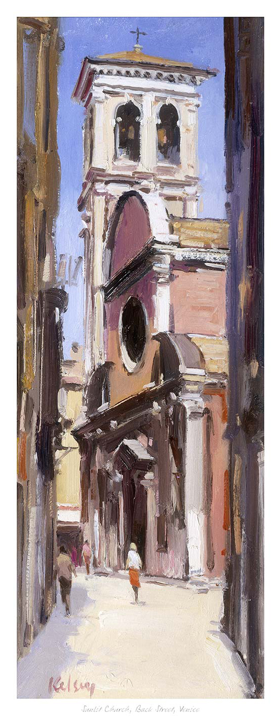
Travel wall art feels most personal when it recalls the experience of finding a place, not simply recognising its headline landmark. Sunlit Church, Back Street, Venice leads the eye along a narrow street towards a glowing bell tower and arched entrance. A handful of figures gives the architecture a believable human scale.
Choose travel wall art that creates a route through the image
Place it where people approach
A hallway end, dining-room sightline or wall opposite a doorway lets the painted street perform like an extension of the room. The bright church becomes the destination.
Echo sunlight, not souvenir colour
Warm plaster, aged brass or a single amber textile can connect with the light. Gondola ornaments and repeated Venetian motifs would make the relationship too literal.
Preserve the quieter foreground
Use nearby lighting that reveals the darker street without reflecting across the church. The contrast between shade and sun creates depth.
Because the view is architectural but informal, it can bridge traditional mouldings and cleaner modern furniture. The image does not require an Italian-themed room. Its useful design qualities are direction, warmth and the visual pause provided by the distant facade.
Retain the contrast that makes the street feel sunlit
Robert Kelsey’s light depends on rich colour and a clear transition from shaded foreground to glowing architecture. Colour-managed Giclée reproduction helps preserve that progression and the visible brushwork. Bespoke framing provides a stable edge without closing down the sense of distance.
As travel wall art, Sunlit Church, Back Street, Venice offers the quieter reward of discovery: a back street, a patch of sun and a destination that unfolds gradually rather than announcing itself at once.
Vintage poster prints can bring history and forward motion to a study when they are treated as artwork rather than memorabilia. Spitfire places a stylised fighter aircraft above a faded Union Jack, with a second aircraft in shadow. The strong diagonal movement can energise a desk wall without needing a crowded display.
Balance vintage poster prints with quiet furniture lines
Above a desk
Set the picture slightly above the monitor line and leave room for the aircraft to appear to travel across the wall. Keep cables and tall desk accessories out of that visual route.
Above a low cabinet
Relate the framed width to the furniture below. One model or book stack is enough; a full row of aviation objects would turn the arrangement into a themed exhibit.
Does the room need red, white and blue accessories?
No. The faded flag already establishes that palette. Dark timber, leather, warm grey or muted blue can support the print without repeating every colour literally.
The subject also works on a video-call backdrop if it is offset from the sitter rather than centred behind the head. That placement keeps the aircraft readable and lets the image convey interest without distracting from conversation.
Frame graphic movement without making it heavier
The aircraft outline, shadow form and weathered flag require both crisp edges and controlled softer passages. Colour-managed Giclée production preserves that contrast. A hand-finished frame can then contain the diagonal energy while giving the print the polished finish expected in a working room.
Among vintage poster prints, Spitfire offers a useful mix of graphic strength and aviation history, provided the surrounding study gives its movement room to breathe.
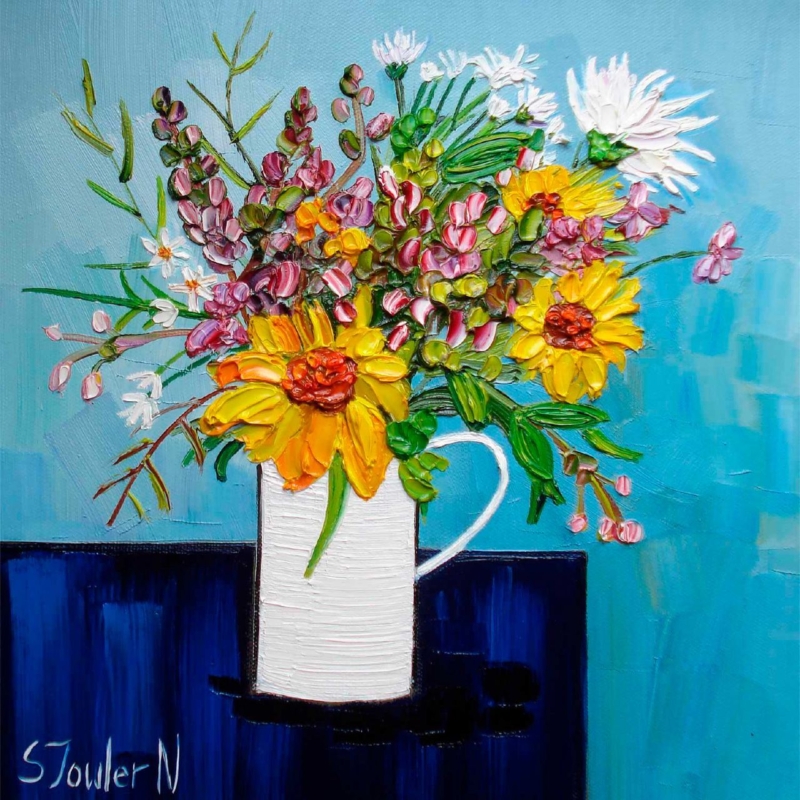
Botanical wall art can make an everyday breakfast corner feel fresher without turning it into a formal dining space. Summer Flowers in a White Jug uses a familiar white jug and summer flowers to create an easy focal point. Its square format is especially useful above a compact table, bench or narrow side unit.
Keep botanical wall art fresh rather than overly decorative
Choose one flower colour from the print for a napkin, bowl or seat pad.
Let the white jug connect with pale ceramics or painted joinery.
Avoid adding floral curtains and patterned tableware at the same time.
Mark the framed square on the wall so it relates to the furniture below.
One concentrated floral image feels more confident than several small botanical references competing around the room.
The available square proportions can bring order to a corner filled with horizontal surfaces. Hang the centre near seated eye level if the work will mainly be seen over breakfast. Where the room opens into a kitchen, check the view from both areas before fixing the final position.
Give summer colour a clean, lasting boundary
Petals, foliage and the pale vessel need clear colour separation if the still life is to feel lively rather than blurred. Colour-managed Giclée production supports those small differences. Bespoke in-house framing gives the composition enough definition to sit comfortably near practical furniture and hard kitchen surfaces.
For a breakfast corner, Summer Flowers in a White Jug shows how botanical wall art can introduce season, warmth and personality while the wider room remains simple and useful.
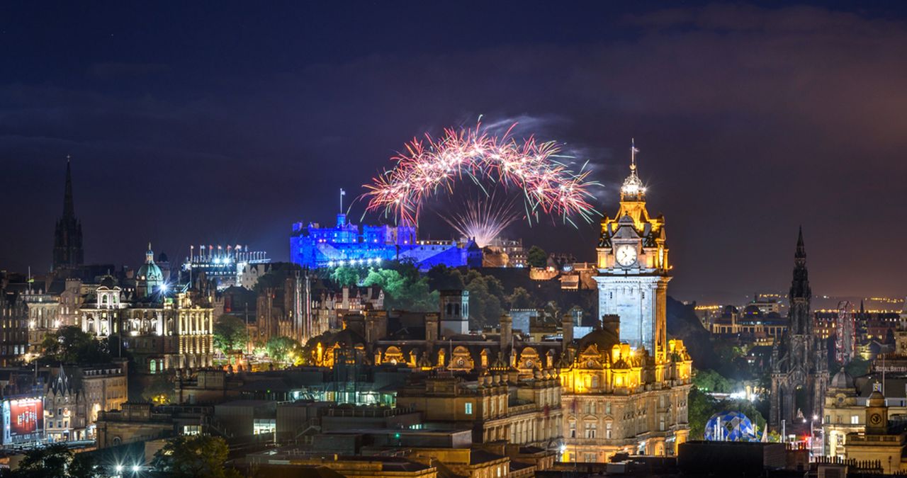
Edinburgh wall art can capture more than a landmark. Fireworks display marks the end of the Edinburgh Fringe and International Festival records the festival-closing fireworks above an illuminated city, with Edinburgh Castle anchoring the night skyline. It suits a dining or entertaining space where the artwork should feel celebratory, yet the architecture still needs to read clearly.
Use Edinburgh wall art to create an evening focal point
Room decision
Why it matters
Choose a wall away from direct glare
Reflections can obscure the castle and smaller city lights.
Use warm, indirect lamps
They support the amber skyline without competing with the fireworks.
Leave a clear border around the frame
Dark photography needs separation from nearby screens and shelving.
A night image can work on a pale wall because its dark field creates a strong edge. On navy or charcoal paint, a mount or contrasting frame becomes more important. It stops the sky from disappearing into the room and preserves the photograph as a distinct window onto the city.
Keep other Edinburgh references restrained. One recognisable city image carries more conviction than a collection of souvenir motifs. The fireworks already supply movement, colour and occasion, while the castle provides a steady visual base.
Protect detail in the sky and city below
The photograph depends on a wide tonal range, from near-black sky to bright bursts and small illuminated windows. Colour-managed Giclée production helps retain those steps instead of turning the skyline into a solid silhouette. A hand-finished frame then gives the busy light display a disciplined edge.
As Edinburgh wall art, Fireworks display marks the end of the Edinburgh Fringe and International Festival brings place, celebration and architectural presence together in one focused image that can still reward a closer look after the room lights come on.
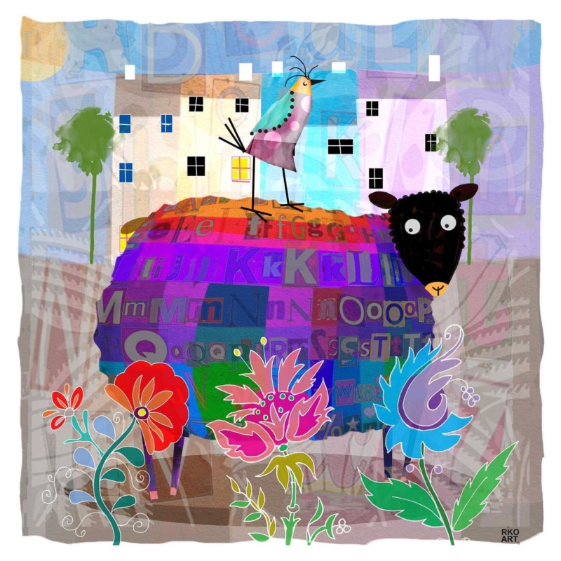
colourful wall art for a child’s homework corner can make a small study area feel like part of the room rather than a desk placed wherever space was available. Alphie Baa by Rikki O’Neill brings together a cheerful sheep, layered letters, flowers, and bright colour. Those details connect naturally with early learning, yet the lively illustration has enough personality to remain enjoyable when worksheets and school routines change.
What colourful wall art for a child’s homework corner can add
A homework corner needs to be practical first. The chair should fit, the light should be comfortable, and pencils or books need somewhere to go. Once those basics are settled, one framed picture can give the area identity. It tells a child that this is a place prepared for them, not an improvised spillover from the kitchen table.
In Alphie Baa, letterforms run through the sheep’s richly coloured fleece. They suggest reading and language without turning the picture into an educational chart. The bird, flowers, houses, and wide-eyed animal create small stories to notice between tasks. That imaginative quality is useful because it makes the corner friendly without covering the wall in instructions or motivational slogans.
Plan a simple three-zone homework setup
Working zone: keep the desk surface clear enough for the current book, paper, and device.
Storage zone: use one drawer, caddy, or shelf so spare materials can leave the work surface quickly.
Visual zone: hang one framed artwork where it can be enjoyed without competing with timetables and reminders.
Separating those jobs reduces visual noise. If notices are needed, place them on a small board beside the desk rather than around the picture. The artwork then remains a positive constant while school information changes. It also makes the setup easier to tidy at the end of the day.
Place the square format with care
The square print size can work well above a narrow desk or on the adjacent wall. It does not need to be centred on the whole room. Instead, relate it to the desk and chair as one small composition. Leave space below for a task light, but avoid hanging it so high that a seated child sees only the underside of the frame.
Make a paper template using the finished frame dimensions and view it from both sitting and standing height. Check that the position is clear of shelving, opening doors, and the path of a rising chair. Secure fixings are essential in a child’s room or family study area, particularly where the wall receives regular bumps.
Use colour to organise rather than overwhelm
The illustration already contains violet, red, blue, green, turquoise, and warm orange. There is no need to repeat them all. Choose one colour for a pencil pot or storage box, then keep the larger desk and wall surfaces calmer. This gives the print presence while helping books and supplies remain easy to find.
A simple frame can contain the energy. A pale timber may keep the result light and friendly, while a slim darker option can define the irregular picture edge and strong black details. The best choice should also relate to the desk, floor, and door finishes so the corner belongs to the wider room.
Choose art that is not tied to one school year
Alphabet posters and age-specific learning aids have a useful but short life. A characterful artwork can last longer because its appeal is visual and imaginative. The letters in the sheep create an early connection to learning, while the humour, collage effect, and confident colour can still suit an older child’s creative corner.
First 4 Frames produces colour-managed Giclée prints and completes professional framing in-house at its Falkirk workshop. The hand-finished presentation turns a playful image into a durable part of the room and means it arrives ready to hang rather than becoming another unfinished decorating task.
Useful colourful wall art for a child’s homework corner should welcome a child to the desk without distracting from the work. View the framed Alphie Baa print for a compact, story-rich focal point that brings learning, humour, and colour into better balance.
wall art for a colour-blocked interior needs to connect confident areas of colour without making the room feel like a collection of separate statements. Blue Chair by Emily Little offers a useful model. Its orange, ochre, teal, and pale blue shapes overlap within a recognisable interior, so the image feels energetic yet held together. It can give a bold room one focal point that explains the palette rather than merely adding another colour.
Why wall art for a colour-blocked interior needs a bridge
Colour blocking is most successful when each area feels intentional. A teal chair, rust-coloured curtain, blue cabinet, and warm painted wall can all look good alone. Together, however, they may seem unrelated. Artwork can act as the bridge because one composition can contain warm and cool notes while also introducing a clear rhythm of shapes.
Blue Chair is especially well suited to that role. The chair gives the eye an identifiable starting point, while the surrounding planes suggest windows, curtains, furniture, and changing light. That balance between representation and abstraction makes the picture easy to live with. It has enough subject to feel welcoming and enough visual structure to support a design-led room.
Build the room around three levels of colour
Colour role
How to use it
What to avoid
Foundation
Keep the largest wall or floor area relatively quiet
Giving every surface equal intensity
Anchor
Choose one substantial teal, blue, rust, or timber element
Scattering many small accents around the room
Echo
Repeat one picture tone in a cushion, lamp, or ceramic
Matching every colour in the artwork exactly
The print should not become a shopping list for accessories. Choose one dominant connection and perhaps one quieter echo. For example, a teal armchair could relate to the chair and cooler passages in the image, while a small rust cushion picks up a warm note. The remaining surfaces can stay calm. This gives the artwork room to carry the more complex colour relationships.
Use the vertical format to solve a narrower wall
The available print proportions are vertical, which makes the piece useful beside a doorway, at the end of a short dining wall, or above a compact side table. Measure the solid wall area rather than the whole elevation. The frame needs a clear margin on both sides so that the energetic composition does not feel squeezed.
Check the view from the main seat as well as from the entrance. From a distance, the broad orange and teal forms should read first. At closer range, the layered marks and interior details become more apparent. That change rewards repeated viewing and helps the picture work in a room used throughout the day.
Balance daylight and evening light
Strong daylight can make pale walls and brighter colours appear more separate. In the evening, warmer lamps may pull the orange and ochre forward. Test the intended wall at both times. A lamp positioned to wash the wall gently can keep the blues and layered texture visible after dusk, but it should not create a hard reflection across the glazing.
A mount can provide a quiet interval between the image and the room. A slim dark moulding may sharpen the geometry, while a warm timber can connect the ochre passages to furniture. Avoid choosing the frame from a tiny colour sample alone. Compare it with the actual print, the wall, and the room’s permanent finishes.
Let craftsmanship steady the colour
Artwork with layered colour depends on controlled reproduction. First 4 Frames uses colour-managed Giclée production and completes bespoke framing by hand at its Falkirk workshop. This in-house process supports the shifts between transparent-looking passages, stronger blocks, and smaller marks while giving the finished piece a polished, ready-to-hang presence.
Good wall art for a colour-blocked interior should make strong choices feel connected, not tame them. View the framed Blue Chair print for a vertical focal point that can unite warm and cool colour while keeping a confident room balanced.
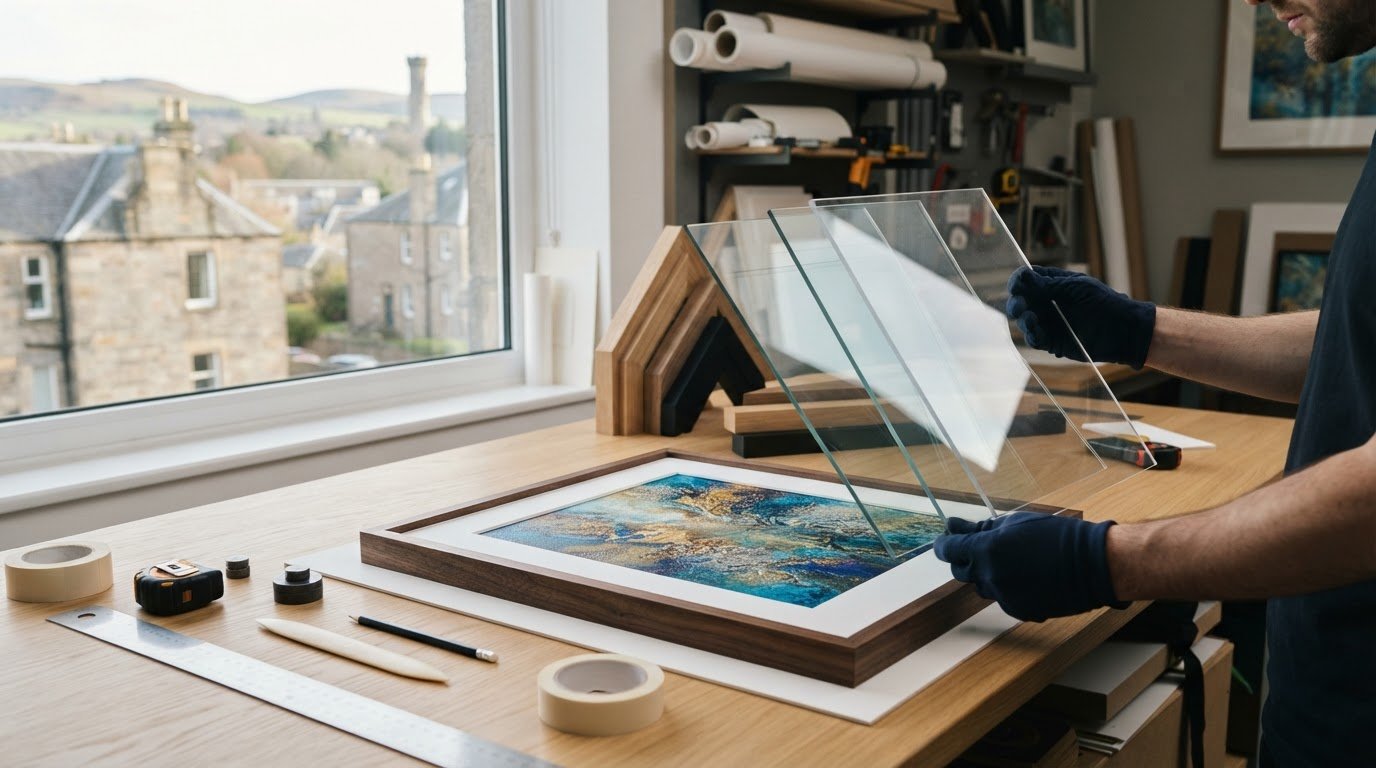
What if your frame can stay, but its glazing needs to change? If you’re asking, “can I get my existing frame re-glazed with UV glass”, the answer may be yes. A framer first needs to check whether the frame can safely accommodate the new glazing and whether it is suitable for the artwork.
It makes sense to check before replacing a frame you already love. UV protection varies between glazing options, and filtering UV light is not the same as reducing reflections or improving clarity. First4Frames Gallery specifies 2mm float glass for its framing, but standard float glass should not be mistaken for UV-protective glazing. Whether First4Frames Gallery offers UV-glass reglazing is not confirmed, so check directly before making plans.
This guide explains what a framer needs to assess, what to ask about UV performance, and how glass and acrylic differ. You’ll also learn when bespoke reframing may be a better fit, so you can make an informed choice for your artwork.
Key Takeaways
Wondering “can I get my existing frame re-glazed with UV glass”? A framer needs to assess the frame and artwork before confirming whether they’re suitable.
Compare glazing by its documented UV specification, clarity, reflections and handling needs. Don’t rely on the label “UV glass” alone.
Photograph your frame and describe the artwork, then ask about glazing availability, fit and whether the mount needs review.
If the frame is unsuitable, bespoke picture framing may provide a better fit, with each frame individually crafted for the artwork.
Can an Existing Picture Frame Be Re-Glazed with UV Glass?
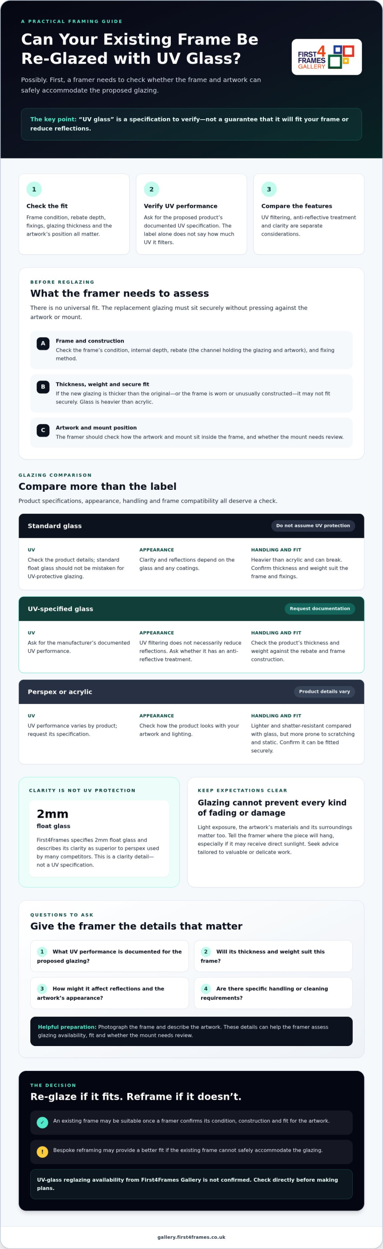
Yes, an existing frame may be suitable for UV-protective glass, but a framer needs to check the frame and artwork before confirming. The glazing must fit securely without pressing against the artwork or mount. The frame’s condition, internal depth, rebate (the channel that holds the glazing and artwork) and fixing method all affect whether it can be reused. There is no universal fit.
If you’re asking, “can I get my existing frame re-glazed with UV glass”, treat UV protection as a specification to verify, not an automatic feature of replacement glass. Ask which product is proposed and request its documented UV performance. This is separate from whether the glass is anti-reflective or offers a clear view. UV filtering can help reduce one source of deterioration, but it cannot prevent every cause of fading or damage.
What needs checking before replacing the glazing?
Ask a framer to inspect the frame, rebate depth, fixings and existing glazing. They should also check how the artwork and mount sit inside the frame. If the replacement glazing is thicker than the original, or the frame is worn or unusually constructed, it may not fit securely. An assessment can establish whether reglazing is practical or bespoke reframing would be more suitable.
What does UV-protective glass mean for framed art?
The term “UV glass” alone does not tell you how much UV the product filters. Check the manufacturer’s documented specification and ask the framer to explain what it means for your artwork. A picture frame brings together several components, including protective glazing, but glazing cannot preserve artwork on its own. Light exposure, the artwork’s materials and its surroundings matter too.
UV filtering and anti-reflective treatment are different features. One concerns UV performance, while the other reduces reflections. Ordinary glass clarity is another consideration. First4Frames specifies 2mm float glass and describes its clarity as superior to perspex used by many competitors, but this is not a claim of UV protection. Its available information confirms bespoke framing, not UV-glass reglazing, so check availability directly.
UV Glass, Standard Glass, and Perspex: What Should You Compare?
The label “UV glass” is not enough to judge whether glazing suits your artwork or frame. Compare the documented UV specification alongside appearance, handling and fit. UV filtering, anti-reflective treatment and glass clarity are separate considerations.
Glazing
UV specification
Clarity and reflections
Handling and compatibility
Standard glass
Check the product details. Don’t assume it has a UV-protective specification.
Appearance and reflections depend on the glass and any coatings.
Heavier than acrylic and can break. Confirm that its thickness and weight suit the frame and fixings.
UV-specified glass
Ask for the manufacturer’s documented UV performance.
UV filtering does not necessarily reduce reflections. Ask whether the glazing has an anti-reflective treatment.
Check the chosen product’s thickness and weight against the frame’s rebate and construction.
Perspex or acrylic
UV performance varies by product, so request its specification.
Check the product’s appearance against your artwork and lighting.
Lighter and shatter-resistant compared with glass, but more prone to scratching and static. Confirm it can be fitted securely.
First4Frames specifies 2mm float glass and describes it as clearer than perspex used by many competitors. This detail concerns clarity, not UV protection, and should not be treated as a UV specification.
Which glazing questions should you ask a framer?
Ask what UV performance is documented for the proposed glazing, whether its thickness and weight suit your frame, and how it may affect reflections and the artwork’s appearance. Check any handling or cleaning requirements as well. If you’re considering whether can I get my existing frame re-glazed with UV glass is practical, these details will help the framer assess your specific frame.
Does UV glass protect artwork from all fading?
No glazing can prevent every kind of fading or damage. Tell the framer where the piece will hang, particularly if it may receive direct sunlight, and seek advice tailored to valuable or delicate work. If reframing is a better fit, you can browse framed artwork for inspiration.
How to Decide Whether to Re-Glaze or Reframe Your Artwork
A careful assessment helps protect both the artwork and the frame. Before approving new glazing, give a framer enough information to check the frame’s condition, construction and fit.
Photograph the frame. Share clear images of the front, back, corners and fixings. Include a side view so the framer can see the frame’s depth.
Describe the artwork. Explain what it is made from, whether it has a mount and where it is displayed. Mention any concerns about its condition or sensitivity.
Ask for an assessment. Confirm whether the requested glazing is available, whether it will fit securely and what handling it needs. Ask whether removing and refitting the artwork could affect the mount or frame construction.
Agree the next step. Proceed with reglazing only after a professional confirms that the frame can safely accommodate the chosen material.
When might keeping the existing frame make sense?
Reusing a frame may be practical if it is in good condition and the framer confirms that the replacement glazing fits the rebate and fixings. Even then, changing the glazing means taking the frame apart. Ask whether removing and refitting the artwork could affect it or the mount. The answer depends on the individual frame, so don’t assume it will be a straightforward swap.
When should you consider bespoke reframing?
If the frame cannot safely hold your preferred glazing, a new frame made for the artwork may be more suitable. First4Frames offers bespoke picture framing, with each frame individually crafted for the order using quality materials. Its available information does not confirm whether it accepts reglazing jobs, so check service availability before making arrangements.
Your Next Step: Get the Right Framing Advice for Your Artwork
Before authorising work, ask a framer to confirm the UV specification, check that the glazing fits your frame and establish whether it is suitable for the artwork. Preparing clear details will help them assess your options.
What information should you prepare for a framing enquiry?
Gather these details before speaking to a framer:
Measurements: Record the outside frame dimensions and, if accessible, the artwork and rebate dimensions.
Photographs: Take clear pictures of the front, back and edges, including any visible damage.
Artwork and glazing: Describe the artwork, current glazing, display location and the UV-protection outcome you want. If you have a digital photograph, ask about print and frame options. First4Frames sells Giclée fine art prints that customers can pair with a custom frame.
First4Frames offers bespoke framing, but whether it provides UV-glass reglazing is not confirmed. If a new piece better suits your needs, explore its selection of fine art prints and ready-to-hang framed art, with a choice of frames. You can also consider bespoke framed art for your home or commercial space. Browse the framed art gallery for inspiration.
Choose the Right Next Step for Your Artwork
The answer to “can I get my existing frame re-glazed with UV glass” depends on the frame’s construction, the glazing available and what suits the artwork. Before authorising a change, ask a framer to confirm the UV specification, check the frame’s fit and consider how the artwork and mount will sit behind the replacement glazing.
Clear details make that conversation easier. Share the frame’s measurements and photographs, describe the artwork and its display location, and explain what you want UV protection to achieve. First4Frames specifies 2mm float glass for its clarity compared with perspex, but this is not a UV-protection claim. If a new frame is a better solution, First4Frames offers bespoke picture framing, with each frame individually crafted for the order.
Looking for a fresh piece instead? Explore framed art in the First4Frames Gallery for inspiration. Ask a framer to assess your existing frame, or browse the gallery to find artwork that you can pair with a frame.
Frequently Asked Questions
Can I replace the glass in my existing picture frame with UV glass?
Possibly, but a framer needs to inspect the frame and confirm that the required glazing is available. The frame’s depth, condition and fixings must suit the replacement, and the artwork must sit safely behind it. If you’re asking, “can I get my existing frame re-glazed with UV glass”, request the product’s documented UV specification and a fit assessment before approving any work.
Will UV glass fit any existing picture frame?
No, there is no universal fit. A framer needs to check the frame’s depth and rebate, its condition, and whether the fixings can hold the new glazing securely. They should also make sure the artwork and mount have enough clearance and will not press against the glass. The answer depends on the specific frame and glazing, so arrange an assessment before choosing a replacement.
Does UV glass stop artwork from fading completely?
No. UV-filtering glazing can help reduce exposure to UV radiation, but it cannot prevent every cause of fading or damage. Other light and environmental conditions matter too, including display location and direct sunlight. Ask a framer how the proposed glazing’s documented specification relates to your artwork and where it will hang. For valuable or delicate work, seek advice tailored to the piece.
Is UV glass better than perspex for picture framing?
Neither is automatically better for every artwork or frame. Compare the specific product’s documented UV performance, appearance, thickness and handling needs. Glass is generally more scratch-resistant but can break. Acrylic, often called perspex, is lighter and shatter-resistant but can scratch and attract dust through static. First4Frames specifies 2mm float glass and highlights its clarity compared with perspex, but this is not a UV-protection claim.
Can a picture framer reglaze a frame without replacing the artwork or mount?
It may be possible, but the framer should inspect the specific frame construction first. They need to consider how the glazing is held in place and whether the artwork and mount can be removed and refitted safely. The mount may need review if the replacement affects the available clearance. Don’t assume the artwork can remain untouched or that the mount will suit the new glazing.
Art for a room with blue walls does not need to repeat blue as its dominant note. View from the Harbour places orange, yellow, red, green and violet boats across lively turquoise water. Those warm hulls create contrast, while the harbour subject still connects naturally with the wall colour.
Choose art for a room with blue walls by temperature
Start by identifying the paint. A cool navy will make the yellow and orange boats appear especially bright. A softer petrol or teal wall will connect more closely to the water. In both cases, the frame needs to create a clear edge so turquoise passages do not merge into the background.
Echo one warm hull colour in a cushion, vase or chair fabric.
Use natural timber if the room needs warmth beyond the artwork.
Keep other coastal objects minimal; the boats already tell the story.
Test the square outline above the furniture before choosing the largest size.
The dense cluster of boats rewards a position with comfortable viewing distance. Above a dining bench, sideboard or broad sofa, the square composition can anchor the furniture while its energetic marks prevent a dark blue scheme from feeling static.
Can this work in a small blue room?
Yes, if the frame has breathing room and the remaining accessories stay edited. Select a size related to the furniture below rather than trying to fill the entire wall.
Keep every boat distinct against lively water
Closely placed complementary colours can turn muddy if reproduction is poorly controlled. Colour-managed Giclée production preserves the separation between hulls, masts and water. Bespoke framing gives the busy harbour a calm perimeter and a polished, ready-to-hang finish.
As art for a room with blue walls, View from the Harbour adds the warmth and motion the paint may lack, creating contrast without breaking the room’s coastal connection.