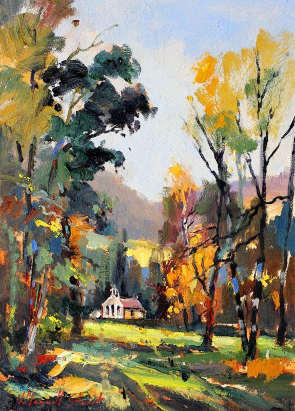
art for limestone flooring becomes more useful when the picture solves a real placement question. Autumn Light offers a clear starting point because its vertical format and warm seasonal idea can counter a broad, cool floor without covering the stone or forcing the whole room into an autumn palette.
Balance art for limestone flooring from the ground up
Limestone usually contributes pale tone, quiet variation and a strong horizontal plane. A portrait artwork answers that structure by drawing the eye upwards. Mark both available print sizes—230 x 320 mm and 400 x 550 mm—then add allowances for mount and moulding.
Use warmth selectively
Repeat one russet, amber or soft brown in a textile or ceramic. Leave other surfaces quieter so the artwork remains the source of warmth.
Keep the stone visible
Avoid several heavy rugs and dark objects merely to correct a cool floor. Texture and one framed focal point can be enough.
Check the picture in the light that reaches the room. Limestone can bounce daylight upwards, while evening lamps may introduce warm glare. View the proposed glazing from seated and standing positions before finalising the hanging point.
- Photograph the room in morning and evening light.
- Template the complete frame above the main furniture group.
- Choose one colour connection instead of a fully matched palette.
- Keep the lower wall clear enough for floor and picture to read together.
Separate warm colour from pale stone
Subtle seasonal colour needs accurate relationships, not simply extra saturation. Colour-managed Giclée production helps preserve that balance. A hand-finished frame creates a measured transition between the artwork, wall and limestone below.
For natural context on the changing colour that inspires autumn imagery, read the Woodland Trust’s guide to autumn leaf colour. You can also browse the Joseph Maxwell Stuart collection or view the exact framed product.
Art for limestone flooring should add warmth while respecting the material already in the room. Autumn Light offers upward movement and seasonal colour, allowing the floor to remain calm rather than cold.