Posted on

Art for Plum Walls Feels More Balanced With Mossy Red

Image of Mossy Red by Noel Fenech Photography

Finding the right art for plum walls is usually about contrast, not matching. Mossy Red shows why, combining rock texture, mossy greens, calm water, and warmer tones in a way that gives a richer wall colour more life rather than making it feel darker still.

art for plum walls - Mossy Red

Why Mossy Red works as art for plum walls

Plum walls can look elegant and cocooning, but they also need artwork that prevents the scheme from becoming too enclosed. Mossy Red helps because it introduces surface texture and natural variation. The red-brown rock notes sit comfortably with a deeper palette, while the green moss and open water stop the room from feeling visually flat. That balance works well in dining rooms, lounges, and more atmospheric bedrooms.

  • It gives darker paintwork contrast without clashing.
  • It brings natural texture that keeps a richer room feeling alive.
  • It suits spaces where warmth matters but heaviness does not.

Because First 4 Frames handles the production and framing in-house, the final piece benefits from bespoke workmanship and careful colour control. That is especially useful when artwork is being chosen for a stronger wall colour, because subtle tonal balance is what keeps the result sophisticated rather than overworked.

For more on the photographer, visit Noel Fenech. You can also browse more work by Noel Fenech Photography and view the exact framed product here.

If you are comparing options for art for plum walls, Mossy Red is a very good way to add warmth, contrast, and natural depth to a richer interior.

Posted on

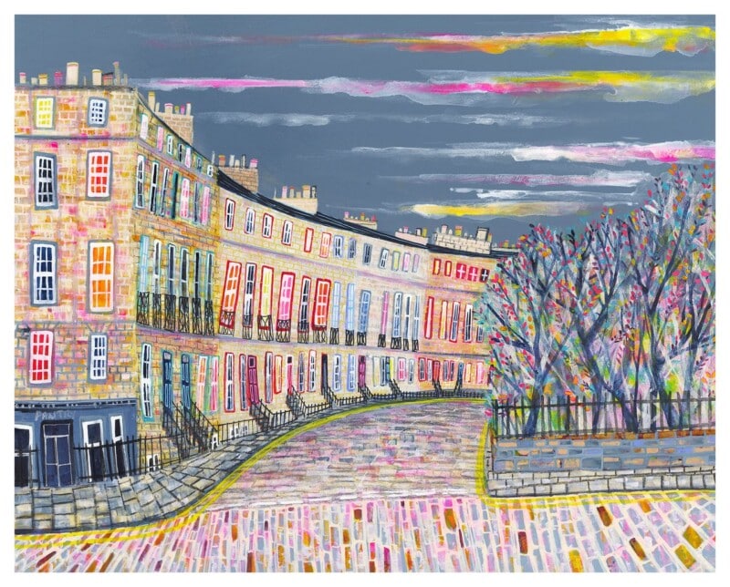
Art for Plum Walls, Why Royal Circus Feels Balanced and Lively

Image of Royal Circus by Nikki Monaghan

Deeper paint colours can look beautiful, but they ask more of the artwork around them. Royal Circus is a compelling choice for art for plum walls because it introduces movement and lightness without losing the richness that makes plum so attractive in the first place.

Why this piece suits the space

A darker wall often needs a framed piece that can stand clear of it. This print does that by combining structure, atmosphere, and enough tonal variation to stop the room from feeling flat or overly enclosed.

  • It gives plum walls a brighter counterpoint without becoming sugary.
  • The architectural subject helps a room feel tailored rather than theme-led.
  • It suits studies, sitting rooms, and hallways that already lean a little moodier.

Where it works best

This kind of pairing works well when you want contrast with confidence. Instead of fighting a dark wall, Royal Circus uses it as a backdrop. The artwork gains definition, and the paint colour feels more deliberate and sophisticated as a result.

Why the framed finish matters

At First 4 Frames, the piece is finished in-house with bespoke framing, colour-managed Giclee printing, and hand-finished craftsmanship. That refined presentation is important when the wall colour is strong, because weaker finishes can look thin very quickly.

This artwork is by Nikki Monaghan, and you can view the exact framed product here.

If you are looking for art for plum walls, Royal Circus is a strong way to keep the room rich, balanced, and full of character.

Posted on

Choosing Art for Plum Walls, Why Echoes of Autumn, Kenmore Feels So Balanced

Image of Echoes of Autumn, Kenmore by Colin Robertson

Choosing art for plum walls is often about balance. The paint colour already brings depth and personality, so the artwork has to add interest without making the room feel heavier still. Echoes of Autumn, Kenmore works beautifully because it carries warmth and atmosphere while keeping the whole scheme composed.

Why deeper wall colours need thoughtful contrast

Plum can feel elegant, cocooning, and full of character. It can also become too visually dense if every element leans dark or overly formal. This piece helps by introducing tonal variation and a gentler sense of movement, which makes the room feel richer rather than heavier.

  • It suits bedrooms, dining rooms, and moodier sitting rooms.
  • It works well with brass, walnut, and soft upholstery.
  • It gives a darker wall a more settled focal point.

Why this landscape sits so comfortably with plum

There is enough warmth in the artwork to connect naturally with the wall colour, but it also has light and space within it. That balance is what stops the overall room from feeling closed in. Instead, it feels layered, thoughtful, and easier to live with.

Why the in-house finish matters

First 4 Frames completes every piece in-house in Falkirk using bespoke framing, colour-managed Giclée printing, and hand-finished craftsmanship. In a colour-led room, those details matter because the framed work needs enough refinement to sit confidently against a stronger backdrop.

This artwork is by Colin Robertson, and you can view the exact framed product here.

If you need art for plum walls that feels warm, balanced, and confidently put together, this piece is a very smart choice.