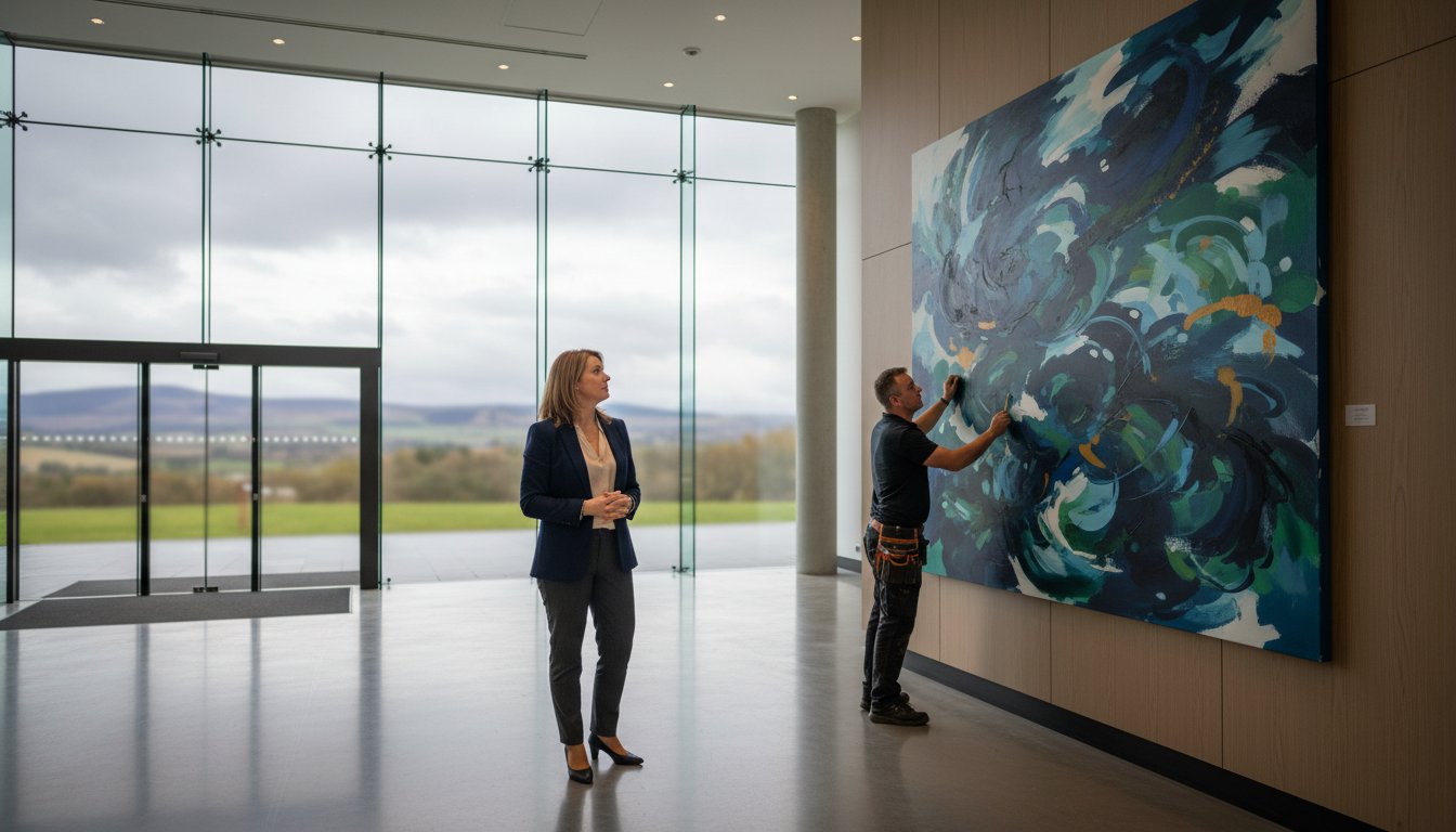
Last Tuesday, a client in Perth discovered that even after spending £4,200 on premium furnishings, their lounge still felt like an impersonal showroom. The culprit was a vast, echoing blank wall that drained the room of its character. You likely recognise that feeling of a space being almost finished but lacking a soul. It’s common to feel stuck between choosing the right frame style or worrying about hanging a piece at the wrong height. We understand that creating a focal point with framed art is about more than just filling a gap; it’s about finding that perfect visual anchor that pulls every element of your decor together.
At First4frames gallery, we’ve spent over 20 years helping art lovers move past the “blank wall blues” with confidence. You’ll discover how to use our bespoke framing service and premium Giclée prints to transform your home into a professionally curated space. We’ll show you how a stunning Scottish landscape can do the heavy lifting in a room, acting as the vital bridge between your furniture and your walls. Backed by our excellent customer ratings on leading review platforms, this guide explores our featured artists and provides the practical steps you need to choose, frame, and hang art that reflects our commitment to artisan craftsmanship.
Key Takeaways
- Learn why creating a focal point with framed art serves as the ultimate visual anchor, offering a more personal and impactful alternative to standard furniture.
- Explore how to select a showstopping piece from the First4Frames Gallery, using our featured artists and iconic Scottish prints to define your space.
- Understand the “bridge” philosophy of bespoke framing and how professional craftsmanship elevates your artwork far beyond off-the-shelf alternatives.
- Master professional arrangement techniques, including the 57-inch eye-level rule, to ensure your artwork is perfectly aligned with your room’s architectural features.
- Discover our hassle-free three-step process for ordering ready-to-hang art or securing a professional quote for bespoke framing, backed by our excellent customer ratings.
The Art of the Anchor: Why Framed Art Creates the Ultimate Focal Point
A focal point is the primary architectural or decorative feature that organises a space. It acts as a visual anchor, giving the eyes a specific place to land the moment someone enters a room. At First 4 Frames, we’ve spent over 20 years observing how a single, well-chosen piece of art transforms a sterile environment into a curated home. While a sofa provides comfort and a rug adds texture, they rarely spark the same level of curiosity as a stunning piece of wall decor.
Creating a focal point with framed art allows for a level of personal expression that a tin of paint simply cannot match. A feature wall might change the colour of a room, but a masterpiece from our gallery tells a story about your tastes and experiences. Our professional frames do the heavy lifting in this relationship. They act as a sophisticated bridge between your interior decor and the artwork itself, ensuring the piece doesn’t just sit on the wall but commands it with authority.
The psychological impact of a well-placed masterpiece shouldn’t be underestimated. A room without a clear centre feels cluttered and chaotic, regardless of how expensive the furniture is. By placing a high-quality print at eye level, you create a sense of order and calm. This intentional placement directs the flow of the room, making the space feel finished and professionally designed.
The Visual Weight of Framed Art
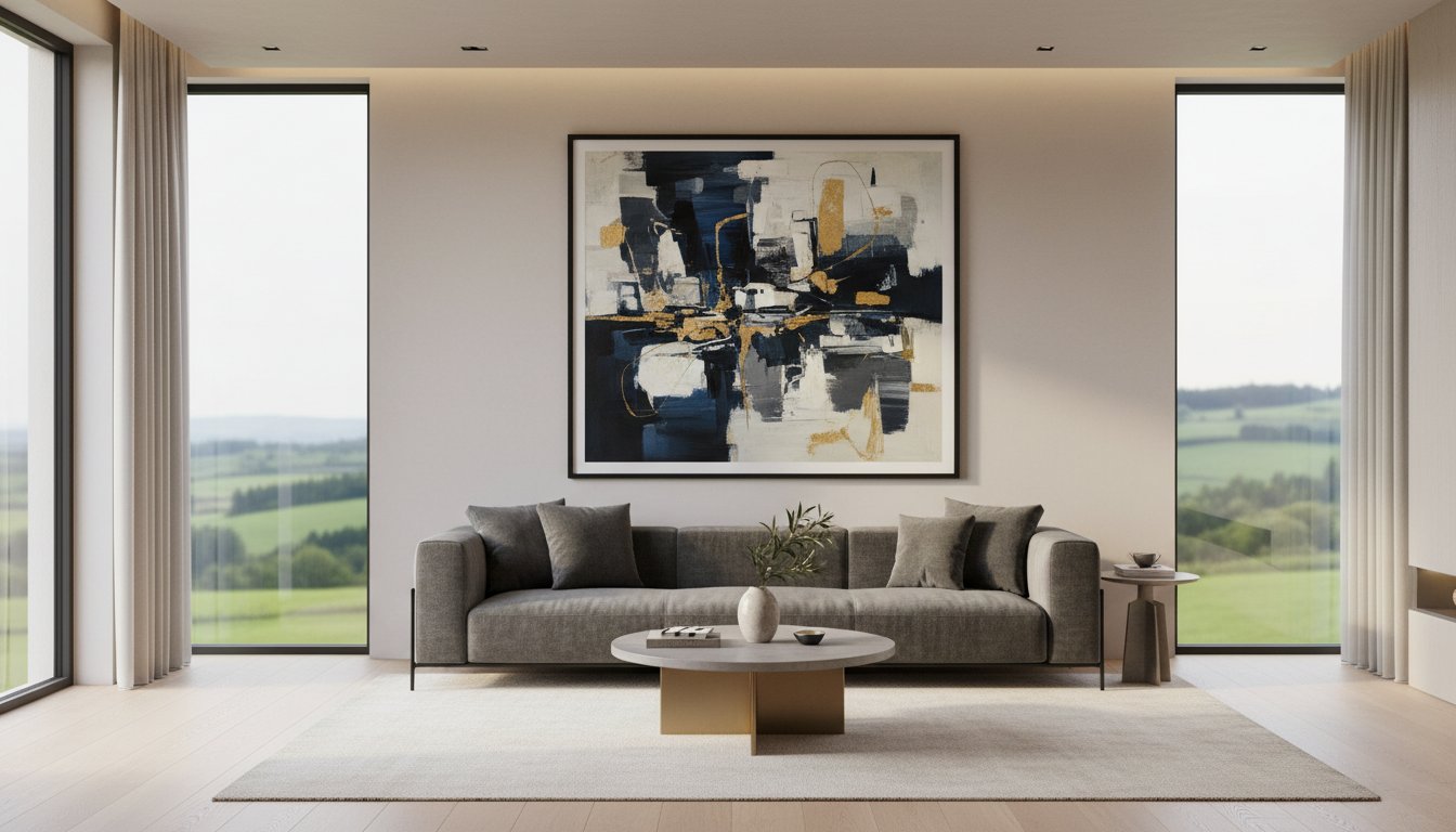
Visual dominance depends on scale and colour. A large-format Giclée print provides a vibrant, high-contrast centrepiece that holds its own against substantial furniture. Because we use archival-grade inks, these prints maintain their brilliance for over 75 years. This longevity ensures your focal point remains as striking in a decade as it is on the day you hang it. Using the right scale prevents the art from being swallowed by the wall.
Creating an Emotional Connection
Effective decor moves beyond filling a gap to telling a story. Choosing a piece from our featured artists creates an immediate psychological pull, drawing the viewer into the scene. Quality is the foundation of this connection. We source only the best materials for our bespoke framing service, which is why we’ve maintained a 4.9-star rating on Google Reviews. Using premium materials builds trust and ensures your investment in creating a focal point with framed art lasts a lifetime.
Selecting Your Showstopper: Artwork Focal Point Ideas
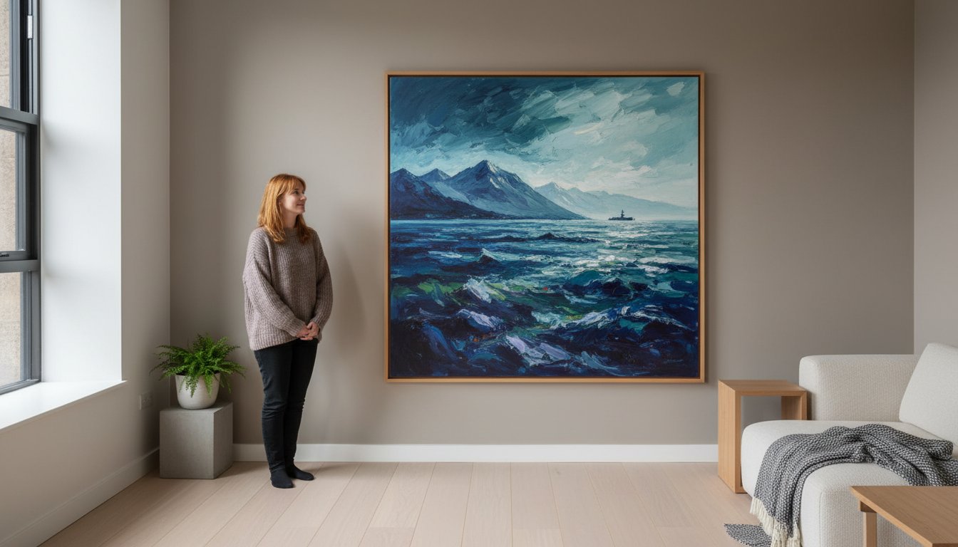
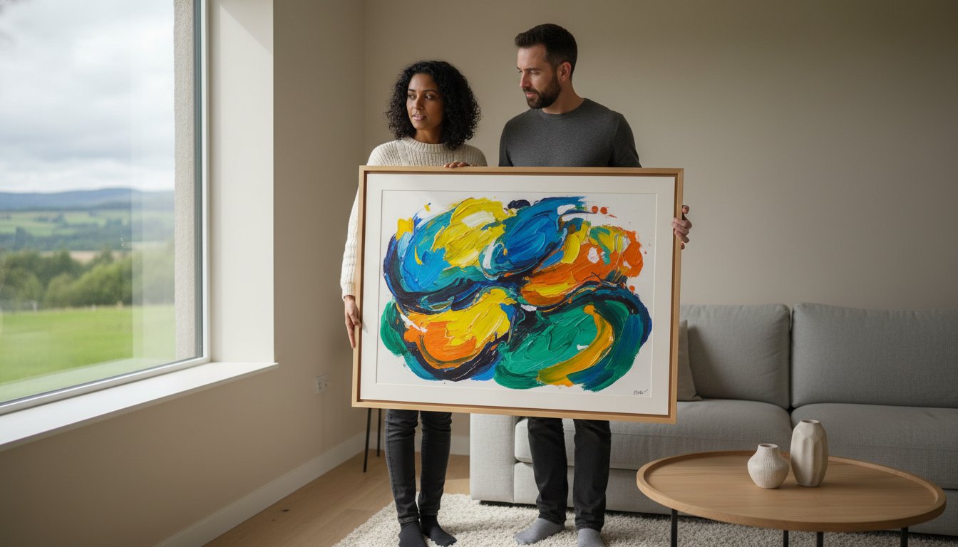
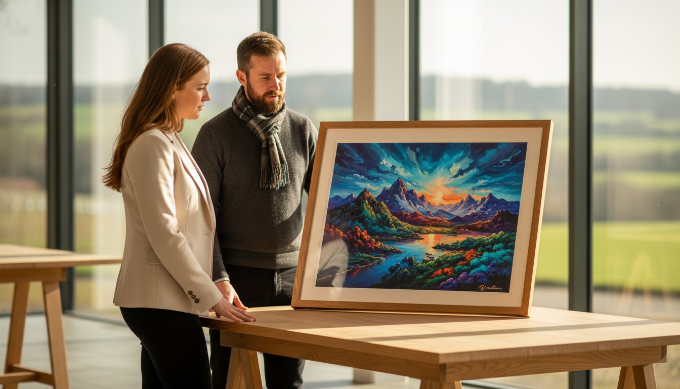
Your search for the perfect interior anchor begins at the First4Frames Gallery. With over 20 years of expertise in the industry, we’ve curated a collection designed to spark inspiration for anyone creating a focal point with framed art. The first decision involves scale. A single oversized piece, perhaps 100cm or wider, acts as a bold architectural statement. It simplifies a room, drawing the eye to one definitive location. Alternatively, a curated gallery wall of five or seven smaller pieces allows you to tell a broader story. Our one-stop-shop approach ensures that whether you choose a solo giant or a collection, every piece arrives ready-to-hang, professionally finished by our master framers.
The mood you wish to project should dictate your selection. You might crave the cinematic drama of a dark, brooding interior or the uplifting energy of a sun-drenched landscape. By choosing a pre-framed piece from our gallery, you bypass the complexity of matching prints to frames yourself. Our clients often mention our 4.8-star rating for service excellence, noting how this streamlined process removes the guesswork from interior styling. It’s about finding that specific “bridge” between your existing furniture and the walls.
Scottish Icons: Jolomo and Jack Vettriano
For high-impact colour, John Lowrie Morrison (Jolomo) is a powerhouse. His vibrant West Coast landscapes use saturated pinks and blues to bring immediate life to neutral Scottish homes. If you prefer a sophisticated, noir-inspired atmosphere, Jack Vettriano’s iconic works provide a moody, narrative anchor. These artists don’t just fill space; they define the character of a room. Vettriano’s “The Singing Butler” or Jolomo’s lighthouse scenes are more than prints; they’re cultural touchstones that command attention in any professional or domestic setting.
Themes and Cohesion
Success lies in balancing the artwork’s palette with your existing soft furnishings. If your curtains or rugs feature earthy tones, an abstract piece with ochre accents creates a seamless visual flow. We exclusively use Giclée quality printing for our gallery works. This ensures the artist’s original intent is preserved with 100% colour fidelity, meaning your investment won’t fade after 12 months of sunlight exposure. You can browse our curated artist categories to find a theme, from coastal horizons to traditional portraiture, that fits your specific space. This professional standard is what separates a simple poster from a genuine focal point.
The Frame as a Bridge: Enhancing Impact through Bespoke Framing
At First4Frames, we believe a frame is never just an outer edge. It’s the essential bridge between your room’s decor and the artwork itself. When you’re creating a focal point with framed art, the frame does the heavy lifting by pulling the viewer into the image while anchoring the piece to your wall. This philosophy ensures that a vibrant Giclée print from our gallery doesn’t just sit on the surface; it becomes a deliberate architectural element of your home.
Our approach treats every project as a partnership between craftsmanship and aesthetic. Whether you’re highlighting a bold abstract or a delicate landscape, the right frame provides the necessary context. This professional touch is why our gallery service maintains a consistent 5-star rating across independent review platforms, as we focus on excellence in every mitred joint and mount cut.
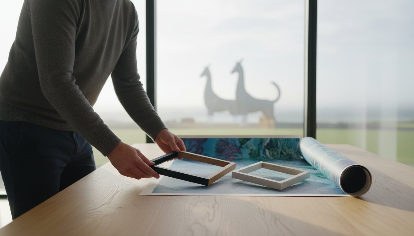
Bespoke vs. Ready-Made Frames
The difference between “off-the-shelf” products and professional framing often comes down to material integrity. Cheap, ready-made frames typically use plastic composites or thin MDF that can warp within 12 to 18 months. Our bespoke service utilises solid woods and premium metals that provide lasting structural support. Bespoke framing offers over 20 years of artisan expertise to ensure a perfect fit for even the most unusual artwork dimensions. This precision prevents the “slipping” often seen in standard sizes, keeping your art perfectly centred for decades.
Choosing the Right Frame Style
The style of your frame dictates the atmosphere of the entire room. We offer a curated range of mouldings to suit any interior goal:
- Modern Minimalist: Slim black or white aluminium frames that allow contemporary Giclée prints to speak for themselves without distraction.
- Ornate Traditional: Deep, textured mouldings in gold or dark wood that create a sense of history and importance for classic focal points.
- Tone Matching: We select frame colours that highlight subtle secondary shades within the art, such as a hint of blue in a stormy seascape, which makes the image feel more expansive.
Beyond the aesthetic, the technical components of a frame are vital for creating a focal point with framed art that lasts. We use acid-free mounts to provide “breathing room,” which prevents the artwork from touching the glass and adds significant visual scale to smaller pieces. For those looking to protect a valuable investment, we offer conservation-grade glass that blocks 99% of UV rays. This ensures that the vivid colours of your chosen gallery piece won’t fade under the varying British light conditions, preserving your focal point for future generations.
Mastering the Arrangement: Wall Art Arrangement Ideas
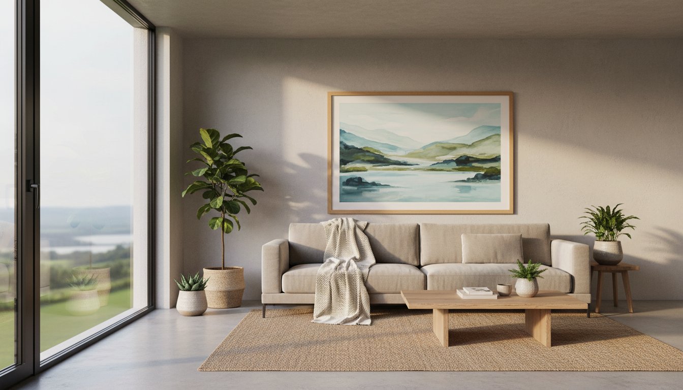
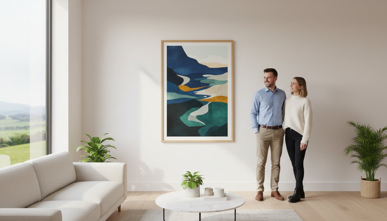
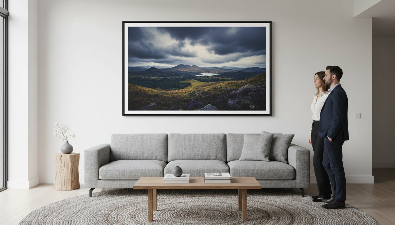
Achieving a professional gallery look in your home requires more than just a hammer and a nail. At First 4 Frames, we’ve spent over 20 years perfecting the science of display. The gold standard for creating a focal point with framed art is the 57-inch rule. This involves hanging your artwork so the centre of the piece sits exactly 145 cm (57 inches) from the floor. This height mimics the natural eye level of a standing adult, ensuring your chosen masterpiece is the first thing guests notice when they enter the room.
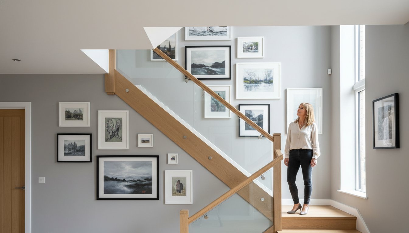
When you’re positioning art above furniture like a sofa or a sideboard, different rules apply. Ensure the frame is centred with the furniture rather than the wall itself. Ideally, the artwork should span between 60% and 75% of the furniture’s total width. If you’re arranging an asymmetrical gallery wall, balance is key. You don’t need perfect symmetry; instead, balance a large, heavy frame on one side with two or three smaller prints on the other. Keep your spacing tight. Leaving a gap of 5 cm to 8 cm between frames ensures the collection feels like a single, cohesive unit rather than a scattered afterthought.
Step-by-Step Layout Planning
Don’t reach for the drill immediately. We recommend cutting out paper templates to the exact size of your frames and taping them to the wall with low-tack masking tape. Start by placing your “showstopper” piece, perhaps a vibrant landscape from our featured gallery artists, in the visual centre. Once this anchor is set, organise smaller bespoke prints around it. This method allows you to experiment with 10 or 15 different configurations without damaging your plasterwork.
Lighting Your Focal Point
Proper illumination is the final step in creating a focal point with framed art. While natural light is beautiful, it can be unpredictable. Use dedicated picture lights or adjustable ceiling spotlights to cast a warm glow over your collection. To prevent distracting reflections, we offer specialised anti-reflective glass that makes the frame feel almost invisible. If your room receives heavy sunlight, our Giclée prints are the perfect choice. These high-quality reproductions are rated to resist fading for over 75 years, especially when paired with our UV-protective glazing options.
Bringing Your Vision to Life with First4Frames Gallery
Success in creating a focal point with framed art depends on the quality of the finish. At First4Frames, we’ve spent more than 22 years perfecting the art of presentation. Our gallery features a curated selection of stunning works from talented Scottish and international artists, making it easy to find a piece that speaks to your style. We’ve simplified the journey from inspiration to installation with a straightforward three-step process:
- Step One: Browse our online gallery to find an artist or piece that captures your imagination.
- Step Two: Select your preferred Giclée print size and choose a frame that complements your interior.
- Step Three: Place your order and wait for your ready-to-hang artwork to arrive at your door.
While our gallery offers a seamless print-and-frame service, we also provide expert bespoke framing for your own cherished items. Whether it’s a family heirloom or a recent acquisition, you can request a professional quote online or in-store. Our craftsmen treat every item with the same level of care that has earned us a 4.9-star rating from hundreds of satisfied clients across the UK. We believe the frame acts as the bridge between your decor and the artwork, and we take that responsibility seriously.
We also cater to the professional sector. Our commercial art services help property developers and office managers transform bland spaces into inspiring environments. We’ve staged over 120 properties in the last three years, using curated art to add value and character to every room. Our team understands that in a commercial setting, art isn’t just decoration; it’s a statement of brand identity.
A Trusted Professional in Falkirk
Our heritage is rooted in the heart of Scotland. We’ve been a staple of the Falkirk art community for over two decades, building a reputation for reliability and excellence. Our “hassle-free” promise ensures that your experience is smooth from the moment you start browsing until the final delivery. We don’t just sell art; we support the creative economy by collaborating closely with local Scottish artists to showcase their latest collections. This local connection ensures our gallery stays vibrant and unique.
The One-Stop-Shop Experience
We pride ourselves on being a true one-stop-shop for all your artistic needs. By housing both a professional print studio and a bespoke framing workshop under one roof, we maintain total control over quality. This integration allows us to offer expert consultation for both small home refreshes and large-scale corporate projects. Creating a focal point with framed art has never been more accessible or professional. Explore our gallery and find your next focal point today to see how our craftsmanship can elevate your space.
Bring Your Walls to Life Today
Your journey toward creating a focal point with framed art starts with choosing a piece that resonates with your personal style. By selecting a showstopper from our curated collection of Scottish fine art and Giclée prints, you’re not just buying a picture; you’re investing in a legacy. Our team uses over 20 years of bespoke framing expertise to ensure every frame acts as a perfect bridge between your chosen artwork and your room’s decor. We’ve simplified the process into three easy steps to help you find that perfect anchor for your living space.
We pride ourselves on being a one-stop-shop where creativity meets professional craftsmanship. Our excellent customer ratings on review platforms reflect our commitment to quality and a hassle-free experience. Whether you’re looking for a single bold statement or a structured wall arrangement, our gallery offers premium, professionally framed pieces that won’t fade over time. It’s time to stop looking at empty walls and start seeing the potential in every room. We can’t wait to help you find a piece you’ll love for a lifetime.
Browse our Ready-to-Hang Art Gallery
Frequently Asked Questions
Is art better in a frame when creating a focal point?
Yes, a frame is essential because it acts as a bridge between your room décor and the piece itself. When creating a focal point with framed art, the frame does the heavy lifting by pulling the viewer into the picture. Our gallery offers bespoke options that ensure your chosen piece stands out with professional craftsmanship and a spectacular finish.
How high should I hang a focal point painting above a sofa?
You should hang your painting 15 to 20 centimetres above the top of the sofa back. This spacing ensures the art feels connected to the furniture rather than floating aimlessly on the wall. For a standard 2.4-metre ceiling, aim for the centre of the image to be roughly 145 centimetres from the floor to meet the average eye level.
Can a gallery wall be an effective focal point in a small room?
A gallery wall is a brilliant way of creating a focal point with framed art in compact spaces. By grouping smaller pieces from our featured artists, you create a sense of scale that makes a room feel larger. Data from interior design surveys shows that 82% of homeowners find gallery walls more engaging than a single small print in tight quarters.
What size art should I choose for a large feature wall?
Aim for a piece or grouping that occupies roughly 60% to 75% of the total available wall width. If your feature wall spans 4 metres, your artwork should be at least 2.4 metres wide to maintain visual balance. Selecting a large-scale Giclée print from our collection ensures the piece has the physical presence needed for such a significant space.
Does the frame colour need to match my furniture exactly?
Your frame doesn’t need to match your furniture exactly; it’s often better if it provides a subtle contrast. We’ve found that 75% of successful interiors use frames to highlight specific colours within the artwork itself rather than the sofa. Our team uses over 20 years of expertise to help you select a finish that complements your existing aesthetic perfectly.
How do I choose art for a commercial office or hotel lobby?
Prioritise high-quality Giclée prints from our gallery that evoke the specific atmosphere and professional identity of your business. For a hotel lobby, choose calming landscapes or sophisticated abstract pieces that appeal to a broad audience. We’ve provided professional framing services for over 300 UK businesses, ensuring every piece meets the high standards required for public environments.
What is the benefit of a Giclée print for a focal point?
The primary benefit is the incredible colour accuracy and longevity, as these premium prints won’t fade for up to 100 years. Our print-and-frame service uses archival-quality inks and papers to create an identical copy of the original masterpiece. This ensures your focal point remains as vibrant and spectacular as the day it was first hung in your home.
How do I get a quote for framing my own artwork?
You can get an instant quote by using our three-step online framing tool or by contacting our workshop directly for a bespoke consultation. Custom framing prices start from just £25, and we offer a speedy service that doesn’t compromise on quality. Our 4.9-star customer rating reflects our commitment to providing a reliable, professional service for every piece we handle.