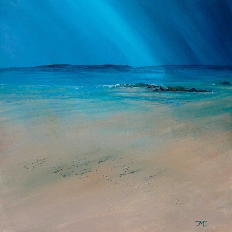
Good landing wall art can make an overlooked staircase area feel much more intentional. On the Rocks works especially well when you want that upper space to feel connected to the rest of the home rather than left undecorated.
Landings are often transitional spaces, but that does not mean they should feel unfinished. On the Rocks helps create a more considered visual pause between rooms, adding personality without overwhelming a narrower wall.
It gives an in-between space a clearer sense of purpose.
It works well where you want character but not visual heaviness.
It helps tie upstairs décor back to the style of the rest of the home.
This kind of piece suits the main wall you see as you reach the top of the stairs, a turning point on the staircase, or a quieter upper hallway that needs a focal point.
Why the framed finish matters
At First 4 Frames, the artwork is completed in-house with colour-managed Giclée printing, bespoke framing, and hand-finished craftsmanship. That extra polish matters in passing spaces, where a clean presentation makes the whole home feel more cared for.
The artwork is by Jill McIntosh, and you can view the exact framed product here.
If you want landing wall art that feels thoughtful, polished, and easy to live with, On the Rocks is a very good option.
The best reading nook wall art should support the mood of the space rather than fight with it. Haven is a lovely option when you want a quiet corner to feel calmer, warmer, and more complete.
A reading nook does not usually need loud colour or a dramatic statement piece. It benefits more from artwork that helps the area feel settled and properly finished, especially when the chair, lamp, and shelving are already doing most of the practical work. Haven has that gentler presence.
It suits corners designed for reading, reflection, and slower evenings.
It adds personality without making a small space feel visually busy.
It works well with soft upholstery, timber shelving, and neutral wall colours.
This kind of piece can work above a reading chair, beside a bookcase, or on the wall you face when you sit down with a book. In each case, the framed presentation helps the area feel intentional rather than improvised.
Why the framed finish matters
At First 4 Frames, every piece is completed in-house in Falkirk with colour-managed Giclée printing, bespoke framing, and hand-finished craftsmanship. That quality-led finish matters in smaller spaces, where every detail is noticed more closely.
The artwork is by Jill McIntosh, and you can view the exact framed product here.
If you want reading nook wall art that feels calm, personal, and professionally finished, Haven is a strong option.
Choosing art for a north-facing room can be surprisingly tricky. Cooler natural light often makes a space feel flatter, so the artwork has to bring life without becoming overpowering. Sparkle in the Rain strikes that balance beautifully, adding movement and colour while still feeling calm enough for everyday living.
Why this piece suits cooler light
North-facing rooms often benefit from artwork that has brightness and depth built into it. This piece has a lively quality that helps the wall feel more awake, yet it does not rely on harsh contrast or loud colour to get there. That makes it useful in rooms where you want a lift rather than a jolt.
It helps a cooler room feel more welcoming and less flat through the day.
It brings visual movement, which can stop a plain wall from feeling static.
It suits spaces where you want colour, but still want the room to feel settled.
Where it works especially well
Sparkle in the Rain would work nicely in a north-facing sitting room, a dining space that lacks direct sun, or a hallway where daylight is limited. In each setting, the framed print can give the room a more considered focal point and stop the décor from feeling purely functional.
Why the framed finish matters
At First 4 Frames, every piece is produced in-house in Falkirk with colour-managed Giclée printing and hand-finished bespoke framing. That level of craftsmanship matters when you are relying on one artwork to lift a room, because the presentation needs to feel polished from both a distance and up close.
The artwork is by Jill McIntosh, and you can view the exact framed product here.
If a north-facing room needs more warmth, character, and presence, Sparkle in the Rain is a very persuasive option.
The right home office wall art can do more than decorate a blank wall. It can help the room feel more focused, more personal, and less like an afterthought. Stranded is a strong choice when you want that balance of calm atmosphere and visual interest in a workspace used every day.
Why this piece works well in a working room
A home office can easily feel too functional if the furniture, storage, and equipment all lean practical. Artwork helps soften that. Stranded brings movement and coastal mood into the room, which can make the space feel more considered without becoming distracting.
It gives a workspace a calmer focal point.
It adds character without creating visual clutter.
It suits offices that need warmth rather than louder colour.
Where to place it for best effect
This artwork would sit comfortably on the wall behind a desk, on a side wall visible during video calls, or in a quieter corner that needs a more finished look. If your office includes timber, soft neutrals, muted blues, or simple shelving, the framed piece can tie the room together with very little effort.
Why the framed finish matters
At First 4 Frames, every piece is completed in-house in Falkirk with bespoke framing, colour-managed Giclée printing, and hand-finished craftsmanship. That extra quality makes a real difference in a room where you spend long hours and notice the details every day.
This artwork is by Jill McIntosh, and you can view the exact framed product here.
If you want home office wall art that brings warmth, atmosphere, and a more polished finish to the room, Stranded is well worth considering.
Some interiors look polished but still feel as if they need a spark. That is often where statement wall art comes in. Storm Force is a strong example of how one framed piece can wake up a neutral room, adding movement, contrast, and atmosphere without changing the whole scheme.
Why a bold seascape works in a restrained interior
Neutral rooms often rely on texture, shape, and a few deliberate accents rather than lots of colour. That means a single artwork can do a great deal of visual work. Storm Force brings rich blues, white movement, and a striking red focal point into the space, so it naturally draws the eye and creates a centre of gravity for the room.
It adds energy to beige, stone, grey, and off-white schemes.
The coastal subject brings drama without feeling random or disconnected.
It suits spaces that need a focal point rather than extra clutter.
Useful when you want a room to feel less flat
If a room has clean lines, simple furniture, and a limited palette, it can sometimes feel a little too controlled. A more atmospheric artwork helps break that up. Storm Force introduces movement and intensity, which can make the room feel more alive while still preserving the overall simplicity of the design.
This approach can work especially well in a modern sitting room, a hallway with strong natural light, or a contemporary space where you want one feature to carry the emotional weight of the scheme. Rather than filling several walls, one confident piece can often do the job better.
Craftsmanship helps a statement piece feel intentional
Because Storm Force is such a visual focal point, presentation matters. First 4 Frames completes the work in-house in Falkirk, combining bespoke framing, colour-managed Giclée quality, and a hand-finished standard that suits a quality-led interior. The result feels deliberate and properly resolved, not like a temporary decorative stopgap.
This artwork is by Jill McIntosh, and you can see the framed product itself here.
For a neutral room that needs more character, movement, and confidence, Storm Force is a compelling statement wall art choice.
Choosing bedroom wall art is rarely about making the biggest statement in the house. More often, it is about creating a room that feels settled, restful, and personal. Sunart Blue is a particularly good fit for that kind of space, thanks to its calm coastal palette and atmospheric sense of distance.
A better choice for a room meant for rest
Bedrooms tend to suit artwork that gives the eye somewhere gentle to land. This piece has enough depth to hold attention, but it does not feel busy or demanding. Blue tones can help a room feel cooler, quieter, and more composed, which is exactly why they work so well in spaces designed for winding down.
It complements soft neutrals, pale timber, and layered bedding.
It adds atmosphere without making the room feel heavy.
It suits both modern and more traditional bedroom schemes.
Where Sunart Blue can sit best
This artwork works especially well above a chest of drawers, opposite the bed, or on a wall that needs quiet character rather than loud colour. If your bedroom already includes creams, stone shades, faded blues, or natural textures, the print can settle into the room with ease while still giving it a more considered finish.
It is also a good option for guest bedrooms where you want the space to feel welcoming and complete without becoming overly decorative.
Why framed Giclée quality matters here
In a bedroom, subtle presentation often makes the difference. A hand-finished framed Giclée print brings clarity, depth, and a more refined presence than a loose print or standard poster. First 4 Frames completes the work in-house in Falkirk, using colour-managed printing and careful craftsmanship so the finished piece feels bespoke from the start.
This artwork is by Jill McIntosh, whose Scottish scenes are known for mood and atmosphere. You can view the exact framed product here.
If you are looking for bedroom wall art with a calm, coastal feel and a superior quality framed finish, Sunart Blue is well worth considering.
When choosing living room wall art, one of the hardest things is finding a piece with enough character to anchor the room without making it feel dark or overdone. Sweeping Through strikes that balance beautifully. It has movement, atmosphere, and depth, but it still feels calm enough for everyday living.
Why movement matters in a sitting room
A living room can easily feel static when the furniture, shelving, and layout are all quite structured. Artwork with a sense of sweep or weather can soften that. It draws the eye, gives the room a focal point, and introduces energy without needing loud colour or busy detail.
That is part of what makes Sweeping Through so useful. It works well in spaces that already have texture from fabrics, rugs, and upholstery, because it adds atmosphere rather than visual clutter.
Where it can have the strongest impact
This piece would suit the main wall above a sofa, a chimney breast, or a quieter corner of the room where you want a statement that still feels restful. If your décor includes layered neutrals, muted blues, stone tones, or natural timber, the artwork can sit into the scheme with real ease.
The best focal pieces do not just match a room. They steady it.
Why framed quality changes the result
In a living room, presentation is everything. A hand-finished framed Giclée print gives the artwork weight, clarity, and a more resolved presence. First 4 Frames completes the work in-house in Falkirk, using colour-managed printing and craftsmanship that helps the final piece feel bespoke rather than off-the-shelf.
Jill McIntosh is well known for atmospheric Scottish scenes, which makes this a particularly good option if you want artwork with a local feel and a strong sense of place. You can view the framed product itself here.
If you want living room wall art that brings movement and mood while still feeling balanced, Sweeping Through is well worth considering.
Hallways and landings are often some of the most overlooked spaces in the home, yet they shape the mood of everyday life more than we realise. A well-chosen framed print can make these transitional spaces feel considered, welcoming, and full of character. That is exactly why Wayfaring makes such a strong choice for hallway wall art.
This expressive piece by Jill McIntosh has a sense of movement and atmosphere that suits a space people pass through regularly. Rather than feeling static, it brings the eye forward and gives the wall a clear purpose, which works especially well in a corridor, entrance passage, or upper landing.
A strong fit for narrow spaces
In many homes, the hallway is not the biggest room, so the artwork needs to add presence without making the space feel heavy. Wayfaring achieves that balance nicely. Its layered tones and weathered feel create depth, while the composition still feels open enough for a narrower wall. It adds interest without making the area feel crowded.
This is especially useful if you want hallway wall art that feels more refined than generic decorative prints. A framed Giclée piece gives the space a more finished and personal feel, especially when presented with the craftsmanship and hand-finished quality that First 4 Frames is known for.
Creating a welcoming first impression
The entrance to a home sets expectations for the rooms beyond it. Wayfaring has a calm but characterful presence that helps create that first impression in a subtle, quality-led way. The artwork feels thoughtful rather than loud, which makes it a very practical choice for people who want their décor to feel polished and considered.
It also works well if your hallway already includes natural textures, muted paint colours, timber finishes, or soft neutral tones. The print can sit comfortably within those surroundings while still offering enough visual detail to stand out.
Why framed presentation matters here
Hallways are high-traffic spaces, so presentation matters as much as the artwork itself. A professionally framed print feels more resolved and durable than an unframed poster, and it helps the piece hold its own in an area where people move past it every day. With superior quality Giclée printing and in-house framing, First 4 Frames can present a piece like Wayfaring with the care and finish it deserves.
If you are looking for hallway wall art that feels stylish, welcoming, and genuinely well made, Wayfaring is an excellent option. It brings atmosphere to an often-neglected part of the home while still feeling easy to live with day after day.
Choosing artwork for a bathroom or en-suite can be tricky. You want something that feels fresh and relaxing, but still has enough presence to make the room feel finished. Tidal Pool by Jill McIntosh is a strong fit for that brief, especially if you want coastal wall art with a more thoughtful, atmospheric feel.
Why coastal artwork suits a bathroom so naturally
Bathrooms are one of the easiest places to introduce a coastal influence without it feeling forced. Water, light, and reflective surfaces already shape the room, so artwork that echoes those elements can make the whole space feel more settled. Tidal Pool brings in those associations in a subtle way, helping the room feel calmer and more complete.
A softer alternative to obvious nautical décor
Many people want a coastal look but prefer to avoid themed décor that feels too literal. Tidal Pool offers a more refined answer. Jill McIntosh’s painting style captures movement, atmosphere, and colour rather than relying on decorative clichés. That makes the print well suited to contemporary bathrooms, en-suites, or cloakrooms where you want character without clutter.
Using blue and sea tones to create a restful space
Blue-led artwork can be especially effective in rooms designed for quiet routines. Pieces like Tidal Pool work well with white tiles, stone finishes, brushed metals, and pale timber accents. The result is a room that feels lighter and more intentional, with artwork doing more than simply filling a blank wall.
Why a professionally framed print adds value
When you choose framed wall art for a smaller room, quality matters. A bespoke framed print gives the artwork a stronger visual presence and helps it feel part of the design of the room rather than an afterthought. First 4 Frames produces work in-house in Falkirk, combining craftsmanship, colour-managed printing, and hand-finished presentation for a superior quality result.
You can take a closer look at Tidal Pool here and browse more artwork by Jill McIntosh if you are building a calm coastal scheme for your home.
Not every room benefits from loud artwork. In a workspace, studio or reception area, the right piece often does something quieter. It settles the room, gives the eye somewhere to rest and helps the space feel considered. That is exactly where Under Our Skies comes into its own.
With its coastal mood, layered sky and cool, reflective palette, this Jill McIntosh print is a strong choice for anyone looking for calm wall art for an office or reception area. It has presence, but it does not demand attention in a way that would overwhelm the room.
Why calming artwork matters in working spaces
People often think about furniture, lighting and storage first when shaping a work environment, but the walls do a great deal of emotional work too. In client-facing spaces, artwork helps set the tone before a conversation even begins. In personal workspaces, it can make the room feel more balanced and less purely functional.
Under Our Skies suits that job well because the composition feels open and breathable. The sea-and-sky atmosphere creates a sense of distance and stillness that works naturally in places where you want people to feel at ease.
Where this print works best
This piece is especially effective in:
home offices that need a calmer visual rhythm
reception spaces where first impressions matter
meeting rooms that benefit from a softer backdrop
studios, treatment rooms or consulting spaces where a restful feel is important
Because the colours are cool and understated, it can sit comfortably alongside neutral décor, natural wood, black frames or contemporary interiors with clean lines.
The value of bespoke framing for a professional finish
Presentation matters even more in work settings. A bespoke frame gives the artwork a finished, intentional look and helps it sit confidently within the wider design of the room. At First 4 Frames, every piece is framed in-house, which means the final result can be tailored to suit a modern office, a softer reception space or a more design-led studio interior.
A simple contemporary frame can keep the look crisp and architectural. A slightly warmer finish can make the piece feel more welcoming in client-facing spaces. Either way, careful framing helps the print feel substantial rather than incidental.
A useful choice when you want art without visual noise
Some artwork is chosen to dominate a room. Under Our Skies is different. Its strength is in how it supports the atmosphere of a space. The coastal palette brings freshness, while the expansive sky introduces a sense of openness that can be especially helpful in smaller offices or enclosed rooms.
That makes it a practical option for businesses and homeowners alike, particularly when they want art that feels polished, calming and easy to live with over time.
View the product
You can see Under Our Skies at First 4 Frames here. If you need advice on a suitable frame for a workspace, reception area or home office, First 4 Frames can help you choose a presentation that matches the setting.
For rooms that need composure rather than clutter, Under Our Skies is a very strong fit. Professionally framed, it offers a calm focal point with the craftsmanship and finish to suit a quality-led interior.