Posted on

Dundee V&A: A Scottish Gift for an Architecture Graduate

Image of Dundee: V&A by Stewart Bremner

A Scottish gift for an architecture graduate can mark years of study without defaulting to drawing tools, novelty plans, or another object for a crowded desk. Dundee: V&A by Stewart Bremner connects the occasion to a distinctive piece of Scottish architecture. Its bold graphic treatment also reflects the graduate’s trained eye for silhouette, proportion, and the relationship between a building and its setting.

Scottish gift for an architecture graduate: Dundee: V&A by Stewart Bremner

Why a Scottish gift for an architecture graduate should feel specific

Graduation presents are most memorable when they acknowledge what the recipient has learned. An image of a recognised contemporary building does this without turning their degree into a slogan. The V&A Dundee provides a strong subject because the structure is immediately defined by its form and riverside position.

The Scottish setting adds another layer. It may connect with a graduate who studied in Dundee, grew up nearby, visited the museum during their course, or simply values ambitious public architecture. Those personal links make the gift easier to remember than a broadly architectural poster chosen without reference to place.

Match the gift to the graduate, not only the degree

  • For a Dundee connection: the landmark can hold memories of study, work placements, exhibitions, or the waterfront.
  • For a design-led home: the travel-poster influence sits naturally with clean furniture and strong colour.
  • For a first professional office: the subject signals architectural interest without looking like course material.
  • For a move after graduation: a framed image provides a portable connection to Scotland and a familiar city.

Think about the recipient’s taste before selecting a size or frame. Someone who prefers minimal rooms may want a restrained moulding and plenty of wall space. A graduate with a more colourful interior may enjoy a stronger frame edge. The aim is to support the graphic image rather than compete with it.

Choose a size for where life goes next

The available print sizes are 594 by 420 and 840 by 594 millimetres before framing. The smaller option is easier to place in a rented flat, study, or compact office. The larger version can become a substantial focal point in a living room or studio. If you do not know the graduate’s future wall space, the more adaptable size is often the considerate choice.

A ready-to-hang framed print also reduces practical work during a busy transition. First 4 Frames uses colour-managed Giclée production and completes bespoke framing by hand at its Falkirk workshop. The result feels properly finished for a milestone while remaining useful long after the ceremony.

Add a message without marking the artwork

Write a separate card that records the qualification, date, and why you chose the building. This keeps the print versatile if it later moves from a home to a workplace. It also gives the recipient a personal note to keep without adding a plaque or inscription that may not suit every future room.

Stewart Bremner is an Edinburgh-based artist, illustrator, and graphic designer whose Scottish work draws on travel posters and mid-century graphic design. See the wider range on Stewart Bremner’s official website, or compare more subjects in the Stewart Bremner collection at First 4 Frames.

As a Scottish gift for an architecture graduate, this image recognises both achievement and an enduring interest in the built environment. View the framed Dundee: V&A print for a landmark-led present with bold design and lasting craftsmanship.
Posted on

Ye Mak a Better Door Than a Windae: Scottish Wall Art for a Flatshare

Image of Ye Mak a Better Door Than a Windae by Stewart Bremner

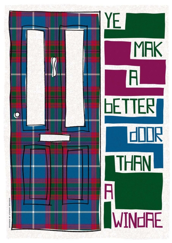
Scottish wall art for a flatshare has to do more than suit one person’s taste. A shared living room may contain inherited chairs, temporary shelving, several colour preferences, and housemates who change over time. Ye Mak a Better Door Than a Windae by Stewart Bremner meets that challenge with a familiar joke, a strong graphic layout, and tartan-inspired colour. It gives everyone a talking point without pretending the room has one perfectly coordinated style.

Scottish wall art for a flatshare: Ye Mak a Better Door Than a Windae by Stewart Bremner

What Scottish wall art for a flatshare should contribute

Communal artwork works best when it creates recognition rather than claiming ownership of the whole room. This phrase is likely to raise a smile for anyone who has blocked a television, window, or kitchen cupboard without noticing. The humour comes from ordinary shared life, so it feels more inclusive than a personal slogan or a highly specific hobby print.

The design has enough visual substance even before the words are read. A tall tartan-covered door occupies one side. Blocks of green, magenta, blue, and white turn the phrase into a lively vertical rhythm on the other. That balance allows the print to work as graphic art from across the room and reveal the joke at closer range.

Agree on a position before debating every colour

A shared decision becomes easier when housemates start with the wall rather than the frame finish. Look for a place seen by everyone: above a low sideboard, beside the dining table, or on the main route between kitchen and sitting area. Avoid the narrow strip behind an actual open door, where both the artwork and the joke would spend much of the day hidden.

  • Use the common sightline. Check the view from the sofa, dining seats, and doorway.
  • Keep notices separate. Do not crowd the frame with calendars, keys, or a household chore board.
  • Allow for changing furniture. A strong wall position should still work if a borrowed bookcase or table is replaced.
  • Choose one colour connection. Repeat a green, blue, or magenta note if it already exists, but do not force the entire room to match.

Use the generous format as a shared focal point

The available print sizes are 420 by 594 millimetres and 594 by 840 millimetres before framing. Both are substantial enough to avoid looking like a temporary sign. The larger size can anchor a broad communal wall, while the smaller option may suit a dining corner or the end of a galley-style living space.

Measure the complete framed dimensions rather than the print alone. A mount and moulding add presence. Use paper templates to compare the two options, then make sure doors, cupboard fronts, and tall lamps have clear movement around the proposed position.

Can bold Scots language art still look polished?

Yes, provided the presentation treats it as artwork rather than a poster pinned up for a season. A simple dark moulding can echo the black outlines and sharpen the blocks of colour. A quiet natural timber may soften the graphic quality in a room with older furniture. In either case, the frame should contain the energy rather than compete with it.

First 4 Frames uses colour-managed Giclée production and hand-finishes its bespoke framing in-house in Falkirk. That level of craftsmanship supports the fine tartan pattern, clean lettering, and saturated colour. It also gives a shared home one properly finished piece that can move with its owner later, instead of becoming disposable flat decor.

A familiar phrase with confident graphic design

Stewart Bremner is an Edinburgh-based artist, illustrator, and graphic designer whose work celebrates Scottish language, landscape, and culture. His bold shapes and poster-like compositions make familiar subjects feel contemporary. See the wider range on Stewart Bremner’s official website, or browse the Stewart Bremner collection at First 4 Frames.

The best Scottish wall art for a flatshare gives several people a reason to enjoy the same wall. View the framed Ye Mak a Better Door Than a Windae print for a colourful piece whose humour, scale, and distinctly Scottish voice can hold together an otherwise mixed communal room.

Posted on

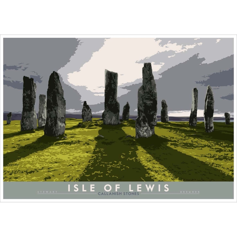
Scottish Art Prints for a Quiet Bedroom: Let Callanish Hold the Horizon

Image of Isle of Lewis: Callanish Stones by Stewart Bremner

Scottish art prints should earn its place by answering a real question about the room or recipient. Isle of Lewis: Callanish Stones is a useful starting point because the ancient stone circle offers stillness through strong form and open landscape rather than through an image so pale that it loses presence.

Scottish art prints - Isle of Lewis: Callanish Stones

Choose Scottish art prints with calm structure

Bedroom calm does not require artwork to disappear. The standing stones provide a stable rhythm, while the island setting gives the eye room to travel. This balance works well opposite the bed, where the picture can become a settled first view in the morning.

Three placement checks before hanging

Confirm the full framed size from bed height, keep the top below any strong sloping ceiling line, and test whether bedside or ceiling lights reflect across the image.

Use bed linen and curtains to support the mood, not copy the subject. Undyed texture, muted earth colour and dark timber can relate to stone and land. Tartan, maps and multiple heritage objects are unnecessary when one recognisable place already carries the room’s Scottish identity.

If the picture sits above a chest, measure from the furniture rather than the full wall. A clear gap keeps the display connected while leaving everyday objects enough practical space.

Retain the stones’ texture and island atmosphere

Subtle land, sky and stone relationships benefit from colour-managed Giclée reproduction. Careful mounting and a bespoke frame, completed in-house by First 4 Frames, can preserve that detail while giving the composition a quiet, durable presence.

For archaeological context and current visitor information, read Historic Environment Scotland’s Calanais guide. You can also browse the Stewart Bremner collection or see the exact framed product.

Scottish art prints can bring real calm when the image has structure as well as atmosphere. Callanish Stones offers both, creating a bedroom focal point that feels rooted, spacious and quietly memorable.

Posted on

Contemporary Framed Art Prints for an Open-Plan Home: Learn From Dundee V&A

Image of Dundee: V&A by Stewart Bremner

contemporary framed art prints should earn its place by answering a real question about the room or recipient. Dundee: V&A is a useful starting point because the building’s distinctive geometry can mark a transition between living, dining and circulation zones without putting another object on the floor.

contemporary framed art prints - Dundee: V&A

Use contemporary framed art prints to define a transition

Walk the full route through the room and identify the wall visible at the change of use. It may face the dining table, sit beyond a sofa arm or appear at the turn toward the kitchen. Centre the artwork on that movement line, not automatically on the whole wall.

  1. Mark the finished frame with low-tack tape.
  2. Check it from each adjoining zone.
  3. Align one edge with a dependable architectural line.
  4. Keep tall furniture away from the strongest silhouette.
  5. Review the arrangement after dark.

The print can provide structure while softer furnishings handle comfort. Curved upholstery, a textured rug or warm timber prevents the architecture from making the room feel hard. Repeating the building shape in accessories would weaken its impact.

Give bold architecture a precise boundary

Geometric subjects need square mounting and a frame that feels intentional from several viewpoints. First 4 Frames combines colour-managed production with bespoke in-house framing, helping lines remain crisp and the final object feel coherent in a multi-use room.

For exhibitions, architecture and the design museum’s waterfront context, visit V&A Dundee’s official website. You can also browse the Stewart Bremner collection or see the exact framed product.

Contemporary framed art prints can organise open-plan space without closing it down. Dundee: V&A gives the eye a strong marker, while careful alignment lets people and daily activity continue to flow around it.

Posted on

Scottish Coastal Art for a Reading Nook: Find Direction at Sumburgh Head

Image of Shetland: Sumburgh Head Lighthouse by Stewart Bremner

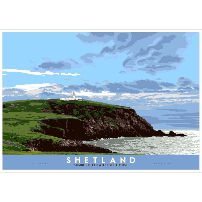
Scottish coastal art should earn its place by answering a real question about the room or recipient. Shetland: Sumburgh Head Lighthouse is a useful starting point because the remote Shetland landmark gives a small corner a view, a destination and enough narrative to reward repeated looking.

Scottish coastal art - Shetland: Sumburgh Head Lighthouse

Let Scottish coastal art expand a compact corner

A reading nook is viewed at close range, so bigger is not automatically better. Mark the finished framed outline above or beside the chair. Leave enough wall around it for the lighthouse and surrounding coast to feel open.

The picture should create distance for the eye while the chair, light and table continue to do practical work.

Place the task lamp so its beam falls on the page rather than the glazing. Wool, timber and one quiet blue or stone tone can support the coastal atmosphere. Avoid adding rope, model boats or lighthouse ornaments; the artwork already carries the location clearly.

Consider the view when entering the room as well as the seated view. A strong landmark can help the nook feel intentional from a distance, while finer details offer something different when the reader settles nearby.

Protect clarity in the sea light and landmark

Controlled Giclée output helps coastal colour and graphic detail remain distinct at close range. A measured mount and hand-finished frame made in Falkirk can give the scene definition while preserving its sense of air and distance.

For the lighthouse’s history, wildlife and Shetland setting, explore Sumburgh Head Lighthouse and visitor centre. You can also browse the Stewart Bremner collection or see the exact framed product.

Scottish coastal art can make a reading nook feel larger and more personal. Sumburgh Head offers a destination for the eye, while restrained styling leaves the corner calm enough for a book.

Posted on

Office Wall Art UK Teams Can Use to Express Place and Modern Civic Design

Image of Edinburgh: Scottish Parliament by Stewart Bremner

office wall art UK should earn its place by answering a real question about the room or recipient. Edinburgh: Scottish Parliament is a useful starting point because the recognisable Edinburgh building combines civic identity with architecture that can start a thoughtful conversation in a shared workplace.

office wall art UK - Edinburgh: Scottish Parliament

Choose office wall art UK visitors can connect with

Start with the audience. In a reception area, the picture should be readable from the doorway and offer a clear local reference. In a meeting room, it can sit on the wall seen by both in-person guests and video-call participants without becoming visual branding.

Reception

Choose a generous finished size and keep visitor information physically separate from the artwork.

Meeting room

Check screen glare, seated sightlines and the visual background before fixing the hanging height.

A workplace does not need to explain its values with text on every wall. Recognisable contemporary architecture can suggest curiosity, public life and confidence more subtly. It also gives staff and visitors a subject that is specific to Scotland.

Specify a professional framed finish

A public-facing room benefits from accurate mounting, durable materials and a frame proportioned to the final wall. First 4 Frames handles colour-managed printing and bespoke framing in-house, which supports a consistent finish for one office or a wider commercial scheme.

To understand the building through tours, exhibitions and public access, see the Scottish Parliament visitor information. You can also browse the Stewart Bremner collection or see the exact framed product.

Office wall art UK organisations select should do more than fill unused space. Edinburgh: Scottish Parliament can provide local recognition, architectural interest and a calm professional focal point.

Posted on

Wall Art for a Room With Blue Walls: Warm the Scheme With Portobello Sunset

Image of Edinburgh: Portobello Sunset by Stewart Bremner

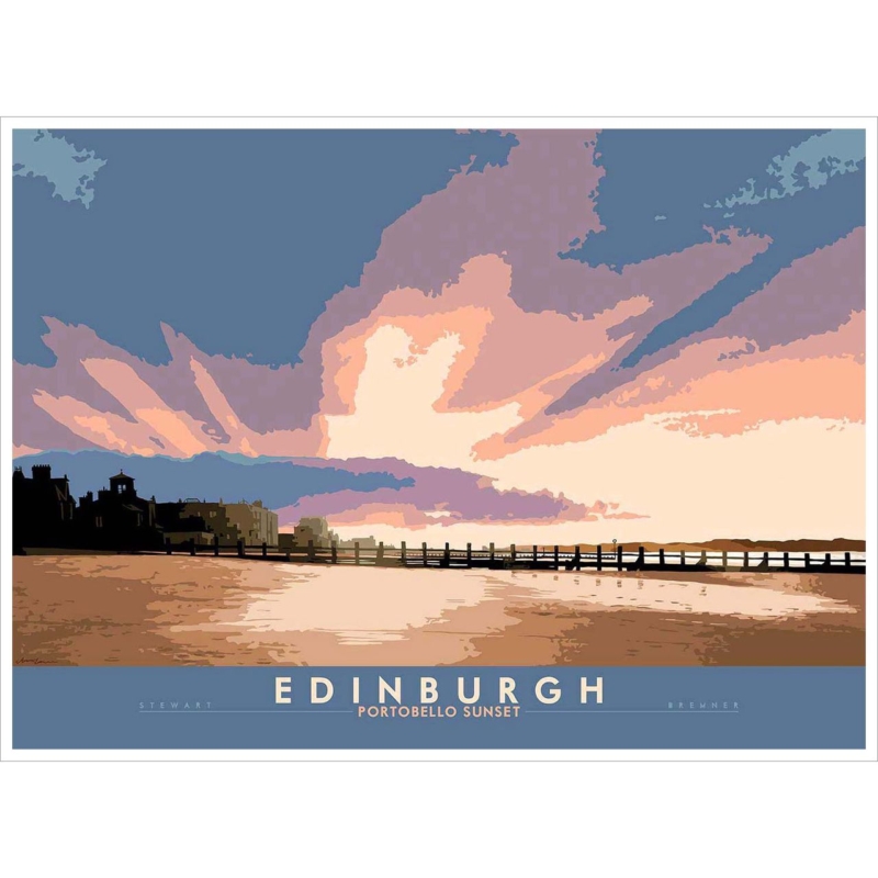
wall art for a room with blue walls should earn its place by answering a real question about the room or recipient. Edinburgh: Portobello Sunset is a useful starting point because its Edinburgh shoreline keeps a natural link to the wall colour while the sunset introduces a warmer counterpoint.

wall art for a room with blue walls - Edinburgh: Portobello Sunset

Build wall art for a room with blue walls around contrast

First identify the blue’s temperature. A green-leaning teal, clear coastal blue and greyed navy each change how sunset colour reads. View the print sample against the painted wall in daylight and again under the lamps used at night.

Room elementUseful response
Cool pale blueLet the warmer sky supply a gentle focal point.
Deep navyUse a frame or mount that creates a clean break.
Orange accentsRepeat only one muted sunset note.
Evening lampsAngle them to limit reflection across the image.

The aim is not to match every colour. Blue walls already establish the room’s identity. The artwork should bring depth and temperature variation, while neutral upholstery or timber gives the eye somewhere to rest.

Keep sunset colour natural through the finish

Colour-managed Giclée production helps the transition between sea, sky and evening warmth remain nuanced. Bespoke framing completed in-house can separate those colours from the painted wall, preserving contrast without making the presentation harsh.

For more context on Edinburgh’s seaside district, visit VisitScotland’s guide to Portobello. You can also browse the Stewart Bremner collection or see the exact framed product.

Wall art for a room with blue walls works best through measured difference. Portobello Sunset keeps the palette connected to water and sky while adding the warmth that a cool scheme may need.

Posted on

Hallway Wall Art That Rewards a Clear Sightline: Ye Mak a Better Door Than a Windae

Image of Ye Mak a Better Door Than a Windae by Stewart Bremner

hallway wall art should earn its place by answering a real question about the room or recipient. Ye Mak a Better Door Than a Windae is a useful starting point because the familiar complaint about someone blocking the view becomes especially apt in a route shaped by doors, openings and people moving through it.

hallway wall art - Ye Mak a Better Door Than a Windae

Give hallway wall art an uninterrupted reading distance

Typography has to work at the speed of the room. Stand at the entrance and note where the whole phrase becomes legible. That point should remain clear when nearby doors are open, coats are hanging and the household is moving through the space.

  • Keep the framed edge away from a door swing.
  • Test the wording from both directions of travel.
  • Leave hooks, switches and noticeboards outside its visual boundary.
  • Use one phrase print rather than a corridor full of competing slogans.

A console can anchor the picture, but it should stay quieter than the words. A lamp and one useful tray are enough. The humour lands more naturally when the surrounding wall is orderly and the phrase is not asked to compete with household messages.

Finish the phrase like lasting artwork

Crisp mounting and a hand-finished frame turn strong lettering into a resolved piece for a busy part of the home. First 4 Frames produces and frames the print in-house in Falkirk, so the presentation can withstand close viewing without looking like a temporary sign.

For definitions, examples and the depth of Scotland’s languages, explore Dictionaries of the Scots Language. You can also browse the Stewart Bremner collection or see the exact framed product.

Hallway wall art can be witty and practical at once. A clear route, disciplined spacing and this perfectly placed phrase create an arrival that feels personal without adding clutter.

Posted on

Ye Cannae Shove Yer Granny Aff a Bus: A Scottish Birthday Gift for a Granny

Image of Ye Cannae Shove Yer Granny Aff a Bus by Stewart Bremner

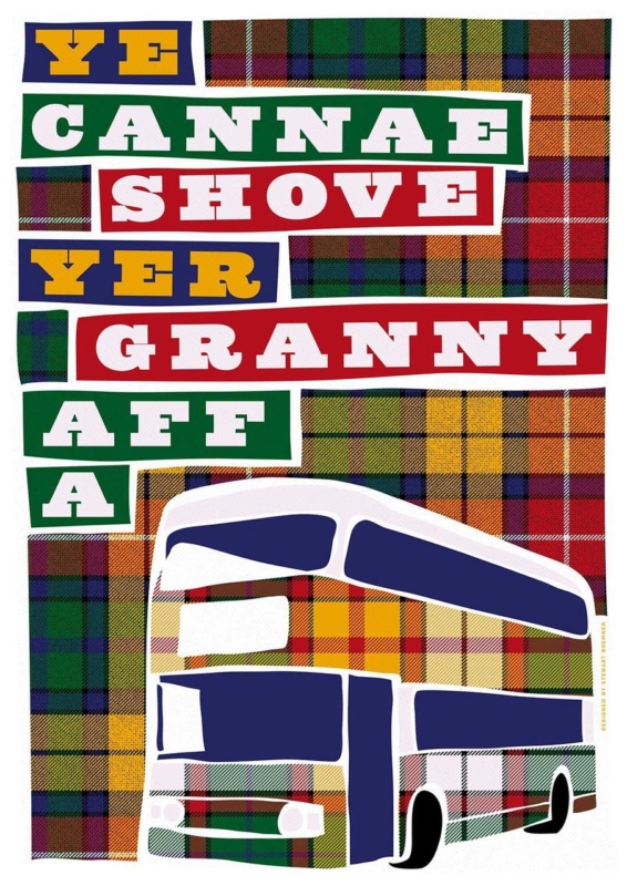
A Scottish birthday gift for a granny should feel connected to the person receiving it, not merely decorated with tartan or a generic birthday message. Ye Cannae Shove Yer Granny Aff a Bus by Stewart Bremner starts with a familiar Scottish children’s song. That shared reference can recall family singalongs, playground humour, and the particular warmth of a granny who knows the words before anyone reaches the chorus.

Scottish birthday gift for a granny: Ye Cannae Shove Yer Granny Aff a Bus by Stewart Bremner

Why this Scottish birthday gift for a granny feels personal

The strongest family gifts carry a story that the recipient already owns. This title is affectionate because it depends on recognition. It can remind several generations of the same tune while giving them an easy reason to laugh together. That makes the artwork especially suitable when children or grandchildren want to choose one present as a family.

Humour still needs good presentation. A phrase printed on a disposable item may be amusing for an afternoon. A framed fine art print has a longer role. It can become part of a kitchen, hall, family room, or reading corner and keep prompting conversation after the birthday cards have gone.

Check that the joke belongs to her

Before buying, think about the recipient rather than the occasion alone. Does she know the song? Does she enjoy Scots language and playful family banter? Would she like the title displayed where visitors can see it? A confident yes matters more than matching the present to a milestone number.

  1. Ask a quiet family question. One relative may remember whether the song featured at home or school.
  2. Choose a message for her personality. The humour should feel affectionate, never like a comment about age or mobility.
  3. Add the shared memory. A short note can explain why the family chose this particular line.
  4. Plan the handover. Let grandchildren present it together if the song connects several generations.

This small amount of thought turns a witty title into a specific family gift. It also avoids the usual trap of buying something Scottish simply because the recipient lives in Scotland or has Scottish roots.

Choose the print size for the wall, not the birthday

The print is available in 420 by 594 millimetres and 594 by 840 millimetres before framing. Both are substantial portrait formats. The smaller size may suit a kitchen-dining wall, broad hallway, or family room. The larger option needs more viewing distance and a clear wall where the words can read comfortably without dominating nearby furniture.

Before orderingUseful check
Measure the full areaAllow for the mount and moulding as well as the printed sheet
Check the reading distanceView a paper template from the doorway and the main seat
Look for competitionAvoid crowding the words beside calendars, signs, or a busy photo wall
Consider deliveryMake sure the finished frame can move safely through doors and stairs

A larger size is not automatically more generous. A well-proportioned frame that fits her home is the more attentive gift. If the family is unsure, measuring a likely position or asking someone nearby to help is better than guessing.

Frame playful words with lasting quality

Typography benefits from a decisive edge and enough clear space around the design. A simple dark moulding can sharpen the graphic character. A restrained timber can make the piece feel warmer in a relaxed family room. The best choice will respond to the actual print and to finishes already present in the recipient’s home.

First 4 Frames produces colour-managed Giclée prints and completes bespoke framing in-house at its Falkirk workshop. The hand-finished presentation gives the humorous subject the care of a proper artwork. It also means the gift arrives ready to hang rather than becoming another project for the recipient.

Scottish graphic art by Stewart Bremner

Stewart Bremner is an Edinburgh-based artist, illustrator, and graphic designer whose work celebrates Scottish language, culture, landscapes, and heritage. See more of his work on Stewart Bremner’s official website, or compare other designs in the Stewart Bremner collection at First 4 Frames. Browsing the wider range can help a family decide whether this song is the most meaningful reference for their granny.

A thoughtful Scottish birthday gift for a granny can be funny and beautifully made at the same time. View the framed Ye Cannae Shove Yer Granny Aff a Bus print for a familiar line presented with bold character and lasting in-house craftsmanship.

Posted on

Scottish Phrase Wall Art With Family Wit: Ye Cannae Shove Yer Granny Aff a Bus

Image of Ye Cannae Shove Yer Granny Aff a Bus by Stewart Bremner

Scottish phrase wall art should earn its place by answering a real question about the room or recipient. Ye Cannae Shove Yer Granny Aff a Bus is a useful starting point because the familiar line carries rhythm, shared memory and a distinctly Scottish sense of humour without needing a long explanation.

Scottish phrase wall art - Ye Cannae Shove Yer Granny Aff a Bus

Give Scottish phrase wall art one confident position

Words need a different kind of breathing room from a landscape. Place this print where the whole phrase can be read in one pause: above a kitchen bench, beside a breakfast table or on the wall facing a family-room doorway. Avoid hanging it behind open shelving, tall appliances or a busy collection of signs.

For everyday rooms

Let the line supply the humour. Plain ceramics, timber and a restrained wall colour keep the setting warm without repeating the joke.

For a family gift

Choose it when the recipient already knows the song or saying. That shared recognition makes the gift personal rather than generically Scottish.

The available landscape proportions suit a wall above low furniture. Mark the full framed width before ordering, then check that a standing viewer can read the wording without looking through pendant lights or across a cluttered worktop.

Frame the words as artwork, not a temporary sign

Accurate mounting and a hand-finished frame give typography a deliberate edge. First 4 Frames completes its framing in-house in Falkirk, so the finished piece can feel substantial while the bold line remains clear and immediate.

To see more of the Edinburgh-based illustrator’s work and Scottish visual language, visit Stewart Bremner’s official website. You can also browse the Stewart Bremner collection or see the exact framed product.

Scottish phrase wall art works best when the humour is specific and the display is disciplined. This familiar family line can bring warmth to a social room without turning the whole interior into a collection of slogans.