Posted on

Archival Ink Prints for Everyday Rooms: Why Process Matters

Over the Meadow captures a barn owl in flight above abstract blue, green, and beige grasses, its wings outstretched against a soft earth-toned backdrop.

archival ink prints becomes more useful when the artwork answers a real feature of the room. Over the Meadow offers a clear example because a nature-led image intended for daily enjoyment still benefits from informed choices about printing, paper, framing and placement.

archival ink prints - Over the Meadow

What archival ink prints need beyond the word archival

Longevity is a chain rather than one specification. Ink and paper matter, but so do colour control, handling, mounting, glazing and the wall where the finished piece hangs. Ask how the image is produced and framed instead of relying on a single reassuring label.

Four practical questions

  • Is the file printed through a colour-managed workflow?
  • Is the paper suitable for fine-art reproduction?
  • Will the mount and frame support the work without crowding it?
  • Can the finished piece avoid direct sun, damp and abrupt temperature changes?

Placement does not need to become anxious. Choose a stable interior wall, keep the frame away from persistent moisture and use curtains or blinds when direct sun is strongest. Normal, thoughtful care lets the artwork remain part of everyday life.

Join print quality to careful presentation

First 4 Frames combines certified colour-managed Giclée production with bespoke framing completed in-house at its Falkirk workshop. That joined-up process helps the print, mount and frame function as one hand-finished object rather than unrelated components.

For conservation-minded display advice, read the Library of Congress guidance on caring for works on paper. You can also browse the Charlotte Strawbridge collection or view the exact framed product.

Archival ink prints are best understood through process and care, not a promise in isolation. Over the Meadow can be enjoyed as everyday artwork while informed production, framing and placement support its presentation over time.
Posted on

Abstract Landscape Art at Square Scale: Plan Upside Down II

Image of Upside Down II by David Short

abstract landscape art becomes more useful when the artwork answers a real feature of the room. Upside Down II offers a clear example because its 265 mm, 500 mm and 800 mm square print choices allow the same composition to move from an intimate accent to a substantial focal point.

abstract landscape art - Upside Down II

Judge abstract landscape art by distance as well as dimensions

Print sizeLikely rolePlanning priority
265 × 265 mmClose-view accentKeep nearby objects sparse.
500 × 500 mmIndependent focal pointAlign with a cabinet or chair grouping.
800 × 800 mmRoom anchorConfirm viewing distance and finished frame size.

Square artwork creates a stable visual centre, but that does not mean it should be centred on every wall. Relate it to the furniture group used most often. An offset position above a sideboard may feel more balanced than the mathematical middle of a long open-plan wall.

At larger scale, remove small competing pictures from the immediate area. At compact scale, leave enough blank wall that the piece does not look like an afterthought among shelves and switches.

Use the frame to clarify an open composition

Abstract work benefits from accurate colour separation and a frame chosen for the whole composition, not one isolated tone. Colour-managed Giclée production and bespoke in-house framing give Upside Down II a precise square boundary at each available scale.

For context on abstraction and interpretation, see Tate’s guide to abstract art. You can also browse the David Short collection or view the exact framed product.

Abstract landscape art can shift role dramatically as it grows. Upside Down II makes that choice practical: decide whether the room needs a detail, a focal point or a true anchor before choosing the size.

Posted on

Art Size Guide for Every Room: Use The Attic Room on Awkward Walls

Image of The Attic Room by Emily Little

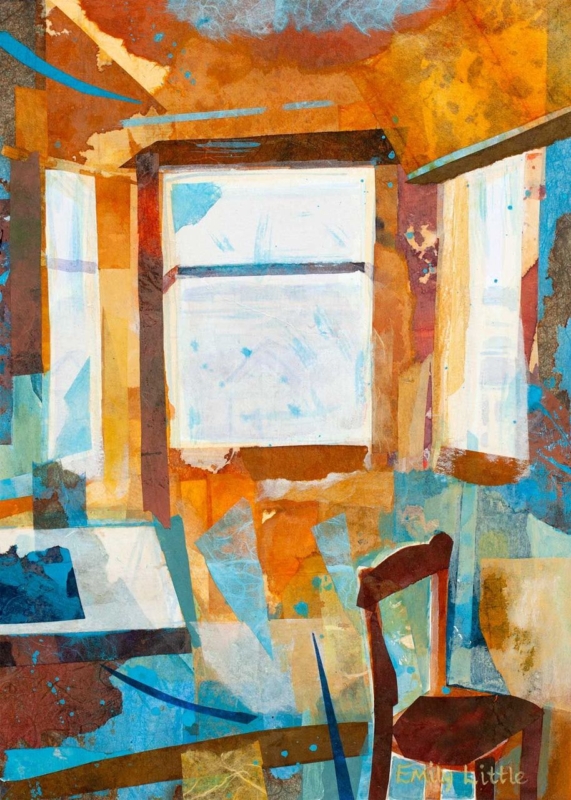
art size guide for every room becomes more useful when the artwork answers a real feature of the room. The Attic Room offers a clear example because its portrait proportions and 230 × 322 mm or 360 × 500 mm print options suit the kinds of vertical spaces that standard sofa-wall advice often overlooks.

art size guide for every room - The Attic Room

An art size guide for every room starts with usable wall space

Do not measure only the total wall. Record the rectangle that remains after skirting, sloping ceiling, door swing and furniture are considered. That usable area determines whether the framed work can breathe and whether its centre will sit near a comfortable eye line.

  1. Measure the narrowest width along the intended hanging area.
  2. Mark the expected outer frame, not just the print dimensions.
  3. Open doors and drawers to check clearance.
  4. View the paper outline from the room entrance and usual seat.
  5. Confirm where a hook can be fixed safely before ordering.

The smaller print can suit a wall return or reading corner. The larger option needs more uninterrupted height, but it may feel better balanced beside a chest or low chair. A paper template makes that difference visible before the frame arrives.

Treat the finished frame as the true measurement

Bespoke framing adds mount, moulding and glazing around the listed print size. First 4 Frames can bring those elements together in-house, creating a proportioned outer edge that looks intentional even on a difficult wall.

For a general reminder to record dimensions accurately, consult RICS consumer guidance on measuring up. You can also browse the Emily Little collection or view the exact framed product.

A useful art size guide for every room must account for awkward architecture. The Attic Room offers portrait flexibility, but the final decision should always be based on the complete framed outline.

Posted on

Dance Wall Art That Gives a Social Room Its Rhythm

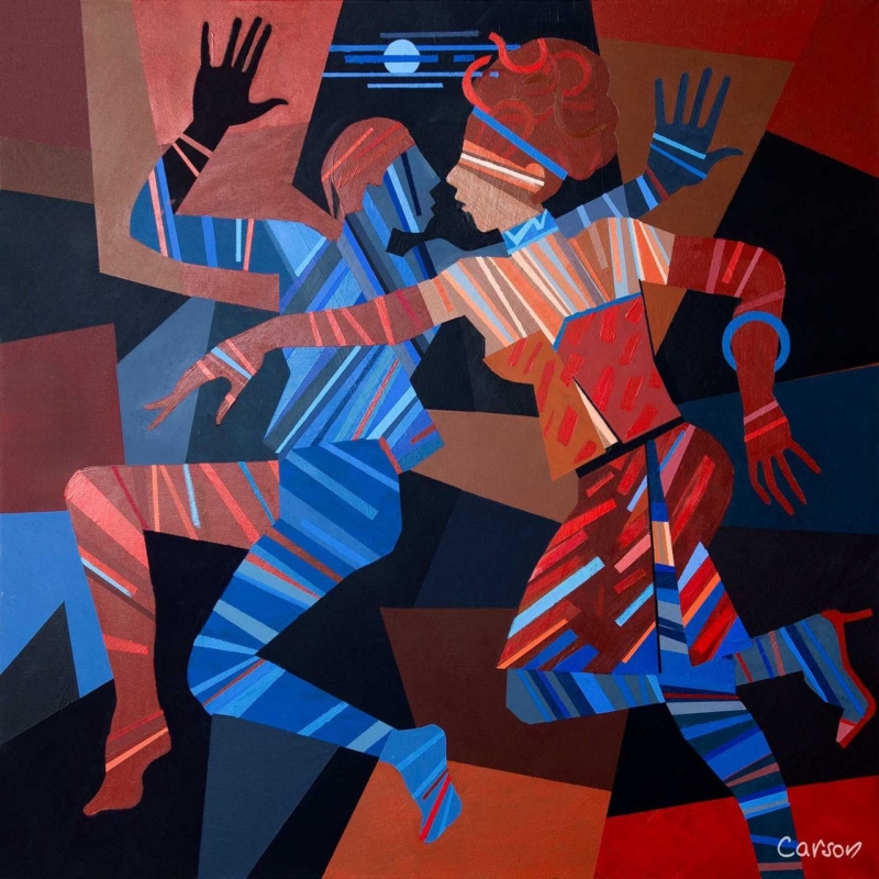
Image of Dance Till Dawn by Fred Carson

dance wall art becomes more useful when the artwork answers a real feature of the room. Dance Till Dawn offers a clear example because its title carries a clear sense of movement and shared energy, making it suitable for a space used for music, meals or conversation.

dance wall art - Dance Till Dawn

Place dance wall art where the room becomes social

Movement in an artwork is most effective when the room leaves it space to continue.

Choose a wall seen as people enter or gather, not one hidden behind a tall speaker or open door. The compact 265 × 265 mm print format can create a deliberate beat above a drinks cabinet, beside record shelving or within a dining corner.

  • Keep cables and audio equipment visually tidy beneath the picture.
  • Use warm ambient light, but avoid placing a bright fitting directly opposite the glazing.
  • Repeat one energetic line or colour in a small object rather than adding dance-themed signs.
  • Leave clear wall around the frame so the square shape reads confidently.

The artwork should support the atmosphere even when no music is playing. That is why a resolved framed presentation matters more than a collection of literal decorative references.

Give movement a disciplined frame

A hand-finished frame provides a still boundary around an energetic subject. Combined with colour-managed Giclée production, that clean edge helps Dance Till Dawn hold its own among furniture, lighting and the activity of a social room.

For a wider view of contemporary dance in Scotland, visit National Dance Company of Scotland. You can also browse the Fred Carson collection or view the exact framed product.

Dance wall art can suggest sound and movement without dictating the whole scheme. Dance Till Dawn gives a social space rhythm, while its compact framed form keeps the result controlled.

Posted on

Giclée Art Prints in Changing Light: Look Closely at Late Afternoon

Image of Late Afternoon by Josepth Maxwell Stuart

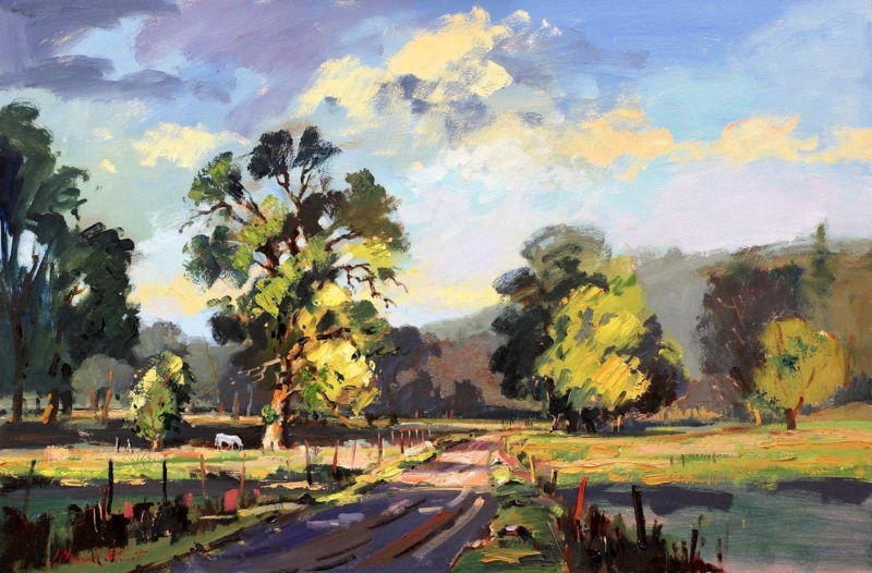
Giclee art prints becomes more useful when the artwork answers a real feature of the room. Late Afternoon offers a clear example because the scene’s atmosphere depends on the transitions that occur as stronger daylight softens towards evening.

Giclee art prints - Late Afternoon

What to notice in Giclee art prints with subtle light

A print built around time of day needs more than a bright overall result. Look for separation between the lightest areas, middle tones and deeper passages. If those zones collapse together, the atmosphere becomes flat. A colour-managed workflow is valuable because it aims to reproduce those relationships consistently.

Viewing checkWhat to look for
Morning daylightQuiet tones should remain distinct rather than appearing washed out.
Late afternoonWarm room light should support the scene without turning every neutral orange.
After darkA nearby lamp should reveal detail without reflecting directly in the glazing.

Late Afternoon is offered in 350 × 230 mm and 550 × 365 mm print sizes. Compare the finished framed outline with the viewing distance, since the larger option can reveal gradual tonal changes more readily from across a room.

Frame atmosphere without introducing visual noise

First 4 Frames produces colour-managed Giclée work in-house in Falkirk. A restrained bespoke frame can then protect the quieter mood, while careful positioning prevents glare from hiding the tonal work the print process preserves.

For background on the print method, read Tate’s definition of a Giclée print. You can also browse the Joseph Maxwell Stuart collection or view the exact framed product.

The appeal of Giclee art prints lies partly in controlled detail and tone. Late Afternoon rewards checking those qualities under the real light in which the finished work will be seen.

Posted on

Art by Colour: Build a Room Palette Around Poppies and Thistles

Image of Poppies and Thistles, Perthshire by Sheila Fowler

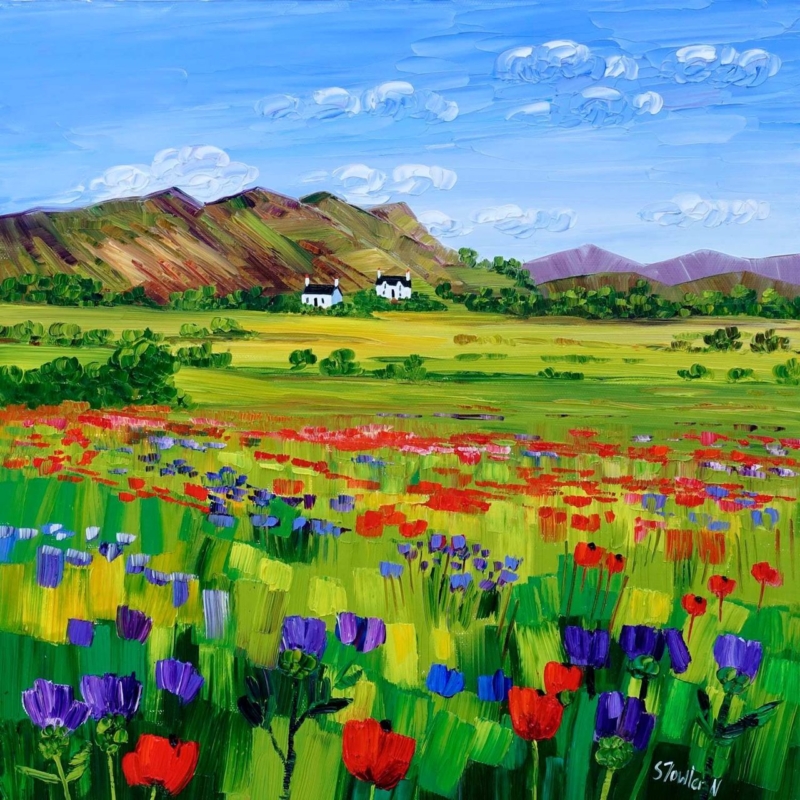
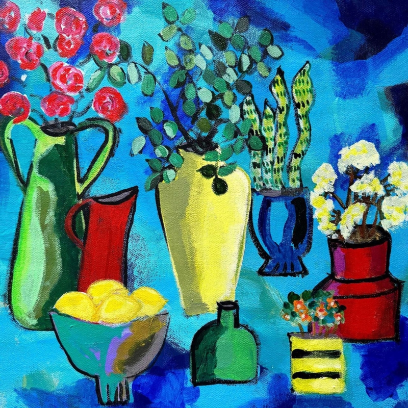
art by colour becomes more useful when the artwork answers a real feature of the room. Poppies and Thistles, Perthshire offers a clear example because its floral subject and rooted Perthshire identity make it possible to draw out colour without turning the whole interior into a matching botanical scheme.

art by colour - Poppies and Thistles, Perthshire

Use art by colour as a starting point, not a formula

Start with the picture rather than a handful of paint cards. Identify the colour that catches your eye first, then decide whether it should lead the room or remain a small accent. With a floral work, repeating every petal and leaf tone can feel forced. One flower colour in a cushion or lamp base is often enough.

Choose a lead note

Let one poppy or thistle tone provide energy. Keep the repeat smaller than the framed work so the picture remains the source.

Add a quiet support

Use foliage, field or earth colours in timber, linen or ceramics. These supporting notes connect the artwork without obvious copying.

The square 265 × 265 mm and 500 × 500 mm print choices can serve different rooms. Mark the finished frame outline before deciding how much colour to repeat nearby.

Let framing give the palette a clean boundary

A considered frame separates concentrated floral colour from wall paint and furnishings. Colour-managed Giclée production helps retain distinctions between neighbouring tones, while bespoke in-house framing gives the square composition a calm edge.

For a useful explanation of colour relationships, see the V&A’s introduction to the colour wheel. You can also browse the Sheila Fowler collection or view the exact framed product.

Art by colour should create connection rather than perfect coordination. Poppies and Thistles, Perthshire can lead a layered interior while still keeping its own visual identity.

Posted on

Wall Art for a Room With Garden Views: Poppies at Lower Largo

Image of Poppies at Lower Largo by Sheila Fowler

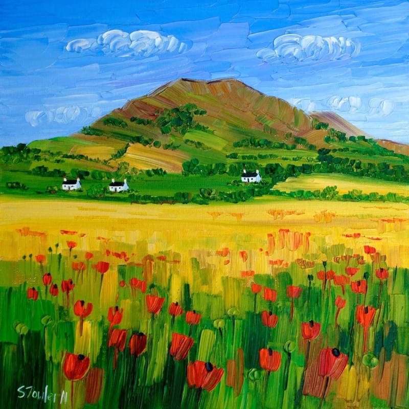
wall art for a room with garden views works best when it responds to the room instead of simply filling an empty surface. Poppies at Lower Largo is a useful example because its poppies create a seasonal colour link to the outdoors while the square composition remains clearly separate from the changing view beyond the glass.

wall art for a room with garden views - Poppies at Lower Largo

Choose wall art for a room with garden views by season

Do not try to reproduce every plant visible outside. Instead, choose one relationship: a shared red, the rhythm of stems or the contrast between cultivated flowers and a wider landscape. The artwork then feels connected even when the garden changes through autumn and winter.


The two square print sizes, 265 × 265 mm and 500 × 500 mm, create different effects. The smaller size can finish a breakfast corner or wall return. The larger option can hold a clearer sightline across a dining or garden room.

Check placement on a bright day. Position the piece where direct glare will not erase the colour, and avoid centring it between two windows if that leaves too little visual space around the finished frame.

Use framing to separate garden colour from the wall

Floral colour needs clarity without becoming harsh. Colour-managed Giclée printing helps retain the shifts within the poppies and landscape, while a bespoke frame made in Falkirk gives the square image a deliberate interior boundary.

For inspiration on seasonal planting and designed views, explore the National Trust for Scotland’s garden at Kellie Castle. You can also browse the Sheila Fowler collection or view the exact framed product.

Wall art for a room with garden views should still offer something the window cannot. Poppies at Lower Largo adds a lasting square composition, coastal identity and colour that remains after the flowers outside have faded.

Posted on

Cloakroom Wall Art With Scottish Wit: Ah Dinnae Ken

Image of Ah Dinnae Ken by Stewart Bremner

cloakroom wall art works best when it responds to the room instead of simply filling an empty surface. Ah Dinnae Ken is a useful example because its portrait format and familiar Scots expression give a small room character without demanding several competing objects.

cloakroom wall art - Ah Dinnae Ken

Keep cloakroom wall art clear and singular

A cloakroom is often seen in a mirror as well as directly. Hold a paper template on the intended wall, close the door and check both views. The 420 × 594 mm print option can suit a vertical space, while the larger 594 × 840 mm option needs more distance than many compact rooms provide.

Three compact-room checks

  • Keep the frame clear of splash zones and towel movement.
  • Allow the wording to be read comfortably from the doorway.
  • Use one characterful piece instead of building a collection of novelty signs.

Let the wall colour do the supporting work. A clean contrast around the frame will make the phrase legible, while restrained accessories stop the joke from becoming a theme.

Give informal wording a properly made finish

Humour does not need a throwaway presentation. In-house Giclée production and bespoke framing give this Scottish phrase crisp definition and a durable, hand-finished presence suited to a carefully decorated home.

For the meaning and history of Scots words and phrases, search Dictionaries of the Scots Language. You can also browse the Stewart Bremner collection or view the exact framed product.

Cloakroom wall art has limited space in which to make an impression. Ah Dinnae Ken does it with one clear phrase, useful portrait proportions and no need for decorative clutter.

Posted on

Contemporary Framed Art Prints: Give A Path Unseen Space to Move

Image of A Path Unseen by Diana Hand

contemporary framed art prints works best when it responds to the room instead of simply filling an empty surface. A Path Unseen is a useful example because Diana Hand’s confident equestrian lines need a clear boundary, yet the horse must still feel able to move beyond the marks.

contemporary framed art prints - A Path Unseen

Use contemporary framed art prints to contain energy

Expressive drawing asks for restraint around the edge. A wide, ornate moulding can turn every charcoal stroke into decoration, while an overly narrow dark frame may close the composition too tightly. Begin with the palest open area in the image and allow the mount to extend that breathing space.

  1. Identify the strongest direction of movement.
  2. Keep nearby furniture clear of that visual route.
  3. Test a quiet timber, black or pale frame against the actual wall.
  4. Judge the complete 420 × 297 mm print presentation from normal viewing distance.

In a study, landing or living room, position the work where people naturally pause. The anatomy and gesture deserve a closer look, but the picture should also read as one assured shape from across the room.

Protect the marks without boxing in the horse

Accurate tonal control keeps charcoal-like marks distinct from the paper ground. Colour-managed Giclée printing supports that separation, while bespoke in-house framing gives the work structure and a hand-finished edge.

To see the artist’s wider approach to equestrian drawing, visit Diana Hand’s own website. You can also browse the Diana Hand collection or view the exact framed product.

The strongest contemporary framed art prints feel resolved but not restricted. A Path Unseen keeps its expressive movement because the surrounding presentation knows when to stay quiet.

Posted on

How Large Should Artwork Be Above a Sofa? Measure A Moment by the Sea

Image of A Moment by the Sea by Colin Robertson

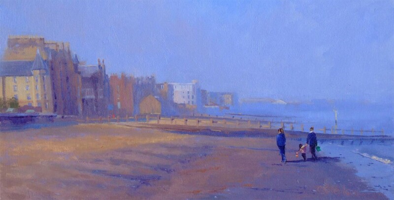
how large should artwork be above a sofa works best when it responds to the room instead of simply filling an empty surface. A Moment by the Sea is a useful example because its horizontal format can relate naturally to seating, while the available 400 × 190 mm and 560 × 270 mm print sizes make proportion easier to discuss.

how large should artwork be above a sofa - A Moment by the Sea

How large should artwork be above a sofa in practice?

MeasurePractical check
Sofa widthUse it as the visual anchor, not the full wall.
Finished frameConfirm the outer size after mount and moulding are added.
Gap above sofaKeep the picture connected to the seating without risking head contact.
Side spaceLeave an even margin so the arrangement can breathe.

A useful starting point is for the finished artwork to occupy roughly half to two-thirds of the sofa width. Treat that as a visual test, not a rigid law. A deep sofa, high back or nearby floor lamp can change what feels balanced.

Mark the finished outline first

Use low-tack tape or paper to mark the proposed outer frame dimensions. Sit down, enter through the main doorway and check the arrangement in evening light before fixing a hook.

Let the frame complete the measurement

The print dimension is only part of the decision. Bespoke framing adds the mount, moulding and glazing that create the true wall footprint. First 4 Frames completes that work in-house and uses colour-managed Giclée production for the coastal detail.

For a broader reminder to record dimensions carefully, consult RICS consumer guidance on measuring up. You can also browse the Colin Robertson collection or view the exact framed product.

When asking how large should artwork be above a sofa, measure the furniture and the finished frame together. A Moment by the Sea offers calm horizontal movement without overwhelming the seating below.