The ‘safe’ mount colour you’re considering might be the very thing holding your artwork back. It’s a familiar dilemma: you’ve found a beautiful piece, perhaps a spectacular print from one of our First4Frames Gallery artists, but now you’re stalled. Faced with an overwhelming wall of colour swatches, the fear of making the wrong choice is real. Should it match the wall? Should it pull a colour from the art? When you’re asking, “what colour mount should I choose?”, defaulting to a simple cream can feel like the only option, but it rarely does justice to the art.
We believe choosing a mount shouldn’t be a source of stress. It’s an art form in itself. With over 20 years of bespoke framing experience, we’re here to share our professional secrets and give you a clear framework for making the perfect choice. This guide will show you exactly how to select mount colours that enhance your artwork, creating a seamless bridge between your art and your home décor. We’ll explore the simple rules professionals follow, so you can feel confident creating a truly stunning, gallery-quality display at home.
Key Takeaways
Learn the professional technique of looking beyond the dominant colour in your artwork to find the perfect complementary mount.
Find a definitive answer to what colour mount should I choose by learning how to assess the artwork’s unique mood and energy.
Discover how a mount can act as the perfect design bridge, harmonising your chosen art with your room’s unique lighting and furnishings.
See these principles applied in practice with expert analysis of framing iconic Scottish artists like John Lowrie Morrison (Jolomo) and Jack Vettriano.
The Essential Role of the Picture Mount: More Than Just a Border
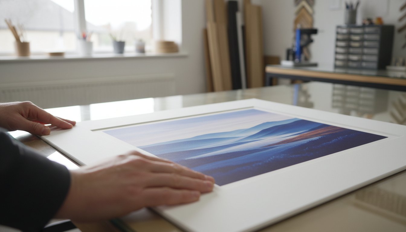
Choosing the perfect frame is an exciting step, but there’s a crucial element sitting between the art and the frame that deserves just as much attention: the picture mount. Before we explore the central question of what colour mount should I choose, it’s vital to understand why the mount itself is so fundamental. A mount, also known as a mat, is the precision-cut, premium card that creates a window around your artwork, sitting directly between the print and the protective glass. It’s far more than a simple border; it’s a key player in both the presentation and preservation of your art.
Think of the mount as providing essential ‘breathing space’. Without it, a piece of art can feel cramped and lost within its frame, its edges visually crashing into the frame moulding. A mount provides a quiet, neutral space that allows the eye to transition smoothly from the surrounding room into the artwork itself. At First4Frames, we see the mount as the perfect bridge connecting your room’s décor with the world inside the picture. It harmonises the colours of a vibrant abstract print, like those in our gallery, with the calm tones of your wall, creating a cohesive and professional display.
Why a Professional Mount Makes the Difference
The difference between a piece of fine art framed with and without a mount is instantly noticeable. A ‘bare’ frame can diminish the artwork, whereas a professionally selected mount elevates it, focusing the viewer’s attention and drawing them into the artist’s world. The width of the mount also has a profound impact. A generous mount can make a smaller print feel more substantial and significant, increasing its visual presence and perceived value. A standard A4 print, for example, can command the same wall space as a much larger piece when given a 3- to 4-inch mount, turning it into a spectacular focal point.
Archival Quality: Beyond Just Colour
The material of your mount is just as important as its shade. Low-quality, acidic boards will yellow over time and can cause irreversible damage to your print, a phenomenon known as ‘mount burn’. That’s why at First4Frames, we use only premium, acid-free, conservation-grade materials for all our picture framing services. This commitment to quality ensures your art is protected for decades. Part of this quality comes down to the core of the mountboard, which becomes visible as a fine line on the bevelled edge of the window cut. A white core offers a crisp, clean finish, while a black core can add a dramatic, sharp outline that works beautifully with monochrome photography. Understanding the role of the picture mount in preservation is key. In short, archival mounting is the non-negotiable industry standard for ensuring Giclée print longevity and colour fidelity.
Now that you appreciate the mount’s crucial role as a protector and a vital design tool, you’re ready for the next step. Answering the question of what colour mount should I choose is where your personal creative journey truly begins.
The Professional’s 3-Step Guide to Choosing Mount Colours
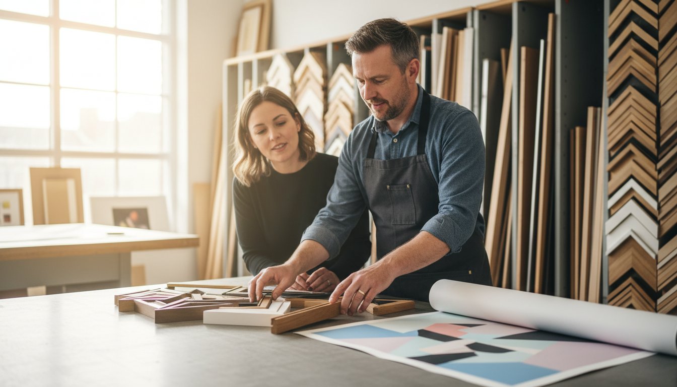
Choosing a mount colour can feel overwhelming, but it doesn’t have to be. With over 20 years of bespoke framing experience, we’ve refined the process into a simple, three-step method that ensures a spectacular result every time. This isn’t just about matching colours; it’s about creating a bridge between your room and the artwork, enhancing the piece without overpowering it. Our goal is to help you answer the question, “what colour mount should I choose?” with confidence and creativity.
Follow these steps to find the perfect partner for your print:
Step 1: Look Beyond the Obvious. Your first instinct might be to match the mount to the most dominant colour in the artwork. Instead, we advise looking for the secondary or tertiary colours. In a landscape by an artist like Anthony Barrow, you might ignore the dominant blue of the sky and instead pick up the subtle, warm ochre from a distant field. This technique creates a sophisticated, cohesive look that draws the viewer deeper into the image.
Step 2: Match the Mood. Every piece of art has its own emotional energy. Is it a vibrant, dynamic abstract bursting with life? Or is it a calm, muted photograph that inspires quiet contemplation? A bright, bold mount can amplify an energetic piece, while a soft, understated tone will preserve the serenity of a calmer one. The mount’s job is to support the artwork’s story, not to tell a different one.
Step 3: Consider Your Walls. The mount is the final link between the art and its environment. Hold your chosen mount samples against your actual wall paint or wallpaper. You’re looking for harmony, not an exact match. The colour should feel at home in the space, complementing your décor while allowing the artwork to remain the star.
Option A: The Neutral Approach (Timeless & Safe)
For a classic, gallery-quality finish, you can’t go wrong with neutral tones like off-white, cream, or pale grey. This approach is timeless for a reason: it provides breathing room, allowing the artwork to speak for itself without any competition. It’s the perfect choice for busy compositions or pieces you want to stand the test of time. For our premium Giclée prints, matching the mount to the specific white tone of the archival paper creates a seamless, professional transition from print to frame. This attention to detail is a key part of professional presentation, a topic covered well in this comprehensive guide to framing art.
Option B: The Accent Approach (Bold & Modern)
If you’re aiming for a more contemporary or dramatic effect, using the mount to create an accent is a powerful choice. By selecting a colour that picks up a tiny, almost hidden detail in the art, you can make that element pop and bring a new dimension to the piece. Dark mounts in charcoal, deep navy, or forest green work beautifully to add depth and drama, especially for light-toned prints or monochrome photography. Just remember the ‘Rule of Tones’: ensure your mount is either significantly darker or lighter than your wall colour to create a clean contrast and avoid a muddled appearance. You can see these principles beautifully applied when you browse the professionally framed pieces in our gallery.
Case Studies: Mounting Iconic Scottish Art from First4Frames
Theory is a great starting point, but the real magic happens when you apply it to actual artwork. To truly understand the impact of a mount, let’s explore how we approach framing for two of Scotland’s most iconic and stylistically different artists, both featured in our First4Frames gallery. Their work provides a perfect lesson in how a bespoke mount can either tame a riot of colour or deepen a dramatic narrative.
Framing Jolomo: Managing Intense Colour
John Lowrie Morrison’s (Jolomo) paintings are an explosion of expressionist energy. His depictions of the Scottish West Coast pulse with vibrant pinks, electric blues, and brilliant yellows. A single, stark white mount can often feel jarring against such intensity. So, when customers ask us what colour mount should I choose for a Jolomo, our bespoke framing team often recommends a double mount. The top mount, a wider layer of a soft, neutral colour like ‘Hayseed’ or ‘Cloudy White’, gives the artwork essential breathing room. The second, thinner mount underneath provides a ‘sliver’ of colour. By carefully selecting a subtle secondary shade from the painting, like a pale yellow to echo a sunlit cottage wall, you create a beautiful, harmonious transition that pulls you right into the landscape. With this much happening in the art and mount, a simple, elegant frame in a matte black or light oak finish is all that’s needed to complete the piece.
Framing Vettriano: Enhancing the Narrative
Jack Vettriano’s work is the polar opposite of Jolomo’s. His art is cinematic, atmospheric, and steeped in a noir-inspired narrative. Here, a light, neutral mount can sever the connection to the piece’s moody interior world. To honour this aesthetic, we often guide clients toward deep, rich tones. A wide, dramatic mount in a deep burgundy, charcoal grey, or classic black can extend the painting’s atmosphere beyond its edges. While many an expert guide to framing and hanging art suggests playing it safe with white, Vettriano’s work often demands a bolder choice. This creates a powerful ‘window’ effect, making you feel as though you’re peering into a private scene from another era. A crucial consideration with dark mounts is reflection. We always recommend pairing them with one of our premium glazing options, like anti-reflective Artglass, to ensure the view remains crystal clear. It’s this attention to detail that our customers praise in their 5-star reviews, ensuring the final framed piece is nothing short of spectacular.
Understanding these different approaches shows that the answer to “what colour mount should I choose?” isn’t a single rule, but a creative decision based on the artwork itself. Whether you’re purchasing a print from our gallery or using our framing service for your own art, our expert team is here to help you make the perfect choice.
Matching the Mount to Your Interior Décor
A picture mount does more than just protect your artwork; it acts as a crucial design bridge, connecting the piece to your room’s décor. The right mount colour can harmonise with your wall paint, echo the tones in your soft furnishings, or create a deliberate, stunning contrast. It’s the final touch that transforms a simple print into an integral part of your home’s aesthetic. So, when asking yourself ‘what colour mount should I choose?‘, think beyond the artwork and consider the entire space.
This holistic view extends to all elements of the room’s architecture and design. For example, the way light enters a room through its windows plays a huge role. The clean, structured lines of high-quality window shutters, such as those designed by specialists like Shutters Factory, can create a particular style—be it modern minimalism or classic elegance—that you may want your framing choices to reflect.
The lighting in your room plays a significant role. A crisp, brilliant white mount might look spectacular in a room with abundant natural light, but under the warm, yellow glow of a 2700K tungsten bulb in the evening, it can appear jarringly bright. Conversely, a subtle off-white or cream mount can look dull under cool, blue-toned LED office lighting. We find that our ‘Minuet’ conservation-grade mount board, a soft and versatile off-white, works beautifully in over 90% of residential settings because it adapts gracefully to changing light conditions.
Your goal also dictates the choice. For a personal gallery wall at home, the selection is about your unique story. For commercial spaces, such as staging a new property development or designing a hotel lobby, the mount’s job is to create a cohesive and aspirational atmosphere that appeals to a wider audience.
The Gallery Wall Strategy
Creating a gallery wall is a beautiful way to display a collection, but it presents a key question: should all the mounts match? Using a uniform mount colour, like a consistent off-white, is a professional trick to bring order and sophistication to a collection of different art styles and frame types. It creates a visual rhythm that allows the eye to move seamlessly from a vibrant abstract by Sarah Hooper to a delicate botanical print. This approach is one we frequently recommend to our commercial clients, helping them curate a high-end, cohesive look across multiple rooms with precision and style.
Measuring and Proportion
Great mounting isn’t just about colour; it’s about proportion. Have you ever noticed how professionally framed art just looks ‘right’? The secret is often ‘bottom weighting’. This technique involves making the bottom border of the mount slightly wider than the top and sides, typically by 10-20%. This small adjustment counteracts an optical illusion that makes a centred object appear to be slipping down, giving the artwork a stable, perfectly balanced foundation. This level of detail is only achievable with a bespoke service, which allows for creative and precise proportions that standard off-the-shelf frames can’t offer.
Achieving this professional finish is embedded in our simple, three-step process. First, browse the beautiful fine art in our gallery. Second, choose your bespoke frame and mount combination, applying these expert principles. Third, place your order and let our craftsmanship bring it all together. Ready to find the perfect piece and apply these professional mounting principles? Explore the First4Frames gallery today.
Experience the First4Frames Bespoke Framing Service
Choosing the right mount is an art form in itself, but you don’t have to master it alone. For over 20 years, our family-run business in Falkirk, Scotland, has been the trusted partner for art lovers and creators. We combine a deep passion for craftsmanship with professional expertise to help you find the perfect finish for your artwork, ensuring every piece looks its absolute best.
Our unique advantage is the ‘one-stop-shop’ experience. You can explore our gallery’s stunning collection of fine art Giclée prints and have your chosen piece professionally mounted and framed right here. This seamless process means your art arrives ready to hang, with every element perfectly harmonised by our expert team. We handle all the details, so you can simply enjoy the beautiful result. This commitment to quality is why our customers have given us a 4.9-star rating on Google Reviews; we believe every frame should be a masterpiece.
At the heart of our service is an unwavering dedication to quality. We source only the best materials for every bespoke order, from premium, conservation-grade mount boards that protect your art from discolouration to high-clarity glazing. Our professional craftsmanship ensures precision-cut mounts and flawlessly joined frames that are built to last a lifetime.
Custom Framing for Your Own Treasures
Our expertise extends far beyond the prints in our gallery. We apply the same principles of colour theory and design to your own cherished items. Bring us your family photographs, military medals, or treasured memorabilia, and we’ll help you preserve and display them with the care they deserve. Our consultation process makes deciding what colour mount should I choose a creative and enjoyable experience, as we guide you through a spectacular range of options to find the perfect match.
Visit Our Falkirk Gallery
The best way to understand the impact of a mount is to see it for yourself. We invite you to visit our Falkirk gallery to experience our spectacular Giclée prints in person, where you can truly appreciate their rich texture and vibrant colour. Get hands-on with our extensive range of mount samples and see the ‘bridge’ effect in real-time as you pair different tones with beautiful artwork. Let us help you find the perfect combination. Start your artistic discovery and browse our gallery today.
Frame Your Art with Confidence and Craftsmanship
Choosing a mount is no longer a mystery. By remembering to serve the artwork first and considering how the mount acts as a bridge to your décor, you can select a colour that truly elevates your piece. You now have the professional insight to decide whether a neutral tone will let the art speak for itself or if a bolder choice will create a stunning statement. Armed with this advice, the question of what colour mount should I choose transforms from a daunting task into an exciting part of the creative process.
At First4Frames, we’ve channelled over 20 years of bespoke framing expertise into helping art lovers make these very decisions. Our passion for craftsmanship is reflected in our top-rated customer reviews for quality and service, particularly for the spectacular Scottish fine art and Giclée prints we specialise in. You’re not just buying a frame; you’re investing in decades of experience.
What is the most popular mount colour for art prints?
The most popular mount colour is overwhelmingly a shade of off-white or ivory. Classic choices like our ‘Snow White’ or ‘Antique White’ mounts are versatile and timeless. They create a clean, bright space around your artwork, allowing the piece itself to be the true focus without any colour distraction. This neutral approach complements the vast majority of art styles and interior decors, making it a safe yet professional choice for almost any print in our gallery.
Should the mount be lighter or darker than the wall?
A mount should typically be lighter than the artwork but distinct from your wall colour. This creates a beautiful, seamless transition from the wall to the art. If you’re wondering what colour mount should I choose to make a statement, a darker mount can make the colours in your print appear more vibrant and ‘pop’. However, for most pieces, a soft, neutral mount that is a few shades lighter than the most prominent colour in the art provides a classic, gallery-quality finish.
What is a double mount, and when should I use one?
A double mount features two layers of mountboard, with the bottom layer cut slightly larger to reveal a thin border of colour around the artwork. It’s a premium technique used to add depth and a bespoke, decorative finish. We often use a double mount to pick out a subtle secondary colour from one of our artist’s prints, creating a stunning, cohesive look. This small detail elevates the final piece, demonstrating true bespoke craftsmanship and drawing your eye into the image.
Can I change the mount colour if I change my room décor?
Yes, you can absolutely change the mount if your décor changes. It’s one of the simplest and most effective ways to refresh your framed art. Our professional picture framing service can easily replace an existing mount with a new one to perfectly match your updated colour scheme. This is a far more cost-effective solution than buying entirely new art, ensuring the pieces you love continue to look perfect in your home, a service reflected in our excellent customer ratings.
Does the mount colour affect the perceived size of the artwork?
Yes, the mount colour significantly affects the perceived size of your artwork. A light or white mount tends to open up the image, making the entire framed piece feel larger and more airy on your wall. In contrast, a dark mount, such as a deep grey or black, creates a more focused and contained effect. This can sometimes make the artwork itself appear slightly smaller, but it also adds a sense of drama and intimacy to the viewing experience.
Is there a ‘standard’ width for a picture mount?
There isn’t a strict ‘standard’ width, as the perfect mount is always proportional to the artwork. However, a common guideline for most A4 to A2 sized prints is a width between 50mm and 85mm. The primary goal is to give the artwork breathing room, preventing it from feeling cramped against the frame. For very large or small pieces, our bespoke framing experts adjust this width to achieve the perfect visual balance, ensuring a professional and harmonious result.
How do I choose a mount for a black and white photograph?
For a black and white photograph, classic mount choices are crisp white, off-white, or black. A pure white mount creates a sharp, high-contrast look that makes the blacks in the photo appear deeper and richer. An off-white provides a softer, more traditional feel. For a bold, contemporary statement, a black mount is superb, especially when paired with a thin white inner mount (a double mount) to cleanly separate the photograph from the dark surround.
Why should I choose an acid-free mount for my Giclée prints?
You should always choose an acid-free mount for Giclée prints to guarantee their preservation. Standard mounts contain acids that can seep into the paper over years, causing permanent yellowing and damage known as ‘mat burn’. Our conservation-grade, acid-free mounts are pH neutral. They protect your fine art print from deterioration, ensuring the archival inks and paper retain their vibrancy and quality for over 100 years, safeguarding your investment in beautiful, lasting art.
You’ve found the perfect piece of art or a treasured photograph that deserves pride of place on your wall. But now comes the daunting part: choosing the frame. Faced with a sea of mouldings, mounts, and glazing options, it’s easy to feel overwhelmed, worried about making a costly mistake that fails to do your artwork justice. This is where expert guidance makes all the difference. When you get a framing consultation, you’re not just buying a frame; you’re partnering with a passionate specialist who understands how to make your art truly shine.
A frame is the essential bridge between your art and your home décor, and choosing the right one is a craft in itself. In this guide, we’ll demystify the bespoke framing process. Discover how our expert advice helps you navigate the choices with confidence, select the perfect premium materials to both enhance and preserve your piece for generations, and create a beautifully finished work of art you’ll be proud to display. Let’s turn your vision into a spectacular reality you can love for years to come.
Key Takeaways
A professional consultation is a creative collaboration, ensuring your frame does more than just surround your art-it enhances it.
Discover how bespoke framing can protect and elevate almost any item, from fine art prints to cherished family memorabilia.
A little preparation, like considering where your art will hang, helps our experts provide the best possible advice for a perfect result.
The best way to protect your treasures and find a style you love is to get a framing consultation with a skilled professional.
Why a Professional Framing Consultation is Your Most Important Step
Choosing a frame for your cherished artwork or print is about so much more than just picking four pieces of wood. It’s the final, crucial step in creating a beautiful presentation that protects your piece and enhances your home. This is where a professional framing consultation becomes your most valuable asset. It’s a creative collaboration between you and an expert artisan, transforming a good piece into a spectacular focal point. It’s the difference between an ‘okay’ result and a genuine ‘wow’ moment every time you walk into the room.
To see what this collaborative process looks like, watch this short video:
The Expert Eye for Design and Aesthetics
Our experts bring years of craftsmanship and a deep understanding of design principles to every project. We act as the bridge between your artwork and your room’s décor, considering everything from colour balance to proportion. We’ll guide you on:
Style & Mood: From traditional ornate frames that evoke a classic feel to sleek, modern profiles for a contemporary look, the style can completely change the artwork’s mood. Understanding the history of picture frames helps inform these creative choices.
Colour & Proportion: We help select the perfect mount colour and width to draw the eye inward, giving the artwork space to breathe without overwhelming it.
Your Space: We consider your existing décor, wall colour, and lighting to ensure the final piece feels perfectly at home.
The Science of Preservation Framing
A beautiful frame must also be a protective one. Our bespoke framing service uses conservation-grade materials to safeguard your art for decades to come. We protect your piece from common enemies like UV light, which causes fading, and humidity. By using acid-free mounts and backing boards, we prevent the yellowing and deterioration that can occur with standard materials, ensuring your treasured memories or valuable art remain in pristine condition.
Avoiding Costly Mistakes and ‘Framing Regret’
We’ve all seen it: a beautiful picture diminished by a poorly chosen frame. When you get a framing consultation, you eliminate the guesswork and avoid that sinking feeling of ‘framing regret’. Our experts ensure the choice complements, rather than competes with, your artwork. For larger or heavier pieces, we guarantee the structural integrity to hang it safely. Getting it right the first time saves you the significant time and expense of a costly re-frame down the line.
What to Expect During Your First4Frames Consultation
When you get a framing consultation with First4Frames, you’re not just scheduling a service; you’re starting a creative partnership. Our process is designed to be welcoming, collaborative, and genuinely inspiring. We believe the journey of framing your treasured piece should be as beautiful as the final result. This is a hands-on experience, not a transaction, where we take the time to understand your artwork and your vision, ensuring you leave feeling confident and excited about your bespoke frame.
Step 1: The Conversation – Understanding Your Piece
Every piece has a story, and we want to hear it. Our consultation begins with a friendly chat about your artwork. Is it a family heirloom, a travel souvenir, or a spectacular fine art print? We’ll ask where it will be displayed to consider lighting, décor, and the environment. This is your chance to share your personal style and any ideas you have. This initial conversation is crucial, as it allows us to tailor our suggestions perfectly to you and your home.
Step 2: Exploring the Options – A Hands-On Approach
This is where the magic happens. We’ll lay your artwork on our design table and bring out a curated selection of mount and frame samples. You can see and feel the quality of our premium mouldings and materials, from classic hardwoods to contemporary finishes. We will guide you through the technical choices, like selecting the right glazing-from standard to anti-reflective UV glass-explaining the benefits of each. This tactile process, guided by standards of excellence championed by organisations like the Professional Picture Framers Association (PPFA), makes it far easier to visualise the perfect combination and appreciate the craftsmanship involved.
Step 3: Visualisation and Finalising the Design
Once we’ve narrowed down the options, we’ll help you see how all the components work together to enhance your artwork. For more complex or large-scale projects, we can even create digital mock-ups to give you a precise preview. When you are completely happy with the design, we will finalise the specifications. To conclude, you will receive a clear, transparent, no-obligation quote in pounds (£). The decision to proceed is entirely yours, but our goal is to ensure that when you get a framing consultation with us, you leave with a perfect, bespoke design you truly love.
How to Prepare for Your Consultation for the Best Results
A little preparation can make your time with our framing experts even more effective. When you come prepared, you help us give you the most accurate advice and bespoke recommendations for your piece. These simple steps ensure that when you get a framing consultation with us, the session is smooth, productive, and inspiring. And remember, our passionate team is here to guide you every step of the way, even if you’re unsure where to begin.
Bring Your Artwork and Key Information
The most crucial step is to bring the physical piece of art with you. This allows our experts to assess its condition, colours, and texture up close, ensuring we recommend the perfect materials. Seeing the work in person helps us advise on everything from UV-protective glazing to the nuances of preservation matting and framing. For very large or bulky items, please bring:
Accurate measurements (height, width, and depth).
Several clear, well-lit photographs of the piece.
A few photos of the room where the art will hang. This context is invaluable for choosing a frame that acts as a beautiful bridge between your artwork and your décor.
Consider Your Budget and Style
Having a general budget in mind helps us guide you toward the best options within your price range. Our extensive collection includes mouldings and materials to suit every project, from simple poster frames to elaborate, museum-quality displays. It’s also helpful to think about your personal taste. Are you drawn to modern minimalism, traditional elegance, or a more eclectic style? Don’t worry if you can’t put a name to it; we are experts at helping you define your aesthetic and finding the perfect frame to match.
Come with an Open Mind
While it’s great to have ideas, we encourage you to come with an open mind. With over two decades of experience, our framers have a trained eye for design and can offer suggestions you may not have considered. Sometimes the most unexpected combination of mount colour and frame style creates the most spectacular, head-turning result. We love the collaborative journey of finding that perfect finish that makes your art truly sing.
From Prints to Memorabilia: What Can We Frame for You?
At First4Frames Gallery, our passion for craftsmanship extends to almost any item you can imagine. With over two decades of experience, we have developed bespoke framing solutions for a spectacular range of art, objects, and personal treasures. No project is too big, too small, or too unusual for our dedicated team. From a single precious photograph to a large-scale original canvas, we treat every piece with the same professional care.
If you have something unique in mind, the best first step is to get a framing consultation with our experts. In the meantime, here are just a few examples of the items we regularly transform.
Fine Art, Giclée Prints, and Posters
A beautiful frame is the bridge between your art and your decor. We specialise in enhancing the beauty of original paintings and limited editions, ensuring the frame complements the artist’s vision without overpowering it. Our premium craftsmanship can make high-quality Giclée prints look like gallery masterpieces and elevate even simple posters into stylish, personal pieces of wall art that command attention.
Photographs, Diplomas, and Certificates
Your most important moments deserve to be preserved and displayed with pride. We create elegant, professional displays for diplomas and certificates that reflect your hard-earned achievements. For cherished family photos and portraits, we use conservation techniques and UV-protective glass to shield them from fading over time. Choose from countless options, from a classic single frame to a custom multi-opening collage that tells a bigger story.
3D Objects and Memorabilia
Some memories can’t be contained in a flat frame. Our custom box frames are the perfect solution for showcasing treasured 3D memorabilia, from sports shirts and medals to collectibles and sentimental objects. Using specialised, secure mounting techniques, we create a protected and stylish display that turns your memories into a unique and deeply personal piece of art for your home.
Whatever you wish to display, our team has the expertise to bring your vision to life. If you’re ready to protect and showcase your treasured items, get a framing consultation today and let’s create something spectacular together. You can also explore our online gallery for more inspiration.
Begin Your Bespoke Framing Journey
Your artwork deserves more than just a frame; it deserves a perfect presentation. A professional consultation is the vital first step-a collaborative journey where your vision meets our expertise. By understanding what to expect and preparing for your visit, you ensure the final result is a beautiful bridge between your piece and your space. It’s why it is so valuable to get a framing consultation with true artisans who are passionate about their craft.
With over 20 years of professional framing experience, our passionate team of local Scottish artisans at First 4 Frames is dedicated to this craft. We use only high-quality, conservation-grade materials to ensure your treasured prints, memorabilia, and artwork are protected and beautifully presented for a lifetime of enjoyment.
Frequently Asked Questions About Our Framing Consultations
How much does a framing consultation cost?
Our expert framing consultations are completely free of charge. We believe everyone deserves access to professional advice to find the perfect frame for their art. This is a no-obligation service designed to help you explore the possibilities for your piece. Our passion is helping you create a spectacular display, and this initial conversation is the first step in that creative journey. We are here to provide guidance and inspiration without any upfront cost.
How long does a typical framing consultation take?
A typical consultation lasts between 15 and 30 minutes. The exact time depends on your specific needs and the complexity of your project. During this dedicated session, we will discuss your artwork, your personal style, and your décor. We’ll explore different mount boards, mouldings, and glazing options to find the perfect combination. Our goal is to be thorough and helpful, ensuring you feel confident in your choices without taking up too much of your day.
Do I need to book an appointment for a consultation?
Yes, we highly recommend booking an appointment. While we do our best to accommodate walk-in visitors, booking ensures you have the undivided attention of one of our framing specialists. An appointment guarantees we have dedicated time set aside just for you to discuss your artwork in detail. This allows us to provide the focused, bespoke service your art deserves and helps us manage our time to give every client the best possible experience.
What should I do if I can’t bring my artwork to the gallery?
That’s no problem at all. We can still provide a comprehensive consultation remotely. Simply email us high-quality photographs of your artwork, along with its exact dimensions. We can then schedule a phone or video call to discuss your vision and show you samples. It’s now easier than ever to get a framing consultation from the comfort of your home, ensuring you receive the same expert advice and personalised service as an in-person visit.
Will you give me a quote during the consultation?
Absolutely. At the end of our discussion, we will provide you with a detailed, no-obligation quote. This quote will clearly outline the costs for all the chosen components, including the frame moulding, mount, glazing, and any other specialist materials or work required. We believe in complete transparency, allowing you to make an informed decision with a full understanding of the investment in your beautifully finished piece. There are no hidden fees or charges.
What’s the difference between your service and a cheap ready-made frame?
The difference lies in craftsmanship, quality, and preservation. A ready-made frame uses standard sizes and lower-grade materials that can damage your artwork over time. Our bespoke service creates a frame that is the perfect partner for your art-a bridge between the piece and your room’s décor. We use premium, conservation-grade materials that protect your art from fading and environmental damage, ensuring it remains beautiful for generations to come.
That beautiful print you finally bought, the family photograph you cherish, or the original artwork you invested in – these pieces deserve more than just a frame; they deserve the perfect one. Yet, navigating the world of mounts, glass types, and materials can feel overwhelming. It’s easy to make common picture framing mistakes to avoid that could, at best, fail to do your art justice, and at worst, cause costly and irreversible damage over time. Don’t let uncertainty prevent you from creating a stunning display.
As passionate experts in bespoke craftsmanship, we’re here to guide you. This article will walk you through the ten most common pitfalls, ensuring you can confidently choose the right elements for your piece. You’ll learn how to protect your artwork from fading, achieve a spectacular, gallery-quality finish in your own home, and understand exactly when it’s worth investing in a professional service. Let’s ensure your art is beautifully and safely displayed for a lifetime.
Mistake #1: Ignoring Conservation-Grade Materials
One of the most significant picture framing mistakes to avoid is viewing a frame as purely decorative. While a beautiful frame enhances your artwork and complements your décor, its most crucial role is preservation. A well-made picture frame is a protective shield, and opting for cheap, low-quality materials can cause irreversible damage to the very piece you wish to display. This is where the professional standard of ‘conservation framing’ becomes essential, ensuring your art is protected for generations.
At its core, conservation framing uses premium materials specifically designed to protect your artwork from environmental damage. To see why this is so important, the video below offers an excellent overview of common pitfalls.
Using Acidic Mounts and Backing Boards
Standard mount boards are often made from wood pulp, which contains acid. Over time, this acid leeches out of the board and into your artwork, causing a brownish stain known as ‘mat burn’. This discolouration is permanent and is perhaps the most common cause of damage we see. To prevent this, always insist on professional-grade materials like acid-free or, for ultimate protection, 100% cotton rag mounts and backing boards. These are chemically inert and will not harm your art.
Choosing the Wrong Type of Glazing (Glass)
Think of standard glass as a window that lets in damaging sunlight. It offers virtually no protection from ultraviolet (UV) rays, which are the primary cause of fading in photographs, prints, and original watercolours. The damage is gradual but devastating. In contrast, conservation-grade glazing is coated to filter out 99% of harmful UV rays, dramatically slowing the fading process. For crystal-clear viewing without distracting reflections, you can also opt for premium anti-reflective glass.
Improperly Securing the Artwork
Never, ever use household tapes like Sellotape or masking tape to attach your art to its mount. These tapes contain acids and adhesives that will yellow, become brittle, and leave a sticky, damaging residue that is extremely difficult to remove. The professional method involves using specialised acid-free paper ‘T-hinges’ to suspend the artwork from the backing board. This allows the paper to expand and contract naturally with changes in humidity, preventing buckling while ensuring it can be safely removed in the future.
Mistake #2: Making Poor Aesthetic and Design Choices
While the first mistake focuses on preservation, this one is about presentation. A frame does more than just protect; it’s a critical design element that completes the artwork. The right choice enhances the piece, pulling you into the picture, while the wrong one can be a jarring distraction. The goal is to create harmony between the art, the frame, and your room’s decor. The impact of picture frames on an interior space is significant, and getting the colour and proportions right is crucial for a spectacular result.
Selecting the Wrong Frame Size or Proportions
Proportion is everything. A frame that is out of scale with the artwork can make the entire presentation feel unbalanced. A large, powerful piece of art will look flimsy and unsupported in a frame that’s too thin. Conversely, a delicate sketch or a small photograph can be completely overwhelmed by a thick, bulky frame. A good rule of thumb is for the frame’s width to be a noticeable accent but never so wide that it competes with the art for attention. Think of it as the final, perfecting touch, not the main event.
Mismanaging the Mount (Mat Board)
The mount, or mat board, provides visual breathing space and is key to a professional finish. One of the most common picture framing mistakes to avoid is using a mount with perfectly equal borders. For a more balanced and visually stable look, the bottom border should be slightly ‘weighted’-or deeper-than the top and sides. This subtle adjustment prevents the optical illusion of the artwork ‘slipping’ down inside the frame. We also advise choosing a neutral mount colour, like off-white or soft grey, to let the artwork’s colours shine without competition.
Clashing the Frame Style with the Artwork
Your frame style should always complement the artwork’s personality. Placing a sleek, contemporary abstract print into a heavily ornate, traditional gold frame creates a jarring visual disconnect that serves neither the art nor the frame. The key is to consider the artwork’s era, style, and mood. Minimalist black or natural wood frames often pair beautifully with modern photography, while classic art may call for a more detailed profile. It’s about creating a harmonious pairing that feels intentional. See how we pair frames with art in our gallery.
Mistake #3: Falling into the ‘Ready-Made’ Frame Trap
We’ve all been there. You find a piece of art you love, and the next logical step is a frame. The high street and online giants offer a tempting solution: cheap, ready-made frames that promise a quick fix for just a few pounds. While the low price tag seems like a victory, it often hides a much greater cost down the line. Many people believe professional framing is too expensive, but this is one of the most common picture framing mistakes to avoid. Think of it not as an expense, but as an investment in protecting something you cherish. The real cost of a cheap frame is the potential damage to your art-a classic case of “pay now or pay later.”
Forcing Your Art into a Standard Size
The first problem you’ll encounter is the one-size-fits-all approach. Most original art, prints, and photographs don’t conform perfectly to standard A4 or 50x70cm dimensions. This leaves you with a difficult choice: do you crop the edges of your beautiful artwork, or do you leave awkward, uneven gaps around it? Neither option does justice to the piece. A bespoke frame, however, is built with precision craftsmanship around your art, ensuring a perfect, harmonious fit that elevates the final presentation from amateur to spectacular.
Overlooking Low-Quality Construction
Beyond the poor fit, the materials used in mass-produced frames are simply not designed for preservation. You’ll often find:
Flimsy plastic or styrene glazing that scratches easily and offers no UV protection.
Thin, acidic backing boards made of cardboard that will leach chemicals and cause yellowing over time.
Poorly joined corners held by staples that can separate, leaving the frame unstable.
These materials are a false economy. They actively harm your artwork. True preservation requires archival-quality, acid-free materials as outlined in professional conservation framing guidelines. Choosing a quality, professionally made frame is the single best way to ensure your art is protected for years to come, avoiding one of the costliest picture framing mistakes to avoid. A premium frame is a protective home, not just a decorative border. To see the profound difference that professional craftsmanship makes, we invite you to explore our online gallery.
Mistake #4: Committing Hanging and Placement Errors
You’ve invested in a beautiful, bespoke frame that perfectly complements your art. The job is done, right? Not quite. How and where you hang your artwork is the final, crucial step in its presentation. Even a professionally framed masterpiece can look out of place if hung incorrectly. Committing these common placement errors is one of the most disheartening picture framing mistakes to avoid, but thankfully, they are simple to fix.
Here are our expert tips for hanging your art with the precision and care it deserves.
Hanging Artwork Too High
This is perhaps the most frequent interior design mistake we see. Art hung too high feels disconnected from the room and its furniture. The solution is simple: follow the gallery rule. The centre of your artwork should be at average eye level, which is between 57 and 60 inches (approximately 145-152 cm) from the floor. This standard creates a natural, comfortable viewing experience and ensures your art feels grounded in the space.
Poor Lighting and Environmental Placement
Where you hang your art matters just as much as how high you hang it. The wrong environment can not only diminish its visual impact but also cause irreversible damage over time. Keep these key points in mind:
Avoid Direct Sunlight: Even with UV-protective glazing, prolonged exposure to harsh, direct sunlight will cause colours to fade. Choose a wall that doesn’t receive direct sun.
Beware of Humidity and Heat: High-moisture areas like bathrooms or kitchens can lead to warping and mould. Similarly, hanging art above a radiator or fireplace can cause the materials to dry out and crack.
Illuminate Intentionally: To make your art truly stand out, consider using directional spotlights or a dedicated picture light. This ensures your piece is beautifully lit without being exposed to harmful elements.
Creating Awkward Groupings or Spacing
The relationship between artworks and the space around them is critical. A tiny frame floating alone on a vast wall will look lost, while a gallery wall with inconsistent, wide gaps can feel chaotic. When creating a gallery wall, treat the entire collection as one single unit. A professional tip is to lay out your arrangement on the floor first. Trace each frame onto paper, cut them out, and tape them to the wall to perfect your spacing before hammering a single nail.
Getting the placement right is the final flourish that honours your art. Once you’ve mastered these hanging techniques, you’ll be ready to find your next spectacular piece. Explore our gallery for inspiration.
Frame Your Memories, Flawlessly
Your artwork tells a story, and its frame is a crucial part of the narrative. From selecting conservation-grade materials that protect against fading to making aesthetic choices that enhance its beauty, the details matter immensely. Escaping the ‘ready-made’ trap and ensuring correct placement are just as vital. By understanding these common picture framing mistakes to avoid, you can ensure your cherished art is preserved and presented perfectly for generations to enjoy.
Don’t leave it to chance. At First4Frames Gallery, we bring over 20 years of professional framing experience to every project. Our passion lies in craftsmanship, using only the finest conservation-grade materials to offer a truly bespoke service tailored to your artwork and your home. We build the perfect bridge between your piece and your décor, ensuring a flawless result every time. Avoid these mistakes. Trust our experts with your bespoke framing needs.
Embark on your framing journey with confidence. Let’s give your art the spectacular, lasting home it truly deserves.
Frequently Asked Questions
Is professional picture framing really worth the cost?
Absolutely. While professional framing can range from £50 to over £200, it’s a worthwhile investment in protecting your art. A professional framer uses archival, acid-free materials and UV-protective glass that prevent fading and irreversible damage over time. This bespoke craftsmanship not only enhances the artwork’s beauty but ensures its longevity, making it a crucial step for any piece you truly value, whether its worth is sentimental or monetary.
How can I tell if my current picture frame is damaging my art?
Look for tell-tale signs of poor-quality framing. Yellowing or brown marks on the artwork or mount board, known as acid burn, are a clear red flag. If the colours in your print appear faded, it likely lacks UV-protective glass. Also, check if the artwork is pressed directly against the glass; this can cause moisture damage and sticking. A flimsy frame that feels loose or weak also fails to provide adequate physical protection for your piece.
What is the most important thing to invest in: the frame, the mount, or the glass?
While all three elements work together, the mount and the glass are most critical for preservation. An acid-free, archival-quality mount is essential to prevent chemical burns that can destroy your artwork. Secondly, investing in glazing with at least 99% UV protection is the only way to prevent colours from fading over time. The frame provides the structural support and aesthetic finish, but the mount and glass do the real heavy lifting in protecting your art.
Can I frame a canvas painting myself?
While it is possible to frame a stretched canvas at home, especially with a simple floater frame, it requires care and precision. The main challenge is ensuring the canvas is stretched with perfect, even tension to avoid sagging or rippling over time. For valuable or sentimental paintings, we always recommend professional framing. This ensures the canvas is handled correctly and securely fitted, helping you steer clear of common DIY picture framing mistakes to avoid long-term damage.
How do I clean the glass on my framed pictures without causing damage?
The golden rule is to never spray cleaner directly onto the glass. Liquid can easily seep under the edge of the frame and damage the mount or the artwork itself. Instead, lightly spray a gentle, ammonia-free glass cleaner onto a clean microfibre cloth. Wipe the glass carefully, then use a dry part of the cloth to buff away any streaks. For acrylic or Perspex glazing, use only a cleaner specifically designed for acrylic to prevent scratching.
What’s the best way to hang a very heavy picture frame securely?
For any frame weighing over 10kg, standard picture hooks are not sufficient. The most secure method is to use two heavy-duty D-rings screwed into the back of the frame, hung on two separate, robust wall hooks. This distributes the weight evenly and helps keep the frame level. Always ensure your wall fixings are drilled into a solid stud in a plasterboard wall or secured with appropriate rawl plugs in a brick wall for maximum safety.