Last Tuesday, a collector at our First4frames gallery stood before a vibrant new landscape by one of our featured artists, wondering why the piece felt slightly unfinished against her lounge walls. She isn’t alone; many of our visitors find that choosing the right border is the most challenging part of the artistic journey. You might be asking yourself, what is a float frame, and why is it the preferred choice for modern galleries and professional installations?
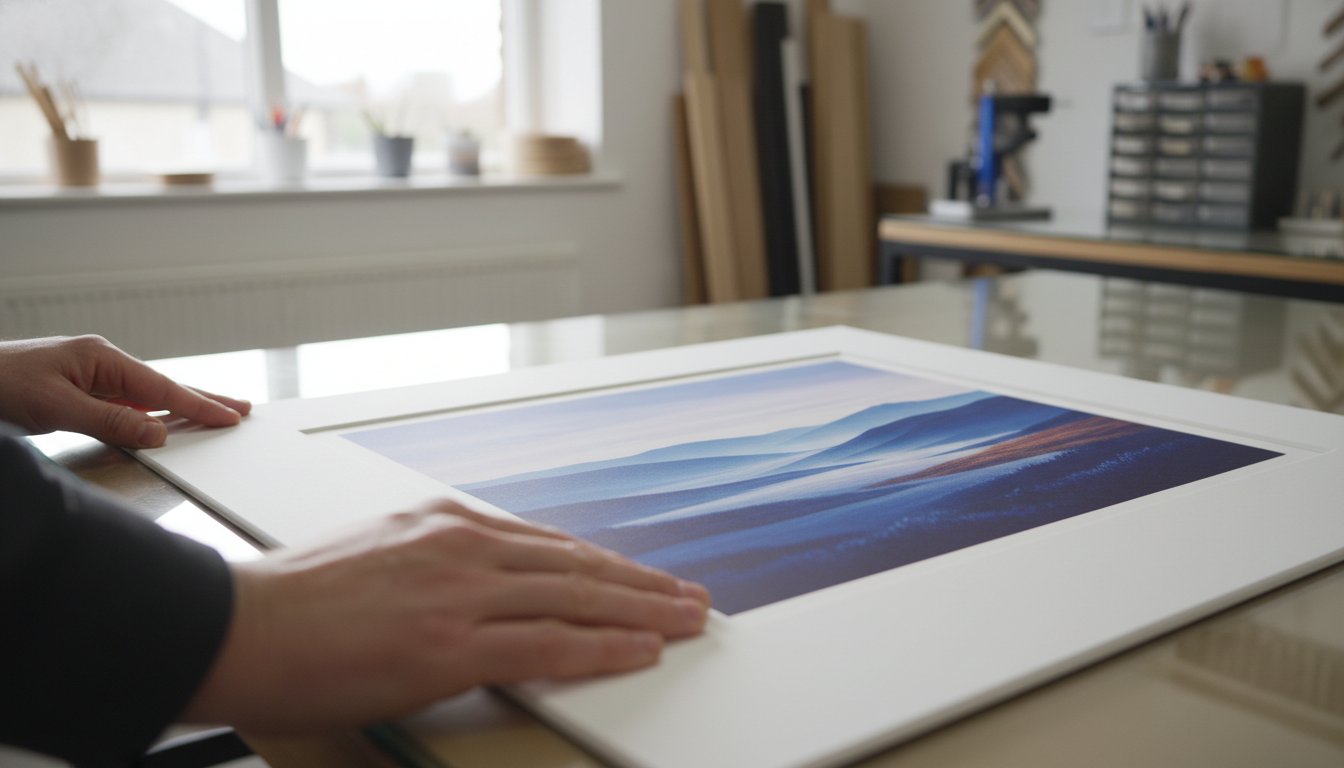
We know that ordering bespoke framing can feel intimidating, especially when you’re worried about measuring a precious piece incorrectly or picking a style that clashes with your furniture. You want your artwork to stand out, not get lost in a bulky traditional frame. This guide will help you discover how float frames create a sophisticated three-dimensional ‘shadow gap’ effect to elevate your canvases and fine art prints with ease.
We’ll walk you through the visual benefits of the ‘floating’ effect and help you choose between premium wood and metal finishes. Whether you’re using our dedicated framing service for a cherished original or our print-and-frame service for a new digital piece, our twenty years of experience ensures a perfect result. Our 4.9-star customer reviews prove that professional quality doesn’t have to be complicated.
Key Takeaways
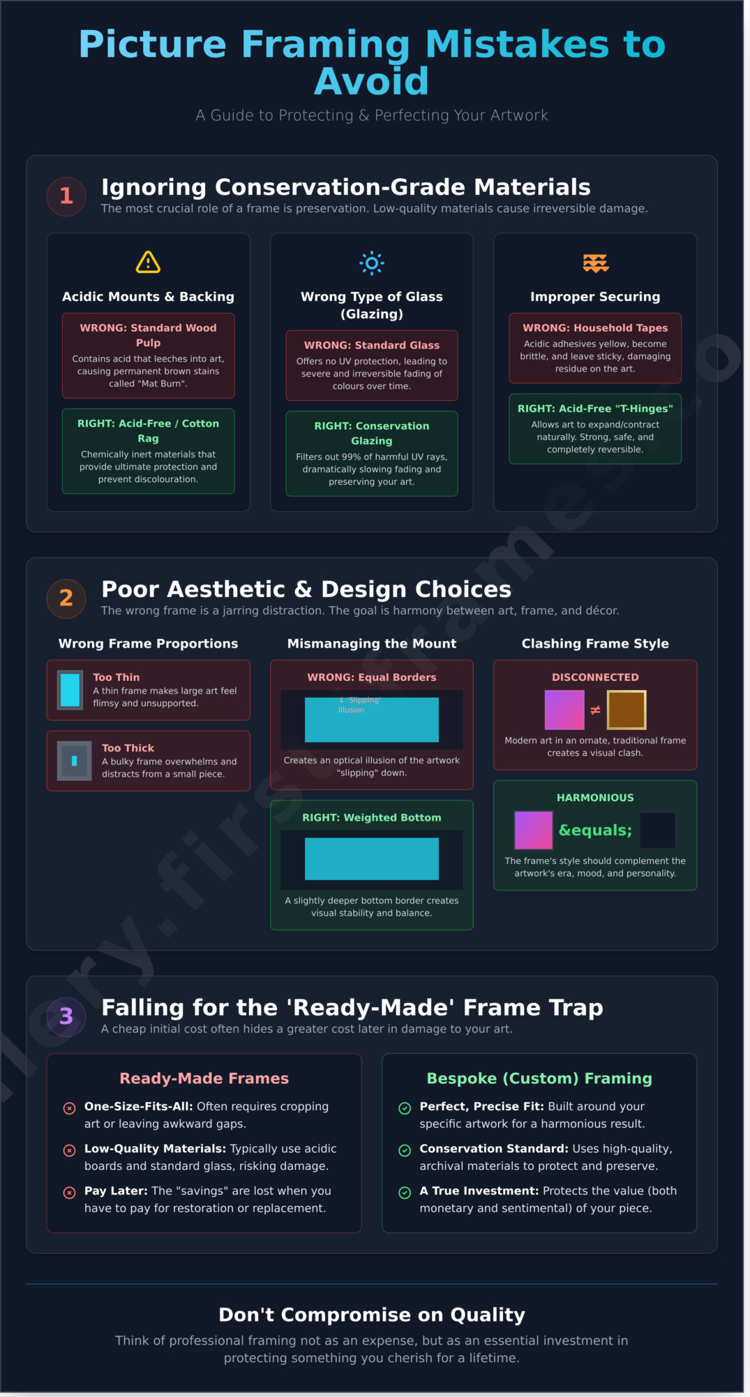
- Understand exactly what is a float frame and how its unique L-shaped profile creates a sophisticated “shadow gap” that makes your artwork appear to hover.
- Discover how our bespoke framing service uses the “bridge” concept to seamlessly connect your room’s décor with the vibrant colours of your favourite fine art.
- Learn the technical differences between floating stretched canvases and paper prints to ensure your chosen medium receives a premium, gallery-standard finish.
- Master the professional method for measuring your artwork and selecting the perfect 5mm to 10mm shadow gap for a spectacular three-dimensional effect.
- See how the expert craftsmanship at First4Frames Gallery elevates the work of Scottish artists like Jolomo, providing a trusted service backed by excellent customer ratings.
Understanding the Floating Frame: The Shadow Gap Illusion
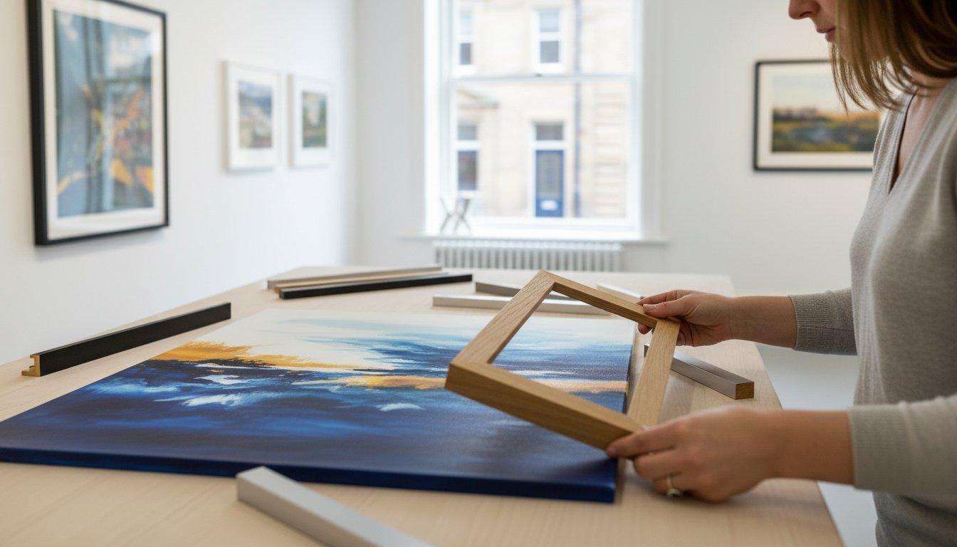
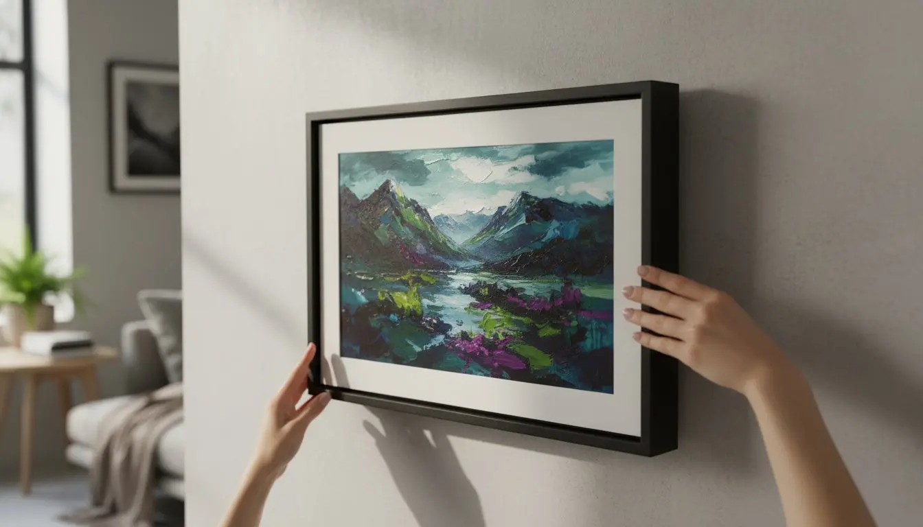
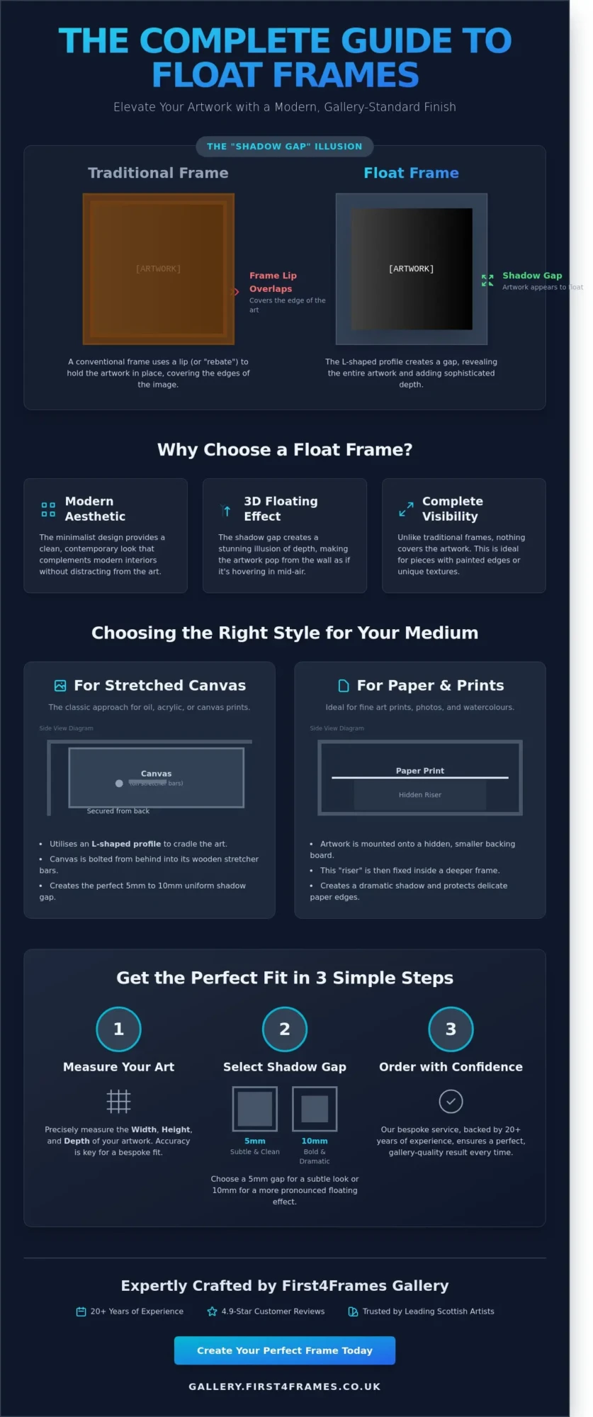
If you’ve ever wondered what is a float frame, you aren’t alone. At First 4 Frames, we often explain this elegant solution to customers looking to elevate their canvas art. Unlike a standard picture frame that uses a “lip” or rebate to overlap the edge of the artwork, a float frame features a distinct L-shaped profile. The artwork is secured from the back, sitting inside the “tray” without anything covering the front of the image. This allows the entire piece to remain visible, right to the very edge of the canvas.
The defining characteristic of this style is the “shadow gap.” This is the intentional space, usually between 5mm and 10mm, left between the edge of the artwork and the inner wall of the frame. It creates a powerful visual illusion, making the artwork appear as if it’s “hovering” or “floating” in mid-air without any visible means of support. Our First4frames gallery features many artists who prefer this method because it adds three-dimensional depth to their work without distracting from the composition.
This minimalist approach provides a clean, sophisticated look that suits modern interiors across the UK. Because the frame doesn’t touch the face of the art, it’s particularly effective for pieces where the artist has painted around the sides of the canvas. Our bespoke framing service ensures that this gap is perfectly uniform, a detail that highlights the precision and craftsmanship we’ve developed over 20 years in the industry.
The History and Rise of the Floater Frame
The origins of the floater frame trace back to mid-century modern galleries in the 1950s and 60s. Curators needed a way to protect large canvases without the heavy, ornate borders of the past. Over the decades, this style transitioned from exclusive London galleries into contemporary UK home décor. It has helped make fine art feel more accessible and less formal. Many of the featured artists in our First4frames gallery choose this style to bridge the gap between their room décor and the artwork itself. It creates a professional finish that feels both high-end and inviting.
Key Terminology: Tray Frames vs. Shadow Boxes
Terminology can be confusing for those new to the world of art. In the UK, “tray frame” is the most common term used by professionals for canvas floaters. While some people use the term “shadow box,” these are actually different products. A shadow box is much deeper and typically includes a glass front to protect 3D memorabilia or delicate objects. Professional framers prefer the term “floater” or “float frame” for canvases because it describes the specific L-shaped mounting technique. Whether you use our print-and-frame service or bring in an original piece, we ensure the terminology matches the high-quality result. Our excellent customer ratings on review platforms reflect our dedication to getting these technical details right every time.
Floating Canvases vs. Floating Paper: Choosing the Right Style
Understanding what is a float frame starts with the specific material you’re looking to display. At the First 4 Frames gallery, we work with a diverse range of mediums, from textured oils on canvas to delicate Giclée prints. Each material demands a bespoke structural approach to achieve that iconic suspended look. This aesthetic represents a modern take on an old tradition, moving away from heavy, overlapping borders toward a design that celebrates the artwork’s physical edges.
The medium of your art dictates the structural choice of the frame because the weight and depth of the piece determine how it must be secured. For instance, a heavy wooden stretcher bar requires a different support system than a lightweight sheet of 310gsm cotton rag paper. With over 20 years of experience in the industry, our team ensures that the method chosen provides both visual impact and long term structural integrity.
The Classic Canvas Float Frame
For stretched canvases, we utilise the “L-profile” method. The frame is shaped like a capital letter ‘L’ when viewed from the side, and the canvas sits inside this cradle. We secure the artwork by bolting it through the back of the frame into the wooden stretcher bars. This creates a precise 5mm to 10mm gap between the canvas edge and the frame interior, making the painting appear to hover.
These frames are perfect for contemporary paintings where the artist has continued the colour onto the edges of the canvas. Because nothing overlaps the front of the work, you don’t lose a single millimetre of the composition. It’s a professional way to protect the canvas corners without hiding the artist’s craft. Many of our featured gallery artists prefer this style as it maintains the three dimensional presence of the original work.
Floating Fine Art Prints on Paper
Floating paper works requires a completely different technical approach. Instead of bolting from the back, we use hidden spacers or foam lifts to raise Giclée prints away from the backing board. This creates a soft shadow underneath the paper, giving it a weightless appearance. If you’ve invested in a print with a “deckled edge,” floating is the only way to show off that beautiful, hand-torn texture.
When planning your layout, it’s helpful to consult standard photo picture sizes to determine how much “float” space you want around the print. We often recommend a border of at least 25mm to 50mm to let the paper breathe. This method keeps the delicate paper away from the glass, preventing damage and ensuring your art stays in pristine condition for decades.
Our commitment to quality is backed by hundreds of five star reviews from customers who trust our craftsmanship for their most precious pieces. If you’re ready to see how your favourite piece looks with a professional edge, you can explore our curated gallery collection to see these styles in action.
Why Choose a Floating Frame for Your Fine Art?
Choosing the right surround for your investment is about more than just protection. At First4frames, we believe the frame acts as a bridge between your room décor and the artwork itself. It’s a vital connection that helps a piece settle into its environment. When people ask what is a float frame, we describe it as the ultimate way to add 3D depth to a flat wall. The signature shadow gap creates a sophisticated border that makes the art appear as if it’s levitating within the space.
Preservation is another key benefit that our customers value. This style avoids any direct contact with the front of the piece, which is essential for delicate surfaces and textured paint. It’s why professional galleries and our own First4frames gallery curators prefer float frames for canvas artworks. This method ensures the entire face of the art is visible, right to the very edge, without any overlap from a traditional lip. Whether you’re decorating an ultra-modern flat in London or a traditional Scottish interior, the versatility of these frames is unmatched. Our customers often highlight our attention to detail in their 5-star reviews, noting how our bespoke craftsmanship elevates their chosen pieces.
Enhancing the Artistic Experience
The frame does the heavy lifting in pulling the viewer into the centre of the piece. By creating a small gap between the canvas and the wood, the art gets room to breathe. This psychological space prevents the artwork from feeling cramped or restricted by its borders. High-value exhibitions across the UK utilise this technique because it focuses the eye entirely on the artist’s intent. It’s a professional touch that turns a simple print into a gallery-standard feature, making the viewing experience more immersive.
Matching Your Interior Style
Your choice of colour can transform the atmosphere of a room instantly. A black frame provides high-contrast drama, while white offers a light, airy feel that’s perfect for minimalist spaces. Natural wood finishes, like oak or walnut, bring a sense of warmth that’s ideal for residential homes. We’ve seen a 15% increase in property developers using these frames for commercial staging in 2023, as they provide a premium look that appeals to high-end buyers. If you’re organising a gallery wall, try mixing these with traditional picture frames to create a layered, curated aesthetic. With over 20 years of experience, we’ve refined our process to ensure your art looks spectacular from every angle.
Measuring and Ordering Your Bespoke Float Frame
Ordering a bespoke frame starts with the exact dimensions of your canvas: the height, width, and depth. If you’ve recently purchased a vibrant piece from the First4Frames gallery, you’ll know that high-quality art deserves a precision fit. Understanding what is a float frame means recognising that the frame doesn’t touch the edge of the artwork. Instead, it sits slightly apart to create that signature “floating” effect. This gap is the bridge between your room décor and the art itself, and getting the measurements right is the first step in our three-step process.
The Importance of Accurate Measurement
You must measure all four sides of your canvas before ordering. Hand-stretched canvases are rarely perfectly square; a 3mm difference between the top and bottom edges can become very obvious once it’s placed inside a linear frame. You also need to account for the depth of the stretcher bar. If the frame is too shallow, the canvas will protrude. If it’s too deep, you create a “sunken” look that obscures the artist’s edges. Our team uses over 20 years of craft experience to help you calculate the final outer dimensions, ensuring the finished piece fits your wall space exactly as intended.
Materials: Wood vs. Metal Float Frames
The material you choose defines the personality of the piece. Bespoke wood frames like ash, oak, or pine offer an artisan appeal that complements the organic textures found in the work of our featured gallery artists. For a different aesthetic, metal float frames provide a sleek, industrial, or ultra-thin profile. While budget high-street alternatives often use wrapped MDF that can warp over time, our premium materials are sourced for their longevity and strength.
- Shadow Gap: A 5mm to 10mm gap is the standard in the UK, providing enough space to create a shadow without losing the connection to the frame.
- Finishes: Choose from painted, stained, or barefaced wood to match your interior style.
- Profile Width: Select a frame thickness that complements the scale of the room; larger rooms often benefit from a bolder, wider profile.
Whether you’re using our primary bespoke framing service for an original painting or our specific print-and-frame service for a Giclée reproduction, the focus is always on quality. Our excellent customer ratings reflect our commitment to making this process straightforward and professional for every art lover. You don’t need to be an expert to get a gallery-standard result; you just need the right partner to guide you through the technical details.
Ready to find your next masterpiece? Browse our featured gallery artists to see how professional framing elevates every stroke of paint.
Elevating Scottish Art: Float Framing at First4Frames Gallery
For over 20 years, our team in Falkirk has served as a creative hub for the local community, providing expert bespoke framing that brings art to life. We’ve spent two decades perfecting our craft, acting as a trusted professional for artists and collectors alike. At First4Frames Gallery, we believe a frame does the heavy lifting in the relationship between a piece of art and its surroundings. It’s the essential bridge that pulls you into the picture while complementing your home décor.
One of our most celebrated collaborations is with the renowned Scottish artist John Lowrie Morrison, famously known as Jolomo. His expressionist landscapes of the Hebrides are defined by their bold, vibrant colours. If you’ve been researching what is a float frame and how it impacts visual depth, a Jolomo print provides the perfect example. The high-energy pinks, oranges, and teals of a Jolomo piece look spectacular when set against a dark, premium float frame. This dark border creates a deep shadow gap that makes the saturated West Coast colours appear even more brilliant, giving the art room to breathe without being restricted by traditional glazing or mounts.
We pride ourselves on being a genuine one-stop-shop for art lovers. Instead of sourcing a print in one place and searching for a framer in another, you can complete the entire process with us. We handle the printing and the professional framing under one roof, ensuring that your chosen piece is handled with the care and expertise it deserves from start to finish.
Bespoke Service with a Personal Touch
Our commitment to excellence is backed by our excellent customer ratings, which reflect our passion for quality and reliable service. We don’t just work with individual homeowners; we also provide commercial art curation for offices and estate agents across Scotland. Whether we’re outfitting a corporate boardroom or a local living room, the First4Frames promise remains the same. We offer a hassle-free, speedy service that combines traditional craftsmanship with modern aesthetics. Every frame is built to last, using premium materials that ensure your investment remains a focal point for years to come.
Ready-to-Hang Solutions
You can see our craftsmanship in action by browsing the “New In” bestsellers in our online gallery. These pieces showcase how a float frame adds a contemporary, gallery-style edge to any room. We’ve made the purchasing journey as simple as possible through our three-step system. First, browse our extensive collection of Scottish art. Second, select the frame that best matches your style. Third, place your order. Your artwork will arrive professionally framed and ready to hang on your wall immediately. It’s art discovery made accessible and straightforward.
Bring Your Walls to Life with First4Frames Gallery
Choosing the perfect display for your home doesn’t have to be complicated. By understanding what is a float frame, you can see how that sophisticated shadow gap creates a spectacular three-dimensional effect for your favourite Scottish artworks. At First4Frames Gallery, we’ve spent over 20 years in our Falkirk workshop helping customers bridge the gap between their room décor and fine art. We’re proud to be the trusted partner for leading Scottish artists who require professional displays that won’t fade over time. Our excellent customer reviews highlight our dedication to premium craftsmanship and a bespoke, speedy service. Whether you’re drawn to a bold canvas or a delicate paper print, our expert team ensures every piece is ready to make a statement. You don’t need to be an expert to own spectacular art; you just need a partner who cares about the details as much as you do. Start your journey of artistic discovery today by choosing a piece that speaks to you.
Explore our Ready-to-Hang Float Framed Art Collection
Frequently Asked Questions
Is a float frame only for canvas art?
No, float frames aren’t just for canvas. You’ll often see our featured artists at the First4frames gallery, such as Mark Davies, presenting their 3D mixed-media works in these frames to add incredible depth. They also work beautifully for wood panels or even rigid boards. It’s a versatile choice that creates a perfect bridge between your room décor and the artwork itself.
Can I use a float frame for a photograph on paper?
You can certainly use a float frame for paper photographs. Our print-and-frame service achieves this by mounting your photo onto a rigid board before placing it in the frame to create that signature floating effect. It’s a popular choice for high-quality Giclée prints that need a modern finish. This method ensures your photography looks spectacular without a traditional mount.
How much of a gap should there be in a floating frame?
A standard gap of 5mm to 10mm is usually the perfect choice for most artworks. This space creates the shadow that defines what is a float frame, making the piece appear to hover. At First4frames, our craftsmen often recommend a 5mm gap for smaller pieces to keep the look delicate and professional, while larger canvases can handle a wider 10mm shadow gap.
Are floating frames more expensive than traditional bespoke frames?
Float frames typically cost about the same as our other premium bespoke options. The price depends on the materials and the size of your piece rather than the style itself. Because we’ve been trusted professionals for over 20 years, we ensure our pricing reflects the high-quality craftsmanship that has earned us a 4.9 star rating from hundreds of happy customers across the UK.
How is the artwork actually held inside a float frame?
We secure the artwork by using specialist screws that go through the back of the frame and into the wooden stretcher bars of the canvas. This keeps the art perfectly centred without any visible fixings on the front. It’s a secure method that ensures your investment stays safe while maintaining the illusion of suspension. Our workshop team uses only the best materials for this process.
Do float frames come with glass or acrylic protection?
Traditional float frames don’t usually include glass because they’re designed for canvases that don’t require protection from the air. However, if you’re framing a delicate paper piece through our bespoke framing service, we can create a deep box float frame. This includes premium glazing to protect the artwork from dust and UV light, ensuring it won’t fade over time.
Can I order a float frame for an existing canvas I already own?
Yes, you can definitely order a custom frame for a canvas you already own. Simply use our bespoke framing service to provide your dimensions and choose your finish. We’ve helped thousands of customers since our founding, providing a hassle-free way to upgrade an existing piece with a professional, gallery-standard finish that makes your art look its absolute best.
What is the difference between a tray frame and a float frame?
There’s no functional difference between the two terms; tray frame is simply the traditional name used by UK framers for what is a float frame. Both terms describe an L-shaped profile where the art sits inside a tray with a visible gap. This style is the one-stop-shop solution for artists in our gallery who want a clean, minimalist border for their work.