That precious piece of art, a cherished family photograph, or a hard-won medal – it deserves more than just a standard, off-the-shelf frame. But the thought of bespoke framing can feel daunting. How do you protect something so valuable? What style will truly enhance the piece without overwhelming it? Finding a professional you can trust with your treasures can be the biggest hurdle of all. We believe the journey to finding perfect picture framing in Belfast should be as inspiring as the item you’re framing, not a source of stress.
This guide is your partner in that journey. We’ll walk you through the simple, clear steps to achieving museum-quality results from the comfort of your home. Discover how to select the ideal bespoke frame, mount, and protective glass to create a spectacular display that not only looks beautiful but preserves your memories for a lifetime. Let’s transform your treasured item into a professionally framed masterpiece, crafted with passion and delivered securely to your door.
Key Takeaways
- Understand how bespoke framing uses conservation-grade materials to protect your precious art and memorabilia for years to come.
- Discover the wide range of items that can be professionally framed, from fine art prints and photos to treasured 3D objects.
- See how our expert picture framing Belfast service delivers museum-quality craftsmanship directly and securely to your door.
- Follow a simple, hassle-free online process to get expert advice and a no-obligation quote for your perfect custom frame.
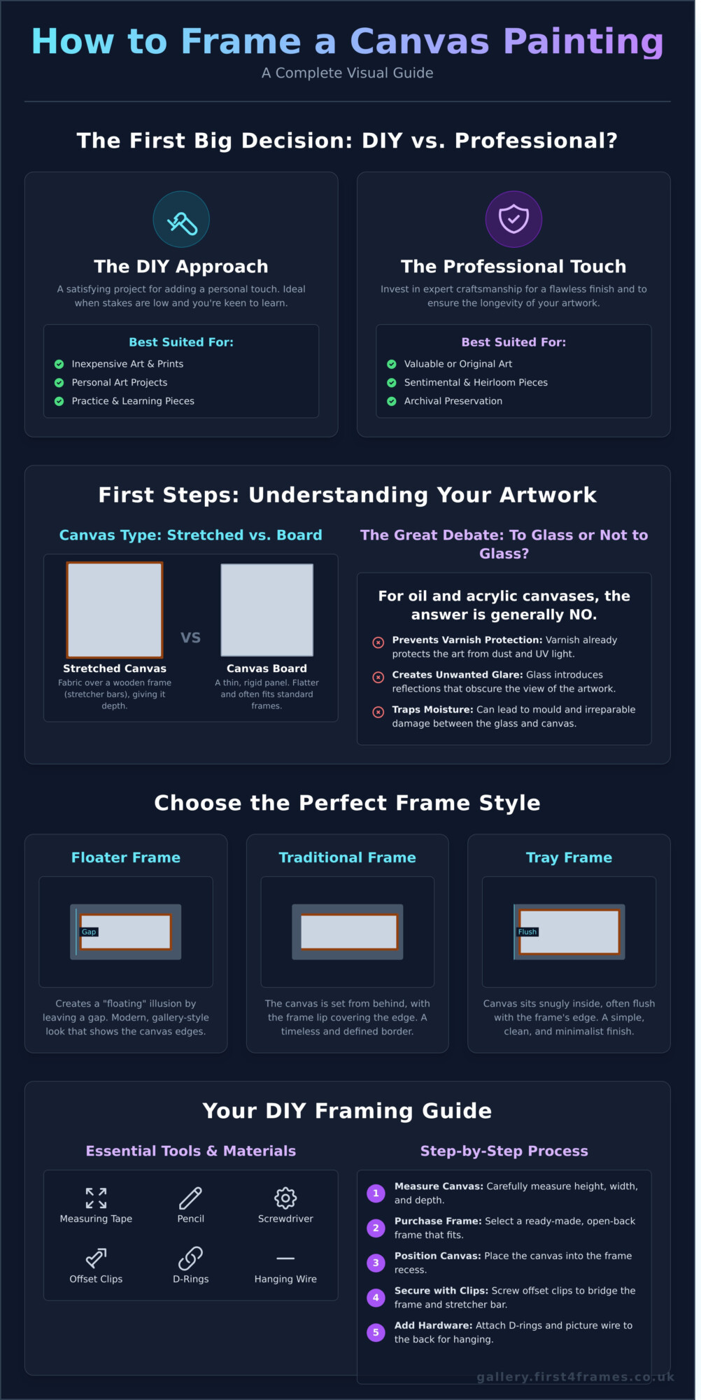
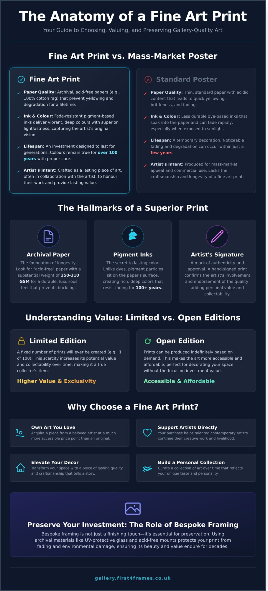
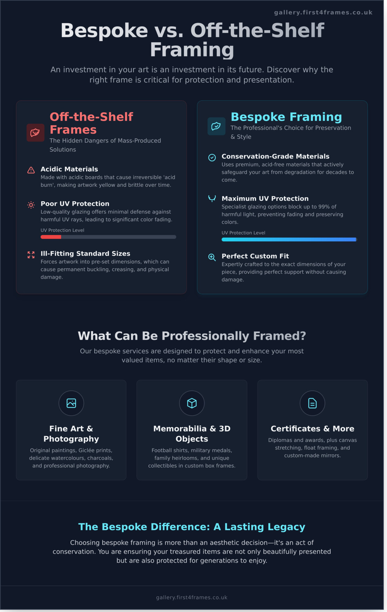
Why Choose Bespoke Framing Over Off-the-Shelf Frames?
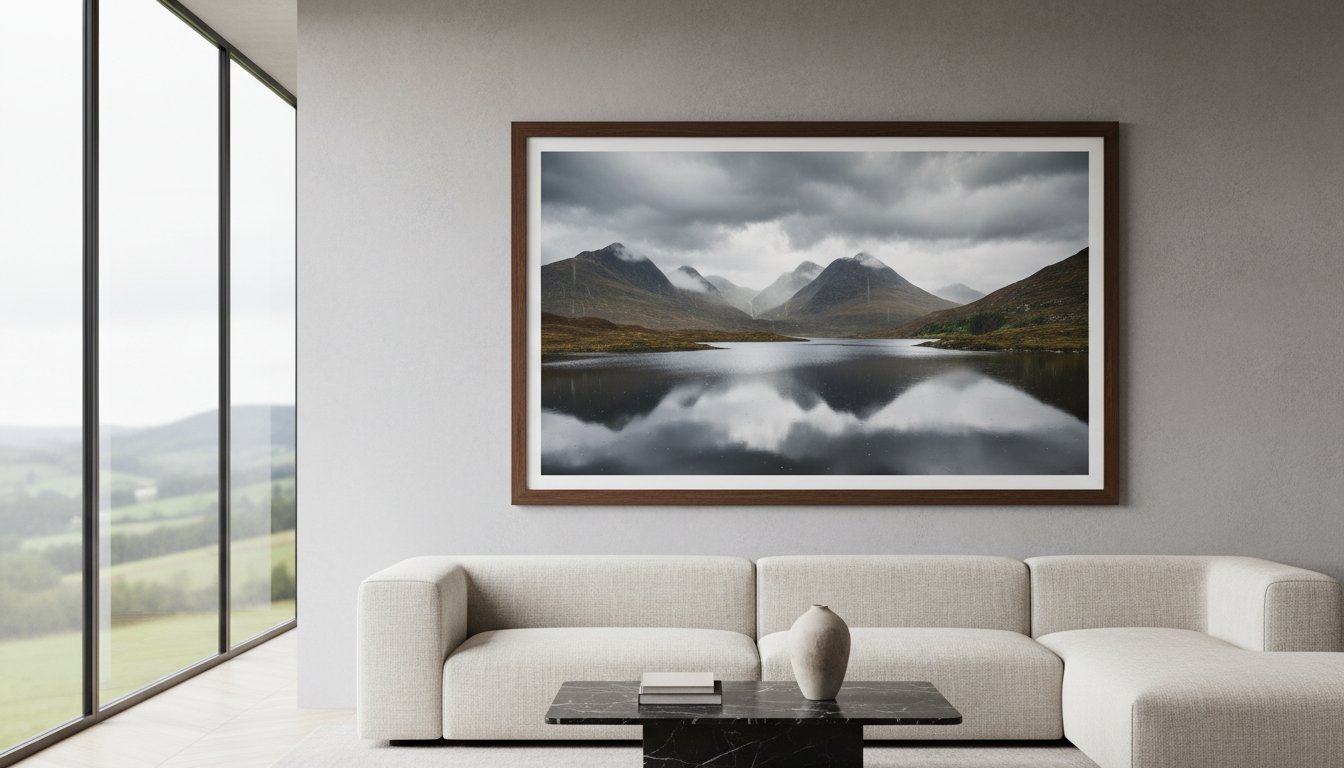
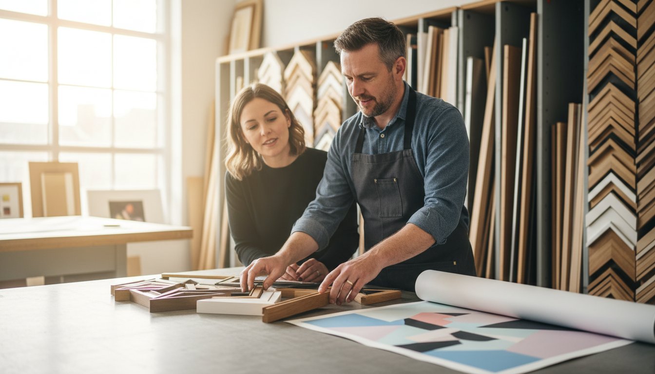
When you have a piece of art, a photograph, or a treasured memento, the frame you choose does more than just hang it on the wall-it protects and enhances it. While an off-the-shelf frame might seem like a quick and easy solution, it often falls short. Bespoke framing is a beautiful craft dedicated to creating a perfect, custom-fit home for your artwork, ensuring it looks its best while being preserved for generations to come. It’s an investment in the art itself.
To see the craftsmanship that goes into a bespoke frame, take a look at this short video:
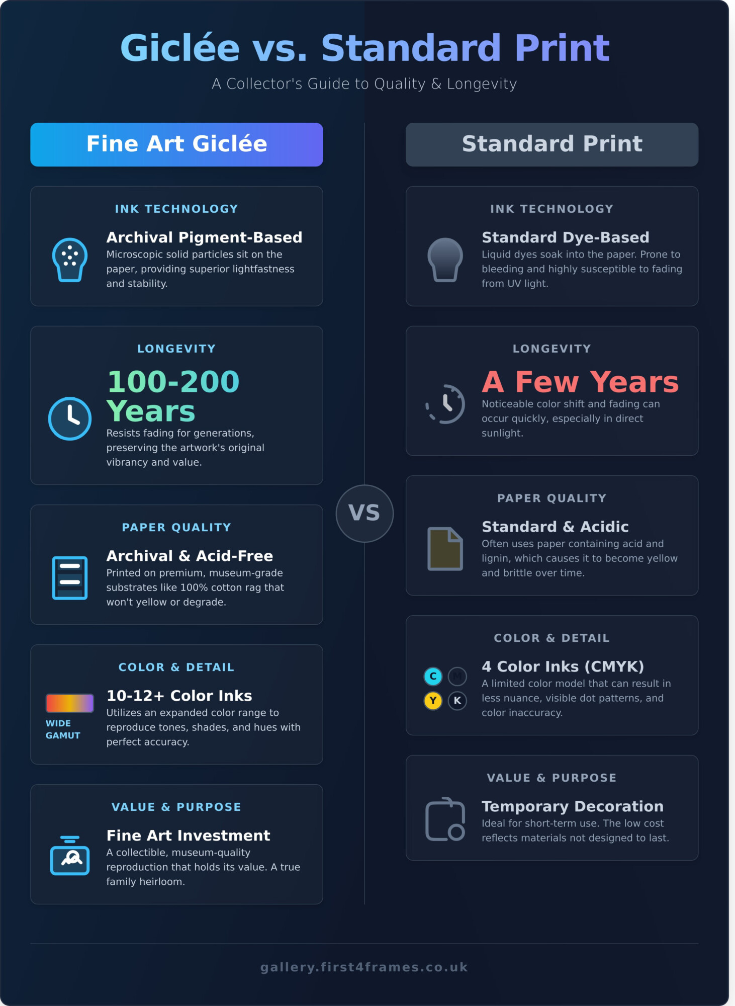
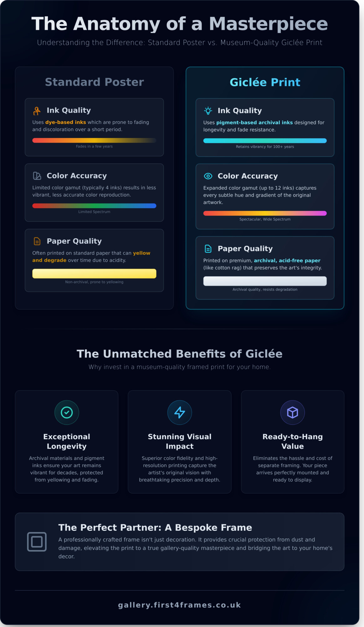
The Hidden Dangers of Ready-Made Frames
Mass-produced frames often cut corners where it matters most. Their backing boards and mounts are frequently made from acidic materials that can leach into your artwork, causing irreversible yellowing and brittleness-a process known as ‘acid burn’. The low-quality glazing typically offers little to no UV protection, leaving your art vulnerable to fading. Furthermore, an ill-fitting standard-size frame can cause the artwork to buckle or crease, inflicting permanent physical damage over time.
Preservation and Protection for Your Valuables
True professional framing is an act of conservation. Our approach to picture framing in Belfast prioritises the longevity of your piece. We use only premium, conservation-grade, acid-free materials to safeguard your art for decades. You can also choose from a range of specialist glazing options, including UV-protective glass that blocks up to 99% of harmful light rays. Our expert sealing techniques then create a stable micro-environment, protecting your valuables from dust, moisture, and insects.
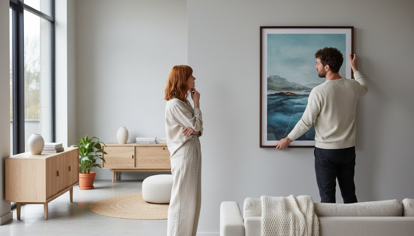
Unleash Your Creativity with Limitless Choice
A bespoke frame is the ultimate creative partnership between your art, your decor, and our craftsmanship. Forget limited options; we provide access to thousands of moulding styles that reflect the history of picture frames, from ornate and traditional to sleek and contemporary. Paired with a vast palette of mount colours and textures, the possibilities are endless. Our expert team is here to offer friendly advice, helping you navigate the choices to create a beautiful, cohesive statement that you’ll love for years.
Our Custom Picture Framing Services for Belfast
At First4Frames Gallery, we provide a complete, bespoke framing service designed to protect and enhance your most valued items. Our workshop is a hub of creativity and craftsmanship, where we handle everything from delicate fine art to cherished 3D memorabilia. Whether you are an artist, a passionate collector, or a homeowner looking to add a personal touch to your space, we offer the professional picture framing Belfast residents trust. Our mission is simple: to preserve your piece for a lifetime and present it in a way that truly does it justice.
Explore our most popular services to see how we can help you create something spectacular.
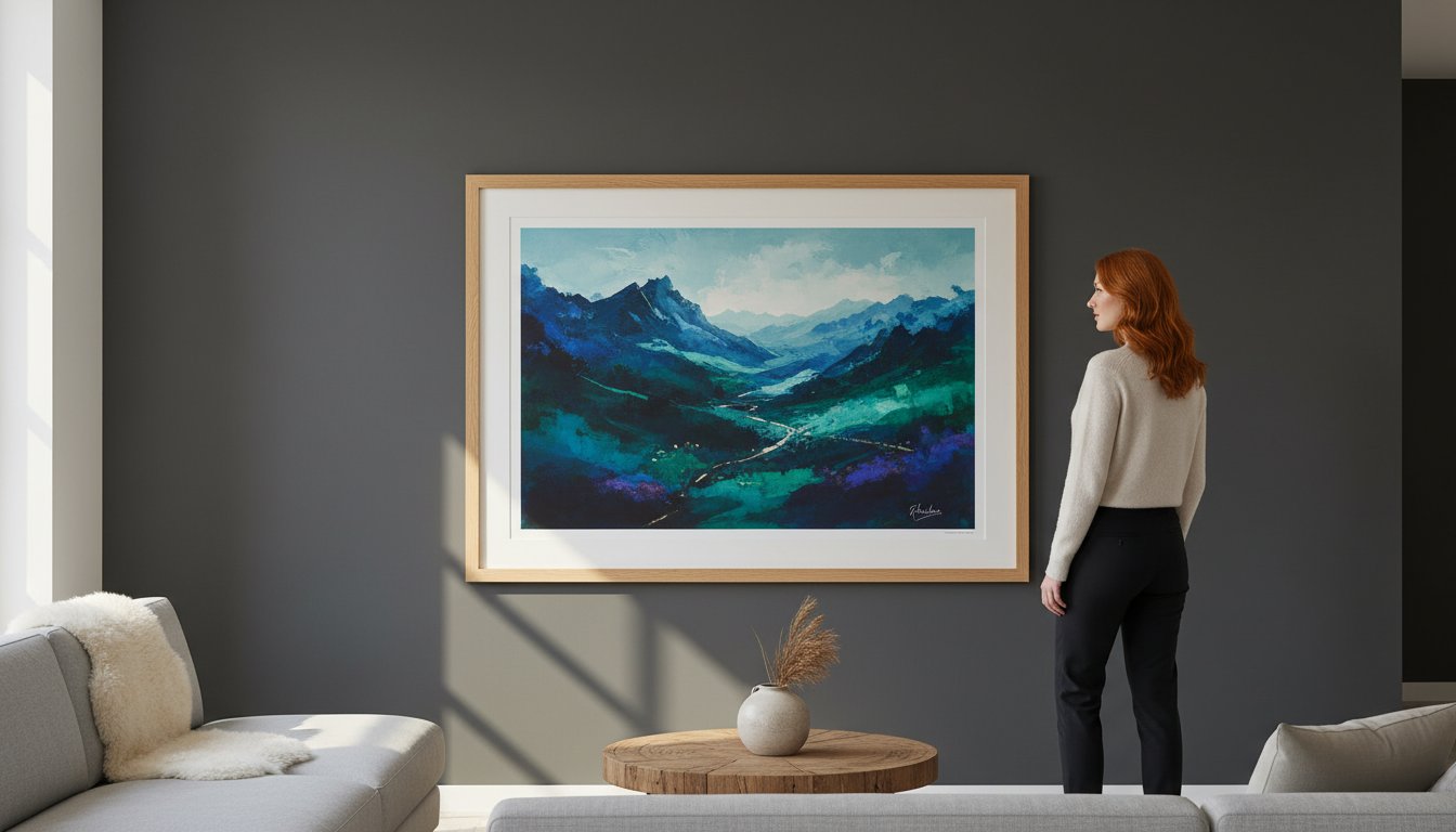
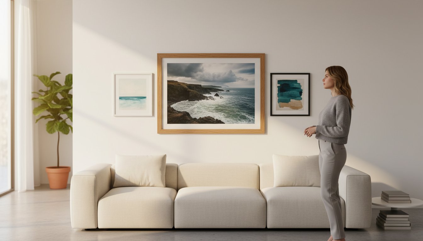
Fine Art, Prints & Photography Framing
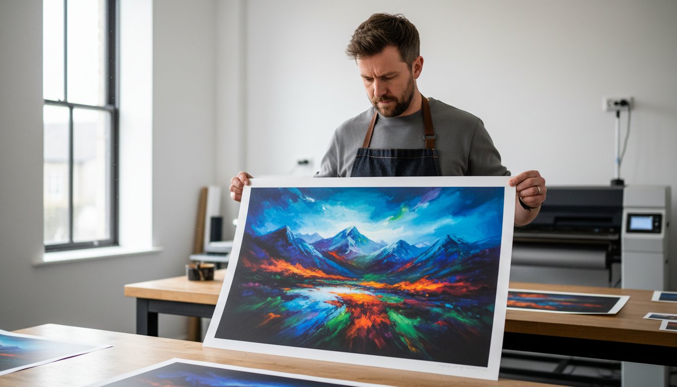
Your artwork deserves a frame that elevates its beauty without overpowering it. We specialise in framing original paintings, Giclée prints, and limited editions, using conservation techniques to protect delicate media like watercolours and charcoals. Our approach adheres to the highest museum-quality framing standards, ensuring longevity and protection from environmental damage. For photographers, we offer expert guidance on choosing the perfect mount and frame profile to complement your composition and draw the viewer’s eye.
Specialist Memorabilia & 3D Object Framing
Bring your treasured memories to life. Our custom box frames are perfect for displaying three-dimensional items, transforming them into spectacular talking points. We are one of the few specialists in Belfast still offering expert football and rugby shirt framing, meticulously pinning and mounting each jersey to avoid damage. From military medals and family heirlooms to unique collectibles, we design and build secure, beautiful displays that tell a story.
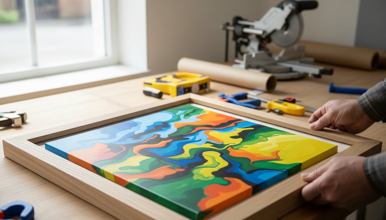
Certificate, Canvas & Mirror Framing
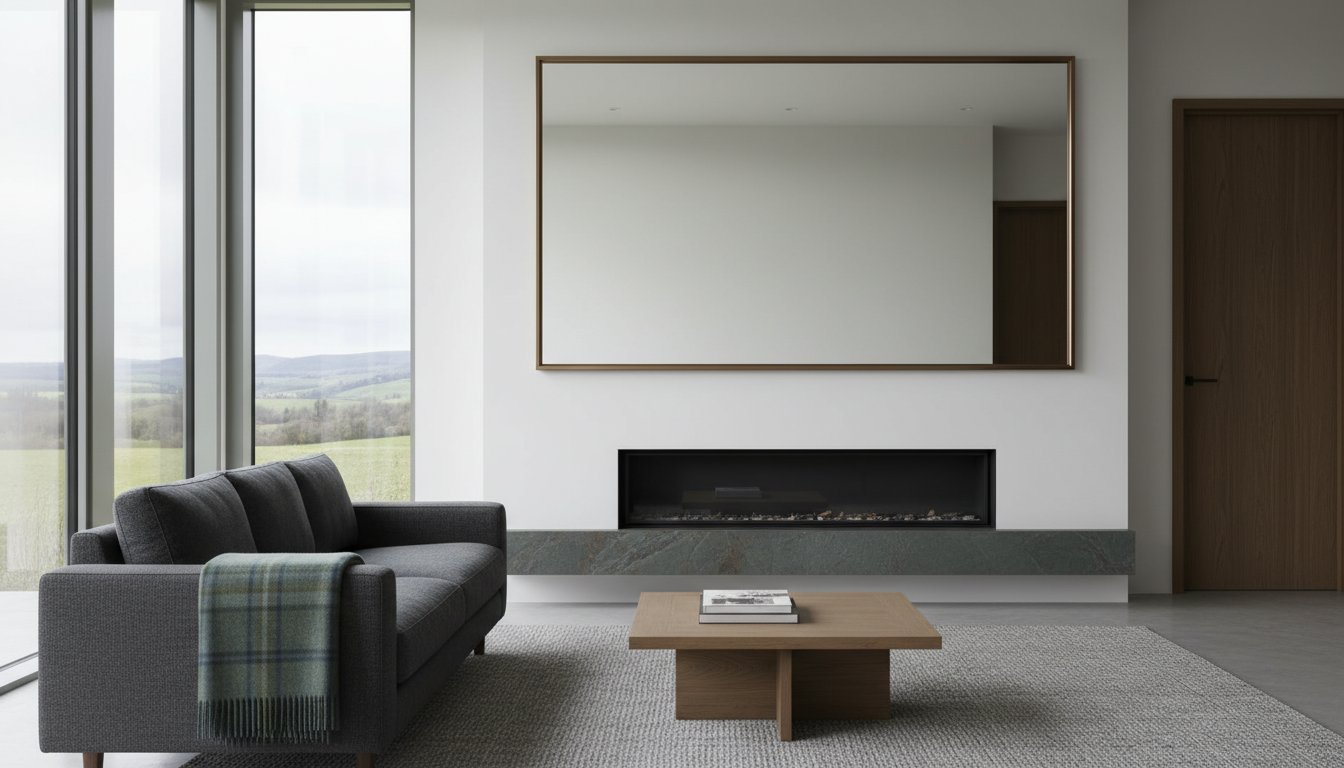
Celebrate your achievements with an elegant frame for your diploma, award, or professional certificate. We also provide a full canvas service, including stretching and float framing to give your original art a contemporary, gallery-finish. Looking for something unique for your home? We create stunning, custom-made mirrors in any size or style, perfectly tailored to fit your space and reflect your taste.
The First4Frames Difference: Quality Craftsmanship Delivered to Your Door
While our workshop is based in mainland UK, our passion for perfect presentation knows no borders. Customers from across the country choose First4Frames because we deliver the quality and care of a specialist framing workshop directly to your door. Our seamless online service makes expert picture framing belfast both simple and accessible, connecting you with over two decades of experience without you ever having to leave home. We bridge the distance with uncompromising quality and a commitment to protecting your precious art.
Our Commitment to Museum-Quality Materials
A beautiful frame must also be a protective one. We believe in using only the best, which is why we source premium solid wood and elegant mouldings from trusted, sustainable suppliers. To preserve your artwork for a lifetime, all our mountboards are acid-free as standard, preventing yellowing and degradation. We also provide a range of specialist glazing options to suit your needs, including:
- Clarity Glass: Reduces reflections for a crystal-clear view.
- UV-Filtering Glass: Protects your art from fading caused by harmful ultraviolet light.
- Museum Glass: Offers the ultimate combination of anti-reflection and 99% UV protection.
Expertise You Can Trust: Our Guild Commended Framers
Your art is in the hands of true professionals. Our team is proud to include Guild Commended Framers, a qualification awarded by the Fine Art Trade Guild that signifies the highest standard of craftsmanship. This dedication to excellence is recognised by leading industry bodies like the Professional Picture Framers Association, assuring you that your piece is treated with expert care. With over 20 years of experience, we combine time-honoured traditional techniques with modern technology to achieve a flawless finish every time.
Secure & Insured Delivery to Belfast & Northern Ireland
We understand the importance of getting your artwork to you safely. Every frame is meticulously packaged in our specialist, custom-designed boxes to ensure it arrives in perfect condition. We partner with trusted, reliable couriers for tracked delivery to Belfast and across Northern Ireland. For your complete peace of mind, every single shipment is fully insured during transit, so you can order with total confidence. See the spectacular results for yourself and get ideas for your next piece.
Explore our gallery of past projects for inspiration.
How Our Belfast Picture Framing Service Works: A Simple 3-Step Process
We believe that commissioning a bespoke frame should be as inspiring as the art it holds. That’s why we’ve perfected our process to be simple, transparent, and completely hassle-free. From your initial idea to the final delivery, you can follow your order with confidence, knowing our experts are handling your treasured pieces with the utmost care. We’ve streamlined our picture framing belfast service to bring our workshop expertise directly to your door.
Follow our three easy steps to get your artwork professionally framed without ever leaving your home.
Step 1: Get Your Free Online Consultation & Quote
Your journey begins with a conversation. Simply use our online form to tell us about your artwork and your vision. You can even upload a photo, allowing our experts to provide a virtual consultation tailored to your piece. Shortly after, you’ll receive a detailed, no-obligation quote with a clear breakdown of costs-no surprises, just honest, expert advice to help you choose the perfect frame.
Step 2: Sending Us Your Artwork Safely
Once you’re ready to proceed, we make getting your artwork to us safe and effortless. We provide simple, clear instructions on how to package your item securely for transit. Then, we’ll arrange for a convenient, fully insured courier to collect it directly from your Belfast home or office. You’ll receive an immediate confirmation the moment it arrives safely in our workshop, giving you complete peace of mind.
Step 3: Crafting & Delivery of Your Bespoke Frame
This is where the magic happens. Our master framers get to work, using premium materials and time-honoured techniques to craft your frame to your exact specifications. Before we prepare it for its journey back to you, we’ll send a final preview for your approval. Your artwork will arrive back home, beautifully framed, protected, and ready to hang for a lifetime of enjoyment.
Ready to transform your art into a masterpiece? Get your no-obligation quote today!
Your Masterpiece Deserves the Perfect Frame
A frame is more than a border; it’s the bridge between your art and your space. Choosing bespoke over off-the-shelf is an investment in preserving your memories and enhancing your décor with a truly personal touch. As we’ve shown, our simple three-step process makes professional picture framing belfast accessible and hassle-free, from initial consultation to final delivery. You don’t just get a frame; you get a piece of craftsmanship designed to protect and elevate your artwork for years to come.
As Guild Commended Framers with over 20 years of experience, we pour our passion and expertise into every project. We believe your art deserves nothing less than the best. Whether it’s a family photograph, a limited edition print, or an original canvas, we’re here to help you create a stunning display. With secure, insured UK-wide delivery, you can trust us to handle your treasures with the utmost care.
Ready to begin your creative journey? Let’s bring your vision to life.
Start Your Bespoke Framing Project – Get a Free Quote
Frequently Asked Questions
Do I need to visit your workshop in Falkirk from Belfast?
Not at all! We have designed a seamless and convenient remote service for our clients across the UK, including Belfast. You can embark on your framing journey from the comfort of your home. We’ll consult with you via phone or email to understand your vision, help you select the perfect materials, and guide you through the process of safely sending your artwork to our Falkirk workshop. It’s professional framing made simple.
How much does bespoke picture framing cost?
As every piece of art is unique, so is every frame we create. The cost of a bespoke frame depends on several factors, including the size of your artwork, the specific frame moulding, the type of mount board, and your choice of glazing (such as UV-protective or anti-reflective glass). For an accurate, no-obligation quote for your picture framing Belfast project, please get in touch with your requirements and we’ll be delighted to provide a detailed estimate.
How do I safely send my valuable artwork to you from Belfast?
To ensure your art arrives safely, we recommend using a tracked and insured courier service. For prints or posters, roll them carefully in acid-free paper and place them inside a sturdy postal tube. For canvases or more rigid items, protect them with bubble wrap and pack them securely in a strong, well-padded cardboard box. Including your name and order details inside the package helps us process your artwork promptly upon its arrival.
How long will it take to get my framed picture back?
Our standard turnaround for bespoke framing is typically 7-10 working days from the day we receive your artwork at our workshop. This allows our artisans the time needed to give your piece the meticulous attention it deserves. Once the craftsmanship is complete, we securely package your frame and dispatch it via a trusted courier. Delivery to Belfast usually takes an additional 1-2 working days. We’ll keep you updated throughout the process.
What happens if my frame is damaged during delivery to Belfast?
We take immense pride in our work and package every frame with the utmost care for its journey. However, in the rare event that your order arrives damaged, please don’t worry. All our shipments are fully insured. Simply contact us within 24 hours of delivery with photographs of the damage to both the frame and the packaging. We will immediately arrange a hassle-free collection and craft a perfect replacement for you at no extra cost.
Can you frame a football shirt or other bulky items?
Yes, absolutely! Our expertise extends to 3D object framing, often called box framing. This is the perfect way to display treasured memorabilia like football shirts, medals, baby shoes, or other sentimental items. We create a beautiful shadow box that not only showcases your item spectacularly but also protects it from dust and damage. Contact us to discuss your specific item, and we can design a truly unique and personal display case for it.
What is a ‘Guild Commended Framer’ and why does it matter?
Being a ‘Guild Commended Framer’ is a prestigious accreditation from the Fine Art Trade Guild, the UK’s governing body for the industry. This qualification is a mark of quality, demonstrating that our framers have passed rigorous exams and adhere to the highest standards of craftsmanship and conservation. It assures you that we use the correct techniques and premium, acid-free materials to protect and preserve your artwork, ensuring its longevity and value for years to come.