When you purchase a piece of fine art photography, you’re investing in far more than a beautiful picture. You’re bringing home the vision, patience and expertise of a photographer who has dedicated years to mastering their craft. That is exactly what you’ll find in the stunning collection of Noel Fenech Framed Prints available from First 4 Frames Gallery. Whether you’re looking to transform a living room, brighten an office or find the perfect gift for someone who appreciates exceptional photography, Noel Fenech’s framed prints offer timeless beauty and outstanding quality. Who is Noel Fenech? Noel Fenech is an internationally recognised professional photographer whose work has earned numerous awards and distinctions. Originally from Malta and now based in Scotland, Noel has been working professionally since 2009, creating commercial photography, portraits, corporate imagery and breathtaking landscape photography. His passion for the natural world has taken him across Scotland’s rugged mountains, peaceful lochs, dramatic coastlines and ancient forests, while his Mediterranean heritage continues to inspire stunning images from Malta’s spectacular scenery.
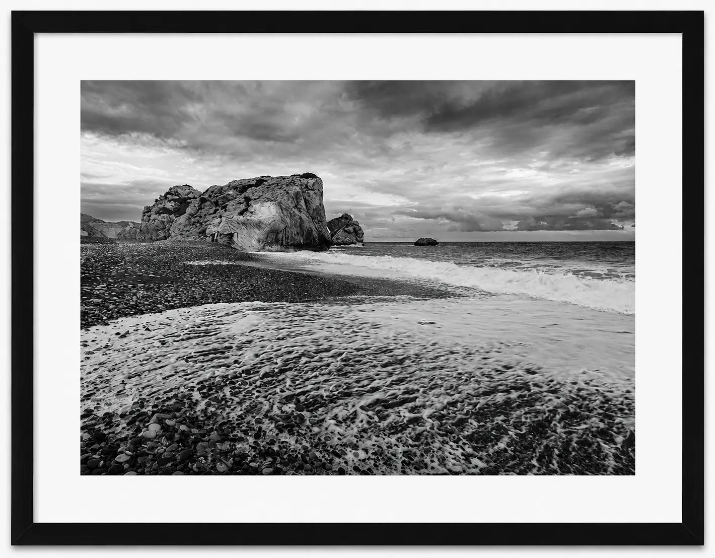
Black and white photo of a rocky beach with waves washing ashore, a large rock formation in the background, dramatic clouds overhead, and a framed border—part of the striking Noel Fenech Framed Prints collection.
His work has received international recognition through photographic competitions and professional organisations, reflecting both his technical expertise and artistic creativity. Photography That Requires More Than Just a Camera One of the biggest misconceptions about landscape photography is that success simply depends on owning an expensive camera. In reality, creating photographs like Noel Fenech’s requires an extraordinary combination of technical knowledge, artistic vision and patience. Every image begins long before the shutter is pressed. Professional landscape photographers often spend days researching locations, studying weather forecasts and calculating exactly when the light will be perfect. Sometimes this means returning to the same location multiple times before conditions align perfectly. Golden sunrise light may last only a few minutes. Morning mist may disappear within seconds. Cloud formations constantly change. The finest photographers know precisely when these fleeting moments occur. That experience is clearly visible throughout Noel’s collection. Mastering Light Photography literally means “drawing with light.” Noel’s images demonstrate an exceptional understanding of natural light. Rather than relying on heavy editing, he carefully works with the available light to create mood, depth and atmosphere. You’ll notice warm golden sunsets illuminating mountain peaks. Soft mist drifting through woodland. Storm clouds gathering over dramatic coastlines. Crystal-clear reflections across still waters. These aren’t accidents—they’re the result of experience, planning and remarkable patience. Composition That Draws You Into Every Scene Great landscape photography isn’t simply about recording a place. It’s about guiding the viewer through the image. Noel expertly uses leading lines, foreground interest, framing, balance and perspective to create photographs that feel immersive.
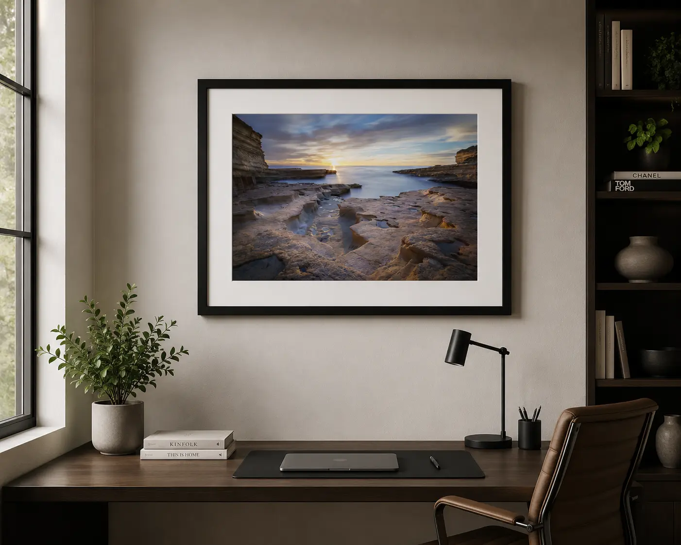
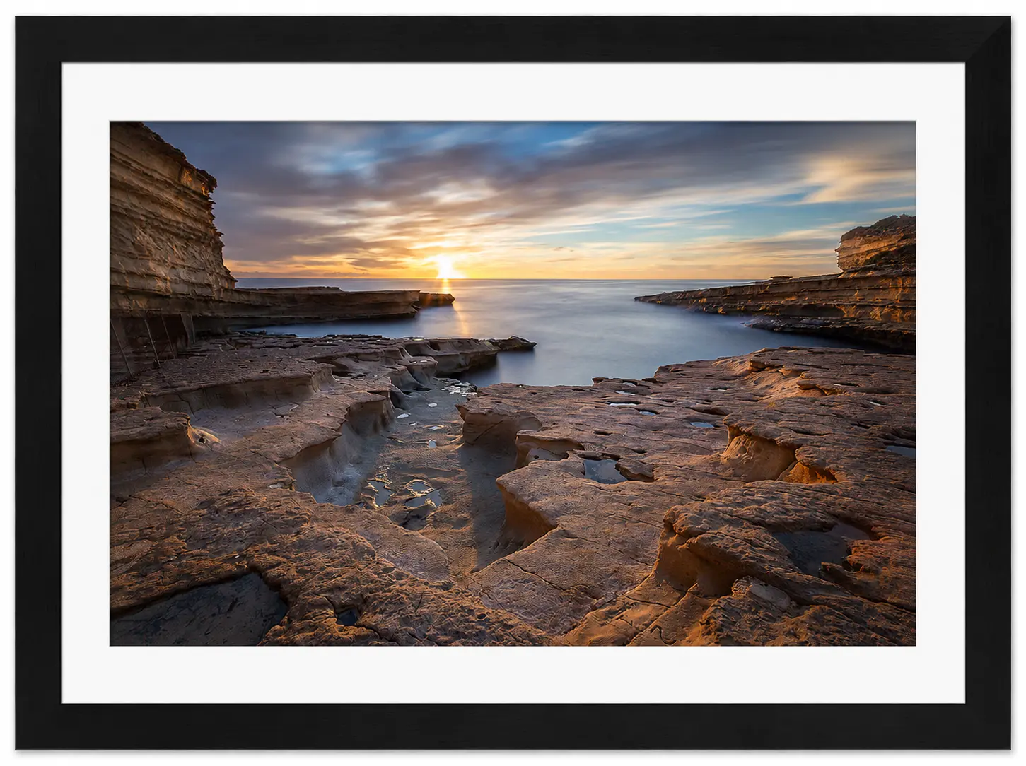
A coastal landscape at sunset, with layered rock formations in the foreground and the sun shining over a calm sea. Dramatic clouds fill the sky in this striking black and white image, available as Noel Fenech Framed Prints.
Your eye naturally travels through each composition, discovering new details every time you view the print. This is one reason his work remains so engaging whether displayed in a home, hotel reception, office or gallery. The Beauty of Scotland and Malta Living between Scotland and Malta has given Noel access to two of Europe’s most diverse landscapes. Scotland provides dramatic mountains, ancient glens, rugged coastlines and peaceful lochs. Malta offers crystal-clear waters, limestone cliffs, historic architecture and stunning Mediterranean sunsets. Each destination presents unique photographic challenges, and Noel has mastered both environments with remarkable consistency. His collection celebrates nature in all its forms. Why Choose Noel Fenech Framed Prints? Buying professionally framed artwork offers several advantages over purchasing an unframed print. Every Noel Fenech framed print supplied by First 4 Frames Gallery is professionally presented to enhance the image while protecting it for years to come. Benefits include: • Ready to hang straight from the box. • Professional framing enhances colours and depth. • Protection against handling damage. • A premium gallery-quality finish. • Perfect for homes, offices and commercial interiors. • An ideal gift for photography and nature lovers. Rather than worrying about finding the right frame yourself, you receive a finished piece of artwork that’s ready to become the focal point of any room. Exceptional Print Quality Outstanding photography deserves outstanding presentation. Every detail within Noel’s images—from tiny rocks on a distant shoreline to delicate reflections on still water—is reproduced with exceptional clarity. Professional printing preserves the rich colours, subtle tonal gradients and remarkable sharpness that make his work so distinctive. Combined with expert framing, these prints become genuine pieces of wall art. Interior Design Meets Fine Art Landscape photography is one of the most versatile forms of wall art. Neutral colours blend beautifully with contemporary interiors. Dramatic skies create striking focal points. Peaceful woodland scenes promote relaxation. Coastal images bring a sense of openness into smaller spaces. Whether your décor is modern, traditional, Scandinavian or minimalist, Noel Fenech’s photography complements a wide variety of interior styles. A Photographer Dedicated to Excellence Behind every framed print lies years of learning, travelling and refining photographic techniques. Professional landscape photography demands knowledge of: • Camera systems • Exposure control • Composition • Weather patterns • Seasonal changes • Natural light • Post-processing • Fine art printing
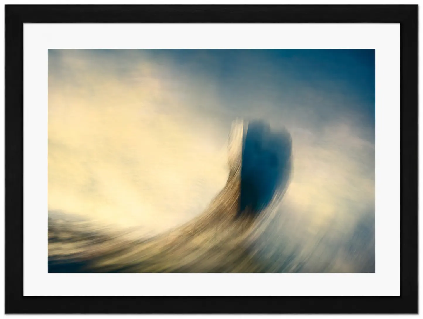
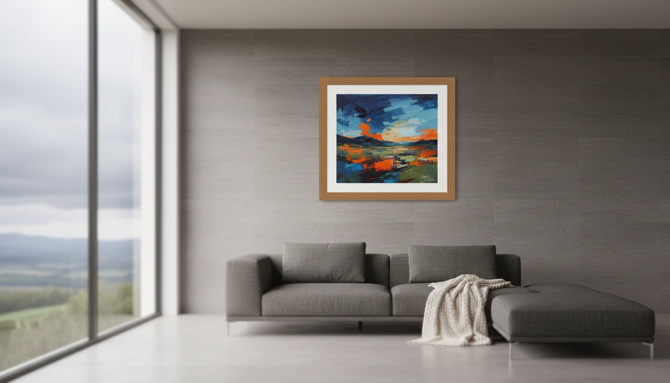
Abstract image with soft, swirling colours in blue, yellow, and beige tones, featuring a dark central shape. Dreamy and blurred, this piece evokes movement and light—an ideal addition to any Noel Fenech Framed Prints collection.
Noel combines all of these skills to produce images that are technically flawless while remaining emotionally engaging. That balance is what separates great photography from truly memorable artwork. Discover Noel Fenech Framed Prints at First 4 Frames At First 4 Frames Gallery, we’re proud to showcase a carefully selected collection of Noel Fenech framed prints. Each image demonstrates the passion, patience and craftsmanship that have made Noel one of today’s respected landscape photographers. Whether you’re searching for dramatic Scottish scenery, peaceful woodland landscapes or beautiful Mediterranean coastlines, you’ll find photography that brings nature indoors with elegance and style. Our professionally framed prints arrive ready to display, allowing you to enjoy gallery-quality artwork from the moment it arrives. If you’re looking for photography that combines artistic vision with technical excellence, Noel Fenech framed prints are an outstanding choice. Browse the collection today and discover why Noel’s work continues to inspire collectors, interior designers and photography enthusiasts alike.
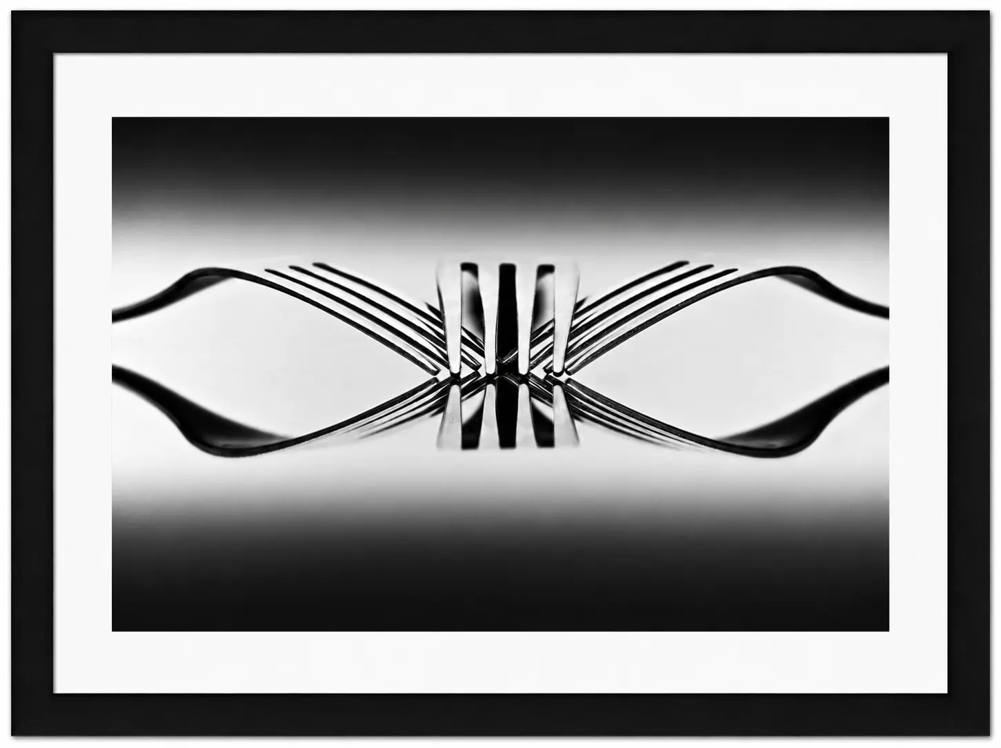
Black and white photo of four forks standing upright, their tines interlocked and reflected on a glossy surface, creating a symmetrical, abstract pattern. Presented as one of the elegant Noel Fenech Framed Prints with a white mount and black frame.
Did you know that nearly 49% of consumers now use virtual room planning apps before they commit to a purchase? Using a Wall Art Visualiser isn’t just about playing with digital layouts; it’s about removing the nagging fear that your new piece will be the wrong size or clash with your decor. When you can visualise art on your wall, you gain the freedom to experiment with custom framed art prints without any of the traditional guesswork. You want to see artwork before you buy to ensure your investment truly enhances your home.
We understand the hesitation that comes with online picture framing. You’ve likely worried if digital colours will translate to the physical print or if a frame will look like a cheap, mass-produced afterthought. We agree your home deserves better. In this guide, we’ll show you how to design your framed artwork with total confidence. You’ll learn how our print and frame service transforms photography prints, fine art, or Scottish landscape art into bespoke framed wall art. We’ll explore how our art print framing service allows you to choose your frame online and why professional 2mm float glass provides clarity that basic perspex simply can’t match. From coastal wall art and landscape wall art to contemporary art prints by famous and best-selling artists, we’ll help you move from a digital preview to a hand-finished masterpiece delivered safely to your door.
Discover how a Wall Art Visualiser allows you to see artwork before you buy, ensuring every piece perfectly matches your room’s scale and lighting.
Master the steps to design your framed artwork online, moving from a digital preview to custom framed art prints that elevate your interior design.
Understand why our art print framing service uses 2mm float glass to provide superior clarity and durability over standard, mass-produced perspex alternatives.
Learn how to choose your frame online for personal photography prints or curated Scottish landscape art to create bespoke framed wall art.
Find out how professional couriers and secure packaging ensure your hand-crafted frames arrive in perfect condition, ready to transform your space.
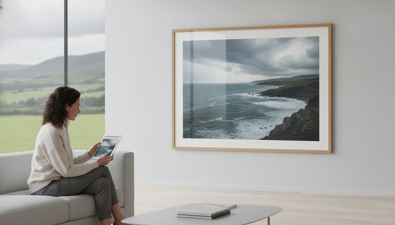
A Wall Art Visualiser is a sophisticated digital bridge between your creative vision and your home’s reality. It’s a tool that overlays high-resolution artwork onto a photograph of your own room, solving the persistent “Will it fit?” dilemma that plagues many home decorators. Scale and proportion are notoriously difficult to judge when you’re looking at a flat screen. A piece of Scottish landscape art might look grand in a product photo but appear lost on a high-ceilinged feature wall. By using a visualiser, you can precisely see artwork before you buy, ensuring the dimensions complement your furniture perfectly.
This technology often relies on Augmented Reality (AR) to map digital objects onto the real world. It’s an approach used by major global retailers to help consumers place furniture, and it works just as effectively when you want to design your framed artwork. It removes the guesswork, allowing you to see how contemporary art prints or fine art photography prints interact with your existing decor and lighting.
To better understand how high-quality visuals can transform your space, watch this helpful video:
Achieving colour harmony is another major benefit. You can instantly check if the vibrant tones in coastal wall art match your soft furnishings or if the frame style you’ve picked clashes with your flooring. This process significantly reduces “returns anxiety.” When you choose online picture framing for bespoke framed wall art, you’re not buying a generic, mass-produced product. Every frame provided by First4Frames Gallery is individually crafted for your specific order. Seeing the final result digitally first ensures that when your hand-made frame arrives via professional courier, it’s exactly what you expected.
Visualise Art on Your Wall: App vs. Web Tools
You generally have two ways to visualise art on your wall. AR-powered smartphone apps offer a real-time experience where you can move around the room to see the art from different angles. Alternatively, web-based visualisers are perfect for desktop users who want to drag and drop different styles into preset room templates. Whether you want to choose your frame online for a new piece or use our art print framing service for your own digital photos, these tools are the first step toward a bespoke interior. Unlike competitors who use cheap perspex, First4Frames Gallery ensures your vision is realised with 2mm float glass for superior clarity and a professional finish.
Using a Wall Art Visualiser effectively requires a few simple preparation steps to ensure the digital preview matches your physical reality. First, photograph your wall in natural daylight. This is the best way to achieve accurate colour matching between your paint and the final print. Avoid using a flash, as it creates artificial glares that might distort the appearance of the frames. Once you have your photo, follow these five steps to create your ideal display:
Upload and select: Bring your room photo into the visualiser or use a preset template that mirrors your architectural style.
Pick your artwork: Browse through categories like Coastal wall art, Scottish landscape art, or Contemporary art prints to find a piece that resonates with you.
Choose your frame online: Experiment with different finishes and widths. This feature lets you test how various textures interact with your wallpaper or furniture.
Adjust the scale: Use standard photo picture sizes or input your wall’s specific measurements to ensure the scale is perfectly proportional.
Finalise the details: Check the overall composition to ensure your bespoke framed wall art enhances the room rather than cluttering it.
This process is about more than just aesthetics; it’s about confidence. Recent research on AR’s impact on sales suggests that being able to visualise products in your own environment significantly reduces purchase uncertainty. It allows you to see artwork before you buy, ensuring that when your hand-made frame arrives via professional courier, it fits your vision exactly.
Designing Your Framed Artwork Online
When you design your framed artwork, pay close attention to the mount. A wider mount can create a sophisticated, gallery-like feel for Fine art or Photography prints, giving the image room to breathe. You should also match the frame style to your existing furniture. While minimalist frames suit modern spaces, more ornate options might better complement traditional decor. We invite you to explore our online gallery to find the perfect print for your visualiser. Unlike competitors who use cheap perspex, every order we craft features 2mm float glass for superior clarity. To begin your creative journey, you can browse our collection of best-selling artists today.
While a Wall Art Visualiser provides a perfect digital blueprint, the physical materials determine if that vision actually lasts. Many online providers rely on mass-produced, “one-size-fits-all” frames. These often warp over time because they aren’t built for the specific weight or dimensions of your print. At First4Frames Gallery, we believe bespoke framed wall art should be an investment. Every order is individually crafted by skilled artisans who select materials based on the unique requirements of your chosen Coastal wall art or Contemporary art prints.
The most visible difference between professional online picture framing and budget alternatives is the glazing. Competitors frequently use thin Perspex or plastic sheets. While lightweight, these materials scratch easily and often have a “wavy” distortion that ruins the fidelity of Fine art. We exclusively use 2mm float glass. This provides superior clarity, ensuring the colours of your Scottish landscape art remain as vivid as the day they were printed. It’s the difference between a temporary decoration and a piece that defines a room.
The Importance of Glazing and Materials
Choosing the right materials is essential for longevity. We follow professional Conservation framing standards to protect your custom framed art prints from environmental damage. A hand-made frame ensures a precise fit, preventing the “buckling” often seen in standard frames. This level of care is why famous artists trust our art print framing service. When you design your framed artwork, you aren’t just picking a border; you’re choosing a protective environment for your art.
Once you’ve used the Wall Art Visualiser to perfect your layout, the final stage is bringing that digital vision into your physical space. Whether you’re selecting a vibrant piece of Scottish landscape art from best-selling artists like Janet McCrorie or Jolomo, or using our “print and frame” service for your own photography prints, the transition should be seamless. We don’t just provide standard frames; we create bespoke framed art prints that are individually hand-crafted to meet the highest gallery standards. Every component is selected to ensure your contemporary art prints look exactly as you imagined during the design phase.
Safety during transit is where many online providers fall short. We address this by ensuring every piece of bespoke framed wall art is fully packaged in protective materials specifically designed to prevent damage. Unlike competitors who might leave you guessing about delivery safety, we ship exclusively via professional couriers across the UK. This ensures your custom framed art prints arrive gallery-ready and in pristine condition. Your investment is protected from the moment it leaves our workshop until it’s ready to hang on your wall.
The Complete Art Print Framing Service
We handle your digital files with expert care, using high-quality Giclée printing to ensure colour fidelity matches what you saw when you chose to visualise art on your wall. Our artisans perform a rigorous final check on every order, verifying that the physical 2mm float glass and frame finish perfectly mirror the visualiser’s promise. This attention to detail is why famous artists trust our art print framing service. We bridge the gap between digital convenience and traditional craftsmanship, ensuring your Fine art is presented with the clarity it deserves.
Ready to start? Photo printing and framing online makes the transition from digital to wall art effortless. By choosing to design your framed artwork with us, you’re choosing a partner dedicated to professional quality and reliable delivery.
Using a Wall Art Visualiser is the smartest way to bridge the gap between a blank wall and a beautifully curated home. You’ve seen how digital tools eliminate the stress of choosing the wrong size or style, but the true magic happens when that digital preview becomes a physical masterpiece. By choosing professional craftsmanship over mass-produced alternatives, you ensure your bespoke framed wall art isn’t just a temporary fixture; it’s a lasting investment in your environment.
We take pride in every detail, from our expert Scottish art curation to our use of premium 2mm float glass as standard. Every frame is individually crafted to provide the clarity and durability that generic plastic glazing simply can’t offer. Whether you are framing a cherished memory or a piece by a best-selling artist, our commitment to quality ensures your vision is realised perfectly. Our professional couriers handle the logistics, so you can focus on the creative process.
Start designing your bespoke framed wall art today and experience the difference that hand-made precision brings to your home. Your walls are a canvas for your personality; let’s make them extraordinary together.
A Wall Art Visualiser is highly accurate when you use real-world measurements or a reference object to calibrate the digital overlay. It allows you to see artwork before you buy by placing it in proportion to your furniture and ceiling height. This prevents the common mistake of ordering a piece that feels lost on a large feature wall or appears too crowded in a smaller room.
Can I see my own photos in the visualiser before choosing a frame?
You can absolutely upload your own digital photography prints to our art print framing service to see how they look in various settings. This feature helps you design your framed artwork by testing different mount widths and frame colours against your personal images. It’s the perfect way to ensure your bespoke framed wall art looks exactly as you intended before any physical materials are cut.
What is the best glass to use for custom framed art?
We recommend 2mm float glass as the gold standard for clarity and protection in custom framed art prints. Unlike the cheap, thin perspex used by many competitors, float glass doesn’t warp or scratch easily. It ensures that the fine details in Coastal wall art or Scottish landscape art remain crisp and vivid, providing a professional gallery finish that lasts for years.
How do I know if a frame style will suit my room?
The most reliable method is to choose your frame online and use the visualiser to compare different styles against your room’s existing textures and colours. You can test how a minimalist frame looks with contemporary art prints or see if a traditional wood finish better suits your landscape wall art. This visual comparison removes the uncertainty of matching new art to your established interior design.
How is bespoke framed wall art shipped to prevent damage?
Every piece of bespoke framed wall art is individually wrapped and fully packaged in reinforced materials designed to withstand the transit process. We don’t rely on standard postal services; instead, we use professional couriers to deliver your finished work gallery-ready. This logistical care ensures that whether you’ve ordered works by famous artists or personal fine art prints, they arrive in pristine condition.
The most striking room in your home shouldn’t be defined by a gallery wall, but by one spectacular piece of Large Framed Wall Art that captures the imagination. It’s frustrating when that vision is spoiled by a frame that arrives damaged or a Perspex cover that looks wavy and dull under your lights. You deserve a statement piece that reflects your style without the compromises found in mass-produced alternatives.
We understand that choosing the perfect focal point is a significant decision. That’s why we’ve simplified the process to help you transform your space with bespoke framed wall art that’s hand-made to last. You’ll learn how to use a wall art visualiser to visualise art on your wall before you buy, ensuring the scale is perfect for your room. We’ll also explain why professional materials, like 2mm float glass and individually crafted frames, make all the difference in clarity and durability.
From exploring coastal wall art to Scottish landscape art by best-selling artists, this guide covers everything you need to design your framed artwork with confidence. We’ll walk you through our art print framing service, show you how to choose your frame online, and explain how our professional courier delivery ensures your custom framed art prints arrive in pristine condition, ready to hang and enjoy.
Learn why a single piece of Large Framed Wall Art creates a more sophisticated focal point and anchor for your interior design than a traditional gallery wall.
Discover how to use a wall art visualiser to see artwork before you buy, allowing you to design your framed artwork with total confidence in the dimensions.
Understand the “2mm float glass” advantage and why hand-finished, bespoke frames provide superior clarity and structural integrity over mass-produced alternatives.
Explore an extensive range of styles, from vibrant Scottish landscape art to contemporary photography prints, all available through a professional art print framing service.
Gain peace of mind regarding delivery with our commitment to professional courier shipping and protective packaging that ensures your bespoke piece arrives ready to hang.
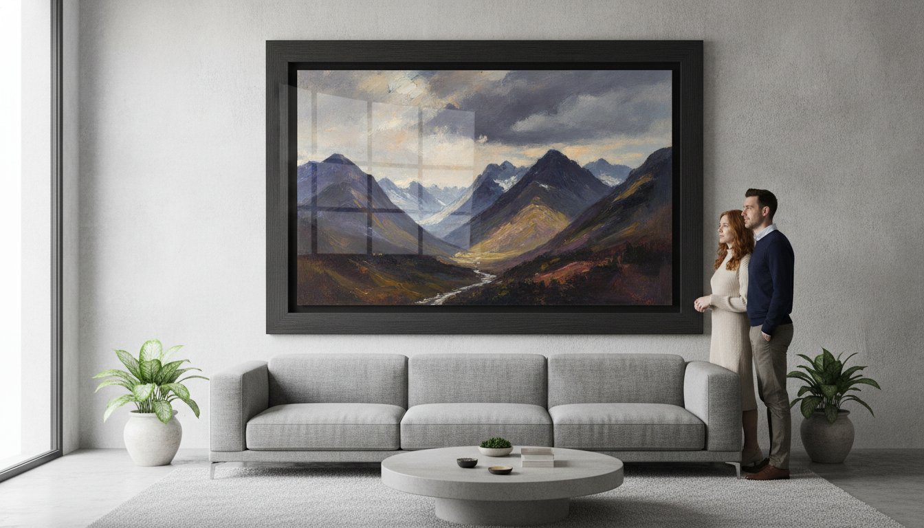
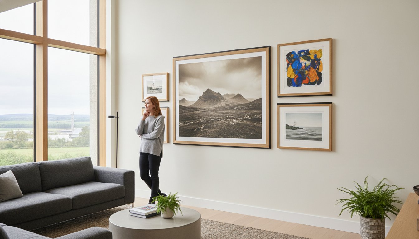
Large scale art doesn’t just fill a gap; it anchors your entire room’s design. When you choose Large Framed Wall Art, you’re creating a definitive focal point that commands attention. Unlike smaller pieces that can feel lost on an expansive surface, a grand frame provides the “Gallery Effect” often seen in professional office receptions or high-end hotel lobbies. The right picture frame does more than hold an image; it defines the boundary between the art and the architecture of your home.
To better understand the visual impact of scale in a room, watch this helpful video:
Scale is the most critical factor in successful interior design. A common mistake is choosing a piece that’s too small, which results in a “floating” look that feels disconnected from the furniture below it. By opting for bespoke framed wall art, you ensure the proportions are tailored to your specific wall dimensions. This isn’t about just filling a space cheaply; it’s about investing in a piece with structural integrity and visual weight. Our art print framing service allows you to choose your frame online and design your framed artwork from the comfort of your sofa. We specialise in custom framed art prints that bring professional craftsmanship into your home.
Choosing a Theme for Your Statement Piece
Your choice of imagery sets the emotional tone for your space. For instance, Scottish landscape art can add incredible depth and a sense of timeless serenity to a study or living area. If you’re looking to create a light, airy atmosphere in a modern home, coastal wall art featuring soft horizons and ocean hues is an excellent choice. For minimalist or industrial interiors, contemporary art prints often provide the sharp, bold lines needed to complement a sleek aesthetic. You can browse our online picture framing gallery to find the perfect match for your vision and use our wall art visualiser to visualise art on your wall and see artwork before you buy, ensuring the theme and scale work perfectly together.
Large scale art demands more than just a bigger frame; it requires structural integrity that mass-produced options simply can’t provide. One of the biggest differences is the glazing. While many competitors use thin perspex that looks wavy or dull at a distance, we use premium 2mm float glass. This ensures superior clarity so your Large Framed Wall Art looks sharp from every angle, without the distracting reflections or distortions common in cheaper materials.
Every piece is hand-finished in Scotland. This individual crafting is vital for large formats where the weight of the materials can cause cheap, standard frames to bow or develop unsightly corner gaps. By choosing an art print framing service that treats each order as a unique project, you’re investing in a piece built to last. Our Giclée fine art prints offer the longevity and fidelity required to ensure your investment doesn’t fade. This keeps the vibrant colours of Scottish landscape art or photography prints as striking as the day they arrived.
Logistics are just as important as the craftsmanship itself. We understand the anxiety of ordering large-scale items online, which is why we use professional couriers and specialized, robust packaging. This ensures your custom framed art prints arrive in pristine condition, bypassing the common pitfalls of standard postal services that often struggle with oversized parcels.
Bespoke Framing vs. Standard Sizes
Standard “off-the-shelf” frames often fail when tasked with supporting heavy, large-format art. They aren’t designed for the tension that comes with increased dimensions. Bespoke framed wall art is engineered specifically for the weight of the glass and the print, preventing the frame from warping over time. This level of care is especially important when you design your framed artwork using personal digital memories. Our print and frame service ensures your photos are handled with the same premium standards as works by famous artists.
Selecting the right piece involves more than just picking a pretty picture. It requires a thoughtful approach to scale and placement. Research from Ohio University highlights the profound impact of interior design on our daily environments; a well-placed piece of Large Framed Wall Art is central to that harmony. To avoid a cluttered or mismatched look, follow these four simple steps.
Step 1: Measure twice. Always measure your wall space while allowing for “breathing room.” We recommend leaving at least 15cm to 20cm of clear wall around the edges of the frame to let the art breathe.
Step 2: Use our wall art visualiser. This is where we bridge the gap that many competitors ignore. You can visualise art on your wall and see artwork before you buy, ensuring the proportions feel exactly right for your room.
Step 3: Choose your frame online. Browse our curated selection of styles and colours. Unlike standard frames, our bespoke framed wall art is crafted to fit the specific needs of your chosen piece.
Step 4: Design your framed artwork. Consider adding a high-quality mount. This doesn’t just protect the print; it expands the visual scale and adds a professional, gallery-standard finish.
Online Picture Framing Made Simple
Our online picture framing platform makes the entire journey from inspiration to installation effortless. We’ve designed our art print framing service to be a comprehensive partner in your creative process. If you have your own high-resolution files, our “Print and Frame” service is the perfect solution. We take your digital memories and transform them into custom framed art prints using the same professional standards we apply to works by famous artists. You can explore our high-quality photo printing and framing online to get started. Ready to find your next statement piece? Browse our full collection of bespoke framed wall art today.
Bringing a sense of place into your home requires more than just a generic print. It’s about capturing the soul of a landscape. Our collection of Large Framed Wall Art features some of the most celebrated names in the industry. From the vibrant, unmistakable colours of Jolomo to the fluid movement captured by Janet McCrorie, these pieces do more than decorate; they tell a story. Authentic Scottish landscape art allows you to bring the rugged beauty of the Highlands and the serenity of the Islands directly into your living room or office decor.
Beyond residential spaces, we provide comprehensive commercial art services. Whether you’re involved in property staging, designing a modern office, or curating a gallery, our professional advisory service helps you find the right fit. We don’t just sell frames; we partner with you to ensure the bespoke framed wall art you choose aligns with your brand or the psychological atmosphere of the environment. Every order is met with our promise of fine art quality and expert craftsmanship that mass-produced alternatives simply can’t match.
Sourcing Art from Famous Artists
When you’re looking for large-scale reproductions of works by famous artists, Giclée fine art prints are the gold standard. They offer incredible colour fidelity and longevity, ensuring that the intricate details of the original piece aren’t lost when scaled up. Because we individually craft every frame, we can accommodate rare or uniquely sized prints that wouldn’t fit into a standard, off-the-shelf solution. You can visit our gallery to see our full range of artist prints and find a piece that resonates with your personal style. Whether it’s coastal wall art or contemporary art prints, our team is here to ensure your selection is framed to perfection and delivered safely by professional couriers.
Choosing Large Framed Wall Art is an investment in your home’s atmosphere and your personal style. We’ve explored how the right scale anchors a room and why bespoke quality is non-negotiable for large-format pieces. By opting for 2mm float glass as standard and frames expertly hand-made in Scotland, you avoid the wavy distortions and structural weaknesses found in mass-produced alternatives. Your chosen artwork deserves a finish that matches its visual impact and preserves its beauty for years to come.
Our process is designed to make your journey from inspiration to installation entirely seamless. You can use our wall art visualiser to ensure the perfect fit for your specific wall dimensions and enjoy the peace of mind that comes with fully insured professional courier shipping. Whether you’re selecting a masterpiece from a famous artist or using our service to frame your own photography, we’re dedicated to ensuring every detail is perfect.
Ready to transform your living space with a piece that truly commands attention? Design your bespoke framed wall art today and experience the difference that professional craftsmanship makes. We look forward to being your partner in creating a home that feels both inspired and complete.
The gold standard for Large Framed Wall Art is 2mm float glass because it offers superior optical clarity and structural stability. Unlike the cheap perspex or acrylic glazing used by many mass-market retailers, float glass won’t warp or appear wavy at larger dimensions. This ensures your artwork remains perfectly flat and vibrant under any lighting. It’s an essential choice for anyone seeking a high-end, professional finish that lasts.
Can I see how the artwork looks on my wall before I buy it?
You can easily see how a piece will transform your space by using our interactive wall art visualiser. This tool allows you to visualise art on your wall in real-time, helping you judge the scale and colour against your existing decor. It’s the best way to see artwork before you buy, removing the guesswork often associated with online shopping and ensuring your chosen piece fits your room’s dimensions perfectly.
How do you ship large framed art prints safely across the UK?
We ship all large items using professional couriers who specialise in handling fragile goods. Every frame is fully packaged in robust, protective materials to prevent any transit damage. Because large pieces require extra care, we ensure our logistics process is fully insured for your peace of mind. This commitment to secure delivery means your order arrives in pristine condition, ready to hang and enjoy immediately.
Do you offer custom framing for my own digital photos?
Yes, our art print framing service includes a dedicated “Print and Frame” option for your own digital photography. We use Giclée fine art printing to ensure your memories are reproduced with the highest colour fidelity possible. Once printed, we create custom framed art prints tailored to your specific size requirements. This ensures your personal photos receive the same premium treatment and hand-finished craftsmanship as our artist collections.
What is the difference between a standard frame and a bespoke frame?
A bespoke framed wall art piece is individually hand-made to the exact dimensions of your artwork, whereas standard frames are mass-produced in fixed sizes. Standard options often use inferior materials like plastic or MDF that can’t support the weight of large scales. When you use our online picture framing service to choose your frame online, you can design your framed artwork using premium components that ensure a perfect fit and long-term durability.
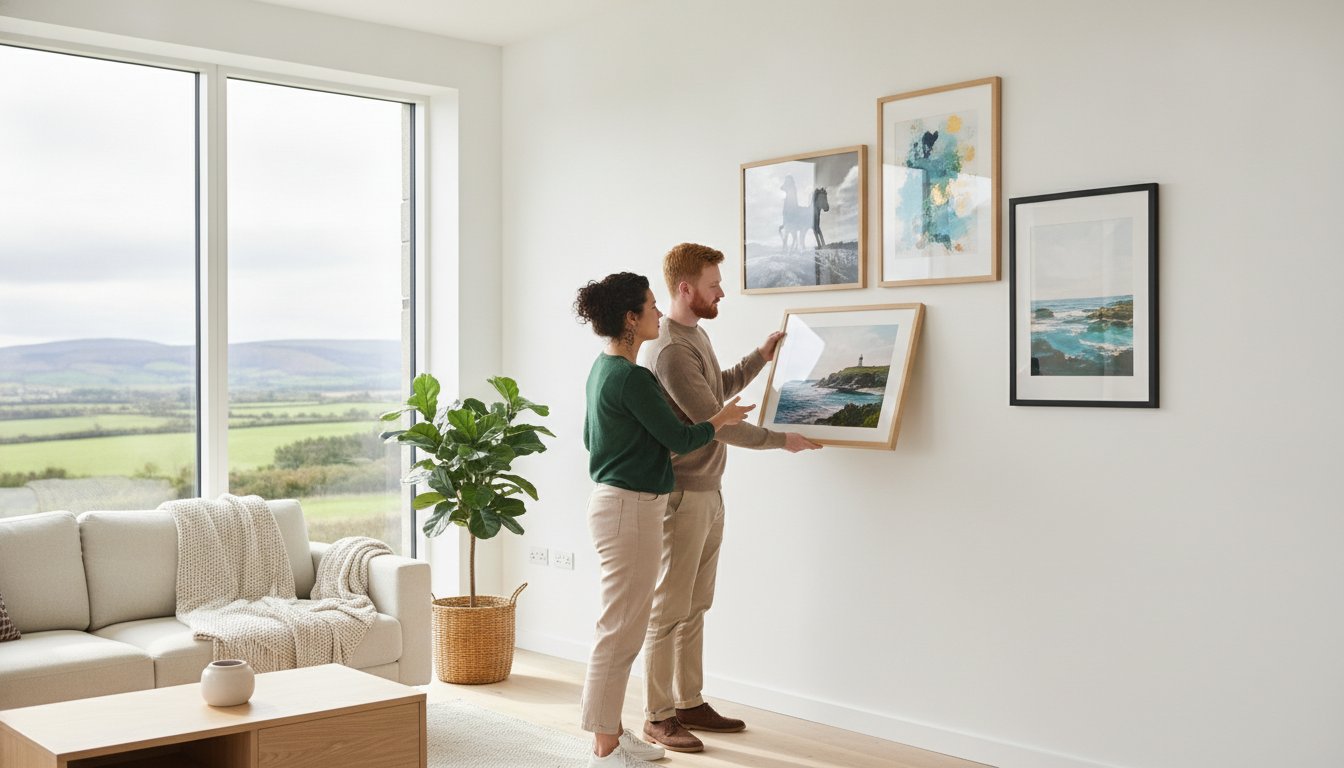
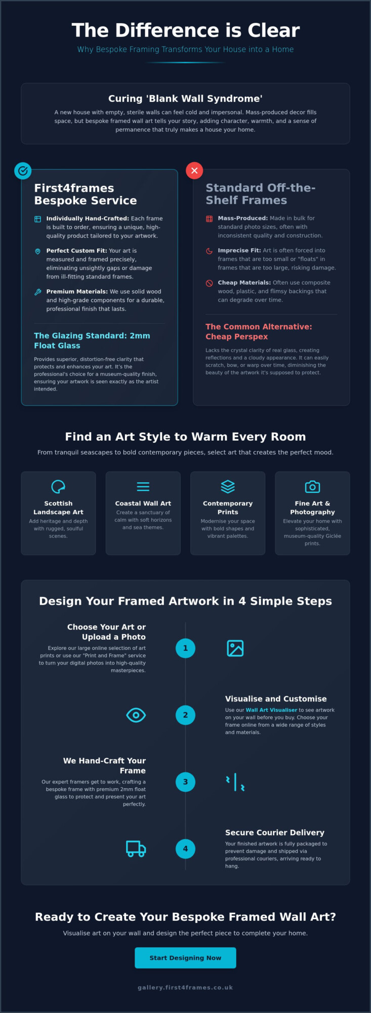
Why does a brand new house, with its pristine paint and perfect finishes, often feel like a cold showroom rather than a sanctuary? It’s a common frustration for new homeowners who find themselves staring at “blank wall syndrome,” unsure how to inject warmth without ruining the aesthetic. Choosing the right art to make a new house feel like a home is about more than just filling space; it’s about selecting pieces that resonate with your story. Whether you’re drawn to the beauty of Scottish landscape art, fine art, or photography prints, your walls should be a reflection of your personality.
We know that the fear of picking the “wrong” piece often leads to empty rooms. This guide simplifies the journey, showing you how to use a wall art visualiser to visualise art on your wall and see artwork before you buy. You’ll discover how bespoke framed wall art, crafted with premium 2mm float glass rather than cheap perspex, provides the clarity your home deserves. From contemporary art prints to landscape wall art, we’ll show you how to choose your frame online and design your framed artwork using professional online picture framing and an expert art print framing service to ensure every piece arrives safely via specialist courier.
Key Takeaways
Understand how to choose art to make a new house feel like a home by replacing empty, sterile walls with bespoke pieces that add immediate character.
Explore various aesthetic styles like coastal wall art and Scottish landscape art to find the perfect match for your room’s specific mood.
Learn why premium 2mm float glass is essential for clarity and how it outperforms the cheap perspex used by standard retailers.
Use a wall art visualiser to see artwork before you buy, ensuring the scale and frame style are perfect for your space before you order.
Discover how our professional “print and frame” service turns your digital photos into high-quality, bespoke framed wall art with secure courier delivery.
Curing ‘Blank Wall Syndrome’: Why Bespoke Framed Wall Art Matters
Walking into a newly built property feels exciting, yet the silence of those pristine, white surfaces can be unsettling. This is often called “blank wall syndrome,” where the lack of texture and history makes a space feel temporary or sterile. To solve this, you need more than just decor; you need art to make a new house feel like a home. While mass-produced posters might fill a gap, they don’t offer the permanence or depth required to truly anchor a room. A room without art lacks a narrative, but a carefully placed frame tells a story about who lives there.
Bespoke framed wall art acts as the “soul” of your living space. It transforms a house into a sanctuary by reflecting your personal taste and experiences. By applying the fundamental principles of interior design, you can use art to create focal points that suggest a lived-in history. Unlike a showroom, a home should feel curated over time. Selecting custom framed art prints provides that essential sense of belonging, moving your space from a construction project to a personal retreat.
To better understand this concept, watch this helpful video:
Quality Over Quantity: The Bespoke Difference
Standard shop-bought frames often use thin perspex, which lacks clarity and can warp over time. We believe in a different approach. Bespoke framing is a hand-made process where every frame is individually crafted to ensure every piece is unique and fits your artwork perfectly. Using premium 2mm float glass ensures superior clarity, providing a professional finish that mass-market plastic simply cannot match.
Seeing real materials like wood and glass in your home provides a psychological sense of stability and quality. Our art print framing service protects your investment while helping you choose your frame online with ease. We package your bespoke framed wall art securely for shipping via professional couriers, ensuring it arrives in perfect condition to transform your environment.
A Roundup of Art Styles to Warm Every Room
Selecting the right art to make a new house feel like a home is about more than just matching colours. It’s about creating a visual language that resonates with your emotional needs. Citing the psychological benefits of art, experts note that curated surroundings can significantly reduce stress and increase your sense of belonging. Each room in a new build offers a fresh canvas to define these moods through different genres.
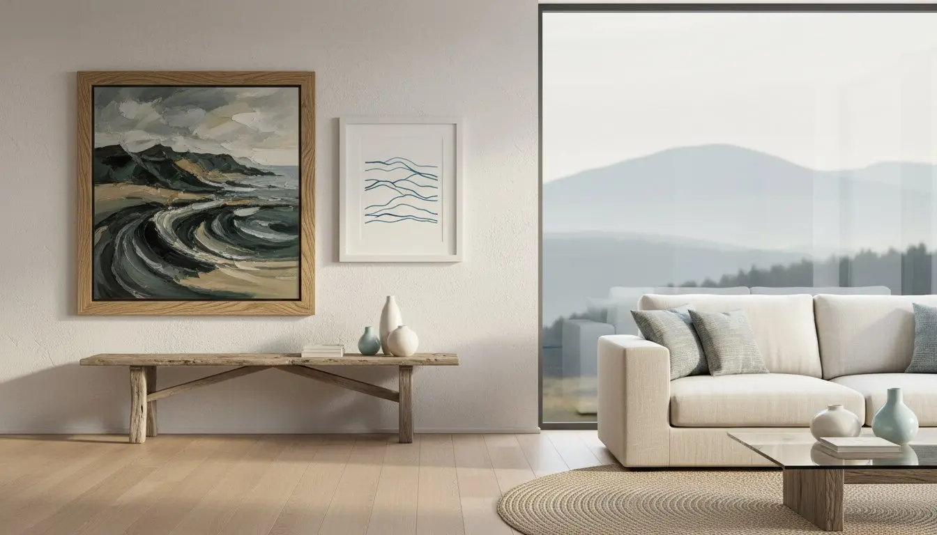
Scottish landscape art: Bring the rugged, soulful beauty of the Highlands into your living room. These textures add a sense of heritage and depth to modern, clean-lined interiors.
Coastal wall art: Maritime themes and soft horizons create a sanctuary of calm. These pieces are particularly effective in bedrooms and bathrooms where tranquility is essential.
Contemporary art prints: Use bold abstract shapes and vibrant palettes to modernise traditional spaces or provide a striking focal point in a minimalist hallway.
Fine art and photography prints: Elevate a home office or study with museum-quality Giclée prints. Whether you choose works by famous artists or best-selling artists, high-fidelity bespoke framed wall art provides a sophisticated, professional finish.
Curating for Connection
Personalising your space requires a balance between the artwork and the architecture. You can use our wall art visualiser to visualise art on your wall and see artwork before you buy. This tool allows you to design your framed artwork by testing different combinations. When you choose your frame online, consider how the wood tones or metallic finishes complement your existing furniture. Supporting local talent and landscape wall art specialists ensures your home feels authentic rather than generic. You can explore our full range of curated collections in our online art gallery.
The ‘Print and Frame’ Service for Personal Memories
Sometimes the best custom framed art prints aren’t found in a gallery but in your own camera roll. Our photo printing and framing online service allows you to transform digital photography into professional-grade wall decor. We use an art print framing service that matches the high standards of our bespoke frames. Every order is individually hand-made using premium materials, including 2mm float glass for superior clarity. Your finished memories are fully packaged to prevent damage and shipped via professional couriers, ensuring your personal history is preserved with the same care as a masterpiece.
The Craftsman’s Secret: Why Your Glazing and Framing Matter
Quality is the silent partner of style. When choosing art to make a new house feel like a home, the physical construction of the piece is just as vital as the image itself. Many mass-market retailers use standard-sized, pre-made frames and cheap perspex glazing. This often leads to a dull, plastic-like finish that reflects light poorly and can warp over time. We reject this approach in favour of traditional craftsmanship that treats every piece with the respect it deserves.
Our gold standard is 2mm float glass. This premium material offers superior clarity, allowing the true colours and textures of your bespoke framed wall art to shine through without the milky distortion often found in plastic alternatives. Every frame we produce is individually crafted for your specific order. This hand-made process ensures a perfect fit for your artwork, providing a level of structural integrity and aesthetic perfection that standard frames simply cannot reach. When you design your framed artwork with us, you’re choosing a product built to professional gallery standards.
We also understand that your investment needs to arrive safely to truly transform your space. Finished frames are fully packaged using specialized materials to prevent any damage during transit. By using professional couriers instead of standard postal services, we ensure your custom framed art prints arrive in pristine condition, ready to hang the moment they reach your door.
Preservation and Longevity
A home is a long-term sanctuary, so your art should be built to last. We use high-quality Giclée prints to ensure exceptional colour fidelity and resistance to fading. When combined with our professional online picture framing, these materials prevent the paper from warping or the colours from losing their vibrancy. Whether you’re displaying Scottish landscape art or contemporary art prints, our art print framing service guarantees that your walls will look as beautiful in a decade as they do today. You can browse our collection of custom framed art prints to find a piece that stands the test of time.
How to Design Your Framed Artwork Online
Transforming your space shouldn’t be a guessing game. While some suggest just “eyeballing” the size, professional results require better tools. Using a wall art visualiser allows you to see artwork before you buy, ensuring the scale is perfect for your specific room. This technology bridges the gap between digital browsing and physical reality, helping you find the right art to make a new house feel like a home.
The process is a simple, three-step journey. First, browse our gallery to find a piece that speaks to you, whether it’s Scottish landscape art or contemporary art prints. Second, choose your frame online from our extensive selection of hand-crafted mouldings. Finally, use the wall art visualiser to visualise art on your wall. These online picture framing tools let you experiment with different mount widths and frame styles until the combination is exactly right.
Step-by-Step Customisation
Finalising Your Home’s Look
Once your art arrives, fully packaged and delivered by professional couriers, it’s time for the final touch. For a cohesive feel, hang pieces so the centre is at eye level. If you’re creating a gallery wall, lay the frames out on the floor first to test the arrangement. Understanding dimensions is key to a perfect fit. You can learn more about standard photo and picture sizes to plan your layout effectively. Every home deserves the warmth of quality art.
Our art print framing service ensures your custom framed art prints are presented with the clarity and protection they deserve. Start curating your home today at First4Frames Gallery and experience the difference that professional craftsmanship makes.
Transform Your Space with Bespoke Artistry
Your journey from a sterile new build to a characterful sanctuary starts with the right choices. You’ve seen how professional glazing and individually hand-crafted frames provide a level of clarity and permanence that mass-market alternatives simply can’t match. By using our digital tools, you can confidently select art to make a new house feel like a home without the fear of making a mistake. Every frame we produce is hand-crafted in the UK using superior 2mm float glass as standard; this ensures your investment is protected and beautifully presented.
We are proud to collaborate with best-selling Scottish artists to bring you a collection that is as unique as your new space. Whether you’re hanging a sprawling landscape or a personal photograph, the craftsmanship behind the frame is what creates that essential lived-in feel. It’s time to stop looking at blank walls and start telling your story. Visualise art on your wall and start your collection today. We’re here to help you turn every room into a place you’re truly proud to call home.
Frequently Asked Questions
How do I choose the right size art for a large blank wall?
You should aim for artwork that occupies between 60% and 75% of the available wall space to achieve a balanced, professional look. Using our wall art visualiser is the most effective way to ensure the scale is correct before you commit to a purchase. This tool allows you to see artwork before you buy by projecting the piece onto a digital representation of your room. It prevents the common mistake of choosing a piece that is too small for a large new-build wall.
What is the difference between float glass and perspex in picture frames?
We use 2mm float glass as our standard because it provides superior clarity and doesn’t warp or scratch as easily as plastic. Many mass-market competitors use cheap perspex, which often has a milky appearance and can distort the colours of your bespoke framed wall art. Real glass offers a professional, gallery-quality finish that significantly enhances the visual impact of your prints. It’s an essential component for achieving a high-end look that lasts for years in your new home.
Can I turn my own photos into professional framed wall art?
Yes, our specialized “print and frame” service transforms your digital memories into museum-quality custom framed art prints. This is a wonderful way to find the perfect art to make a new house feel like a home by using your own personal photography. We print your images to the highest professional standards, ensuring they match the quality of our individually crafted frames. Every order is hand-made to your specific requirements to ensure a perfect fit and a truly unique finish.
How do I make sure my framed art won’t be damaged during delivery?
We protect your investment by ensuring every frame is fully packaged in specialized, impact-resistant materials before it leaves our workshop. Unlike standard postal services, we use professional couriers who are experienced in handling fragile, bespoke items. This logistical care ensures that your custom framed art prints arrive in pristine condition. We take full responsibility for the journey, so you can focus on finding the perfect spot for your new art without worrying about transit risks.
What art styles are best for a modern new-build house?
Modern new-builds benefit from styles that add texture and organic depth, such as Scottish landscape art or coastal wall art. These genres introduce natural elements that soften the sharp lines of contemporary architecture. You might also consider contemporary art prints with bold abstract shapes to create a striking focal point in a minimalist room. Our gallery features landscape wall art by best-selling artists, allowing you to design your framed artwork to match your home’s unique personality perfectly.
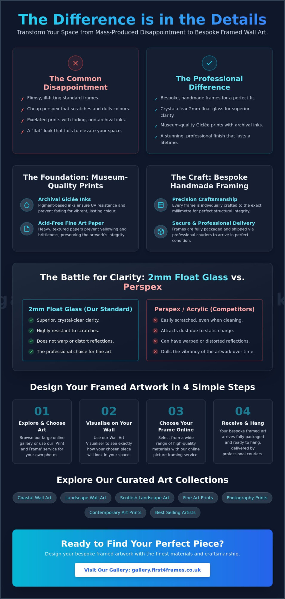
A beautiful home deserves more than a pixelated poster trapped behind a sheet of scratching plastic. You’ve likely felt the disappointment of ordering contemporary art prints only for them to arrive looking flat, dull, or housed in a frame that feels like it might fall apart. It’s frustrating when your vision for a sophisticated space is let down by low-quality materials that fail to capture the true depth and colour of the artwork.
We understand that choosing the right piece is a personal journey, and you want a finished result that looks professional and expensive. In this guide, we’ll show you how to select high-quality contemporary art prints and pair them with bespoke, handmade framing to elevate your interior. You’ll learn how to use a wall art visualiser to visualise art on your wall before you buy and discover why our online picture framing service uses 2mm float glass instead of cheap perspex. From Scottish landscape art to modern photography prints, we’ll help you design your framed artwork and choose your frame online so your bespoke framed wall art arrives ready to hang and built to last.
Key Takeaways
Learn why Giclée technology and archival inks are essential for ensuring your contemporary art prints maintain their vibrant colours and professional finish for years.
Discover the artisan difference of bespoke, handmade framing and why 2mm float glass offers clarity that standard plastic glazing simply can’t match.
Master the art of selection by using a wall art visualiser to see exactly how your chosen piece will look on your specific wall before you buy.
Explore how to turn your personal digital files into professional-grade decor using a specialized print and frame service designed for photography prints.
Gain insights into commercial curation and how to match specific art styles, from coastal themes to Scottish landscapes, to your unique environment.
What Defines High-Quality Contemporary Art Prints in 2026?
High-quality art is an investment in your environment’s atmosphere. While many retailers sell mass-produced posters, true • Contemporary art prints are limited or open-edition works created by living artists using sophisticated reproduction techniques. If you’ve ever wondered What is Contemporary Art?, it’s essentially the art of today, reflecting current themes and diverse perspectives. These pieces aren’t just images; they’re carefully curated expressions of modern life that bring a unique energy to your home or office.
The main difference between a standard digital poster and a fine art print lies in the materials. Cheap alternatives often use thin paper and standard dyes that fade quickly. In contrast, professional-grade prints use archival inks and heavy, textured papers designed to last a lifetime. This ensures the fidelity of the original work is preserved, providing a depth of colour that standard printing simply can’t achieve. When you choose a high-quality print, you’re choosing a piece that will look as vibrant in twenty years as it does today.
To see how different styles can transform a modern space, watch this helpful video on blue art prints:
Longevity is the hallmark of a genuine fine art investment. When you browse our online gallery, you’ll find works from best-selling and famous artists that meet these rigorous standards. Our role as a dedicated partner is to bridge the gap between the artist’s studio and your wall. We ensure every piece reflects the highest standards of the industry, moving beyond the “flat” look of basic prints to offer something truly atmospheric.
The Giclée Standard: Why It Matters for Your Collection
Giclée printing is the gold standard for high-end reproduction. It involves a sophisticated inkjet process using pigment-based inks rather than traditional dyes. These pigments offer superior UV resistance, so your art won’t lose its vibrance when exposed to sunlight. We also prioritise acid-free paper, which prevents the yellowing and brittleness often seen in cheaper wood-pulp papers over time. Giclée is the recognized industry standard for museum-quality reproduction, ensuring every detail of the artist’s brushwork or lens is captured with absolute precision.
The Artisan Difference: Why Bespoke Framing Outperforms Ready-Made
A print is only as good as the frame that protects it. While mass-market plastic frames might seem convenient, they often fail to fit the artwork properly, leading to warping or damage. We believe in a different approach. Every piece of bespoke framed wall art we produce is individually crafted in our workshop to the exact millimetre of your print. This structural integrity ensures your investment in • Contemporary art prints remains a focal point for years. By using a professional art print framing service that prioritises craftsmanship, you avoid the “shattered glass” nightmare. We fully package every order and use professional couriers to ensure your art arrives in perfect condition.
2mm Float Glass vs. Perspex: The Battle for Clarity
Clarity is everything. Most budget retailers use perspex to save on weight, but this material attracts dust and scratches easily. We use 2mm float glass as the professional choice for its superior clarity and resistance to the “warped” reflections seen in acrylic. This commitment to quality materials reflects standards often highlighted in official government research regarding the display of fine art. Unlike perspex, glass doesn’t dull the vibrant colours of your photography prints or fine art.
Feature
2mm Float Glass
Perspex / Acrylic
Optical Clarity
Crystal clear; no distortion
Can appear “warped”
Scratch Resistance
Highly resistant
Scratches very easily
Dust Attraction
Neutral
High static; attracts dust
Craftsmanship in the Workshop: Handmade in Falkirk
In our Falkirk workshop, frames aren’t mass-produced; they’re hand-joined by experts. We use premium wood and mountboards that prevent the artwork from sagging. Whether you’re framing Coastal wall art or Scottish landscape art, our Bespoke Picture Framing process guarantees a level of detail that factory machines can’t match. You can design your framed artwork and see artwork before you buy using our digital tools. This ensures the final piece perfectly complements your modern UK interior. If you’re ready to start your project, you can choose your frame online today.
Choosing Your Style: Contemporary Art Print Categories
Selecting the right style is about more than just matching colours; it’s about setting a specific mood for your living space. For 2026, we’re seeing a strong trend toward Scottish landscape art and vibrant Coastal wall art. These categories offer a window into the natural world, providing a grounding influence in a busy home. When you choose your frame online, you can experiment with how different mouldings change the narrative of the piece. A rustic wood frame might emphasise the ruggedness of a cliffside, while a sleek black frame adds a modern, gallery-style edge.
Matching • Contemporary art prints to your room’s function is an art in itself. Photography prints often suit minimalist home offices because they provide a clean, sharp focus that aids concentration. Conversely, traditional fine art pieces bring a layer of warmth and sophistication to lounges or dining areas. Landscape wall art does more than fill a space; it creates a psychological sense of “place” and heritage, connecting your interior to the wider world and your personal history.
Scottish Landscape Art: Capturing the Highlands and Islands
Highland scenes are defined by unique light and rugged textures that demand high-quality reproduction. A bespoke frame enhances this natural feel, acting as a sturdy, hand-crafted border for the wild beauty of the islands. For those looking to source rare or specific works from best-selling artists, explore our resource on Art in the Frame. These pieces often become family heirlooms when protected by our professional art print framing service.
Visualise Art on Your Wall: Using Modern Tools
It’s often difficult to imagine how a print will look on your specific wall. Our wall art visualiser allows you to see artwork before you buy, eliminating the fear of picking the wrong size or a clashing colour. To ensure your bespoke framed wall art fits perfectly, follow this quick checklist:
Measure the total wall width and height of the intended area.
Account for the height of any furniture sitting below the art.
Leave at least 15-20cm of “breathability” space around the frame.
Ready to see your vision come to life? You can design your framed artwork and browse our full collection of custom framed art prints today.
Transforming Your Space: From Digital Files to Commercial Curation
Your own creative vision can be just as powerful as a piece by a famous artist. While we offer a vast collection of • Contemporary art prints, we also believe in the beauty of your personal captures. Our “print and frame” service turns your digital files into professional-grade wall art that matches the quality of any gallery piece. Whether you’re a homeowner looking for a single statement piece or an office manager planning a full building refresh, we act as your dedicated partner. We move beyond the simple utility of a frame to create a larger aesthetic experience that defines your environment.
Unlike mass-market sites that focus on high-volume, low-quality posters, we prioritise the artisan’s touch. Every frame we produce is individually crafted for your specific order. This means your photography prints or fine art pieces aren’t forced into “near-enough” sizes that look awkward or flimsy. By combining high-resolution printing with our bespoke framing, you receive a ready-to-hang piece that carries the weight and clarity of a true investment.
Professional Photo Printing and Framing
We use a high-resolution printing process to ensure your digital photography prints have the same depth and clarity as our fine art collections. We treat every photograph with artisan respect, using archival inks that won’t fade. You can design your framed artwork using our online tools, choosing the same high-quality wood and 2mm float glass we use for our most expensive pieces. This ensures your memories aren’t just displayed; they’re preserved with superior clarity compared to the cheap perspex used elsewhere.
Commercial Solutions: Staging with Style
For property developers, estate agents, and office managers, art is a strategic tool. A cohesive collection of • Contemporary art prints can stage a property to increase its market appeal or project a professional brand image to clients. Cheap, standard frames from competitors often look flimsy in a high-stakes commercial setting. Our bespoke, hand-made frames provide the structural integrity and premium finish required for luxury developments and professional offices. Every piece arrives fully packaged via professional couriers, ready to hang immediately. If you’re managing a large-scale project, visit our Contact Page for a bespoke commercial quote.
Bring Your Vision to Life with Artisan Craftsmanship
Choosing the right art is about more than just finding a pretty picture. It’s about ensuring every detail, from the Giclée ink to the hand-joined frame, reflects your personal style and commitment to quality. You’ve seen how 2mm float glass provides superior clarity and how bespoke framing protects your investment from warping. These professional standards are why we’re trusted by property developers and commercial galleries across the UK to deliver excellence.
Whether you’re looking for Scottish landscape art or want to frame your own photography prints, we’re here to help you bridge the gap between a digital file and a museum-quality display. Our artisan workshop in Scotland takes pride in every individually crafted piece of bespoke framed wall art. It’s time to move away from flat, pixelated posters and embrace the depth of professional • Contemporary art prints.
What is the difference between an art print and a poster?
An art print is a museum-quality reproduction, whereas a poster is a mass-produced commercial product. True contemporary art prints use Giclée technology and pigment-based archival inks on heavy, acid-free paper. This process ensures the colours stay vibrant for decades. Posters typically use thin paper and standard dyes that fade quickly when exposed to sunlight. Investing in a fine art print means you’re getting a piece with the depth and texture of the original work.
Why is 2mm float glass better than perspex or acrylic?
2mm float glass is the professional choice because it offers crystal-clear transparency and high scratch resistance. Many competitors use perspex or acrylic to save on shipping costs, but these materials have several drawbacks. Perspex carries a static charge that attracts dust and is very easy to scratch during cleaning. It also tends to produce “warped” or distorted reflections, while float glass maintains a perfectly flat, premium finish that showcases your art beautifully.
Can I see how the art will look on my wall before I buy?
You can certainly see how a piece will look in your space before making a purchase. Our digital wall art visualiser allows you to visualise art on your wall by placing the print in a variety of room settings. This tool helps you judge the scale, colour, and overall mood of the piece against your existing decor. It’s a simple way to see artwork before you buy, ensuring the final result is exactly what you imagined for your home.
How are your framed art prints shipped to ensure they don’t break?
We take the logistical process very seriously and fully package every order to prevent any damage during transit. Every frame is individually wrapped in protective materials and housed in robust, reinforced boxes. We don’t use standard postal services for our larger pieces; instead, we ship via professional couriers who are experienced in handling fragile items. This ensures your bespoke framed wall art arrives in perfect condition, ready to be hung immediately on your wall.
Do you offer custom framing for my own digital photographs?
What if the biggest challenge in your open-plan home isn’t the lack of walls, but the way you’re using the ones you have? Many homeowners find that selecting art for an open concept living space feels like a daunting task, especially when a single piece needs to bridge the gap between a bustling kitchen and a tranquil lounge. It’s easy to feel overwhelmed by vast, empty stretches of drywall or to worry that your favorite prints look lost in the scale of the room.
We understand that your home is a reflection of your personality, and creating a cohesive flow shouldn’t feel like a chore. This guide will show you how to use professional curation and bespoke framing to turn those intimidating walls into purposeful anchors that define your dining and living zones with ease. You’ll discover the latest 2026 trends, from oversized statement pieces to the “Cloud Dancer” palette, and learn how First4Frames Gallery can help you source and preserve the perfect artwork. By blending expert advice with our workshop’s bespoke capabilities, we’ll help you choose the right scale and frame styles to ensure your space feels sophisticated, unified, and uniquely yours.
Key Takeaways
Learn how to use artwork as a structural anchor to define functional zones like dining and lounge areas without the need for physical walls.
Discover why professional scale and bespoke framing are essential when selecting art for an open concept living space to prevent furniture from appearing “lost.”
Master the “Hero Wall” and “Colour Thread” techniques to create a seamless visual flow that unifies different sections of your open-plan home.
Explore how First4frames can source specific prints and bespoke frame profiles to ensure your entire collection remains cohesive and gallery-standard.
Gain confidence in your curation by checking our professional reviews and choosing between convenient shipping or workshop collection for your finished pieces.
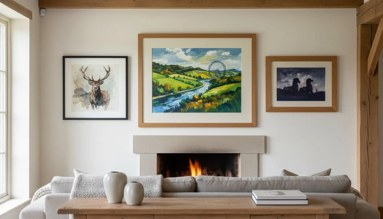
Why Art for an Open Concept Living Space is Your Most Powerful Design Tool
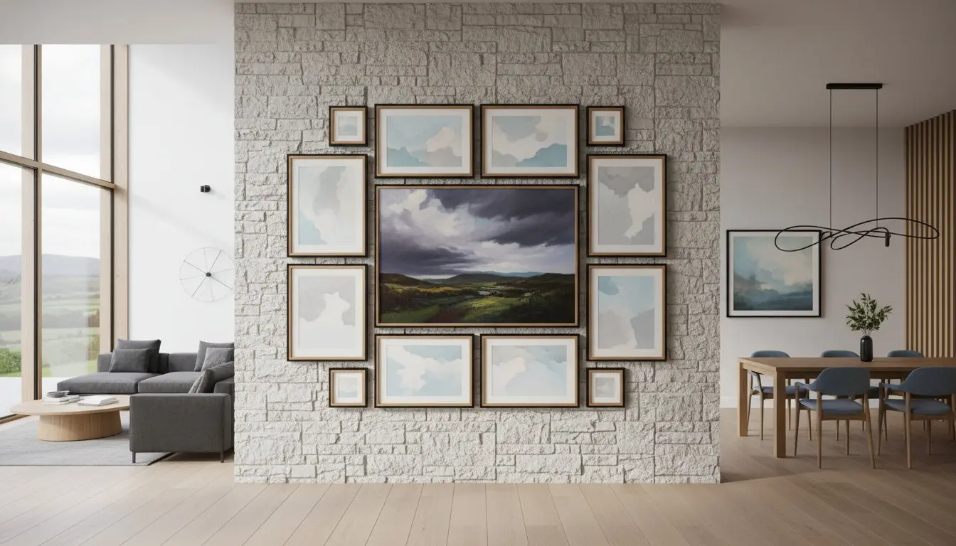
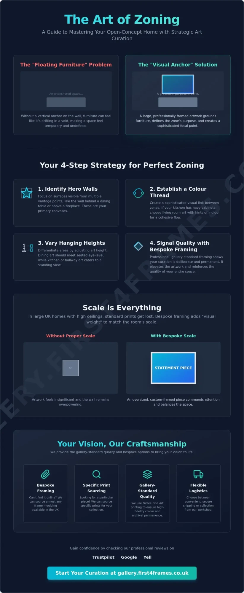
Choosing art for an open concept living space involves more than just picking a picture you like; it’s an architectural decision. In a home where walls are absent, artwork steps in to perform a structural role. We define “Open Concept Art” as pieces selected specifically to anchor a functional zone, such as a dining area or a reading nook, within a wall-less layout. Without these visual cues, even the most expensive furniture can feel like it’s drifting in a void.
Integrating art into a thoughtful open-plan design helps create a “visual sightline” that leads the eye naturally from the kitchen to the lounge. This transition reduces the psychological “warehouse” effect, replacing cold expanses with human-scale focal points. To see how these elements come together in a real-world setting, watch this inspiring walkthrough:
One of the most common issues we see is the “floating furniture” problem. When a sofa or dining table sits in the middle of a large room without a corresponding vertical element on the wall, the arrangement lacks gravity. At First4Frames Gallery, we believe a well-placed piece provides that necessary vertical anchor. It grounds the furniture and gives the entire zone a sense of permanence and purpose.
Art as a Visual Anchor vs. Mere Decoration
Filling a space is easy; anchoring a zone requires strategy. Mere decoration just covers a blank spot, but an anchor commands attention and defines the area’s boundaries. In large, open layouts, a single oversized statement piece often works much better than a cluster of smaller frames. It creates a bold, singular focus that matches the room’s scale. Multiple small pieces can often look cluttered against a vast, expansive backdrop.
The Role of Scale in Large UK Homes
Many modern UK developments feature high ceilings and expansive walls that swallow up standard-sized prints. To counter this, you must consider the “visual weight” of your curation. Visual weight refers to how much a piece of art and its frame command the viewer’s attention based on its size, color intensity, and the thickness of the frame profile. Using bespoke framing allows First4Frames Gallery to source wider, more substantial mouldings that give your artwork the presence it needs to stand its ground in a large room.
How to Zone Your Open-Plan Home Using Strategic Art Placement
While we have established the structural role of art, the actual execution relies on a logical zoning plan. Using art for an open concept living space effectively requires a four-step strategy to ensure each functional area feels distinct yet connected. By treating your walls as a roadmap, you can guide guests through your home without the need for physical barriers.
Identify Hero Walls: Focus on surfaces visible from multiple vantage points, such as the wall behind a dining table or the space above a central fireplace.
Establish a Colour Thread: Select a palette that bridges different zones to create a sense of harmony.
Vary the Hanging Heights: Differentiate areas by adjusting the height of your pieces. Dining art should meet the eye level of those seated, while kitchen art should cater to those standing.
Signal Quality: Use professional finishes to show that the placement is deliberate and permanent.
The ‘Colour Thread’ Technique
Cohesion is the secret to a successful open-plan layout. If your kitchen features navy cabinetry, selecting a print for the living area that incorporates hints of indigo creates a sophisticated visual link. Research on the impact of interior design suggests that consistent visual cues help the brain process large spaces more comfortably. First4Frames Gallery utilizes Giclée Fine Art Prints to ensure the high-fidelity colour matching required to pull these specific tones across your entire home.
Differentiating Zones with Style
You can use different art genres to set the mood for each functional area. Bold, energetic abstracts often suit the high-activity nature of a kitchen or breakfast bar. In contrast, Scottish landscape art prints by artists like Jolomo or Janet McCrorie bring a sense of heritage and warmth to the lounge. This transition in style helps define the relaxation zone naturally. We can source specific prints to help you build this narrative from scratch. If you’re ready to start zoning, explore our curated gallery for professional inspiration.
The Importance of Scale and Bespoke Framing in Large Spaces
In an open-plan home, the scale of your walls can be intimidating. Standard, off-the-shelf frames often fall short because they lack the physical presence to stand up to vast architectural spaces. They also lack the durability to withstand the unique environment of a combined kitchen and lounge. Professional, bespoke framing isn’t just about protection; it’s a critical design choice for anyone curating art for an open concept living space. Large-format prints in these areas are often exposed to more natural light and kitchen humidity than those in traditional rooms, making gallery-standard materials a necessity rather than a luxury.
By choosing a consistent frame profile, you create a visual rhythm that bridges different functional areas. At First4Frames Gallery, we take pride in our ability to source almost any frame available in the UK. This allows us to match your frame finishes to your interior hardware, such as kitchen taps or door handles, creating a truly integrated look. This level of customization is why our customers consistently leave five-star reviews on Trustpilot, Google, and Yell. We offer full logistical flexibility, providing secure shipping across the country or the option for workshop collection if you prefer to visit us in person.
Custom Framing: Bridging the Gap Between Kitchen and Lounge
The transition from a sleek, metallic kitchen to a warm, textured living room can be jarring. Custom framing helps bridge this gap. You might choose a frame that reflects the cool tones of your appliances but features a profile that complements your living room furniture. While you can review standard photo and picture sizes to get started, large-scale walls almost always require a custom approach to achieve the right visual weight and presence.
Large Format Ready-to-Hang Solutions
For busy homeowners or property stagers, our Ready-to-Hang collections offer an immediate solution without sacrificing quality. These pieces are designed to survive the light and humidity levels often found in modern Biophilic Design layouts. If you have a specific print in mind that isn’t on our website, First4Frames Gallery can source it for you and provide a bespoke frame to match. This ensures your art for an open concept living space remains cohesive and professional. We encourage you to view our ready-to-hang art collection to see the quality of our craftsmanship firsthand.
Curating a Cohesive Collection: From Scottish Landscapes to Modern Prints
Building a collection of art for an open concept living space is about more than just filling walls; it’s about establishing a narrative that flows through your home. Choosing a consistent theme helps unify the disparate areas of a large room. For many of our clients, Scottish art provides the perfect emotional anchor. The vibrant palettes and textured brushstrokes of artists like Jolomo or the energetic movement in Janet McCrorie’s work create a sense of place and personality that neutral, modern interiors often lack. These pieces don’t just sit on the wall. They act as conversation starters that bridge the gap between your culinary and relaxation zones.
If you prefer a gallery wall over a single statement piece, layout is everything. In an open-plan setting, aim for a tight, disciplined arrangement. We recommend keeping the spacing between frames consistent, typically around 5 to 8cm, to ensure the collection looks like a single, unified installation rather than a scattered group of small objects. This prevents the “busy” look that often plagues larger rooms. Before you invest in your collection, we encourage you to check our reviews on Trustpilot, Google, and Yell. Building trust is essential when choosing a partner for high-end framing and curation.
Spotlight on Scottish Artists for Modern Interiors
The bold colors found in traditional and contemporary Scottish prints can inject life into a minimalist open-plan palette. Whether you’re looking for the rugged beauty of the Highlands or stylized modern interpretations, these works provide a timeless appeal. You can browse the First4Frames Gallery for inspiration on specific artist prints that suit your home’s aesthetic. If you have a specific artist in mind who isn’t featured, remember that we can source almost any print for you.
Finalizing Your Space: The First4Frames Gallery Process
We’ve simplified the journey from inspiration to installation with our three-step formula. First, you choose the artwork that speaks to your style. Second, we help you select a bespoke frame that complements your existing decor and furniture. Finally, you receive a ready-to-hang masterpiece delivered to your door. We offer flexible logistics, including secure UK-wide shipping and the option for collection from our Falkirk workshop. For a more personal touch, you can visit our Falkirk workshop for a consultation. Our team at First4Frames Gallery is dedicated to ensuring your art for an open concept living space is framed to gallery standards, preserving your investment for years to come.
Transform Your Open-Plan Vision into a Gallery-Standard Reality
You’ve seen how the right artwork acts as more than just decoration; it’s the invisible wall that defines your home’s narrative. By mastering the “Hero Wall” and “Colour Thread” techniques, you can transform a vast room into a series of intimate, purposeful zones. Choosing the correct scale and professional framing ensures your collection has the presence it needs to anchor your furniture and lead the eye through the space.
Finding the perfect art for an open concept living space shouldn’t be a source of stress. Whether you’re drawn to the vibrant textures of Giclée prints by renowned Scottish artists or require bespoke framing sourced from the best materials in the UK, we’re here to help. Our commitment to quality is reflected in our excellent reviews on Trustpilot, Google, and Yell. With logistical flexibility that includes secure UK-wide shipping and Falkirk workshop collection, your journey to a sophisticated home is straightforward and inspiring.
We look forward to helping you create a space that feels unified, professional, and uniquely yours.
Frequently Asked Questions
How big should art be for a large open-plan wall?
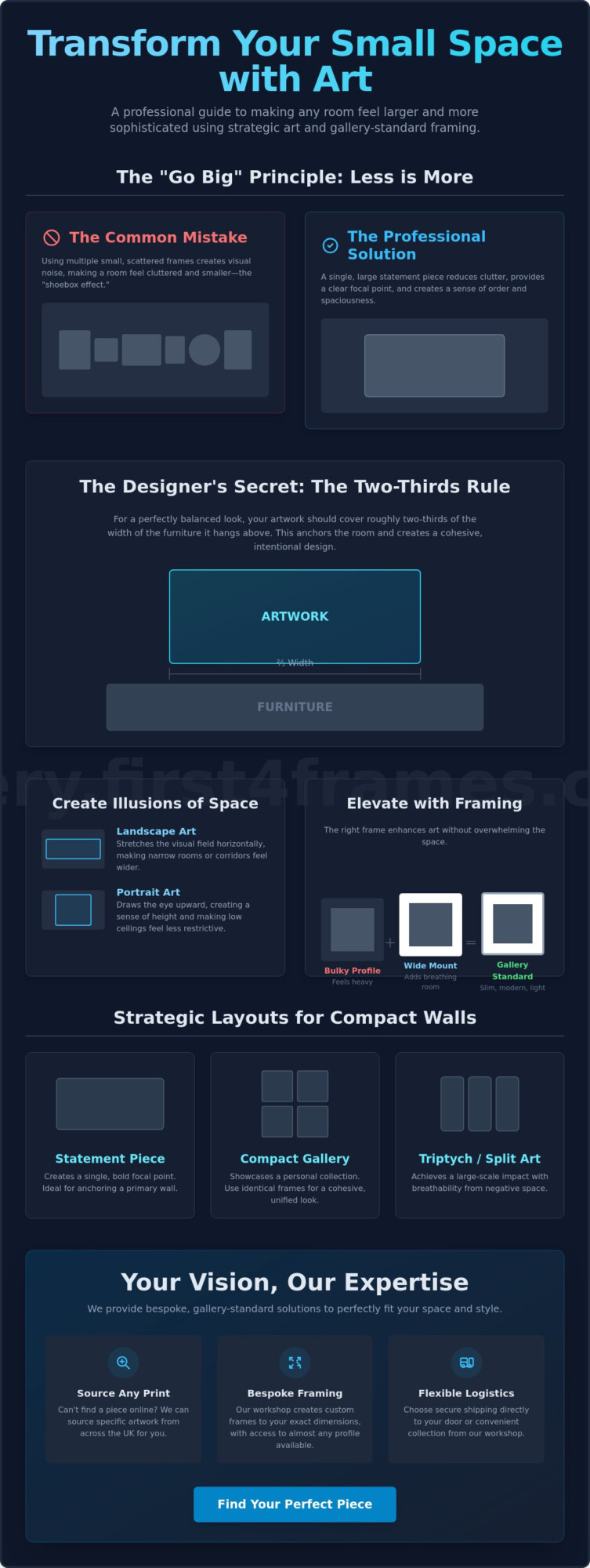
Your artwork should generally occupy between 60% and 75% of the available wall space that isn’t covered by furniture or mouldings. When selecting art for an open concept living space, it’s better to lean toward oversized pieces rather than anything too small. If you have a particularly wide wall, consider a large-format landscape or a series of three related prints to create a sense of continuity that matches the room’s architecture.
Can I use different frame styles in the same open-concept room?
You can mix different frame styles as long as there is a common visual element, such as a shared colour palette or material. For instance, pairing a natural oak frame in the lounge with a thinner oak profile in the dining area maintains a professional flow while allowing each zone to have its own identity. First4Frames Gallery specializes in sourcing cohesive frame sets that respect these subtle transitions across a large, wall-less environment.
How do I protect framed art in an open kitchen-living area?
To protect your investment in a combined space, you should always opt for gallery-standard glazing and humidity-resistant backing. Open kitchens introduce steam and airborne oils that can damage unprotected paper over time. We recommend using UV-protective glass or acrylic to prevent fading from the large windows often found in modern layouts. Our workshop ensures every piece is sealed to professional standards to withstand these specific environmental factors.
Where is the best place to hang a statement piece in an open-plan layout?
The most effective spot is a “Hero Wall” that acts as a focal point from multiple entry points or seating areas. Placing art for an open concept living space on a wall visible from both the kitchen island and the sofa helps unify the entire room. This placement creates a natural sightline that anchors your furniture and makes the expansive layout feel more intentional and less like a hollow warehouse.
Can First4Frames Gallery source a specific print I saw elsewhere?
Yes, we can source specific prints for you even if they aren’t currently displayed in our online collections. Our team has access to an extensive network of artists and publishers across the UK, allowing us to find the exact piece you need to complete your home’s narrative. Simply reach out to First4Frames Gallery with the artist’s name or a description, and we’ll handle the sourcing, bespoke framing, and secure delivery or collection.
You might think that choosing tiny art for a small apartment is the only way to avoid a cluttered look, but the opposite is often true. It’s a common fear that a bold frame will make a room feel closed in or that awkward wall dimensions will forever limit your creative vision. We know how frustrating it is to stare at a cramped corner and wonder if a professional gallery look is even possible in a compact home.
This guide will show you how to transform your living space using strategic art sizing and high-quality framing techniques. You’ll learn how to use bespoke dimensions to create the illusion of architectural depth and make your rooms feel significantly larger. We’ll walk you through designer-led curation and professional scaling secrets, giving you the confidence to choose the perfect pieces that turn a small flat into a sophisticated, curated sanctuary.
Key Takeaways
Learn why “going big” with a single statement piece often works better than multiple small frames to reduce visual clutter.
Discover how to use the “two-thirds rule” to perfectly balance art for a small apartment with your furniture and wall dimensions.
Understand how slim frame profiles and wide mounts can elevate your artwork to gallery standards without overwhelming a compact room.
Find out how to source specific prints and bespoke framing materials that aren’t listed online through a dedicated workshop service.
Explore how vibrant colour palettes from Scottish artists like Jolomo and Janet McCrorie can create a sense of light and space in any flat.
Scaling Art for Small Apartments: Why ‘Going Big’ Often Wins
Many people assume that a compact room requires miniature decor, but this often leads to a cluttered, fragmented look. In reality, choosing art for a small apartment usually requires a “go big” mentality to create a sense of order. A single, large-scale piece reduces visual noise and gives the eye a clear place to rest. Visual noise is the sensory overload caused by too many competing patterns, objects, or small frames that prevent the eye from finding a restful focal point.
To anchor your room effectively, we recommend following the two-thirds rule. This means your artwork should cover roughly 2/3 of the width of the furniture it sits above, such as a sofa or a dining table. This creates a balanced look that aligns with fundamental design principles, ensuring your home feels cohesive and intentionally designed rather than accidental. If you can’t find the right size online, the First4Frames Gallery workshop can source specific prints and create bespoke frames to fit your exact wall dimensions.
To better understand how these concepts work in a real-world setting, watch this helpful studio makeover:
The Illusion of Space and Proportion
Landscape-oriented prints are a brilliant tool for “widening” narrow rooms or tight corridors. By stretching the visual field horizontally, they trick the brain into perceiving more expanse. On the other hand, vertical art is perfect for flats with low ceilings. It draws the eye upward, creating a sense of height and making the room feel far less restrictive. Using these professional scaling secrets helps turn art for a small apartment into a strategic architectural feature.
Avoiding the ‘Shoebox’ Effect
Tiny, scattered frames often make walls feel cluttered and smaller, a phenomenon we call the “shoebox” effect. The secret to avoiding this is embracing negative space. By leaving enough “breathing room” around a statement frame, you allow the artwork to shine without crowding the walls. At First4Frames Gallery, our custom picture framing services allow you to choose slim, modern profiles that provide structural support without adding unnecessary bulk to your living space.
Strategic Layouts: Gallery Walls vs. Statement Prints
Choosing the right layout is essential for balancing space and style within a limited footprint. While a single statement piece creates a bold focal point, a compact gallery wall allows you to showcase a personal collection without overwhelming the room. The key is intent. In studio apartments, art serves as a powerful zoning tool. You can hang a vibrant piece to anchor a dining nook and use more muted tones to define a dedicated workspace. This visual separation helps break up a single room into functional zones without the need for bulky physical dividers.
Consistency is your best friend when selecting art for a small apartment. To prevent a diverse collection from looking messy, use identical framing styles across different pieces. This creates a unified, professional look that feels like a deliberate gallery installation. When planning your arrangement, it’s helpful to refer to standard photo and picture sizes to ensure your frames sit comfortably within your available wall space. If you find a print you love elsewhere, remember that First4Frames Gallery can source almost any specific artwork or frame available in the UK to complete your vision.
The Compact Gallery Wall
For narrow hallways or small alcoves, a grid layout is a sophisticated choice. By aligning frames in a perfect square or rectangular formation, you create a clean, architectural feel that expands the space. This is an excellent way to mix high-quality Giclée prints with personal photography. Using professional mounts in a consistent colour will bridge the gap between different media, making the entire display feel cohesive. You can browse the First4Frames Gallery Ready-to-Hang collection to find pieces that fit this structured style.
Triptychs and Split Artworks
Splitting a single large image into three panels, known as a triptych, is a clever designer secret for small walls. This approach provides breathability by introducing small gaps of negative space between the frames. It allows you to enjoy large-scale imagery without the heavy feeling of one massive frame. For the best results, keep the spacing between panels consistent, usually between two to three inches. This ensures the eye still perceives the image as a single, flowing narrative while the wall remains light and airy.
The Power of Bespoke Framing in Compact Spaces
Frame choice is often an afterthought, but it acts as vital visual architecture when selecting art for a small apartment. A heavy, ornate frame can easily make a small room feel claustrophobic by crowding the walls. Instead, choosing slim, modern profiles provides a clean, professional finish that doesn’t eat into your precious living space. If you don’t see the perfect profile on our website, don’t worry. First4Frames Gallery can source almost any frame available in the UK through our workshop, ensuring your art fits your interior style perfectly.
The secret to a high-end look often lies in the mount. Using a wider mount can make a smaller piece of art feel much more significant, giving it a gallery-standard presence without the need for a massive print. Beyond aesthetics, professional framing is a practical necessity for apartment living. A high-quality frame from First4Frames Gallery protects your Giclée prints from the fluctuating humidity often found in smaller flats, ensuring your investment stays pristine for years. We take great pride in our workmanship, and you can see our dedication to quality by checking our reviews on Trustpilot, Google, and Yell.
Creating Depth Without Bulk
Shadow box frames are a brilliant tool for adding three-dimensional interest without needing extra floor space. They create a sense of depth that draws the eye into the artwork rather than just onto the surface. Additionally, high-quality glazing plays a crucial role in compact living. It helps reflect light around the room, which can make a dark corner feel significantly brighter and more open.
Bespoke Sourcing for Awkward Nooks
Modern apartments often feature unusual alcoves or narrow wall strips where off-the-shelf frames simply won’t fit. Trying to force a standard size into an awkward gap usually highlights the room’s limitations. We encourage you to contact us for custom sizing that fits your exact wall dimensions. Whether you require shipping to your door or prefer workshop collection in Falkirk, First4Frames Gallery offers a flexible, all-in-one solution for your home. Browse our bespoke framing options to see how we can elevate your space.
Curating Your Collection: Sourcing Art and Framing in the UK
Sourcing the right art for a small apartment doesn’t have to be limited by what you see in a standard catalogue. We pride ourselves on being a versatile partner for your creative journey. If you’ve seen a specific print elsewhere or have a particular artist in mind, we can often source it for you. This bespoke service applies even if the artwork isn’t currently featured on our website. Our goal is to ensure you never have to settle for “close enough” when it comes to your home’s aesthetic.
To bring a sense of light and space into a compact flat, consider the vibrant works of Scottish artists like Jolomo or Janet McCrorie. Their mastery of colour and dynamic brushstrokes can transform a dull wall into a window to the highlands or a lively coastal scene, effectively “opening up” your room. We understand that trust is paramount when handling fine art. We encourage you to check our reviews on Trustpilot, Google, and Yell to see why customers across the country rely on us for gallery-standard results. Once your piece is ready, you can choose between secure UK-wide shipping or convenient workshop collection in Falkirk.
From Digital Image to Wall Art
Sometimes the most meaningful art for a small apartment comes from your own lens. By using our service for image printing and framing online, you can elevate phone photos into professional decor. We carefully check every digital file for resolution and quality. This ensures that even large-scale prints maintain their clarity, colour fidelity, and professional impact once they reach your wall.
The First4Frames Quality Guarantee
Our commitment to traditional craftsmanship ensures that every frame is more than just a border; it’s a protective shield. Understanding why art in the frame matters is an investment in your home’s long-term beauty. We use expert preservation techniques to safeguard your collection. This dedication to quality ensures your chosen pieces remain essential, vibrant components of your living environment for many years to come.
Transform Your Compact Living Space Today
You now have the professional secrets to turn a limited footprint into a sophisticated, curated sanctuary. By embracing the “go big” paradox and utilizing the two-thirds rule, you can anchor your rooms with absolute confidence. Remember that bespoke framing is more than a border; it’s visual architecture that respects your home’s unique dimensions and protects your investment. Whether you choose vibrant Giclée prints from renowned Scottish artists like Jolomo or source a specific frame from across the UK, every choice should serve your vision of a more open, intentional home.
First4frames is your dedicated partner in this journey, offering the flexibility of secure nationwide shipping or workshop collection in Falkirk. Our commitment to traditional craftsmanship ensures your art for a small apartment meets the highest gallery standards. We invite you to check our reviews on Trustpilot, Google, and Yell to see the pride we take in every project. It’s time to stop viewing your walls as a limitation and start seeing them as a canvas for high-end, professional style.
What is the best size of art for a small apartment living room?
The best size for your living room art is typically determined by the furniture it sits above, following the two-thirds rule. This means the frame should cover approximately 60% to 75% of the width of your sofa or sideboard. Choosing art for a small apartment that matches these proportions ensures the piece anchors the room without looking like an afterthought or a tiny, lost object on a vast wall.
Can I use large art in a studio apartment without it looking cluttered?
How do I choose a frame colour for a small, dark room?
In a small, dark room, you should opt for light-coloured frames or reflective metallic finishes to bounce light around the space. White, pale oak, or silver profiles are excellent choices because they don’t add “weight” to the walls. If you have a specific colour scheme in mind, we can source bespoke frame finishes from across the UK to ensure your choice perfectly complements your lighting conditions and existing decor.
Is it better to hang art vertically or horizontally in a small flat?
The orientation depends on the architectural challenge you want to solve. Hang art vertically to draw the eye upward and make low ceilings feel significantly higher. Conversely, horizontal or landscape-oriented prints are better for narrow rooms because they stretch the visual field and make walls feel wider. Using these directional tricks helps you manipulate the perceived proportions of your home to create a more spacious atmosphere.
How do I hang art in a rental apartment without damaging the walls?
High-quality adhesive strips are the most common solution for lightweight frames in rentals, though you should always check the weight limits before hanging. For heavier bespoke pieces, consider leaning your framed art on a sturdy sideboard or a mantelpiece instead of mounting it directly. This “leaning” technique is a popular designer trend that adds a relaxed, gallery-standard feel to your home without requiring any permanent alterations to the walls.
What if the secret to a truly soulful home isn’t the furniture you buy, but the stories you hang on your walls? You likely want a space that feels warm and established, yet finding authentic art for country farmhouse style often leads to a frustrating cycle of generic prints and flimsy frames that detract from your vision. Interior trends in 2026 have moved away from the staged look toward a more authentic, lived-in feel. This makes it even harder to find specific rural subjects, such as a particular Scottish landscape, that resonate with your personal heritage without settling for low-quality materials.
At First4Frames Gallery, we believe your home deserves the same craftsmanship found in a professional gallery. This guide will help you curate a heritage-inspired collection and choose the perfect bespoke framing combinations for a high-end finish. We’ll show you how our team sources specific prints and provides gallery-standard, custom-made frames that ensure your artwork remains protected for years. Whether you need shipping across the country or prefer workshop collection, we offer a hassle-free service that moves from inspiration to action. From sourcing rare subjects to professional Giclée printing, we’re here to help you create a curated environment. You can even check our reviews on Trustpilot, Google, and Yell to see why we’re a trusted partner for art lovers.
Key Takeaways
Identify the core themes of authentic country farmhouse art, including pastoral Scottish landscapes and natural textures that add immediate warmth to your home.
Learn how to choose high-quality materials like real wood grains and textured mounts to ensure your collection has a professional, gallery-standard finish.
Discover the most effective ways to curate art for country farmhouse style by pairing heritage-inspired subjects with bespoke framing solutions.
Explore our unique ability to source specific prints and custom frame designs that aren’t listed online, providing a truly personalized and high-end service.
Gain confidence in the logistics of your collection with options for secure UK-wide shipping or direct workshop collection from our Falkirk location.
Authentic art for country farmhouse style is defined by its ability to evoke a sense of heritage and quiet permanence. This aesthetic isn’t just about rustic decor; it’s a carefully balanced blend of pastoral subjects, natural textures, and a warm, lived-in colour palette. Think of botanical sketches, livestock portraits, or quiet bothy scenes. Much like the historical roots of American Folk Art, this style celebrates the unpretentious beauty of rural life and the stories of the land. It avoids the coldness of modern minimalism, opting instead for pieces that feel like they’ve been part of the home for generations.
To better understand how these artistic elements translate into a home environment, watch this helpful video:
While traditional country style often leans toward ornate frames and layered textures, the modern farmhouse approach is more streamlined. Both styles rely on professional framing as the secret ingredient. A high-quality print can look underwhelming in a mass-produced plastic frame, but when paired with gallery-standard wood grains, it becomes a sophisticated focal point. At First4Frames Gallery, we specialise in this transformation. If you’ve found a specific rural subject that isn’t in our current online gallery, we can source it for you. Our team takes pride in providing a bespoke service that ensures your art for country farmhouse style feels curated. Before you start your collection, we encourage you to check our reviews on Trustpilot, Google, and Yell to see how we maintain these high standards for our clients.
The Palette of the Countryside
Choosing the Right Subjects: From Scottish Landscapes to Wildlife
Selecting the right subject is the foundation of a successful interior. While generic prints are easy to find, they often lack the emotional weight required for a truly heritage-inspired home. Authentic art for country farmhouse style thrives on a local connection. Artists like Jolomo or Margaret Evans are perfect examples. Their work captures the rugged beauty of the coast and countryside with a vibrancy that mass-produced alternatives simply cannot match. These pieces don’t just fill a gap on the wall; they bring the spirit of the outdoors into your living room.
Landscape Art as a Window
Large-format Highland scenes do more than decorate a wall; they act as a window to the outside world. This is especially effective in smaller rooms where you want to create an illusion of depth and space. For those seeking something truly unique, we recommend reading our guide on Art in the Frame, which serves as a complete resource for sourcing rare rural prints. Choosing a vast vista can transform a cramped corner into a breathtaking escape.
Wildlife and Pastoral Portraits
No farmhouse is complete without the iconic Highland cow. These livestock portraits remain a staple of the aesthetic because they bridge the gap between nature and the home. You can even balance whimsical pieces, such as those by Matylda Konecka, with traditional, high-end framing to keep the overall look sophisticated. This combination ensures your decor feels playful yet professionally curated. We encourage you to explore our curated collection to find a piece that speaks to your personal style. Check our reviews on Trustpilot, Google, and Yell to see how we’ve helped others achieve this balance with gallery-standard results.
The Art of Bespoke Framing for a Rural Aesthetic
While the subject of your print tells the story, the frame provides the voice. Choosing the right materials is critical when selecting art for country farmhouse style, as synthetic or plastic alternatives often feel hollow and out of place against natural stone or timber walls. We recommend real wood grains like oak, pine, or hand-distressed finishes. These organic materials age beautifully and complement the heritage-inspired themes of rural art. This synergy between subject and surround is what makes art for country farmhouse style feel truly authentic.
To achieve a true gallery feel, mounting is just as important as the frame itself. We use wide, off-white or textured mounts to give the artwork breathing space. This technique draws the eye inward and prevents the piece from feeling cramped. Because we understand that every home is unique, our bespoke capabilities allow us to source almost any frame available in the UK. If you need a specific profile to match your existing furniture or a particular wood trim, we can find it. Our workshop is dedicated to providing a high-end, customizable solution for every client.
Practical protection is also a priority. Many farmhouses feature large windows and sun-drenched kitchens, which can cause prints to fade over time. We offer UV-protective glass to shield your fine art from light damage. This ensures the subtle heather and moss tones remain vibrant for decades. It’s a small but vital step in preserving the fidelity of your collection.
Rustic vs. Ornate: Matching the Frame to the Room
The right choice depends on the specific atmosphere you want to create. A chunky, rustic frame works perfectly for a rugged look, especially when paired with wildlife portraits or livestock sketches. Conversely, gold-leaf or ornate frames can add a sophisticated manor house touch to traditional landscapes. Explore our custom picture framing options to see how these different styles can transform your space. We encourage you to view our ready-to-hang art to find the perfect combination for your home. Our commitment to craftsmanship is reflected in our reviews on Trustpilot, Google, and Yell, where customers highlight our attention to detail and professional finish.
Sourcing and Displaying Your Country Art Collection
Bringing your vision to life is the final, most rewarding step in the creative process. We understand that investing in art for country farmhouse style is a personal journey, which is why we prioritise trust and transparency. Before you make your selection, we encourage you to check our reviews on Trustpilot, Google, and Yell. These testimonials reflect our commitment to gallery-standard craftsmanship and show why homeowners trust First4Frames Gallery to preserve their most cherished rural scenes. We don’t just sell frames; we act as a dedicated partner in your home’s aesthetic evolution.
Logistics shouldn’t be a barrier to a beautiful home. Whether you’re decorating a remote cottage or a modern townhouse, we offer secure UK-wide shipping for all our ready-to-hang framed art. If you’re local to Central Scotland, you can also choose to collect your pieces directly from our Falkirk workshop. This flexibility ensures a hassle-free journey from our hands to your walls. If you can’t find the specific print you’re looking for on our website, remember that First4Frames Gallery can source almost any artwork for you through our bespoke service.
For a truly lived-in feel, consider creating a gallery wall that mixes different subjects and scales. This approach avoids a staged look and instead feels like a collection gathered over many years. To help you plan your layout, we’ve created a standard photo picture sizes guide that covers everything you need to know about UK framing dimensions. Combining various sizes is the most effective way to achieve that organic, heritage-inspired atmosphere characteristic of art for country farmhouse style.
Planning Your Gallery Wall
Step 1: Lay out your framed prints on the floor first. This allows you to test the flow of subjects and colours without making unnecessary holes in your walls.
Step 2: Use a mix of landscape and portrait orientations. This variety keeps the eye moving and prevents the display from looking too rigid or formal.
Step 3: Ensure consistent spacing for a professional finish. While the subjects can be eclectic, keeping a uniform distance between frames provides the structural glue that makes the collection feel intentional.
The First4Frames Gallery promise is simple: we handle the technical precision and material sourcing so you can focus on the joy of the art itself. From our Giclée fine art prints to our bespoke framing capabilities, every element is designed to enhance your environment. We’re proud to help you create a home that feels warm, curated, and high-end.
Elevate Your Home with Authentic Heritage Art
Creating a warm, curated space is about more than just filling empty walls. It’s about finding pieces that resonate with your personal history and the landscape around you. By focusing on authentic subjects and pairing them with high-quality real wood grains, you ensure your art for country farmhouse style feels both intentional and sophisticated. We take immense pride in our 5-star rating across Trustpilot, Google, and Yell. This reputation reflects the care we put into every single project that leaves our hands.
From expert Giclée printing to handcrafted framing in our Falkirk workshop, First4Frames Gallery handles every detail with the precision of a dedicated artisan. If you have a specific vision that requires a bespoke frame sourced from across the UK, we’re here to make that process effortless. You don’t have to settle for mass-produced decor when a professional, gallery-standard solution is just a click away. Browse our Gallery of Scottish Art and Bespoke Frames to find the perfect anchor for your next room. We look forward to helping you transform your environment into a beautiful, heritage-inspired home.
Focus Keyphrase: art for country farmhouse style
Frequently Asked Questions
What is the best type of frame for a country farmhouse look?
The best choice for a country farmhouse look is a real wood frame, such as oak or pine, with a natural or slightly distressed finish. These materials complement the organic textures often found in rural interiors. Choosing the right frame is essential for authentic art for country farmhouse style, as it bridges the gap between the artwork and the home’s architecture. We avoid synthetic alternatives to ensure your collection feels grounded and high-end.
Can you frame my own photos to match the farmhouse style?
First4Frames Gallery can certainly frame your own photographs or digital files using our professional Giclée printing and custom picture framing services. This allows you to turn personal rural memories into gallery-standard art for country farmhouse style. By using the same high-quality wood mouldings and textured mounts we use for our artist collections, your personal photos will seamlessly blend into the warm, heritage-inspired decor of your home.
What if I want a print that is not listed on your website?
If you have a specific artist or a particular rural subject in mind that isn’t featured in our online gallery, we can likely source it for you. Our team has extensive industry connections and can find almost any print or frame available in the UK. This bespoke sourcing service ensures you don’t have to settle for generic alternatives. Simply contact our Falkirk workshop to discuss your specific requirements with our experts.
How do I know the quality of the framing will be gallery-standard?
You can be confident in our gallery-standard quality because we use professional-grade materials and traditional handcrafted techniques in our local workshop. We use acid-free mounts and UV-protective glass to ensure the longevity of every piece. To see our track record, we encourage you to check our reviews on platforms like Trustpilot, Google, and Yell. These testimonials reflect our commitment to excellence and the pride we take in our workmanship.
Do you offer bulk framing for commercial country properties or holiday lets?
We provide commercial artwork curation and bulk framing services specifically tailored for holiday lets, hotels, and country estates. Our team can help you select a cohesive collection that enhances the professional feel of your property. We offer logistical flexibility with secure UK-wide shipping or direct collection from our Falkirk workshop. This ensures a smooth, hassle-free process from the initial design phase to the final delivery of your ready-to-hang art.
The most beautiful seaside home can be instantly undermined by a single mass-produced, plastic-framed anchor print. We have all seen coastal decor that feels more like a souvenir shop than a serene sanctuary, often because the art for coastal themed rooms is treated as a generic afterthought. You likely want your space to reflect the authentic, textured calm of the ocean, yet finding unique pieces that avoid clichés while standing up to the humidity of a coastal environment is a difficult task.
We understand that a high-quality frame is not just a border; it’s a vital part of the artwork’s story and durability. In this guide, you’ll learn how to select sophisticated, gallery-standard pieces and elevate them with bespoke framing that protects against warping and fading. At First4frames, we specialize in sourcing rare prints and crafting custom solutions that bring a professional, artisan touch to your home. We will show you how to move from basic beach decor to a curated, high-end aesthetic that captures the true spirit of the coast and stands the test of time.
Key Takeaways
Learn how to move beyond nautical clichés by selecting artwork that focuses on evocative textures and muted palettes for a sophisticated, modern aesthetic.
Discover how to choose the perfect art for coastal themed rooms by matching atmospheric seascapes to your bedroom and bold statement pieces to your living area.
Understand why bespoke framing is essential for protecting your prints from coastal humidity while adding tactile depth with materials like limed oak or satin finishes.
Find out how our sourcing guarantee allows you to secure almost any specific print or UK-available frame, even if they aren’t currently listed on our website.
Explore how our flexible shipping and workshop collection options, supported by top-tier reviews on Trustpilot and Google, ensure a reliable and professional service.
Defining Art for Coastal Themed Rooms: Beyond the Clichés
Modern coastal design has evolved far beyond the literal motifs of anchors and lifebuoys. Today, choosing art for coastal themed rooms is about capturing a feeling rather than a theme. It’s the difference between a kitsch souvenir and a curated space that breathes. We focus on evocative textures, distant horizons, and sophisticated palettes that mirror the ever-changing mood of the shoreline. This approach ensures your home feels like a sanctuary rather than a seaside gift shop.
This shift relies heavily on the strategic use of light and colour. Muted teals, sandy beiges, and crisp whites work together to open up a room, creating an airy atmosphere that feels both expansive and grounded. Seascape art serves as a primary anchor for this aesthetic; it provides a visual window to the natural world that influences our emotional state. By selecting art that emphasizes these natural tones, you can create a seamless flow between your interior and the world outside.
To better understand how these elements come together in a modern setting, watch this helpful video:
In the UK, we are particularly inspired by the rugged, untamed beauty of the Scottish coast. The dramatic light of the Highlands and the stark horizons of the islands offer a perfect fit for contemporary interiors. To capture these details with absolute fidelity, we always recommend Giclée fine art prints. These are the gold standard for coastal art, ensuring that every subtle gradient of a misty morning or a crashing wave is preserved with museum-quality precision and longevity.
The Shift Toward Coastal Minimalism
Abstract seascapes offer a sophisticated alternative to traditional nautical imagery. By focusing on the intersection of sky and water, these pieces invite contemplation without cluttering the visual field. For those who love vibrant, high-end colour, artists like Jolomo capture the Scottish coastline with a passion that transforms any room. At First4Frames Gallery, we take pride in sourcing these specific prints for our clients. Whether you choose to collect from our Falkirk gallery or prefer UK-wide shipping, our professional standards are reflected in our glowing reviews on Google, Yell, and Trustpilot. If you have a specific coastal print in mind that isn’t on our site, we’ll find it for you.
Selecting Coastal Artwork for Every Room
Selecting the right art for coastal themed rooms involves more than just picking a pretty picture; it’s about matching the mood of the room to the rhythm of the sea. In your living room, consider a large-scale statement piece. This anchors the space and provides a central point for conversation. For a more intimate setting, look at ocean-inspired art from established collections to see how masters capture the scale of the Atlantic. These powerful images create a sense of grandeur and openness that smaller pieces simply can’t replicate.
Your bedroom should be a sanctuary. Here, we suggest ethereal, calm seascapes with soft horizons. These pieces help lower the heart rate and promote a restful night’s sleep by mimicking the gentle ebb and flow of the tide. Conversely, bathrooms and kitchens present a technical challenge. Steam and humidity can easily damage standard prints or warp low-quality frames. At First4Frames Gallery, our bespoke framing includes high-quality sealing techniques designed to protect your investment in these damp environments, ensuring your artwork remains as crisp as the day it was framed.
Hallways offer a unique opportunity to create a “coastal journey.” Instead of one large piece, try a series of smaller, themed Giclée prints. This leads the eye through the home, building a narrative of your favorite coastal memories. If you’re looking for inspiration, you can browse our curated online art gallery to find the perfect starting point for your collection. We take pride in our logistical flexibility, offering both secure UK shipping and workshop collection at our Falkirk location.
Creating a Coastal Gallery Wall
A well-planned gallery wall brings a curated, professional feel to any home. The key is balance. Mix contemporary photography with abstract wave studies and delicate botanical seaweed prints. This variety prevents the “cliché” look and adds sophisticated visual layers to your decor. To ensure your layout is perfect before you drive a single nail into the wall, check our guide on Standard Photo & Picture Sizes. Planning your dimensions early helps create a cohesive aesthetic. Whether you need a specific size or a rare print we don’t currently stock, we can source it for you through our extensive UK network. Our customers often leave glowing feedback on Trustpilot and Google regarding First4Frames Gallery and our ability to find exactly what they need.
The Framing Factor: Elevating Coastal Decor with Bespoke Craftsmanship
A frame is far more than a simple border; it acts as a window to the coast, providing the necessary context for your artwork to shine. When selecting art for coastal themed rooms, the material of the frame must complement the textures found in nature. We often recommend “driftwood” styles or limed oaks that mimic the weathered remnants found on a shoreline. For a more modern look, sleek white satin finishes provide a crisp, clean edge that highlights the vibrant blues of a seascape without distraction.
Achieving sophisticated coastal decor requires attention to detail that mass-produced options simply cannot provide. At First4Frames Gallery, our bespoke advantage lies in our ability to source almost any frame available in the UK. If you have a specific vision for your interior that isn’t represented online, we’ll find the perfect match for you. We also prioritize the longevity of your collection. By using UV-protective glass, we ensure those delicate sea-blue pigments don’t fade when exposed to the bright sunlight typical of airy, seaside-inspired spaces.
Bespoke vs. Ready-Made: Which is Right for Your Coastline?
High-street alternatives often rely on plastic-fronted frames that lack the tactile depth required for a high-end aesthetic. These mass-produced products feel uniform and often look cheap, detracting from the serene atmosphere you’ve worked hard to create. Professional framing offers superior durability and a tailored fit that respects the unique dimensions of your print. For deeper technical insights on choosing the right display, read our Ultimate Guide to Picture Frames. Whether you choose workshop collection in Falkirk or UK-wide shipping, our commitment to quality is backed by our excellent reviews on Google, Yell, and Trustpilot at First4Frames Gallery.
Sourcing and Crafting Your Vision with First4Frames
Most online retailers limit your choices to a fixed catalogue. We break that mould. Our “Sourcing Guarantee” means that your search for the perfect art for coastal themed rooms isn’t restricted by what you see on our website. If you’ve discovered a specific print elsewhere, or if you have a unique frame style in mind, we can find it for you. We have the capability to source almost any frame available in the UK; this ensures your interior vision is never compromised by stock limitations.
Our Falkirk artisans treat every piece of coastal art as a bespoke project. We don’t just ship boxes; we deliver craftsmanship. This personal touch is why our customers trust us with their most cherished pieces. You can choose secure UK-wide shipping or visit our Falkirk gallery for a workshop collection. To see the quality of our work for yourself, we encourage you to read our reviews on Trustpilot, Google, and Yell. These testimonials reflect our commitment to professional standards and customer satisfaction.
Start Your Coastal Transformation Today
The journey to a serene seaside aesthetic is straightforward and inspiring. You can begin by following these simple steps:
Browse our online gallery for inspiration or send us details of a specific coastal print you’d like us to source.
Select a frame that complements your room’s palette; if you don’t see the right texture online, ask us to find a bespoke UK option for you.
Finalise your order for secure delivery to your door or arrange to collect it from our workshop.
Bring the Shoreline Home with Professional Craftsmanship
You now have the essential tools to move beyond generic seaside decor and create a space that feels truly authentic. By focusing on atmospheric Giclée prints and matching them with bespoke textures like limed oak or weathered driftwood, you transform a simple room into a curated sanctuary. It’s the attention to detail, from the choice of mount to the use of UV-protective glass, that ensures your collection remains vibrant and protected against the elements for years to come.
At First4frames, we’re dedicated to helping you realize this vision with total flexibility. Whether we’re sourcing a rare print specifically for your project or crafting a frame from a style found anywhere in the UK, our Falkirk artisans handle every piece with professional care. We encourage you to check our 5-star reviews on Trustpilot and Google to see how our commitment to gallery-standard quality has helped homeowners across the country create beautiful interiors.
Finding the perfect art for coastal themed rooms is an inspiring journey that shouldn’t be limited by a standard catalogue. We invite you to Explore our Coastal Art Gallery and Bespoke Framing Options today. Let’s work together to bring the calming, sophisticated spirit of the coast into your home with a finish that lasts a lifetime.
Frequently Asked Questions
What type of art is best for a coastal themed room?
Modern coastal art focuses on evocative textures and atmospheric horizons rather than literal nautical motifs. Abstract seascapes and minimalist ocean photography are excellent choices for a sophisticated look. These styles capture the emotional essence of the shore while maintaining a high-end feel. For the best visual results, choose Giclée fine art prints, as they offer the museum-quality detail and colour depth required for high-standard art for coastal themed rooms.
How do I choose a frame that matches a beach or coastal theme?
Choose a frame that echoes the natural textures found at the shoreline to create a cohesive aesthetic. Materials such as limed oak, weathered “driftwood” styles, or textured white satin finishes are perfect for a seaside feel. These options act as a window to the coast rather than a simple border. If you have a specific vision in mind, we can source almost any frame style available in the UK to match your interior perfectly.
Can I source a specific coastal print if it is not on your website?
Yes, we can source specific coastal prints for you even if they aren’t currently featured in our online gallery. Our “Sourcing Guarantee” ensures that your creative vision isn’t limited by a fixed inventory. Simply contact our Falkirk workshop with the details of the artist or specific piece you’re looking for. We’ll use our extensive network to locate the print and provide a gallery-standard framing solution that fits your space perfectly.
What is the best way to protect coastal art from fading in sunny rooms?
The most effective way to prevent fading is by using UV-protective glass in a bespoke frame. Coastal-themed rooms are often filled with bright, natural light, which can degrade pigments over time. By combining archival-quality Giclée printing with specialized glazing, you ensure the delicate sea-blues and sandy tones remain vibrant for decades. This professional approach protects your investment from the sun’s harmful rays while maintaining the clarity and fidelity of the original artwork for coastal themed rooms.
Do you offer shipping for large framed coastal art pieces across the UK?
We provide secure, professional shipping for large framed art pieces to any location across the UK. Our logistics team ensures that every bespoke project is packaged to gallery standards to prevent damage during transit. If you’re local to Central Scotland, you also have the option for workshop collection at our Falkirk gallery. You can trust our reliability and high standards by checking our latest reviews on platforms like Google, Trustpilot, and Yell.
One of the biggest mistakes people make when decorating a home is treating artwork as an afterthought.
A print on its own can look unfinished, temporary, or disconnected from the room around it. Professionally framed artwork changes that completely.
At First4Frames Gallery, we believe artwork should feel intentional — not just something pinned to a wall, but something curated, presented, and designed to become part of the room itself.
That is why professionally framed art consistently creates a more premium, cohesive, and long-lasting interior than unframed posters or mass-produced prints.
In this guide, we explain:
Why framed artwork changes the feel of a room
The difference between gallery-quality framing and standard frames
How professionally framed prints protect artwork
Why interior designers prioritise framed art
How to choose the right framed wall art for your home
Interior designers rarely use unframed prints in finished spaces.
There is a reason for this.
Professional framing creates:
visual structure
depth
proportion
balance
permanence
and perceived value.
A properly framed print immediately feels more considered and more architectural within a room.
The frame acts as a transition between the artwork and the surrounding space.
Without this transition, even beautiful artwork can feel disconnected.
This is especially important in:
living rooms
bedrooms
hallways
office spaces
hotels
restaurants
gallery walls
and open-plan interiors.
Professionally framed art also photographs better, which is one reason framed artwork dominates Pinterest, Instagram interiors, and modern design publications.