Posted on

Why Drift Bass, Canty Bay Works Beautifully as Wall Art for Tongue and Groove Walls

Image of Drift Bass, Canty Bay by Esther Cohen

Finding the right wall art for tongue and groove walls takes a bit of judgment. Panelled walls already carry texture and rhythm, so the artwork needs to calm the surface rather than add more visual noise. Drift Bass, Canty Bay does that especially well with its softer movement and coastal ease.

Why panelled walls need artwork with breathing space

Tongue and groove gives a room instant character, but it can also make the wall feel visually active before anything is hung. This is why a piece that feels open and balanced often works better than something crowded. The framed artwork gives the eye a resting point while still respecting the texture behind it.

  • It suits bathrooms, hallways, bedrooms, and coastal-style sitting rooms.
  • It helps panelling feel decorative rather than dominant.
  • It adds movement without clutter.

Why this piece is so easy to place

Drift Bass, Canty Bay works well on painted tongue and groove in softer whites, muted blues, and natural greens. It can sit above a bench, a chest, or a quieter section of wall where the room needs just one clear focal point.

Why craftsmanship matters in a textured room

First 4 Frames produces each piece in-house in Falkirk with bespoke framing, colour-managed Giclée printing, and hand-finished craftsmanship. Against a detailed wall treatment, that quality helps the artwork feel deliberate and properly resolved.

This artwork is by Esther Cohen, and you can view the exact framed product here.

If you need wall art for tongue and groove walls that feels calm, polished, and easy to place, Drift Bass, Canty Bay is an excellent option.

Posted on

Why Time to Create a Splash, Brims Ness Works So Well as Art for Ash Wood Furniture

Image of Time to Create a Splash, Brims Ness by Arie Vardi

Choosing art for ash wood furniture can be harder than it first appears. Pale timber gives a room a calm, modern base, but it can also leave the whole scheme feeling slightly light in weight if the artwork is too timid. Time to Create a Splash, Brims Ness works especially well because it adds movement and warmth without fighting the cleaner character of ash.

Why ash wood interiors need a little visual depth

Ash furniture often brings brightness, neat grain, and an easy contemporary feel. The risk is that walls can seem underplayed beside it. This piece helps by adding a stronger point of focus while still keeping the room calm and breathable.

  • It works beautifully with pale oak, ash, and light flooring.
  • It adds energy without making the room feel busy.
  • It suits sitting rooms, bedrooms, and open-plan spaces alike.

Where this piece tends to look most settled

It is particularly effective above a sideboard, over a sofa, or on the main wall of a dining space where pale wood already sets the tone. In those places, the framed finish helps the room feel more complete and less reliant on furniture alone for character.

Why presentation matters in a lighter scheme

First 4 Frames completes every piece in-house in Falkirk using bespoke framing, colour-managed Giclée printing, and hand-finished craftsmanship. In a pale timber interior, those quality details matter because the print and frame need enough presence to anchor the room properly.

This artwork is by Arie Vardi, and you can view the exact framed product here.

If you need art for ash wood furniture that feels warm, balanced, and easy to live with, this is a very confident choice.

Posted on

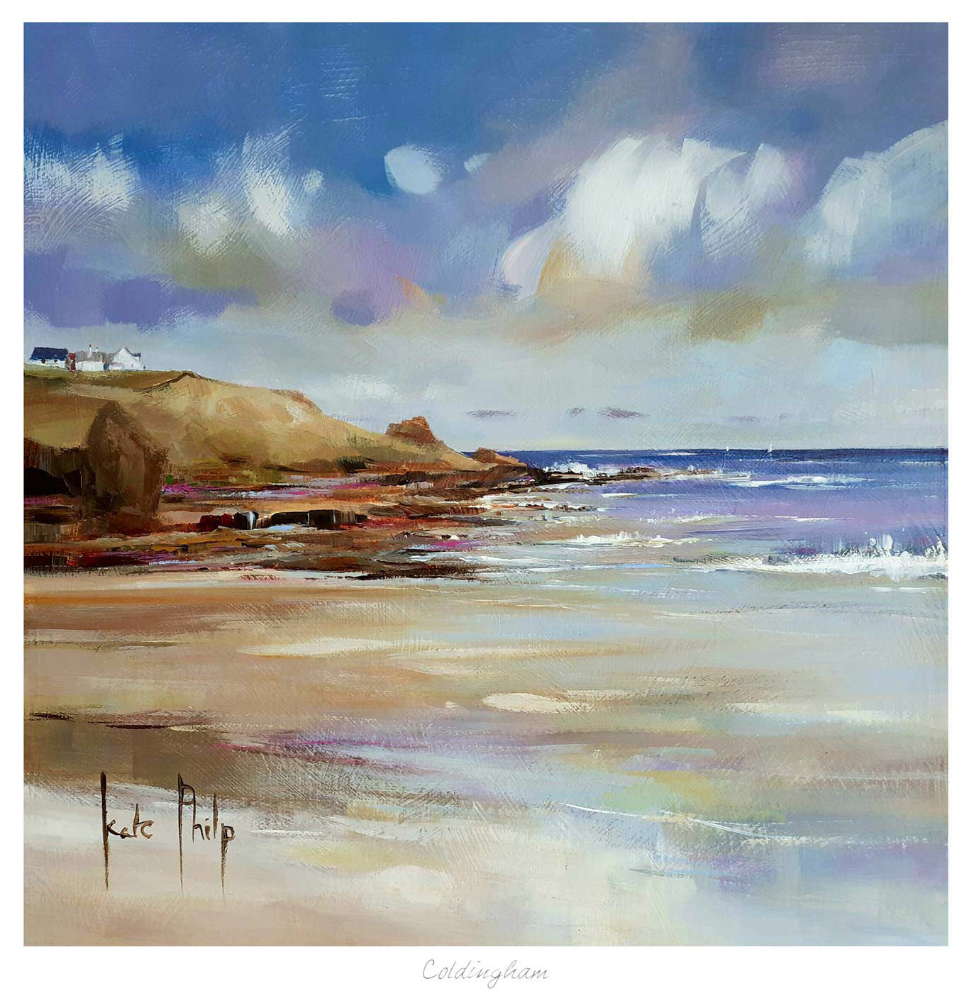
Choosing Art for Willow Green Walls, Why Peffer Sands Feels So Balanced

Image of Peffer Sands by Esther Cohen

Choosing art for willow green walls can be surprisingly tricky. The colour already brings softness and character, so the artwork needs to add interest without making the room feel heavy or overly rustic. Peffer Sands does that especially well by introducing light, movement, and a cleaner sense of space.

Why willow green benefits from something airy

Green walls often look their best when the room feels grounded but not enclosed. This piece helps keep that balance. It has enough warmth to belong with the paint colour, yet it also brings freshness that stops the scheme from becoming too earthy.

  • It works well with timber, brass, and natural textiles.
  • It suits bedrooms, kitchens, and garden-facing sitting rooms.
  • It adds flow where a green room needs a little lift.

How it helps the room feel finished

Peffer Sands can sit beautifully above a sideboard, on a chimney breast, or on the wall that needs a softer focal point. In each case, the framed presentation gives the room clarity without upsetting the calm that drew you to willow green in the first place.

Why the in-house finish counts

First 4 Frames produces every piece in-house in Falkirk using bespoke framing, colour-managed Giclée printing, and hand-finished craftsmanship. In a colour-led room, that quality matters because the print and frame need to feel considered alongside the rest of the scheme.

This artwork is by Esther Cohen, and you can view the exact framed product here.

If you need art for willow green walls that feels light, balanced, and easy to live with, Peffer Sands is an excellent choice.

Posted on

Why Secluded Sands Works Beautifully as Art for Sandy Beige Walls

Image of Secluded Sands by Arie Vardi

Choosing art for sandy beige walls is usually less about contrast for its own sake and more about stopping a soft neutral room from becoming too quiet. Secluded Sands is a particularly good fit because it keeps the scheme calm while adding more depth, movement, and coastal character.

Why beige rooms still need a clear focal point

Sandy beige can make a room feel warm and easy to live with, but it can also leave the walls slightly underpowered if the artwork is too timid. This piece brings enough atmosphere to hold the eye without breaking the restful feel that makes the colour appealing in the first place.

  • It works well with natural timber, linen, and woven textures.
  • It adds flow to a room that already leans soft and understated.
  • It suits living rooms, bedrooms, and quieter hallways equally well.

Where this kind of piece tends to shine

Secluded Sands sits especially well above a sofa, over a bed, or on a main wall where the room needs one stronger visual anchor. In a neutral scheme, that framed focal point helps everything else feel more deliberate.

Why the finish matters in a subtle room

First 4 Frames completes each piece in-house in Falkirk using bespoke framing, colour-managed Giclée printing, and hand-finished craftsmanship. In softer interiors, those quality details matter because the presentation has to carry the room without shouting for attention.

This artwork is by Arie Vardi, and you can view the exact framed product here.

If you need art for sandy beige walls that feels calm, warm, and beautifully resolved, Secluded Sands is a very strong choice.

Posted on

Afternoon Waves, The Bass Rock and the Challenge of Art for Pebble Grey Walls

Image of Afternoon Waves, The Bass Rock by Colin Robertson

Finding the right art for pebble grey walls is often about giving the room enough contrast without breaking its calmer mood. Pebble grey is a useful, elegant wall colour, but it can also make the wrong artwork disappear. Afternoon Waves, The Bass Rock works beautifully because it adds movement and depth while still feeling completely at ease in a softer neutral scheme.

Why softer greys still need a clear focal point

Grey often appeals because it feels easy to live with. The risk is that a whole room can become a little too quiet if the art does not bring enough structure. This piece avoids that problem by introducing a stronger horizon and a little more energy without losing the room’s calm.

It is especially useful in living rooms, bedrooms, and hallways where the wall colour is doing a lot of the background work already.

Why this piece pairs so naturally with pebble grey

  • It keeps the scheme soft but not flat.
  • It adds movement without looking busy.
  • It suits both modern and more traditional interiors.

Why the print quality matters

First 4 Frames completes every piece in-house with bespoke framing, colour-managed Giclée printing, and hand-finished craftsmanship. In a neutral room, subtle differences in print quality and finish become easier to notice, so superior presentation really counts.

This artwork is by Colin Robertson, and you can view the exact framed product here.

If you need art for pebble grey walls that feels calm, layered, and properly finished, Afternoon Waves, The Bass Rock is a very strong option.

Posted on

Choosing Art for Pale Blue Walls, Why White Horses, Lewis Works So Well

Image of White Horses, Lewis by Arie Vardi

Choosing art for pale blue walls is often about making sure the room keeps its freshness without tipping into feeling chilly or visually thin. White Horses, Lewis is a particularly good answer because it brings movement and coastal atmosphere while still holding enough warmth to stop the scheme feeling washed out.

Why pale blue needs the right kind of contrast

Soft blue walls can look calm and elegant, but they often need artwork with a little more life in it. Too close a colour match and the whole room can drift into one flat note. This piece helps avoid that by adding texture, rhythm, and a stronger focal point.

  • It keeps a cool room feeling airy rather than cold.
  • It suits bedrooms, sitting rooms, and quieter hallways.
  • It adds energy without making the scheme feel louder.

Where it tends to work best

This kind of piece sits especially well above a sofa, chest of drawers, or bed where the room needs one clearer anchor. It also works well in spaces with daylight from more than one side, where pale wall colour can otherwise feel a little diffuse.

Why the finish matters in a lighter scheme

First 4 Frames completes every piece in-house in Falkirk using bespoke framing, colour-managed Giclée printing, and hand-finished craftsmanship. In a pale room, those details matter because cleaner print quality and a well-judged frame help the artwork feel deliberate rather than faint.

This artwork is by Arie Vardi, and you can view the exact framed product here.

If you need art for pale blue walls that feels fresh, balanced, and easy to live with, White Horses, Lewis is an excellent choice.

Posted on

Canty Bay Bass (Vertical) and the Appeal of Wall Art for a Narrow Wall Between Windows

Image of Canty Bay Bass (Vertical) by Esther Cohen

Finding the right wall art for a narrow wall between windows can be surprisingly difficult. The space is often too slim for standard artwork, yet too visible to leave undecorated. Canty Bay Bass (Vertical) is a very strong answer because its shape suits the proportions naturally while the subject keeps the wall feeling calm rather than crowded.

Why awkward gaps still matter to the whole room

A narrow section between windows can easily look like a leftover strip of wall. When it is handled well, though, it can become one of the details that makes a room feel thoughtful. The key is choosing a piece that works with the height and rhythm of the glazing rather than fighting it.

This artwork does that beautifully. It gives the eye something graceful to land on, but it does not make the space feel boxed in.

Why a vertical piece is often the right answer

  • It echoes the proportions of the window lines.
  • It helps a slim wall look intentional.
  • It adds interest without crowding the surrounding light.

That makes it especially useful in dining rooms, stair landings, and garden-facing spaces where windows already define the architecture.

Why the First 4 Frames approach suits this kind of placement

First 4 Frames completes each piece in-house with bespoke framing, colour-managed Giclée printing, and hand-finished craftsmanship. In a tighter wall position, neat presentation matters even more because the frame and proportions are seen very clearly.

This artwork is by Esther Cohen, and you can view the exact framed product here.

If you want wall art for a narrow wall between windows that feels elegant, balanced, and professionally finished, Canty Bay Bass (Vertical) is an excellent choice.

Posted on

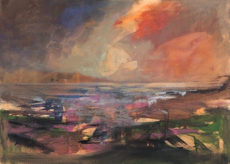
Why Last Light, Arisaig Works So Well as Wall Art for Limestone Flooring

Image of Last Light, Arisaig by Colin Robertson

Choosing wall art for limestone flooring is often about introducing warmth without losing the room’s elegance. Limestone gives a space real presence, but it can also make the overall scheme feel a little cool or rigid if the walls do not soften it. Last Light, Arisaig works beautifully because it adds glow, atmosphere, and a more relaxed sense of movement.

Why stone floors benefit from softer wall choices

Limestone often appears in kitchens, hallways, garden rooms, and open-plan spaces where durability matters. The flooring can look superb, but it still needs artwork that prevents the room from feeling too hard-edged. This piece does that by bringing warmth upward onto the wall.

  • It helps pale stone feel less stark.
  • It suits calmer schemes with natural materials.
  • It gives a larger room a more welcoming centre.

Why this colour and mood pairing works

Rooms with limestone flooring often benefit from artwork that introduces a little dusk, sunset, or reflected light. That kind of atmosphere balances the quieter tone of the floor without making the room feel overly decorated. Last Light, Arisaig does that especially well.

It can sit comfortably above a sideboard, on the main wall of a kitchen diner, or in an entrance space where the stone floor is one of the first things you notice.

Why the print and frame quality matter

First 4 Frames completes every piece in-house in Falkirk with bespoke framing, colour-managed Giclée printing, and hand-finished craftsmanship. In a room already shaped by quality materials, that superior finish helps the artwork feel properly at home.

This artwork is by Colin Robertson, and you can view the exact framed product here.

If you need wall art for limestone flooring that feels warm, composed, and professionally finished, Last Light, Arisaig is an excellent fit.

Posted on

How Evening Glow at Morar Can Work Beautifully as Wall Art for a Room With a Painted Ceiling

Image of Evening Glow at Morar by Colin Robertson

Choosing wall art for a room with a painted ceiling takes a little more care than styling a standard space. Once colour moves overhead, the room already has a stronger point of view, so the artwork needs to connect with that idea rather than sit apart from it. Evening Glow at Morar works especially well because it helps the room feel linked together instead of split between walls and ceiling.

Why decorative ceilings need grounded artwork

A painted ceiling can add intimacy and character, but it also shifts visual weight upward. The right framed print helps rebalance the room. It gives the walls enough purpose to support the scheme, which stops the space from feeling top-heavy or overworked.

  • It suits bedrooms, dining rooms, and sitting rooms with a stronger decorative mood.
  • It helps the ceiling colour feel intentional rather than isolated.
  • It adds depth without competing with the architecture.

Why this artwork feels especially useful

Evening Glow at Morar has enough atmosphere to hold the wall, but it still leaves room for the rest of the scheme to breathe. That is exactly what a room with a painted ceiling often needs. The artwork supports the idea of the room rather than trying to become the only thing you notice.

Why a bespoke framed finish completes the look

First 4 Frames produces each piece in-house in Falkirk with bespoke framing, colour-managed Giclée printing, and hand-finished craftsmanship. In a room where colour and finish have already been considered carefully, that superior standard helps the final result feel coherent and well judged.

This artwork is by Colin Robertson, and you can view the exact framed product here.

If you want wall art for a room with a painted ceiling that feels balanced, atmospheric, and professionally finished, Evening Glow at Morar is an excellent option.

Posted on

Why Coastal Path web Works So Well as Wall Art for Sliding Patio Doors

Image of Coastal Path web by Arie Vardi

Choosing wall art for sliding patio doors is often about restoring balance. Large panes of glass bring in wonderful light and a strong garden connection, but they can also leave the interior feeling visually light on one side. Coastal Path web works especially well because it gives the room a calm focal point without making it feel heavier or more enclosed.

Why wide glazing needs something steady nearby

Patio doors naturally pull the eye outward. That is part of their appeal, but it means the walls around them need a little more intention. A well-chosen framed print helps the room feel finished even when the view outside changes with the weather and the time of day.

  • It suits sitting rooms, dining spaces, and garden rooms with broad glazing.
  • It adds structure without competing with the outdoor view.
  • It helps the room feel styled indoors rather than defined only by the doors.

Why this piece feels right in a brighter room

Coastal Path web has enough movement and colour to hold its place, yet it still keeps the room relaxed. That matters in spaces with large glass openings, where artwork needs presence but should not feel too dense. The result is a more settled room that still feels open and easy to live with.

Why the finish matters

First 4 Frames completes each piece in-house in Falkirk with bespoke framing, colour-managed Giclée printing, and hand-finished craftsmanship. In a light-filled room, that superior presentation makes a real difference because better framing and print quality stop the artwork from looking washed out beside the glass.

This artwork is by Arie Vardi, and you can view the exact framed product here.

If you want wall art for sliding patio doors that feels calm, balanced, and professionally finished, Coastal Path web is an excellent choice.