Posted on

Wall Art for Maple Furniture, Why Autumn Fox Feels So Natural

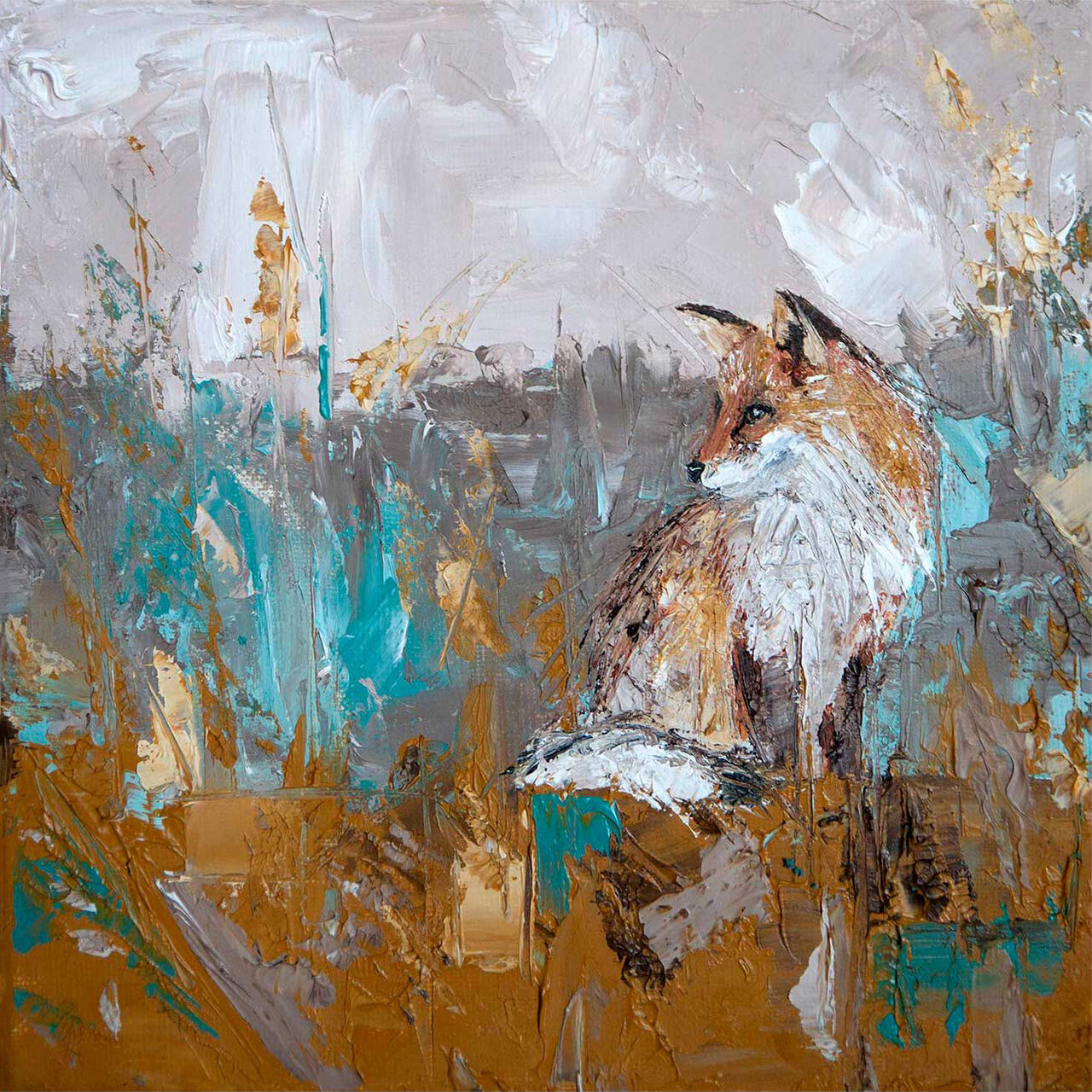
Autumn Fox is a framed fine art giclée print featuring an impressionistic fox in a field, painted with broad, textured brushstrokes in brown, teal, and gray—perfect for adding an abstract touch to any room.

Choosing wall art for maple furniture is often about stopping a lighter timber scheme from feeling too pale or too even. Autumn Fox is a lovely answer because it brings warmth, texture, and a more natural focal point without fighting the calm feel that maple already gives a room.

wall art for maple furniture - Autumn Fox

Why wall art for maple furniture needs warmth and texture

Maple is bright, practical, and easy to decorate around, but it can leave the room needing a little more depth if the artwork is too cool or too faint. Autumn Fox works well because the russet and woodland tones add warmth, while the fox subject keeps the piece lively and distinctive.

  • It softens pale timber without making the room feel heavy.
  • It pairs naturally with creams, olive tones, soft greys, and woven textures.
  • It gives a bedroom, hallway, living room, or reading corner more personality.

Why Autumn Fox feels especially easy to place

The artwork has enough detail to hold the wall, but it still reads as calm rather than busy. First 4 Frames completes the framing and colour-managed fine art printing in-house, so the finished piece feels bespoke, hand-finished, and ready to sit comfortably beside better furniture and quieter palettes.

You can browse more work by Charlotte Strawbridge, learn more about the artist at Charlotte Strawbridge, and view the exact framed product here.

If you are looking for wall art for maple furniture that make a lighter room feel warmer and more layered, Autumn Fox is an excellent fit.
Posted on

Stag Wall Art Feels More Grounded With Stag

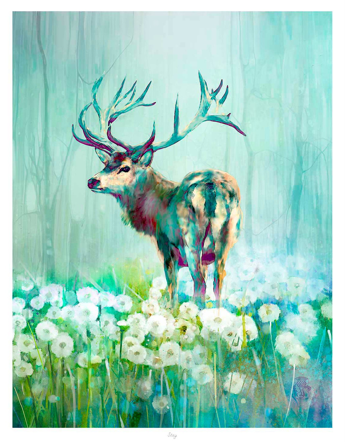
The art print "Stag" features a majestic stag with impressive antlers amid white dandelions, set against soft green and blue tones and a misty forest in the background.

The best stag wall art should give a room character without turning it into a themed space. Stag does that especially well because the single stag subject feels composed, confident, and easy to place in a more considered interior.

stag wall art - Stag

Why stag wall art can feel refined rather than rustic

Wildlife artwork often works best when it has enough visual strength to anchor the wall, but not so much that it starts to dominate the whole room. That is where Stag stands out. The subject carries presence, yet the overall feel remains clean and balanced.

  • It adds Highland character without relying on novelty.
  • It suits timber, leather, wool, and painted joinery equally well.
  • It gives a hallway, study, snug, or sitting room a more grounded focal point.

Why Stag works so well in a more considered interior

Some wildlife prints feel busy once framed, but Stag keeps a stronger sense of shape and restraint. First 4 Frames completes the piece in-house with bespoke framing and colour-managed Giclee production, helping the final artwork feel polished, substantial, and properly resolved on the wall.

You can browse more work by Lee Scammacca, learn more about the artist at Lee Scammacca, and view the exact framed product here.

If you want stag wall art that feel calm, characterful, and easy to live with, Stag is a very strong option.

Posted on

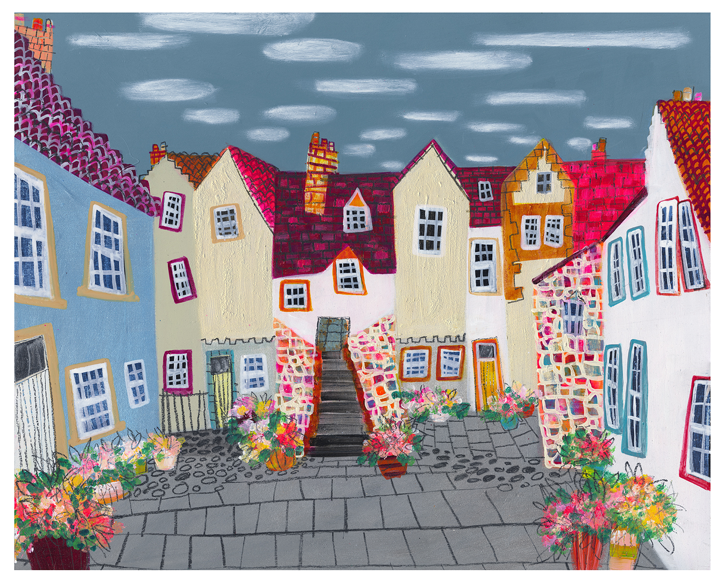
How White Horse Close & Summer Pots Can Brighten a Townhouse Landing

Colorful, whimsical illustration of "White Horse Close & Summer Pots"—a quaint village square with cobblestone paths, flower-filled pots, and tall houses with red-tiled roofs beneath a cloudy sky.

Finding the right art for a townhouse landing is often about giving a passing space real personality without making it feel crowded. White Horse Close & Summer Pots is especially effective because it brings colour, rhythm, and warmth to the stairway while still feeling light enough for an in-between part of the home.

art for a townhouse landing featuring White Horse Close and Summer Pots

Why art for a townhouse landing needs energy without clutter

Landings in older or taller homes can easily feel like leftover space between the rooms that matter most. The best art changes that. White Horse Close & Summer Pots gives the area a clear point of interest, helping the landing feel connected to the style of the rest of the house rather than simply decorative in passing.

  • It adds colour to stair walls that might otherwise feel plain or narrow.
  • It suits homes where the landing should feel welcoming instead of overlooked.
  • It brings a lived-in sense of place without making the space feel heavy.

Where it works best

This piece works particularly well on the wall you see as you reach the top of the stairs, beside a stair turn, or opposite a landing window where the extra colour can catch the light. In each setting, the scene helps the upper floor feel more deliberate and complete.

Why the framed finish matters

At First 4 Frames, the artwork is completed in-house with bespoke framing, colour-managed Giclee printing, and hand-finished craftsmanship. That quality matters on a landing, where a neatly finished frame can make the whole stairwell feel more polished and better resolved.

The artwork is by Nikki Monaghan, and you can view the exact framed product here.

If you are looking for art for a townhouse landing that feels cheerful, characterful, and professionally finished, White Horse Close & Summer Pots is a very smart choice.

Posted on

Custom Framing for Photographers Feels More Useful With Out of Reach

Image of Out of Reach by Noel Fenech Photography

Strong custom framing for photographers is not only about protecting a print. It is about helping the image land properly on the wall. Out of Reach is a very good example because the photograph depends on upward movement, autumn colour, and a sense of lift that can be sharpened or dulled by the framing choices around it.

custom framing for photographers - Out of Reach

Why custom framing for photographers changes the feel of the image

Photography often carries a particular pacing. In this case, the eye moves upward through branches and colour into open sky. The wrong frame can make that movement feel cramped or too abrupt. A well-judged frame helps the composition breathe and gives the photograph the authority it needs in the room.

That matters whether the artwork is going into a hallway, home office, reading corner, or living space with natural materials and calmer colours. The final presentation should support the image, not interrupt it.

Why Out of Reach is such a useful example

Out of Reach already has beautiful seasonal colour and a clear point of view, so it responds especially well to bespoke presentation. First 4 Frames completes the work in-house in Falkirk with colour-managed fine art printing and hand-finished framing, helping the piece feel more resolved, more valuable, and easier to place with confidence.

For wider inspiration around woodland atmosphere and colour, the Woodland Trust is worth a look. You can also explore more work by Noel Fenech Photography and see the exact framed product here.

If you are considering custom framing for photographers, Out of Reach shows why the finish around a photograph is part of the experience, not an afterthought.

Posted on

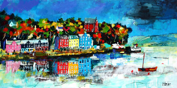
A Frame Visualisation Tool Makes More Sense With Still Water, Tobermory

Still Water, Tobermory" showcases colorful waterfront buildings and trees reflected in calm water under a bright blue sky, with a small red boat in the foreground and another boat near the shore.

A useful frame visualisation tool should help buyers judge more than whether a frame looks nice in isolation. With Still Water, Tobermory, the frame choice can genuinely shift the mood of the finished piece, making it brighter, quieter, more coastal, or more classic.

frame visualisation tool - Still Water, Tobermory

Why a frame visualisation tool is especially helpful with colourful artwork

When an image carries bright harbour detail and reflective water, the finish around it matters more than many people expect. A darker frame can make the scene feel richer and more anchored, while a lighter frame can keep it fresh and more open. Being able to preview those directions before buying makes the decision far less of a guess.

  • It helps you judge whether the artwork should feel airy or more substantial.
  • It shows how the frame changes the balance between colour and calm.
  • It makes it easier to match the piece to furniture, paint, and existing finishes.

Why Still Water, Tobermory benefits from that preview

Still Water, Tobermory has enough life in it to support several good framing directions, which is exactly when visualisation becomes useful rather than gimmicky. First 4 Frames connects that preview to real in-house craftsmanship, bespoke framing, and colour-managed Giclee production, so the finished result reflects a genuine making process rather than a generic mock-up.

For more on the town that inspires the scene, VisitScotland on Tobermory is a good reference. You can also browse more work by Rob Hain and view the exact framed product here.

If you want a frame visualisation tool that actually improves buying confidence, Still Water, Tobermory is a very strong example of why it matters.

Posted on

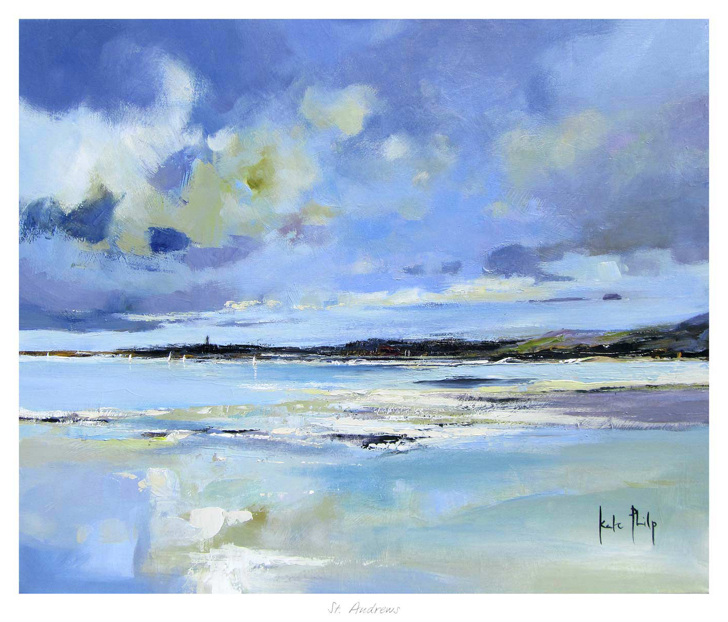
Why St Andrews Works Beautifully as Wall Art for a Room With Window Seats

St Andrews features a coastal landscape painting with a wide, reflective beach, gentle waves, distant shoreline, and a dramatic blue, white, and green sky. Signed by Kate Philp in the corner.

Choosing wall art for a room with window seats is often about balance. A seat by the window already gives the room a natural place to pause, so the artwork nearby needs to add atmosphere without making that brighter corner feel busy. St Andrews works especially well because it brings openness, coastal calm, and enough colour to anchor the view indoors.

wall art for a room with window seats featuring St Andrews

Why wall art for a room with window seats needs calm structure

Window seats tend to become quiet everyday spaces for reading, morning coffee, or simply taking in the light. That means the wall art has to do more than fill a blank area. St Andrews helps the seat feel connected to the wider room, rather than like a separate corner that never quite settles into the scheme.

  • It keeps a bright seating area feeling grounded rather than washed out.
  • It suits interiors where natural light already does a lot of the visual work.
  • It gives a built-in seat or alcove a more considered focal point.

Where it works best

This piece is particularly effective beside a painted window bench, above a lower side table, or on the return wall that frames the seating area. Because the scene has space and movement, it complements the openness that makes a window seat appealing in the first place.

Why the framed finish matters

At First 4 Frames, St Andrews is produced in-house with bespoke framing, colour-managed Giclee printing, and hand-finished craftsmanship. In a room where daylight catches every detail, that superior quality helps the finished piece feel polished and intentional rather than like an afterthought.

The artwork is by Kate Philp, and you can view the exact framed product here.

If you are choosing wall art for a room with window seats and want something calm, coastal, and easy to live with, St Andrews is a very strong option.

Posted on

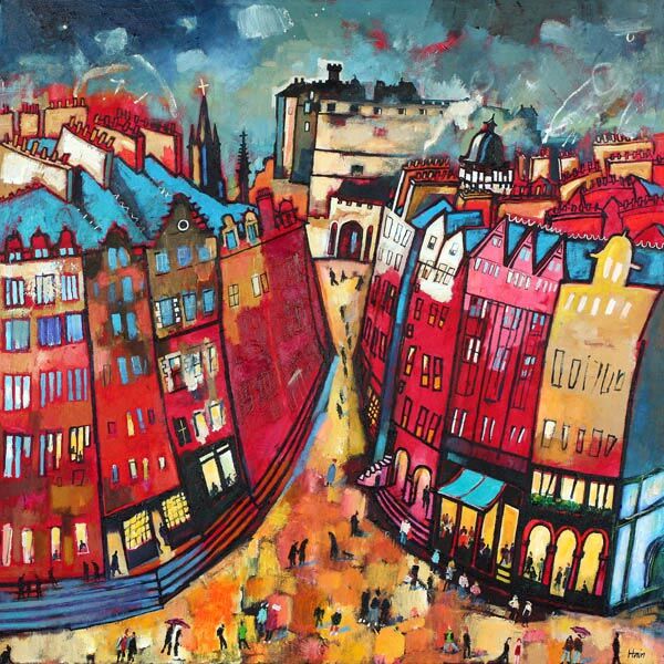
Scottish Artists Bring Urban Character Too, Starting With Edinburgh Nights

The "Edinburgh Nights" painting captures a lively city street with tall, leaning red, blue, and yellow buildings. People stroll beneath a dramatic sky, with distant towers and unique Edinburgh architecture in view.

When people search for Scottish artists, they often picture glens, coastlines, and Highland skies. Those subjects are popular for good reason, but Edinburgh Nights is a reminder that Scottish artists can also bring city light, story, and movement into the home in a way that feels warm rather than hard-edged.

Scottish artists - Edinburgh Nights

Why Scottish artists are not only about landscape

Urban Scottish scenes can add just as much local character as a mountain or shoreline print, but often with a different kind of energy. Edinburgh Nights carries recognisable place and evening glow, which makes it especially useful in a hallway, snug, dining area, or living room where you want the wall to feel lively and rooted rather than formal.

That broader view of Scottish artists is helpful for buyers who want something connected to Scotland without repeating the most expected subjects. A good city-led piece can feel personal, cultured, and easy to live with for years.

Why Edinburgh Nights has that wider appeal

The image has enough light and detail to feel memorable, but the framed result still needs craftsmanship behind it. First 4 Frames produces the piece in-house with bespoke framing and colour-managed Giclee printing, giving the artwork the finish it needs to feel complete on the wall.

For wider background on the city atmosphere behind the scene, Edinburgh World Heritage is worth exploring. You can also browse more work by Rob Hain and see the exact framed product here.

If you are comparing Scottish artists and want something urban, warm, and full of place, Edinburgh Nights is a very appealing choice.

Posted on

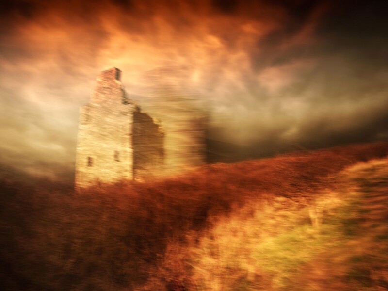
Why Museum Framing Matters More With Greenan Castle

Image of Greenan Castle by Noel Fenech Photography

The appeal of good museum framing is not only protection. It is also about presentation. Greenan Castle is a strong example because the image already has drama, scale, and a strong sense of place. The way it is framed determines whether that drama feels elegant or simply heavy.

museum framing - Greenan Castle

Why museum framing helps a dramatic image breathe

Powerful subjects need enough visual space around them to feel deliberate. With a piece like Greenan Castle, careful framing can stop the image from crowding the room, while still giving it the weight it deserves. That balance is especially useful in studies, sitting rooms, hallways, or offices where the artwork needs to feel confident rather than overpowering.

  • It helps the print feel more collected and less simply mounted.
  • It gives the image clearer authority on the wall.
  • It supports a more timeless result for subjects with heritage and atmosphere.

Why Greenan Castle suits that more formal approach

The subject already carries history, coastline, and weather, so it benefits from a presentation that feels equally measured. First 4 Frames completes the work in-house with bespoke framing and colour-managed fine art printing, helping the finished piece feel polished, spacious, and properly integrated into the room.

For more on the site itself, VisitScotland on Greenan Castle is a useful resource. You can also browse more work by Noel Fenech Photography and view the exact framed product here.

If you are exploring museum framing and want a print that benefits from careful visual discipline, Greenan Castle makes a persuasive case.

Posted on

Premium Framed Artwork Feels More Convincing With Silent Morning

Image of Silent Morning by Noel Fenech Photography

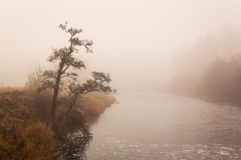
People searching for premium framed artwork are usually looking for more than decoration. They want a piece that feels settled, substantial, and rewarding to live with. Silent Morning is a very good example because its quiet atmosphere depends on subtle shifts of light rather than on obvious impact alone.

premium framed artwork - Silent Morning

Why premium framed artwork matters with quieter images

When a print relies on mist, morning light, and softer tonal transitions, average finishing quickly shows. The image can lose depth or feel flatter than it should. That is why Silent Morning benefits from a higher standard of print and presentation. The mood is part of the artwork, so the framed result needs to protect it.

This kind of piece works particularly well in a bedroom, reading corner, study, or quieter sitting room where you want calm presence rather than a louder statement. It has enough character to shape the wall, but it still leaves the room feeling restful.

Why Silent Morning rewards a more careful finish

First 4 Frames handles the framing and colour-managed Giclee printing in-house in Falkirk. That matters here because the print needs clarity without harshness and softness without muddiness. The final piece feels bespoke, hand-finished, and genuinely room-ready.

For broader inspiration around the kind of landscape calm many buyers enjoy, the Scottish Wildlife Trust is a useful reference. You can also explore more work by Noel Fenech Photography and see the exact framed product here.

If you are weighing up premium framed artwork, Silent Morning is a strong reminder that quieter art often benefits most from superior quality.

Posted on

Why The Final Beacon Works So Well as Black and White Framed Prints

Image of The Final Beacon by Noel Fenech Photography

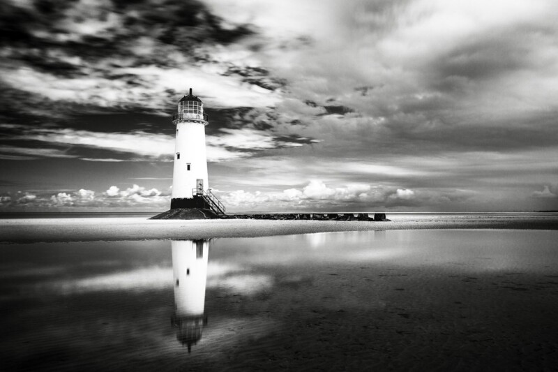
The best black and white framed prints do more than strip colour away. They create a clearer sense of structure, contrast, and mood. The Final Beacon is a particularly strong example because the lighthouse subject feels crisp and architectural, while the wider scene still carries atmosphere and movement.

black and white framed prints - The Final Beacon

Why black and white framed prints often feel more composed

Monochrome artwork can be a very practical choice when a room already has plenty of texture, pattern, or mixed materials. Instead of competing for attention, it brings direction. That is one reason The Final Beacon works so well in a hallway, home office, sitting room, or stair wall where the room wants focus rather than more colour.

  • It gives the eye a strong focal point without visual clutter.
  • It sits easily with timber, stone, metal, and neutral upholstery.
  • It feels atmospheric rather than flat because the subject has depth and weather in it.

Why The Final Beacon feels easier to live with than many monochrome pieces

Some black and white work can feel severe if the image only offers contrast. The Final Beacon avoids that because the composition still carries reflection, sky, and distance. First 4 Frames completes the piece in-house with bespoke framing and colour-managed fine art printing, so the final result feels polished and substantial rather than merely graphic.

For wider background on lighthouse heritage, the Northern Lighthouse Board is useful. You can also explore more work by Noel Fenech Photography and view the exact framed product here.

If you want black and white framed prints that feel calm, dramatic, and well finished, The Final Beacon is an excellent option.