Posted on

Archival Ink Prints Feel More Worthwhile With Formal Glory

Image of Formal Glory by Noel Fenech Photography

People looking for archival ink prints are often trying to avoid a print that feels good only on the day it arrives. They want something that will continue to look refined, stable, and worthwhile on the wall. Formal Glory is an excellent example of why that matters.

archival ink prints - Formal Glory

Why archival ink prints are about more than longevity alone

Longevity matters, of course, but so does how the print looks in the present. The richer and more controlled the tonal range, the more composed the artwork feels. That is especially important with photography-led pieces, where weak output can quickly flatten the entire image.

Formal Glory benefits from that better standard because the finished print needs depth and clarity rather than a merely serviceable reproduction. When printing and framing are handled properly, the artwork feels more substantial and better suited to a considered interior.

Why First 4 Frames makes this easier to trust

Everything is completed in-house in Falkirk, from colour-managed printing through to the hand-finished framed result. That means the final piece is built around craftsmanship, not a mass-market compromise. The difference shows most clearly in artwork that depends on control and polish.

For wider professional context around fine art print standards, Fine Art Trade Guild is a useful reference. You can also explore more work by Noel Fenech Photography and view the exact framed product here.

If you are comparing archival ink prints, Formal Glory is the kind of piece that shows why better materials and better finishing are worth it.
Posted on

Museum Quality Prints Feel More Convincing With Mists and Majesty

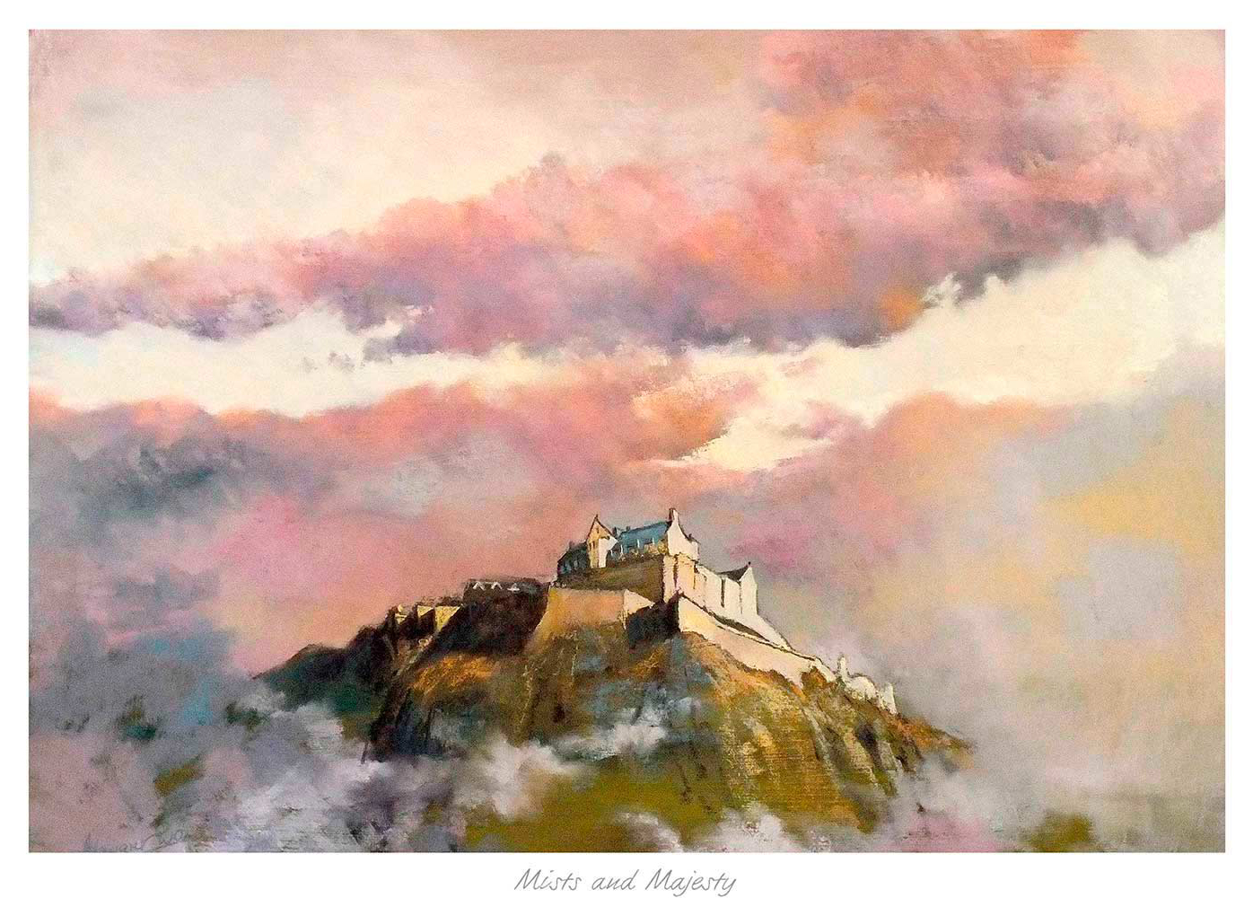
Mists and Majesty reveals a white castle atop a rocky hill, emerging through swirling mists under a dramatic pastel sky with pink and orange clouds, creating an atmospheric, dreamlike scene.

When people search for museum quality prints, they are usually looking for more than a decorative image. They want a print that keeps its depth, subtlety, and sense of atmosphere. That is exactly why Mists and Majesty is such a useful example.

museum quality prints - Mists and Majesty

Why museum quality prints matter most with quieter artwork

Bold prints can survive mediocre production more easily because the eye is carried by stronger contrast and louder colour. Tonal landscapes are less forgiving. If the print process is flat, the image loses mood. If the materials are poor, the whole piece feels less substantial than it should.

Mists and Majesty depends on nuance. It needs gentle transitions, measured colour, and enough tonal separation to keep the scene feeling spacious rather than muddy. That is why superior quality printing and careful framing are not luxuries here. They are part of what makes the artwork work.

How First 4 Frames supports that standard

First 4 Frames produces work in-house in Falkirk using colour-managed Giclee methods and hand-finished framing. That combination gives quieter landscapes the clarity and presence they need, while still keeping the final result elegant and liveable.

For more on fine art paper and print standards, Hahnemuhle Digital FineArt is a useful reference. You can also explore more work by Margaret Evans and view the exact framed product here.

If you are weighing up museum quality prints, Mists and Majesty makes a strong case for choosing a print that keeps its atmosphere as well as its image.

Posted on

A Bespoke Picture Framing Service Shows Its Value With Black Rock Cottage

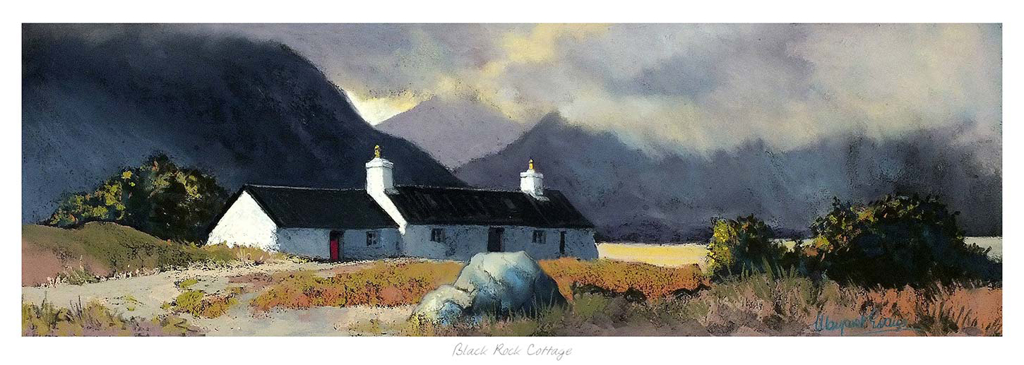
Black Rock Cottage features white walls and a dark roof, nestled in grassy terrain among rocky hills beneath dramatic cloudy skies, with sunlight breaking through to brighten parts of the landscape.

A quality bespoke picture framing service should do more than simply edge a print. It should help the artwork sit properly in the room. With Black Rock Cottage, that matters a great deal because the subject already carries drama, contrast, and a strong sense of place.

bespoke picture framing service - Black Rock Cottage

Why a bespoke picture framing service changes the result

Powerful landscapes can feel magnificent when framed well, but if the presentation is too heavy, too slight, or poorly judged, the room feels the compromise immediately. A bespoke approach allows the proportions, finish, and visual weight of the frame to work with the print rather than against it.

  • A restrained frame can let the image breathe while still giving it authority.
  • A carefully judged mount can separate the print from darker wall colours or busier textures.
  • The finished presentation can make the piece feel atmospheric rather than overpowering.

Why Black Rock Cottage is such a good example

Black Rock Cottage has enough visual depth to become a real focal point, yet it still benefits from disciplined framing choices. That is where First 4 Frames stands out: everything is completed in-house in Falkirk, with colour-managed Giclee printing and hand-finished framing designed to make the final piece feel complete rather than merely packaged.

For more on the wider Glencoe setting, National Trust for Scotland Glencoe is a useful reference. You can explore more work by Margaret Evans and view the exact framed product here.

If you are considering a bespoke picture framing service, Black Rock Cottage is a strong reminder that good framing is part of the artwork’s impact, not an afterthought.

Posted on

Online Picture Framing Feels More Useful With At the Top of the Royal Mile

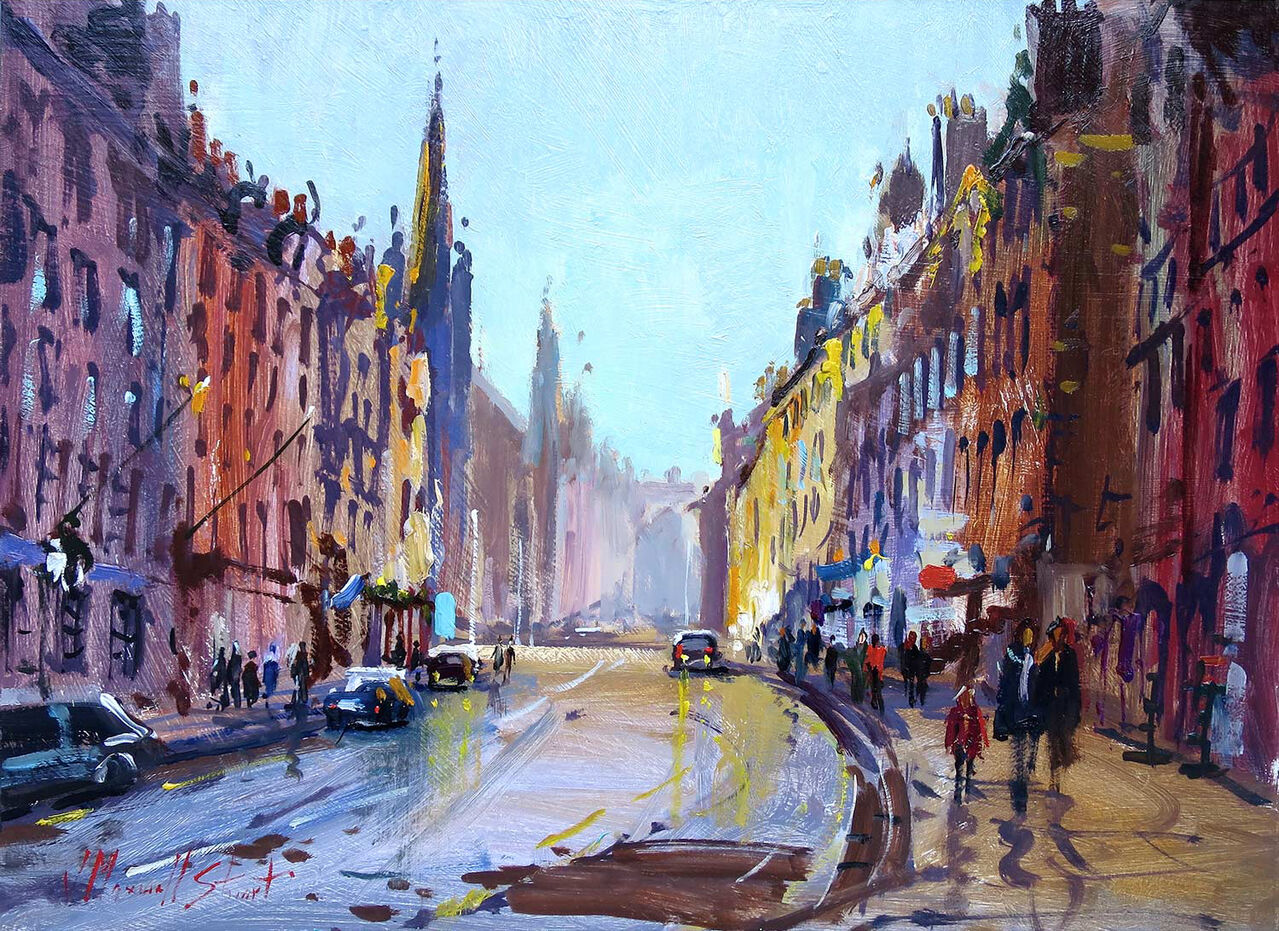
At the Top of the Royal Mile is a vibrant impressionist print showing lively city streets with colorful buildings and people, capturing urban life’s energy.

Well-designed online picture framing should help customers judge more than colour alone. With a detailed city print such as At the Top of the Royal Mile, the frame, mount, and overall proportion all shape whether the finished piece feels crisp, atmospheric, traditional, or more contemporary.

online picture framing - At the Top of the Royal Mile

Why online picture framing matters with detailed artwork

Some prints are simple enough to suit a wide range of finishes. Others benefit from more careful judgement because the frame changes the whole tone. A street scene like At the Top of the Royal Mile has architectural detail, local character, and a clear sense of place. That means a darker frame can make it feel more dramatic, while a lighter presentation can keep it brighter and more relaxed.

Being able to visualise those decisions before buying is genuinely useful. It helps you decide whether the print should act as a crisp urban accent, a more heritage-led feature, or a balanced focal point that simply sits comfortably with the rest of the room.

Why First 4 Frames is well placed to do this properly

Because framing and printing are completed in-house in Falkirk, First 4 Frames can connect that visual choice to real craftsmanship rather than a generic mock-up. The final result is bespoke, hand-finished, and designed to feel at home once it arrives.

For more background on the part of the city pictured here, Edinburgh World Heritage is a useful reference. You can also explore more work by Joseph Maxwell Stuart and view the exact framed product here.

If you want online picture framing that actually helps you make a better choice, At the Top of the Royal Mile is an excellent example of why visualisation matters.

Posted on

Bird Wall Art Feels Softer and More Characterful With Three Little Birds

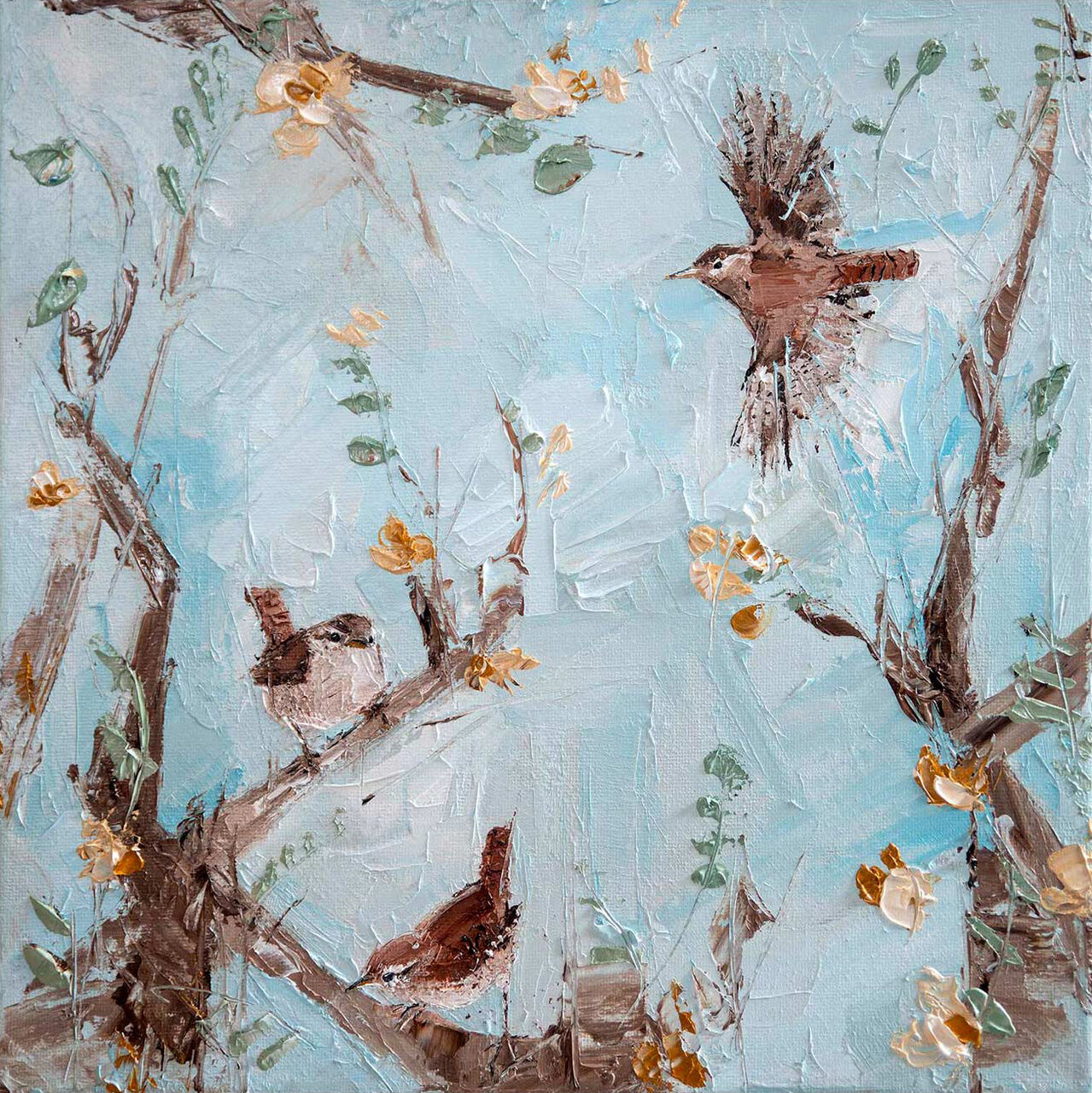
Textured painting of three brown birds among branches with yellow flowers on a light blue background, available as the "Three Little Birds" framed fine art giclée print by Charlotte Strawbridge.

The best bird wall art should bring personality to a room without making it feel childish or overly themed. Three Little Birds works especially well because it has warmth and charm, yet the overall effect still feels calm enough for a grown-up interior.

bird wall art - Three Little Birds

Why bird wall art often works best when it feels understated

Wildlife imagery can be delightful, but it becomes much more useful in the home when it feels observant rather than novelty-led. A piece like Three Little Birds gives the wall a lighter touch. It can soften a kitchen corner, reading nook, guest room, or country hallway without turning the room into a themed space.

That softer approach is one reason bird wall art stays liveable. It adds interest and friendliness while still leaving the room feeling settled. First 4 Frames reinforces that effect through in-house framing, colour-managed Giclee printing, and a hand-finished standard that gives the artwork proper presence.

Where Three Little Birds suits best

  • In a breakfast room that needs a lighter, more welcoming focal point.
  • In a guest space where you want warmth without heaviness.
  • In a country-style interior that already has natural textures and wants one gentle visual lift.

If you enjoy wildlife subjects, the RSPB is a useful resource. You can explore more work by Charlotte Strawbridge and view the exact framed product here.

If you are searching for bird wall art that feels warm, observant, and easy to place, Three Little Birds is a very strong fit.

Posted on

Dance Wall Art Feels More Alive With Ankle Tap

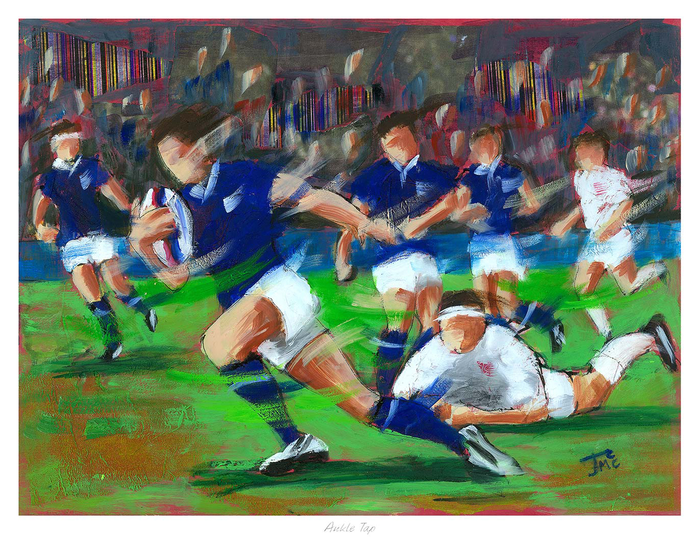
Ankle Tap" is an impressionistic painting depicting a blue-clad rugby player running with the ball as a white-uniformed opponent attempts an ankle tap tackle, with other players and a blurred crowd in the background.

Good dance wall art should make a room feel more alive, not more cluttered. If you want artwork that carries movement and personality, Ankle Tap is a particularly good choice because it feels spirited without becoming overplayed.

dance wall art - Ankle Tap

Why dance wall art needs rhythm as well as colour

Movement-led artwork can easily become too literal if it only shouts about the subject. The stronger approach is to choose a piece that suggests rhythm, energy, and human connection while still feeling resolved enough for everyday living. That is what makes Ankle Tap so useful in a hallway, sitting room, or social snug.

  • It gives a room a sense of movement without making the wall feel busy.
  • It suits spaces where conversation, welcome, and warmth matter more than strict formality.
  • It feels rooted in Scottish culture without reading like a souvenir.

Why Ankle Tap holds that balance

The composition has life in it, but it still feels composed. That matters because the best dance wall art should be energetic enough to lift a room while remaining polished enough to live with for years. First 4 Frames finishes each piece in-house in Falkirk with bespoke framing, hand-finished craftsmanship, and colour-managed Giclee production, so the final presentation feels every bit as considered as the image itself.

For wider context on Scottish social dance traditions, the Royal Scottish Country Dance Society is a useful reference. You can also explore more work by Janet McCrorie and view the exact framed product here.

If you want dance wall art that feels lively, cultured, and genuinely room-ready, Ankle Tap is an excellent option.

Posted on

Exhibition Posters Feel More Room-Ready With Edinburgh Festival

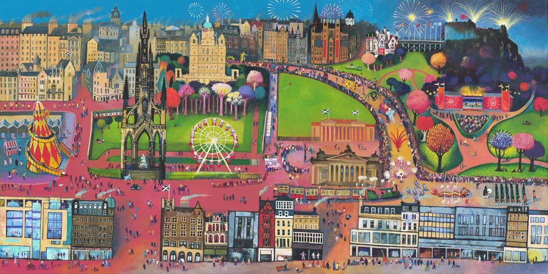
A vibrant illustration of the "Edinburgh Festival" features historic buildings, parks, a Ferris wheel, bright trees, crowds, and fireworks, capturing the lively festival spirit in a colorful urban cityscape.

The best exhibition posters do more than reference an event. They bring enough colour, composition, and cultural energy to feel worth framing properly. Edinburgh Festival works especially well because it captures that celebratory poster spirit while still feeling decorative and display-worthy at home.

exhibition posters - Edinburgh Festival

That balance is what keeps poster-led artwork from feeling temporary. The room gains a lift, but the piece still feels chosen rather than pinned up in haste.

Why Exhibition Posters Need Presence as Well as Energy

A strong poster-inspired piece usually needs both movement and structure. This image brings brightness and city atmosphere, but it also has enough composition to sit comfortably as framed wall art rather than reading as visual noise.

  • It feels celebratory without becoming chaotic.
  • It gives the wall personality and local culture.
  • It works when you want colour with a clearer sense of design.

Where Edinburgh Festival Works Best

Edinburgh Festival would suit a hallway, sitting room, studio, guest room, or music-loving workspace where one framed piece can bring life to the wall. It pairs naturally with neutral backgrounds, black accents, timber, shelving, and other collected details because the image already carries movement in a controlled way.

Why Framing Makes Poster-Led Art Feel Lasting

Poster-inspired artwork becomes far more convincing when the print quality and frame finish lift it beyond the temporary. First 4 Frames handles bespoke framing and colour-managed Giclee production in-house, helping the final piece feel crisp, celebratory, and properly resolved. You can view the exact framed product here, and browse more from Rob Hain if you enjoy Scottish scenes with the same bright graphic lift.

For anyone comparing exhibition posters and wanting something more polished and permanent for the wall, Edinburgh Festival is a smart choice.

Posted on

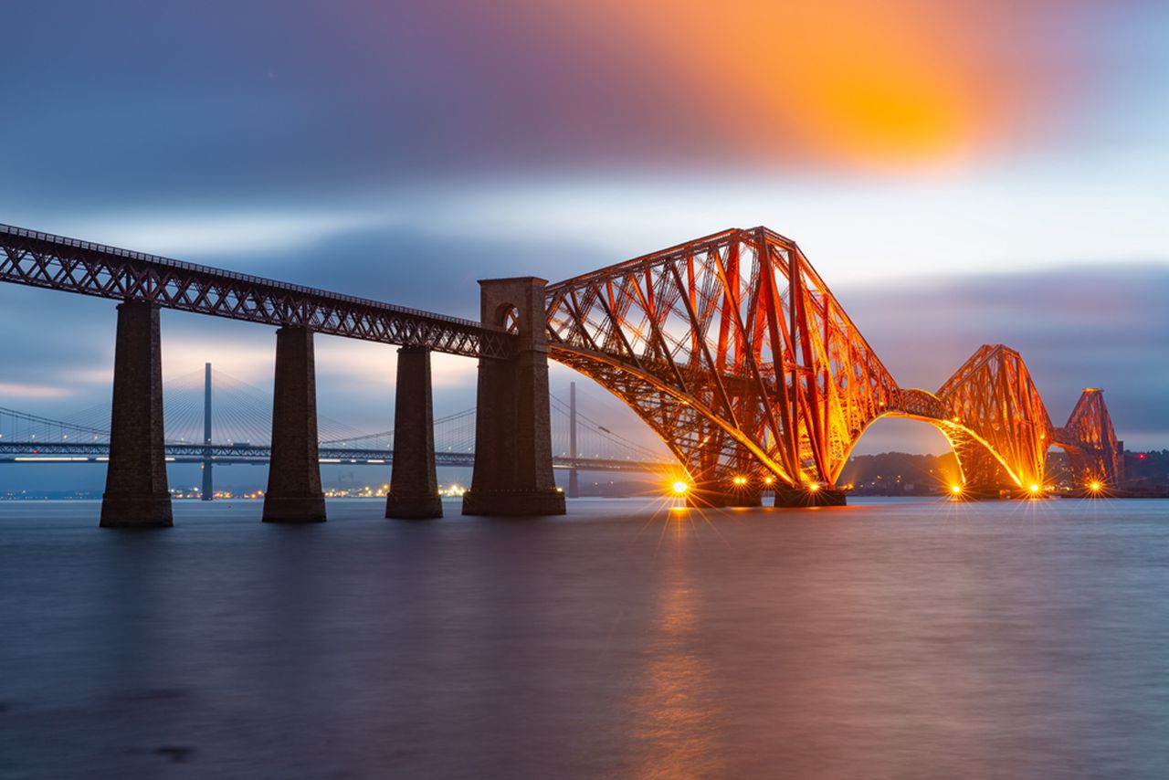
Photography Prints Feel More Architectural With This Evening View of the Forth Bridge

Evening view Forth Bridge, the iconic railway bridge over Firth of Forth near Queensferry, glows at dusk with soft clouds above and another bridge in the distance.

The appeal of good photography prints often lies in the way they bring order and atmosphere together. Evening view Forth Bridge, railway bridge over Firth of Forth near Queensferry does that especially well, turning an iconic Scottish structure into a framed focal point that feels crisp, spacious, and quietly dramatic.

photography prints - Evening view Forth Bridge, railway bridge over Firth of Forth near Queensferry

That makes it useful in interiors where you want presence without clutter. A strong photographic image can sharpen the room and still leave it feeling calm.

Why Photography Prints Work So Well With Architectural Subjects

Photography prints often feel strongest when the image has clear structure. Here, the lines of the bridge give the wall direction and shape, while the evening light stops the result feeling too hard or industrial.

  • It gives the room structure without adding visual fuss.
  • It feels atmospheric without relying on heavy colour.
  • It suits more modern and cleaner interiors especially well.

Where This Forth Bridge Print Fits Naturally

Evening view Forth Bridge, railway bridge over Firth of Forth near Queensferry would work beautifully in a home office, hallway, living room, study, or reception-style space where one framed image can hold a wall with confidence. It pairs naturally with black accents, softer greys, timber, glass, and simpler furniture lines because the composition already carries clarity and balance.

Why Presentation Matters With Photography Prints

Photography prints depend on tonal control and precise finishing if they are going to feel polished rather than flat. First 4 Frames handles bespoke framing and colour-managed Giclee production in-house, helping the final piece keep its structure and atmosphere. You can view the exact framed product here, and explore more about the subject at The Forth Bridges official site.

If you are comparing photography prints and want something architectural, atmospheric, and easy to place, this Forth Bridge image is a very strong option.

Posted on

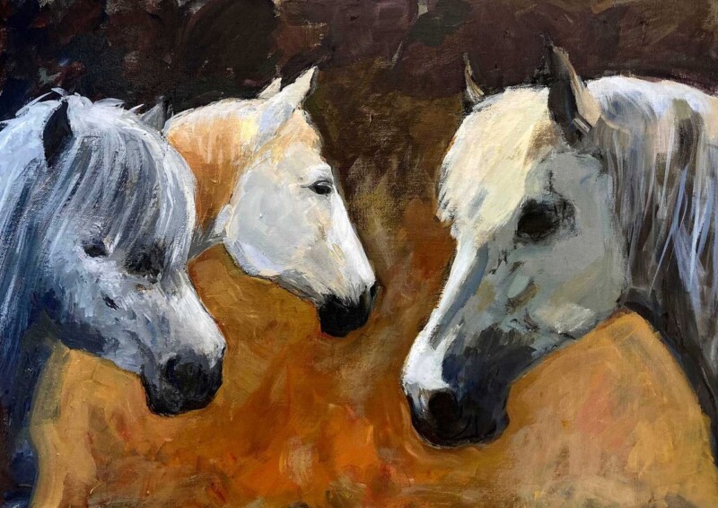
Luxury Wall Art UK Buyers Can Live With, Why Family Portrait Works

Image of Family Portrait by Diana Hand

The best luxury wall art UK buyers choose rarely shouts for attention. Family Portrait is a particularly good example because it feels refined through poise, spacing, and tonal control rather than through anything flashy or overdone.

luxury wall art UK - Family Portrait

That quieter confidence is often what makes a framed piece feel luxurious in the long term. It keeps its presence, but it also remains easy to live with.

Why Luxury Wall Art UK Buyers Often Prefer Restraint

True luxury in artwork usually comes from finish, composition, and balance. This piece brings those qualities together in a way that feels elegant and personal, helping a room feel better judged rather than merely more expensive.

  • It adds sophistication without becoming cold.
  • It feels distinctive without relying on novelty.
  • It rewards a closer look while staying calm at room distance.

Where Family Portrait Feels Most At Home

Family Portrait would suit a sitting room, bedroom, study, dressing room, or hallway where one framed piece can create a more composed mood. It works naturally with warm neutrals, dark timber, brushed brass, upholstered textures, and quieter paint colours because the image already carries that same settled elegance.

Why In-House Craftsmanship Matters

Luxury wall art UK buyers can trust usually depends on how the piece is finished as much as on the image itself. First 4 Frames completes bespoke framing and colour-managed Giclee production in-house, helping the final result feel polished, substantial, and genuinely room-ready. You can view the exact framed product here, and browse more from Diana Hand if you enjoy equestrian work with the same composure.

For anyone comparing luxury wall art UK options and wanting something graceful, lasting, and highly liveable, Family Portrait is an excellent contender.

Posted on

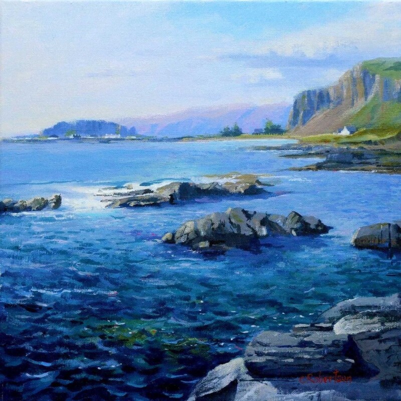
Art for Terrazzo Floors, Why Towards Easdale Feels So Balanced

Image of Towards Easdale by Colin Robertson

Choosing art for terrazzo floors is often about balance. Terrazzo already brings pattern, fleck, and visual energy underfoot, so the wall usually benefits from artwork that adds atmosphere and colour without making the room feel restless. Towards Easdale does that especially well.

art for terrazzo floors - Towards Easdale

Its calm coastal movement helps the room feel softer and more joined up, which is often exactly what a terrazzo-based scheme needs.

Why Art for Terrazzo Floors Needs Calm Direction

When the floor carries texture and small-scale variation, the wall can work harder by offering a broader rhythm. This piece gives you horizon, water, and weather instead of another busy pattern, helping the eye settle while still keeping the room interesting.

  • It softens harder finishes without becoming vague.
  • It picks up cooler and warmer notes in terrazzo naturally.
  • It helps a room feel more layered rather than more crowded.

Where Towards Easdale Works Best

Towards Easdale would work beautifully in a kitchen-dining room, hallway, bathroom-adjacent space, or contemporary sitting room where terrazzo plays a visible role. It pairs naturally with pale woods, off-whites, chalky blues, brushed metal, and stone-toned accents because the image already carries that same balanced restraint.

Why The Framed Finish Matters Here

With a detailed floor beneath it, the artwork needs enough clarity and definition to hold its own. First 4 Frames handles bespoke framing and colour-managed Giclee production in-house, helping the final piece feel properly finished and confidently placed. You can view the exact framed product here, and browse more from Colin Robertson if you enjoy Scottish scenes with the same quiet coastal balance.

If you are looking for art for terrazzo floors that adds warmth and flow rather than extra visual noise, Towards Easdale is a very well-judged option.