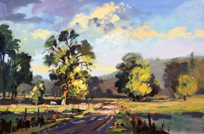
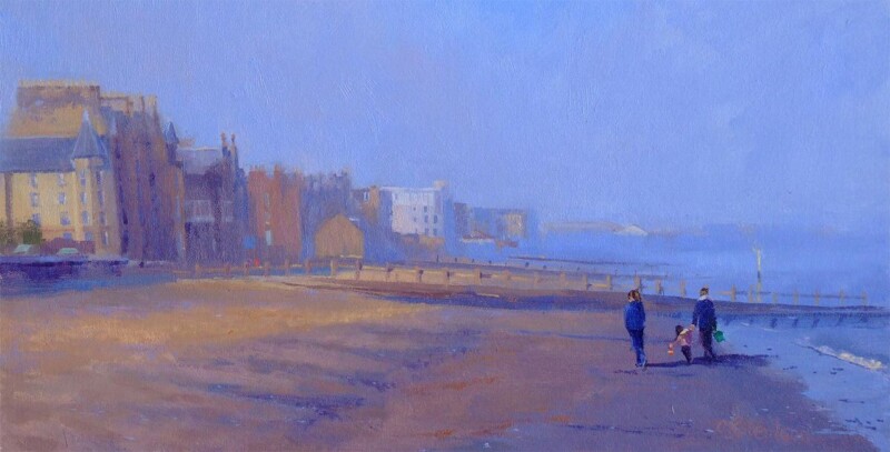
Giclee art prints becomes more useful when the artwork answers a real feature of the room. Late Afternoon offers a clear example because the scene’s atmosphere depends on the transitions that occur as stronger daylight softens towards evening.
What to notice in Giclee art prints with subtle light
A print built around time of day needs more than a bright overall result. Look for separation between the lightest areas, middle tones and deeper passages. If those zones collapse together, the atmosphere becomes flat. A colour-managed workflow is valuable because it aims to reproduce those relationships consistently.
Viewing check
What to look for
Morning daylight
Quiet tones should remain distinct rather than appearing washed out.
Late afternoon
Warm room light should support the scene without turning every neutral orange.
After dark
A nearby lamp should reveal detail without reflecting directly in the glazing.
Late Afternoon is offered in 350 × 230 mm and 550 × 365 mm print sizes. Compare the finished framed outline with the viewing distance, since the larger option can reveal gradual tonal changes more readily from across a room.
Frame atmosphere without introducing visual noise
First 4 Frames produces colour-managed Giclée work in-house in Falkirk. A restrained bespoke frame can then protect the quieter mood, while careful positioning prevents glare from hiding the tonal work the print process preserves.
The appeal of Giclee art prints lies partly in controlled detail and tone. Late Afternoon rewards checking those qualities under the real light in which the finished work will be seen.
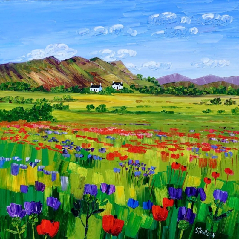
art by colour becomes more useful when the artwork answers a real feature of the room. Poppies and Thistles, Perthshire offers a clear example because its floral subject and rooted Perthshire identity make it possible to draw out colour without turning the whole interior into a matching botanical scheme.
Use art by colour as a starting point, not a formula
Start with the picture rather than a handful of paint cards. Identify the colour that catches your eye first, then decide whether it should lead the room or remain a small accent. With a floral work, repeating every petal and leaf tone can feel forced. One flower colour in a cushion or lamp base is often enough.
Choose a lead note
Let one poppy or thistle tone provide energy. Keep the repeat smaller than the framed work so the picture remains the source.
Add a quiet support
Use foliage, field or earth colours in timber, linen or ceramics. These supporting notes connect the artwork without obvious copying.
The square 265 × 265 mm and 500 × 500 mm print choices can serve different rooms. Mark the finished frame outline before deciding how much colour to repeat nearby.
Let framing give the palette a clean boundary
A considered frame separates concentrated floral colour from wall paint and furnishings. Colour-managed Giclée production helps retain distinctions between neighbouring tones, while bespoke in-house framing gives the square composition a calm edge.
Art by colour should create connection rather than perfect coordination. Poppies and Thistles, Perthshire can lead a layered interior while still keeping its own visual identity.
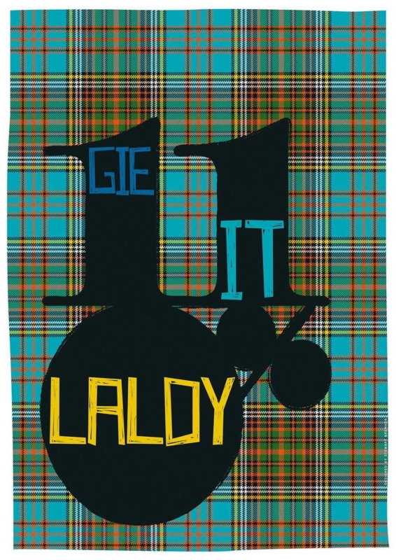
A Scottish gift for a choir singer should recognise the pleasure of singing together, not simply add another treble clef to a shelf. Gie it Laldy by Stewart Bremner takes a more personal route. The familiar Scots phrase means to do something with gusto, making it a fitting tribute to the singer who commits fully to rehearsals, concerts, and every final chorus.
Why Gie it Laldy suits a singer
The phrase is encouraging without being sentimental. It can recall a conductor asking for more energy, the lift of a full ensemble, or the confidence needed for a solo. Because the wording belongs to everyday Scots, it also carries a sense of home and shared humour that generic music gifts rarely achieve.
The design matters just as much as the saying. Strong typography gives the words presence from across a room, so the piece functions as graphic art rather than a printed slogan. That makes it suitable for an adult home, rehearsal space, or teaching room long after a particular concert has passed.
When a Scottish gift for a choir singer feels especially apt
After a first major performance: mark the confidence it took to step on stage and sing as part of the whole.
At the end of a choir season: thank a section leader, accompanist, or committed member without choosing a disposable token.
For a milestone birthday: connect the gift to the person’s musical life and Scottish voice at the same time.
When someone joins a new choir: offer encouragement that feels spirited rather than solemn.
Make the presentation personal without over-explaining it
Add a short card naming the concert, song, or rehearsal memory that made you think of the phrase. One specific reference will give the gift emotional weight. There is no need to cover the back with a long message or ask everyone to sign the artwork itself, which can make future conservation and reframing more difficult.
If the gift comes from the whole choir, collect messages in a separate card. The framed print then remains clean and easy to display, while the handwritten wishes can be kept safely. This approach is practical for a retirement, a move to another ensemble, or thanks to someone who has helped the group find its voice.
Find a wall where the words can be enjoyed
Typography works best where it can be read without visual competition. A hall, home practice corner, kitchen-dining area, or landing can all provide enough passing attention. Leave clear wall around the finished frame, particularly if nearby shelves already hold scores, photographs, and concert programmes.
A simple dark moulding can strengthen the graphic lines. A lighter timber may make the piece feel more relaxed in a home with warm natural finishes. First 4 Frames completes colour-managed Giclée production and bespoke framing in-house in Falkirk, so the final presentation feels like a considered artwork rather than a temporary performance souvenir.
For a Scottish gift for a choir singer with humour, cultural character, and a genuine link to wholehearted performance, view the framed Gie it Laldy print. It is a compact way to say keep singing, give it everything, and enjoy the noise.
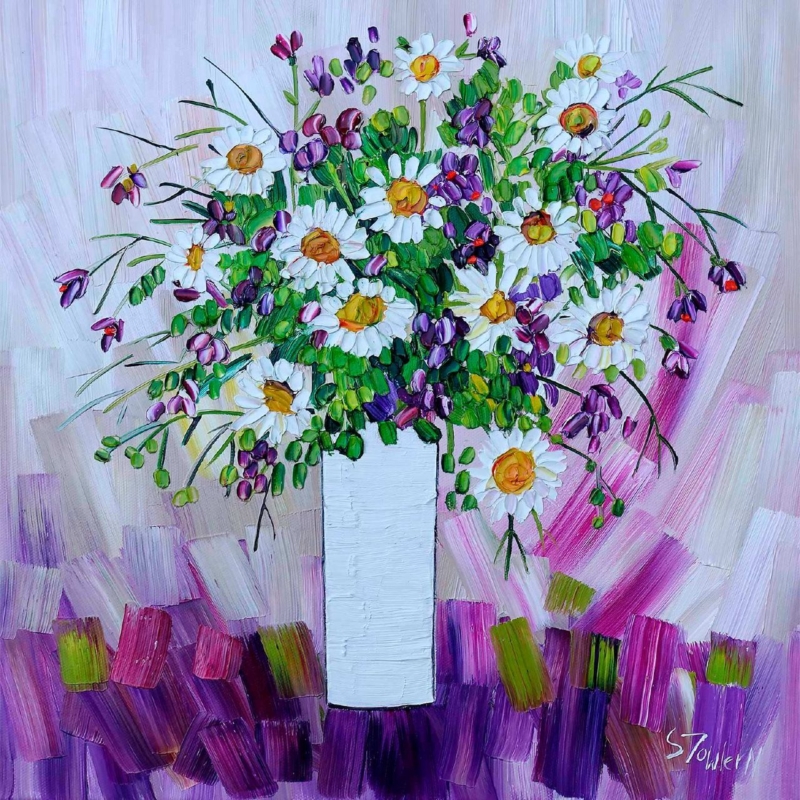
floral wall art for a garden designer’s studio should feel connected to plants without behaving like a specimen chart. A working studio needs inspiration, but it also needs enough visual calm for drawings, samples, and client plans. Daisies and Campanula by Sheila Fowler offers that balance. White daisies and blue-violet campanula emerge through lively green marks, creating the impression of a border in bloom rather than a rigid botanical record.
What floral wall art for a garden designer’s studio needs to contribute
A design workspace already contains visual information. Plant photographs, material samples, site plans, and colour swatches can quickly fill every surface. The artwork should therefore contribute atmosphere and observation rather than another layer of technical reference. An expressive flower painting works well because it recalls the movement and irregularity of a real garden.
Daisies and Campanula is especially useful in this setting. Its pale flower heads provide clear pauses among richer blues and greens. Looser marks suggest stems, foliage, and changing light without prescribing a particular planting scheme. That leaves room for a designer’s own ideas while keeping the studio rooted in the living material behind the work.
Use the painting as a conversation point, not a mood board
Place the print where a client can see it from the consultation table, but avoid surrounding it with pinned references. Clear wall around the frame lets the image read as a finished piece. It can then open useful conversations about looseness, seasonal change, or the balance between white flowers and saturated colour without implying that every garden should copy its palette.
Studio question
What the artwork can demonstrate
How can white planting avoid looking flat?
Darker blue and green marks give the pale daisies definition and depth.
How much colour is enough?
Blue-violet flowers create rhythm while the white blooms provide breathing space.
Can an informal border still feel composed?
Repeated flower heads hold the energetic brushwork together.
Choose a position that supports the working layout
A wall beyond the main desk can give the eye a useful change of focus after close work. The print could also sit above a low sample cabinet, provided doors and tall display boards do not obscure it. Make a paper template using the finished framed size, then view it from both the designer’s chair and the client’s seat.
Daylight is helpful for a garden-led subject, but direct sun and strong reflections are not. Check the wall at different times before fixing the position. If task lighting dominates after dusk, use a soft, offset light that preserves the quieter white petals as well as the deeper campanula colour.
Frame the colour without making the studio feel themed
A light timber moulding may connect naturally with material samples and worktables. A restrained dark frame can instead sharpen the expressive marks and separate the print from a busy sample area. There is no need to repeat flower motifs elsewhere. One blue notebook, glazed pot, or fabric sample is enough to create a quiet relationship.
First 4 Frames produces colour-managed Giclée prints and completes bespoke framing in-house at its Falkirk workshop. That considered finish matters in a professional studio, where clients will notice clean presentation and the relationship between colour, paper, mount, and moulding.
Painterly flowers grounded in close observation
Sheila Fowler is known for expressive paintings of Scottish landscapes, coastlines, wildflowers, and still life. Her layered colour feels well suited to a creative practice concerned with growth and changing seasons. See more work at Sheila Fowler’s official website, or browse the Sheila Fowler collection at First 4 Frames.
Thoughtful floral wall art for a garden designer’s studio can make the workplace feel connected to its purpose while remaining polished for meetings. View the framed Daisies and Campanula print for a lively botanical focal point made with colour-managed printing and hand-finished craftsmanship.
What makes a landscape feel Scottish when it’s expressed through colour and shape rather than shown in literal detail? A sweep of deep green, shifting light over water or the rhythm of a rugged coastline can suggest a familiar sense of place. If you’re exploring abstract landscape prints Scotland has inspired, consider how the colours and composition will feel in your home.
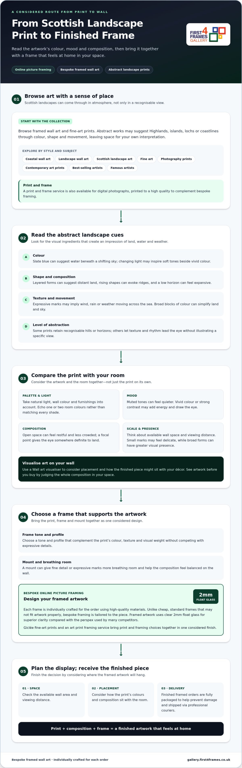
Abstract art doesn’t need to depict a recognisable scene to bring Scotland’s landscapes to mind. This guide explains how to read those visual cues, compare a print’s palette, mood and scale with your room, and choose a frame that completes the artwork. With online picture framing, you can choose your frame online and have it individually crafted for your order using high-quality materials. Finished framed artwork uses clear 2mm float glass, rather than the perspex used by many competitors, and is fully packaged to help prevent damage before being shipped via professional couriers.
Key Takeaways
Abstract landscape prints scotland can suggest a strong sense of place through colour, texture and movement, even without depicting a recognisable view.
Compare a print’s palette, composition and level of abstraction with the mood you want to create in your room.
Choose a frame colour, profile and mount that give the artwork presence without competing with its expressive details.
Explore framed wall art, Scottish landscape art, fine art and contemporary prints to find a piece that feels personal to your home.
Abstract Landscape Prints in Scotland: How Art Suggests a Sense of Place
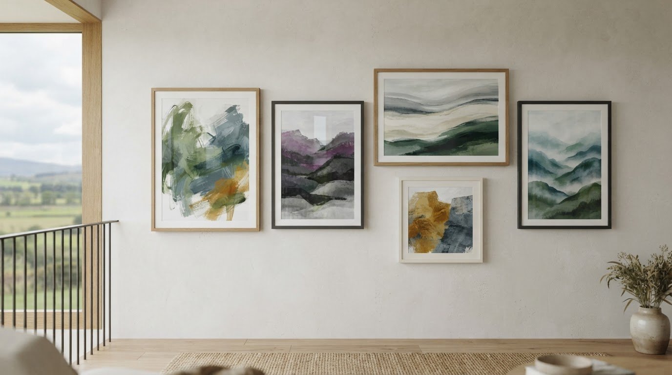
A landscape can feel unmistakably Scottish without showing a named mountain, loch or shoreline. In abstract art, colour, shape, texture and movement do the describing: a band of slate blue might suggest water beneath a shifting sky, while broken, rising forms can call to mind Highland ridges. The artwork invites you to recognise a place through atmosphere rather than an exact view.
A useful way to understand abstract landscape prints scotland is to look for visual cues that evoke Scottish terrain and mood, while leaving room for your own interpretation. Unlike a photograph or strictly representational painting, an abstract work doesn’t aim to record every detail. For background on the tradition, explore this history of landscape painting in Scotland.
Watch an expressive watercolour approach to a Scottish landscape in this tutorial:
What makes a landscape print abstract?
Look for simplification and interpretation rather than one fixed style. An artist might reduce land and sky to broad blocks of colour, use expressive marks to imply wind or rain, or shift natural colours to heighten a feeling. Some compositions retain recognisable horizons and hills; others are more open-ended, letting texture and rhythm lead the eye. Both can suggest landscape without illustrating it literally.
How Scottish places can inspire abstract art
Highlands, islands, lochs and coastlines offer starting points for mood and composition, but they don’t necessarily identify a specific location. A low horizon can feel expansive, layered shapes can suggest distant land, and restless marks might evoke weather moving across the sea. Changing light can inspire contrasts between soft tones and vivid colour. These visual cues let Scottish landscape art feel rooted in place while remaining personal and imaginative.
Choose Abstract Scottish Landscape Art by Colour, Mood and Composition
Choosing between abstract landscape prints Scotland has inspired is easier when you compare four things: palette, composition, level of abstraction and the mood you want in the room. Abstract art uses form, colour and line in many ways; the Tate’s guide to what is abstract art is a helpful starting point for looking beyond literal subject matter.
Match the print’s mood to the room
Consider how natural light, wall colour and furnishings affect the artwork’s presence. Muted tones can create a quieter feel, while vivid colour or strong contrasts may add energy and draw the eye. An open composition can feel restful; bolder marks may suit a room that already has a lively character.
Selection tip: Let the artwork echo one or two colours already in the room rather than matching every shade exactly. This creates a connection without making the print disappear into the décor.
Compare categories by atmosphere, too. Coastal wall art may feel open and airy, while broader landscape wall art can create a more grounded impression. Contemporary art prints range from restrained arrangements to striking colour relationships. Before choosing a size and position, visualise art on your wall by considering the available space and viewing distance. To see artwork before you buy, assess how the whole composition might sit in your room, not just how it looks on its own.
Read the composition before choosing
An open composition with generous negative space can make a wall feel less crowded. A concentrated focal point gives the eye somewhere definite to land, while balanced shapes can create a steadier impression. Consider scale as well: small, scattered marks may feel delicate, whereas broad forms can have greater visual presence. If you’re comparing abstract landscape prints Scotland offers, browse the fine-art print gallery with your room’s colours, proportions and light in mind.
Frame and Display Abstract Landscape Prints for a Finished Look
A frame should support an abstract print’s colour, texture and movement without competing for attention. Consider its tone and profile alongside the artwork’s visual weight and your room’s décor. A mount can create breathing room around expressive marks or fine detail, helping the composition feel balanced on the wall.
Choose a frame that complements the print
Design your framed artwork by considering the print, frame and mount together. First4Frames Gallery individually crafts each frame for the order using high-quality materials. Unlike cheap, standard frames that may not fit artwork properly, bespoke framing is tailored to the piece. This creates custom framed art prints with a considered finish. An art print framing service should bring the artwork and framing choices together as one coherent presentation.
Consider print quality and glazing together
First4Frames Gallery offers Giclée fine-art prints, and framed artwork uses 2mm float glass for superior clarity compared with the perspex used by many competitors. Use a Wall art visualiser to consider how the finished piece might sit in your room, and assess the artwork’s colours and placement against your décor.
Finished framed orders are fully packaged to help prevent damage and shipped via professional couriers. Explore framed art and fine-art prints to find a piece and frame that feel right for your space.
Find Abstract Landscape Prints in Scotland and Make Them Your Own
Make your choice in a few considered steps: browse the artwork, compare its mood with your room, explore frame options, then plan where the finished piece will hang. A large online selection of artwork and frames gives you room to compare different looks. Treating the print and frame as one design decision helps the artwork feel at home in your space.
From choosing a print to choosing your frame online
Explore Scottish landscape art, fine art, contemporary art prints and photography prints, alongside framed wall art by best-selling and famous artists. Once you’ve found a print you love, use online picture framing to choose a frame that suits its colours and composition. First4Frames’ custom picture framing brings your preferred choices together in a finished piece, with the frame crafted for the artwork.
Before deciding, consider the wall’s available space, nearby furnishings and viewing distance. Mark out the proposed position with removable paper to help judge scale and placement. This practical step makes it easier to picture how the finished artwork will sit in the room.
A personal print-and-frame option
A digital photograph offers another way to make a wall personal. First4Frames’ print-and-frame service produces photographs to the highest quality to match bespoke framing. It’s a distinct option from choosing an abstract landscape print, but the same thoughtful approach applies: consider the image’s colours, where it will hang and how its frame can bring the presentation together.
Abstract landscape art can evoke Scotland through colour, form and atmosphere without reproducing a particular view. As you choose abstract landscape prints scotland has inspired, consider how the palette and composition will feel in your room, then select a frame and mount that support the artwork rather than distract from it.
First4Frames offers fine-art Giclée prints from a range of artists, primarily from Scotland. Each frame is individually crafted for the order using high-quality materials, and framed artwork uses clear 2mm float glass rather than the perspex used by many competitors. Finished frames are fully packaged to help prevent damage and shipped via professional couriers, ready to become part of your home.
Abstract landscape prints suggest scenery through colour, shape, texture or movement rather than depicting every feature literally. Some retain recognisable horizons or landforms, while others focus mainly on atmosphere. In Scottish landscape art, layered forms or shifting tones may bring coast, loch, island or Highland environments to mind without mapping a precise location or serving as a photographic record.
How can abstract art represent Scotland without showing a recognisable place?
Abstract art can suggest Scotland through visual cues such as changing light, weather, landforms, colour and movement. Abstract landscape prints Scotland has inspired may convey a sense of place without identifying a particular view. Notice the mood the composition creates, then consider whether it suits your room. A named location isn’t necessary for the artwork to feel meaningful or connected to Scotland.
How do I choose an abstract landscape print for my home?
Start with the room where you plan to display the print, then compare its palette, scale, composition and mood with the space. Decide whether you’d like a calm focal point or a more energetic accent. Consider the wall colour, light and furnishings, then think about the frame and mount alongside the artwork so the finished piece feels balanced and thoughtfully placed.
Should abstract landscape art be framed?
Framing can give a print a finished look and help it sit comfortably within a room. Choose a frame and mount that complement the artwork’s colours and composition without distracting from them. First4Frames Gallery individually crafts each frame for the order using high-quality materials. Framed artwork uses clear 2mm float glass, rather than the perspex used by many competitors.
Can I have a digital photograph printed and framed?
Yes, First4Frames Gallery offers a print-and-frame service for digital photographs, with printing produced to a high quality to complement the bespoke framing. This is a separate option from choosing an abstract landscape print, but similar considerations apply. Think about the image’s colours, the room where it will hang and how the frame can bring the finished artwork together.
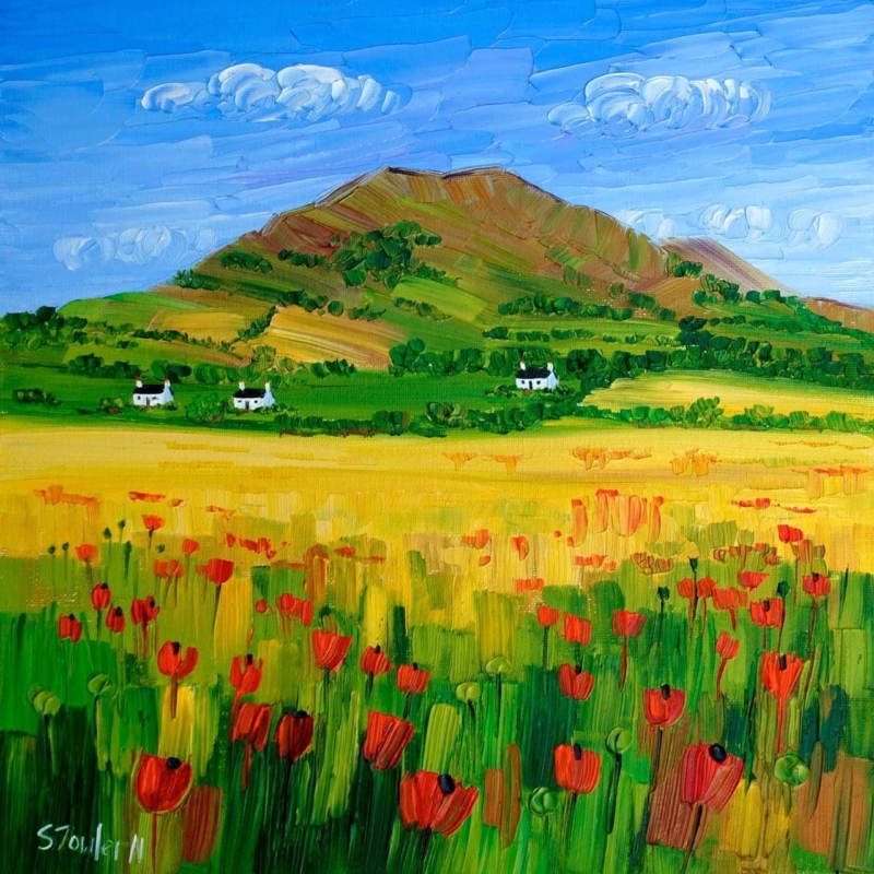
wall art for a room with garden views works best when it responds to the room instead of simply filling an empty surface. Poppies at Lower Largo is a useful example because its poppies create a seasonal colour link to the outdoors while the square composition remains clearly separate from the changing view beyond the glass.
Choose wall art for a room with garden views by season
Do not try to reproduce every plant visible outside. Instead, choose one relationship: a shared red, the rhythm of stems or the contrast between cultivated flowers and a wider landscape. The artwork then feels connected even when the garden changes through autumn and winter.
The two square print sizes, 265 × 265 mm and 500 × 500 mm, create different effects. The smaller size can finish a breakfast corner or wall return. The larger option can hold a clearer sightline across a dining or garden room.
Check placement on a bright day. Position the piece where direct glare will not erase the colour, and avoid centring it between two windows if that leaves too little visual space around the finished frame.
Use framing to separate garden colour from the wall
Floral colour needs clarity without becoming harsh. Colour-managed Giclée printing helps retain the shifts within the poppies and landscape, while a bespoke frame made in Falkirk gives the square image a deliberate interior boundary.
Wall art for a room with garden views should still offer something the window cannot. Poppies at Lower Largo adds a lasting square composition, coastal identity and colour that remains after the flowers outside have faded.
cloakroom wall art works best when it responds to the room instead of simply filling an empty surface. Ah Dinnae Ken is a useful example because its portrait format and familiar Scots expression give a small room character without demanding several competing objects.
Keep cloakroom wall art clear and singular
A cloakroom is often seen in a mirror as well as directly. Hold a paper template on the intended wall, close the door and check both views. The 420 × 594 mm print option can suit a vertical space, while the larger 594 × 840 mm option needs more distance than many compact rooms provide.
Three compact-room checks
Keep the frame clear of splash zones and towel movement.
Allow the wording to be read comfortably from the doorway.
Use one characterful piece instead of building a collection of novelty signs.
Let the wall colour do the supporting work. A clean contrast around the frame will make the phrase legible, while restrained accessories stop the joke from becoming a theme.
Give informal wording a properly made finish
Humour does not need a throwaway presentation. In-house Giclée production and bespoke framing give this Scottish phrase crisp definition and a durable, hand-finished presence suited to a carefully decorated home.
Cloakroom wall art has limited space in which to make an impression. Ah Dinnae Ken does it with one clear phrase, useful portrait proportions and no need for decorative clutter.
contemporary framed art prints works best when it responds to the room instead of simply filling an empty surface. A Path Unseen is a useful example because Diana Hand’s confident equestrian lines need a clear boundary, yet the horse must still feel able to move beyond the marks.
Use contemporary framed art prints to contain energy
Expressive drawing asks for restraint around the edge. A wide, ornate moulding can turn every charcoal stroke into decoration, while an overly narrow dark frame may close the composition too tightly. Begin with the palest open area in the image and allow the mount to extend that breathing space.
Identify the strongest direction of movement.
Keep nearby furniture clear of that visual route.
Test a quiet timber, black or pale frame against the actual wall.
Judge the complete 420 × 297 mm print presentation from normal viewing distance.
In a study, landing or living room, position the work where people naturally pause. The anatomy and gesture deserve a closer look, but the picture should also read as one assured shape from across the room.
Protect the marks without boxing in the horse
Accurate tonal control keeps charcoal-like marks distinct from the paper ground. Colour-managed Giclée printing supports that separation, while bespoke in-house framing gives the work structure and a hand-finished edge.
The strongest contemporary framed art prints feel resolved but not restricted. A Path Unseen keeps its expressive movement because the surrounding presentation knows when to stay quiet.
how large should artwork be above a sofa works best when it responds to the room instead of simply filling an empty surface. A Moment by the Sea is a useful example because its horizontal format can relate naturally to seating, while the available 400 × 190 mm and 560 × 270 mm print sizes make proportion easier to discuss.
How large should artwork be above a sofa in practice?
Measure
Practical check
Sofa width
Use it as the visual anchor, not the full wall.
Finished frame
Confirm the outer size after mount and moulding are added.
Gap above sofa
Keep the picture connected to the seating without risking head contact.
Side space
Leave an even margin so the arrangement can breathe.
A useful starting point is for the finished artwork to occupy roughly half to two-thirds of the sofa width. Treat that as a visual test, not a rigid law. A deep sofa, high back or nearby floor lamp can change what feels balanced.
Mark the finished outline first
Use low-tack tape or paper to mark the proposed outer frame dimensions. Sit down, enter through the main doorway and check the arrangement in evening light before fixing a hook.
Let the frame complete the measurement
The print dimension is only part of the decision. Bespoke framing adds the mount, moulding and glazing that create the true wall footprint. First 4 Frames completes that work in-house and uses colour-managed Giclée production for the coastal detail.
When asking how large should artwork be above a sofa, measure the furniture and the finished frame together. A Moment by the Sea offers calm horizontal movement without overwhelming the seating below.
animal wall art works best when it responds to the room instead of simply filling an empty surface. A Bear Who Carried A Kingdom is a useful example because its steady bear, scarlet rider and cluster of glowing windows invite a story that can keep unfolding over time.
Choose animal wall art that rewards another look
A narrative image can make a reading corner feel shared across generations without turning it into a themed children’s space.
Look first at emotional tone. The bear feels protective rather than threatening, while the carried kingdom introduces scale, shelter and adventure. That balance makes the picture suitable for an older child’s room, family library or landing where both adults and children will encounter it.
Leave enough space to notice the tiny windows and rider.
Echo one muted woodland tone rather than every colour.
Keep toys and animal ornaments away from the wall so the story remains open.
A chair and a warm lamp are enough to complete the setting. The artwork provides its own cast of characters, so additional narrative decoration would only narrow the viewer’s imagination.
Give imaginative detail a lasting presentation
The soft gold light, bare branches and fine architectural details need accurate reproduction. First 4 Frames combines colour-managed Giclée production with hand-finished bespoke framing in Falkirk, helping the quieter marks stay legible.
Animal wall art can be thoughtful, mysterious and easy to live with. A Bear Who Carried a Kingdom brings wildlife and fable together in one considered focal point.