Choosing wall art for sisal carpet is often about building warmth around texture. Sisal gives a room wonderful natural character, but it can also leave the scheme feeling a little dry if the walls do not bring enough softness or colour. Croft House works very well in that setting because it keeps the natural mood while adding a more welcoming focal point.
Why natural flooring needs more than neutrals alone
Sisal often appears in rooms built around relaxed materials and quieter tones. That can look beautiful, but it still helps to have artwork that gives the eye a clear resting point. A framed print can stop the room from feeling too textural and not quite finished.
- It suits sitting rooms, bedrooms, and lightly dressed guest spaces.
- It adds warmth without losing the room’s natural ease.
- It helps textured materials feel curated rather than accidental.
Why this artwork feels especially compatible
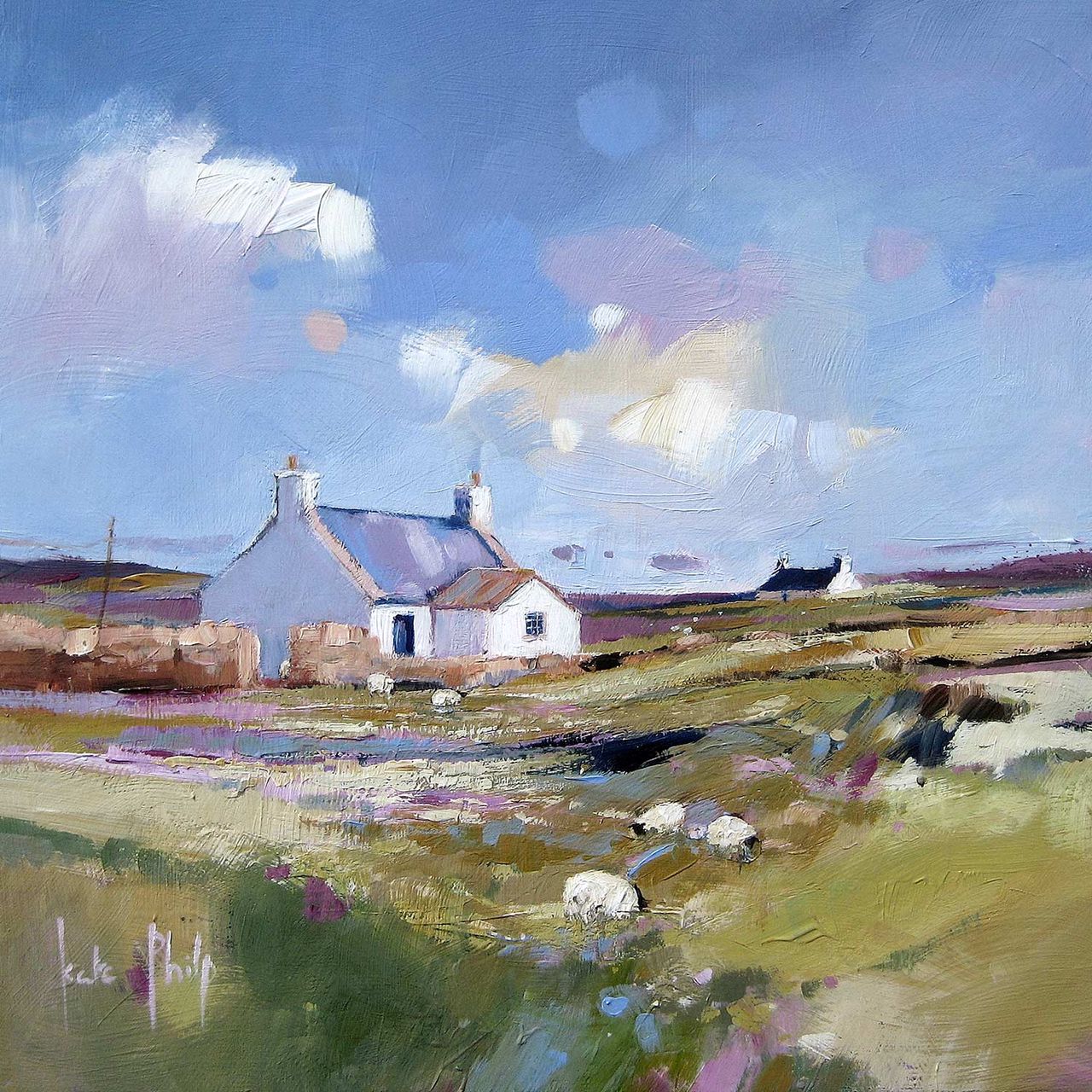
Croft House has a grounded, approachable quality that sits naturally with woven flooring and other tactile materials. It gives the wall enough presence to anchor the room, yet it still feels calm. That balance is exactly what many sisal-led spaces need.
Why the framing quality matters
First 4 Frames produces each piece in-house with bespoke framing, colour-managed Giclée printing, and hand-finished craftsmanship. In a room where material quality is part of the appeal, that higher standard helps the artwork feel properly resolved rather than decorative for its own sake.
This artwork is by Kate Philp, and you can view the exact framed product here.
If you need wall art for sisal carpet that feels warm, natural, and professionally finished, Croft House is an excellent option.