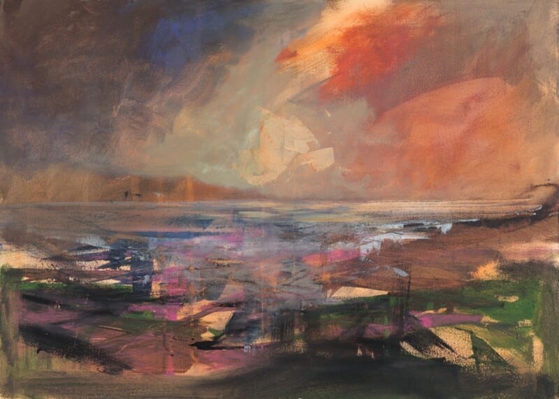
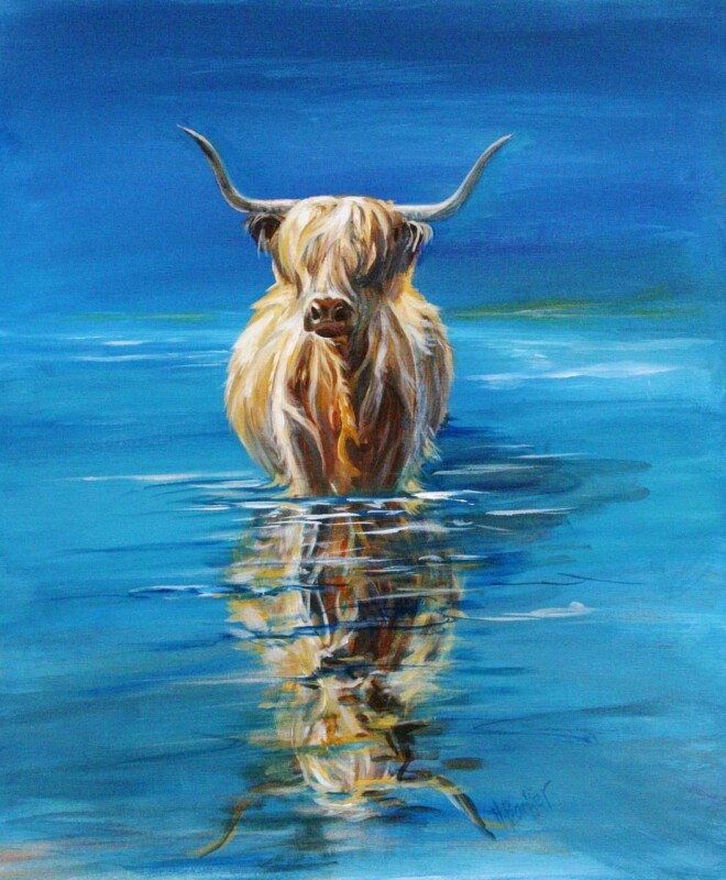
The best wall art for oak flooring should work with the warmth already in the room rather than fighting it. The Sound of Mull is a strong example because it introduces cooler coastal blues, gentle movement, and enough tonal variation to stop oak-heavy spaces feeling too uniform.
Why wall art for oak flooring needs contrast as well as warmth
Oak flooring often brings natural richness, visible grain, and a steady golden undertone. That is a real strength, but it can also make a room feel visually same-note if the artwork leans too brown, too muted, or too close in tone. A better choice introduces freshness and depth while still sitting comfortably with the timber beneath it.
The Sound of Mull does that beautifully. The coastal subject has softness and space in it, which helps an oak-led interior feel lighter and more open. It can work especially well in living rooms, bedrooms, hallways, or open-plan spaces where the floor already contributes a strong sense of material character.
How The Sound of Mull helps wall art for oak flooring feel more balanced
It introduces cooler blues and natural contrast without clashing with timber tones.
It keeps a warm room feeling layered rather than overly golden.
It suits homes where calm presentation and craftsmanship matter more than quick trend changes.
First 4 Frames completes each piece in-house in Falkirk with bespoke framing, colour-managed Giclee printing, and hand-finished craftsmanship. That superior quality matters when a room already includes strong natural materials, because the artwork needs enough presence and finish to hold its place beside them.
If you are comparing wall art for oak flooring and want something that brings contrast, calm, and lasting display value, The Sound of Mull is well worth a closer look.
Did you know that for the 2026 tax year, your business could potentially expense up to $2,560,000 in qualifying property, including high-quality art for commercial properties? It’s a powerful strategic investment. Yet, many offices are still held back by generic, mass-produced frames that arrive with low-clarity plastic glazing or transit damage. You likely agree that your workspace deserves better than “off-the-shelf” decor that looks cheap and dated within months. This guide will show you how to transform your interiors with bespoke, hand-made framed art that truly enhances your brand value.
We’ll explore how to use our wall art visualiser to see artwork before you buy, ensuring a perfect fit for your specific space. From the superior clarity of 2mm float glass to the rich textures of Scottish landscape art from best-selling local artists, you’ll discover a hassle-free procurement process for durable, ready-to-hang pieces. We’ll show you how to choose your frame online and use our professional print and frame service to create a cohesive, inspiring environment that leaves a lasting impression on every client.
Key Takeaways
Learn how to align your brand identity with curated styles, ranging from vibrant Scottish landscape art to professional photography prints that reflect your unique corporate values.
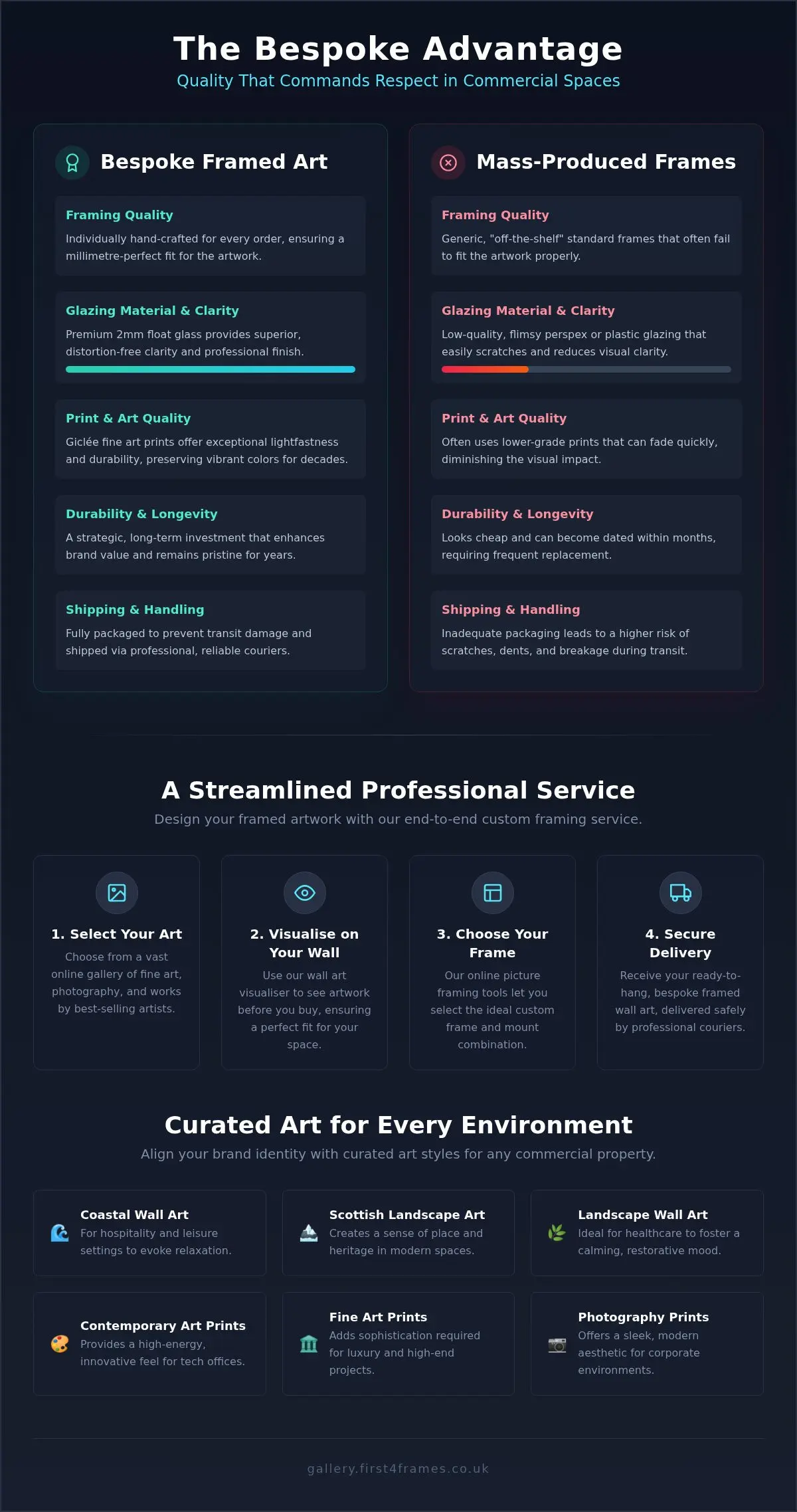
Understand the technical benefits of bespoke framed wall art, specifically how 2mm float glass provides superior clarity compared to the low-quality plastic glazing used in mass-produced frames.
Discover a streamlined system for sourcing art for commercial properties that guarantees durable, high-quality results through a dedicated and professional print and frame service.
Master the tools needed to visualise art on your wall and design your framed artwork online, ensuring a perfect fit and a hassle-free delivery process via professional couriers.
The Strategic Role of Art for Commercial Properties
Choosing art for commercial properties isn’t just about covering bare walls; it’s a strategic investment in your brand’s narrative. When you curate a space, you’re defining the atmosphere where deals are made and ideas are born. High-quality pieces serve as a bridge between your company’s values and the people you serve. This concept draws from the long history of Public art, where visual elements are used to enhance shared spaces and improve the human experience.
The psychological impact on employees and clients is profound. Thoughtful curation builds trust by projecting stability and attention to detail. For many UK developments, using Scottish landscape art creates an immediate sense of place and heritage, grounding modern architecture in local tradition. Unlike cheap, standard frames that look flimsy, our bespoke framed wall art uses 2mm float glass to ensure every detail is visible with perfect clarity. This professional finish signals that your business doesn’t cut corners.
Matching Art Styles to Business Objectives
Every industry has a unique visual language. You can use our wall art visualiser to see artwork before you buy, ensuring the style meets your specific goals. Consider these strategic pairings:
Coastal wall art: Perfect for hospitality and leisure settings to evoke a sense of relaxation and escape.
Contemporary art prints: These provide a high-energy, innovative feel for modern tech offices and creative agencies.
Landscape wall art: Essential for healthcare and wellness spaces to foster a calming, restorative environment.
Photography prints and fine art: These Giclée prints from best-selling artists offer the sophistication required for luxury hotels and high-end residential staging.
By using our professional print and frame service, you ensure that your selections are individually crafted and ready to hang. This hassle-free approach lets you focus on your business while we handle the craftsmanship and delivery via professional couriers.
Selection Criteria: Balancing the ‘Head and the Heart’
Selecting art for commercial properties requires a dual approach. The “heart” focuses on finding pieces that resonate with your brand’s core values and unique culture. Art in the workplace is proven to boost wellness and creativity, making it essential to choose styles that connect emotionally with your team and clients. Whether it’s the rugged beauty of Scottish landscape art or sleek photography prints, your choice should feel intentional and authentic to your mission.
The “head” involves the practicalities of commercial longevity and maintenance. Giclée fine art prints are the gold standard here, offering exceptional lightfastness and durability. Unlike mass-produced alternatives that use cheap, standard frames, our bespoke framed wall art is individually crafted for every order. We use 2mm float glass for superior clarity. This is a critical distinction; the perspex used by many competitors often lacks the fidelity needed for professional environments. This ensures your investment in art for commercial properties remains vibrant for decades. Every order is fully packaged to prevent damage and shipped via professional couriers.
Curating for Scale and Cohesion
When managing multi-room projects, developing a “visualise art on your wall” strategy is vital for success. You can browse our full gallery of Scottish and contemporary art to find pieces by best-selling artists that maintain a premium feel across large spaces. You might choose a consistent frame style to create a unified corporate identity, or opt for an eclectic gallery wall to add character to breakout areas. Using a wall art visualiser allows you to see artwork before you buy, ensuring every piece fits the scale of your specific space perfectly. Our all-in-one print and frame service makes this complex procurement simple and reliable.
The Bespoke Advantage: Quality That Commands Respect
Mass-produced frames often fail to do justice to high-end art for commercial properties. While competitors might use cheap, standard frames, our approach centers on the bespoke. Every frame is individually crafted for your specific order. This ensures a millimetre-perfect fit, whether you’ve selected a large-scale Scottish landscape art piece or a series of contemporary art prints. Understanding the strategic role of art in commercial spaces means acknowledging that the frame is just as important as the image it holds.
We explicitly avoid using perspex for our premium glazing. Perspex is prone to a “wavy” visual distortion and attracts static dust, which can quickly make professional interiors look neglected. Instead, we use 2mm float glass. This material provides the superior clarity required to showcase the fine details of Giclée prints and photography prints. It doesn’t flex or bow, maintaining a flat, professional profile that commands respect from clients and visitors alike. When you design your framed artwork with us, you’re choosing a standard that reflects your own professional excellence.
Technical Standards for Commercial Environments
Clarity and protection are non-negotiable when selecting art for commercial properties. Our use of 2mm float glass ensures that your bespoke framed wall art remains a sharp, vivid focal point. This commitment to quality extends to our sustainability practices, with all craftsmanship taking place in our UK-based facility. You can learn more about our custom framing process to see how we balance traditional artisan skills with modern business needs. Once finished, each piece is fully packaged to prevent transit damage. It arrives safely via professional couriers. This ensures your order arrives ready to hang, exactly as you envisioned it when you used our wall art visualiser.
Executing a strategy for art for commercial properties shouldn’t be a logistical burden. Our online picture framing tools are designed to streamline the procurement process for developers and business owners alike. The “See artwork before you buy” phase is a critical step in modern curation. By using our wall art visualiser, you can present a virtual mockup to stakeholders or clients, ensuring absolute confidence in the scale and style before production begins. This digital integration bridges the gap between a conceptual design and a finished, branded environment.
Designing Your Framed Artwork Online
The journey from inspiration to installation is straightforward and sequential. First, you choose your frame online to match your specific interior palette, whether you’re selecting sleek contemporary art prints or vibrant Scottish landscape art. You can then design your framed artwork by selecting specific dimensions, mounts, and finishes. This system allows you to order custom framed art prints at scale without losing the hand-made quality that defines our artisan approach.
Once your order is complete, we provide a hassle-free delivery experience. Every frame is fully packaged in damage-proof materials to protect the 2mm float glass and shipped via professional couriers. This ensures your ready-to-hang art arrives in perfect condition, ready to elevate your property immediately. If you need assistance with a large-scale project or specific customisations, contact our commercial team for a bespoke consultation.
Transforming Your Workspace with Artisan Excellence
Investing in art for commercial properties is about more than aesthetics; it’s a commitment to your brand’s identity and the well-being of those who inhabit your space. By choosing bespoke, individually crafted frames over cheap, standard alternatives, you ensure that your environment reflects the highest professional standards. We’ve explored how 2mm float glass provides the superior clarity your fine art deserves, avoiding the wavy distortion and static dust common with low-quality perspex. Whether you’re showcasing vibrant Scottish landscape art or sleek contemporary art prints, the craftsmanship behind the frame is what creates a truly lasting impression.
Our comprehensive curation service makes it easy to select and scale your project with total confidence. From our expert print and frame options to secure delivery via professional couriers, we handle every detail with artisan pride. You don’t have to settle for dated office decor when bespoke quality is just a few clicks away. Take the first step toward an inspired interior and design your bespoke commercial wall art with First4Frames today. We’re here to help you turn your vision into a beautiful, professional reality.
Frequently Asked Questions
What is the best type of art for a professional office space?
The best choice depends on your brand’s unique personality and the atmosphere you wish to create. For a sense of stability and heritage, many businesses choose vibrant Scottish landscape art from best-selling artists. If you want a high-energy, modern feel, contemporary art prints are an excellent solution. You can use our wall art visualiser to see artwork before you buy, ensuring your selection of art for commercial properties perfectly matches your interior design goals.
Why is glass preferred over perspex for commercial picture framing?
We exclusively use 2mm float glass because it provides superior clarity and a flat, professional finish that perspex cannot match. Many competitors use cheap, standard frames with plastic glazing that often looks wavy and attracts static dust. Our bespoke framed wall art ensures your images are displayed with perfect fidelity. This premium component protects your investment and ensures that your commercial interiors always command respect from visiting clients and staff.
Can I use my own company photography for commercial wall art?
Yes, our professional print and frame service allows you to transform high-resolution company photography into custom framed art prints. We ensure your digital files are printed to the highest Giclée standards to match our artisan-quality framing. This is a fantastic way to showcase your own projects or heritage. You can choose your frame online to ensure the final product aligns with your existing office palette and corporate branding.
How long does the bespoke framing process take for large commercial orders?
Every order is individually crafted in our UK workshop to ensure a perfect, bespoke fit for your specific prints. While timing depends on the project’s scale, we focus on a streamlined process that prioritises both quality and efficiency. Once your bespoke framed wall art is finished, it is fully packaged to prevent damage during transit. We then ship your order via professional couriers to ensure it arrives ready to hang immediately.
What are the benefits of Giclée prints for commercial properties?
Giclée prints offer exceptional longevity and colour fidelity, which is essential for art for commercial properties that stays on display for years. These fine art prints are created using archival-quality inks, ensuring they don’t fade under office lighting. When paired with our 2mm float glass and individually crafted frames, they provide a premium aesthetic that mass-produced alternatives simply can’t achieve. This makes them a durable, high-value choice for any professional environment.
Finding the right wall art for a room with skylights is often about balance. Skylights bring welcome brightness, but they can also make an upper room feel a little visually adrift if the walls are left too plain. House by the Cliff is a strong answer because it gives the space a clear point of focus while still feeling airy enough for a light-filled room.
Why House by the Cliff works as wall art for a room with skylights
Rooms with skylights often have strong natural light from above rather than a conventional window-led view. That means artwork needs enough structure to ground the space, but not so much density that it fights the openness. House by the Cliff gets that balance right by combining a sense of place with plenty of breathing room around it.
This makes it especially useful in loft rooms, upper-floor studies, attic guest rooms, or top-floor lounges where the light is generous but the wall arrangement can feel slightly awkward. The piece helps the room feel finished rather than merely bright.
It anchors a brighter upper room without weighing it down.
It works well where the walls need a clear focal point.
It complements natural light instead of competing with it.
Because First 4 Frames produces and frames the work in-house, the finished result has the bespoke quality and craftsmanship that help the image feel properly resolved. In a clean, light-driven room, that attention to finish makes a visible difference.
If you are planning or refining a loft-style interior, Ideal Home’s loft room ideas offers helpful inspiration. You can also browse more work by Matylda Konecka and view the exact framed product here.
If you are comparing wall art for a room with skylights, House by the Cliff is a strong option for adding focus, atmosphere, and a more grounded feel to a bright upper room.
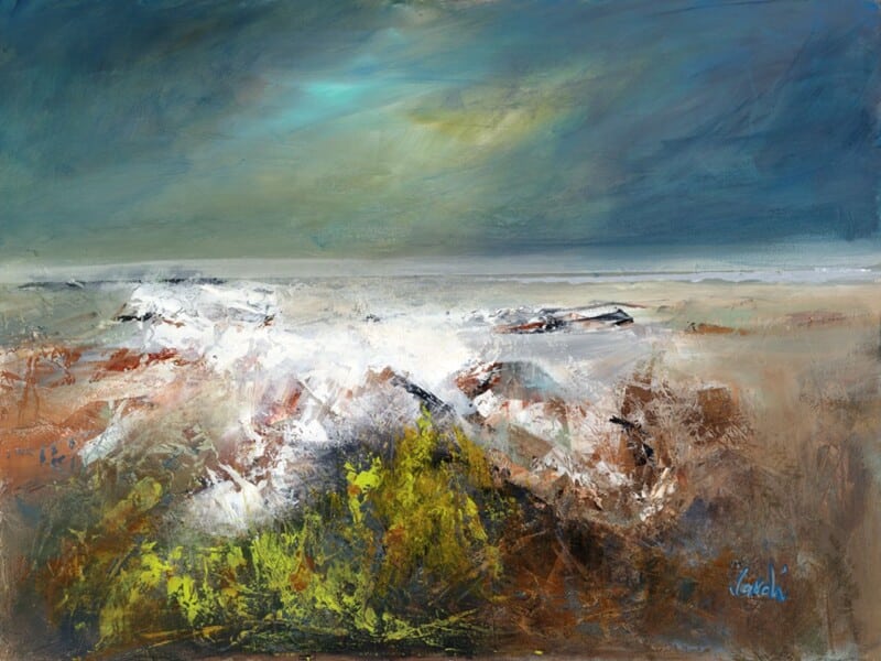
The right art for a room with low winter light can change the whole mood of a darker room. When daylight is limited for much of the year, artwork needs to bring lift and openness without feeling artificially bright. Northern Light II works especially well because it offers light, distance, and calm in a very natural way.
Why Northern Light II suits art for a room with low winter light
Some darker rooms need more than a pop of colour. They need a sense of atmosphere that feels expansive rather than enclosed. Northern Light II delivers that by drawing the eye into the distance, which helps the room feel more open even on greyer days. That is useful in sitting rooms, studies, or upstairs spaces that naturally receive less direct light.
It brightens the feel of a room without looking forced.
It suits muted palettes that still need a clearer focal point.
It offers calm light rather than decorative glare.
At First 4 Frames, the in-house Giclée printing and bespoke framing make those subtler tonal shifts hold together beautifully. In a lower-light room, good colour management and a hand-finished presentation matter more than ever because every tonal change becomes part of the atmosphere.
If you are thinking about how daylight shapes interior mood, RIBA’s guide to daylight in interiors is useful background reading. You can also browse more work by Arie Vardi and see the exact framed product here.
For customers looking at art for a room with low winter light, Northern Light II is a strong option for making a darker room feel gentler, lighter, and more spacious through the colder months.
Choosing art for a room with green velvet sofa is often about stopping a richer room scheme from feeling too formal or too heavy. Green velvet has depth and elegance, but it benefits from artwork that adds warmth and approachability. Cooling off does that beautifully, bringing character and a grounded sense of comfort to the space.
Why Cooling off works as art for a room with green velvet sofa seating
The strength of this pairing is tonal rather than matchy. A green velvet sofa already gives the room texture and richness, so the artwork needs to complement that with warmth, not just more darkness. Cooling off introduces a natural, slightly rustic note that keeps the room feeling welcoming and lived with.
It is especially effective in living rooms where brass, timber, or layered neutrals sit alongside the green upholstery. The image adds personality and softness, which helps the scheme feel balanced rather than stage set.
It brings warmth to a richer palette.
It adds personality without making the room overly theme led.
It helps deeper seating colours feel more relaxed and approachable.
Because First 4 Frames completes the framing and colour-managed Giclée production in-house, the final piece has the kind of craftsmanship that suits a more design-aware room. The hand-finished presentation helps the artwork feel intentional from the start.
If you are comparing art for a room with green velvet sofa, Cooling off is a very good example of how to keep a richer room warm, balanced, and easy to enjoy every day.
Good art for a room with exposed brick should balance texture rather than compete with it. Exposed brick already gives a room weight, pattern, and character, so the artwork needs to bring something different. Astronomers works especially well because it introduces atmosphere and story without arguing with the wall behind it.
Why Astronomers suits art for a room with exposed brick
The appeal of Astronomers is that it feels imaginative rather than industrial. That contrast is useful in brick-led interiors, where harder surfaces can benefit from something more lyrical and human. The result is a room that feels layered rather than one-note, especially if the furniture is simple or the palette leans warm and earthy.
It adds softness without losing presence.
It gives a textured wall a more thoughtful focal point.
It helps a loft-style or character property feel less visually hard.
This is also where framing matters. First 4 Frames completes the Giclée printing and bespoke framing in-house, which helps the finished work hold its own against a tactile brick backdrop while still feeling refined. A well-judged frame gives the image just enough separation from the wall to let the artwork breathe.
For anyone comparing art for a room with exposed brick, Astronomers shows how a more imaginative piece can make a textured room feel warmer, softer, and more complete.
The best wall art for exposed ceiling beams should balance a room rather than compete with it. In spaces with visible timber overhead, the architecture already carries strong lines and texture. Where Ghosts Wander works especially well because it brings depth and atmosphere while softening the harder structure around it.
Why wall art for exposed ceiling beams needs softness and depth
Exposed beams can give a room wonderful age, rhythm, and presence, but they also make the upper part of the space feel visually firm. That often means the artwork below needs to introduce some ease. The strongest choice brings atmosphere, movement, or tonal variation so the room feels layered instead of slightly top heavy.
Where Ghosts Wander does that beautifully. Its woodland subject feels immersive and calm, and the tree forms echo natural structure without repeating the straight geometry of the beams themselves. That makes it a strong fit for living rooms, garden rooms, studies, and bedrooms where you want a period or cottage interior to feel settled rather than busy.
How Where Ghosts Wander helps wall art for exposed ceiling beams feel more resolved
It softens stronger joinery with organic shapes and tonal depth.
It adds atmosphere without making a characterful room feel darker or heavier.
It suits homes where texture and craftsmanship matter more than trend-led styling.
First 4 Frames completes every piece in-house in Falkirk with bespoke framing, colour-managed Giclee printing, and hand-finished craftsmanship. That superior finish matters in older or more characterful rooms because the artwork needs enough quality to sit confidently beside natural timber, stone, or traditional joinery.
The best wall art for a stairwell should do more than fill height. A staircase needs something with enough character to draw the eye upward while still feeling right as part of the home. Phonebox Cottage does that especially well, bringing narrative detail and warmth to a part of the house that is often overlooked.
Why Phonebox Cottage works well as wall art for a stairwell
Stairwells can feel narrow or purely functional if the artwork is too flat or anonymous. Phonebox Cottage avoids that by offering a clear sense of place and a little story. That makes the transition between floors feel more considered, almost as though the staircase belongs to the home’s personality rather than simply its layout.
The subject also suits a vertical journey through the house. As you move past it, you notice different details, which gives the image more staying power than a simpler decorative filler print. It works especially well with painted timber, runners, or stair walls that need warmth rather than extra heaviness.
Because First 4 Frames handles the print and framing in-house, the finished piece has the kind of hand-finished quality that helps a passing space feel properly finished too. That is often what elevates stairwell styling from adequate to genuinely polished.
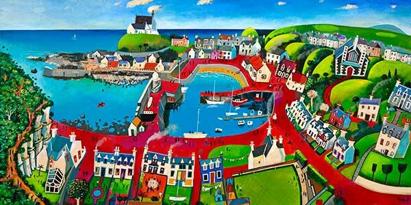
Well-chosen seaside cafe wall art should help a cafe feel welcoming before anyone even sits down. Findochty works especially well because it brings harbour character, friendly colour, and a recognisable sense of place without tipping into overly themed seaside styling.
Why seaside cafe wall art needs personality as well as calm
A good cafe interior should feel easy to settle into. Artwork can help with that, but only when it adds warmth and local character rather than feeling like a stock coastal theme. The strongest piece gives people something to notice while still supporting the room’s atmosphere, conversation, and comfort.
Findochty suits that kind of setting because the harbour subject feels grounded and human. It can work beautifully in a coffee shop, breakfast room, bakery cafe, or coastal tearoom where you want the walls to feel lively and welcoming rather than purely decorative.
Why Findochty works so naturally as seaside cafe wall art
It adds a clear coastal identity without leaning on obvious nautical cliches.
It brings colour and story that help a seating area feel more relaxed and memorable.
It suits customer-facing interiors where atmosphere matters as much as neat presentation.
First 4 Frames completes each piece in-house in Falkirk with bespoke framing, colour-managed Giclee printing, and hand-finished craftsmanship. That superior quality matters in hospitality spaces because customers notice the details, especially when artwork is positioned near tables, counters, or waiting areas.
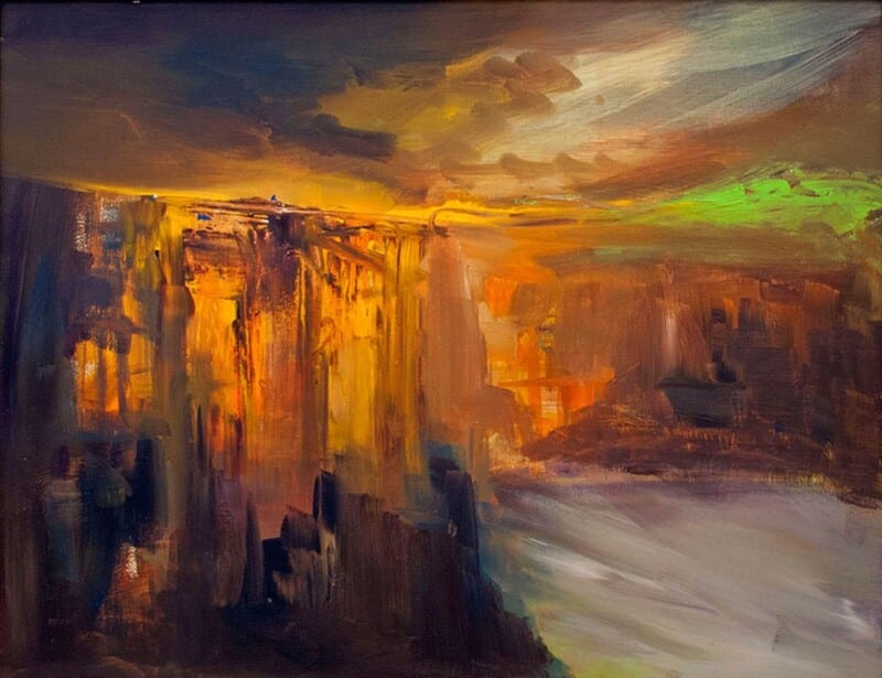
Choosing art for a room with black window frames is often about balance. Black window frames bring definition and architectural confidence, but they can also make a room feel a touch firmer than intended. First Light 2 works beautifully because it introduces light, distance, and atmosphere without losing the room’s sharper sense of structure.
Why First Light 2 suits art for a room with black window frames
The key here is contrast of mood rather than contrast of colour alone. Where black-framed glazing creates clear lines and stronger edges, this piece offers a gentler coastal openness that helps the room feel more relaxed. It is especially effective in spaces with pale walls, timber floors, or broad windows that already dominate the visual rhythm.
It softens a scheme without making it feel bland.
It gives a window-led room a second focal point that still feels calm.
It pairs well with modern joinery, natural textures, and quieter upholstery.
Because First 4 Frames completes the Giclée printing and framing in-house in Falkirk, the final piece feels bespoke and well judged. That craftsmanship matters when a room depends on clean lines and tonal control rather than decorative excess.
For broader context on the kind of coastal light that makes this subject so appealing, the East Neuk of Fife guide is worth exploring. You can also browse more work by Arie Vardi and view the exact framed product here.
If you are comparing art for a room with black window frames, First Light 2 is a strong example of how softer artwork can bring warmth and ease to a room with more architectural glazing.